10,000 search results
(0.029 seconds)
- Modern MT for Dior JP by Monotype,
$29.99Cut by Monotype between 1900 and 1902, the Monotype Modern font family was based on Miller & Richards News 23 and 28; slightly condensed news text types of the 1890s. Monotype Modern is a lively typeface, with long, fine hairlines and well rounded letterforms, representing the best of nineteenth century modern face design. A classic text face, and typical of the moderns that were produced in the United Kingdom at that time, being less extreme in its rendering than some of the models of purer form being produced elsewhere. Monotype Modern is an excellent text face for magazines, newspapers and books, the heavier and more condensed versions are useful in headlines and display. - Modern MT for Dior KO by Monotype,
$29.99Cut by Monotype between 1900 and 1902, the Monotype Modern font family was based on Miller & Richards News 23 and 28; slightly condensed news text types of the 1890s. Monotype Modern is a lively typeface, with long, fine hairlines and well rounded letterforms, representing the best of nineteenth century modern face design. A classic text face, and typical of the moderns that were produced in the United Kingdom at that time, being less extreme in its rendering than some of the models of purer form being produced elsewhere. Monotype Modern is an excellent text face for magazines, newspapers and books, the heavier and more condensed versions are useful in headlines and display. - Futura ND by Neufville Digital,
$45.25 Futura is one of the best known and most widely used of modern typefaces. Designed by Paul Renner between 1924-1927 for the Bauersche Giesserei, it remains today one of the most successful typefaces due to its simplicity of features, perfect legibility, and meticulous finish of each of its letters. Its great variety of styles and weights makes Futura particularly fit for distinguished user interfaces, information displays, smart watches, e-readers, television apps, technical appliances, and internet-related uses. Futura is a Trademark of BauerTypes SL
 - Cyclo by Cubo Fonts,
$39.00 Ainsi que le considérait Geoffroy Tory, typographe et philosophe de la Renaissance, chaque lettre de l'alphabet peut être dessinée à partir d'un cercle et d'un trait. La fonte "cyclo" actualise et radicalise ce principe graphique visionnaire. Le pack contient une version "regular" assez sage et une version "alternate" plus fantaisiste dans les accents et des signes de ponctuation. La fonte cyclo est dont adaptée à tous les usages (titres, sous-titres, chapitres et blocs de text), et peut servir efficacement l'identité visuelle de votre projet.
 - Remus by RMU,
$25.00 Both fonts of the Remus family are complete redesigns of turn-of-the-century fonts. The regular style is based upon an inhouse design of Schelter & Giesecke in 1889, called Romanisch. This font was adopted by other German foundries and slightly modified and a bold version was added. Due to their proportions, these fonts fit perfectly into narrow columns, and still they are very legible. In January 2023, an Italic style was added. Here too it is recommended to use both ligature features Standard and Discretionary.
 - Osaca by Rosario Nocera,
$15.00 Osaca is a sans serif font family inspired by nature and it is composed of 6 weights, from extra light to heavy, including the matching italics. Osaca is a typeface that doesn't go unnoticed due to its particular design: its curves and lines mirror the typical motif of leaves. Osaca is ideal for large and medium headers and titles, but also perfectly suitable for short or large paragraphs as it creates an effect that is quite different from the classic sans-serif and definitely unique.
 - Agaste by Letterara,
$16.00 Agaste is a stylish and elegant serif font. It is suitable for a wide variety of designs due to its unique and cool style. Comes with some alternates and ligatures, so you can combine them to make a perfect typography design. It is ideal for your upcoming projects. Such as luxury logo and branding, classy editorial design, magazines, Packaging, poster, movie, cosmetic brand, fashion promotions, weddings, fashion, art gallery branding, and more. This font is PUA encoded, meaning you can access all of the glyphs.
 - Coluna by Dominik Krotscheck,
$12.00 Coluna is a friendly, handdrawn all caps font. Due to its playful, organic shapes it makes you think of cocktails on the beach and the earthy smell of the woods in the morning. It offers vast support for languages using the latin alphabet and comes with a couple of icons to make it even easier to complete the handmade look of your designs. Coluna is perfectly all sort of different use cases, such as birthday cards, packaging, children's books, branding, posters, menus and many more.
 - Linotype Spitz by Linotype,
$29.00The Chrysler Building's decorative motif acted as the formal language that inspired the Linotype Spitz typeface. Linotype Spitz is a combination of pointed and semicircular elements that develop their own aesthetic value in their interplay. Neither the Chrysler Building nor the Linotype Spitz is designed on the basis of geometric rules; they both take account of optical phenomena in their design. Linotype Spitz is characterized by its elegant appearance, due to its exceptionally fine and pointed design. The font is ideal for posters and advertising. - Generisch Mono by Akufadhl,
$29.00 Generisch Mono is a monospaced version of Generisch Sans. Generisch - a german equivalent of generic - sans serif typeface has gain its own place among designers and earn such popularity due to its "simple" design. Generisch is influenced by early grotesk typefaces from early 1900's when sans was starting to get popular and used as a body type. Some old ligatures such as ch ck and ng are present in generisch (not the ct and st tho), old style numeral for better typesetting experience and more.
 - Foundry Gridnik by The Foundry,
$96.00 The new Foundry Gridnik typeface family features an expressive range of 10 weights – from Light to Extra Bold, each with accompanying Italics. Foundry Gridnik was developed from the single weight monospaced 'typewriter’ face, originally created by Dutch designer Wim Crouwel in the 1960s. Crouwel's devotion to grids and systems led to his affectionate nickname of ‘Mr Gridnik’, and this inspired the new typeface family name. Foundry Gridnik’s distinct geometric design has been described as ‘the thinking man’s Courier’. Crouwel said, ‘I am a functionalist troubled by aesthetics’, and although Gridnik is based on logic, rationality and strict adherence to the grid, it also has a human dimension that sets it apart.
 - Modesto Open by Parkinson,
$20.00 Modesto Open is now a Chromatic Font Family. The old font Modesto Open has been improved, renamed Modesto Open Primary and joined by four new fonts that ornament and augment the Primary font in many different ways. All Caps. Modesto is a loose-knit group of Font Families based on a signpainting lettering style popular in the late-19th and early-20th centuries. It evolved from the lettering I used for the Ringling Bros. and Barnum & Bailey Circus Logo. The Modesto family was not planned. It just happened, a few fonts at a time over about fifteen years. In 2014 seven new Italic fonts and two Chromatic families were added.
 - Pitcher by Fenotype,
$35.00 Pitcher is a bold brush with roots in 1940s and 1950s Americana. Pitcher is great for sports team or bar logos, beer labels or anything where you need a strong sturdy script with lots of character. Pitcher is equipped with several OpenType features - keep on Standard Ligatures and Contextual Alternates for smooth connections between letters. Try Swash or Titling Alternates when you need more customised headlines or when designing a logo and look for Glyph Palette for even more alternates. Pitcher Printed is the same font with a worn-out texture and a bit softer corners. Combine Pitcher Ornaments with the script to complete your designs!
 - Classic Grotesque by Monotype,
$40.99 Classic Grotesque by Rod McDonald: a traditional font with a modern face. The growing popularity of grotesque typefaces meant that many new sans serif analogues were published in the early 20th century. Setting machines were not compatible with each other but all foundries wanted to offer up-to-date fonts, and as a result numerous different typeface families appeared that seem almost identical at first glance and yet go their separate ways with regard to details. One of the first fonts created with automatic typesetting in mind was Monotype Grotesque®. Although this typeface that was designed and published by Frank Hinman Pierpont in 1926 has since been digitalised, it has never achieved the status of other grotesque fonts of this period. But Monotype Grotesque was always one of designer Rod McDonald’s favourites, and he was overjoyed when he finally got the go-ahead from Monotype in 2008 to update this “hidden treasure”. The design process lasted four years, with regular interruptions due to the need to complete projects for other clients. In retrospect, McDonald admits that he had no idea at the beginning of just how challenging and complex a task it would be to create Classic Grotesque™. It took him considerable time before he found the right approach. In his initial drafts, he tried to develop Monotype Grotesque only to find that the result was almost identical with Arial®, a typeface that is also derived in many respects from Monotype Grotesque. It was only when he went back a stage, and incorporated elements of Bauer Font’s Venus™ and Ideal Grotesk by the Julius Klinkhardt foundry into the design process, that he found the way forward. Both these typefaces had served as the original inspiration for Monotype Grotesque. The name says it all: Classic Grotesque has all the attributes of the early grotesque fonts of the 20th century: The slightly artificial nature gives the characters a formal appearance. There are very few and only minor variations in line width. The tittles of the ‘i’ and ‘j’, the umlaut diacritic and other diacritic marks are rectangular. Interestingly, it is among the uppercase letters that certain variations from the standard pattern can be found, and it is these that enliven the typeface. Hence the horizontal bars of the “E”, “F” and “L” have bevelled terminals. The chamfered terminal of the bow of the “J” has a particular flamboyance, while the slightly curved descender of the “Q” provides for additional dynamism. The character alternatives available through the OpenType option provide the designer with a wealth of opportunities. These include a closed “a”, a double-counter “g” and an “e” in which the transverse bar deviates slightly from the horizontal. The seven different weights also extend the scope of uses of Classic Grotesque. These range from the delicate Light to the super thick Extrabold. There are genuine italic versions of each weight; these are not only slightly narrower than their counterparts, but also have variant shapes. The “a” is closed, the “f” has a semi-descender while the “e” is rounded. Its neutral appearance and excellent features mean that Classic Grotesque is suitable for use in nearly all imaginable applications. Even during the design phase, McDonald used his new font to set books and in promotional projects. However, he would be pleased to learn of possible applications that he himself has not yet considered. Classic Grotesque, which has its own individual character despite its neutral and restrained appearance, is the ideal partner for your print and web project.
 - Standing Flower by Din Studio,
$25.00 A must have item for your design, here's the Standing Flower. Standing Flower is a handcrafted script font combined with a refined sans serif font which suit your needs. Together, these complementary fonts portray elegant and modern vibes. The script font has natural feel to it, thanks to the handwritten letters not always connecting-much like when someone is written in cursive for a while and adds their unique spin to it. Besides that, the sans serif brings a flare of modern and sense of elegance. The organic feel of this font duo is enhanced by the amazing features provided. Easy to work with and pleasant to look at what else can you possibly need? Features: Ligatures Stylistic Sets Multilingual Supports PUA Encoded Numerals and Punctuation It works perfectly for for many design projects, such as poster, logo, book cover, branding, heading, printed product, merchandise, quotes, social media campaign, etc. Learn more about how to use it by seeing the font preview. Thank you for purchasing our fonts. Please don’t hesitate to contact us, if you have any further question or issues. We’re happy to help. Happy Designing.
 - Automobile Contest by Asd Studio,
$15.00 Introducing the new font Automobile Contest - Handbrush, the new version of Qillsey Einstein Font, a type of script that has a natural scratch texture. I made by using a brush pen that makes the impression seem natural. My font is complete with two StylisticSet which will make the writing more beautiful and charming. This typeface is suitable for use in a variety of design fields, such as event advertisements, product promotions, book titles, activity titles, logos, adventure, and others. This font can when paired with serif font types will make your design project more beautiful and perfect. I highly recommend using a program that supports OpenType featuresand Glyphs panels such as Adobe Illustrator, Adobe Photoshop CC, Adobe InDesign, or CorelDraw, so you can see and access all Glyph variations. This font is encoded with Unicode PUA, which allows full access toall additional characters without having special design software. Mac users can use Font Book, and Windows users can use Character Map to view and copy one of the extra characters to paste into your favorite text editor / application. I hope you enjoy the font, thank you.
 - Librum E by Hackberry Font Foundry,
$24.95 The major focus of my life and ministry at this point is book design. In the brave new world of 21st century self-publishing a new paradigm has arisen: the indie small shop. One of the problems is that all books are published as ebooks, and many books are published only as ebooks. There are two problems with this: character availability and licensing. The licensing problem is solved by including an ebook license with all of the Librum E fonts. The character availability is the core of the design. OpenType features do not work yet with ePUBs [though it is in the spec, if I understand correctly]. Kerning doesn't work, and so on. So these five fonts have only the 256-character [or less] ASCII set. A separate small caps is included. It has lining figures {proportional} and small caps instead of the graphics. The other four fonts have graphics to give bullet choices in lists, oldstyle figures {proportional}, and care given to character shapes so they will work better without kerning. For a great deal, see Librum Book Design Group , for a package containing all fifteen fonts!
 - Radio Volna by Supfonts,
$12.00 This is my new font, a classic calligraphic script, made with a thick brush. The font is super versatile and suitable for any project. You want to post on instagram? The menu in the cafe? A banner or sign on the website? It's easy! Classic never gets old, your design will always look fresh. And one more thing, this font fully supports Cyrillic! Oh Yes, this is cool news for Russian-speaking designers. Fresh font in the piggy Bank, and satisfied customers. --- Здравствуйте, друзья. Это мой новый шрифт, классическая каллиграфия толстой кистью. Шрифт супер универсальный и подойдёт для любых проектов. Хочешь пост в инстаграм? Меню в кафе? Баннер или надпись на сайт? ЛЕГКО Классика никогда не стареет, ваш дизайн будет выглядеть свежо всегда И еще одна фишка, этот шрифт полностью поддерживает кириллицу! О да, это крутая новость для русскоязычных дизайнеров. Свежий шрифт в копилку, и довольные клиенты --- Test it out below to see how it could look for your next project! Includes: Ful Cyrillic support Latin language support Uppercase and lowercase Numbers and punctuation Ligatures Check out my blog: https://www.instagram.com/zloillev pinterest.com/dmitriychirkov7
 - Sinete by Ndiscover,
$89.00 Sinete, besides being and elegant and charming typeface, is also an extraordinary monogram set. You can create any 2 letter combination with its more than 350 handmade interlocking monograms. There is also the possibility of creating stylish 3 letter combinations. But that is not all, Sinete provides you with 30+ numeral ligatures and a variety of frames to combine with the monograms. This font also gives you the ability to create many text textures with its 4 case design approach (Uppercase, Small Caps, cantered Small Caps and “Opulent” Case). This gives you plenty of versatility. Make sure you play with the 9 Stylistic Sets provided. Sinete is all about creating wonderful words. Perfect for wedding invitations and other events as well as for refined logos and branding. This is also a great typeface for titles due to its delicate design and captivating look.
 - Abitare Sans by FSD,
$60.27 Abitare Sans was originally commissioned by the group Rizzoli Corriere della Sera. It’s a typeface of 30 weights designed to be used in Abitare magazine. The request of the president Mario Piazza was a new CP Company with some redesigned glyphs, but the result is a radical evolution of its concept being intended to be used as a font for text far more readable. In Abitare Sans the geometric structure was kept without neglecting the numerous editorial requirements.
 - Argonautica by URW Type Foundry,
$39.99 Argonautica is based on a relict of the future that was left on earth by time-travelling extra-terrestrials. In 1947, an UFO crashed in the New Mexico desert. There were unknown glyphs found on the spaceship which couldn�t be deciphered to date. Based on one of the unknown glyphs, Gabriele Lindemann developed a complete alphabet readable for human beings. Argonautica is particularly suited for colored typography and can be read much better with growing distance.
 - Poipoi by Dharma Type,
$14.99 Extraordinary impact and visual conspicuousness. Poipoi is a super 3D sans family for posters, logos and all display. The basic idea is not a brand new. The Stacking type system has been used since before wood type age. As you imagined, colored wood type(woodcut), many other engravings and contemporary printer machine print many colors separately with different printing plates for each color. Poipoi uses the same system for 3d effect. Please use Photoshop or Illustrator, or your favorite graphic design apps that can handle layers. Layers are the printing plates of wood type. You should be able to change text color for each layer. Poipoi "Standard" style is the base of this font family. You can add effects by stacking Highlight and shadow layers. Stacked layers in different color make the text in 3D. Instruction 1. Type your text as you like. 2. Set font-name "Poipoi" and font-style "Standard" 3. Set color of "Standard" layer. 4. Duplicate the "Standard" layer twice (One for Highlight, one for Shadow). 4'. The layer order should be Highlight, Standard, and Shadow from top to bottom. 5. Set font-style and color of "Highlight" and "Shadow" layers. 6. Adjust tracking if you need. (Please use same tracking value for all 3 layers.) For further detail, https://www.dropbox.com/s/xymis7dh5hwxn9q/Poipoi.pdf Poipoi Standard, Highlighted, and shadowed style can be used solely. Rounded terminals add soft, cute, and casual impressions to your design. Spec: Over 400 glyphs! Basic Latin ✓ Western Europe ✓ Central Europe ✓ South Eastern Europe ✓ Mac Roman ✓ Windows 1252 ✓ Adobe Latin 1 ✓ Adobe Latin 2 ✓ Adobe Latin 3 ✓ Almost all Latins are covered.
 - Open Book ING by Ingrimayne Type,
$9.00 OpenBookING is a gimmick or novelty font that has letters on pages of a book. It is caps only and monospaced. The letters on the upper-case keys are on the left-handed pages of an open book and the letters on the lower-case keys are the same letters but on the right-handed pages of an open book. One could alternate upper and lower case keys to get letters on complete books, but the Opentype feature of contextual alternatives (calt) does this automatically. Several previous typefaces from IngrimayneType used the calt feature to alternate shapes that fit together in an interlocking pattern, such as alternating concave and convex shapes. OpenBookING uses the calt feature in a different way, to alternate two halves of a symmetrical shape. To provide two copies of numbers and common symbols, some non-alphabetical characters are unavailable because their slots were taken by the second form of the number or common symbol. If stylistic set one (ss01) is turned on, spaces are replaced with empty pages. This may leave you with unwanted spaces at the end of lines, and to eliminate them, turn off the feature (or change the font) for these spaces. The empty pages can be used in a layer to add color to the text. There is also a second set of empty pages with a filled page that can also be used in layers. (See poster for examples.) These pages are on the (logicalnot multiply) and (register divide) characters for the first set and on the (ordmasculine ellipsis) and (macron trademark) keys for the second set. Finally, OpenBookING has a large set of accented characters if anyone should need them. The letters used on the books were derived from the font Myhota-Bold. For a related typeface of letters on book covers, see NewLibrary. OpenBookING has limited uses and is priced accordingly.
 - Crown Title - Unknown license

- Golden Moment JNL by Jeff Levine,
$29.00 The hand lettered cast credits for the 1939 film “Golden Boy” (starring Barbara Stanwyck, Adolphe Menjou, William Holden and Lee J. Cobb) was the model for Golden Moment JNL, which is available in both regular and oblique versions.
 - Cheesegum by PizzaDude.dk,
$20.00 Cheesegum is super legible even at very small sizes. If you use Cheesegum at larger sizes, you can see the delightful crucnhy edges! Kinda like roasted cheese! The crunchier, the lovelier! :) Just go ahead and eat some Cheesegum!!!
 - Velvet Script by Typadelic,
$19.00A pretty handwriting typeface. Smooth and feminine. You'll find an alternate "r" and "s" (Option 9 and Option 10 on the keyboard) which have a beginning stroke to achieve a finished look. Try it and see for yourself. - Grundee by Ingrimayne Type,
$9.00 Grundee is a grungy serifed face. It is sloppy and irregular but still quite legible. It was one of several efforts to draw a serifed typeface by pen; see also SarahfSlob, which contains a complete family of styles.
 - Baka Expert by Positype,
$25.00 Why Baka Expert? There’s actually a simple answer. The original Baka was done as an experiment of sorts. I wanted to quickly capture a rough, frenetic handwriting style that broke normal conventions. Commercially, it was successful, received some accolades ... but I wasn’t completely satisfied, so I went back to the master art and the lettering explorations and produced Baka Too. This addressed some of the line items I wanted to refine in Baka. I liked it. Each font has been out for a few years now, and I have seen them in use. I’m very critical of my work, and I could still see things—modulations of strokes, angle of the nib, ink swell, and so on—that I wanted to change, refine, and reorder. For me, it is typographic indulgence, but I wanted to take this handwriting ‘font’ and turn it into a robust ‘typeface.’ So I did just that and a bit more by adding back more of my initial flourish concepts; attaining tighter, consistent control of the modulation; optimizing points; adding titling options; and expanding the character language set. Baka and Baka Too had to exist to produce this entirely new re-envisioning of an old friend ... and they all play well together :)
 - Waldorfschrift by Joachim Frank,
$23.00 The Waldorfschrift family was created in digital form in the years 1993-1994 by Joachim Frank, inspired by the naturally organic letters from the anthroposophical movement of the 20th century of Rudolf Steiner . In nature there are no right angles, straight lines or complete uniformity, but instead round corners, varying thicknesses and all kinds of variability. This is what the anthroposophical movement created in their buildings, their art, in their music – and also in their lettering. And this Font is like the plants in nature: it grows upwards, branches out, letters hugs to some letters, with others they keeps more distance, some letters proudly stretch their belly, others crouch in the corner - a completely natural font. Take a look at the brand of Weleda (the natural cosmetics company), Demeter (one of the biggest organic foods companies), Filderklinik (a great anthroposophical hospital in Germany) and you will see these great companies work with different but organic letter styles. More recently, Joachim revisited the Waldorf fonts with modern type design software and added extra characters such as the euro sign, and extra weights to make the fonts useable for a wide variety of design tasks. Dez 21: A big update: All fonts have been digitized again and given a complete character set, new kerning, minor bugs removed.
 - Konstarica by Ilhamtaro,
$27.00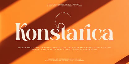 KONSTARICA is a serif font with some unique ligatures. It is suitable for branding and can be used for fonts on social media. In addition, it will also be suitable for headline fonts. To enable the OpenType Stylistic alternates, you need a program that supports OpenType features such as Adobe Illustrator CS, Adobe Indesign & CorelDraw X6-X7. Guides to access all alternates glyphs : http://adobe.ly/1m1fn4Y Cheers!
 - Fairytales Script by Dhan Studio,
$25.00 Fairytales Script is a beautiful handmade typeface, organic and dancing baseline with different swashes that can be applied to the beginning and ends of all lowercase. For the separate swashes font, type lowercase a-z for the beginning swashes and end swashes. This fonts can be used for various purposes.such as headings, signature, logos, wedding invitation, t-shirt, letterhead, signage, lable, news, posters, badges etc.
 - Hipetype Vector by Get Studio,
$17.00 Introducing Hipetype, a handwritten font with a unique and strong character crafted with high-definition paint textures. Hipetype can be used for various types of design needs such as branding materials, t-shirts, social media templates, business cards, logos, promotional flyers, posters, and more. With multilingual support, this font is also suitable to be combined with san-serif to get an extraordinary result for your design projects.
 - Cocogoose Classic by Zetafonts,
$39.00 Download PDF Specimen Created as a display typeface in 2012 by Cosimo Lorenzo Pancini, Cocogoose is one of Zetafonts most loved typefaces. A sans serif typeface of geometric proportions, with very low contrast and slightly rounded corners, it was the first typeface to be produced in the Coco series, an ongoing research on the design variation in gothic typefaces through the ages. Cocogoose extreme x-height and ultrabold weight (with regular being comparable to heavy weights of other typefaces), have since then made it very popular for effective display and logo use, also thanks to decorative versions like Cocogoose Letterpress. Since 2016, Andrea Tartarelli has been improving the typeface expanding the original glyph set to include cyrillic and greek and adding extra weights, widths, and italics to the original family range, and bringing Cocogoose to an impressive count of 52 variants. In 2019, Francesco Canovaro has teamed with Andrea Tartarelli and Cosimo Lorenzo Pancini to create a new variant subfamily: Cocogoose Classic, featuring 8 weights and matching italics. Cocogoose Classic keeps the original design for uppercase characters while developing a new design for lowercase, with a smaller x-height, round dots and expanded open-type features, including positional numerals, alternate forms, and extended ligatures and bringing the glyph count to over 1000 characters.
 - Lovage by RagamKata,
$14.00 Lovage is Modern Elegant Serif Typeface The serifs that we made specifically for the needs of elegant branding, with additional ligatures and alternates in a more feminine and unique form will be ready to add value to your brand. It's great to take advantage of designers or product owners who need a solution to make their designs look more classy and modern. This font is specially designed for fashion-themed projects, perfectly suitable for creating elegant, chic, lifestyle designs such as logos, titles, magazines, and more.
 - Radish & Garlick by Jehansyah,
$9.00 This font is inspired by clean handwriting that is a bit simple, but still maintains elegance and creates a luxurious feel in the design, Radish and garlick This handcrafted font, so cute and so cute for any design you want to look simple yet aesthetically pleasing, use this design for all your design needs, it will potentially be your best font choice use it for all your design needs, print media, brochures, social media, social media status, letters, invitations, and much more. Thank you very Much
 - Pelinka by Jehoo Creative,
$18.00 Upholding aspects of geometric shapes Created Pelinka. Pelinka is a Sans serif Family that has a solid foundation of geometric shapes designed to be bold and flexible. This typeface has all the widths needed to meet various design needs, Condensed, Normal and Expanded each width has 9 weights. Pelinka also includes support for Cyrillic and Greek Alphabets. Opentype feature: aalt, frac, liga, locl, numr, onum,ordn, salt, sinf, ss01, ss02, subs, sups, kern, mark. Language support for the Americas, most of Europe,Cyrillic and Greek.
 - Genova by Graphicxell,
$14.00 Genova is a sans serif type family with 4 variables namely Thin, Regular, Medium and Black. This font has a harmonious and beautiful shape that makes it perfect for all your needs for long text, branding, logotypes, print designs and more. This font is made in detail and measured by using geometric details to make this font look balanced and minimalist. This font is dedicated to the use of all needs in 2023, and will be the most popular and best selling font of the year.
 - De Ruyter by Trafotype,
$29.00 De Ruyter font was inspired by old and new. Old beautiful calligraphy and blackletter fonts used across the ages and new clean, simple sans-serif style fonts which may be use in many types of modern media. This typeface include 438 glyphs which cover 98% of Latin Plus languages and 94% of Latin Plus diacritics. De Ruyter include regular and italic version which will perfect works in any branding, logos, magazines, films projects, badges and headlines. The font is distributed in TrueType format including kerning.
 - Glaser Stencil by Linotype,
$40.99 The renowned American illustrator and graphic designer Milton Glaser designed Glaser Stencil in 1970. Glaser Stencil is a perfect summation of both Modernist proportion and New York-style solidity and self-assurance. An all capitals font, the shapes of the letters are reminiscent of popular sans serif faces of the time, such as Futura and ITC Avant Garde Gothic. Like everything New York-related, Glaser Stencil should be used big, in headlines and display applications, where it can play a bold, proud, and confident role.
