10,000 search results
(0.044 seconds)
- Numbers Style Three by Gerald Gallo,
$20.00 Each style includes 6 fonts of 100 characters each of circle, square, and diamond in positive and negative. For ordering purposes, each style (6 fonts) counts as 1 font.
 - Whiplash by 38-lineart,
$16.00 Whiplash is a natural handwritten font with firm strokes as the main character. All-caps and mixed-match are the main concepts of this font, where the uppercase and lowercase can be pair according to your taste. This font has a very strong and very prominent character that will distract the eyes. This is a great choice when used as a title on banners, posters, book titles and even magazine covers. Modern lifestyle brands such as fashion, cosmetics, and outdoor sports are also a trend to use this font style. You who like travelling can also try to write a caption or quote, people are increasingly curious about the mystery of your adventure and short notes. Besides being equipped with multi-language, we also equip ligature such as ee, ll, gg, oo, ss, tt, pp, rr. Enjoy our fonts, and make sure your brand will stand out and invite people to take a closer look.
 - Price Didone by Eclectotype,
$25.00 PUBLIC SERVICE ANNOUNCEMENT: Price Didone has inspired a full alphabetic font - Mastadoni, so if you're after more than numerals, head over there! Price Didone is a font with a singular purpose: The setting of elegant, stylish price tags. As such it is non-alphabetic, featuring instead numerals, a large array of currency symbols, and a smattering of typographic niceties such as quotes, brackets, pilcrow, daggers and a very curvaceous ampersand. Certain currency symbols that are not independent glyphs (Q, Ft, kr etc.) are included as their constituent letters, some of which also have automatic ligatures for that little something extra. There are currency symbols included which have not (yet) been accepted to unicode, such as the Russian Ruble and Bitcoin symbols. For ease of access, these can be typed using the standard ligatures feature. See features below for the full list. Features: Automatic Fractions - with fractions feature engaged, arbitrary fractions are a doddle. Stylistic Sets: SS01 - an alternate look for 4 SS02 - a double stroked dollar symbol SS03- the # sign becomes a stylish numero Stylistic Alternates - for software that doesn't support stylistic sets, the above three features are grouped into the one SALT feature. Standard Ligatures - certain typed combinations automatically change to different glyphs: B|| = Bitcoin symbol P- = Russian Ruble RM = Malaysian Rimgit symbol Rp = Indonesian Rupiah Rs = Rupees Ft = Hungarian Forint kr = Kroner symbol % off;%off;%ff = Special percent off ligature Discretionary Ligatures - this feature sets decimal prices like $5.95 with the numerals after the period smaller and raised from the baseline, underlined by a nice swoosh. It also shrinks the dollar, sterling, and Euro symbols for a more authentic look. While intended for one sole purpose, Price Didone could nevertheless be quite versatile. Quote marks and typographic symbols can be used for decoration. Everybody loves a nice ampersand and this is one I'm really proud of. Or you might just want some pretty numbers for your house, or sports jersey, or just to stand out a little from the rest of your text. Whatever use you may have in mind, go for it. And do let me know if your currency symbol isn't included, and I'll quickly add it to the glyph set in future versions.
 - Mr Moustache by FaceType,
$19.00 Handmade Mr Moustache™ is designed for Great Type. · Extra thin letters, condensed and with a handwritten touch, Mr Moustache gives a warm and friendly feeling to your layout. Mix upper- and lowercase letters according to your own liking. Furthermore, choose between a hand-drawn Unicase and an almost Unicase appearance. Use Mr Moustache Display for headlines and anything BIG. Use Mr Moustache Text for small type sizes or large volumes of text. · Mr Moustache is accompanied by frames, ornaments and dingbats in regular and solid, that can be layered for multicolored effects, providing endless design-possibilities. Please download MrMoustacheAccessories.pdf to get a complete overview. If you prefer the document in Indesign, please send an email to office@buerofliegenpilz.at · Mr Moustache offers OpenType features, including contextual alternates and stylistic sets. The font family works best with frame-based layout programs that support full OpenType functionality. · For Mr Moustache Frames please note: The glyph preview in your design application may be a bit confusing due to the size of the "letters". Please download the MrMoustacheAccessories.pdf which shows all possible frame parts. Here you can easily copy and paste all the parts you need. · View other fonts from Georg Herold-Wildfellner: Sofa Serif | Sofa Sans | Mila Script Pro | Pinto | Supernett | Mr Moustache | Aeronaut | Ivory | Weingut · Language Report for MrMoustache / 175 languages supported: Abenaki, Afaan Oromo, Afar, Afrikaans, Albanian, Alsatian, Amis, Anuta, Aragonese, Aranese, Aromanian, Arrernte, Arvanitic, Asturian, Aymara, Basque, Bikol, Bislama, Bosnian, Breton, Cape Verdean, Catalan, Cebuano, Chamorro, Chavacano, Chickasaw, Cimbrian, Cofan, Corsican, Croatian, Czech, Danish, Dawan, Delaware, Dholuo, Drehu, Dutch, English, Estonian, Faroese, Fijian, Filipino, Finnish, Folkspraak, French, Frisian, Friulian, Galician, Genoese, German, Gooniyandi, Greenlandic, Guadeloupean, Gwichin, Haitian Creole, Han, Hiligaynon, Hopi, Hungarian, Icelandic, Ido, Ilocano, Indonesian, Interglossa, Interlingua, Irish, Istroromanian, Italian, Jamaican, Javanese, Jerriais, Kala Lagaw Ya, Kapampangan, Kaqchikel, Karelian, Kashubian, Kikongo, Kinyarwanda, Kiribati, Kirundi, Klingon, Ladin, Latin, Latino Sine, Lojban, Lombard, Low Saxon, Luxembourgish, Makhuwa, Malay, Manx, Marquesan, Meglenoromanian, Meriam Mir, Mohawk, Moldovan, Montagnais, Montenegrin, Murrinhpatha, Nagamese Creole, Ndebele, Neapolitan, Ngiyambaa, Norwegian, Novial, Occidental, Occitan, Oshiwambo, Ossetian, Palauan, Papiamento, Piedmontese, Polish, Portuguese, Potawatomi, Qeqchi, Quechua, Rarotongan, Romanian, Romansh, Rotokas, Sami Lule, Sami Southern, Samoan, Sango, Saramaccan, Sardinian, Scottish Gaelic, Serbian, Seri, Seychellois, Shawnee, Shona, Sicilian, Silesian, Slovak, Slovenian, Slovio, Somali, Sorbian Lower, Sorbian Upper, Sotho Northern, Sotho Southern, Spanish, Sranan, Sundanese, Swahili, Swazi, Swedish, Tagalog, Tetum, Tok Pisin, Tokelauan, Tshiluba, Tsonga, Tswana, Tumbuka, Tzotzil, Uzbek, Venetian, Vepsian, Volapuk, Voro, Walloon, Waraywaray, Warlpiri, Wayuu, Wikmungkan, Wiradjuri, Xhosa, Yapese, Yindjibarndi, Zapotec, Zulu, Zuni
 - Teeshirt by Typodermic,
$11.95 Hey there, so you want to look like a walking throwback to the 1980s? Well, lucky for you, Teeshirt is here to help you achieve that coveted slovenly appearance. If you’re looking for a typeface that screams, “I don’t care” then Teeshirt is your new best friend. It’s designed to mimic vintage t-shirt lettering, so you can rock that “I just rolled out of bed and put on the first thing I found on my floor” look. And if you’re worried about being too uniform with your letters, fear not! Teeshirt has got you covered with letter pair ligatures. Because who wants to look like they put any effort into their appearance, right? And if you’re feeling adventurous and want to shake things up a bit, you can always disable the “standard ligatures” feature in your application. Teeshirt comes in two styles: Regular and Pressed. The bouncy Regular style will make it look like your letters are ready to jump right off your shirt, while the orderly Pressed style will give you that crisp, just-ironed look (although let’s be real, who has time for ironing?). So what are you waiting for? Embrace your inner sloth and give Teeshirt a try. Because who needs effort and a polished appearance when you can look like a hot mess instead? Most Latin-based European writing systems are supported, including the following languages. Afaan Oromo, Afar, Afrikaans, Albanian, Alsatian, Aromanian, Aymara, Bashkir (Latin), Basque, Belarusian (Latin), Bemba, Bikol, Bosnian, Breton, Cape Verdean, Creole, Catalan, Cebuano, Chamorro, Chavacano, Chichewa, Crimean Tatar (Latin), Croatian, Czech, Danish, Dawan, Dholuo, Dutch, English, Estonian, Faroese, Fijian, Filipino, Finnish, French, Frisian, Friulian, Gagauz (Latin), Galician, Ganda, Genoese, German, Greenlandic, Guadeloupean Creole, Haitian Creole, Hawaiian, Hiligaynon, Hungarian, Icelandic, Ilocano, Indonesian, Irish, Italian, Jamaican, Kaqchikel, Karakalpak (Latin), Kashubian, Kikongo, Kinyarwanda, Kirundi, Kurdish (Latin), Latvian, Lithuanian, Lombard, Low Saxon, Luxembourgish, Maasai, Makhuwa, Malay, Maltese, Māori, Moldovan, Montenegrin, Ndebele, Neapolitan, Norwegian, Novial, Occitan, Ossetian (Latin), Papiamento, Piedmontese, Polish, Portuguese, Quechua, Rarotongan, Romanian, Romansh, Sami, Sango, Saramaccan, Sardinian, Scottish Gaelic, Serbian (Latin), Shona, Sicilian, Silesian, Slovak, Slovenian, Somali, Sorbian, Sotho, Spanish, Swahili, Swazi, Swedish, Tagalog, Tahitian, Tetum, Tongan, Tshiluba, Tsonga, Tswana, Tumbuka, Turkish, Turkmen (Latin), Tuvaluan, Uzbek (Latin), Venetian, Vepsian, Võro, Walloon, Waray-Waray, Wayuu, Welsh, Wolof, Xhosa, Yapese, Zapotec Zulu and Zuni.
 - Elektrakution by Comicraft,
$19.00 SHE'S DEAD, FRANK It's the year 1991, BC (Before Comicraft) when REM were still making records and Frank Miller’s memorable run on Marvel Comics’ DAREDEVIL was just over ten years old. Comicraft’s Richard Starkings found himself working in Anaheim, California for Graphitti Designs. Graphitti had produced the first hardcover edition of Miller’s Batman tale, DARK KNIGHT RETURNS and was now putting together the sequel to Miller’s DAREDEVIL — ELEKTRA LIVES AGAIN! Richard was not engaged to letter this book, the pages of Frank’s incredible original art that came through Graphitti’s studio were already lettered by Marvel Stalwart, Jim Novak. However, there were some cover elements that needed to be added, based on the logo originally rendered by Frank’s brother, Steve. Starkings set about the task of creating an alphabet that could be used to develop Steve’s idea for the trade dress -- the cover elements, the back cover copy and credits on the interior pages. This was long before Macintosh computers and font programs made this work considerably easier, so Rich sat down with a pencil and a sheet of vellum and rendered an alphabet that could be used as the basis for the text that was needed... Those sketches have languished in a drawer for nearly thirty years, but now, finally, Comicraft’s John Roshell has dusted off those old letterforms and Elektrakuted a font based on those designs, a font we HAD to call ELEKTRAKUTION! As for Elektra; she’s dead, Frank. Features: Ten weights (Light, Regular, Bold; Rough Light, Regular & Bold; Inline, Inline Rough, Outline & Outline Rough) with upper & lowercase characters, Western & Central European accents and Greek characters.
 - CA Saygon Text by Cape Arcona Type Foundry,
$40.00 CA Saygon Text is the logic consequence of CA Saygon. It is much calmer and therefore also suitable for reading texts and everyday’s editorial tasks. Basic shapes and proportions were adopted from Saygon and continued in such a way that a font family from Thin to Extrabold resulted. A fundamental inspiration were early static grotesque typefaces such as Akzidenz Grotesk. Nevertheless, the typeface was by no means intended to have a historical look. Thus, a relatively high x-height was chosen, which makes the typeface quite economical in type-setting, since the letters appear visually larger. A relatively small line spacing with good legibility can be achieved due to the small ascenders and the low cap height. Letters like f and t, which otherwise tend to end in curves, were given right angles, which on the one hand meets certain design elements of the original Saygon, but on the other hand also refers to contemporary trends in typeface design. A special feature are the five styles in which CA Saygon Text can be used. The default setting is the Helvetica style, with two-storey a and g. The Futura style has a single-storey a and a two-storey g accordingly. The third style with two-storey a and three-storey g is called the Franklin style. But the real highlight is the Cape style with single-storey a and three-storey g – a real rarity up to now. Let yourself be inspired by this unusual typeface. If you like it even more progressive, you should try the flat style, which continues the right angles in a, g, and y as well. Thanks to the Cyrillic and Latin Extended character sets, a huge linguistic area is covered that even extends to Vietnam! Even the exotic German capital-double-s is available and appears automatically when typed between other capital letters. Numerous OpenType features make life easier for the professional typographer: there are fractions, superscript and subscript numbers, as well as proportional and tabular capitals.
 - Arista Pro by Zetafonts,
$39.00 Arista Pro is the definitive version of the successful Arista typeface, designed by Francesco Canovaro, first released in 2007 as Arista Z and then reissued as Arista 2.0 in 2010. The pro version of Arista features the geometric and soft approach of the original typeface but comes in a full range of weights and two alternate versions (Arista Pro Regular and Arista Pro alternate version). The typeface has been expanded with the inclusion of Greek and Cyrillic alphabets as well as an extended range of latin characters. A companion icon typeface, Arista Pro Icon, has been developed, allowing for variable-width monoline icons that can be used to faultlessly match the typeface line width, up to semibold weight.
 - TT Fellows by TypeType,
$39.00 TT Fellows useful links: Specimen | Graphic presentation | Customization options There can't be too many universal fonts! Meet TT Fellows, a new workhorse whose functionality allows you to comfortably use the font in a variety of projects. Calm and neutral at first glance, the mood of TT Fellows can change. Working with the typeface, you can reveal its soft and friendly nature, or even the brutal one, for example, by typing the text exclusively in capital letters in the bold style. TT Fellows is easy to use and perfect for setting large text arrays. Thanks to the font's uniwidth and versatility, the font is ideal for use on websites or in periodicals. Bold styles will work harmoniously in headlines or as accents in print or on packaging. TT Fellows is a humanist sans serif with a mechanical touch. With its open shapes, the friendly neutral character of thin weights and an even softer character in bold weights, the new typeface differs in character from the classic TT Norms® and TT Commons sans serifs, while still offering the same functionality. Calm regular styles differ from bold, deliberately display and more expressive ones. By the way, TT Fellows is a unwidth typeface. It was important for us that the user could change the styles, knowing that the layout will not suffer. The typeface features equal width proportions, open apertures, and slightly squared ovals, which associatively brings it closer to other popular modern fonts. Since the idea of the typeface was focused on it being a uniwidth typeface, we needed to fit the bold styles into the regular em squares, which led to interesting graphic solutions that are noticeable, for example, in the k and ж characters, in which the branches are cut directly into the stems. TT Fellows consists of 19 styles: 9 upright, 9 italic and 1 variable, each with over 700 glyphs. The font has 26 useful OpenType features. For example, there is a switch to single-part versions of letters a and y, fractions, tabular characters, case versions of punctuation, and localized versions of characters for different languages. There is a ligature for a combination of two characters of a complex design fl. TT Fellows font field guide including best practices, font pairings and alternatives.
 - Postea by TypeTogether,
$47.00 The Postea font family is Veronika Burian and José Scaglione’s take on German geometric typefaces, reshaped with the right attributes for setting paragraphs and headings, and perfect for branding and text use. Some typefaces are a rough tool, like a pumice rock: abrasive to the senses, unforgiving, and unhelpful for most reading situations. Postea is an obsidian: smooth and classy, with attractive nuances in any light. The classic curves and purposeful details keep its individuality intact while allowing it to fit an incredible range of geometric font needs. Because of these qualities, Postea makes normal reading in paragraphs a cinch and your branding memorable. Compared to midcentury attributes of restraint and a sparse appearance, Postea’s deliberate play between character widths injects life and distinctiveness into its personality. The default ‘t, f’ have lyrical doses akin to a robust evening drink and are rounded out with a serpentine ‘s’ and rotund ‘o, g, b’. Another nice surprise awaits: spacing for the Hairline weight is tighter for optimal use in large headings and titles, while the regular weights have the expected, slightly looser spacing for text. Setting the test word ‘bogarts’ brings all this together nicely, invoking a balance between a constructed and human feel while brushing away the dust from a century of derivatives. Postea is opinionated and its modern stylistic sets allow it to be accommodating with softer, specially-designed alternative characters. SS01 replaces ‘b, f, M, m, t’, while SS02 changes only the lowercase ‘a’ to the round style, and SS03 swaps out the angled ‘y’ for a straight version. The fourth and sixth stylistic sets are packed with wallpaper-worthy geometric patterns, ornaments, arrows, and symbols aplenty. Postea’s 14 styles (seven upright and italic) and two variable fonts are accompanied by an all-new family of icons in three weights, which we developed a new, easy way to activate. Simply bookend the desired icon name with colons (:arrowUp: :chargingStation: :aid: :firstAid:), making sure to capitalise each word after the first word, then highlight and activate SS05. Icons include wayfinding, social interface, sanitary precautions like face masks, thermometers, and hand washing, and much more. Postea is resilient in the number of ways the family can be used, and its recognisable characters make it a prime selection for branding, signage, corporate typefaces, and magazines. Beginning with midcentury virtues, Postea is the rational response for text — a lyrical take on geometric sans serifs.
 - Grafical by Halbfett,
$30.00 Grafical is a contemporary take on 19th-century sans serifs. In this family, the amount of geometry inherent within the letterforms has been amped up. Many shapes have received further streamlining, too. All the geometric forms you see have been optically corrected, ensuring their delivery of better legibility. Grafical ships in two different formats: depending on your preference, you can install the typeface as two Variable Fonts or use the family’s 16 static OpenType font files instead. The static fonts offer eight weights, running from Extralight through Black. Each weight has an upright and an italic font available. While the static-format fonts offer a good intermediary-step selection, users who install the Variable Fonts have vastly greater control over their text’s stroke width. The Grafical Variable and Grafical Variable Italic font’s weight axes allow users to differentiate between almost 1,000 possible font weights. That enables you to fine-tune your text’s exact appearance on-screen or in print. Grafical is the perfect tool for a range of design uses, including text on the web, text in print, and text in motion graphics. Its fonts are typographic workhorses – not just from their legibility perspective but also because of the amount of OpenType features they include. There are ligatures, for instance, as well as proportional and tabular lining and oldstyle figures, fractions, numbers placed inside circles, and even Roman numerals. Users can also substitute alternate versions of the “a”, “g”, “i”, “j”, “y”, “G”, and “Q” into their work.
 - Hanna by Wilton Foundry,
$29.00Hanna has its roots in the Plato and Cilantro fonts published earlier by Wilton Foundry. It is an informal roman and very legible at any size - a rare combination for many applications. Hanna was specifically designed to generate additional income for an orphanage in Ethiopia. Hanna Teshome runs an orphanage of roughly 140 children in Addis Ababa, Ethiopia. She is an amazing lady with a deep passion for orphan kids as well as innocent kids that find themselves in jail because their mothers have been imprisoned - they are treated as prisoners and are typically sexually abused - it is not uncommon for them to commit suicide when they are released from jail at age 18. Most of the orphans end up with Hanna because one or both of their parents have died from AIDS. Hanna relies entirely on donations to keep her orphanage running and this font is a small but tangible way for you to help make a difference in the lives of the orphan kids. I am committed to helping Hanna after visiting the orphanage several times and seeing the jails from where the kids have been rescued. Hanna is my hero because she stepped out of her comfort zone, with no financial support, to take care of the kids. My hope is that you will use this font as a messenger of good. All of Wilton Foundry royalties for this font will go to the support of Hanna’s orphanage in Ethiopia. Thank you in advance for your support on behalf of Hanna and the kids! - Dot Your Eyes - Personal use only

- Ringlet - Unknown license

- TXT Delicate Script by Illustration Ink,
$3.00Go back in time by downloading this calligraphy style script font. The elegant letters are charming additions to any lettering project that needs calls for fancy, stylish, and graceful embellishments. - Fartha by Nahda Creative,
$15.00 Fartha is a lovely and delicate script font that exudes elegance and class. This font was particularly crafted for those who need a beautiful and refreshing look to their designs.
 - Mono Iltra by PizzaDude.dk,
$20.00 A wrecked, monospaced font containing ligatures for both double letters and numbers, alternate letters and unique accented characters! You will need to use OpenType supporting applications to use the autoligatures.
 - Autosmash by Rockboys Studio,
$15.00 Autosmash is a lovely and brushed script font that exudes elegance and class. This font was particularly crafted for those who need a beautiful and refreshing look to their designs.
 - Cardilan Tatto by Romie Creative,
$21.00 Introducing our new product called Cardilan font. Cardilan includes upper and lower case letters, numbers, various kinds of punctuation and ligatures. All lowercase letters include line endings and alternative fonts.
 - Iknu font by Iknu,
$10.00 Iknu is a contemporary, minimal font that expresses spiritual life in its simplicity and mistery. Great font for religious / spiritual content and any other that needs a simple attractive font.
 - LHF Henderson by Letterhead Fonts,
$35.00 An excellent example of early 1900's sign artistry. This Letterhead Fonts' revised version of Mike Henderson's bold font features all new spacing, kerning and improved characters. Includes 6 alternates.
 - Insiano by PizzaDude.dk,
$20.00Insiano is a gentle mix of upper- and lowercase, comes with smart ligatures and a cool comic feel! You will need to use OpenType supporting applications to use the ligatures. - Wild Rhytm by Forberas Club,
$16.00 This new script font is written by our team, and ready to pop up your project by using this font for your party, event, invitation or at your wedding decor.
 - Horror Brush by Gassstype,
$27.00 Introducing of our new product the name is Horror Brush is Handmade Brush Font Rough and Creepy typeface. This is a Rough Brush Typeface that is written casually and quickly.
 - Salways by Forberas Club,
$16.00 Salways is our new product , the handwritten font with playful and bouncy theme to match up your personal project like wedding invitation, your party or the cute moment you have.
 - Always Good by Seemly Fonts,
$12.00 Always Good is a brand new handwritten font perfectly suited for stationery, logos, t-shirts, paper, print design, website headers, photo frames, flyers, music covers, posters, image sliders, and more.
 - Unsprit by PizzaDude.dk,
$20.00Unsprit jumps up and down, use the ligatures and the letters combine in all sorts of funky ways! You will need to use OpenType supporting applications to use the ligatures. - Illiad Sans by Scannerlicker,
$44.00 Illiad Sans is an adventurous type family, brave and charismatic, built for editorial contexts. The proportions are reduced in order to supress the need of small caps, avoiding editing hassles.
 - Berdina by TM Type,
$12.00 Berdina feels equally charming and elegant. It looks stunning on wedding invitations, thank you cards, quotes, greeting cards, logos, business cards, and every other design which needs a handwritten touch.
 - Ulsteros by PizzaDude.dk,
$20.00Ulsteros was inspired by old horror movie posters. It comes in OpenType with more than 250 different ligatures! You will need to use OpenType supporting applications to use the autoligatures. - Yesslyn by ARToni,
$19.00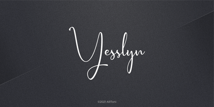 Yesslyn is a lovely and delicate script font that exudes elegance and class. This font was particularly crafted for those who need a beautiful and refreshing look to their designs
 - Reprint JNL by Jeff Levine,
$29.00 Inspired by a bold serif typeface used popularly in the 1960s, Reprint JNL is perfectly adept for handling any titling needs and will get the point across in short order.
 - HOME ROCK by Letterafandi Studio,
$16.00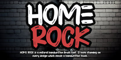 HOME ROCK is a natural handwritten brush font. It looks stunning on thank you cards, quotes, greeting cards, logos, business cards, and every other design which needs a handwritten touch.
 - Konstantin Forte by Wiescher Design,
$39.50My son Konstantin needs a bold face for his bold recipes. So I made Konstantin Forte for him — and the rest of the world. Your bold family designer, Gert Wiescher. - Comic Hand by Tom Chalky,
$16.00 Need to grab attention? Look no further than these three lovingly legible handwritten typefaces oozing with personality and style. Full of charismatic imperfections, this powerful trio is ready for battle!
 - Madine Style by Forberas Club,
$16.00 Introducing Madine Style. This font is our new born project, and ready to help pop up your project as a wedding invitation font, or party event, still playful but gorgeous.
 - Quetzalli by Arendxstudio,
$12.00 Introducing Quetzalli, a very stylish font with characteristics that have a distinctive beautiful hand stroke, which are perfect for your design needs and especially for the benefits of design branding
 - Arco by Nicolas Massi,
$30.00 Arco is a brand new fat-face with some geometrical tweaks grabbing fresh and ideal for fashion editorial headlines. Arco also combines elegant symbols to sweet contrast. Normal & Outline version.
 - Fruit Juice JNL by Jeff Levine,
$29.00 A vintage New York neon sign for a juice stand advertising “Papaya” was the model and inspiration for Fruit Juice JNL, which is available in both regular and oblique versions.
 - Line44 by URW Type Foundry,
$39.99 Remembering us of the early graffiti on the New York subways. And similar to creating and producing a graffiti, a "Piece", also the styles of Line44 are superposed in layers.

