10,000 search results
(0.039 seconds)
- Indus by Linotype,
$29.99Linotype Indus is part of the Take Type Library, which features winners of Linotype’s International Digital Type Design Contest from 1994 to 1997. Designed by P.H. Hashin from India, Indus finds its historical roots in inscriptions found on ancient Indian graves. Thus Indus has a unique look and is versatile in point sizes from middle to headline. The font combines well with sans serif and slab serif typefaces. - Beer Joint JNL by Jeff Levine,
$29.00 A vintage photograph of the Man at the Wheel Saloon in San Pedro, CA [circa 1895] provided an excellent type design source with the unusual lettering on the bar’s sign. Basically a spurred serif design, the unusual characteristic of the type style is the ‘bumps’ or ‘dots’ on the tops of each letter. This has been redrawn digitally as Beer Joint JNL, and is available in both regular and oblique versions.
 - Linotype Dot by Linotype,
$29.99Linotype Dot is part of the Take Type Library, featuring the winners of Linotype’s International Digital Type Design Contest. Designed by Lucy Davies, the figures are composed of a combination of white and black dots and the contrast makes the font look like points of light and darkness. The general impression of Dot lies somewhere between ornamental and technical. It combines well with sans serif and calligraphy fonts. - 64-SRC by ILOTT-TYPE,
$49.00 64-SRC is a condensed monospace font inspired by 1960s IBM Selectric type seen on HAL’s telemetric displays in 2001: A Space Odyssey. It is characterized by unique "double-space" alternates for the widest characters such as “w” and “m”. These alternates maximize legibility, improve the rhythm of readability and keep typographic color even. As a result 64-SRC is as well suited for extensive copy as it is display type.
 - Pleasantwood JNL by Jeff Levine,
$29.00 Although wood types were at their peak of use during the letterpress era of the late 19th and early 20th centuries, there is a growing revival movement of "boutique" print shops who have embraced the look and texture of this form of printing. More modern in design that many of its counterparts, Pleasantwood JNL is still a nice addition to the wood type library re-drawn digitally by Jeff Levine Fonts.
 - Urbancat by VladB,
$20.00 Urbancat is a modern sans serif geometric font, includes upper and lower case characters, Latin, Cyrillic, Latin Eastern Europe, Turkish, Baltic and other. The Urbancat family consists of 8 fonts, divided into 4 subgroups (according to the type of style - St, Rg), and have the 4 types of thickness in each subgroup. Urbancat fonts will be useful in developing a brand, creating posters and other graphic products, and for word processing.
 - HT Tabaccaio by Dharma Type,
$19.99 HT Tabaccaio?is a casual and versatile script. Its very unique kern, loop, and dot makes it unforgettable look. HT Tabaccaio is well-suited for product design, books covers, film posters, branding, magazines, signage and other creative projects. Holiday Type Project offers retro hand drawing scripts. Inspired by retro script on shopfront lettering, wall paint advertisements in Italy around 1950s. Check out the script fonts from Holiday Type!
 - Hands on Albrecht by URW Type Foundry,
$39.99 This typeface is based on Albrecht Dürer’s work “Die Underweysung der Messung” (Institutiones Geometricae, Instruction in Measurement). Please note that this font needs special treatment when typesetting text. If you need black text, you need to type just capital letters separated by spaces. If you need coloured text, type both lower case and upper case (with the lower case character first), and then assign a colour to the lowercase letters only.
 - Linotype Rory by Linotype,
$29.99Linotype Rory oblique is part of the Take Type Library, selected from contestants of Linotype’s International Digital Type Design Contests of 1994 and 1997. The font was designed by Canadian Tad Biernot with strictly constructed forms. The similarly formed figures seem mechanically created and their light slant gives the impression of strenght and dynamism. Linotype Rory oblique should only be used in the shorter texts of headlines in larger point sizes. - Fozzy by VladB,
$24.00 Fozzy is a modern sans serif geometric font, includes upper and lower case characters, Latin, Cyrillic, Latin Eastern Europe, Turkish, Baltic and other. Fozzy family consists of 9 fonts, divided into 3 subgroups (according to the type of style - St, Rg, Op), and have the 3 types of thickness in each subgroup. Fozzy fonts will be useful in developing a brand, creating posters and other graphic products, and for word processing.
 - Align Vertical Mono by Mom,
$89.00 Align Vertical Mono has an innovator construction which gives to the designer the ability to align the letters creating beautiful patterns on the page. It was design by the Tyner (typography Designer) Pedro Mascarenhas to fill a gap in type design. With Align Mono Family type will be the leading role of the design. The final result of the art work depends of the choices designer makes for each glyph.
 - Olive Wildheart by Letterhend,
$14.00 Olive Wildheart is sophisticated script based on manual hand writing. This typeface comes with 2 style fonts which you can choose from. This type of font perfectly made to be applied especially in logo, and the other various formal forms such as invitations, labels, greeting / wedding cards, packaging, fashion, make up, stationery, novels, labels or any type of advertising purpose. Features : Uppercase & lowercase Numbers and punctuation Alternates & Ligatures Multilingual PUA encoded
 - Hathaway by Lunas Type,
$19.00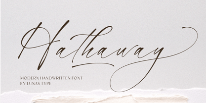 Introducing, Hathaway! Hathaway is a modern and stylish handwritten font. With natural flow it can add a human touch to your designs. Hathaway is perfect for many design needs such as merch, T-shirts, titles, wedding, book covers, social media posts, websites, events, and many more. What's you get : - Ending Swashes - Underline Swashes (just type _1, _2, etc) - Numeral & Punctuation. - ligature. - Multilingual Support. Enjoy Designing! Thanks! Lunas Type
 - Bergen Sans by Mindburger Studio,
$40.00 Bergen Sans is a contemporary sans serif font family of 6 fonts. Carrying clean and stylized Scandinavian geometry, partnered with explosive post Bauhaus type aesthetics, Bergen Sans is perfect companion in any designer's 'survival' kit. While being a small font family it has unlimited capabilities and plenty of Open Type features for highly professional use. Bergen Sans also includes Extended Latin, Cyrillic (including Bulgarian alternates) and Greek language support.
 - Suerte by Resistenza,
$39.00 Say hello to Suerte. This new typeface with inverted contrast and bifurcated serifs was inspired by Caslon’s Italian type and by Aldo Novarese’s Estro, published by the turinese foundry Nebiolo. Our aim was to develop a wood type typeface adding a new personality incorporating Tuscan serifs. The complete alphabet was designed with a flat long brush and Indian ink and then vectorized. Suerte contains a big set of icons and dingbats.
 - Mormont by Letterhend,
$17.00 Mormont is a reverse display font with classic looks. This type of font perfectly made to be applied especially in storybook children or child theme which is need a standout font, and the other various formal forms such as invitations, labels, logos, magazines, books, greeting / wedding cards, packaging, fashion, make up, stationery, novels, labels or any type of advertising purpose. Features : Uppercase & lowercase Numbers and punctuation Alternates & Ligatures Multilingual PUA encoded
 - Parus by VladB,
$20.00 Parus is a impacted modern sans serif geometric font, includes upper and lower case characters, Latin, Cyrillic, Latin Eastern Europe, Turkish, Baltic and other. The Parus family consists of 8 fonts, divided into 2 subgroups (according to the type of style - St, Obl), and have the 4 types of thickness in each subgroup. Parus fonts will be useful in a word processing, developing a brand, creating posters and other graphic products.
 - Erangle by Gatype,
$14.00 Erangle is an elegant serif typeface inspired by a vintage type specimen I found recently at an art fair. Thin to thick contrasting lines and elegant curves make Beginta the perfect font for this type of logo and display purposes. Hope you enjoy it Feel free to contact you with any questions or concerns you may have and I will get back to you as soon as I can.
 - Graffick by Graffiti Fonts,
$12.99 Graffick is a mechanical style created by merging a little traditional type design & typography with a little basic graffiti lettering theory. Extra ascenders and descenders have been added to many of the capital letters to add a more varied & specialized appearance. This layered type system provides for the easy creation of outline/fill effects with regular, italic, wide and outline styles as well as baseline & caps-height alignment options.
 - Wackets by Letterhend,
$19.00 Wackets is a standout script with a touch of vintage look and feel. This type of font perfectly made to be applied especially in logo, headline, signage and the other various formal forms such as invitations, labels, logos, magazines, books, greeting / wedding cards, packaging, fashion, make up, stationery, novels, labels or any type of advertising purpose. Features : uppercase & lowercase numbers and punctuation multilingual alternates / swashes and ligatures PUA encoded
 - HT Espresso by Dharma Type,
$19.99 The biggest feature of HT Espresso is a mixture of straight line and curve.It is like a cup of espresso with a bite-sized piece of chocolate. You can connect all the letters with thin line and It would attract notice. Holiday Type Project offers retro hand drawing scripts. Inspired by retro script on shopfront lettering, wall paint advertisements in Italy around 1950s. Check out the script fonts from Holiday Type!
 - WL Lunatrix by Writ Large,
$12.00 Lunatrix is a conceptual type face for futuristic or fantastic treatments. Ideal for suggesting strange new worlds of science-fiction, it can also evoke a land of fantasy or even hint at the occult. In its lighter weights, Lunatrix is well suited for applications such as posters, album covers, video games, and graphic novels, while in its heavier weights, it’s appropriate for titling and more complex type treatments.
 - Emosia by Gatype,
$14.00 Emosia is an elegant serif typeface inspired by a vintage type specimen I found recently at an art fair. Thin to thick contrasting lines and elegant curves make Beginta the perfect font for this type of logo and display purposes. Hope you enjoy it Feel free to contact you with any questions or concerns you may have and I will get back to you as soon as I can.
 - Necia Stencil by Graviton,
$20.00 Necia Stencil font family is the stencil version of Necia font family, it has been designed for Graviton Font Foundry by Pablo Balcells in 2014. Necia Stencil consists of 16 styles. The 8 “Stencil 1” styles contain a narrow stem for big sizes type and/or rigid materials printing, and the 8 “Stencil 2” styles contain a wide stem for small sizes type and/or light materials printing.
 - Aguda Stencil by Graviton,
$20.00 Aguda Stencil font family is the stencil version of the Aguda font family and has been designed for Graviton Font Foundry by Pablo Balcells in 2014. Aguda Stencil consists of 16 styles. The 8 “Stencil 1” styles contain a narrow stem for big sizes type and/or rigid materials printing, and the 8 “Stencil 2” styles contain a wide stem for small sizes type and/or light materials printing.
 - Breakfast Script by Fenotype,
$35.00 Breakfast Script is an elegant connected script family of three weights. Breakfast Script is equipped with Contextual Alternates that helps to keep connections smooth. Every standard character also has Swash Alternate for more funky letters. In addition there’s 26 ending swooshes placed in a-z that you can access from Stylistic Alternates. Breakfast Script is a great display type that works as a logotype or fancy headline type.
 - Bamdad by Naghi Naghachian,
$95.00 Bamdad Extra Bold Condensed is designed by Naghi Naghashian. This Headline Font is developed on the basis of specific research and analysis on Arabic characters and definition of their structure. This innovation is a contribution to modernisation of Arabic typography, gives the font design of Arabic letters real typographic arrangement and provides more typographic flexibility. This step was necessary after more than two hundred years of relative stagnation in Arabic font design. Bamdad supports Arabic, Persian, and Urdu. It also includes proportional and tabular numerals for the supported languages. Bamdad Font is available in Extra Bold Condensed. This font is designed to be used as advertising and newspaper headlines. Bamdad design fulfills the following needs: A Explicitly crafted for use in electronic media fulfills the demands of electronic communication. Bamdad is not based on any pre-digital typefaces. It is not a revival. Rather, its forms were created with today’s technology in mind. B Suitability for multiple applications. Gives the widest potential acceptability. C Extreme legibility not only in small sizes, but also when the type is filtered or skewed, e.g., in Photoshop or Illustrator. Bamdad's simplified forms may be artificial 'obliqued' in InDesign or Illustrator, without any loss in quality for the effected text. D An attractive typographic image. Bamdad was developed for multiple languages and writing conventions. E The highest degree of geometric clarity and the necessary amount of calligraphic references. This typeface offers a fine balance between calligraphic tradition and the contemporary sans serif aesthetic now common in Latin typography.
 - East by Tarallo Design,
$22.99 East is a simple and confident typeface. It is timeless and current, but with a subtle nostalgia of vintage Jazz albums, film credits, newspapers, and signage. The light weight has excellent legibility at small sizes. The Extra Bold weight will capture attention. Its condensed width allows a lot of text in little space. East is versatile, but would be a good choice for film titles, labels + packages, posters, publications or any design where space is limited. It has six weights between Light and Extra Bold. A variable font with weight and slant axes is available and included in a full family purchase. The OpenType features include; stylistic sets, a one story ‘a’, hooked letters, seriffed uppercase I and 1, a slashed zero, raised colon and punctuation (Spanish), several German eszetts, ligatures, diverse bullets, and vertically stacked pre-built fractions. It will support western and central European languages as well as other Latin-based written languages. Read on if you are not familiar with variable fonts. What makes a variable font special is that all font weights are inside of one file and you can incrementally control the width and italic slant between Light (300) and ExtraBold (800). These changes are commonly made with slide controls in the font/type palette of the software. Variable fonts are also smaller in file size, which benefit both web and software performance. Currently variable fonts are supported by Adobe, Sketch, Corel Draw, and most web browsers. Check for your software support here: www.v-fonts.com/support.
 - Bonyad by Naghi Naghachian,
$98.00 The Bonyad font family, designed by Naghi Naghashian, was developed considering specific research and analysis on Arabic characters and definition of their structure. Bonyad is a modern Sans Serif font family.The Bonyad innovation is a contribution to modernisation of Arabic typography; gives the Arabic font letters real typographic arrangement and provides for more typographic flexibility. Bonyad supports Arabic, Persian, and Urdu and includes proportional and tabular numerals for the supported languages. The Bonyad Font family is available in six weights; Thin, Light, Regular, Demi Bold, Bold and Heavy. Its intuitive design arrangement fulfills the following needs: It is precisely crafted for use in electronic and print media. Bonyad is not based on any pre-digital typefaces and it is not a revival. Rather, its forms were created with today’s ever-changing technology in mind. Bonyad is suitable for multiple applications, and gives the widest potential for acceptability. It is extremely legible not only in its small sizes, but also when the type is filtered or skewed, e.g., in Photoshop or Illustrator. Bonyad's simplified forms may be artificially oblique with InDesign or Illustrator, without any degradation of its quality for the effected text. Bonyad is an eye-catching and classy typographic image that developed for multiple languages and writing conventions. Bonyad uses the very highest degree of geometric clarity along with the necessary amount of calligraphic references. The Bonyad typeface is of a high vibration that is finely balance between calligraphic tradition and the contemporary sans serif aesthetic commonly seen in Latin typography.
 - Sicero by Konstantine Studio,
$12.00 Back in 1800 - 1900, the Serif fonts or known as Roman styles were very popular. Used in so many media, came from calligraphic technique and refined till it became a solid style even so many sign painters use this letter style back in that era. And today, these kinda style still got their fans who love the elegant yet clean solid style. That's what this came for. Please welcome, Sicero Duo Fonts. Its a dynamic duo fonts that came in Serif and Sans-Serif style which is perfectly fit to each other. Bring the old vibes instantly to your project with them :) Sicero Roman A Serif style font with implementations of old-era style, clean and done in click-by-click to fulfil your perfectionist personal. And it comes in Old Style Numbering too, to make the vibes stronger in the whole vintage design when using it. Sicero Sans A Sans-Serif font to make a good pair with Sicero Roman still holding those old vibes but a little bit modern touch in here to reach wider range of trends. Use it all alone is still good to go if you want something different with not pairing it with Sicero Roman as well. Available in OTF, TTF, and Webfonts. Enjoy it more. Have some fun with it, Oldsport :) Cheers, Konstantine Studio
 - Catalpa by TypeTogether,
$35.00 The Catalpa font family is José Scaglione and Veronika Burian’s wood type inspired design for an overwhelming headline presence. It has no regular weights, only four slender and four hulking weights. Catalpa wasn’t made to be normal; it was made to overwhelm, to stand out, to bellow. Catalpa is the first font family within a trilogy that will be released through 2020. Each of the three have a distinct purpose and their own look, but they serve a common goal: to act as a complete family covering an editorial’s wide array of needs. As the first of the three, Catalpa is the bookend font family with a headlining purpose. What requirements are there for a great headline typeface? Distinction, weight, and cohesiveness are a good start. Its distinctiveness must catch attention, it must have a range of weights applicable to its purpose, and its internal consistency and external look must create a cohesive family. Catalpa is a distinct and unified family whose weights are attuned to its single-minded purpose — headlines and large text. Catalpa has only eight styles that are divided into two ranges of weights — four very light weights (Hairline, Thin, Extralight, and Light ) and four very bold ones (Extrabold, Heavy, Black, and Extrablack). The thin and heavy ends of the spectrum also have their own variable fonts, each with one axis of weight so designers can fine-tune their work. The geometric influence of the design is more obvious in the light range, with their line thickness increasing in the classical manner. The bold weights increase more in width and substance to serve well in websites, mobile apps, posters, advertisements, and magazines that aim for impact more than spreading information. As a family, Catalpa gels in big headlines, short sentences, and isolated words. The family has many recognizable features, in the bolder weights especially, like the reversed contrast ‘S, s’ or the angular design of ‘Q, M, W, w, a, f, 2, 3’. Catalpa’s headlining mixture of geometry and quirkiness leaves an impression that is so characteristic of wood type, but designed for substrates and screens.
 - Quire Sans by Monotype,
$155.99 My goal was to make a design that might fit in anywhere,” says Jim Ford about his Quire Sans™ typeface. “I wanted it to be highly functional and sexy at the same time.” With one foot comfortably in the realm of oldstyle design and traditional book typography, and the other in evolving electronic media, the Quire Sans family does, indeed, fit in just about anywhere. As for sexy, someone once quotably wrote, “A great figure or physique is nice, but it's self-confidence that makes someone really sexy.” Yes, Quire Sans is sexy, performing confidently in virtually any setting. 2014-06-26 00:00:00.000 57.9900 F43063-S193385 42831 Neue Frutiger World Monotype https://www.myfonts.com/collections/neue-frutiger-world-font-monotype-imaging https://cdn.myfonts.net/cdn-cgi/image/width=417,height=208,fit=contain,format=auto/images/pim/10000/279026_ed8c8093fe1ac59ebe9e3ee1d9262c8e.png Neue Frutiger World is designed for global use with an impressive range of 10 weights, from Ultra Light to Extra Black, with matching italics. It embodies the same warmth and clarity as Adrian Frutiger’s original design, but allows brands to maintain their visual identity, and communicate with a consistent tone of voice, regardless of the language. Neue Frutiger World supports more than 150 languages and scripts including Latin, Greek, Cyrillic, Georgian, Armenian, Hebrew, Arabic, Thai and Vietnamese. “Before Neue Frutiger World it was not an easy task for western brands to find families in Arabic, Hebrew, Thai and Vietnamese which match with their Latin,” says Monotype type director Akira Kobayashi, who led the Neue Frutiger World project. “They may find a type with closer expression, but there was no guarantee if the bold version in the non-Latin family matches the bold in their Latin. Neue Frutiger World offers a better solution.” In addition to Neue Frutiger World’s linguistic versatility, it works hard across environments – suited to branding and corporate identity, advertising, signage, wayfinding, print, and digital environments. The Neue Frutiger World fonts can be paired with Monotype’s CJK fonts: M XiangHe Hei (Chinese), Tazugane Gothic (Japanese), Tazugane Info (Japanese), and Seol Sans (Korean). These were all designed to address brands’ needs to expand into Asian cultures and solve for global typographic challenges.
 - Botanika by Suitcase Type Foundry,
$75.00The motivation behind the Botanika family was the desire to create a text version of the Magion font. Although the glyphs were originally drawn using the same proportions, they were subsequently adjusted in order to improve legibility. The font retains certain characteristics of the original, such as the top serif on the “i” and the similar bottom serif on the “l”. Lowering the x-height lent the family a new and original character. The italics are slightly more condensed than the regular weight, without losing the austere grace of the regular weight. They are distinct enough to stand out in the text. Alternative characters can be selected to spice up the setting, or conversely to subdue headlines by using more traditional letter shapes. Small caps are available as well. The monospace version is a 10 pitch font: at 10 pt type size 10 characters fit exactly into the width of one inch, meaning that individual letters Take up 60 % of an em in width. The family is provided with matching italics. The modifications made during the OpenType transition included the addition of missing glyphs to cover the Suitcase Standard set and adding relevant kerning pairs, plus redrawing the bold weight and the accents. Despite its lower x-height, the font is often used for setting medium to long texts. Its slightly archaic feel lends text set in Botanika an air of novelty, which may be the reason why it is so popular in extensive corporate identity systems. If you are looking for an alternative to the cold, neutral sans serifs which are so popular these days, Botanika is the perfect choice. - Familiar Pro - 100% free

- Deep Mind by Ben Hodosi,
$19.00 Deep Mind font is a special appearance display type. You can easily create text, frames, and seamless patterns embedded in illusory type optical patterns in a variety of layouts. In addition to repeating and intertwining lines, the unique optical effect is provided by the use of variable line widths. Deep Mind basically uses two line widths. The base style pattern appears with a thicker line thickness. The other style is the opposite. The characters embedded in the pattern are rendered as a secondary image using a thinner thickness, which is provided by the use of a variable line width. This gives it a modern and unique look. All characters are the same width and height for easy and simpler use. The glyphs connect perfectly on both sides, also below and above each other. This guarantees the continuity and smoothness of the pattern. The basic pattern can also be selected and used with the thinner line thickness for variability and completeness of the optical illusion (by typing "z"). There are also tiles that provide a smooth transition from thin to thick or from thick to thin line thickness. Of course, in all four directions. You can access these tiles by typing the characters: “lmno and p". The negative version provides additional opportunities for versatile use. Type the same letter several times and the pattern will repeat. Type in: “zzzzzz". You can create a frame using the closing elements as follows: Type in: “abcdefgh and ijk" The font has a separate option for placing your own logo, in square and circular forms. Type in: “rs and tuvw and xy" The font contains 119 glyphs, which include uppercase, numbers, punctuation, symbols, patterns, frames, closing elements, and tiles that provide a continuous transition between different line widths. Deep Mind font is ideal for any use that has an innovative and modernist purpose, adaptable to display decorations, running borders or repeating patterns. It can be used in larger sizes as display fonts, as headers, and for attention-grabbing use. Small sizes are ideal for use in Security Printers as microtext and background printing system.
 - Fantini by Canada Type,
$29.95 Fantini is the revival and elaborate update of a typeface called Fantan, made in-house and released in 1970 by a minor Chicago film type supplier called Custom Headings International. In the most excellent tradition of seriously-planned American film faces back then, CHI released a full complement of swashes and alternates to the curly art nouveau letters. Fantan didn't fare much among the type scene's big players back then, but it did spread like electricity among the smaller ones, the mom-and-pop type shops. But by the late 1980s, when film type was giving up the ghost, most smaller players in the industry were gone, in some cases along with little original libraries that existed nowhere else and became instant rarities on their way to be forgotten and almost impossible to resurrect for future technologies. Fantini is the fun and curly art nouveau font bridging the softness and psychedelia of the 1960s with the flirtatious flare of the 1970s like no other face does. Elements of psychedelia and funk flare out and intermix crazily to create cool, swirly letters packed with a lot of joy and energy. This is the kind of American art nouveau font that made its comeback in the late 20th century and is now a standard visual in the branding drive of almost every consumer product, from coffee labels to book and music covers to your favorite sugar or thirst-crunching fix. Alongside Fantini's enormous main font come small caps and three extra fonts loaded with swashy alternates and variations on plenty of letters. All available in all popular font formats. Fantini Pro, the OpenType version, packs the whole she-bang in a single font of high versatility for those who have applications that support advanced type technologies. In order to make Fantini a reality, Canada Type received original 2" film specimen from Robert Donona, a Clevelander whose enthusiasm about American film type has never faltered, even decades after the technology itself became obsolete. Keep an eye out for that name. Robert, who was computer-reluctant for the longest time, has now come a long way toward mastering digital type design.
 - Night Sign JNL by Jeff Levine,
$29.00 For decades, the soft glow of a neon sign beckoned weary travelers to roadside rest courts, told the hungry individual where to eat; let enthusiastic revelers know where the night life was happening. There is something special about a neon sign, yet changing times, city ordinances and even technology itself is turning this staple of urban life for over a hundred years into a museum piece. Night Sign JNL emulates the craft of hand-formed neon signage and it (along with a few added special effects) can really add some good-old-fashioned pizzazz to a print or web project.
 - Cowgirl by By Meg Burk,
$25.00 An uppercase font that has versatile character. Got a story to tell? Cowgirl can help you tell it. Includes western-themed vector illustrations handmade by Meg Burk. I grew up spending almost every family vacation as a road trip across the southwestern US. In these adventures, I fell in love with learning about the nature around us; deserts, mountains, plains, piñon trees, rainbow trout, black bears, eagles, and more. I fell into freezing cold white water rapids, explored long-abandoned cliff dwellings, camped under the Milky Way, saw old cave markings, stone markings, preserved art, and read many a many old map legends. These memories are visceral and the inspiration that I get from them permeates my every day. Take a piece of these stories with you and use them in your designs, too. Handmade, meant to last a lifetime and inspire others for decades to come.
 - KG One More Night by Kimberly Geswein,
$5.00 Tall, skinny handwritten letters in both a wide and a narrow version. The uppercase slots hold all of the wide versions, while the lowercase slots hold all of the narrow versions.
 - Annie - Unknown license


