10,000 search results (0.028 seconds)
  1. Havelock Titling by XO Type Co, $40.00
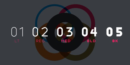
    Havelock Titling builds upon the essential geometry of Havelock , adding new weights for spacious, authoritative text. Made to combine with Havelock’s display capabilities for more traditional reading scenarios. Built on the same weight range as Rocinante Titling , which broadens your design options. Light matches Light, Bold matches Bold, and so on. Both Havelock and Havelock Titling collections are included in Havelock Complete for a lower price.
  2. Lost Signal by Zamjump, $11.00
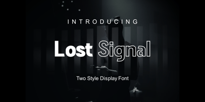
    Lost Signal is a two-style display that's absolutely perfect for editorial headlines. Her bold and characterful figure makes her perfect for posters, extreme sports, automotive and magazine covers. Reserved for upper and lower case in each style, featuring fl and fi ligatures, this calm and bold typeface is a content creator's best friend. Including: Uppercase, Lowercase. Numbers, Punctuation & Symbols. Diacritic for Multilingual Support
  3. Tallings by Grontype, $14.00
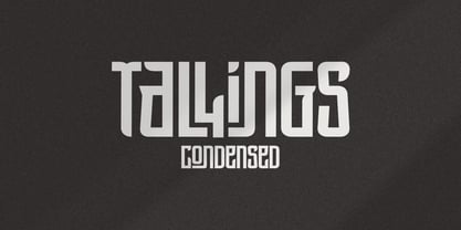
    TALLINGS is a bold modern, urban-condensed font, inspired by street urban poster that combines the classic and modern style. TALLINGS will be best suited for creating logotypes, branding, headlines, corporate identities, Invitation card, and other graphic design elements. TALLINGS Features: Bold condensed font Punctuation & Characters Ligatures and alternates Glyphs included superscript & Symbol Currencies Multilingual Thankyou for picking up this font. Happy creating! Regard, Grontype
  4. American Advertise 014 by Intellecta Design, $18.95
    from the wood type heritage of America
  5. French Clarendon Expanded by Wooden Type Fonts, $20.00
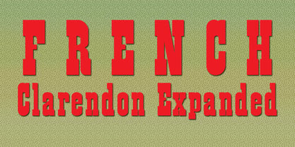
    French Clarendon Expanded, a display text type.
  6. ZXA by Dharma Type, $9.99
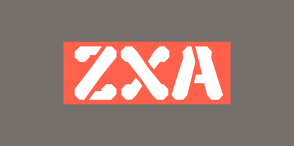
    Experimental 90s geometric type. Regular and Stencil.
  7. SF Laundromatic Condensed - Unknown license
  8. SF Arborcrest Medium - Unknown license
  9. SF Wasabi Condensed - Unknown license
  10. SF Hallucination Outline - Unknown license
  11. SF DecoTechno Shaded - Unknown license
  12. SF Speedwaystar Shaded - Unknown license
  13. SF Chromium 24 - Unknown license
  14. SF Burlington Script - Unknown license
  15. SF Retroesque SC - Unknown license
  16. SF Arborcrest Heavy - Unknown license
  17. SF Arborcrest Light - Unknown license
  18. SF DecoTechno Condensed - Unknown license
  19. SF Hallucination Extreme - Unknown license
  20. SF Hallucination Shadow - Unknown license
  21. SF Retroesque Outline - Unknown license
  22. SF Planetary Orbiter - Unknown license
  23. SF Espresso Shack - Unknown license
  24. SF Cosmic Age - Unknown license
  25. SF Willamette Extended - Unknown license
  26. SF Port McKenzie - Unknown license
  27. SF Groove Machine - Unknown license
  28. SF Synthonic Pop - Unknown license
  29. SF Baroquesque Extended - Unknown license
  30. SF Laundromatic Extended - Unknown license
  31. SF Zero Gravity - Unknown license
  32. SF Baroquesque Condensed - Unknown license
  33. SF Speedwaystar Condensed - Unknown license
  34. Venus by Linotype, $29.00
    The Venus type family is a historic hot metal face with left slanted weights that is used for the german cartographic map production. There are also special typefaces required like the Roemisch and Topografische Zahlentafel type family."
  35. Berolina by Solotype, $19.95
    A circa 1900 type from the foundry of W. Grauneau, Berlin. A great utility face as it works well as the "plain" face with other decorative type of the same era. Reads well in paragraphs of copy.
  36. Catalyst by Ryan Williamson, $-
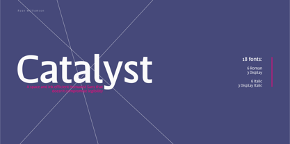
    Catalyst is an attempt at increasing the economy of print while retaining optimal legibility through type design. This type family does so through subtle and intentional OpenType features, as well as referencing successful past attempts throughout history.
  37. Venus Egyptienne by Linotype, $29.00
    The Venus type family is a historic hot metal face with left slanted weights that is used for the german cartographic map production. There are also special typefaces required like the Roemisch and Topografische Zahlentafel type family."
  38. NTF Tout by Noble Type Foundry, $10.00
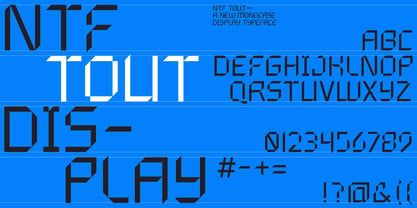
    A new experimental display typeface from Noble Type Foundry. Inspired by the hard 45 degree cuts of traditional blackletter type but simplified for a digital age, this unique evolution commands a strong geometric presence in any design.
  39. Caslon Graphique by ITC, $29.99
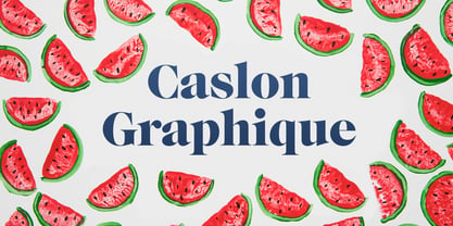
    The Englishman William Caslon punchcut many roman, italic, and non-Latin typefaces from 1720 until his death in 1766. At that time most types were being imported to England from Dutch sources, so Caslon was influenced by the characteristics of Dutch types. He did, however, achieve a level of craft that enabled his recognition as the first great English punchcutter. Caslon's roman became so popular that it was known as the script of kings, although on the other side of the political spectrum (and the ocean), the Americans used it for their Declaration of Independence in 1776. The original Caslon specimen sheets and punches have long provided a fertile source for the range of types bearing his name. Identifying characteristics of most Caslons include a cap A with a scooped-out apex; a cap C with two full serifs; and in the italic, a swashed lowercase v and w. Caslon's types have achieved legendary status among printers and typographers, and are considered safe, solid, and dependable. Caslon Antique was designed by Berne Nadall and brought out by the American type foundry Barnhart Bros & Spindler in 1896 to 1898. It doesn't bear any resemblance to Caslon, but has the quaint crudeness of what people imagine type looked like in the eighteenth century. Use Caslon Antique for that old-timey" effect in graphic designs. It looks best in large sizes for titles or initials. Caslon Black was designed by David Farey in the 1990s, and consists of one relatively narrow and very black weight. It is intended exclusively for titles or headlines. Caslon Black has a hint of the original Caslon lurking in the shadows of its shapes, but has taken on its own robust expression. Caslon Graphique was designed by Leslie Usherwood in the 1980s. The basic forms are close to the original Caslon, but this version has wide heavy forms with very high contrast between the hairline thin strokes and the fat main strokes. This precisely drawn and stylized Caslon has verve; it's ideal for headlines or initials in large sizes."
  40. Helen Bg by HS Fonts, $19.00
    The font package Helen Bg Family is in 5 weights and two widths, 18 styles: Thin, Thin Italic, Light, Light Italic, Regular, Italic, Bold, Bold Italic, Black, Black Italic, Light Condensed, Light Condensed Italic, Condensed, Condensed Italic, Bold Condensed, Bold Condensed Italic, Black Condensed and Black Condensed Italic. Helen Bg is made with Bulgarian Design of Cyrillic and is recommended for the publications for Bulgaria. Other version with standard Cyrillic is available from HermesSoft Limited. Typeface design: Vassil Nikolov. Release date: 1991 - 96, HermesSOFT Design notes and Technical data Helen belongs to the typefaces from the humanistic sanserif grotesk fonts. The font is for wide use – from the classical typesetting to the display typography. In the Bulgarian Code Page are included all vowels with accents that are really necessary for the typesetting in Bulgarian language, and are not included in the Cyrillic Code Page: Helen Is available in OpenType PostScript and WEB font formats.
Looking for more fonts? Check out our New, Sans, Script, Handwriting fonts or Categories
abstract fontscontact usprivacy policyweb font generator
Processing