10,000 search results
(0.247 seconds)
- LTC Record Title by Lanston Type Co.,
$24.95 Record Title was designed by Frederic Goudy in 1927 as a proprietary commission for the Architectural Record magazine. Based on classic Roman letter proportions, Goudy considered this one of his most successful commissions ever. It is an all caps titling face originally digitized by Jim Rimmer for Lanston in 2001. It was remastered in early 2007.
 - Arakne by Scriptorium,
$12.00While working on a font based on Spencerian Script (a popular late 19th century handwriting style) we did some experimenting with original designs which created the general feel of Spencerian and brought to mind the spidery handwriting of old ladies and Dickensian clerks. The result was Arakne, a spidery script font with a really striking look. - Riga Screen by Ludwig Type,
$45.00 Riga Screen is designed to work particularly well on screen. Especially responsive websites or office applications will appreciate its economic proportions. Riga has been specially engineered and optimized for exceptional readability in small sizes on all current computer monitors, including tablets and smartphones. This small family of four weights is the perfect companion for the Riga type family.
 - Saturday Detentions by Bogstav,
$18.00 Saturday Detentions is based on the classic serif "High School" style. However, this version is handmade and a bit rugged here and there - and loose in a legible/organic way. I've added 7 different versions of each letter and they automatically cycle as you type - or you can manually choose the one you prefer from the glyph menu.
 - Semiramis by Scriptorium,
$18.00Semiramis is based on lettering from the Roycroft movement, but has a Science Fiction/Fantasy feel to it, drawing on elements from antique scripts and the Art Nouveau period to produce a result which is modern and ancient at the same time. There are two different shapes for each character, accessed with the upper and lower case keys. - Millano Script by MJB Letters,
$17.00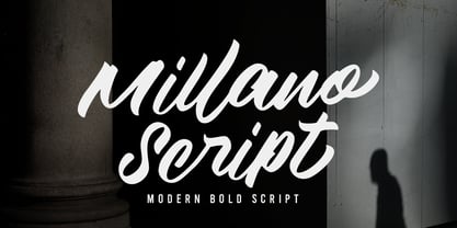 Millano Script is a bold script font, with a strong and masculine style that is equipped with some unique ligatures and alternates so that it can provide an interesting look Works on PC & Mac Simple installations Accessible in the Adobe Illustrator, Adobe Photoshop, Adobe InDesign, even work on Microsoft Word. PUA Encoded Characters – Fully accessible without additional design software
 - Circles JY by JY&A,
$39.00Based on electrical circuitry, David Philpott's Circles typefaces are oddly legible, even though one might think they were destined for display usage only. The circle is the base form, repeated throughout the design. Originally drafted during his time at the Massey University School of Design, subsequent refinements have turned Circles into two complete fonts with a full character set. - Meatball by Parkinson,
$25.00 Meatball is a fat and happy display font based on some lettering on a mid-20th century poster for the movie Bringing Up Baby. The lettering for the names of the stars, AudryHepburn, Cary Grant and Charles Ruggles, was the basis for Meatball. The sample was all caps and as it evolved, a lower case started to appear, etc.
 - Misket by Altay,
$9.00 Misket is a display typeface designed by Altay Dagistan. The glyphs were drawn one by one by hand, using traditional calligraphy methods. The font features a modulation called “reversed contrast”. Instead of the stems being thicker than the horizontals like in most typefaces, the contrast is reversed so, the stems are much thinner than the horizontals.
 - Splashdown by Comicraft,
$29.00 Surf's Up! Head on down to the Barrier Reef with your favorite board, your latest pair of Oakleys and join us where the waves break. Zip up your wetsuit and be prepared to Wipe Out! On the other hand, if you'd rather not get wet, simply install this font and experience similar results. Splashdown is totally tubular, dude!
 - Dudek PRO by Hotniedog Studio,
$22.00 Dudek is a highly functional font family. Styles from thin to black with italics for each one, allows to create wide and consistent design systems. I wanted Dudek to be soft and simple. Not too much geometrical, but also not calligraphic in detail. Dudek can help in every day jobs and wide multilingual support leaves no one behind.
 - Hungry Zombie by Hanoded,
$15.00 I’ve never been one for zombies and all that. I did watch a couple of seasons of The Walking Dead, but after the 2.000.000th zombie got whacked, I had enough. When I made this font, it gave me a zombie feeling. One thing I learned from watching TWD was that zombies are always hungry. There you have it!
 - Mikeys Roman NF by Nick's Fonts,
$10.00Here's an amalgam of letterforms from two giants of the handlettering pantheon: an uppercase based on the work of Mike Stevens, and a lowercase based on the work of Alf Becker. The two work in perfect harmony to create warm, friendly and engaging headlines. Both versions contain the complete Latin 1252, Central European 1250 and Turkish 1254 character sets. - Vida Bandida by Vozzy,
$20.00 Introducing vintage label font named Vida Bandida. It is based on my other font, Black Widow. All available characters you can see at the screenshots. This font has six styles: Regular, Full, Shadow, Shadow FX, Texture and Texture FX. This font will look good on any vintsge styled designs like a poster, T-shirt, label, logo, etc.
 - Onry Display by NicolassFonts,
$35.00 Onry Display is a modern family based on Willgray font family. It comes in 20 weights, 10 uprights, and matching italics. The ExtraBold weight is free of charge. This font family can be used as a headline or as a body copy typeface. The font features excellent legibility for print, as it does for reproduction on TV screens.
 - Black Cycle 2 by Vozzy,
$10.00 Introducing vintage label font duo named Black Cycle. These two fonts has an additional characters and multilungual support (check out all available characters on previews). Both of font familes has four styles: Clean, Clean Shadow, Aged and Aged Shadow. This font will look good on any vintage styled designs like a poster, T-shirt, label, logo, etc.
 - Little Humble by Zeenesia Studio,
$14.00 Introducing Little Humble Font Little Humble is natural kid font. It made based on real handwriting. It can be used for cafe or coffee shop menu lists on board, branding, invitations, watermarks, advertisements, product designs, labels, product packaging, book content, quotes and more. It came with number & punctuation, multilingual support, and PUA encode Hope you like this product.
 - Kybul by Invasi Studio,
$19.00 A bubbly, sweet font with a cutoff letterform on detail. Kabul takes another step and brings the bubbly into a casual style. Perfect for use in big sizes on posters or flyers. It's a good combination with sans font. Its imperfections keep it casual while still providing legibility. This is a great combination of casual and retro eras.
 - Kage Retro by Sakti Avellin,
$15.00 Kage Retro is a fun and retro font, it's perfect for designs that need a playful, cheery accent. Kage Retro is suitable for book covers, posters, packaging, merchandise, logotypes, and many more! -standard glyph -Works on PC & Mac -Accessible in Adobe Illustrator, Adobe InDesign, it even works in Microsoft Word. PUA Encoded Characters – Fully accessible with no add-ons.
 - Top Forty by Jeff Levine,
$29.00 A 1963 issue of Billboard Magazine contained an ad for Jimmy Smith (along with some other artists on the same record label) that was hand-lettered in a free-form style similar to show-card ‘one-stroke’ typographic design. This was the inspiration for Top Forty JNL, which is available in both regular and oblique versions.
 - Mastadoni by Eclectotype,
$40.00 Mastadoni is a bold headliner/masthead typeface, with high vertical contrast in a Didone style. That's the starting point at least. There's much more to this font than another modern clone. It is a specialized (only one weight) typeface that comes in five optical grades. Use G1 at very large sizes and G5 at smaller sizes. The grades can be combined so that the thins of type set at different point sizes appear the same thickness - a very useful feature for magazine layouts. Optical grades could also be used in circumstances where a logo needs to be size-specific; the text on your bistro sign can afford to be more delicate than that on your coffee cups. This is a typeface with a big x-height, small cap-height and stubby ascenders and descenders, which contribute to an overall appearance somewhat different from must Didones, and make for some interesting layout possibilities in tight spaces. Mastadoni features a number of useful OpenType features. All fonts include standard ligatures and automatic fractions. In the discretionary ligature feature, you'll find the esoteric "percent off" glyph. Just type '%ff' with dlig engaged and there it is! Case-sensitive forms are available in all the fonts. The contextual alternates feature performs a subtle trick that resolves an optical illusion whereby two ascenders next to each other appear to be different heights. The Roman and Italic styles have a different group of stylistic sets as follows: Roman: SS01 substitutes a less decorative 4; SS02 is a different eszett; SS03 substitues the # with an attractive numero glyph; and SS04 gives an alternate K. Italic: SS01 and SS03 are the same as in the Romans; SS02 gives you more bulbous variants of v, w, and y letters; SS04 is a single storey g; SS05 changes C, G and S to non-ball-terminal varieties; and SS06 changes the swash versions of E, L, N and Q (when the swash feature is engaged). Speaking of the swash feature, the italic fonts feature swash capitals from A to Z, and swash variations for lower case h k m n v w and z. Lastly, the discretionary ligature feature in the italic fonts has vi, wi, KA and RA ligatures. Mastadoni is a typeface that would find itself immediately at home in glossy magazines, while offering a different aesthetic palette from the more standard choices of Didones.
 - Kisba Nova by Identity Letters,
$29.00 Kisba Nova – A character actor that turns heads. Spiky serifs, soft ball terminals. All eyes on Kisba Nova: enter a typeface designed to arouse attention. Kisba Nova is that one guest who joins a party, and a murmur goes through the crowd. Kisba Nova is pure charisma. Opposites attract: Kisba Nova combines sharp wedge serifs and spiky spurs with round and soft ball terminals. Infuse this with a neoclassical stroke contrast and you get a thrilling typeface driven by visual extremes. Sure: Kisba Nova is a diva. But it’s a pro, after all. That’s why it comes in two optical sizes: Headline and Text. This makes sure it looks gorgeous in any situation. The Kisba Nova Headline subfamily is flaunts the trademark flamboyant looks and extravagant letters like f and k. They bring you all of the excitement of the showbiz in large applications—use it for sizes of 24 Pt. and more. The extraordinarily designed, thin and monolinear diacritics, punctuation marks, and symbols of Kisba Nova Headline add to this modern and elegant character. Kisba Nova Headline consists of seven weights from Thin to Black, offering plenty of possibilities to set headlines and titles. With about 600 characters per weight, it contains enough functionality for the demands of a skilled typographer. OpenType features, such as a large set of ligatures, extended language support, case-sensitive forms, different sets of figures, and arrows, enable sensational designs both in web & print layouts. The Kisba Nova Text subfamily comes with decreased contrast, more generous letter proportions, and wider spacing. Instead of employing flashy thin and monolinear diacritics, punctuation marks, and symbols, Kisba Nova Text aims for a more even texture on the page. It retains the true, elegant Kisba DNA while allowing you to set legible copy in sizes between 9 and 18 Pt. Nothing will distract your reader–Kisba Nova Text aims to please. Kisba Nova Text consists of seven weights from Thin to Black, offering plenty of possibilities to set body copy and subheadlines. With about 600 characters per weight, it contains enough functionality for the demands of a skilled typographer. OpenType features, such as a large set of ligatures, extended language support, case-sensitive forms, different sets of figures, and arrows, enable sensational designs both in web & print layouts. Kisba Nova celebrates the dual nature of softness and sharpness in a single typeface. It’s a character actor that turns heads.
 - Basilia by Linotype,
$29.99 Among the countless typefaces available today, the Modern Face style is relatively underrepresented. During the 19th century and then later with the competition from the mechanized hot metal types and film setting, a number of attractive headline types appeared in this style. For text, however, the available types were limited to those based on tried and true classics like Walbaum, Didot and Bodoni, which were created between 1780 and 1830, as well as a few variations from the end of the 19th and beginning of the 20th centuries. The demand for new Modern text types remained nonexistant until the 1960s. Such was the situation when the Haas'sche Schriftgiesserei (Haas Type Foundry) commissioned me to come up with a concept and sketches of a new hot metal type. I was able to convince the director of the foundry that there was a niche to be filled with contemporary Modern typography. Another reason for the production of a new type was of a technical nature: the introduction of a new setting technique should not be limited to existing typefaces, but instead should lead to innovative text types suited to the demands of the new applications. André Gürtler, Basilia's designer: I began to work on the concept and initial designs of the new text type in 1968. I wanted to give the type a classical look, expressed above all in the strong stroke contrast between the robust verticals and fine horizontal strokes and serifs. This is one of the main characteristics of Modern typography.""This new typeface, Basilia, is distinguished by its soft, open appearance as well as a number of details which together mark a departure from historical models. For example, it has nothing of Bodoni's round letters and their angular, narrow spacing, and displays instead round forms with a much softer stroke in the curves. It was very important to me to avoid the Modern characteristic of stiff, vertical, grid-like strokes and to create instead a lighter, more transparent type. I retained the Modern style by using straight horizontal serifs at right angles to the strokes to still give the type its sense of rigidity." Three sketches for Basilia (normal, italic, and bold) were finished in 1973. Only the 9-point size was produced at first. In the following years, basic weights were made and adapted to filmsetting."
 - Arlune by Creative Juncture,
$15.00 How does one describe Arlune. It started as a typeface with curves based on the arc of a crescent moon (Arc + Lunar = Arlune), then evolved into what it is. A very unique graphic typeface with a dynamic character that works well for titles, headings, and other lines of text that need to grab your attention. This is a typeface that is sure to leave an impression. One that will make people stop, take pause, and maybe even ponder the meaning of life as they study its intricacies. It has a significant number of characters and symbols to meet the needs of many languages.
 - Interrupt Display Pro by T4 Foundry,
$21.00Torbjörn Olsson's Interrupt is a salty dog of a sanserif, harboring memories of freighters unloading their cargo in a run-down port. Interrupt works great for signs, and looks just fine painted on the side of a wooden crate or stencilled on an old tarpaulin. Interrupt is recommended for use over 36 points. You have run out of packing crates and would like to use it on paper? Sure, Interrupt can add its sturdy sailor's gait to any medium... just don't set any novel in Interrupt. Not even Melville. Interrupt is an OpenType typeface for both PC and Mac. - Grafista by Scannerlicker,
$44.00 Grafista is an extrapolation on what fonts are used for: in spite of the possibility to use it for setting text, Grafista strives when used as a texture library, the same way that one would set up tiles. Thus, Grafista was built as two different things compiled in the same font: the letterforms (for setting text) and the texture library. Both of the sets are monospaced (with every glyph having the same width), but the letterforms are half of the texture tiles' width. On the tech side, the letterforms are 500/1000 UPMs, while the tiles are 1000/1000 UPMs.
 - Litho Display by Arkitype,
$9.00 Litho Display is a bold display typeface, it has 8 fonts in the family with four different styles. Litho Display has been created with bold headline and poster typography in mind. It is perfect for use on typography heavy posters, packaging or on screen idents. The four different styles Litho Display comes in is Regular, Rounded, Rough and Press each with an italic pairing. With these styles Litho Display is versatile for various different uses whether it needs to be clean type for a poster or on screen or a more rough and rustic style for some packaging.
 - Magento by Anomali Creative,
$11.00 Introducing MAGENTO MAGENTO is a stylish font It has both modern and retro look - clear, modern and fun. Helps to create layout design in 60s or 70s design projects. This MAGENTO Family has 9 weights from thin to black, and Italic version on it What's you get? Magento TTF, OTF, WOFF Magento Italic TTF, OTF, and WOFF Unique letterforms Works on PC & Mac Simple Installations Accessible in the Adobe Illustrator, Adobe Photoshop, Microsoft Word even work on Canva! Fully accessible without additional design software. For MORE FREEBIES : just like these and more, as well as Font Deals and discounts , visit https://wecreatype.com
 - Etnyca by Ahmad Jamaludin,
$17.00 Presenting new our font, Etnyca Etnyca - fearless and stylish typeface perfect for headlines for print and web. It's modern, bold, and playful. Perfect if you want to add character to your project. Etnyca fits perfectly too into those nostalgic mood boards and vintage logos. It comes with Italic style, unique lower and uppercase plus numbers, punctuation & multilingual letters File Included : Unique letterforms Works on PC & Mac Simple Installations Accessible in Adobe Illustrator, Adobe Photoshop, Microsoft Word even work on Canva! PUA Encoded Characters Fully accessible without additional design software. Come and say hello over on Instagram! https://www.instagram.com/dharmas.studio/ Dharmas Studio
 - Break Walkout by Aldedesign,
$19.00 Break Walkout is a simple, yet classy signature typeface. It includes beautiful swashes that will add an organic feel to any design project! This font is a stylish signature font that is inspired by modern photography. It’s easy to use, to create a stunning watermark for your photos, invitations, branding. It also works great as a business signature or on other branding materials. - PUA encoded = Accessible in Adobe Illustrator, Adobe Photoshop, Adobe InDesign, even work on Microsoft Word. - PUA Encoded Characters - Fully accessible without additional design software. How to access alternate glyphs? you can see it on this link: http://goo.gl/1vy2fv
 - Povetarac Didone by Tour De Force,
$25.00 Povetarac Didone font family is part of Povetarac Superfamily together with Povetarac Sans and Povetarac Display. Available in 6 weights with matching italics, Povetarac Didone relays on lively uppercase proportions that took inspiration from vintage typefaces. It is well balanced family, elegant and fully recognizable. One of its characteristics are straight and wide terminals without usual serifs for this kind of typefaces. Playful and harmonic italics are one more uniqueness of Povetarac Didone. They were gently crafted to fulfil they role not just for editorial use, but as display typeface as well. Comes with Fractions and extended Latin character map.
 - P22 Declaration by P22 Type Foundry,
$24.95 The new Declaration font set from P22 features two lettering fonts based on the Declaration of Independence of the United States of America. A script font that features the look of classic 18th Century penmanship, with a slightly irregular edge, as found on documents made with ink quill pens on vellum or parchment. The accompanying Blackletter font is also derived from the Declaration of Independence as it was used for emphasis and of course the famous document title itself. A third font, which features the signatures of the signers of the Declaration of Independence, is also included.
 - Lovestrong by Rometheme,
$25.00 Lovestrong Script is a beautiful and modern handwritten font script. this font looks elegant, classy, readable, stylish, catchy and easy to use. Lovestrong is the best choice for your professional design projects, including signature, watermark on photography, quotes, wedding, fashion, letter, invitation, business card, logo, branding, magazines, social media, advertisements, product designs, and much other design projects. Highlight: - Easy instalation - Work on PC or Mac - PUA Encoded Support - Basic Latin A-Z and a-z - Numbers - Symbols - No special software is required, The fonts can be opened and used in Adobe Illustrator, Adobe Photoshop, Adobe InDesign, even work on Microsoft Word.
 - Bandleader JNL by Jeff Levine,
$29.00 How does one arrive at a font name? With the thousands of digital typefaces available, it's not an easy process. Bandleader JNL was modeled from the hand-lettered title on a piece of sheet music called "Largo", which means "slow tempo". Since the names "Largo" and "Tempo" were already taken, what other musical theme would fit? The lettering is in an Art Deco style, and Big Band was all the rage of the Art Deco period; therefore "Bandleader". Sometimes the road to naming a font takes on many twists and turns but the end result is always gratifying.
 - Emily Austin by Three Islands Press,
$39.00 An indomitable woman who traveled a lot, Emily Austin (Bryan) Perry was one of the children of Moses Austin, of Austinville, Virginia. Like her famous brother, Stephen F. Austin, she settled in Texas as one of that region's earliest colonists. While traveling about seeking treatment for a sickly daughter, she wrote many letters home -- letters that show a distinctively compact, legible hand. The challenge for me in designing the face: resisting the temptation to read and re-read her bossy directives and urgent appeals, all packed tightly together on a page. Emily Austin has a complete character set, and then some.
 - I am not a robot by PizzaDude.dk,
$15.00 The other day I had to login to a page several times, and as security I had to check the "I am not a robot" box. Actually, I think I did a login at that particular page like 30 times that day...and in the end I was thinking "Come on, you should know by now that I am not a robot" And even though I thought it was a repetitious hassle I figured that I needed to name a font "I am not a robot" - and not a robotic-like one, but a sweet and funny cartoonish one! :)
 - Jeeves by Red Rooster Collection,
$79.00 The inspiration for Jeeves came from Leslie Carbarga's wonderful book LETTERHEADS, One Hundred Years of Great Design, 1850-1950. It was based on a secondary type usage for the letterhead for Sutherland in New York. The rest of the letterhead had features that were more typical of the Art Deco period, but this script added a touch of timeless elegance. And since at the time I was reading every scrap of P.G. Wodehouse I could get my hands on, the name Jeeves seemed like a perfect fit. The font is loaded with a plethora of extra glyphs, ligature characters and OpenType features.
 - Chaman by Cubo Fonts,
$29.00 Chaman is a “hybrid” font. On the one hand serifless, temperate and readable, and on the other hand quick and livily as a manual script, thanks to many unexpected ligatures. Letter design is plain and functional, punctuated by dynamic elements, mostly in ligatures and contextual glyphs, generated at the beginning and end of the word, thanks to your software’s OpenType features. It draws inspiration from the Tibetan alphabet, originally close to our own latin alphabet, as it stems from Bhram handwriting, itself derived from Phoenician alphabet. This alternation of stright vertical lines and regular bows makes Chaman’s design stand out.
 - HS Almisk Serif by Hiba Studio,
$50.00 HS Almisk Serif is a display typeface. It can be used for titles and graphic projects, which support Arabic and. It has been created based on modern kufi style. It enjoys flexibility between sharp and curved lines in the structure of characters. This supports with a beautiful appearance and wonderful geometric structure. It based on HS Almisk typeface with a serif on some of its characters. (5) Weights has been created for this typeface between the Light weight and Black weight. This typeface with its diversity of (5) weights is intended to be an attempt for a good addition to Arabic typography.
 - Cooked by Sudtipos,
$79.00 Koziupa and Paul are just as good in the kitchen as they are on the drawing board. Cooked is their choice offering of stir-fried and juicy alphabet ready to complement any visual stew you can put together. This meaty course, with even meatier OpenType programming, was designed to crank up the volume on the viewer's senses of smell and taste, and induce drooling at a mere glance. Cooked is just as suitable in packaging as it is on posters, books or music stressing the wild, adventurous and extremely pleasurable side of life. Lot of alternates of each letter are included. Enjoy!