1,185 search results
(0.027 seconds)
- TRACK - Unknown license

- Vandotta by Flawlessandco,
$9.00 Introducing Vandotta, a dynamic and powerful sport display font designed to make a bold statement. With its sleek lines and strong geometric shapes, Vendetta embodies the spirit of competition and athleticism. There's some connected letters and some alternates that suitable for any graphic designs such as branding materials, t-shirt, print, business cards, logo, poster, t-shirt, photography, quotes .etc This font support for some multilingual. Also contains uppercase A-Z and lowercase a-z, alternate character, numbers 0-9, and some punctuation. If you need help, just write me! Thanks so much for checking out my shop!
 - Forenight by Flawlessandco,
$9.00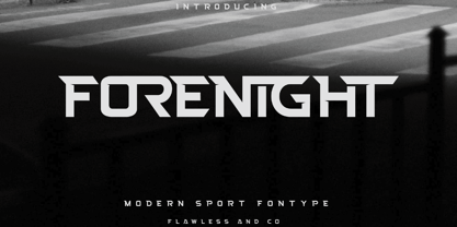 Introducing "Forenight" - a dynamic and modern sport font designed to capture the spirit of athleticism and energy. With its bold and sleek letterforms, Forenight brings a sense of power and movement to your sports-related designs. There's some connected letters and some alternates that suitable for any graphic designs such as branding materials, t-shirt, print, business cards, logo, poster, t-shirt, photography, quotes .etc This font support for some multilingual. Also contains uppercase A-Z and lowercase a-z, alternate character, numbers 0-9, and some punctuation. If you need help, just write me! Thanks so much for checking out my shop!
 - Faerie Queen NF by Nick's Fonts,
$10.00Based on a typeface named "Titania" from a 1930s specimen book from the Fundición Richard Gans in Madrid, this exquisite design will add a touch of elegance and nostalgic charm to any project it graces. - Horesport by Mightyfire,
$15.00 Horesport is a bold sport font is a typographic style that exudes strength, dynamism, and a sense of action. Characterized by thick, robust letterforms, this font is designed to make a powerful visual impact, capturing the essence of athleticism and energy. The letters are crafted with strong, confident strokes, creating a bold and assertive appearance. Whether used on jerseys, banners, posters, or digital displays, a bold sport font commands attention and reinforces the spirit of competition. Its high-impact design ensures visibility from a distance, making it ideal for conveying a team's identity or promoting sporting events with flair and vigor. We're proud and honored if Horesport can be the part of your special projects. Thank you :)
 - Gans Antigua Manuscrito by Intellecta Design,
$14.95Gans Antigua Manuscrito is a revival font by Intellecta Design. researched at the rare catalogue from the extinct Fundicion Richard Gans, from Madrid. See also other font families inspired by Gans' original typefaces: Gans Tipo Adorno , Gans Lath Modern , Gans Titular Adornada , Gans Ibarra , Gans Antigua , Gans Fulgor and Gans Radio Lumina . - Retiro Std by Typofonderie,
$59.00 Full of life Hispanic Didot in 2 optical sizes Retiro is a daring interpretation of Spanish typography. Severe, austere and yet, full of life, Retiro is a vernacular version of Castilian and Andalusian in a typical Didot. Named after a lovely park in Madrid, Retiro started life as a a bespoke typeface designed to give a unique voice to the magazine Madriz. In 2006, the founder of Madriz was looking for a Didot for his new magazine. The Didot is the archetypal typeface used in high-end magazines. Retiro is a synthesis of these high contrast styles mixed with an Hispanic mind. Result is then, after 2-3 years of work, a typeface with countless variations to establish typographic shades adapted to different sections and pages of the Madriz. In 2014, it was necessary to further revise the typeface before its launch at Typofonderie. In order to keep its originality, the unique weight was retained, but complemented with optical size variants to set highly contrasted headlines into various sizes, visually balanced. How to use Retiro optical sizes? Each font provided in Retiro family is named according to the scale of body size: 24 pt and 64 pt. Of course, these names are referring to the body sizes used in typographic design. In the “glorious old days,” the letterpress period, it was customary to cut punches directly to the size at which typefaces would be used. The punchcutter had to visually adapt his design to the engraving size. The aim was to optimize the best contrast and general weight, but also to respect both design’s and reader’s needs. In Retiro’s case, intended for large titling sizes, it’s an adaptation of this ancient practice for our contemporary uses. Although each font is named by a typographic point size, do not feel obliged to use this font at this precise size, but why not, in larger or smaller. It’s rather the concept of gradients that must be preserved in layouts, rather than strictly size numbers. It’s up to the designer to select the right font size for his own designs. Granshan Awards 2012 Creative Review Type Annual 2011 Designpreis 2011 Club des directeurs artistiques, 41e palmarès Type Directors Club 2010 Certificate of Type design Excellence
 - Decimosexto NF by Nick's Fonts,
$10.00This typeface family includes Spanish Roman letters and “Griffo” style italics, both hand-drawn by Francisco Lucas in Madrid, 1577. The letters, sometimes slightly mismatched in size or off the baseline, capture the look and feel of sixteenth-century printing. Both versions of the font include 1252 Latin, 1250 CE (with localization for Romanian and Moldovan). - OricNeo by The Northern Block,
$12.80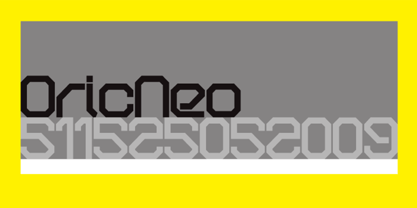 A computerized typeface inspired by the Matrix trilogy.
 - Fmiring Campotype One - Personal use only

- Procyon by Fatchair,
$6.95A dot-matrix style display font with a twist. - TB Abacus by TrueBlue,
$9.00A creative dot matrix font reminiscent of Abacus counters. - Melina BT by Bitstream,
$50.99Melina Plain and Melina Fancy are characterized by graceful lines, strong contrast and nostalgic overtones. These typefaces are patterned after two members of a type family named Greco, released by Fundición Tipográfica Richard Gans of Madrid, Spain, in the 1920s. Melina Plain is a refined version of Greco Bold, and Melina Fancy is based on Greco Adornado, with the notable addition of a lowercase, which was not a part of the original design. Melina is based on two typefaces (ca. 1920) from the Fundición Tipográfica Richard Gans in Madrid, Spain. Nick Curtis first found Greco Adornado in a type specimen at the Library of Congress. It was a cap only design. He made a cut of the original (Melina Fancy) and created his own lowercase, and many other characters to support contemporary character sets. Later he came across Greco Bold, which had a lowercase, but he chose not to use it and instead, adapted his Melina Fancy to create Melina Plain. - Almoneda by Sudtipos,
$49.00 Almoneda: Sale at public auction of movable goods, generally used. And also: private and voluntary sale of jewelry and junk that is made without the intervention of justice. Formerly, it was nothing more than the market or sale of things and spoils won from the enemy in war. Nowadays, the almoneda is practically associated with spaces where the sale of "old things" takes place and, in Madrid, they are usually concentrated in the area of El Rastro, an open-air market that is set up on Sundays and some holidays in the center of Madrid. There, you can find everything and, if you walk around a lot and look hard enough, great typographic finds. It is there where I find a large number of elements (usually from the late nineteenth and early twentieth century) such as boxes, posters, books, etc.. in which appear uppercase letters with a variety of shapes, letters embedded, rare ligatures ... In addition, many elements extracted from street signs, tiles from bars and commemorative elements of Madrid have been used to complete this font design made with care and patience. Thus was born Almoneda, a modern typeface with a marked axis and great contrast, and an uppercase with several sets of characters to play with and enjoy. It also includes a large number of ligatures and discretionary ligatures. A Variable font is included with the full package license. Almoneda, a typeface that will not leave you indifferent. They take it out of my hands, hey!
 - Transactive JNL by Jeff Levine,
$29.00Transactive JNL is a simple dot matrix font design from Jeff Levine. - Kifisia Antigua NF by Nick's Fonts,
$10.00This rough-and-ready display face is based on El Greco Antique, released by the Fundición Richard Gans of Madrid in the 1930s. Distressed but not distressing, rough yet charming, ragged around the edges but curiously refined. Named after a village in Greece which is the ancestral home of the forebears of the Curtii. Both versions of the font include 1252 Latin, 1250 CE (with localization for Romanian and Moldovan). - Romeo by Font Bureau,
$40.00 David Berlow drew Romeo Medium Condensed during winter of 1990, basing the design on the Estrecha Fina weight of Electra, a spectacular art deco sanserif with an unusually fine condensed series. Carlos Winkow designed it circa 1940 for the Nacional typefoundry of Madrid, the leading typefoundry in Spain. Jill Pichotta drew the ultra-light Skinny Condensed, a digital tour de force released with Medium Condensed; FB 1990–91
 - Rodrigues PERSONAL USE ONLY - Personal use only

- WL Rasteroids by Writ Large,
$5.00 Rasteroids is a typographic flashback to computing of the mid 1980s, when 9-pin dot-matrix printers were the state of the art, and most home computer displays were TVs hooked up to RF modulators. Rasteroids not only captures the dot-matrix printer look, but recreates the rasterized appearance of text on those lower-resolution monitors. Unlike that dot matrix type of yore, Rasteroids does have some variation in character width, and is legible in small blocks of copy. Still, it is best used sparingly, or as a special effect.
 - Foundry Flek by The Foundry,
$99.00 Foundry Flek and Foundry Plek are created on the same dot matrix grid system. Each family includes: light, regular, medium and bold weights – with a selection of dot patterns that can extend the grid vertically and horizontally. The underlying matrix common to each weight allows experimentation with overlays, and mixing weights produces varying effects. Foundry Plek used conventionally works well for serious correspondence, with a 'typewriter font' effect. Foundry Flek has an integral dot matrix grid as a background. With these two fonts a whole new graphic language can be explored.
 - Foundry Plek by The Foundry,
$99.00 Foundry Plek and Foundry Flek are created on the same dot matrix grid system. Each family includes: light, regular, medium and bold weights – with a selection of dot patterns that can extend the grid vertically and horizontally. The underlying matrix common to each weight allows experimentation with overlays, and mixing weights produces varying effects. Foundry Plek used conventionally works well for serious correspondence, with a 'typewriter font' effect. Foundry Flek has an integral dot matrix grid as a background. With these two fonts a whole new graphic language can be explored.
 - Lamia by Atelier laia,
$50.00 The Lamia font is inspired by the work of the most famous calligrapher of the Basque Country, Jose Francisco de Iturzaeta Eizaguirre (Getaria1788-Madrid 1853). His writing method was compulsory in Spanish schools since 1835. His "unpolished Spanish font" tried to be more effective than the more commercial English version by avoiding embellishments and excessive rear tearing. More akin with the liberal values imported by the French, his offerings sought uniformity, speed and efficiency to ensure that those in the less-favored echelons of society had an effective communication tool. From his "general collection of characters of European Letters" published in Madrid in 1833, we have chosen the "lower case pancilla reformed" represented in one of the prints. We have tried to reinterpret it by keeping its essence but also ensuring that it is viable for potential contemporary uses which, thanks to its good readability and effectiveness in longer texts, basically means as a decorative or display font. The upper case was generated using the lower case as a reference.
 - Normande by Bitstream,
$29.99A French form of Fat Face, derived from the British; matrices survive at Berthold in Berlin. - Dottie by Ingrimayne Type,
$12.95 Dottie is based on a matrix of dots. It was inspired by the output of old, cheap, dot-matrix printers. In addition to Dottie-Regular with round dots, the family group includes DottieDiamond with diamond dots, DottieSquareTwo with square dots that do not overlap, and DottieSquare with square dots that overlap to create horizontal and vertical bars.
 - War by Suomi,
$19.00 The matrix screen types from the movie War Games stuck in my mind, so I decided to make few versions.
 - Technomat by Storm Type Foundry,
$10.00Technomat takes inspiration from matrix or thermal dot printers. Minimalistic construction and soft edges makes it legible from 3 point size. - Irritation by Ingrimayne Type,
$12.95 Have you ever had to read text from a cheap dot-matrix printer which is not aligned quite right, so that the tops of the letters are either darker or lighter than the bottoms? Now with IrritationOne and IrritationTwo you can relive that experience even though you no longer use a dot-matrix printer. IrritationOne has dark tops and fading bottoms, while IrritationTwo has the opposite. Naturally both are monospaced.
 - Stuyvesant BT by Bitstream,
$29.99Based on an engravers’ pattern plate, this outline form deriving from an English roundhand was fitted to linecasting matrices by Intertype about 1940. - HeartMatrixed by Ingrimayne Type,
$12.95 HeartMatrixed is based on a matrix of dots in the shape of little hearts. It uses the same design pattern for placing dots as Dottie.
 - CrEAtoR cAmpoTYPe SmcP - Personal use only

- Valliciergo by Tipo Pèpel,
$44.00 This font is inspired by the samples of the booklet "Caligrafía inglesa" published in Madrid in the late nineteenth century by the spanish calligrapher Vicente Fernández Valliciergo. Hundred of new glyphs have been added, taking advantage of Opentype features. Ligatures, decorative figures, initials and final forms, inspired in the samples of English Calligraphy as shown in "The universal penman" by George Bickham have been added to the font. The result is Valliciergo, a font with more than 1000 glyphs, meant to be a useful tool to simulate the master strokes of the great calligraphers.
 - Pinel Pro by URW Type Foundry,
$39.99 The characteristic ‘French face’ was originally made in 1899 under the supervision of Joseph Pinel. Thus, what was originally French 10 pt. Nº 2, got its present name. The Frenchman Joseph Pinel called himself a "typographical engineer", but was at the time employed as a type draughtsman at the Linotype Works in Altrincham. It appears that this and some other faces that he supervised, were, except for use on the Linotype, also meant for manufacturing matrices for the Dyotype. This composing machine was an invention of Pinel. The Dyotype was a rather complicated machine and consisted, like the Monotype, of two separate contraptions, a keyboard which produced a perforated paper ribbon and a casting machine which produced justified lines of movable type. Unlike the Monotype which has a square matrix carrier, the Dyotype had the matrices on a drum (in fact two drums, hence the name of the machine). A Pinel Diotype company was founded in Paris and a machine was built with the help of the printing press manufacturer Jules Derriey. As is often the case, a lack of sufficient capital prevented the commercializing of this ingenious composing machine. Coen Hofmann digitized the font from a batch of very incomplete, damaged and musty drawings, which he dug up in Altrincham. He redrew all characters, bringing up the hairstrokes somewhat in the process. The result is a roman and italic, while the roman font also includes Small Caps
 - Bubblewrap by Fontmill Foundry,
$20.00Bubblewrap is based on a 10 x 14 dot matrix grid and is perfect for projects where a little care and attention is the order of the day. - WL Rasteroids Monospace by Writ Large,
$5.00 Rasteroids Monospace is a typographic flashback to computing of the mid 1980s, when 9-pin dot-matrix printers were the state of the art, and most home computer displays were TVs hooked up to RF modulators. Rasteroids not only captures the dot-matrix printer look, but recreates the rasterized appearance of text on those lower-resolution monitors. Because of its fixed character width, Rasteroids Monospace is intended for use in accents or small areas of copy rather than long documents.
 - DS Diploma - Unknown license

- Single Gyrl - Unknown license

- IllegalEdding - Unknown license

- Dot Grid by Essqué Productions,
$35.00 A font that can be used to simulate old dot-matrix style printing, older receipts, or even as marquee light lettering. Includes extended Latin diacritics, Roman Numerals, and Greek, Hebrew, and Cyrillic Alphabets.
 - PAG Marina by Prop-a-ganda,
$19.99Prop-a-ganda offers retro-flavored fonts inspired by lettering on retro propaganda posters, retro advertising posters, retro packages all the world over. This is perfect font for your retrospective project. PAG Maria is bold and heavy sans serif font with happy and sweet touch. It is certainly chubby, but in some ways it is also pointed. So PAG Maria is polished and friendly font. - DS Diploma-DBL - Unknown license


