10,000 search results
(0.025 seconds)
- Dynamique by PizzaDude.dk,
$15.00 I wouldn't recommend that you use this font for massive text, or text written in CAPS ... but then again, go ahead and try - I even kerned all the capital letters ... just in case that you would do something so crazy! :) Dynamique is a kind of a "straight out of the highway" grid-font. But then again, not ... if you use the lowercase alone, you have this almost monospaced font - try starting every word with a capital letter, and let it end with the alternate ligature, your words suddenly got even more power! If you want to go lightspeed - then use the same technique, but only with the italic version!
 - Bornholm Tejn Low by Trine Rask,
$25.00 Bornholm Tejn is named after a village »Tejn« on the only rocky island in Denmark »Bornholm« Bornholm Tejn Low is the lowercase variant of Bornholm Tejn, released in 2012, the first face in a series of rough stone cut typefaces, that shares proportions, but differs in any other aspect like different pieces of rock. It is a powerful face, but still very friendly. Good for very big sizes, but can be used for small texts, movie titles, cartoons … Bornholm Tejn Low has a large x-height which supports the heavy and black look of the typeface. It contains tabular and proportional old style and lining figures.
 - Bouncer by Ingrimayne Type,
$6.95 The letters in Bouncer are round because they all begin as a ball and then have parts of the ball cut away. Bouncer was one of the earliest typefaces from Ingrimayne Type. Lower-case letters are smaller versions of the upper-case letters. BouncerTwo, designed twenty years after the original Bouncer, continues playing with the idea of making letters by cutting out parts of a circle, but in this case the circles are interlocking. All letters are upper-case but some of those on the lower-case keys differ from those on the upper-case keys. BouncerTwo is eye-catching but not highly legible.
 - Young Itch AOE by Astigmatic,
$19.95Ok, so many of you are now probably wondering if I am a teenager. Nope. But I was once, and I had alot of pent up angst like alot of other teens, and maybe this typeface is my outlet for what is left of those teenage days of mine. Take it as you will, but Young Itch is a bold, scratchy, handdrawn typestyle, with that feel of grunge and pent up anger. The typeface comes with its own persona, but I bet it would work itself well into a wide array of designs. Ventilate your current or past teen angst with Young Itch today! - ITC Ellipse Script by Typorium,
$30.00 The Typorium presents a new optimized and enriched version of ITC Ellipse which first appeared in 1996 in the International Typeface Corporation typeface library. ITC Ellipse Script is a complementary typeface to ITC Ellipse Neo, designed a very legible handwriting style. ITC Ellipse Script is both modern and classic. Modern in the unusual shape based on the geometric ellipse form. And classic in the structure of some letters like the lower cases c, e, g, o, s. These letters alone could come from a traditional typeface, but they fit perfectly with the atypical rest of the alphabet giving it a present-day and traditional mix. Furthermore, the ellipse shape fits naturally in the italic styles, giving the font an organic and fluid feeling. ITC Ellipse Script offers OpenType features such as alternate characters for upper and lower case, and an extended accented character set to support many languages. Five weights have been created for each style to offer a wide range of graphic possibilities in a tidy digital footprint. Designer: Jean-Renaud Cuaz Publisher: Typorium MyFonts debut: Nov 1, 2020 Le Typorium présente une nouvelle version optimisée et enrichie d'ITC Ellipse qui est apparue pour la première fois en 1996 dans la bibliothèque de caractères de l'International Typeface Corporation. ITC Ellipse Script est une police complémentaire à ITC Ellipse Neo, conçue dans un style d'écriture très lisible. ITC Ellipse Script est à la fois moderne et classique. Moderne dans le dessin inhabituel basé sur la forme géométrique de l’ellipse. Et classique dans la structure de certaines lettres comme les minuscules c, e, g, o, s. Ces lettres pourraient provenir d'une police de caractères traditionnelle, mais elles s'intègrent parfaitement avec le reste de l'alphabet plus insolite en lui donnant un mélange de modernité et de tradition. De plus, la forme de l'ellipse s'intègre naturellement dans les styles italiques, donnant à la police une sensation organique et fluide. ITC Ellipse Script offre des fonctionnalités OpenType telles que des caractères alternatifs pour les capitales et les bas de casse, et un jeu de caractères accentués étendu pour prendre en charge de nombreuses langues. Cinq graisses ont été créés pour chaque style afin d'offrir un large éventail de possibilités graphiques pour une empreinte numérique rigoureuse.
 - Byzantine - Unknown license

- Kellnear-Italic - Unknown license

- Seeds - Unknown license

- VNI-Thufapfan - Unknown license

- Minya - Unknown license

- Elbjorg - Unknown license

- Exit by FSD,
$50.00Exit is my first typeface (designed in 1988). The relationship to Neville Brody's work is evident but with personal touch - Bunky by Lebbad Design,
$24.95 Bunky is a fun font with a quirky twist. Bouncy and bold, it packs a punch for a funky headline!
 - Cheapside by Device,
$29.00 A condensed serif that’s been through the ravages of reproduction but has now been digitized for modern use. Elegantly wasted.
 - RM Serifancy by Ray Meadows,
$19.00 A bit Circus ... a bit Showbiz ... a bit Western ... but completely FANCY Includes: Western European, Central European, Baltic & Turkish sets
 - Alta Basilica by Blendy wine,
$9.00 This font was created to capture the delicacy of ancient art. But it can still be used today very well.
 - Generica Condensed by Monotype,
$29.99Generica Condensed is based on mid-20th century geometric sans designs, but is less formal, with a touch of playfullness. - Jive Jump JNL by Jeff Levine,
$29.00Jive Jump JNL is a fun and playful font for any layout where a casual and friendly approach is needed. - Afterthought JNL by Jeff Levine,
$29.00 Afterthought JNL is a light, bouncy and playful typeface . Perfect for any project that exudes a fun or casual theme.
 - DetourDork by JOEBOB graphics,
$9.00 DetourDork was inspired by American highway signs. Hand-drawn with a medium marker, but it looks very clean and straight.
 - Crosshair by Burghal Design,
$29.00Unfortunately, Crosshair was inspired by the youthful craze that's all the rage: on-campus shootings. Put the gun down, Junior. - Comic Boys by Stringlabs Creative Studio,
$25.00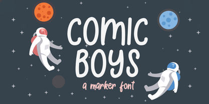 Comic Boys embodies fun, quirkiness and authenticity. This enchanting display font will turn any creative idea into a true standout.
 - Old Story by Gleb Guralnyk,
$12.00 Hello! Introducing "Old story" typeface with funny doodles. All the graphics you can access from the "glyphs" palette. Have fun!
 - TOMO Astoria by TOMO Fonts,
$10.00 TOMO Astoria is a handmade typeface with clear Art Deco roots. Ideal for illustrative posters and subtle details. Have fun!
 - Casual Lunch JNL by Jeff Levine,
$29.00Casual Lunch JNL is a friendly, relaxed typeface that's perfect for headlines where legibility is important, but formality is optional. - Handana by Ingrimayne Type,
$9.95 Handana is an informal face with a simple but distinctive calligraphic look in four weights: light, plain, medium, and bold.
 - ZP A Dorky Print by Illustration Ink,
$2.00 This fun and whimsical font features a very youthful lettering with a bit of toggle and bounce in the baseline.
 - Mrs. Shmelding JNL by Jeff Levine,
$29.00Lighten things up and let your imagination run free with Mrs. Shmelding JNL, a lighthearted novelty font from Jeff Levine. - Warbones by Forberas Club,
$16.00 Introducing Warbones by Forberas, yet playful but still serious. You can use this as decorative material for your upcoming project.
 - Benjamin Franklin - Personal use only

- M Stiff Hei PRC by Monotype HK,
$523.99 Stems (豎) and crossbars (橫) are direct and simple, dots (點) are short but authoritative, downstrokes (撇、捺) are no longer curvy but straight and sharp, thus, a smart and straightforward typeface. Bold in this family is rough and tough, demonstrating a high extent of muscularity. Meanwhile Light is neatly, naturally and nicely crafted, aiming to achieve high legibility. A popular choice for advertising with diverse usages.
 - Thursday Afternoon by Bogstav,
$15.00 Nothing is as it really should be with Thursday Afternoon. The x-height is jumpy, letters are not in their right places, lines are crunchy, serifs are uneven...the list goes on...but in the end, Thursday Afternoon turns out as a legible and functional font. It has most of the moves from classic serif fonts, but then again it has a mind of its own!
 - Norden Retro Round by Asgeir Pedersen,
$14.99 Norden Retro Round is based on Norden Round, but Retro comes with an added perspective, giving it a "retro-futuristic" look. It has a lower x-height than its parent, due to it being slightly tilted. Norden Retro Round can be used in any setting, but given its lively style, it will excel as a display font; in headings, titlings, logos and so on.
 - Pixel Pants by PizzaDude.dk,
$18.00 Pixel Pants is my wanna-be 1980-ies pixelfont. Well, it really looks like a pixel font, but it's kid of fake - at larger sizes you will notice the wacky and uneven lines, but it sure do bring back memories of the 80-ies! I've made 5 different versions of each letter - just to break the monotony of the usual pixel font! Insert coin and enjoy!
 - Snow Atisen by Differentialtype,
$10.00 Snow Atisen is a festive and fun handwritten font. Perfect for adding a touch of holiday magic to Christmas cards, New Year's decorations, winter designs and other fun projects. Comes with 3 styles that you can mix and match. This font has the potential to become your favorite font of choice, whatever the occasion, spread the joy of the season with this unique font.
 - Deco Redux JNL by Jeff Levine,
$29.00 A long-set aside Art Deco typeface design begun (but not completed) may or not have been from a vintage source, but its roots go well back into Art Deco lettering. Taking the existing letters and thickening their weights, removing the counters and ending up with a completely new, solid alphabet design resulted in Deco Redux JNL, which is available in both regular and oblique versions.
 - Otari by TK Type,
$25.00 Otari is vibrant and contemporary, but serious and built to last. Its character shines in display type, but doesn’t interfere at text sizes. Otari aims to capture the essence of Wellington, New Zealand in a single typeface. The contrast of a colorful art scene and the conservative colonial British aesthetic, which is still evident in the capital city, laid the groundwork for this design.
 - Kolkata Hotelroom by Hanoded,
$10.00 Hotel rooms in Kolkata don't top the list of 'luxurious habitations'. They are dingy, fly-ridden, dirty and noisy. But if you look really hard, you will find traces of long gone grandeur. This font is all of the above and more: it is sloppy and messy, it spikes and sags, but it does give your designs that extra oomph you are looking for.
 - Triple Lemon by Reyrey Blue Std,
$12.00 Triple Lemon is fun and charming hand-drawn typeface. This typeface can add more fun and happiness in your design. It can be used to create a beautiful inscription for t-shirts, children's books, branding, small business, book covers, stationery, marketing, blog, magazines and more. All characters of this font supported PUA encoded. Features : · All Uppercase and Lowercase · Number & Symbol · Supported Languages · Stylistic Alternates · PUA Encoded
 - Chill Script by Eclectotype,
$40.00 Looking for a break from modern calligraphy? Tired of skinny scripts? Here's something seriously relaxed. Chill Script is a totally new typeface, it eschews any brush influence, but maintains a warmth that comes from not being rigidly constructed. It's a sans serif script, with a nice top-heaviness that makes it friendly. As you expect from fonts today, it's loaded (but not pointlessly overloaded) with OpenType features.


