10,000 search results
(0.056 seconds)
- Honest Punch by Sarid Ezra,
$15.00 Honest Punch is a bold and strong quotable font that you can use for any purposes. This font is very suitable for tagline and branding. With readability and clear looks, this font is perfect for quote. Honest Punch contains unique lowercase and uppercase that you can use at the same times in a word that will make your design more attractive. This font also contains ligature, underline, and support multilingual.
 - Spleeny by Galapagos,
$39.00A gentle breeze on a warm summer's day. A cozy gathering of friends and family around a crackling fire. The sweet aroma of freshly baked cinnamon bread. A slow walk in the autumn woods, light sparkling down through the multi-colored leaves. Billowing white clouds against a stark azur sky, leisurely floating past the tops of palm trees. What do these idyllic scenes all have in common? A: Most people can never find the time to enjoy any of them. B: These are just some of the things you would never try to describe using a crankish font like Spleeny Decaf GD. Just as ITC Fontoon was designed to be used with the many critters that populate the "Toonie" series of fonts, Spleeny Decaf GD was created by Steve Zafarana for use in the balloned dialogue portions of a new panel cartoon feature currently under development. Spleeny Decaf GD is the first completed font in a family that ranges from the jittery san serif Spleeny Espresso GD to the sedate and serifed Spleeny Asleep GD. Each font in the series appears a little more relaxed and staid than its predecessor. None of them however, will find themselves being used for the text of any legal documents. Spleeny Decaf GD is the perfect font to use when the weight of the message is leaning towards the light and jocular side of things. So remember, if your documents are starting to put you on edge, it may be time to switch to decaf. Spleeny Decaf GD that is. - Mission Hills by BA Graphics,
$45.00A very heavy yet elegant small serif font, powerful but very legible. Great for punching up your ads. Can be used in numerous ways from magazines to paperbacks. - Badinjal by Issam Type,
$14.00 Badinjal – Modern Serif Font By Issam Type Badinjal serif font can be used for many project such as: book, magazines, logo, branding, photography, crafts, quotes, blog header, poster, advertisements, and much more. What’s Included? Uppercase & lowercase letters, numbers, punctuation Multilingual support If you have any questions, please feel free to get in touch. Thank you
 - Truens by Seventh Imperium,
$15.00 Truens is a vintage display typeface. It's an all uppercase serif font collection with a Script font that was inspired by the look and feel of old serifs. Truens features include badges, ornaments, catchwords, and Multiple Language Support. This fonts is very versatile, all the styles work well together and can look authentically vintage.
 - Malven by Craft Supply Co,
$15.00 Malven is a modern serif features thin stroke, low-contrast modulation, with small serif that make it elegant and classy. It can be used to create almost all types of design projects like print materials. Just use your imagination and your project will become more alive and look great than ever with this typeface.
 - Bogosa by Issam Type,
$14.00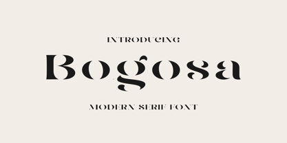 Bogosa – Modern Serif Font By Issam Type Bogosa serif font can be used for many project such as: book, magazines, logo, branding, photography, quotes, blog header, poster, advertisements, and much more. What’s Included? Uppercase & lowercase letters, numbers, punctuation Multilingual support If you have any questions, please feel free to get in touch. Thank you
 - Bear Anark by Ingrimayne Type,
$9.00 BearAnark is a decorative slab-serifed typeface that can be used for some text purposes. It has moderate contrast and comes in five weights, each with a true italic. The development of the family began with a blending of two other slab-serif faces, Anarckhie and BearButteT, and this origin is reflected in its name.
 - Ganora by Eotype,
$12.00 Ganora is a semi serif decorative font. This font has a beautiful and aesthetic look. This font has classic serif legibility as well as beautiful modern curves. This combination makes type interesting in its own way. This font has alternate and ligature features that can help you complete projects like logos, magazines, brands and more.
 - Grimalda by Hikhcreative,
$20.00 Grimalda is an elegant serif typeface with taste of modern and simplicity. It is perfectly for magazine cover, headline, wedding invitations, logo, brand, and many more. Grimalda have more than 100 characters of ligatures and alternates. You can create any imagination with this serif font. What's included? - Uppercase & Lowercase Characters - Multilingual support - Ligatures & Alternates Characters
 - Collint Billy by Maulana Creative,
$14.00 Collint Billy is a fancy handwritten script font duo pair with handwritten sans. With medium contrast stroke, fun character with a bit of ligatures and alternates. To give you an extra creative work. Collint Billy font support multilingual more than 100+ language. This font is good for logo design, Social media, Movie Titles, Books Titles, a short text even a long text letter and good for your secondary text font with sans or serif. Make a stunning work with Collint Billy font. Cheers, Maulana Creative
 - Terrakota by Maulana Creative,
$13.00 Terrakota is casual signature and Sans font duo, with clean thin mono-line stroke, slanted, condensed and fun character. It has Opentype features ligatures of character and lowercase alternates, To give you an extra creative work. Terrakota font duo support multilingual more than 100+ language. This font is good for logo design, Social media, Movie Titles, Books Titles, a short text even a long text letter and good for your secondary text font with sans or serif. Make a stunning work with Terrakota font duo. Cheers, MaulanaCreative
 - Calima by JCFonts,
$30.00 Calima is a humanist sans serif typeface available in six weights. The idea behind this family was simply to try to bring the spontaneity of an italic to an upright roman typeface. The result is a fresh and dynamic sans with clean shapes, well suited for short texts and display use. The fonts, available in Opentype format, include diacritics for most European languages and a variety of Opentype features: oldstyle and tabular figures, subscript and superscript, fractions, case-sensitive forms, localized forms and more.
 - Monstro by PintassilgoPrints,
$24.00 Monstro is a carefully hand-crafted typeface with different lettershapes on upper- and lowercase slots, although being an all-caps font. When working in OpenType savvy applications, the contextual alternates feature can take care of alternating the glyphs, preventing double letters from showing the same lettershape while bringing more spontaneity to your designs. There is also a set of stylistic alternates for added amusement: just turn on the stylistic alternates feature or pick the glyphs manually. Monstro comes in 2 versions: sketchy and solid, both hand-drawn. And yet there is the matching picture font that brings a big bunch of irresistible monsters and other very cool graphic elements. Sans-serif and bold, useful and friendly, these fonts are quite perfect for a monsterful of purposes. I can tell that you are gonna be friends!
 - Kaneishia Script by Solidtype,
$14.00 A new modern calligraphy font, with elegant touch, stylish and lovely. It comes with a handy set of opentype stylistic, use the beautiful ligatures, alternates and swashes. You need a program that supports OpenType features such as Adobe Illustrator CS, Adobe Photoshop CC, Adobe Indesign, Microsoft Word 2010. It is perfect for logo, greetings, branding, quotes, prints, invitations and crafting. All lowercase letters include alternates, beginning & end swashes, that makes the font look fabulous! These are all coded with PUA Unicode. Mac users can use Font Book and Windows users can use Character Map to view and copy any of the extra characters to paste into your favourite text editor/app. For sans serif only available for uppercase letters, numbers, punctuation and all fonts are available in multilingual support. Thanks and have a wonderful day :)
 - Beyond Belief by Comicraft,
$19.00 Fact or Fiction? Are you troubled by strange noises in your font folder? Do you experience feelings of dread in Illustrator, Photoshop or Procreate? Have you or any of your family ever been haunted by an ampersand, cedilla or tilde? If the answer is yes, please don’t wait another minute. BEYOND BELIEF is ready to Believe YOU! Six weights of non-judgmental understanding and faith in everything you have to say -- even the most outrageous font conflicts and naming “coincidences”. Some say this font resembles our tall, friendly sans-serif font Tall Tales, but we don't know what they're talking about. Beyond Belief includes six fonts (Regular, Italic, Bold, Bold Italic, Heavy & Heavy Italic) with upper and lower case alphabets, automatic alternate letters, Crossbar I Technology and Western & Central European language support.
 - Rosabelia Script by Solidtype,
$16.00 A new modern script font with elegant touch, casual and lovely. It comes with a handy set of opentype stylistic, use the beautiful ligatures, alternates and swashes. You need a program that supports OpenType features such as Adobe Illustrator CS, Adobe Photoshop CC, Adobe Indesign, Microsoft Word 2010. It is perfect for logo, greetings, branding, quotes, prints, invitations and crafting. All lowercase letters include alternates, beginning & end swashes, that makes the font look fabulous! These are all coded with PUA Unicode. Mac users can use Font Book and Windows users can use Character Map to view and copy any of the extra characters to paste into your favourite text editor/app. For sans serif only available for uppercase letters, numbers, punctuation and all fonts are available in multilingual support. Thanks and have a wonderful day :)
 - Patihan Variable by Jehoo Creative,
$119.00 Introducing Patihan Variable, a variant that makes it easy for you to access fonts with sharp, strong, bold characters. Patihan Variable is a combination of three different styles – Sans, Slab, and Serif – which are united into 2 Axes weight axes and serif axes, where weight axes have instances: Thin, Extra Light, Light, Regular, Medium, Semibold, Bold , Extrabold, and Black. This font has beautiful Ligature and Stylistic Alternate settings, Patihan font is also equipped with the Smallcaps feature which gives more control over typography, allowing you to create elegant and unique typography. The sans version of this typeface is versatile and easy to read, with a minimalist but impactful aesthetic. The Slab version is characterized by its solid and powerful strokes, while the Serif style has that extra classic flair with elegant curves and a stark contrast to the look. Patihan Variable is optimized to make it easier to access each variation, all you have to do is slide the slide in the software, and then you can access the style you want. Without sacrificing easy readability, this makes it a great choice for headlines, titles, and any long-form content. Ligature settings and discretionary styling add an extra layer of sophistication, making this font a great choice for magazines, branding and advertising. Overall, this font is a great choice for those looking to make a lasting impression. Its versatility, readability and unique features make it an excellent choice for any project.
 - FS Albert by Fontsmith,
$80.00 The x factor How do you make a font like FS Albert unique, distinctive? “When designing a font I try to question every letter,” says Jason Smith, “but all you need is a few that have an x factor. With FS Albert, they’re the lowercase ‘a’ and ‘g’ and the uppercase ‘I’ and ‘J’. “I remember a friend saying, ‘Why on earth have you designed the ‘a’ like that? Isn’t it too friendly for this kind of font?’ And, in a way, that’s what I wanted – honesty and warmth, because a lot of big brands at the time really needed to show a more human side.” Range of weights and styles FS Albert is a charismatic type: a warm, friendly sans serif face with a big personality. Open, strong and amenable, and available in a wide range of weights and styles, FS Albert suits almost every task you put it to. Fontsmith has crafted five finely-tuned upright Roman weights and four italic weights, as well as a special Narrow version to provide the best coverage and give headlines and text an easy-going character. The chunky kid “FS Albert was inspired by – and named after – my son, who was a bit of a chunky kid,” says Jason Smith. “I designed an extra bold weight because I always felt that the really big font heavy weights had the most personality. “I recently told Albert this story. He laughed, and forgave me for thinking he was a fat baby. He liked the big personality bit, though.” 1000s of glyphs Not content with a character set that covered Europe and the whole of the Western world, the studio decided to go further afield. There are now FS Albert character sets that cover western and eastern European languages, including those of Russia, as well as Cyrillic, Arabic and Greek scripts. In fact, the font now covers more than 100 languages, making it ideal for bringing a consistent typographic style to the communications of global brands.
 - FS Albert Paneuropean by Fontsmith,
$90.00The x factor How do you make a font like FS Albert unique, distinctive? “When designing a font I try to question every letter,” says Jason Smith, “but all you need is a few that have an x factor. With FS Albert, they’re the lowercase ‘a’ and ‘g’ and the uppercase ‘I’ and ‘J’. “I remember a friend saying, ‘Why on earth have you designed the ‘a’ like that? Isn’t it too friendly for this kind of font?’ And, in a way, that’s what I wanted – honesty and warmth, because a lot of big brands at the time really needed to show a more human side.” Range of weights and styles FS Albert is a charismatic type: a warm, friendly sans serif face with a big personality. Open, strong and amenable, and available in a wide range of weights and styles, FS Albert suits almost every task you put it to. Fontsmith has crafted five finely-tuned upright Roman weights and four italic weights, as well as a special Narrow version to provide the best coverage and give headlines and text an easy-going character. The chunky kid “FS Albert was inspired by – and named after – my son, who was a bit of a chunky kid,” says Jason Smith. “I designed an extra bold weight because I always felt that the really big font heavy weights had the most personality. “I recently told Albert this story. He laughed, and forgave me for thinking he was a fat baby. He liked the big personality bit, though.” 1000s of glyphs Not content with a character set that covered Europe and the whole of the Western world, the studio decided to go further afield. There are now FS Albert character sets that cover western and eastern European languages, including those of Russia, as well as Cyrillic, Arabic and Greek scripts. In fact, the font now covers more than 100 languages, making it ideal for bringing a consistent typographic style to the communications of global brands. - Lotto by Canada Type,
$24.95 Designed by expert ad artist Herbert Thannhaeuser for East German foundry Typoart in 1955, Lotto was until now one of the long lost gems of European sign and brush lettering faces. Unlike in Kurier (Thannhaeuser’s other brush face digitized by Canada Type as Puma), the forms’ brush construct uses a series of strokes that are mostly sudden, whimsical, and at times even look like great genius being born out of simple afterthought or straight-forward idiosyncracy. For instance, check out the simple brush pause that is the top of the f, the confident yet welcoming serifs on the T, the similarly-themed C/E and O/Q relationship, and much more. Lotto comes with over 400 glyphs, contains a few alternates and ligatures sprinkled throughout the character set, and includes support for the majority of Latin languages.
 - Gothic Tuscan 8 by Wooden Type Fonts,
$15.00 A revival of one of the popular wooden type fonts of the 19th century, suitable for display. The bold version has rounded ball shapes at top and bottom of stems as well as at horizontal strokes. The pointed version has pointed shapes at top and bottom of stems as well as at horizontal strokes. Lowercase was not originally designed for these fonts. These new versions include caps, figures and accented caps.
 - Avenir Next Paneuropean by Linotype,
$99.00 Avenir Next Paneuropean is a new take on a classic face—it’s the result of a project whose goal was to take a beautifully designed sans and update it so that its technical standards surpass the status quo, leaving us with a truly superior sans family. This family is not only an update though, in fact it is the expansion of the original concept that takes the Avenir Next design to the next level. In addition to the standard styles ranging from UltraLight to Heavy, this 56-font collection offers condensed and semi condensed faces that rival any other sans on the market in on and off—screen readability at any size alongside heavy weights that would make excellent display faces in their own right and have the ability to pair well with so many contemporary serif body types. Overall, the family’s design is clean, straightforward and works brilliantly for blocks of copy and headlines alike. Akira Kobayashi worked alongside Avenir’s esteemed creator Adrian Frutiger to bring Avenir Next Pro to life. It was Akira’s ability to bring his own finesse and ideas for expansion into the project while remaining true to Frutiger’s original intent, that makes this not just a modern typeface, but one ahead of its time. Complete your designs with these perfect pairings: Dante™, Joanna® Nova, Kairos™, Menhart™, Soho® and ITC New Veljovic®.
 - Whisky Trail by Vozzy,
$10.00 Introducing a vintage look label font named "Whisky Trail". All available characters you can see at the screenshot. This font have 7 styles - Regular, Full, Shadow, Light, Shadow FX, Light FX and Print. This font will good viewed on any retro design like poster, t-shirt, label, logo etc. For using effect layer: Type your text in Regular. Copy that and paste at the same position. Change the style to Light FX or Shadow FX. After that you can choose different colors for Regular font and Shadow or Light effects. For the catchwords type the word with space before and after word (for sample ' with ', or ' with2 ' for alternate view of catchword), 'Discretionary Ligatures' on the 'OpenType' tab must be turned on. Or paste it from 'Glyphs' tab in any place on your text. This in Illustrator. In Photoshop 'Discretionary Ligatures' you can find in the menu Type - OpenType. Thank you!
 - Josephani Script by Romie Creative,
$14.00 Josephani Script's newest style with modern types of calligraphy fonts, I hope you are interested in this font, if you want to use it for your work. This font can be used easily and simply because there are many features in it it contains the full set of lowercase and uppercase letters, various kinds of punctuation marks, numbers, and multilingual support. The font also contains several alternatives, ligatures and Stylistic Sets for those of you who have software which can work OpenType (Photoshop / Illustrator / InDesign). Josephani Script is appropriate use for market designs developed at this time. This font has a model trendy, natural and soft, with this font you can use a chance at every moment from one extraordinary way to highlight the celebration from your best party, because this font will be a supporter for the goal such as wedding invitations, parties, graduations, birthdays, meetings, etc.
 - Anisette Std Petite by Typofonderie,
$59.00 Geometric font inspired by shop signs in 4 styles Anisette has sprouted as a way to test some ideas of designs. It has started with a simple line construction (not outlines as usual) that can be easily expanded and condensed in its width in Illustrator. Subsequently, this principle of multiple widths and extreme weights permitted to Jean François Porchez to have a better understanding with the limitations associated with the use of MultipleMaster to create intermediate font weights. Anisette built around the idea of two widths capitals can be described as a geometric sanserif typeface influenced by the 30s and the Art Deco movement. Its design relies on multiple sources, from Banjo through Cassandre posters, but especially lettering of Paul Iribe. In France, at that time, the Art Deco spirit is mainly capitals. Gérard Blanchard has pointed to Jean Francois that Art Nouveau typefaces designed by Bellery-Desfontaines was featured before the Banjo with this principle of two widths capitals. The complementarity between the two typefaces are these wide capitals mixed with narrow capitals for the Anisette while the Anisette Petite – in its latest version proposes capitals on a square proportions, intermediate between the two others sets. Of course, the Anisette Petite fonts also includes lowercases too. Anisette Petite, a geometric font inspired by shop signs in 4 styles So, when Jean François Porchez has decided to create lowercases the story became more complicated. His stylistic references couldn’t be restricted anymore to the French Art-déco period but to the shop signs present in our cities throughout the twentieth century. These signs, lettering pieces aren’t the typical foundry typefaces. Simply because the influences of these painted letters are different, not directly connected to foundry roots which generally follow typography history. The outcome is a palette of slightly strange shapes, without strictly not following geometrical, mechanical and historical principles such as those that typically appear in typefaces marketed by foundries. As an example, the Anisette Petite r starts with a small and visible sort of apex that no other similar glyphs such as n or m feature, but present at the end of the l and y. The famous g loop is actually inspired by Chancery scripts, which has nothing to do with the lettering. The goal is of course to mix forms without direct reports, in order to properly celebrate this lettering spirit. This is why the e almost finishes horizontally as the Rotis – and the top a which must logically follow this principle and is drawn more round-curly. This weird choice seemed so odd to its designer that he shared his doubts and asked for advise to Jeremy Tankard who immediately was reassuring: “Oddly, your new top a is fine, it brings roundness to the typeface, when the previous pushes towards Anisette Petite to unwanted austerity.” The Anisette Petite, since its early days, is a mixture of non-consistent but charming shapes. Anisette, an Art Déco typeface Anisette Petite Club des directeurs artistiques, 46e palmarès Bukva:raz 2001
 - Vershen by Page Studio Graphics,
$25.00A calligraphic roman sans-serif, with large x-height, the Vershen font is available in four weights, plus a series with small capitals and old-style figures, also in four weights, and finally, a four-weight set of universal fraction generators. The fonts are thoroughly pair-kerned, including all accented characters and letter pairs not commonly found in English, but frequent in other western European languages. Each font package includes both TrueType and PostScript versions, and is avialable in either PC/Win or Macintosh format. Numerals and currency symbols in the standard font set are monospaced for orderly columns; but a narrower numeral '1' is also provided, along with an alternate lowercase 'g' and ampersand. - Simple by Winnie Tan,
$69.00 Simple - The Bilingual Font. The process of Simple began with the usual alphabets followed by a series of icons and soon it was an avalanche of Chinese characters. The pool of proposed Chinese characters were loosely determined by the needs of a lunar calender. In a nutshell, Simple is a single-weight, minimal, grid-based Sans-serif display. Prudent with details and sturdy in form, the geometrically-driven structure marks the foundation of a cross-cultural assortment of Latin alphabets, Chinese characters and thematic icons. After months of extensive typesetting, Simple is also realized to be well-catered for use in graphical information design in games and tournaments, logotypes, advertisements and headlines. http://www.behance.net/gallery/Simple/847905
 - Highland Morning by Nathatype,
$29.00 Highland Morning is a thick weight serif font in slight watercolor or ink textures with fun retro nuance and complex styles. Its main characters are the addition of small lines/hooks on the top or bottom of the letter and the curvy ending wipes on some of the letters’ edges. With a number of alternative symbols, Highland Morning provides your designs with unique edges and has other interesting features you can utilize. Features: Stylistic Sets Ligatures Swashes Multilingual Supports PUA Encoded Numerals and Punctuations Highland Morning fits for any design projects, such as posters, banners, logos, book covers, album covers, invitations, quotes, greeting cards, name cards, headings, printed products, social media, etc. Find out more ways to use this font by taking a look at the font preview. Thank you and happy designing.)
 - Romile by Nathatype,
$29.00 Looking for an elegant font? Romile is a elegant and bold serif font. It comes to be a single font all in uppercases. Thanks to the cursive and unique swirls at the end of some characters carries a sense of elegant looks. On the other hand, the weight of the font brings strength to any title or header you apply it to. Features: Stylistic Sets Ligatures Swashes Numerals and Punctuations PUA Encoded It can be used for many design projects, such as poster, logo, book cover, branding, heading, printed product, merchandise, quotes, social media campaign, etc. Get more inspiration about how to use it by seeing the font preview. Thank you for purchasing our fonts. Please don’t hesitate to contact us, if you have any further question or issues. We’re happy to help. Happy Designing.
 - Elettra by Flanker,
$23.00 Elettra is a completely new type, primarily designed for display or titling. As you can see, Elettra adopting a transitional style between the nineteenth century printing typefaces and the new fonts at the beginning of the twentieth century: in particular serif are elongated, but the oblique or round shapes continuing softly on the horizontal line instead of staying vertical. Furthermore, two more glyphs were designed for each capital letter: a swashed form, which tends to embrace the following letter, and a backswashed version, that instead embraces the previous. The swash version is accessible from swash or from stylistc set 01 OTF features, while the backswashed version is accessible from stylistc set 02 OTF feature. Be aware that the stylistic set OTF features are not available on Photoshop or Illustrator.
 - Fortezza by Eurotypo,
$22.00 Fortezza is a family of fonts inspired by the great masters who have created the Modern Roman style: Firmin Didot (1764 -1836) and Giambattista Bodoni (1740 -1813) Both typefaces can be similar, but a trained and close vision, show clear differences in the final result, like its weight and the degree of transition of the strokes. The type of Didot suggests greater warmth and elegance, they are characterized by extreme contrast in thick strokes and thin strokes, by the use of serifs very thin and by the vertical stress of the letters. while the Bodoni type conveys a greater robustness and hardness. Fortezza brings together the elegance and spirit of both types, but proposes a contemporary vision, establishing a distance with certain features typical of the baroque that was manifested at that time.
 - Horse Belonk by Arterfak Project,
$16.00 Introducing "Horse Belonk" a western style font. Designed well and inspired by cowboy, rodeo, texas, and vintage designs. This font is based on serif form and reversed contrast, featuring strong looks with the spurs in the middle. Horse Belonk is a display font with an additional Extrude style that you can apply to get a 3-Dimensional typographic design. It's bold, brave, and elegant to use on title or headline, poster, flyer, stickers, vintage logos, signboards, packaging, and more! Packed with extra special characters that allow you to create more magnificent designs. Here what you'll get : Uppercase Smallcaps Numbers & punctuation Ligatures Stylistic alternates Catchwords : And, Or, Is, The, By, On, Be, To, Out, End, In, Will, With, Of, No, For, From, At, Am, Pm. Thank you for watching! Cheers
 - Edith by Dominik Krotscheck,
$12.00 Edith is a handmade serif typeface that can be used for long texts. To make it even better suitable, it is equipped with all the major features you’d expect from a traditional text-font, such as case sensitive forms, old style figures (lining figures are accessible via an opentype feature), fractions and good kerning. To keep up the handwritten appearance, two versions of each letter (A-Z & a-z with diacritics) and number are available and substituted automatically if the same ones meet. Edith is also nice to look at in larger sizes and therefore a great fit for any packaging, advertisement or headline. Edith is for you, if you plan on doing childish things, DIY things, traditional things, illustrated things, nautical things, grungy things or any handmade related things.
 - Urban Ink by Vozzy,
$10.00 Introducing a vintage look label font named Urban Ink. All available characters you can see at the screenshot. This font have 6 styles - Regular, Full, Shadow, Texture, Shadow FX and Texture FX. This tattoo style font will good viewed on any retro design like poster, t-shirt, label, logo etc.
 - Albion's Old Masthead by Greater Albion Typefounders,
$15.00 Albion’s old Masthead is inspired by traditional newspaper mastheads. A heavy Black Letter which brooks no argument, and can be emphatic and refined (emphatically refined?) at the same time. Ideal for signage with a ‘period’ feel, book covers, posters and banners. Why not add something solid to your latest project…
 - Eight Cylinder by Vozzy,
$10.00 Introducing a vintage look label font named Eight Cylinder. All available characters you can see at the screenshot. This font have 8 styles - Regular, Full, Shadow, Shine, Shadow FX, Shine FX, Outline and Print. This font will good viewed on any retro design like poster, t-shirt, label, logo etc.
 - Biff Bam Boom by Comicraft,
$19.00 Thrown from the pages of Spider-Man, Daredevil and Hulk comes BIFF BAM BOOM! Inspired by the Legendary Lettering Legerdemain of comics’ Silver Age, Biff Bam Boom is a font you can’t take a swing at without ending up with a broken nose. If you have any sense, duck and cover!
 - Kulacino by Imagi Type,
$15.00 Kulacino is a modern-retro display typeface inspired by the oldtimes factory signages/ plat licenses. Its seemingly rigid form is tempered by the soft, rounded corners, and fine notched details present at acute angles in the glyphs. You can use Kulacinos into anything as far as your creativity carry you!
 - Klipspringer by ArimaType,
$18.00 Klipspringer is a highly detailed blackletter font. This font is PUA encoded which means you can access all of the glyphs and swashes with ease! Add it confidently to your favorite creations and let yourself be amazed by the outcome generated. If you have questions, please contact us at arimatype@gmail.com