10,000 search results
(0.037 seconds)
- Polotan by Look Minus Today,
$16.00 Introducing Polotan, the ultimate futuristic and modern sans-serif font. With its sleek and streamlined design, Polotan is perfect for creating a cutting-edge, high-tech look that's perfect for a variety of design applications. Featuring strong lines that convey a sense of power and confidence, Polotan is perfect for headlines, titles, and branding materials. But what sets it apart is its unique alternates, which give you the flexibility to create custom designs that stand out from the crowd. And with its alternates, you can take your designs even further and truly make them your own. Its clean and minimalist design makes it easy to read, while its sharp angles and unique letterforms create a sense of energy and movement!. Whether you're designing a high-tech website, a sleek user interface, or a modern brand identity, Polotan will help you make a bold and unforgettable impression. So why settle for a boring and outdated font when you can make a statement with Polotan sans-serif? Try it today and see how it can take your designs to the next level. And please message me if you want your language included or if there are any features or glyph requests, feel free to send me a message.
 - FS Brabo Paneuropean by Fontsmith,
$90.00Worldly Even though it’s a new arrival, FS Brabo has seen the world. Designed by a Brazilian working in London and studying in Belgium under a Dutchman, it’s certainly well-travelled. And it was inspired by the extraordinary archive of early book typefaces at the world-renowned Plantin-Moretus Museum in Antwerp, while Fernando Mello was attending Frank Blokland’s Expert class Type Design course at the Plantin Institute of Typography. It was there that Fernando became engrossed in the collection of early metal type, matrices, punches and type samples by figures such as Garamond and Granjon. So much so that he took on the mighty task of developing ‘a beautiful, functional, serifed text font’ of his own. Heroic FS Brabo’s journey from sketch to font family took an epic three years, starting in Antwerp, continuing at Fontsmith in London, and reaching its conclusion back in Fernando’s home city of São Paulo. No wonder Fernando was reminded of another titanic face-off: that of Antwerp’s Roman hero of legend, Silvius Brabo, and the evil ogre, Antigoon. Brabo came to the town’s rescue after the tyrannical giant had been charging ships’ captains extortionate taxes and chopping off the hands of those who refused to pay up. Having finally downed Antigoon after a long and terrible duel, Brabo cut off the giant’s own hand and threw it into the river Scheldt, unwittingly giving the town its name: the Dutch for ‘hand-throw’ is hand werpen. What better way for Fernando to name his literary typeface than after the hero of Antwerp’s oldest tale? The garalde factor FS Brabo is not a revival, but a very much a contemporary, personal interpretation of a garalde – a class of typeface originating in the 16th century that includes Bembo, Garamond and Plantin, with characteristically rounded serifs and moderate contrast between strokes. Brabo’s ‘ct’ and ‘st’ ligatures, upper-case italic swashes and contextual ending ligatures – ‘as’, ‘is’, ‘us’ – all preserve the beauty and character of traditional typefaces, but its serifs are chunkier than a garalde. Their sharp cuts and squared edges give them a crispness at text sizes, helping to bring a beautifully bookish personality to hardworking modern applications. A workhorse with pedigree It may give the appearance of a simple, four-weight typeface, but FS Brabo has hidden depths beneath its simplicity and beauty. OpenType features such as cap italic swashes, contextual ending swashes – programmed only to appear at the end of words – and stylistic alternatives make this a complete and well-equipped typeface. Comprehensive testing was carried out at text and display sizes, too, to prevent counters from filling in. All of which makes FS Brabo a very modern take on a traditional workhorse serif typeface: colourful and versatile enough to adorn not just editorial projects but also signage, advertising and logotypes. - FS Brabo by Fontsmith,
$80.00 Worldly Even though it’s a new arrival, FS Brabo has seen the world. Designed by a Brazilian working in London and studying in Belgium under a Dutchman, it’s certainly well-travelled. And it was inspired by the extraordinary archive of early book typefaces at the world-renowned Plantin-Moretus Museum in Antwerp, while Fernando Mello was attending Frank Blokland’s Expert class Type Design course at the Plantin Institute of Typography. It was there that Fernando became engrossed in the collection of early metal type, matrices, punches and type samples by figures such as Garamond and Granjon. So much so that he took on the mighty task of developing ‘a beautiful, functional, serifed text font’ of his own. Heroic FS Brabo’s journey from sketch to font family took an epic three years, starting in Antwerp, continuing at Fontsmith in London, and reaching its conclusion back in Fernando’s home city of São Paulo. No wonder Fernando was reminded of another titanic face-off: that of Antwerp’s Roman hero of legend, Silvius Brabo, and the evil ogre, Antigoon. Brabo came to the town’s rescue after the tyrannical giant had been charging ships’ captains extortionate taxes and chopping off the hands of those who refused to pay up. Having finally downed Antigoon after a long and terrible duel, Brabo cut off the giant’s own hand and threw it into the river Scheldt, unwittingly giving the town its name: the Dutch for ‘hand-throw’ is hand werpen. What better way for Fernando to name his literary typeface than after the hero of Antwerp’s oldest tale? The garalde factor FS Brabo is not a revival, but a very much a contemporary, personal interpretation of a garalde – a class of typeface originating in the 16th century that includes Bembo, Garamond and Plantin, with characteristically rounded serifs and moderate contrast between strokes. Brabo’s ‘ct’ and ‘st’ ligatures, upper-case italic swashes and contextual ending ligatures – ‘as’, ‘is’, ‘us’ – all preserve the beauty and character of traditional typefaces, but its serifs are chunkier than a garalde. Their sharp cuts and squared edges give them a crispness at text sizes, helping to bring a beautifully bookish personality to hardworking modern applications. A workhorse with pedigree It may give the appearance of a simple, four-weight typeface, but FS Brabo has hidden depths beneath its simplicity and beauty. OpenType features such as cap italic swashes, contextual ending swashes – programmed only to appear at the end of words – and stylistic alternatives make this a complete and well-equipped typeface. Comprehensive testing was carried out at text and display sizes, too, to prevent counters from filling in. All of which makes FS Brabo a very modern take on a traditional workhorse serif typeface: colourful and versatile enough to adorn not just editorial projects but also signage, advertising and logotypes.
 - Qurve Thin - Unknown license

- Qurve Wide - Unknown license

- Qurve - Unknown license

- Sanity Wide - Unknown license

- Qurve Hollow - Unknown license

- Bigfoot by K-Type,
$20.00 Bigfoot K-Type is a whole font based on the slab capitals used by Victor Moscoso in his 1960s psychedelic rock posters. Capital A alternatives can be found at keystrokes ± and §.
 - Ogelic by Ardyanatypes,
$17.00 Ogelic Typeface Serif is modern and elegant. It pairs well with san serif as pictured or stands firm as a title and brand representative for an elegant look. This Ogelic Typeface is equipped with a modern professional character that can present an elegant and attractive identity for your company for business purposes such as business cards, name tags, and uniforms as a brand enhancement. This modern Ogelic typeface is suitable to be embossed as a letter nameplate or even pasted in your office with a cutting sticker that looks elegant. This elegant Ogelic-type shape is also stunning for book covers or magazine writing. You can see all the available characters in the screenshot above, and you can try the modern & elegant Ogelic now for any design issues. Ogelic also comes with multiple languages, making it easy for any country and language use. It also comes with alternative Ligatures and stylistics to make your designs more attractive.
 - Supra Demiserif by Wiescher Design,
$29.00 »Supra Demiserif« is the demi serif addition to the Supra family. I am no fan of slab serif fonts, so I designed this one with half serifs, that makes the serifs less important. Then I found, that the italic does not look nice with slab serifs, so I did only one italic cut for the normal weight. The light and normal weights and the dominant x-height with its high ascenders make for easy reading of long copy. The heavy and x-light weights are great for elegant headlines. Supra is an OpenType family for professional typography with an extended character set of over 700 glyphs. It supports more than 40 Central- and Eastern-European as well as many Western languages. Ligatures, different figures, fractions, currency symbols and smallcaps can be found in all cuts. with each other.
 - Wolfgang by Aronetiv,
$9.99 The typeface is influenced by early Italian-French serifs such as Garamond, Jenson, Griffo. The font has clear serifs and slightly sharp shapes. It has a modern character. The font has a uniform texture typical for this type of serif. This font family is well suited for the decoration of solemn and graceful materials. The font has a nice and appropriate italics. Wolfgang is legible and easy to read at small sizes. The font family contains 6 styles The font is equipped with a Variable file. Supports languages ??of central Europe Contains old style figures There are several alternates in the font The font has more than 1000 kerning pairs
 - Joy Of Reading by Typephases,
$25.00The theme in these illustrations is the pleasure of books and reading wherever you are, at any time. This series collects illustrations of people enjoying the pleasure of reading in the most diverse places and situations, some of them frankly absurd and funny, ranging from children reading tales to a witch with her magic brewing manual. A fraction of the contained images comes from other Whimbats, but most of them are exclusive. We hope you will feel like reading and start reading a good book! These illustrations are ready to use at any size and in any application (their vectorial format ensures they can be scaled to any size with no loss of sharpness). They can be used out of the box, or easily customized in any graphics program, adding colour or texture, resizing, combining... the variety of suggested uses is huge, from small spot illustrations to full-page layouts. Use them to great effect in magazine spreads, advertisements, stationery, packaging, bulletins or poster creative designs. - Qaligo by Youthlabs,
$18.00 Introducing Qaligo Serif Font - A Brand New Serif Font with Luxury Shape, More Opentype Feature, more neat curves Qaligo Serif Font Inspired by Modern and Luxury Typography. Qaligo Serif Font is a very versatile font. you can use this font to various design. Basics can improve more than 250 alternates character where can collaborate with premade logos. WHAT'S YOU GET ? Unique Letterforms Works on PC & Mac Simple Installations Accessible in the Adobe Illustrator, Adobe Photoshop, Microsoft Word even work on Canva! Fully accessible without additional design software. I really hope you'll get pleasure using Qaligo Serif font and it will be perfect addition to your font collection! Contact me with an inbox message If you have any question. Thank you! Happy Creating.
 - The qoestter by Alit Design,
$19.00 Presenting the ✨The Qostter Retro Serif Font✨ by alitdesign. The Qostter Retro Serif font is inspired by stylish designs from the 80s to 90s. At that time the font style like "The Qotter" had a firm and trendy impression. The Qotter retro font has a wide selection of alternative characters and swashes that make it easy to create bold retro-style designs. The Qostter Retro Serif font is very suitable for making designs with retro concepts, simple and playful designs, for example making magazine cover designs, music covers, YouTube thumbs, text headers, logotypes and so on with an elegant retort theme. Besides that this font is very easy to use both in design and non-design programs because everything changes and glyphs are supported by Unicode (PUA). The Qostter Retro Serif font has a total of 758 glyphs including symbol, multilingual and alternative glyphs. We really enjoyed the process of making The Qostter Retro Serif font, we hope you are also happy when using The Qostter Retro Serif font. Language Support : Latin, Basic, Western European, Central European, South European,Vietnamese. In order to use the beautiful swashes, you need a program that supports OpenType features such as Adobe Illustrator CS, Adobe Photoshop CC, Adobe Indesign and Corel Draw. but if your software doesn't have Glyphs panel, you can install additional swashes font files.
 - Aviano Wedge by insigne,
$24.99 Firm and resolute, the sharp, triangular wedge serifs of the new Aviano Wedge stamps your copy with the confidence of late 19th century luxury, wealth, and power. Indicative of banknotes and financial strength, the large, elegant Aviano Wedge is composed in the Latin style. Aviano Wedge takes its original footing from period signage found on a building in Asheville, NC. While shaped largely by engraved faces, the elegant Aviano Wedge maintains the extra-wide comfort and ease found with the rest of the Aviano series. Aviano Wedge comes in six different weights and is packed with OpenType features. As a complement to these characters, Aviano Wedge includes 40 discretionary ligatures for artistic typographic compositions. To see these features in action, please see the informative .pdf brochure. OpenType capable applications such as Quark or the Adobe Creative suite can take full advantage of the automatically replacing ligatures and alternates. Aviano Wedge also includes support for all Western European languages. This new face has also been designed to pair well with the rest of the Aviano series, including our best-selling Aviano, Aviano Serif, Aviano Sans, Aviano Didone, Aviano Flare, Aviano Contrast, and Aviano Slab. Use it alone, or combine Aviano Wedge with any of these other fonts to build the strong presence you’re looking for.
 - Best Regardz by Outside the Line,
$19.00 Best Regardz is a casual, quirky handprinted font. A headline font that is kerned to be used at 24 pt or larger. This is the latest font in the Love Letters Series. Others in that series include Dearest John , Yourz Truly and Sincerely Yourz . Best Regardz was in the 2011 Typodarium Page-A-Day Calendar on 10-4-2011.
 - TDL Ruha Crown by Tipos Das Letras,
$15.00 TDL Ruha Crown is a decorative, modern and mechanical display typeface and it results from the development of the stencil RUHA. Being the first typeface of the family, sets the basic concepts to be developed further, on each version to come. There is an rigid geometrical connection with the Roman du Roi design approach, since the letterforms are imposed by the constraints of the RUHA ruler. The main typographic proportions are connected with the modern typefaces, like Didot or Bodoni.
 - BD Roylac by Typedifferent,
$30.00 The BD Roylac typeface has its roots in some lowercase glyphs drawn by Jacques Loison in 1972. Some of these characters are included in the use of stylistic alternates. Filed under a retro-futuristic design the font separates two filled shapes by a thin and curvy line; sometimes following to the path leaning readability and sometimes interfere with it. The font is dedicated to the BD fanboy Monsieur «Eric de Broche des Combes» aka «Roy La Combe» to his fiftieth anniversary.
 - Klein by Zetafonts,
$39.00 Klein PDF Specimen Klein is Zetafonts love letter to the grandmother of all geometric sans typefaces, Futura. Starting from a dialogue with Paul Renner’s iconic letterforms and proportions, Francesco Canovaro and Andrea Tartarelli decided to depart from its distinctive modernist shapes with slight humanist touches and grotesque solutions - with some design choices evoking the softness of humanist sans serifs like Gill Sans. The end result is a workhorse superfamily of 54 fonts with full multilingual capabilities and coverage of over two hundred languages using latin, cyrillic and greek alphabets. The original display-oriented family, developed in nine weights with matching italics (from the hairline thin to the sturdy black), has been paired with a text version (with slightly higher x-height, better readability and maximum legibility at small point size) and with a condensed version, to be used for space-saving display solutions in editorial and advertising formats. With a name that is both a nod to its humble functionality and an homage to french nouveau realiste artist Yves Klein, this typeface aims to become your next trusted companion in all your adventures in print, digital and motion design.
 - Groovecore by Mysterylab,
$21.00 Groovecore is a modern bold serif display font with an unmistakable 1970s vibe. This is a design that is equally at home on a retro t-shirt logo as it is on a stylish fashion headline. The combination of plump rounded serifs and pointy curls sets up a nice graphic interplay of shapes. You'll find Groovecore to be carefully and extensively kerned, with even color weight that's makes it shine even in small extended text passages. Quirky but legible, Groovecore is a great choice in many contexts.
 - SF Big Whiskey SC - Unknown license

- Alstoria by Bombastype,
$35.00 Alstoria is a Bold Serif Display font. Suitable for your projects like branding, packaging, printing, header, and many more. Contains 320+ glyphs and 10 ligatures. You could check the full glyph map at this link. This font also contains many swash alternates option to play. Works well for vintage and modern style like you see in our preview images.
 - Marcovaldo by Zetafonts,
$51.00 Developed by Andrea Tartarelli as an extension to Calvino typefamily, Marcovaldo is a heavy condensed wedge serif, optimized for display design. The high contrast and rich texture of the old style letterforms marry digital aesthetics in a typeface that is at the same time impactful and refined, with its nod to the Elzevir and DeVinne tradition.
 - Kino MT by Monotype,
$29.99Kino font was designed in 1930 by Martin Dovey for the Monotype Corporation. Heavy in weight with the letters clipped at the top and bottom, Kino is unique among display types. Display typefaces with triangular serifs are sometimes called Latins and Kino is referred to as a serifless Latin. Use Kino font sparingly in informal display situations." - Benderville by Patricia Lillie,
$39.00Benderville comes with a solid construction, an ample x-height, an angular edge, and an attitude to match. A sort of rangy slab-serif with a voice all its own -- a voice that seems to holler "Hey! What you lookin' at?" Its sturdy single weight has a complete character set, including ligatures, diacriticals, and other symbols. - Ex Libris by Fenotype,
$25.00 Ex Libris is a high contrasted Flared Serif font family in two weights. Ex Libris is a display type and it’s at its best in headlines, branding, packaging or as a logotype. Try adding some extra flair with Swash, Stylistic or Titling Alternates or wield any of Ex Libris’s 33 Discretionary Ligatures when typing in caps.
 - Nika by Typecaste,
$22.00 Nika is a display face with a quirky personality. Born as part of an experiment in contrast within typeface development, Nika has a thin body with chunky serifs. She is simultaneously sleek and playful, legible and distinct. As part of a magazine repertoire, on neighborhood flyers, or a blog, Nika feels at home in various applications.
 - Raque by madeDeduk,
$15.00 Introducing Raque is a Capital Modern Serif, use this font for any branding, product packaging, invitation, quotes, t-shirt, label, poster, logo etc. Feature Uppercase & Lowercase Number & Symbol International Glyphs Multilingual support Alternative Ligature Shoot me on email at: dedukvic@gmail.com and find more previews on my Instagram here : https://www.instagram.com/acekelgondolayu/?hl=en Hope you enjoy it.
 - Magic Romance by Zeenesia Studio,
$19.00 Introducing Magic Romance Magic Romance is a modern and elegant serif font. Magic Romance is well-suited for advertising, branding, logotypes, packaging, titles, headlines and editorial design. We hope you enjoy the font, please feel free to comment if you have any thoughts or feedback. Or email me at zeenesia@gmail.com. Thanks for purchasing and have fun!
 - Dubuffet by SAMUEL DESIGN,
$19.00 The name of this font is Dubuffet, named after a famous artist. The font style is distinct and unforgettable at the same time, showing a simple temperament. The extra thick strokes bring readers a warmer visual experience. The overall shape is artistic and literary. The serif uses a sharp shape that adds a youthful, modern vibe.
 - Thestone by Picatype,
$14.00 Thestone is a font display with a noble and vintage appearance. It has serif at the beginning of stroke and formal design. Thestone has an alternative character, and a binder. all with special characteristics in the past. Thestone is perfect for creating something that feels good and vintage or a sporty look for your design. This letter makes it very flexible. You can design beautiful, elegant and diverse typographic elements. This is perfect for logos, letters, shirt designs, editorial illustrations, product name packages, labels, old coffee shops. Files included: Thestone OTF Thestone is coded with PUA Unicode, which allows full access to all the extra characters without having special designing software. Mac users can use Font Book , and Windows users can use Character Map to view and copy any of the extra characters to paste into your favourite text editor/app.
 - Monotype Grotesque by Monotype,
$40.99 This updating of Berthold’s Ideal Grotesque was supervised at Monotype in 1926 by F.H. Pierpont. With some of the eccentricities in the borrowed original reduced, this series retains enough character to have become one of the world’s great sanserifs.
 - Aviano Didone by insigne,
$24.99 First released in 2009, Aviano Didone has been completely remastered and expanded with new weights and optical sizes. Aviano Didone's high contrast forms lend elegant beauty, luxury and romance to your designs and it's extended letterforms provide strength and power. Aviano's foundational classical forms give the face a look that is unique for Didone faces. Aviano Didone is a bold interpretation of vertically contrasted type. Aviano Didone comes in eight different weights and is packed with OpenType features. Want ball terminals for that logotype or headline? Flat serifs? Swash forms? Aviano Didone includes 102 alternate characters. Five style sets are available, and Art Deco inspired alternates, small forms, swash, titling and stylistic alternates. Aviano Didone also includes 40 discretionary ligatures for artistic typographic compositions. The new optical sizes allow Aviano Didone to be used on the web or in print without losing detail. Be sure to check out the rest of the Aviano series which can be used as complementary faces, including Aviano, Aviano Serif, Aviano Sans and Aviano Flare.
 - Zin Display by CarnokyType,
$46.00 Zin Display is a contemporary typeface designed for various situations of typographic usage. Characteristic feature is a large x-height and balance between neutral construction of letters (strictly vertical axis), dynamic open forms (opened terminals) and sharp instrokes, outstrokes and serifs. Another typical feature is a visually narrower connection between stems and strokes. The complete font family consist of three width proportions (Normal, Condensed and Extended). Every sub-family has 5 weights, ranging from Light to Black with matching Italics. Zin Display can be effectively used especially for display typesetting but works for longer text as well. It can be used especialy in magazine layouts and editorial design, as well in advertising typography, orientation systems, corporate identities and many other situations. Zin Display is a member of the Zin super family, which also includes Zin Sans, Zin Slab and Zin Serif fonts.
 - SparkPlug by Just Font You,
$15.00 Start from my love to vintage motorcycle culture, i am really glad living in this era when vintage motorcycle is now being such a lifestyle. People can express their self through the motorcycle, completed with the fashion and style itself to make their characters and personal branding appear stronger. It can open the new social circle, the community, to those who have the same passion to it. Based on that situation, i try to contribute to the scene with making a typeface that brings the personality of it. So please welcome, Sparkplugs. A vintage biker style font with the strong serif style and bold body. Comes up with the sans-serif too, just in case you need a pair. Handcrafted carefully for your vintage branding, rebel fashion stuff, clothing brand, as long as they're on it, get ready to rockin' all the way!
 - Valveto by Maulana Creative,
$16.00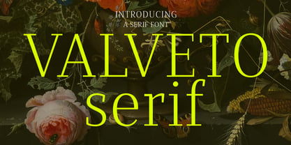 Valveto is a modern display serif. With light and consist serif stroke, fun character with a bit of ligatures and alternates. To give you an extra creative work. Valveto font support multilingual more than 100+ language. This font is good for logo design, Social media, Movie Titles, Books Titles, a short text even a long text letter and good for your secondary text font with sans or serif. Make a stunning work with Valveto font. Cheers, Maulana Creative
 - Akagi Pro by Positype,
$29.00 Akagi Pro is a complete rebuild and expansion of my popular Akagi typeface. Contemporary, clean, simple and friendly continue to serve as the adjectives for an expansion that includes 250+ additional characters per weight, many new ligature options, expanded stylistic alternates, 4 sets of figures, new symbols, case-sensitive punctuation, superscripts, subscripts, ordinals, expanded language support and two new styles that provide even more flexibility within the lighter weights of the family. When I designed Akagi in 2007, I wanted this new sans serif to "smile" at you — with this new expansion, I hope you smile back. Akagi Pro is economical while keeping a distinctive, expressive personality on the page that distinguishes it from among many of the mechanical/rigid/emotionless sans out there without becoming cliché. Perfect for the page and the screen, the flexible weights available allow for pinpoint selection at whatever size. Each style of Akagi Pro has a robust character set made even more functional with expansive OpenType features. A typesetter's dream — case-sensitive punctuation, tabular and proportional variants of lining and oldstyle numerals, true italics, small caps, expansive language support, an alternate 'g' and 'y', highlight a wealth of features of the typeface. This versatility infused within Akagi Pro will allow it to assume both roles of the utilitarian workhorse and light-hearted go-to typeface — and make the user happy.
 - MAREGY by Salamahtype,
$19.00 MAREGY is a modern sans-serif font with an elegant style. This font is perfect for branding projects, logos, social media posts, advertisements, product packaging, wedding invitations, product design, labels, photography, watermarks, stationery, and more.
 - Grammatik by Letterhead Studio-VG,
$15.00 Grammatik was made in the end of 2004. This typeface is clear and simple hybrid between sans and serif styles, which was so popular late 90s. Use Grammatik as a display face for best results.


