10,000 search results
(0.199 seconds)
- Number 515 by Wooden Type Fonts,
$20.00 A display style, with protuding bulb round ends at the serifs and mid-points, very bold, lower case originally not designed.
 - TeoriaMF by Masterfont,
$59.00 A practical font family with 4 weights for all your needs: headlines, body text, signage etc. High legibility at small sizes.
 - Craska by Device,
$39.00 A bold and arresting geometric font built from parallel stripes. Most effective in short headings or logos at larger, display sizes.
 - Hollywood MF by Masterfont,
$59.00 High legibility at small sizes. An extended sans serif typeface with rounded endings that provides unique softness appearance without losing legibility.
 - Plain Script by ParaType,
$25.00Designed at ParaType in 1995 by Tagir Safayev. Based on informal handwriting (caps-only). For use in advertising and display typography. - Fertigo Pro Script by exljbris,
$19.95 Fertigo Pro Script. Fine connected type with a lyrical calligraphic touch. Don't forget to have a look at the regular version.
 - Stranger Blue by PizzaDude.dk,
$15.00 Stranger Blue is a soft-edged and playful comic font with bouncy ligatures. Multilingual support and legible at even small sizes
 - Tonys Trees by Komet & Flicker,
$10.00 Tony’s Trees was inspired by the handmade signs down at the local Christmas tree lot. A fun-forest of typographic possibilities!
 - Irina by ParaType,
$25.00 Designed at ParaType in 1995 by Tagir Safayev. Based on informal handwriting (caps-only). For use in advertising and display typography.
 - Parisine Std by Typofonderie,
$59.00 Ultra legible forceful sanserif in 32 fonts Parisine was born as official parisian métro signage typeface. This family of typefaces has become over years one of the symbols of Paris the Johnston for the London Underground or the Helvetica for the New York Subway. The Parisine was created to accompany travelers in their daily use: ultra-readable, friendly, human while the context is a priori hostile. Meanwhile, Parisine is now a workhorse and economical sanserif font family, highly legible, who can be considered as a more human alternative to the industrial-mechanical Din typeface family. More human, but not fancy: No strange “swashy” f, or cursive v, w etc. on the italics, to keep certain expected regularity, important for information design, signages, and any subjects where legibility, sobriety came first. Born as signage typeface family, the various widths and weights permit a wider range of applications. In editorial projects, the Compress version will enhances your headlines, banners, allowing ultra large settings on pages. The Narrow version will be useful as direct compagnon mixed to standard width version when the space is limited. The various Parisine typeface subfamilies Parisine is organised in various widths and subsets, from the original family Parisine, Parisine Gris featuring lighter versions of the usual weights and italics, Parisine Clair featuring extra light styles, to Parisine Sombre with his darker and extremly black weights as we can seen in Frutiger Black or Antique Olive Nord. Many years of adjustments were necessary to refine this complex family. Initially, Parisine was designed by Jean François Porchez in 1996 for Ratp to solely fulfil the unique needs of signage legibility. Parisine remain the official corporate typeface of the public transport in Paris, the worldwide capital for tourism, and now integral part of the French touch. Directly related, Parisine Office was initially created for Ratp’s internal and external communication, Parisine Office is available at Typofonderie too. Not connected with Ratp and public transports, Parisine Plus was created as an informal version of Parisine. Parisine: Introducing narrow and compressed families About Parisine Parisine helps Parisians catch the right bus Observateur du design star of 2007
 - ITC Modern No. 216 by ITC,
$40.99 Modern typefaces refer to designs that bear similarities to Bodoni and other Didone faces, which were first created during the late 1700s. Ed Benguiat developed ITC Modern No. 216 in 1982 for the International Typeface Corporation (ITC). Showing a high degree of contrast between thick and thin strokes, as well as a large x-height, this revival is more suited to advertising display purposes than the setting of long running text, or books. Many traits in Benguiat's design are worth further notice. The thick stems of the roman weights have a very stately, solid presence. Their thin serifs have been finely grafted on, a masterful solution to the challenge of bracketing presented by Modernist designs. The italic weights have a very flowing, script-like feel to them, and the letters take the form of true italics, not obliques. The ITC Modern No. 216 family contains the following font styles: Light, Light Italic, Medium, Medium Italic, Bold, Bold Italic, Heavy, and Heavy Italic.
 - 914-SOLID - Personal use only

- Hedgehock by Dirtyline Studio,
$19.00 Hedgehock Script Inspired by Sign painting style and combination with Hand Lettering style. I'm made with personality touch every single curve. I hope this can make inspire you from your work. and a very bouncy baseline It has a perfectly paired complimentary marker font , and a super handy set of bonus Swash. Ideal for logos, handwritten quotes, product packaging, header, poster, merchandise, social media & greeting cards. Opentype Feature Stylistic Alternate Alternative Character Ligature Swash Extended Latin Pro
 - Appetizer by Cititype,
$14.00 'Appetizer' is a casual marker font, this font is suitable for a variety of purposes, it is great for logos, craft, prints, text headers, web banners, writing quotes as well as for video editing, animation and other visual presentations. This font is equipped with ligatures and is supported by multi languages, making it worthy of your bringing to any part of the world. Fall in love with its incredibly versatile style and use it to create spectacular designs!
 - Côte by TEKNIKE,
$45.00 Côte is a display monospace handwriting font. The typeface is a distinct hand drawn font using a felt marker. The Côte name is derived from the French word meaning "coast" and is also used to describe winemaking vineyards and regions throughout France. One of the most popular regions in the south of France is the French Riviera also known as the Côte d'Azur. Côte is great for display work, invitations, writing, architecture, posters, wine labels and headings.
 - Freehand 471 by ParaType,
$30.00 Freehand 471 is the Bitstream version of Cascade Script by Matthew Carter. Released by Mergenthaler Linotype in 1965, this design is based on an earlier type by the Ludlow foundry. It's a dark, disconnected script with angular forms. It seems written by heavy marker and thus suitable for informal posters and signage and for advertising and display typography as well. Central European, Cyrillic, and Greek Monotonic characters were designed by Oleg Karpinsky. Released by ParaType in 2011.
 - Yacqui by Jonahfonts,
$45.00 In designing a font that had a Mayan or Aztec quality to it without the usual "Mariachi" look, I decided to make it single weight with some open ends and offbeat rounded serifs to give it a more serious feel which will lend itself to other non ethnic uses. I have added a few discretionary ligatures, which also contain old-style numerals, titling caps and small caps. Usage recommendations: Captions, packaging, cards, posters, ads, book jackets, manuals, and menus.
 - Aesop by Fine Fonts,
$29.00 Aesop was developed from some book jacket lettering drawn by Michael Harvey for an edition of Aesop’s Fables by a master Japanese Artist. It is based upon a pen-drawn script, and is characterised by a lively sense of movement and grace. Aesop Plus, being an OpenType font, contains many alternative characters and additional ligatures which can be automatically substituted to enhance the liveliness of set text, where the application in which it is used, permits.
 - Hai California by Colllab Studio,
$15.00 Meet Hai California, a handwritten font with a fancy script and a small-caps companion, this passionate pair of hand-drawn marker fonts is for logos + branding ,website design + website accents - think travel blogs, fashion blogs, & more, Clean print design, like magazines + flyers, header elements that need handwritten touch, quote graphics for social media. Hai California comes with stylistic alternate, ligatures, swashes, and multilingual support. Follow us for more great fonts. A Million Thanks Colllab Studio
 - Downward Fall by Hanoded,
$15.00 Downward Fall owes its name to one of my favorite Opeth songs, called The Funeral Portrait. The song itself is an uptempo metal composition with rather dark lyrics. This peculiar combination, a mix of good and evil if you will, is what characterizes Downward Fall font: the brushwork is quick, giving the impression of speed. The undertone is darker, scarier - lots of jaggedness and decay. Downward Fall font comes with a 20.000 foot drop of diacritics.
 - Kumo Sans by EchadType,
$10.00 Kumo Sans is a clear and comprehensible font stylized to mimic marker pen handwriting. The idea was to interpret swift and negligent hand movement in a distinct and easy to read familiar glyph silhouette. Family comes in three weights and italic slant option. Shadow version with outline and shadow effect is perfect for short catchy phrases, brand names and headlines use. Font contains Latin diacritics, Hebrew cursive writing, Bitcoin, Indian Rupee, New Israeli Shekel symbols, fractions etc.
 - Salmonillo by Maulana Creative,
$10.00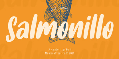 Salmonillo is a Cartoon-is natural handwritten feel font. With marker stroke, slanted and fun character with a bit of ligatures. To give you an extra creative work. Salmonillo font support multilingual more than 100+ language. This font is good for logo design, Social media, Movie Titles, Books Titles, a short text even a long text letter and good for your secondary text font with sans or serif. Make a stunning work with Salmonillo font. Cheers, MaulanaCreative
 - Monotype Gallia by Monotype,
$29.99Monotype Gallia's design was initially developed by Wadsworth A. Parker for the American Type Founders (ATF) in 1927. Monotype released its own version in 1928. Its style is embodied with the spirit of the American Art Deco age and the Roaring 20s. It makes a superb headline selection, and has also been used effectively for packaging as well. Also try the typeface on signage, menus, invitations, or stationary. If you like Monotype Gallia, check out Monotype Broadway, too! - Bumbees by Maulana Creative,
$11.00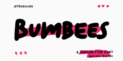 Bumbees is a casual marker handwritten font. With medium stroke, fun character with a bit of ligatures and alternates. To give you an extra creative work. Bumbees font support multilingual more than 100+ language. This font is good for logo design, Social media, Movie Titles, Books Titles, a short text even a long text letter and good for your secondary text font with sans or serif. Make a stunning work with Bumbees font. Cheers, Maulana Creative
 - Destinys by Maulana Creative,
$14.00 Destinys Script and Sans Font Duo is a modern script and display sans font. With regular marker stroke and bold sans stroke, fun character with some of ligatures. To give you an extra creative work. Destinys Script and Sans font support multilingual more than 100+ language. This font is good for logo design, Social media, Movie Titles, Books Titles, a short text even a long text. Make a stunning work with Destinys Script and Sans font. Cheers, MaulanaCreative
 - SCR-N by URW Type Foundry,
$39.99 SCR fonts are screen optimized (also called 'pixel fonts'). Unlike standard fonts (and like the few well-hinted fonts like Verdana or Arial), they give a crisp look on screen at very small sizes, thus increasing legibility. The perfect applications for those fonts are web pages and software user interfaces (computer, cellular phones, console games and any other system that uses a screen interface). Unlike most pixel fonts, SCR fonts contain kerning information. Kerning is the adjustment of space between certain pairs of characters (like 'AV') to make text look more fluid, thus increasing legibility and appeal. To benefit from this feature, auto-kerning must be activated in the application. In Photoshop, kerning must be set to 'Metrics'. Although SCR fonts are optimized for screen, they can be used for print (in Illustrator or Indesign for example) for a decorative 'computer text' effect. In this case, there is no constraint: they can be used as any other font. For screen use (in Photoshop, Fireworks, Flash... ), they have to keep aligned with the screen pixel grid not to look blurred or distorted. To achieve this, here are the guidelines to follow: RESOLUTION If the application permits it (Photoshop, Fireworks), document resolution must be set to 72 pixels per inch. SIZE The font size must be set to 10 (or multiples of 10) points. POSITIONING & ALIGNMENT The reference points of text fields and text blocks (upper left corner for left aligned text, upper right for right aligned text) must be positioned at integer values of pixels. In Photoshop, text can be precisely moved with [Edit Free Transform]. In Flash, movie clips containing text fields must also be positioned at integer values on the stage. Text must be aligned to the left or right only. Center alignment can be simulated with left alignment by adding spaces at the begin of each line. To dispense with the positioning and alignment constraints, text anti-aliasing can be turned off if the application permits it (Photoshop, Flash MX 2004). OTHER SETTINGS Leading (line spacing), tracking (letter spacing), manual kerning and baseline shift must be set either to integer values of points or to multiples of 100 units (depending on the application). Vertical and horizontal scaling must be set to 100%. Faux bold or Faux italic must not be used. The document must neither be resized on export, nor allow resizing (Flash Movies).
 - SCR-I by URW Type Foundry,
$39.99 SCR fonts are screen optimized (also called 'pixel fonts'). Unlike standard fonts (and like the few well-hinted fonts like Verdana or Arial), they give a crisp look on screen at very small sizes, thus increasing legibility. The perfect applications for those fonts are web pages and software user interfaces (computer, cellular phones, console games and any other system that uses a screen interface). Unlike most pixel fonts, SCR fonts contain kerning information. Kerning is the adjustment of space between certain pairs of characters (like 'AV') to make text look more fluid, thus increasing legibility and appeal. To benefit from this feature, auto-kerning must be activated in the application. In Photoshop, kerning must be set to 'Metrics'. Although SCR fonts are optimized for screen, they can be used for print (in Illustrator or Indesign for example) for a decorative 'computer text' effect. In this case, there is no constraint: they can be used as any other font. For screen use (in Photoshop, Fireworks, Flash... ), they have to keep aligned with the screen pixel grid not to look blurred or distorted. To achieve this, here are the guidelines to follow: RESOLUTION If the application permits it (Photoshop, Fireworks), document resolution must be set to 72 pixels per inch. SIZE The font size must be set to 10 (or multiples of 10) points. POSITIONING & ALIGNMENT The reference points of text fields and text blocks (upper left corner for left aligned text, upper right for right aligned text) must be positioned at integer values of pixels. In Photoshop, text can be precisely moved with [Edit Free Transform]. In Flash, movie clips containing text fields must also be positioned at integer values on the stage. Text must be aligned to the left or right only. Center alignment can be simulated with left alignment by adding spaces at the begin of each line. To dispense with the positioning and alignment constraints, text anti-aliasing can be turned off if the application permits it (Photoshop, Flash MX 2004). OTHER SETTINGS Leading (line spacing), tracking (letter spacing), manual kerning and baseline shift must be set either to integer values of points or to multiples of 100 units (depending on the application). Vertical and horizontal scaling must be set to 100%. Faux bold or Faux italic must not be used. The document must neither be resized on export, nor allow resizing (Flash Movies).
 - Andron MC by SIAS,
$99.00 The font series Andron MC introduces a new feature to the repertoire of the Andron family: middlecase glyphs (intermediate between upper- and lowercase) – and uncial letters. Middlecase glyphs reach a medium height compared to full caps height and lowercase x-height. However, ‘uncial’ means the historic transitional lettershapes of the medieval ages which have gained no status in the bicameral typographic system of modern times. In all three of the Andron MC fonts middlecase (“MC”) glyphs dwell on the lowercase positions. These are coined in uncial fashion in the MC Uncial and MC Medieval fonts but appear as capital glyphs in MC Capital. The same variation occurs with the uppercase positions: whereas standard Roman/capital glyphs are there in MC Uncial and MC Capital, MC Medieval features uncial majuscules here instead. At the end that makes three different combinations of uncial and capital sorts. These fonts can be used for a great variety of purposes. The uncial sets are particularly well-suited for any typographic matter related to the middle ages. MC Capital is a worthwhile alternative choice when titling is to be possibly set in CAPITALS or Small caps. Andron MC adds a fascinating new aspect to the classical Andron fonts family. It enhances again the unique scope of typographical possibilities Andron is praised for since quite some time now. All three Andron MC fonts support full Latin, Greek (monotonic), Coptic and Gothic character ranges. Each font contains about 1000 glyphs.
 - Covent BT by Bitstream,
$50.99Designed by Jochen Hasinger of Frankfurt, Germany, Covent BT is an unconventional geometric sans serif typeface, featuring rounded terminal ends and a stencil-like break of the contour in some glyphs. At first glance you might think of it as a display typeface, but the generous x-height and openness of the lowercase makes Covent BT very legible at text sizes. Central Europe and Cyrillic is supported in the extended glyph set. Each weight contains 485 glyphs and includes some alternate figures, some upper and lowercase alternates, as well as others, all accessible via OpenType features. Covent BT Symbols is a stylized geometric symbol font, intended to stand alone or used as a companion to the Covent BT typefaces. The array of glyphs covers many of the more popular icons of the day including symbols for web use, numbers, sports, travel and astrology, to name a few, each with its own unique stylized interpretation. - Aragon by Canada Type,
$24.95 Re-introducing the classic mid-1500s Garamond forms for the twenty-first century is never an easy task. But Hans van Maanen makes a fine attempt at just that by remodeling the traditional shapes through a modern lens with stunning results. Aragon is a workhorse family that performs very well in a variety of text sizes, from footnotes and legal copy to lengthy body sets. Its combination of wedge serifs with uniquely tapered stems offers a sturdy Dutch touch that improves legibility altogether, while at the same time the slight stress shift to the top half of the characters makes the immersive reading experience very open and comfortable. The Aragon family comes in a standard two-weight set with corresponding italics, a roman small caps font with its own italics, and very attractive initials for display uses. All fonts come in the usual popular formats, and include a glyph repertoire that covers Western, Central and Eastern European languages, as well as Turkish and Welsh/Celtic.
 - June by Schriftlabor,
$26.99 June is a contemporary neo-grotesque sans-serif typeface designed to be highly legible, readable, and usable. The clarity and mathematics were inspired by the research into type form by Adrian Frutiger. June was designed by developing a modern and unique approach to his findings. June's legible features include a near uniform stroke width, open apertures and counters, angular cut stems, and a large x-height. Italics are angled at eight degrees and have been redesigned to provide a stylistic difference without reducing legibility. June comes in seven weights, from Thin to Bold, each equipped with OpenType features. June can be used for all print sizes, and has characteristics that are more visible at larger sizes. June was inspired by a close family member of the designer. A part of all sales will be donated to Alzheimer's Society. Free Variable Font: If you buy the full family, you will also receive the Variable Font version of June, without extra charge.
 - Algarabia by Macizo.com.mx,
$30.00 • Algarabía "Joy" is a provocative and multilingual text face designed by Leonardo Vázquez. • It was created for a mexican magazine with the same name that uses it as the body text font, and now it's released for the public. • In 1397, Frederic Goudy's was asked to draw a face for the exclusive use of the University of California Press at Berkeley. The font was called California. In 1983 a digital version of this typeface was created by Aaron Burns and it was called ITC Berkeley. • Algarabía is inspired by ITC Berkeley, it keeps the calligraphic touch and weight, but it presents certain features in its design that might result unexpected, yet at the same time they are invisible when used as body text and provides the typeface its unique own personality. • Small Caps and Small caps italic, Included in each version. • Ideal for magazines, Art books or any editorial purposes where legibility and originality are needed.
 - P22 Wedge by IHOF,
$24.95 Wedge’ is the outcome of a search for the essence of a formal alphabet for text — for 26 letters of the simplest form consistent with ease of reading.. Noted New Zealand architect Bruce Rotherham (1926–2004) was inspired by Herbert Bayer’s ‘universal alphabet’ created at the Bauhaus in 1927. While he admired Bayer’s pure geometry, Rotherham felt it was ‘virtually unreadable’. The Bauhaus-inspired inclination for architectural publications to use sans serif faces provoked Rotherham to consider how a readable Roman book face might be approached using some of Bayer’s same principles of simplification, but also retracing the evolution and use of the Roman form in an analytic manner. The Wedge alphabet was started in 1947 when Rotherham was an architecture student at the University of Auckland. It was worked on and refined over several decades but never commercially released, until now. Over sixty years after it was first conceived, Wedge is available from P22.
 - Brighten by Eurotypo,
$22.00 Brighten is the new family font composed of Brighten Regular and Regular Italic, Brighten Round and Round Italic. With the total number of 606 glyphs, Brighten is the perfect blend of elegant and casual. Brighten is equipped with plenty of OpenType features. Uppercase letters can alternate between at least two or three different forms and lowercase letters have leastways four choices more to avoid repetition. These effects include start and end forms of lowercase letters, which are automatically substituted in at beginnings or ends of words. To activate the optional glyphs, you may click on Swash, Contextual, Standard Ligatures, Stylistic or Discretionary Ligatures buttons in any OpenType savvy program or manually choose the characters from Glyph Palette. Also, there’s some ornaments designed to support the font (access the ornaments through the Glyph Palette). The Brighten family font might be the choice to use on creating headlines, logos & posters for branding and packaging purposes.
 - India Snake Pixel Labyrinth Game by TypoGraphicDesign,
$19.00 CONCEPT/CHARACTERISTICS The curly, pixelated, edgy and futuristic character, gives the typeface a high recognition value and uniqueness. APPLICATION AREA The fancy, videogame like, vintage and sci-fi font „india snake pixel labyrinth game“ would look good at logos, display size for poster, flyer, comics and graphic novel lettering, headlines in magazines or websites, packaging, music covers or webbanner etc. TECHNICAL SPECIFICATIONS Headline Font | Display Font | Sci-Fi Font „india snake pixel labyrinth game“ OpenType Font with & 275 glyphs & 4 styles (regular, bold, light & 3d). Alternative letters, symbols and ligatures (with accents & €) KONZEPT/BESONDERHEITEN Der ausgefallene, videospielartige, retro und futuristische Charakter, geben der Schrift eine hohe Wiedererkennung und eine gewisse Einzigartigkeit.
 - Evergreen by Sudtipos,
$39.00 Evergreen is Koziupa and Paul going all Zeitgeist after a few Malbec drinks. Two fonts praise nature from when the lights go out to the crack of dawn, and vice versa. That's 24/7/365 of wild leafy Kumbaya. Even butterflies and flowers were mystified so much they had to get in there. Evergreen is local, organic, and certified free trade. At some point we wrote down the name of the jungle where it originated, then lost the parchment in the hot springs a few hours later. But that's immaterial. Crank up your Deep Forest sound, prep your Earthtone and Foliage palettes, and get into the big herbal.
 - Memoire by Reserves,
$49.00 Memoire is an elegant linear hairline contemporary sans. It is based on the underlying form of Vanitas, yet is rendered in a nearly monolinear hairline weight. Memoire is intended to be used selectively for headline use starting at 60pt and above. Stylistically, Memoire retains Vanitas’ alluring, sophisticated sensibility that is directly inspired by high fashion. The delicate linear form creates a sense of cohesiveness and lends the typeface an intriguing lightness of character. The upright styles are complimented by a pairing of optically adjusted true italics, which were purposefully adapted to retain the sharpness of their counterparts. Abandoning traditionally executed cursive italic letterforms retains Memoire’s sharp characteristic through each style.
 - HS Hadeel by Hiba Studio,
$50.00 HS Hadeel is a versatile display typeface designed for use in titles and graphic projects that require both Arabic, Persian and English characters. It draws inspiration from the modern kufi style and boasts a unique blend of sharp and curved lines that lend a beautiful and geometric structure to each character. The sharp endings at the bottom of each character add an additional aesthetic touch. With five weights available, ranging from Light to Black, HS Hadeel offers a diverse range of options for designers seeking to elevate their Arabic typography. Overall, HS Hadeel is a great choice for those seeking a visually striking and flexible typeface for their projects.
 - Holografik by Valley Type,
$17.00 Holografik is a Neo-Grotesk sans serif font inspired by scientific progress, existential wonder, and social oneness. With its wide structure and light airy weights, Holografik is an optimistic take on a Grotesk font. The stark Swiss style of the characters is softened with playful curved details, such as a bowed descender in the lowercase y, connected descenders in the alt lowercase g and y, and the curved bottom serif in the alt uppercase B and D. Featuring three weights and italics, it is ideal for use at larger scales like headlines, packaging, editorial, branding, and posters. Includes punctuation, glyphs, diacritics, numerals, icons, and multilingual support.
 - Roberts Script by Roland Hüse Design,
$28.00 Robert's Script is a fresh brush calligraphy typeface with a smooth flow. The Family consists of two weights, Light and Regular. Its stylistic character is based on an elegant brush style. It can be used in various forms of communications. It contains OpenType Features such as Stylistic Alternates, Contextual Alternates, Standard Ligatures, Terminal Forms, Old Style Figures for numbers and Fractions. All European latin languages are covered with diacritics and special characters. For more details on the features and how to make the most out of this font, please refer to the OpenType guide at https://drive.google.com/file/d/1exEp9VcLM1rmrF9ptO2OWlQKKA-uyb4r/view?usp=sharing Cheers & Enjoy!
