10,000 search results
(0.026 seconds)
- Funky Shed by PizzaDude.dk,
$20.00OMG it's the funky shed! The height and width of each character vary to make it look jumpy. At the same time, Funky Shed, has got a crunchy line which makes it even more funky to look at! - Cheesegum by PizzaDude.dk,
$20.00 Cheesegum is super legible even at very small sizes. If you use Cheesegum at larger sizes, you can see the delightful crucnhy edges! Kinda like roasted cheese! The crunchier, the lovelier! :) Just go ahead and eat some Cheesegum!!!
 - somalove - Personal use only

- Nikita by Autographis,
$39.50Nikita is a very lively upright script with lots of 1950s flair. - Dear Sarah Pro by Betatype,
$119.00 Carefully considered letters written long-hand, sealed in an envelope and sent across continents were once the only connection for distant friends and lovers. Dear Sarah is a type that evokes the emotion of those handwritten messages. Using alternates, ligatures and a complex system for randomization and natural connected characters, Dear Sarah seeks to push the boundaries of digital type. The guiding question that drove the design of Dear Sarah was whether it was possible to create a natural looking script that worked well in running text. Hand-written types often work for two or three words, but as soon you you look at them in a paragraph, their unnatural textures make them feel contrived. As one of the first serious types to explore OpenType for a connected script, Dear Sarah uses a unique system to create natural connections. Often script types rely on one connecting point to make sure that all their characters fit together properly. Characters that naturally connect much higher, such as the ‘o’ or ‘v’ are distorted to connect at the same point as an ‘a’ or a ‘c’. Dear Sarah uses multiple sets of lower-case characters to connect at multiple points, creating a much more natural looking script. OpenType is also used to create variety, by using randomization techniques to insert disconnected characters as well as alternates, ligatures, swashes and ink blots to create a natural rhythm across multiple lines.
 - Crescendo by Canada Type,
$29.95 A year after the tremendous success of Memoriam in the "Lives They Lived" issue of the New York Times magazine at the end of 2008, Patrick Griffin and Nancy Harris Rouemy teamed up once more to tackle the same project for the 2009 issue. This time the magazine's design concept revolved around a typeface they created specifically for custom vertical malleability, and that can play just as well in single- or multi-color environments. The result was another iconic commemorative issue that shows exotic tri-line letters merging, swashing, extending and flourishing in stunning gold, silver and blue on black on the cover, and in black on white on the inside pages. Just like in the previous year, the issue won multiple publication design and typography awards. Crescendo is that typeface, finally issued for retail by public demand. Just turn your setting into outlines in your favorite vector program, grab single strands and extend away, and do your best alternating colours between strands. Crescendo comes with a limited punctuation set, but accented characters for Western Latin languages are included, and there many, many alternates and ligatures in there as well. This typeface is best used in large display sizes.
 - Marujo by PintassilgoPrints,
$15.00 Marujo is a highly decorative typeface inspired by painted pieces of Arthur Bispo do Rosário, a striking Brazilian artist who lived for 50 years in a psychiatric institution. Besides its spirited Regular and Light cuts, Marujo family brings nifty eye-catching variations adorned with dots and stripes. It also brings complementary fonts to spice things up even more: there are 2 shadow options and yet a picture font packed with doodles, mostly on nautical subjects (which are strongly present on Bispo do Rosário, a former seaman apprentice.) Bispo do Rosário's works employs a multitude of materials and are often very intricate. Words are everywhere, painted or embroidered at most. He produced a vast amount of works, and is now - posthumously - widely recognized in Brazilian art scene. The psychiatric institution in which he lived is now a museum dedicated exclusively to his work. Marujo draws inspiration not only from Bispo's works, but also from this man's potency, a persistent man who produced amazing art locked in such a tough environment for a life-long. Marujo fonts are positively adventurous and will safely navigate through a sea of feelings, reaching free spirits everywhere. To navigate is precise...
 - Ultrasonik - Unknown license

- Cotton Mather by Intellecta Design,
$22.90 Blackletter at rough style, perfect to fancy jobs
 - Nadall by Solotype,
$19.95This stylish lightface was designed by Bernd Nadall for Barnhart Bros. & Spindler as a caps-only font in 1895. The lowercase was added at Solotype a hundred years later, resulting in a font quite at home in modern advertising. - RM New Albion by Ray Meadows,
$19.00 A classic blackletter Which looks best at 16pt and above. Due to the modular nature of this design there may be a slight lack of smoothness to the curves at very large point sizes (around 100 pt and above).
 - Hypatia by Adobe,
$35.00Hypatia Sans is a geometric sans serif with humanist undertones. Its rich features and wide range of weights make this family both versatile and expressive at larger sizes yet still clear and readable at text sizes in short paragraphs. - Sammy Boy by Hanoded,
$20.00 Sammy Boy is sweet and cuddly when he wants to, but also loud and boisterous. Sammy Boy keeps you awake at night, but smiles at you in the morning. Sammy Boy can speak most languages. Sammy Boy is amazing.
 - Bisco Condensed by Galapagos,
$39.00Bisco Condensed is a small capital design inspired by hand lettered memorial wall art from the Harlem section of New York City. As a memorial, this design is dedicated to a type design colleague who lost his long battle with cancer. This font is a tribute to his strength and his liveliness. The original idea for Bisco Condensed was to capture the energy of those unique "streetforms" in a text/display design and encapsulate them into a lively & fluid type design with a high level of readability at all point sizes. Bisco Condensed is an excellent type for expressive display layouts. It works well as an independent design or a long with contemporary sans serifs that complement Bisco's irregular contours, weighting and bounce. - Nyfors by Linotype,
$29.99Nyfors was a sudden idea. I noticed an ad in a magazine, with some handtexted words. I don't recall what the ad was about, neither the words. When I later on tried to remember how the single characters looked like and began to draw them, the result wasn't bad at all. I am not longer sure that they resemble the characters in the ad, but it doesn't matter. Nyfors is a nice handtexted typeface, whatever its origin. There is a small stream in Tyresö where I live and work, called Nyfors. During some centuries there was a center of small scale industries along it, and they used its water to run their machinery. The typeface has its name from that stream. Nyfors was released in 1995. - Eutaw Stencil JNL by Jeff Levine,
$29.00 A hand lettered emulation of a Roman stencil type face on the cover of the folio for the Stenso School Set was the basis for Eutaw Stencil JNL, which is available in both regular and oblique versions. The Stenso School Set (circa 1940-41) was comprised of three stencils – two lettering guides and a map of the [then] 48 United States. Developed and patented by Baltimore school teacher Ruth Libauer Hormats, her stencils were the first to offer a system for accurate letter spacing and ease of use. “Eutaw” (as part of the font’s name) is taken from Eutaw Place, the street where Ruth and her husband lived at the time of Stenso’s inception. To the Cherokee, the name means “Creek Indian”.
 - Nucliometer by Supremat,
$12.00 Nucleometer is a very contrasting and at the same time elegant display font. It is ideal for large headlines and impressionable typography. A feature of the Nucleometer is the rounding of the lowercase letters a, b and r, as well as a funny "tail" in the letters t, g, j, f, t, y. This gives it a more lively and unique character. Another interesting feature is the increased proportion of the ascender height of Ultra Condensed, which is larger than the usual Bold font. Together, this font is ideal for a designer who needs stylish and very contrasting typography in his work. Nucliometer is available in 5 styles, starting from Bold to Bold UltraCondensed and also has a variable format.
 - Chaparral by Adobe,
$35.00Chaparral is the work of type designer Carol Twombly and combines the legibility of slab serif designs popularized in the 19th century with the grace of 16th century roman book lettering. The result is a versatile, hybrid slab-serif design. Unlike ""geometric"" slab serif designs, Chaparral has varying letter proportions that give it an accessible and friendly appearance in all weights from light to bold. And because it is a multiple master typeface with an optical axis (ranging from 7 to 72 points), Chaparral is clear and legible in smaller text settings while remaining subtle and lively at display sizes. Chaparral�s highly functional design is surprisingly beautiful, the perfect choice for correspondence, as well as book, poster and newsletter design. - Mira by HiH,
$10.00 Mira is a playful, decorative Art Nouveau font, released by Roos & Jung Foundry in Offenbach AM, Germany about 1902. The exaggerated serifs and the sharp contrast between the thick and thin strokes gives the page a whimsical “salt and pepper” look that is very distinctive. Mira uses our new encoding. The Euro symbol has been moved to position 128 and the Zcaron/zcaron have been added at positions 142/158 respectively. Otherwise, MIRA has our usual idiosyncratic glyph selection, with the German ch/ck instead of braces, Western European accented letters, lower case “o” and “u” with Hungarian umlaut and our usual Hand-in-Hand symbol. In addition, black-letter-style upper case “H” and “T” characters are included. Download the PDF Type Specimen for locations.
 - Mariam by Linotype,
$187.99Mariam is a traditional-style Arabic headline face designed by the famous Arabic type designer Ismet Chanbour, who also designed Al Harf Al Jadid - another highly successful typeface from Linotype. Mariam is characterised by certain design features which contribute to its stylistically lively, yet graceful appearance: downward-pointing tails combining with the swinging finial strokes of certain characters, and the various cut-away" effects. This headline face successfully offers a wide range of applications, from very large, bold poster-size work to use at 18 point for emphasis in text work. Available as in the OpenType format, Miriam incorporates the Arabic codepage (CP 1256), and supports Arabic and Persian. It also includes both tabular Arabic and Persian numerals, as well as Latin figures and complete punctuation." - Castle On The Hill by Hanoded,
$15.00 When I started working on this font, I had the radio on. Ed Sheeran was singing his song ‘Castle On The Hill’ and when I looked at this new font of mine, I couldn’t help but notice it had a bit of a medieval look. So I named it Castle On The Hill. COTH is a very lively, messy handpainted serif. It was made with a Japanese brush pen. I actually had a different look in mind, but this is what came out of the pen and I quite liked its looks. It is especially useful for children’s book covers, apps and posters, but be my guest and use it as you like. All it needs is a designers’ touch, a nice tune and a sunset.
 - Route Du Soleil by Hanoded,
$15.00 Probably everyone living in Europe has heard of the (in)famous Route Du Soleil. The Route Du Soleil (Motorway Of The Sun) is a stretch of road from Paris to Lyon (in the south). It is THE route holiday makers take to reach southern France, so they can get there before everyone else does. The result: endless traffic jams, overheated engines and people and more toxic exhaust fumes than your average petroleum distillery. Route Du Soleil is also a very nice hand written font that comes with swashes and ligatures. If you happen to find yourself in a traffic jam on your way to southern France, then I hope you have downloaded this font. Just one look at it and you’ll forget your problems! ;-)
 - Analogia by George Tulloch,
$21.00 Analogia is a digital interpretation of types used in the mid-18th century in books printed at Leuven by Martin van Overbeke. It is intended primarily for use in running text. The roman is businesslike, yet with a distinct personality; it has a generous x-height and is slightly condensed, though without appearing cramped. It is complemented by a more lively italic, which retains some irregularities in the angle of slant that are characteristic of the original. Analogia provides wide support for west, central, and east European languages that use the roman alphabet. Among its OpenType features are ligatures, small caps, several sets of numerals, contextual alternates, intelligent implementation of long ‘s’, and fractions. For more detail, please see the pdf available in the Gallery.
 - Geogrotesque Stencil by Emtype Foundry,
$69.00 Geogrotesque Stencil is a member of the popular Geogrotesque family, and despite being thought as a display typeface, it goes one step further and tries to solve some of the typical problems with stencils fonts. Geogrotesque Stencil comes with 3 widths of cut (A, B and C). These cuts not only allow a better performance when printing at different sizes, you can also move across versions A, B or C in accordance to the rigidity of the material used. The family consists of 42 styles, 7 weights with 3 versions each plus italics, all of them in Open Type format including ligatures, tabular figures, fractions, numerators, denominators, superiors and inferiors with support for Central and Eastern European languages. For more details see the PDF.
 - Newspeak by Barnbrook Fonts,
$30.00 Newspeak is a display typeface based upon Soviet architectural forms from the Stalinist period (spanning the 1930s—'50s). Stalinist architecture is now considered unsightly and without aesthetic merit, yet it has a strange beauty, hinting at an unrealised utopia (while its function was to buttress a brutal dictatorship). Inspiration was also drawn from the Cyrillic alphabet which, to kids growing up in Western Europe in the '70s and '80s, was a cipher for an alternative way of living – Cyrillic letterforms represented the exotic, familiarity-twice-removed universe of Eastern Bloc states. When you visited a communist country you were confronted with unfamiliar typography that reinforced your sense of alienation and unease that there existed a real, if imperfect, working alternative to consumerism.
 - New York Line by Kustomtype,
$30.00 When you go traveling you always fall in love with something… At this time, it is the inscription of Holland America Line which is sparkling on ‘New York Hotel’, Rotterdam-Holland. Based on the letters I had at my disposal from the Holland America Line inscription at ‘Hotel New York,’ I started to complete the alphabet in the same style as the original text. Eventually, I digitized everything in order to acquire a usable and modern font to be able to use it for all graphic purposes. The font is ideal for head text, posters, logos, editorial, branding, signage, web applications, modern design, etc... Don't hesitate to use this unique historical font! It will give your work that glamour that you will find in this extraordinary font. Enjoy the New York Line. The Holland America Line was founded in 1873 as the Dutch-America Steamship, a shipping, and passenger line. Because it was headquartered in Rotterdam and provided service to the Americas, it became known as Holland America Line (HAL). From 1901 the iconic building on the Kop van Zuid shines. It previously housed the Holland America Line; now it houses the hotel-restaurant, Hotel New York. A building with a great history. Hotel New York has a beautiful history. Built in 1901, many ships sailing away and opened in 1993 as a hotel and restaurant. The New York Line Font comes with uppercase, lowercase, numerals, punctuations so you can use it to customize all your designs. Perfect for Logos, Letterhead, Poster, Apparel Design, Package design, Label design etc. The New York Line Font is designed by Coert De Decker in 2018 and published by Kustomtype Font Foundry. Enjoy your journey with the New york Line!
 - Waba by Lewis McGuffie Type,
$40.00 Waba Pronounced ‘Vah-bah’, is a font family that I designed. The name comes from a historical variation on the Estonian word ‘vaba’ – meaning ‘free’, or 'at liberty'. Back in 2017 I visited the Estonian Print & Paper Museum in Tartu to see its great collection of type (well worth a visit!). While I was there I saw some big woodcut blocks of Reklameschrift Herold - a super Art Nouveau/Jugendstil style display font. The Print & Paper Museum's collection covers both Latin and Cyrillic faces and as a foreigner in these parts I'm kind of fascinated by the exoticism of Cyrillic. How it is different but the same to the Latin letters I take for granted (as a humble Englander – no excuses). Not to mention, Jugendstil with its imitation of natural form, reverse-weights and looping-delicious curves (like you've left the window open all summer and the garden plants are climbing in). This mix of Jugendstil, Cyrillic letters and the beautiful historical border town of Tartu inspired me to start drawing Waba. Trimming the serifs from Herold, simplifying those angles and expanding the category of weights, then taking look at the magical logic of Berthold Block and doing a few things that just seemed right at the time – Waba is a bit of love letter to Estonia, the Baltics and the visual history of Eastern Europe. Waba Monogram Waba also contains a monogram face, which allows you to create any monogramming latin and cyrillic. Simply type out your 2-3-4 characters in Waba Monogram, making sure Contextual Alternates is turned on them voila! Monograms can be customised manually using the OpenType select-pop-up in Adobe. Also included are a few Discretionary Ligatures for Mc, De, Von etc. Monograms work best when Contextual Alternates is turned on.
 - Withrose by Sakha Design,
$14.00 Withrose is a romantic and elegant handwritten font. Its distinct and well rounded letters make this font a masterpiece. Fall in love with its incredibly versatile style and use it to create spectacular designs! Withrose is PUA encoded which means you can access all of the glyphs and swashes with ease!
 - Amarylli Blossom by Balpirick,
$15.00 Amarylli Blossom is a sweet, soft hand-lettered handwritten font. The playful rounded characters make it the perfect font for creating stunning designs. Fall in love with its authentic feel and use it to create gorgeous wedding invitations, beautiful stationary art, eye-catching social media posts, and cute greeting cards.
 - Cinnamon Swirl by Hanoded,
$15.00 Cinnamon scent: check. Swirls: check. Curls: check. Cinnamon Swirl is a very romantic, very 'sugar-and-spice-and-all-things-nice' kinda font. It would look great on book covers, slumber party posters and postcards. The Swirl comes with some lovely ligatures and stylistic alternates - and a Smörgåsbord of diacritics.
 - AndrijScript Cyrillic by AndrijType,
$36.00 The glyphs of AndrijScript typeface are based on usual calligrapher's handwriting, my own native Cyrillic. This strange mix of freedom and professionalism looks vivid but a bit elegant. In three very different weights it has some ligatures and contextual alternatives for more natural look. All you need is love, you know ;)
 - Angela Cute by Sipanji21,
$16.00 Angela is a Cute and charm script font with a relaxed theme, featuring a lovely style. No matter the topic, but this font is awesome for every kids or child project, this font will be an incredibly asset to your fonts’ library, as it has the potential to elevate any creation.
 - Autopilot by Juncreative,
$19.00 Autopilot is an elegant and flowing handwritten font. It is PUA encoded which means you can access all of the glyphs and swashes with ease! It maintains its classy calligraphic influences while feeling contemporary and fresh. Fall in love with this font and bring your projects to the highest levels!
 - The Songket by Lemonthe,
$13.00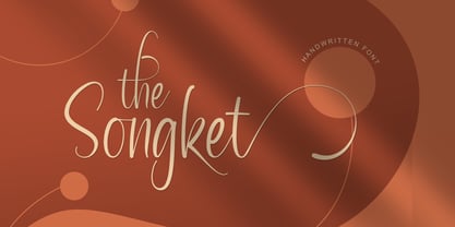 The Songket is a lovely and delicate script font that exudes elegance and class. This font was particularly crafted for those who need a beautiful and refreshing look to their designs. The Songket is PUA encoded which means you can access all of the amazing glyphs and ligatures with ease!
 - Amoure Brides Couple Font by Panatype Studio,
$7.00 Amoure Brides Couple Font is a pairing font between sans serif and handwritten script, These two couple lovely fonts would be perfect to combine in your design. This combination creates an elegant and romantic impression. Suitable for digital invitation, wedding design, fashion design, logo, business cards, branding materials, quotes, etc.
 - Posterizer KG Rounded by Posterizer KG,
$40.00 Posterizer Kg Rounded, is basically rounded version of Egyptian, Slab Serif font Posterizer Kg. By adding rounded corners on serifs, the strict form disappears, in that way, the font gets softer form. Posterizer Kg Rounded is useful for sweet themes like cookies, puppies, love, joy, or some other similar things.
 - Sweet Brittany Script by Letterfreshstudio,
$15.00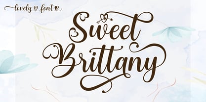 Sweet Brittany Script! Fresh modern lovely font with decorative characters and dancing baseline. So beautiful on invitations such as crafts, greeting cards, branding materials, business cards, quotes, posters and other design concepts. Features: Ligature Style set Basic Latin A-Z and a-z Number International symbols include punctuation fastener Thank you.
 - Camsia by BonjourType,
$12.00 Camsia is a distinct and flowing handwritten font. It is PUA encoded which means you can access all of the glyphs and swashes with ease! It maintains its classy calligraphic influences while feeling contemporary and fresh. Fall in love with this font and bring your projects to the highest levels!
 - Ghostinger by Abo Daniel,
$14.00 introducing GHOSTINGER - luxury signature font - GHOSTINGER is a natural signature font. It is great for branding, packaging, quotes, Signatures, logos, t-shirt designs, tote bag designs, cards, banners, social media, and more. Features: - Uppercase - Lowercase - Numeral - Multilingual Support - Punctuation - Ligatures - PUA encoded I hope you love it. regards, Abo Daniel Studio
 - Masmobius by Afdalul Zikri,
$10.00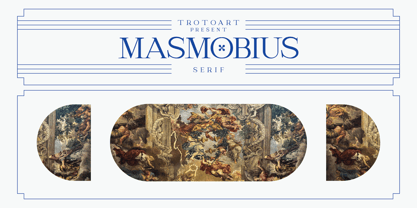 Masmobius is a modern and elegant serif font. Contemporary and fresh, this font is perfect for a wide pool of design ideas. Add it confidently to your projects and you will love the results! Masmobius is PUA encoded which means you can access all the glyphs and ligatures with ease!

