10,000 search results
(0.067 seconds)
- Dwight by Groen Studio,
$25.00 Dwight is a Serif font family, which has a strong and bold character with eight variants, Dwight gives a clear and elegant look to logos, quotes, advertisements and more. Dwight is a versatile typography filled with the character you want, Dwight has standard styles, Stylistic Alternates and ligatures. and includes upper and lower case letters, numbers and punctuation marks. Multilingual support for various languages including: French, German, Spanish, Portuguese, Italian, Dutch, Finnish, Swedish, and more. Dwight works great in any branding, logos, magazines, films. The different weights give you full range to explore a whole host of applications, while the outlined fonts give a real modern feel to any project. OpenType features can be accessed by using OpenType smart programs such as Adobe Photo Shop, Adobe Illustrator, Adobe Indesign, Corel Draw and Microsoft Office. can also be accessed through the character map.
 - Mostyn by Artisan Studio,
$20.00 Description Mostyn Variantions is the font family, Mostyn Variantions is a font family that has 8 variations plus extrude in every variety, it is a model of modern calligraphy typefaces, in combination with a calligraphy writing style. Can be used for various purposes.such as headings, logos, wedding invitation, t-shirt, letterhead, lable, news, posters, badges etc. Multilingual support for various languages including: French, German, Spanish, Portuguese, Italian, Dutch, Finnish, Swedish, and more. Mostyn Variantions works great in any branding, logos, magazines, films. The different weights give you a full range of whole hosts of applications, while the outlined fonts give a real modern feel to any project. OpenType features can be accessed by using OpenType smart programs such as Adobe Photo Shop, Adobe Illustrator, Adobe Indesign, Corel Draw and Microsoft Office. can also be accessed through the character map.
 - Baskuline by Zeenesia Studio,
$15.00 Introducing the new font Baskuline. Baskuline font is a HanwrittenHandbrush handwriting on paper with a coarse type brush, to produce a consistent texture. Baskuline also has ligature which is very suitable if you don't really like lowercase letters and want to change some letters with available ligature letters. and available lowercase alternatives that you can change according to your taste. Baskuline suitable for various projects such as stationery invitations, social media, logos, weddings, branding, graphic design with the addition of several binders and swashes. and can be combined with various types of serif fonts to perfect the project you want to work on. We hope you enjoy the font, please feel free to comment if you have any thoughts or feedback. Or simply send me a PM or email me at zeenesia@gmail.com. Thanks for purchasing and have fun!
 - White Rainbow by Wyarecreatype,
$13.00 Please welcome, White Rainbow. Fun and casual vintage retro decorative font. The definition of real versatility and flexibility. You can rock on both vibes, retro and modern by using a single font. Yes, just like your favourite day-to-day sneakers. Wide variety of Stylistic Alternates and Ligatures in every single letter to elevate your design game to the next level. Cut the process more because it should be easy. Perfectly fit for the visual project such as logo, branding, poster, food and beverages, social media content, website, UI/UX design, youtube thumbnail, CV, mood board, wedding, you name it. FEATURES Uppercase and Lowercase letters ligature and alternates feature Numbering and Punctuations Multilingual Works on PC or Mac Simple Installation Support Adobe Illustrator, Adobe Photoshop, Adobe InDesign, also works on Microsoft Word Hope you Like it. Thanks. Helotype
 - Olimpico by MAC Rhino Fonts,
$59.00 The name of this typeface is a hymn to the Stadio Olimpico in Rome. The home arena to the World's most beautiful football club – AS ROMA. A club with many great players through the years. The biggest of them all, is already a living legend… Francesco Totti. The design is a 2-weight family perfect for elegant display work. The regular weight is more even in blackness while the bold weight carry more contrast.
 - Josefov by Ingo,
$28.00 A narrow, modern Slab Serif. JOSEFOV is directly derived from the sans serif text font ”Hedwig“. Therefore, of course, it pairs best with “Hedwig”. The basic thought was to create a font with heavy rounded serifs in the style of ”Clarendon“ but which hardly reminds one of that particular font. The form principle of rounded serifs is applied whenever possible — for example at the points where the individual strokes of the characters join one another. JOSEFOV seems very technical, very constructed (and truly is). In order to soften up the rigid impression, the serifs are applied at some points contrary to the tradition handed down, as with the upper case A C G K M V W and the lower case a b d h i j k l s t. Historically there is no example of the laterally oriented serifs of capital and small s (S) and C G. On the other hand, the double-sided serifs on the stems of b d h k l appear at the beginning of modern times in the very first serif types from five hundred years ago. The double-sided serifs of A M V W were also customary in the first decades of printing. JOSEVOV is particularly suitable for topics such as nature, folklore, culture, music, nutrition.
 - Menhart by Monotype,
$29.99Czech designer Oldrich Menhart (1897-1962) devoted his life to making letters. He was a calligrapher, lettering artist, and typeface designer with over twenty faces to his credit. The Monotype typeface, Menhart, was the second of his designs. Menhart began work on the design in the early 1930s and turned over his final artwork to the Monotype Drawing Office in 1934. The first size cut was 14 Didot (Didot points are the traditional European system of type measure, and are roughly equivalent to the point system commonly used by today's digital fonts). The 14D font was followed by 18D and 24D, indicating that the design was considered most suitable for display work. However, a 10D size was later cut from the same master drawings at the request of a Monotype customer. Menhart's design was light and open, with an even color and a slight squareness" to its round shapes. Because the Czech alphabet has 15 accented letters, Menhart included these diacritics as an integral part of his design, not as an afterthought. As a result, accented copy set in Menhart has a cohesive quality rarely seen in other typefaces. Monotype's new digital release of Menhart is the first revival since the hot metal fonts were cut. Menhart Display is based on the original Monotype drawings, while a slightly heavier, re-spaced version has been created for text sizes. Both versions offer the full capabilities of the OpenType format, such as the automatic insertion of old style figures, ligatures and small caps. In addition to English, the extended character set supports most Central European and many Eastern European languages. One of Menhart's lifelong goals was to share the richness of his Czech culture by drawing typefaces that uniquely served Czechoslovakia literature. In his words: "I believe that a Czech style of type comes above all from the spirit in which it was designed, which gives it its 'signature,' and not so much from decorative composition, and even less from the geographic location of its creation." The typeface Menhart is a tribute to his values. Now, Menhart Pro and Menhart Display Pro capture the unique personality of this timeless design while greatly extending its range of use. " - Monocolo by Kprojects,
$25.00 Monocolo is the result of a reflection on communication and of the language evolution in the new media. For this reason, some emoticons have been added to the usual glyphs and symbols and icons have been added to the regular. These glyphs, through the use of Discretionary Ligatures (DL) feature, can be recalled by using their name or idea associated with them (in the English language). This feature is designed to retrieve the icons quickly and not to be applied to a text, therefore you have to pay attention to compound words when used through DL.
 - Sanggria by DM Studio,
$25.00 The Sanggria Calligraphic Font is a beautifully crafted typeface that exudes elegance and sophistication. With its graceful, flowing letterforms and intricate details, this font adds a touch of timeless beauty to your designs, making it perfect for wedding invitations, formal correspondence, branding, and other projects that require a sense of refinement and artistry. Features: Calligraphic Elegance: The Sanggria Font is designed in a classic calligraphic style that embodies grace and sophistication. Its flowing, cursive letterforms create an aura of timeless beauty, making it ideal for projects that require an elegant and artistic touch. Intricate Details: The font's intricate details and delicate flourishes add an extra layer of artistry to your typography. It captures the essence of traditional calligraphy, bringing a sense of craftsmanship and refinement to your designs. Versatile Application: This font is versatile and well-suited for various design projects that aim to evoke a sense of elegance and style. Use it in wedding invitations, formal documents, branding materials, packaging, and more to infuse your designs with a touch of classic beauty. Uppercase and Lowercase Letters: The font includes both uppercase and lowercase letters, providing flexibility and creative freedom in your designs. Mix and match the cases to create visually appealing and harmonious typography. Ligatures , Stylistic Alternates and Swashes: The Sanggria Font offers a selection of ligatures, stylistic alternates and Swashes that enhance the visual interest of your text. These special characters create unique connections between letters and alternate forms, allowing you to create sophisticated and personalized typography. Punctuation and Symbols: In addition to the alphabet, the Sanggria Font includes a comprehensive set of punctuation marks, numerals, and common symbols. This ensures consistency and ease of use when incorporating the font into your design projects. Easy to Use: Installing and utilizing the Sanggria Calligraphic Font is hassle-free. It is compatible with both Windows and Mac operating systems and seamlessly integrates into popular design software such as Adobe Photoshop, Illustrator, and InDesign. This ensures a smooth and efficient design workflow. Elevate your designs with the timeless beauty of the Sanggria Calligraphic Font. Let its graceful, flowing letterforms and intricate details bring an aura of elegance and sophistication to your wedding invitations, formal documents, and branding materials. Embrace the artistry of this font and create designs that exude classic beauty and refinement.
 - Vendetta by Emigre,
$69.00 The famous roman type cut in Venice by Nicolas Jenson, and used in 1470 for his printing of the tract, De Evangelica Praeparatione, Eusebius, has usually been declared the seminal and definitive representative of a class of types known as Venetian Old Style. The Jenson type is thought to have been the primary model for types that immediately followed. Subsequent 15th-century Venetian Old Style types, cut by other punchcutters in Venice and elsewhere in Italy, are also worthy of study, but have been largely neglected by 20th-century type designers. There were many versions of Venetian Old Style types produced in the final quarter of the quattrocento. The exact number is unknown, but numerous printed examples survive, though the actual types, matrices, and punches are long gone. All these types are not, however, conspicuously Jensonian in character. Each shows a liberal amount of individuality, inconsistency, and eccentricity. My fascination with these historical types began in the 1970s and eventually led to the production of my first text typeface, Iowan Old Style (Bitstream, 1991). Sometime in the early 1990s, I started doodling letters for another Venetian typeface. The letters were pieced together from sections of circles and squares. The n, a standard lowercase control character in a text typeface, came first. Its most unusual feature was its head serif, a bisected quadrant of a circle. My aim was to see if its sharp beak would work with blunt, rectangular, foot serifs. Next, I wanted to see if I could construct a set of capital letters by following a similar design system. Rectangular serifs, or what we today call "slab serifs," were common in early roman printing types, particularly text types cut in Italy before 1500. Slab serifs are evident on both lowercase and uppercase characters in roman types of the Incunabula period, but they are seen mainly at the feet of the lowercase letters. The head serifs on lowercase letters of early roman types were usually angled. They were not arched, like mine. Oddly, there seems to be no actual historical precedent for my approach. Another characteristic of my arched serif is that the side opposite the arch is flat, not concave. Arched, concave serifs were used extensively in early italic types, a genre which first appeared more than a quarter century after roman types. Their forms followed humanistic cursive writing, common in Italy since before movable type was used there. Initially, italic characters were all lowercase, set with upright capitals (a practice I much admire and would like to see revived). Sloped italic capitals were not introduced until the middle of the sixteenth century, and they have very little to do with the evolution of humanist scripts. In contrast to the cursive writing on which italic types were based, formal book hands used by humanist scholars to transcribe classical texts served as a source of inspiration for the lowercase letters of the first roman types cut in Italy. While book hands were not as informal as cursive scripts, they still had features which could be said to be more calligraphic than geometric in detail. Over time, though, the copied vestiges of calligraphy virtually disappeared from roman fonts, and type became more rational. This profound change in the way type developed was also due in part to popular interest in the classical inscriptions of Roman antiquity. Imperial Roman letters, or majuscules, became models for the capital letters in nearly all early roman printing types. So it was, that the first letters in my typeface arose from pondering how shapes of lowercase letters and capital letters relate to one another in terms of classical ideals and geometric proportions, two pinnacles in a range of artistic notions which emerged during the Italian Renaissance. Indeed, such ideas are interesting to explore, but in the field of type design they often lead to dead ends. It is generally acknowledged, for instance, that pure geometry, as a strict approach to type design, has limitations. No roman alphabet, based solely on the circle and square, has ever been ideal for continuous reading. This much, I knew from the start. In the course of developing my typeface for text, innumerable compromises were made. Even though the finished letterforms retain a measure of geometric structure, they were modified again and again to improve their performance en masse. Each modification caused further deviation from my original scheme, and gave every font a slightly different direction. In the lower case letters especially, I made countless variations, and diverged significantly from my original plan. For example, not all the arcs remained radial, and they were designed to vary from font to font. Such variety added to the individuality of each style. The counters of many letters are described by intersecting arcs or angled facets, and the bowls are not round. In the capitals, angular bracketing was used practically everywhere stems and serifs meet, accentuating the terseness of the characters. As a result of all my tinkering, the entire family took on a kind of rich, familiar, coarseness - akin to roman types of the late 1400s. In his book, Printing Types D. B. Updike wrote: "Almost all Italian roman fonts in the last half of the fifteenth century had an air of "security" and generous ease extremely agreeable to the eye. Indeed, there is nothing better than fine Italian roman type in the whole history of typography." It does seem a shame that only in the 20th century have revivals of these beautiful types found acceptance in the English language. For four centuries (circa 1500 - circa 1900) Venetian Old Style faces were definitely not in favor in any living language. Recently, though, reinterpretations of early Italian printing types have been returning with a vengeance. The name Vendetta, which as an Italian sound I like, struck me as being a word that could be taken to signifiy a comeback of types designed in the Venetian style. In closing, I should add that a large measure of Vendetta's overall character comes from a synthesis of ideas, old and new. Hallmarks of roman type design from the Incunabula period are blended with contemporary concerns for the optimal display of letterforms on computer screens. Vendetta is thus not a historical revival. It is instead an indirect but personal digital homage to the roman types of punchcutters whose work was influenced by the example Jenson set in 1470. John Downer.
 - LT Soul - 100% free

- LT Hoop - 100% free

- Quickstep by Holland Fonts,
$30.00The Quickstep Bold, a 'quick' font, originally made for the 25th anniversary of SSP Printing Co. in Amsterdam. First used for an intro spread of a Brian Eno quote in Wired Magazine (#3.05, May 1995): "The problem with computers is that they don't have enough Africa in them. What's pissing me off is that they use so little of my body". For a less outspoken expression, the Quickstep Sans was developed later. - Ad Hoc by Linotype,
$29.99Ad Hoc is a fake. My intention was to design a typeface with the looks of the characters drawn on paper with a marker pen. But they are all drawn on a monitor, with no scanner ever involved. That's the reason why they look so regular. Ad Hoc is Latin and stands for, approximately, for this reason". The expression itself is often used for something unplanned, improvised. Ad Hoc was released in 1992. - SCR-N by URW Type Foundry,
$39.99 SCR fonts are screen optimized (also called 'pixel fonts'). Unlike standard fonts (and like the few well-hinted fonts like Verdana or Arial), they give a crisp look on screen at very small sizes, thus increasing legibility. The perfect applications for those fonts are web pages and software user interfaces (computer, cellular phones, console games and any other system that uses a screen interface). Unlike most pixel fonts, SCR fonts contain kerning information. Kerning is the adjustment of space between certain pairs of characters (like 'AV') to make text look more fluid, thus increasing legibility and appeal. To benefit from this feature, auto-kerning must be activated in the application. In Photoshop, kerning must be set to 'Metrics'. Although SCR fonts are optimized for screen, they can be used for print (in Illustrator or Indesign for example) for a decorative 'computer text' effect. In this case, there is no constraint: they can be used as any other font. For screen use (in Photoshop, Fireworks, Flash... ), they have to keep aligned with the screen pixel grid not to look blurred or distorted. To achieve this, here are the guidelines to follow: RESOLUTION If the application permits it (Photoshop, Fireworks), document resolution must be set to 72 pixels per inch. SIZE The font size must be set to 10 (or multiples of 10) points. POSITIONING & ALIGNMENT The reference points of text fields and text blocks (upper left corner for left aligned text, upper right for right aligned text) must be positioned at integer values of pixels. In Photoshop, text can be precisely moved with [Edit Free Transform]. In Flash, movie clips containing text fields must also be positioned at integer values on the stage. Text must be aligned to the left or right only. Center alignment can be simulated with left alignment by adding spaces at the begin of each line. To dispense with the positioning and alignment constraints, text anti-aliasing can be turned off if the application permits it (Photoshop, Flash MX 2004). OTHER SETTINGS Leading (line spacing), tracking (letter spacing), manual kerning and baseline shift must be set either to integer values of points or to multiples of 100 units (depending on the application). Vertical and horizontal scaling must be set to 100%. Faux bold or Faux italic must not be used. The document must neither be resized on export, nor allow resizing (Flash Movies).
 - SCR-I by URW Type Foundry,
$39.99 SCR fonts are screen optimized (also called 'pixel fonts'). Unlike standard fonts (and like the few well-hinted fonts like Verdana or Arial), they give a crisp look on screen at very small sizes, thus increasing legibility. The perfect applications for those fonts are web pages and software user interfaces (computer, cellular phones, console games and any other system that uses a screen interface). Unlike most pixel fonts, SCR fonts contain kerning information. Kerning is the adjustment of space between certain pairs of characters (like 'AV') to make text look more fluid, thus increasing legibility and appeal. To benefit from this feature, auto-kerning must be activated in the application. In Photoshop, kerning must be set to 'Metrics'. Although SCR fonts are optimized for screen, they can be used for print (in Illustrator or Indesign for example) for a decorative 'computer text' effect. In this case, there is no constraint: they can be used as any other font. For screen use (in Photoshop, Fireworks, Flash... ), they have to keep aligned with the screen pixel grid not to look blurred or distorted. To achieve this, here are the guidelines to follow: RESOLUTION If the application permits it (Photoshop, Fireworks), document resolution must be set to 72 pixels per inch. SIZE The font size must be set to 10 (or multiples of 10) points. POSITIONING & ALIGNMENT The reference points of text fields and text blocks (upper left corner for left aligned text, upper right for right aligned text) must be positioned at integer values of pixels. In Photoshop, text can be precisely moved with [Edit Free Transform]. In Flash, movie clips containing text fields must also be positioned at integer values on the stage. Text must be aligned to the left or right only. Center alignment can be simulated with left alignment by adding spaces at the begin of each line. To dispense with the positioning and alignment constraints, text anti-aliasing can be turned off if the application permits it (Photoshop, Flash MX 2004). OTHER SETTINGS Leading (line spacing), tracking (letter spacing), manual kerning and baseline shift must be set either to integer values of points or to multiples of 100 units (depending on the application). Vertical and horizontal scaling must be set to 100%. Faux bold or Faux italic must not be used. The document must neither be resized on export, nor allow resizing (Flash Movies).
 - Bridgeriden by VzType,
$15.00 Thanks for checking out Bridgeriden is perfect for all your needs, such as a logo, printed quotes, badge, insignia, packaging, headline, poster, t-shirt/apparel, greeting card, and wedding invitation, & etc.
 - Jully Julia by Romie Creative,
$12.00 Jully Julia ! Fresh modern handwritten font with decorative characters and dancing baseline. So beautiful on invitations such as crafts, greeting cards, branding materials, business cards, quotes, posters and other design concepts.
 - Nugelo by Viswell,
$15.00 Nugelo is a retro modern serif font, comes with stylishtic alternates and ligatures Nugelo will be suitable for your various design needs such as branding, logo, poster, headlines and many others.
 - Jusline by Letterafandi Studio,
$12.00 Jusline is a modern handwritten font. It can be used for various purposes such as logos, wedding invitations, headings, t-shirts, letterhead, signage, labels, news, posters, badges and so much more.
 - Nagarawa by Beewest Studio,
$50.00 Nagarawa is an Asian style font, very suitable for various logotypes for Asian nuanced products, such as Asian food, martial arts clubs, music, novel and comic titles, apharel clothing and others.
 - Algorisma Heart Font by IbeyDesign,
$17.00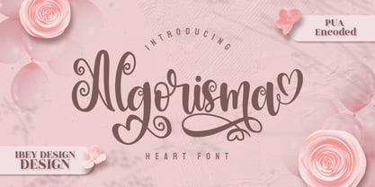 Algorisma Heart Font inspires friendliness and elegance. It is perfect to use for any of your wonderful creations such as branding projects, logos, brochures, business cards, wedding invitations, and many others.
 - Guffie by Dealita Studio,
$9.00 Guffie - a chic & elegant display modern serif with beautiful contrast. Specially designed for fashion-themed projects, perfectly suitable for creating elegant, chic, lifestyle designs such as logos, titles, magazines, and more.
 - Kallisha by Nirmana Visual,
$17.00 Kallisa is such a artistic font, Script with a touch of hand-written, It's best used for logos, wedding stationery, social media, and quotes. Kallisha features: Multilanguange PUA Encoded Thank you!
 - Castile by Eyad Al-Samman,
$3.00 Castile is a central region of Spain that formed the core of the Kingdom of Castile, under which Spain was united in the 15th and 16th centuries. "Castile" is a Kufic modern Arabic typeface. It is suitable for books' covers, advertisement light boards, and titles in magazines and newspapers. It is very distinctive when used in black and white printout. It decorates colored pages and makes artworks more attractive. This font comes in three different weights. I adore Spain and the historical achievements of the Islamic civilization existed there in the past. By designing "Castile" Typeface, I wanted to refer to the Islamic civilization that Muslims had in Spain and especially in Andalusia. Today the name of Castile survives in two autonomous regions of Spain: Castile-La Mancha (capital city is Toledo) and Castile-Leon (capital city is Valladolid). The main characteristic of "Castile" Typeface is in its modern open-end style for some of its Arabic characters such as "Sad", "Dad", "Seen", "Sheen", "Qaf", "Faa", "Yaa" and others. The shape of the characters' "dot", "dots", and "point" is innovative; a triangle with a semi-circle shape. "Castile" Typeface is suitable for books' covers, advertisement light boards, and titles in magazines and newspapers. Its charactersí modern Kufic styles give the typeface more distinction when it is used also in posters, greeting cards, covers, exhibitionsí signboards and external or internal walls of malls or metroís exits and entrances. It can also be used in titles for Arabic news and advertisements appeared in different Arabic and foreign satellite channels.
 - CyberNippon by MXMV Design,
$20.00 CyberNippon is a unique latin script font that references Japanese and Cyberpunk motifs. Literal translation of the name "Cyber Japan" This typeface took many months to complete and was inspired by the style and mood of cyberpunk, for whom Japanese culture is very close. Since the Japanese are inherent in perfectionism, while working on this font, I brought everything to perfection. The result of all the work was, in my opinion, a font that was perfectly verified and worked out for many hours. The main motives that are visible in this work are the modern interpretation of the classic Japanese hieroglyphic systems - hiragana and katakana. Originally, the font was completely handwritten using a calligraphic pen, and then converted to digital format.
 - Report by Typodermic,
$11.95 We’re excited to introduce Report, a geometric sans-serif typeface with rounded ends that takes inspiration from handwriting practice worksheets. Report is designed with legibility in mind, making it an excellent choice for students and educators alike. With its simple yet distinctive letterforms, Report prioritizes readability over austere geometry, making it a top choice for educators looking to create instructional materials that are both engaging and informative. One of the most exciting features of Report is its ability to access alternate characters using OpenType-savvy tools like InDesign, Illustrator, or Photoshop. With these tools, you can access lowercase “q” with a curl, lowercase “f” and “j” with tighter curls, capital “J” with a serif, and a “9” with a tilted stem. These stylistic alternates add personality and flair to your designs, making them stand out from the crowd. For even more versatility, check out Report School, a square-ended version of the typeface, and Sweater School, a more casual version with playful strokes. With three weights and italics included, you’ll have everything you need to create beautiful, engaging educational materials that your students will love. So why settle for boring, hard-to-read typefaces when you can choose Report? Whether you’re creating handouts, worksheets, or other instructional materials, Report’s legible letterforms and stylistic alternates make it the perfect choice for educators who want to create beautiful, engaging designs that inspire their students. Most Latin-based European writing systems are supported, including the following languages. Afaan Oromo, Afar, Afrikaans, Albanian, Alsatian, Aromanian, Aymara, Bashkir (Latin), Basque, Belarusian (Latin), Bemba, Bikol, Bosnian, Breton, Cape Verdean, Creole, Catalan, Cebuano, Chamorro, Chavacano, Chichewa, Crimean Tatar (Latin), Croatian, Czech, Danish, Dawan, Dholuo, Dutch, English, Estonian, Faroese, Fijian, Filipino, Finnish, French, Frisian, Friulian, Gagauz (Latin), Galician, Ganda, Genoese, German, Greenlandic, Guadeloupean Creole, Haitian Creole, Hawaiian, Hiligaynon, Hungarian, Icelandic, Ilocano, Indonesian, Irish, Italian, Jamaican, Kaqchikel, Karakalpak (Latin), Kashubian, Kikongo, Kinyarwanda, Kirundi, Kurdish (Latin), Latvian, Lithuanian, Lombard, Low Saxon, Luxembourgish, Maasai, Makhuwa, Malay, Maltese, Māori, Moldovan, Montenegrin, Ndebele, Neapolitan, Norwegian, Novial, Occitan, Ossetian (Latin), Papiamento, Piedmontese, Polish, Portuguese, Quechua, Rarotongan, Romanian, Romansh, Sami, Sango, Saramaccan, Sardinian, Scottish Gaelic, Serbian (Latin), Shona, Sicilian, Silesian, Slovak, Slovenian, Somali, Sorbian, Sotho, Spanish, Swahili, Swazi, Swedish, Tagalog, Tahitian, Tetum, Tongan, Tshiluba, Tsonga, Tswana, Tumbuka, Turkish, Turkmen (Latin), Tuvaluan, Uzbek (Latin), Venetian, Vepsian, Võro, Walloon, Waray-Waray, Wayuu, Welsh, Wolof, Xhosa, Yapese, Zapotec Zulu and Zuni.
 - Presicav by Typodermic,
$11.95 Introducing Presicav, the sans-serif typeface with a wide and charmingly unique design. Its bold and straightforward approach brings personality and appeal to any design project. We’ve taken inspiration from mid-20th century broad gothic typefaces for our heavyweight versions of Presicav, while the lower weights have a modern and enigmatic finish that sets it apart from other wide grotesques. Presicav is not your ordinary typeface, unlike others that can appear poker-faced and ascetic. Presicav is the perfect choice when you want to add a subtle hint to your readers that something out of the ordinary is happening. With six different weights available, including oblique styles, there’s a Presicav for every occasion. Whether you’re designing a website, creating a logo, or putting together a poster, Presicav will bring a touch of attractiveness and individuality to your project. Its bold and wide design is perfect for catching your reader’s attention and keeping them engaged. So why settle for a boring and ordinary typeface when you can choose Presicav? Try it out today and add a little bit of charm to your next design project! Most Latin-based European, Vietnamese, Greek, and most Cyrillic-based writing systems are supported, including the following languages. Afaan Oromo, Afar, Afrikaans, Albanian, Alsatian, Aromanian, Aymara, Azerbaijani, Bashkir, Bashkir (Latin), Basque, Belarusian, Belarusian (Latin), Bemba, Bikol, Bosnian, Breton, Bulgarian, Buryat, Cape Verdean, Creole, Catalan, Cebuano, Chamorro, Chavacano, Chichewa, Crimean Tatar (Latin), Croatian, Czech, Danish, Dawan, Dholuo, Dungan, Dutch, English, Estonian, Faroese, Fijian, Filipino, Finnish, French, Frisian, Friulian, Gagauz (Latin), Galician, Ganda, Genoese, German, Gikuyu, Greenlandic, Guadeloupean Creole, Haitian Creole, Hawaiian, Hiligaynon, Hungarian, Icelandic, Igbo, Ilocano, Indonesian, Irish, Italian, Jamaican, Kaingang, Khalkha, Kalmyk, Kanuri, Kaqchikel, Karakalpak (Latin), Kashubian, Kazakh, Kikongo, Kinyarwanda, Kirundi, Komi-Permyak, Kurdish, Kurdish (Latin), Kyrgyz, Latvian, Lithuanian, Lombard, Low Saxon, Luxembourgish, Maasai, Macedonian, Makhuwa, Malay, Maltese, Māori, Moldovan, Montenegrin, Nahuatl, Ndebele, Neapolitan, Norwegian, Novial, Occitan, Ossetian, Ossetian (Latin), Papiamento, Piedmontese, Polish, Portuguese, Quechua, Rarotongan, Romanian, Romansh, Russian, Rusyn, Sami, Sango, Saramaccan, Sardinian, Scottish Gaelic, Serbian, Serbian (Latin), Shona, Sicilian, Silesian, Slovak, Slovenian, Somali, Sorbian, Sotho, Spanish, Swahili, Swazi, Swedish, Tagalog, Tahitian, Tajik, Tatar, Tetum, Tongan, Tshiluba, Tsonga, Tswana, Tumbuka, Turkish, Turkmen (Latin), Tuvaluan, Ukrainian, Uzbek, Uzbek (Latin), Venda, Venetian, Vepsian, Vietnamese, Võro, Walloon, Waray-Waray, Wayuu, Welsh, Wolof, Xavante, Xhosa, Yapese, Zapotec, Zarma, Zazaki, Zulu and Zuni.
 - CRESTY Eighties by holyline design,
$19.00 Cresty Eighties is a retro condensed serif family with a modern touch. This font inspired by retro magazine and 80s handcrafted lettering.This font comes in 5 weight from regular to extra bold + variable support. Cresty Eighties designed with Stylistic Alternates and Ligature in some characters that allows you to mix and match pairs of letters to fit your design. Cresty Eighties perfect for headline, sub headline ,custom logo,packaging, quote, merchandise, sticker, badges,social media posts, label, album cover and anything for your creativity. Cresty Eightie is perfect font if you want something new with your project, you can play the 5 fonts style, and you can pairing this font with another font you like, its very satisfy. So happy creating!
 - Trapezoidal by Ingrimayne Type,
$9.00 The letters of Trapezoidal are like sheep: they do not like being alone but want to be part of a flock. Many of the individual letters of Trapezoidal look strange and unshapely in isolation because they are designed to fit into a pattern with other letters. That pattern is formed by alternating asymmetric trapezoids, with trapezoids that are wide at the top alternating with trapezoids that are wide at the bottom. The magic of the OpenType feature of contextual alternatives (calt) automatically alternates them. The fonts in the family are largely monospaced and have very tight letter spacing. (If for some reason one wants to use only one set of the letters, the letters will overlap unless one widens character spacing.) (If D and O are too similar, use the alternative versions of D.) The family has five weights and each weight has an italics formed by flipping the trapezoidal pattern over a vertical line. Like other alternating-character typeface families from IngrimayneType, this distinctive and visually-arresting family can be used for titles or advertising. (For another but very different typeface based on alternating trapezoids, see PoultrySign.)
 - Rolfter by AlienValley,
$13.00 Introducing Rolfter, a classic serif typeface with many features including ligatures, tons of alternates and multilingual support. All the ligatures and alternates can be accessed by installing just one font file. LIGATURES & CONTEXTUAL ALTERNATES We recommend that you turn on both ligatures and contextual alternates for best results. You can do this in either Photoshop or Illustrator. Photoshop: Open the "Character" panel via Window - Character and check the standard ligatures and contextual alternates icons at the bottom left corner of the panel. Illustrator: Open the "OpenType" panel via Window - Type - OpenType and also check the standard ligatures and contextual alternates at the bottom of the panel. OPTIONAL ALTERNATES These are optional alternates that can be used depending on your current design. We recommend moderate use of these for optimal results as using too many can easily make the font unreadable. To access these you need to open the following panels depending on your software: Photoshop: Window - Glyphs (Note that this panel may not be available in earlier PS versions) Illustrator: Type - Glyphs You will then have access to all the glyphs inside the font file to use them as you like.
 - Imperio by Juan I. Siwak,
$40.00 Imperio is a font inspired by old posters, especially those related to constructivism and futurism. It reflects both the rationalism of Bauhaus as a propagandist and revolutionary spirit of an era. On the other hand it is not nostalgic, but instead looks for its own way to get diagonals where there was rigidity. The poster itself is the language of graphic design, and geometry is its ally. This font aims for that goal. It has two variants that derive from its source. Imperio Giga Black attempts to be a negative typography, starting with the black and then searching for small windows in which they begin to uncover the morph. This is an extreme and modern font. Imperio West is a metamorphosis of the original one, with decorative details which transform it into a typeface of wood and saloon font. In all cases we recommend its use in large sizes (up to 20pt) and main titles. Imperio UltraBlack can work in smaller sizes than Imperio Regular.
 - Ongunkan Radloff Anglosaxon by Runic World Tamgacı,
$100.00 Vasili Vasilyevich Radlof or Wilhelm Radloff (Russian: Василий Васильевич Радлов; German: Wilhelm Radloff; 17 January 1837 - 12 May 1918) was a German-born Russian orientalist and founder of Turcology. Radloff is a German-born Russian Turcologist who researches the Turkish world from different perspectives, opens a new era in the history of Turkology by bringing them to light, and devoted 60 years of his 81-year life to these studies. He published his work known as Radloff's Atlas with a runic font specially developed for the Old Turkish Runic Alphabet. I made the Turkish Runic Font using Radloff's Atlas. I developed this Anglo Saxon Futhark font based on this font and adapted it to Anglo Saxon script.
 - High Table by SAMUEL DESIGN,
$39.00 The key words for this font are taste, elegance, storytelling, and a little bit of dynamism. HIGH TABLE family have exquisite details and great quality. We believe that only high quality and unique details can move people more than exaggerated shapes. Fonts are so powerful, they tell a moving story. The PACE typeface was chosen to tell a story quietly but with dynamism. Readers are delighted and relaxed when they see this font family, and colleagues read the story with respect. A brand needs a story, and a brand’s story needs the most appropriate font to carry it.
 - Illuminations Woodcut by Just My Type,
$10.00 Illuminations Woodcut is inspired by the decorated initial capitals of Medieval manuscripts… and an old book of clip art in which they were found. Try decomposing them in Adobe Illustrator and coloring the pieces or dropping color into them in Photoshop: you can get some stunning results. Caps and TrueType only.
 - Metroblack #2 by Linotype,
$29.00American graphic designer William Addison Dwiggins' (W.A.D. for short) first typefaces were the Metro family, designed from 1927 onward. The project grew out of Dwiggins' dissatisfaction with the new European sans serif typefaces of the day, such as Futura, Erbar, and Kabel, a feeling he expressed in his seminal book Layout in Advertising. Urged by Mergenthaler Linotype to create a solution for the problem, Dwiggins began a professional relationship that would span over the next few decades. The first Metro family typeface to be released was Metroblack, brought to market by Linotype in 1929 (Metroblack #2™ the only one of the two versions that Mergenthaler Linotype eventually put into production which is available in digital form). With more of a humanist quality than the geometric styles popular in Europe at the time, Dwiggins drew what he believed to be the ideal sans serif for headlines and advertising copy. Metroblack has a warmer character than the Modernists' achievements, and the type is full of mannered curves and angled terminals (Metroblack also has an astoundingly beautiful Q). The weights of the Metro family, Metromedium #2™ and Metrolite #2™, were each designed by Mergenthaler Linotype's design office under Dwiggins' supervision. In 2012 Toshi Omagari reworked the Metro family as "Metro Nova" with many weights into a modern type family that even contains the alternate characters from the origin Metro family from Dwiggins. Despite having been created more than three-quarters of a century ago, the Metro family types have aged well, and remain a popular sans serif family. Although spec'd less often than other bestsellers, like Futura, Metro continues to find many diverse uses. The typeface has appeared throughout Europe and the North America for decades in newspapers and magazines, and can even help create a great brand image when used in logos and corporate identity. Dwiggins ranks among the most influential graphic designers and typeface designers of the 20th Century. He has several other quality fonts in the Linotype portfolio, including the serif text faces Electra™ and New Caledonia™, as well as Caravan™, a font of typographic ornaments. - Echowarp by Luxfont,
$18.00 Introducing Echowarp is an unusual COLORED font family. Main idea of this font is that a colored echo spreads and fades from minimalistic letters to the sides. Distorted letters give the effect of temporary refraction. The originality of this family is primarily suitable for a bold design. And if you add a random distortion in a graphics program to the finished heading written in this font, the inscription will turn into an absolutely unique and inimitable one. Futuristic set has 23 fonts in the family! Do not limit your imagination, because the font opens up a huge space for creative experiments. Check the quality before purchasing and try the FREE DEMO version of the font to make sure your software supports color fonts. Features: Free Demo font to check it works Letters with color echo & distortion 23 OTF SVG color fonts in the family Gradient and hologram fonts Kerning IMPORTANT: - OTF SVG fonts contain vector letters with gradients and transparency. - Multicolor OTF version of this font will show up only in apps that are compatible with color fonts, like Adobe Photoshop CC 2017.0.1 and above, Illustrator CC 2018. Learn more about color fonts & their support in third-party apps on www.colorfonts.wtf - Don't worry about what you can't see the preview of the font in the tab "Individual Styles" - all fonts are working and have passed technical inspection, but not displayed, they just because the website MyFonts is not yet able to show a preview of colored fonts. Then if you have software with support colored fonts - you can be sure that after installing fonts into the system you will be able to use them like every other classic font. Question/answer: How to install a font? The procedure for installing the font in the system has not changed. Install the font as you would install the classic OTF | TTF fonts. How can I change the font color to my color? Adobe Illustrator: Convert text to outline and easily change color to your taste as if you were repainting a simple vector shape. Adobe Photoshop: You can easily repaint text layer with Layer effects and color overlay. ld.luxfont@gmail.com
 - Jawbox by Chank,
$49.00In 1995, when indie rock hipness was just reaching its pique, Chank was really into Jawbox, a post-punk band from DC. It was their music he was listening to when he made this font for the Space Ghost web site. The band broke up in 1997, but the font named in their honor lives on. This font family includes Jawbox, Jawbox Chanky, and Jawbreaker. - FS Matthew by Fontsmith,
$80.00 Developed for screen For not the first time, Fontsmith was commissioned to develop a font for one of the UK’s terrestrial TV channels. The product was a clearly-defined three-weight family. When italics were added, it became FS Matthew, a clean, stylish, structured sans serif with swooping, open curves and a bright, lively personality. Southbank Inspiration for many of the forms of FS Matthew came from details found within the modernist buildings and architecture of London’s Southbank, such as the Royal Festival Hall. During the font’s gestation, Jason had found himself at London Studios, a TV studio on Southbank, and a wander around the neighbouring arts buildings proved thought-provoking. The result was a font with a very British character: solid forms that provide the platform for innovation and distinctiveness. Feelgood efficiency FS Matthew’s trademark is efficiency with a feelgood factor: disciplined enough for corporate identities, websites and signing systems, and colourful enough for logotypes and advertising. Its versatility and excellent legibility are achieved via some unexpected details: the reaching curves of the “g” and “y”; the simple shape of the “u”; an off-kilter “k”; generous counters; and a slightly condensed aspect that makes FS Matthew a space-saver in text or title sizes.
 - Arabesque by Scholtz Fonts,
$15.00 Arabesque is a romantic, ornamental font, in which intertwining, flowing lines and generous loops enhance the beauty of the basic shapes. Arabesque successfully combines legibility with a decorative, sumptuous style. In its European interpretation it was also called "Moresque". The font "Ability" was the origin of Arabesque, however, numerous, subtle changes set it apart. Arabesque, is characterised by a small x-height and relatively large ascenders and descenders (loops). The loops are created out of two or three delicate, intertwined lines that contrast with the much less expansive bowls and shapes of the lowercase letters. The capitals, more complex and composed of intertwined lines, echo the elegance of the loops on the lowercase letters. As a result of these changes "Arabesque" is both more readable, controlled and extravagant than "Ability". Suggestions for use: - wedding stationery - greeting cards - valentines day media - beauty products media - lingerie tags - women's magazine pages - classical music media - award certificates - magazine pages The font is fully professional: carefully letterspaced and kerned. It contains over 235 characters - (upper and lower case characters, punctuation, numerals, symbols and accented characters are present). It has all the accented characters used in the major European languages. Arabesque works well in Application packages such as Microsoft Word that do not support professional kerning.

