10,000 search results
(0.031 seconds)
- Lady Edith by MKGD,
$13.00 Lady Edith harkens back to the days of flappers and cocktail parties. The early part of the twentieth century, when Art Deco was at it’s height and high fashion was all the rage. A time of beauty, class and elegance. A minimalistic font with clean lines and just enough flare to make it unique. The perfect font for any occasion that needs a bit of high end magic. There is no lower case for Lady Edith as it is a decorative font. The Upper case version serves both the upper and lower case keys. Lady Edith has a glyph count of 397 and supports the following languages; Supported Languages: Afrikaans, Albanian, Asu, Basque, Bemba, Bena, Bosnian, Catalan, Chiga, Colognian, Cornish, Croatian, Czech, Danish, Embu, English, Esperanto, Estonian, Faroese, Filipino, Finnish, French, Friulian, Galician, German, Gusii, Hungarian, Icelandic, Indonesian, Irish, Italian, Kabuverdianu, Kalaallisut, Kalenjin, Kamba, Kikuyu, Kinyarwanda, Latvian, Lithuanian, Low German, Lower Sorbian, Luo, Luxembourgish, Luyia, Machame, Makhuwa-Meetto, Makonde, Malagasy, Malay, Maltese, Manx, Meru, Morisyen, North Ndebele, Norwegian Bokmål, Norwegian Nynorsk, Nyankole, Oromo, Polish, Portuguese, Romanian, Romansh, Rombo, Rundi, Rwa, Samburu, Sango, Sangu, Scottish Gaelic, Sena, Shambala, Shona, Slovak, Slovenian, Soga, Somali, Spanish, Swahili, Swedish, Swiss German, Taita, Teso, Turkmen, Upper Sorbian, Vunjo, Walser, Zulu
 - Waldorfschrift by Joachim Frank,
$23.00 The Waldorfschrift family was created in digital form in the years 1993-1994 by Joachim Frank, inspired by the naturally organic letters from the anthroposophical movement of the 20th century of Rudolf Steiner . In nature there are no right angles, straight lines or complete uniformity, but instead round corners, varying thicknesses and all kinds of variability. This is what the anthroposophical movement created in their buildings, their art, in their music – and also in their lettering. And this Font is like the plants in nature: it grows upwards, branches out, letters hugs to some letters, with others they keeps more distance, some letters proudly stretch their belly, others crouch in the corner - a completely natural font. Take a look at the brand of Weleda (the natural cosmetics company), Demeter (one of the biggest organic foods companies), Filderklinik (a great anthroposophical hospital in Germany) and you will see these great companies work with different but organic letter styles. More recently, Joachim revisited the Waldorf fonts with modern type design software and added extra characters such as the euro sign, and extra weights to make the fonts useable for a wide variety of design tasks. Dez 21: A big update: All fonts have been digitized again and given a complete character set, new kerning, minor bugs removed.
 - Gritty Pencil by Hanoded,
$16.00 As the name implies, this font was made with a gritty pencil. Gritty Pencil comes with language support and a set of cool alternates for the lower case letters.
 - Steed by Device,
$29.00 A condensed and bold obround sans inspired by 60s condensed inserat faces, with a more pronounced thick/thin stress as seen on the titles of the Avengers TV show.
 - Sabron by Fontron,
$35.00Sabron Light is a very round font with the thickness at the corners rather than the side as in most typefaces. Serifs are swollen ends coming to a point. - Evor by Edcreative,
$15.00 Evor is an original handwritten font that can be used in various needs of the network such as screen printing of clothes, posters, films, magazines, banners, books, and more!
 - Runik Futhark by Tim Rolands,
$- Runik Futhark is a modern font incorporating the earliest Germanic-Norse runes, known as the Elder Futhark. It's a bold rendition ready for all your Viking raiding party needs!
 - Numbers Style One by Gerald Gallo,
$20.00 Each style includes 6 fonts of 100 characters each of circle, square, and diamond in positive and negative. For ordering purposes, each style (6 fonts) counts as 1 font.
 - Crow Bait by Typefactory,
$14.00 Crow Bait is an incredibly elegant, bold and vintage display font. This font reads as strong, confident, and dynamic and can add tons of nostalgic character to your designs.
 - Sumi Strokes by James J. Connell,
$9.00Sumi Strokes was created as a set of simple abstract brush stokes that could be used on their own or in conjunction with one another to form a painting. - Central by AVP,
$10.00 Central was developed specifically as a titling font for a theatre-hub website. The pure geometric forms and elegant simplicity provide a pleasing contrast to small screen text sizes.
 - Bubbles by Turtle Arts,
$20.00Bubbles is a fun alphabet with lots of nice bold areas, so it'll work great in colors or as a simple headline. Bubbles is extra nice in larger sizes. - Detention JNL by Jeff Levine,
$29.00Detention JNL is simply the hand printing of its designer, Jeff Levine. Its uses range from personalizing notes and messages to a graffiti look or as "legible grunge lettering". - Obscure Stencil JNL by Jeff Levine,
$29.00 A bold, handmade stencil alphabet from the book “Lettering” by Harry B. Wright (1950) served as the model for Obscure Stencil JNL – available in both regular and oblique versions.
 - Sketchetik Fill by Hiekka Graphics,
$19.00 Sketchetik Fill – brother of famous Sketchetik – is a hand-drawn font in four styles: Light, Regular, Bold and Black. Sketchetik Fill is recommended for use as a display typeface.
 - Kidzhood by NamelaType,
$19.00 Kidzhood represent the characters as funny and flexible, just like childish characters can be. Kidzhood equipped with cute letter form and some attractive ligatures, giving it a playful feeling.
 - Geraldica by Etewut,
$30.00 Geraldica is a monoline script that supports foreign languages and has special characters such as ß, ñ, and ç. It includes 381 symbols including alternates with different calligraphic swashes.
 - Elah Pro by RodrigoTypo,
$29.00 Elah Pro is a Title Typography, which contains different styles such as Ornaments and Dingbats, special to play and combine and make a much more pleasant and entertaining title.
 - Ufaira by Edcreative,
$15.00 Ufaira is an original handwritten font that can be used in various needs of the network such as screen printing of clothes, posters, films, magazines, banners, books, and more!
 - HV Cocktail by Harmonais Visual,
$12.00 Cocktail - elegant retro serif with an artistic touch. Specially designed for vintage, retro, elegant projects, perfectly suitable for creating simple, lifestyle designs such as logos, title, packaging, and more.
 - Diet Riot by PizzaDude.dk,
$15.00A crunchy comic font, suitable for both small and large typing. At small sizes the font appears as a "simple" handwriting font, but at larger points the crunchiness appears! - Numbers Style Two by Gerald Gallo,
$20.00 Each style includes 6 fonts of 100 characters each of circle, square, and diamond in positive and negative. For ordering purposes, each style (6 fonts) counts as 1 font.
 - Jonah Brush by Jonahfonts,
$19.00 As once a sign-painter in my younger years I loved the quick brush strokes used to turn out quick 'Sale' posters. I tried to relive in this font.
 - Astria by Autographis,
$39.50 Astria is a swinging script, that works best in short headlines or as a decorative Element. I like it when the lines overlap, with letters flowing into each other.
 - Mollandia by Romie Creative,
$13.00 Mollandia is a romantic typefaces. bold, elegant & fun vintage script font. Can be used for various purposes.such as logos, wedding invitation, t-shirt, letterhead, signage, news, posters, badges etc.
 - Numbers Style Three by Gerald Gallo,
$20.00 Each style includes 6 fonts of 100 characters each of circle, square, and diamond in positive and negative. For ordering purposes, each style (6 fonts) counts as 1 font.
 - WTF Afroboy by Wasabib Type Foundry,
$11.00 Afroboy Display Font is an obese font with a simple, and modern look. Afroboy Display Font created with the vision of to attract the audience to your brand. The finest details of this typeface are methodically and mathematically created. Afroboy is created with all the tasks of a corporate font and also for the usage in a variety of projects, including branding, logos, titles, headlines, posters, screens, display, digital ads, and everything else.
 - Rockford Sans by Fenotype,
$20.00 Rockford is a geometrical Sans Serif with subtly rounded edges. Rockford comes in eight weights and matching Italics. With its large x-height and round features it’s both legible and friendly. It’s suited to cover a wide variety of tasks from editorial to brand design, advertising, logos and more. Rockford is equipped with plenty of OpenType features to perform well. Rockford comes with Small Caps, Old Style Figures, superior and inferior figures and fractions.
 - Regnante by BustanType,
$19.00 Regnante was created with all of my heart. It has a luxury style, is stylish and lovely, and has a strong personality, so it will catch your attention. This font is ideal for a wide range of tasks including branding, logos, packaging, and more. Regnante includes 12 fonts, including 4 weight variations and Italic style. Regular and Alternate are come separately. You can make your selection based on your personal preferences and requirements.
 - Adelica Brush by Java Pep,
$11.00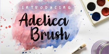 Adelica Brush is made with a handwritten brush. This font is perfect to give your project a fun, feminine, childish, and watercolor effect. Adelica Brush is a solid font. To raise the watercolor effect you must mask it with a watercolor brush or other. Adelica Brush contains: -Uppercase & lowercase -Numeral & punctuation -PUA encoded -Multi-lingual support Thank for using this font, if you have any question don't hesitate to message me at java.indonesian@yahoo.com.
 - Garalda by TypeTogether,
$49.00 Type designer Xavier Dupré’s Garalda is a charming 21st century family that renews a legacy of finesse. As paragraphs on a page, Garalda’s overall impression is of a workaday personality, committed to the main purpose of the job: easy long-form reading. But setting it in display sizes proves something different: This reinvented Garamond is anything but basic. The Garalda story begins with the serendipitous finding of a book typeset in a rare Garalde, called Tory-Garamond, with which Dupré was not immediately familiar. This Garamond was used in bibliophile books in the decades surrounding 1920, but after that it became déclassé for an unknown reason. Dupré found the italic styles especially charming and discovered the family was probably the mythical Ollière Garamond cut from 1914. He obtained low resolution scans of the typeface and used them, rather than high resolution scans, as the basis for his new type family. This allowed Dupré the mental freedom to experiment and remix as he saw fit, culminating in a contemporary family with heritage. As seen in the simplistic rectangular serifs, Garalda is a humanist slab serif, but with a mix of angles and curves to give the classic shapes a fresh, unorthodox feeling. While almost invisible in paragraph text, these produce a graphic effect in display work. The set of ligatures in the roman and italics lend themselves to unique display use, such as creating lovely logotypes. In the italics, some swashes inspired by different historic Garamonds are included, sometimes breaking their curves to be more captivating. Just look at how the italic ‘*-s’ ligatures create ‘s’ with a cursive formation rather than merely a flowing slant. And how the roman ‘g’ link swings as wide as a trainer’s whip. These are all balanced by squared serifs in the roman to keep an overall mechanised regularity. The Garalda family comes in eight styles, includes some of the original arrows and ornaments, and speaks multiple languages for all typesetting needs, from pamphlets to fine book printing. The complete Garalda family, along with our entire catalogue, has been optimised for today’s varied screen uses.
 - Bradley Texting by Monotype,
$57.99Bradley Texting: a clear, friendly and easily legible calligraphy font, also suited to electronic devices With Bradley Texting, Richard Bradley has published another calligraphic typeface that recalls the style of Bradley Hand and Bradley Type. In this case, however, Bradley has advanced the style with clearer forms for display on electronic instruments and on other formats. Two other font families paved the way to the newly introduced Bradley Texting. In the mid-1990s, Bradley published Bradley Hand, with its rough contours. Since these coarse forms do not cut a good figure in the larger font sizes, Bradley Type followed, with smooth letters. During the development of Bradley Type, the idea for a further font came about ? one in the style of the two other calligraphic typefaces, but with simpler, easily legible forms and suited to electronic devices like mobile phones or tablets. The letters for Bradley Texting began with a marker on paper. Looking back, Bradley describes one of the biggest challenges as having the calm required to draw the relaxed-looking letters repeatedly while still making them fit the general style.The somewhat narrow and dynamically designed letters have round line ends, like those left by a felt-tipped pen. As a hand-written print font, the individual letters are not connected to one another. Nonetheless, they demonstrate the influence of a written font, such as the extended ends and the flowing transitions. Clear forms with open counters and a large x-height guarantee Bradley Texting good legibility in the smaller font sizes. Bradley Texting is also effective under more challenging conditions, such as on mobile phones, e-book readers or tablets; the fonts friendly and lively character comes through. With Regular, Semibold and Bold, Bradley Texting is adequately equipped for use as a headline or text font in various sizes. The selection of characters covers the Western European languages and German typographers will be happy to note the presence of the upper-case ß. Use the dynamic and clear forms of Bradley Texting anywhere you need a friendly character with a personal accent. Bradley Texting is persuasive in the print realm, in advertisements or on posters, as well as on electronic devices. - Ps Strijkijzer by Fontopia,
$- Strijkijzer is a funfont. It originated as a joke between friends. Do not take too seriously for it. But it is complete. Download it for free and swing your iron.
 - Ashley Crawford by Monotype,
$29.99Ashley Crawford was designed by Ashley Havinden in 1930. Ashley Crawford is very lively and as such it is ideal for packaging and display purposes where fun is the theme. - TG Cthu by Weishan Gao,
$39.00 This is an industrial-style font with a strong and powerful presence, suitable for use in headings and slogans. It can be applied to industries such as factories and construction.
 - Monthly Meeting JNL by Jeff Levine,
$29.00 A set of plastic pin-back letters served as the model for Monthly Meeting JNL. Pin-back letters were primarily used on cork bulletin boards for changeable notices and announcements.
 - Trissino DT by DTP Types,
$49.00Named after Gian Giorgio Trissino (1478-1550) the Italian Renaissance humanist, poet, dramatist, diplomat and grammarian who was the first to explicitly distinguish I and J as seperate letter sounds. - AZ Dramamine by Artist of Design,
$20.00 AZ Dramamine font has some inspiration from A&F tee-shirts, but mostly it is completely original script. This font was designed for use as a worn and antiqued headline.
 - Buckdance JNL by Jeff Levine,
$29.00Stencil in nature, Western in feel, this font has both form and function. Can be used as a retro design or in a setting where a stencil font is needed. - Bashan by Muksal Creatives,
$12.00 Bashan is modern serif font with beautiful contrast. Specially designed for fashion-themed projects, perfectly suitable for creating elegant, chic, lifestyle design such as logos, title, and magazine, and more.