10,000 search results
(0.025 seconds)
- Love Moment by Gatype,
$12.00 Love moment is a pretty script perfect for branding, wedding invitations, and any other romantic project. you need a program that supports Adobe Illustrator CS, Adobe Indesign & CorelDraw X6-X7, Microsoft Word 2010 or a later version. How to access all alternative characters using Adobe Illustrator: https://www.youtube.com/watch?v=XzwjMkbB-wQ Love moment is coded with PUA Unicode, which allows full access to all additional characters without having to design any special software. Mac users can use Font Book, and Windows users can use Character Map to view and copy any additional characters for pasting into your favorite text editor / application. How to access all alternative characters, using the Windows Character Map with Photoshop: https://www.youtube.com/watch?v=Go9vacoYmBw
 - DBE-Rigil Kentaurus - Personal use only

- Marsmila by Colllab Studio,
$19.00 "Hi there, thank you for passing by. Colllab Studio is here. We crafted best collection of typefaces in a variety of styles to keep you covered for any project that comes your way! Introducing Marsmila, a luxury beauty calligraphy font inspired by the Victorian era and the Grace of the Roman letterforms as well as modern calligraphic aesthetics. Its graceful, curving lines and elegant swirls are a delight to behold. Marsmila comes with massive number of glyphs and stylistic alternates, including extra beginning and ending swashes. Perfect for your next calligraphy project, or when you want to make your text look fancy! Make your next design projects look like you took them to an expensive calligrapher to be done for hundreds of dollars, but you didn't! You can use it in any design and any way you want. Marsmila typeface works best for logos, posters, styling purposes such as invitations, greeting cards or any design projects which have some elegant vibe to them. A Million Thanks Colllab Studio www.colllabstudio.com
 - Overland by Yock Mercado,
$9.99 Introducing OVERLAND, a modern and minimalist Sans Serif typeface with a touch of daring exploration. With slightly rounded corners, it has a strong and distinctive personality that makes it perfect for branding, editorial design, web, and mobile applications. OVERLAND is a versatile typeface that adapts to any environment. Its simplicity makes it highly legible, ideal for communicating clear and direct messages. But its imposing presence makes it stand out in any context, making it an ideal font for those looking to create designs with a touch of originality and style. With six different weights and designed in both uppercase and lowercase, it's a complete typeface family. Its minimalist style is elegant and refined, with its Super and Bold weights ideal for branding or headlines, while its lighter weights allow you to use it for medium or long texts. OVERLAND is a versatile and stylish choice for any project. Thank you for visiting our store, and please don't hesitate to contact us if you have any questions. We're here to help you create stunning designs.
 - DIN Next Arabic by Monotype,
$155.99 DIN Next is a typeface family inspired by the classic industrial German engineering designs, DIN 1451 Engschrift and Mittelschrift. Akira Kobayashi began by revising these two faces-who names just mean ""condensed"" and ""regular"" before expanding them into a new family with seven weights (Light to Black). Each weight ships in three varieties: Regular, Italic, and Condensed, bringing the total number of fonts in the DIN Next family to 21. DIN Next is part of Linotype's Platinum Collection. Linotype has been supplying its customers with the two DIN 1451 fonts since 1980. Recently, they have become more popular than ever, with designers regularly asking for additional weights. The abbreviation ""DIN"" stands for ""Deutsches Institut für Normung e.V."", which is the German Institute for Industrial Standardization. In 1936 the German Standard Committee settled upon DIN 1451 as the standard font for the areas of technology, traffic, administration and business. The design was to be used on German street signs and house numbers. The committee wanted a sans serif, thinking it would be more legible, straightforward, and easy to reproduce. They did not intend for the design to be used for advertisements and other artistically oriented purposes. Nevertheless, because DIN 1451 was seen all over Germany on signs for town names and traffic directions, it became familiar enough to make its way onto the palettes of graphic designers and advertising art directors. The digital version of DIN 1451 would go on to be adopted and used by designers in other countries as well, solidifying its worldwide design reputation. There are many subtle differences in DIN Next's letters when compared with DIN 1451 original. These were added by Kobayashi to make the new family even more versatile in 21st-century media. For instance, although DIN 1451's corners are all pointed angles, DIN Next has rounded them all slightly. Even this softening is a nod to part of DIN 1451's past, however. Many of the signs that use DIN 1451 are cut with routers, which cannot make perfect corners; their rounded heads cut rounded corners best. Linotype's DIN 1451 Engschrift and Mittelschrift are certified by the German DIN Institute for use on official signage projects. Since DIN Next is a new design, these applications within Germany are not possible with it. However, DIN Next may be used for any other project, and it may be used for industrial signage in any other country! DIN Next has been tailored especially for graphic designers, but its industrial heritage makes it surprisingly functional in just about any application. The DIN Next family has been extended with seven Arabic weights and five Devanagari weights. The display of the Devanagari fonts on the website does not show all features of the font and therefore not all language features may be displayed correctly.
 - DIN Next Devanagari by Monotype,
$103.99DIN Next is a typeface family inspired by the classic industrial German engineering designs, DIN 1451 Engschrift and Mittelschrift. Akira Kobayashi began by revising these two faces-who names just mean ""condensed"" and ""regular"" before expanding them into a new family with seven weights (Light to Black). Each weight ships in three varieties: Regular, Italic, and Condensed, bringing the total number of fonts in the DIN Next family to 21. DIN Next is part of Linotype's Platinum Collection. Linotype has been supplying its customers with the two DIN 1451 fonts since 1980. Recently, they have become more popular than ever, with designers regularly asking for additional weights. The abbreviation ""DIN"" stands for ""Deutsches Institut für Normung e.V."", which is the German Institute for Industrial Standardization. In 1936 the German Standard Committee settled upon DIN 1451 as the standard font for the areas of technology, traffic, administration and business. The design was to be used on German street signs and house numbers. The committee wanted a sans serif, thinking it would be more legible, straightforward, and easy to reproduce. They did not intend for the design to be used for advertisements and other artistically oriented purposes. Nevertheless, because DIN 1451 was seen all over Germany on signs for town names and traffic directions, it became familiar enough to make its way onto the palettes of graphic designers and advertising art directors. The digital version of DIN 1451 would go on to be adopted and used by designers in other countries as well, solidifying its worldwide design reputation. There are many subtle differences in DIN Next's letters when compared with DIN 1451 original. These were added by Kobayashi to make the new family even more versatile in 21st-century media. For instance, although DIN 1451's corners are all pointed angles, DIN Next has rounded them all slightly. Even this softening is a nod to part of DIN 1451's past, however. Many of the signs that use DIN 1451 are cut with routers, which cannot make perfect corners; their rounded heads cut rounded corners best. Linotype's DIN 1451 Engschrift and Mittelschrift are certified by the German DIN Institute for use on official signage projects. Since DIN Next is a new design, these applications within Germany are not possible with it. However, DIN Next may be used for any other project, and it may be used for industrial signage in any other country! DIN Next has been tailored especially for graphic designers, but its industrial heritage makes it surprisingly functional in just about any application. The DIN Next family has been extended with seven Arabic weights and five Devanagari weights. The display of the Devanagari fonts on the website does not show all features of the font and therefore not all language features may be displayed correctly. - DIN Next Cyrillic by Monotype,
$65.00DIN Next is a typeface family inspired by the classic industrial German engineering designs, DIN 1451 Engschrift and Mittelschrift. Akira Kobayashi began by revising these two faces-who names just mean ""condensed"" and ""regular"" before expanding them into a new family with seven weights (Light to Black). Each weight ships in three varieties: Regular, Italic, and Condensed, bringing the total number of fonts in the DIN Next family to 21. DIN Next is part of Linotype's Platinum Collection. Linotype has been supplying its customers with the two DIN 1451 fonts since 1980. Recently, they have become more popular than ever, with designers regularly asking for additional weights. The abbreviation ""DIN"" stands for ""Deutsches Institut für Normung e.V."", which is the German Institute for Industrial Standardization. In 1936 the German Standard Committee settled upon DIN 1451 as the standard font for the areas of technology, traffic, administration and business. The design was to be used on German street signs and house numbers. The committee wanted a sans serif, thinking it would be more legible, straightforward, and easy to reproduce. They did not intend for the design to be used for advertisements and other artistically oriented purposes. Nevertheless, because DIN 1451 was seen all over Germany on signs for town names and traffic directions, it became familiar enough to make its way onto the palettes of graphic designers and advertising art directors. The digital version of DIN 1451 would go on to be adopted and used by designers in other countries as well, solidifying its worldwide design reputation. There are many subtle differences in DIN Next's letters when compared with DIN 1451 original. These were added by Kobayashi to make the new family even more versatile in 21st-century media. For instance, although DIN 1451's corners are all pointed angles, DIN Next has rounded them all slightly. Even this softening is a nod to part of DIN 1451's past, however. Many of the signs that use DIN 1451 are cut with routers, which cannot make perfect corners; their rounded heads cut rounded corners best. Linotype's DIN 1451 Engschrift and Mittelschrift are certified by the German DIN Institute for use on official signage projects. Since DIN Next is a new design, these applications within Germany are not possible with it. However, DIN Next may be used for any other project, and it may be used for industrial signage in any other country! DIN Next has been tailored especially for graphic designers, but its industrial heritage makes it surprisingly functional in just about any application. The DIN Next family has been extended with seven Arabic weights and five Devanagari weights. The display of the Devanagari fonts on the website does not show all features of the font and therefore not all language features may be displayed correctly. - DIN Next Paneuropean by Monotype,
$92.99DIN Next is a typeface family inspired by the classic industrial German engineering designs, DIN 1451 Engschrift and Mittelschrift. Akira Kobayashi began by revising these two faces-who names just mean ""condensed"" and ""regular"" before expanding them into a new family with seven weights (Light to Black). Each weight ships in three varieties: Regular, Italic, and Condensed, bringing the total number of fonts in the DIN Next family to 21. DIN Next is part of Linotype's Platinum Collection. Linotype has been supplying its customers with the two DIN 1451 fonts since 1980. Recently, they have become more popular than ever, with designers regularly asking for additional weights. The abbreviation ""DIN"" stands for ""Deutsches Institut für Normung e.V."", which is the German Institute for Industrial Standardization. In 1936 the German Standard Committee settled upon DIN 1451 as the standard font for the areas of technology, traffic, administration and business. The design was to be used on German street signs and house numbers. The committee wanted a sans serif, thinking it would be more legible, straightforward, and easy to reproduce. They did not intend for the design to be used for advertisements and other artistically oriented purposes. Nevertheless, because DIN 1451 was seen all over Germany on signs for town names and traffic directions, it became familiar enough to make its way onto the palettes of graphic designers and advertising art directors. The digital version of DIN 1451 would go on to be adopted and used by designers in other countries as well, solidifying its worldwide design reputation. There are many subtle differences in DIN Next's letters when compared with DIN 1451 original. These were added by Kobayashi to make the new family even more versatile in 21st-century media. For instance, although DIN 1451's corners are all pointed angles, DIN Next has rounded them all slightly. Even this softening is a nod to part of DIN 1451's past, however. Many of the signs that use DIN 1451 are cut with routers, which cannot make perfect corners; their rounded heads cut rounded corners best. Linotype's DIN 1451 Engschrift and Mittelschrift are certified by the German DIN Institute for use on official signage projects. Since DIN Next is a new design, these applications within Germany are not possible with it. However, DIN Next may be used for any other project, and it may be used for industrial signage in any other country! DIN Next has been tailored especially for graphic designers, but its industrial heritage makes it surprisingly functional in just about any application. The DIN Next family has been extended with seven Arabic weights and five Devanagari weights. The display of the Devanagari fonts on the website does not show all features of the font and therefore not all language features may be displayed correctly. - VTCTattooScriptTwo - Personal use only

- Skullbats by Canada Type,
$24.95Patrick Griffin's sister is a really annoying individual sometimes. Not only is she into theater, but she thinks everyone else in the universe is into it as well. So once in a while tickets to local or provincial Shakespearean plays get delivered to the mailbox or dropped off on the living room's table. And once in a while the tickets just cannot be "lost" or ignored. Three or four times a year, Patrick must be subjected to Olde Englishe Speake, umbrella dresses and squeezetops, featherhats and men in leggings, rhyme and treason, mortality and immorality, drama inflicted by some mama, and it never ends. Last June it was Hamlet. Again. Someone's (wink wink) idea of a good time. There he goes, the Prince of Denmark, holding that skull with the tips of his fingers like it's an alien egg. Alas, poor Yorick! Yadda yadda boop-bop-a-loo-bop. And so the idea of a font made of skulls was born. And what can we possibly be but conduits for such abhorring ideas? Where be our gibes, our songs, our flashes of merriment? Skullbats has more skulls than you'll ever see in your lifetime. At least we hope so. Scary skulls, funny skulls, evil skulls, strange skulls, pixel skulls, fiery skulls, surprised skulls, happy skulls, sad skulls, cow skulls, sketched skulls, profiled skulls, light bulb skulls, cartoon skulls, techno skulls, alien skulls, expressionist skulls, pirate skulls, horned skulls, and skulls with whacky headgear. You name it, it's there. There's even a disco skull there for you. We lost count at 90 skulls, but there's a few more in there. For a complete showing of the skulls in the font, consult the image in the MyFonts gallery. Patrick's sister didn't turn out to be so bad after all. After making this font, he couldn't help but notice that her skull was a bit small compared to his. So now he takes every opportunity to remind her that the size of the cranium is relative to what it houses. Her upcoming halloween present will be a shirt with guess-what on it. Shirts, now there's putting Skullbats to good use! - Piss off the Professor - Unknown license

- Ruina Inline by RodrigoTypo,
$25.00 Ruina inline is an alternate version of Ruina, containing inline and also oblique, a very expressive font that can be seen in any casual design
 - Capitol Pro by RMU,
$30.00 Like a phoenix from the ashes - here comes Capitol Pro, a complete redesign of Schriftguss' 1931 Capitol font of which just a few letters existed.
 - DarkVanguard by RagamKata,
$14.00 Lucifer is Modern Display Font. This typeface is perfect for branding, logos, headlines, Captions. or simply as a stylish text overlay to any background image.
 - Poster Inline JNL by Jeff Levine,
$29.00 The word "Signs" hand-lettered on the cover of a 1930s instructional book on sign and poster lettering was the basis for Poster Inline JNL.
 - Horror Hustle by Seemly Fonts,
$14.00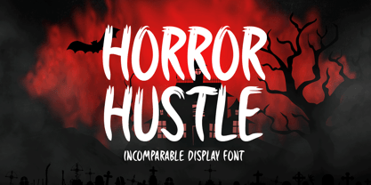 Horror Hustle is a casual display font. It is perfectly suitable for any Halloween-related project or crafty idea! The only limit is your imagination.
 - Betterday Script by Fargun Studio,
$12.00 Handwritten font with a signature style. Perfect for branding projects, homeware designs, product packaging or simply as a stylish text overlay to any background image.
 - Stylo Standard by Fonts of Chaos,
$10.00 With this font, you sure have the flow! Standard hand writing easy to apply in your designs and layouts. UPPERCASE lowercase Numerals Punctuation 198 characters
 - Kinsley by Nissa Nana,
$22.00 Kinsley Script is a beautifully light script font with a silky smooth feel. It will add plenty of class and character to any design project!
 - Stitka by ARToni,
$19.00 Stitka is a chic, refined script font that emanates sophistication and elegance. Its stylish and ligatures make this font the perfect match for any project.
 - PR Snowflakes 01 by PR Fonts,
$12.00 These are curly designs arranged into fanciful snowflakes, evoking 1960’s psychedelia as well as Victorian romanticism. An excellent choice for any winter holiday material.
 - Cattapilla by Typadelic,
$14.95 How cute can you get? Cattapilla's open type version has extra ligatures and stylistic alternates, perfect for scrapbooking, greeting cards, announcements or any creative project.
 - Century New Style by Red Rooster Collection,
$45.00Designed by Les Usherwood. Digitally engineered by Steve Jackaman. This beautiful version of Century Old Style by Les may be superior to any existing versions. - Sport Shaded JNL by Jeff Levine,
$29.00Sport Shaded JNL is a classic block font with a cast shadow, perfect for any project for sports teams, college life or high school activities. - Adolescent by Krakenbox Studio,
$12.00 Adolescent is a cute and playful handwritten font. Use this font to add that special cool touch to any design idea you can think of!
 - Ravioli by Arendxstudio,
$12.00 Ravioli combines fun fonts that will easily turn any design idea into a stand out! Fall in love with this adorable and versatile font family!
 - Rosianne by HandletterYean,
$10.00 Rosianne is a bold and unique handwritten font with a distorted and classic feel. It will effortlessly turn any creative idea into a stand out.
 - Contra Sans by Wiescher Design,
$16.50 Contra Sans is the base of my Contra family of fonts. It has just sufficient contrast to make for easy reading and an interesting appearance.
 - Redmoon by Krakenbox Studio,
$9.00 Redmoon is a cute and playful handwritten font. Use this font to add that special cool touch to any design idea you can think of!
 - Obvia Wide by Typefolio,
$29.00 'Obvia' appeared as a result of direct observation on typefaces classified as geometric and the plan to explore for the first time width axes Condensed, Narrow (soon), Normal and new Wide and Expanded. The idea behind 'Obvia's design was to create a distancing from geometrically pure shapes, in this case, square shapes. Then some details were added, such as subtle inktraps, concave endings of the stems and carefully drawn alternate characters, giving a 'geohumanist' tone to the font. This first family of 'Obvia' has 9 weights ranging from Thin to Black, delivering a strong typographic identity, from the paper to the pixel.
 - Obvia Expanded by Typefolio,
$29.00 'Obvia' appeared as a result of direct observation on typefaces classified as geometric and the plan to explore for the first time width axes Condensed, Narrow (soon), Normal and new Wide and Expanded. The idea behind 'Obvia's design was to create a distancing from geometrically pure shapes, in this case, square shapes. Then some details were added, such as subtle inktraps, concave endings of the stems and carefully drawn alternate characters, giving a 'geohumanist' tone to the font. This first family of 'Obvia' has 9 weights ranging from Thin to Black, delivering a strong typographic identity, from the paper to the pixel.
 - Treefrog by Three Islands Press,
$39.00 A one-time co-worker of mine sometimes used a fanciful inkpen-style script in display-lettering situations. I liked it a lot. "Phil," I says, "why not do the whole alphabet, maybe a few little dingbats, and I'll make a font." Well, one day he presented me with a stack of posterboard; he'd done some letters, all right -- hundreds of 'em. I managed to boil these down into a typeface called Treefrog, a name that seems to match its organic jumble, its tall x-height, its left- and right-leaning stems, its thick and thin strokes. Full release has many dingbats.
 - Valentia Nit by Eurotypo,
$59.00 “Valentia Nit” is a copperplate typeface enriched with swashes and extensions in alternate characters. Its main feature is the intense contrast between thick and thin strokes that gives you clarity of reading while providing a delicate and subtle texture in the text. Another feature is the spontaneity of its stems, the agile and casual ties, which in fact, these combinations can offer the designer a variety of possibilities to structure a logo or headline in sophisticated lettering style. “Valentia Nit” was designed to combine with our previous font “Valentia” in order to obtain the necessary hierarchy of texts using changing thicknesses.
 - Fatum by ParaType,
$25.00 Fatum™ is a new original ultrablack slab serif typeface that was initiated by the impression of the TDC 2011 exhibition. Redundant stem thickness and closed character shapes make a feeling that counterspaces are the narrow slits cut in massive character bodies. Fatum can be used in large sizes in placards, playbills, in the headings of magazines, newspapers and Web-pages, as initials in book setting, for typographic illustrations and compositions. Ultrablack weight also gives a possibility to insert pictures, ornaments or other decorations into the contours of letters. This typeface was designed by Sveta Morozova and released by ParaType in 2013.
 - Chaman by Cubo Fonts,
$29.00 Chaman is a “hybrid” font. On the one hand serifless, temperate and readable, and on the other hand quick and livily as a manual script, thanks to many unexpected ligatures. Letter design is plain and functional, punctuated by dynamic elements, mostly in ligatures and contextual glyphs, generated at the beginning and end of the word, thanks to your software’s OpenType features. It draws inspiration from the Tibetan alphabet, originally close to our own latin alphabet, as it stems from Bhram handwriting, itself derived from Phoenician alphabet. This alternation of stright vertical lines and regular bows makes Chaman’s design stand out.
 - Obvia Condensed by Typefolio,
$29.00 'Obvia' appeared as a result of direct observation on typefaces classified as geometric and the plan to explore for the first time width axes Expanded, Wide, Normal, Narrow and Condensed The idea behind 'Obvia's design was to create a distancing from geometrically pure shapes, in this case, square shapes. Then some details were added, such as subtle inktraps, concave endings of the stems and carefully drawn alternate characters, giving a 'geohumanist' tone to the font. This first family of 'Obvia' has 9 weights ranging from Thin to Black, delivering a strong typographic identity, from the paper to the pixel.
 - Gramma by CAST,
$45.00 Gramma is a compact sans with big x-height, a robust and balanced typeface that work well both for headlines and main bodies of text. The initial constructions, assembled from a few well-defined geometric modules, were later polished into more organic forms; the letters’ arches are quite squared, and the counters and other internal negative spaces push outward, creating a tension that balances the forms’ compression. Gramma’s most evident characteristic is its “bird-beak” terminals (present in many letters, including the c, e, f, s...) that replicate the unconnected junctures between stem and curve, visible in the a,b,d,g,h.
 - Enza Expanded by Neo Type Foundry,
$25.00 Designed by José José Villamizar, Enza Expanded is a display sans font family. This typeface has nine styles and was published by Neo Type Foundry. This font includes 8 OpenType features including Stylistic Alternates and Standard Ligatures making this font a great value. Enza Expanded has extensive Latin language support. Its design stems from the typographic exploration for conducting an identity aimed at entrepreneurs of the Millennial Generation, also known as Generation Y. Its use is recommended for titles, semicondensed texts or short, and elements of visual communication large phrases. It is also ideal for creating logos, in packaging, signboards and poster design.
 - Vandermark by TypeTrust,
$30.00Vandermark began as a simple daydream of what became the 'n' glyph. I considered the elegant balance of a terminal stroke that would never join its supporting stem. The premise was simple, but further experimentation was required for other parts of the alphabet. Vandermark follows a somewhat flexible array of structural rules and curve arrangements that called for considerable sketching to harmonize. The names I choose for my typefaces have to look decent when set in the signature type. Considering its improvisational development, it was only fitting that the namesake is a jazz musician and fellow Chicagoan, Ken Vandermark. - Skarpa by Aga Silva,
$23.99 This is long awaited thorough revision to Skarpa family. The revision has inculded both another look at letter shapes as well as kerning and metrics of the files. The shapes encapsulated in this font stem from old time architectural drawings hand executed at drawing board with tracing paper and rapidographs. Think of lettering stencils sliding across the tracing paper and craftily exectuted drawing descriptions. The font is based on geometric forms devoid of excessive flourishing. Would suit modern designs either in fashion, technology or laboratory setting. Would look good on door plaques in pharmacy or simple drawer plaques - especially Medium or Bold specimen.


