10,000 search results
(0.061 seconds)
- Leitmotiv by GRIN3 (Nowak),
$19.00Leitmotiv is a handwritten calligraphy font which can be used for invitations, greeting cards, posters, advertising, weddings, books, menus etc. Language support includes Western, Central and Eastern European character sets, as well as Baltic and Turkish languages. - Belqees Pro by GHEEN Studio,
$20.00 Belqees Pro is a modern Arabic and Latin typeface that belongs to the Kufi font family. This version is distinguished by an improvement in the form of the typefaces, as well as many additions for different uses
 - Borgson by Alphabet Agency,
$14.00 Borgson font is a sans serif display font that includes capitals and small capitals. The font includes basic Latin characters (128 characters). The font is great for vintage and hipster themes as well as sports related themes.
 - Elementarz Pro by GRIN3 (Nowak),
$29.00 Elementarz Pro is a handwritten, monoline, fully connected script with ligatures and contextual alternates to help with flow and readability. Language support includes Western, Central and Eastern European character sets, as well as Baltic and Turkish languages.
 - Galeb by Tour De Force,
$25.00 Galeb is simple geometric sans font family in 4 weights - Light, Regular, Bold and Black, ideal for corporate and editorial projects. With angled stem endings, Galeb gives enough impression to be used as display font as well.
 - Ginger Mate MS by Redcollegiya,
$8.00 Ginger Mate is a handwritten funny font duo which makes it great for Christmas cards or advertising, as well as for any children's design. Each of these fonts include latin and cyrillic characters, diacritics, numbers and punctuation.
 - Harpers Grotesque by Cloud9 Type Dept,
$45.00 Harpers Grotesque is a classic multiusable grotesk font with a modern twist. Harper Grotesque has an extended character set to support Central and Eastern European as well as Western European languages plus OpenType features, fractions and alternates.
 - Debunk by Matt Grey Design,
$19.00 Debunk is made to look (mis)printed, like a faulty, worn out and mixed up letterpress or typewriter. The typeface is ideal for stationary branding, labels, band artwork or album covers as well as endless other uses.
 - Flirt by Canada Type,
$25.00It's a very happy day when we stumble upon beautiful alphabets that were never digitized. It is even a happier day when the beautiful alphabet finds its way to us through friends and people who like our work. Some two months ago, the forms of this gorgeous font were pointed to us by a friend who saw it in an old Dover Publications specimen book showcasing historical alphabets. It was there under the name Vanessa, with nothing else to go by. We looked and researched for further information but found nothing else. So this gem comes to you like a coal that winked its way out of the ashes because it wanted to shine again. Flirt is very authentic art deco with a noticeable element of artistic pride, swashy delicate majuscules and very aristocratic, fashionable and flirty minuscules. The majuscules can be used as every other capitals usually are, or as initial caps. The minuscules can very nicely stand on their own quite independently from the caps whenever desired. These letters are quite similar to the hand lettering used on of the kind of theater posters, specifically burlesque and opera entertainment, which are now considered very retro-chic and fashionable to see hanging on walls in home or office. The initial specimen we worked from showed a single basic art deco alphabet with numerals which seemed as they belonged to another font. That alphabet became the base Flirt font, the numerals were redrawn to fit much better with the minuscules, and the character set was greatly expanded to include punctuation, accented characters, and many many alternates, especially for the majuscules. Majuscules with a descending right vertical stroke were a common artistic touch in the high days of theater posters, so we thought they would be great additions to the character set. These alternates can be found all over the font. So to maximize the design fun, have a character map or glyphs palette handy when you use Flirt. After the base font was finished, we thought it would be a good idea to give it a bold treatment unlike anything seen out there, and the farthest thing from the mechanical bolds seen everywhere now. This bolding treatment consisted of thickening the lowercase's vertical strokes inwards, but leaving the horizontal stroke weight as is, and thickening only the thicker vertical strokes of the uppercase. The result is quite the visual feat. We encourage you to test both the regular and bold weights and see for yourself. - Shout by HiH,
$12.00 Shout is a “Hey, Look at ME” font. It is an attention-getting font for posters, flyers and ads. Its lineage includes the Haas Type Foundry’s 19th century advertising font, Kompakte Grotesk, which Jan Tschichold (1902-1974) dryly described as “extended sans serif” and which graphic designer Roland Holst (1868-1938) would have disapprovingly referred to as a “shout,” as opposed to the quiet presentation of information that he believed was the proper function of advertising. In 1963 Letraset released what appears to be an updated variation in multiple weights designed by Frederick Lambert called Compacta. Shout draws heavily on Compacta, as well as other similar fonts of the 50s and 60s like Eurostile Bold Condensed and Permanent Headline. In weight, it falls about halfway between Compacta Bold and Compacta Black, but with a relatively heavier lower case that is not so easily pushed around by the upper case. After all, one can shout while sitting down. Shout is the first font released with our new encoding, as noted in the All_customer_readme.txt. The Euro symbol has been moved to position 128 and the Zcaron/zcaron have been added at positions 142/158 respectively. Otherwise, Shout has our usual idiosyncratic glyph selection, with the German ch/ck instead of braces, a long s instead of the Greek mu and our usual Hand-in-Hand symbol. There are also left and right glyphs of a big mouth ]ing (135/137) and left and right glyphs of an angry man shouting (172/177). Please use Shout with discretion. Folks get tired of being yelled out. After awhile, they stop listening. Shout ML represents a major extension of the original release, with the following changes: 1. Added glyphs for the 1250 Central Europe, the 1252 Turkish and the 1257 Baltic Code Pages. Add glyphs to complete standard 1252 Western Europe Code Page. Special glyphs relocated and assigned Unicode codepoints, some in Private Use area. Total of 355 glyphs. 2. Added OpenType GSUB layout features: pnum, ornm, liga, hist & salt. 3. Added 266 kerning pairs. 4. Revised vertical metrics for improved cross-platform line spacing. 5. Revised hyphen, dashes & math operators. 6. Minor refinements to various glyph outlines. 7. Inclusion of both tabular & proportional numbers. Please note that some older applications may only be able to access the Western Europe character set (approximately 221 glyphs). The zip package includes two versions of the font at no extra charge. There is an OTF version which is in Open PS (Post Script Type 1) format and a TTF version which is in Open TT (True Type)format. Use whichever works best for your applications.
 - Anca by DizajnDesign,
$49.00 Anca typeface started as a comission work for Fest Anca, an international animation festival. They needed something to complement the corporate identity of the festival. Inspiration came from a sketch made by my friend long time ago, which had a tremendous potential. As letters were digitized and the basic alphabet was completed, a very practical and universal typeface resulted. The whole type family has a playful and simple look with rounded stroke endings as well as long ascenders. The construction skeleton uses the minimum number of strokes and as a consequence, some original letter shapes (Q, w, j, &, A, §) were produced. Despite the fact that most letter shapes are based on geometry, some strokes are intentionally irregular, which creates a very natural feeling. Anca is appropriate for setting short paragraphs, headings and big inscriptions.
 - SK Paragrapher by Shriftovik,
$10.00 SK Paragrapher™ is a monumental geometric typeface whose structure was inspired by the paragraph glyph. The entire typeface is built on a rhythmic composition and a black-to-white balance. Each character corresponds to a grid, and all its characters are monospaced, so the typeface looks harmonious and complete, despite the complexity of perception of its appearance. This typeface has both uppercase and lowercase letters, as well as a capital! The typeface supports a multilingual layout that includes: extended Latin and Cyrillic characters, additional characters, and Hebrew. This typeface also includes more than 10 currency symbols, as well as 4 fonts: Solid, Outline, Rounded, Sharp! As a result, SK Paragrapher is a multilingual, monospaced geometric monumental typeface that contains almost 1000 glyphs for your any design work, be it a poster or a website!
 - Legan by PeGGO Fonts,
$39.00 Legan, created by PeGGO Fonts, is a typeface with a large number of glyphs. The uppercase letters follow the classical Trajan pattern. It is designed with several geometrical proportions such as root five, divine proportion (Golden Ratio), regular square, and others, just like the Greek Trajan letters used on Trajan’s Column. The major innovation is a lowercase that is designed in accordance with the same Trajan rules. My concern for the global community is reflected by the large number of diacritics I have provided, first on the basic alphabet, then on extended latin languages, as well as ones for Cyrillic and Greek. Because it is OpenType, there are various setup possibilities including traditional ligatures, as well as various alternates. Altogether you will find this a very playful, fashionable, and elegant typeface.
 - Tiqqun by Harvester Type,
$20.00 Tiqqun appeared as a font for a monumental, but at the same time futuristic design. During the creation process, many variations for each glyph came to mind. Therefore, it was decided to create an entire system of alternative options. As a result, we have more than 130 alternative characters and as many as two full-fledged alternative sets. The font contains monumentality, brutality, futurism, rigor and uniqueness of some forms. As a result, Tiqqun has become a font system that can cover a large range of your design needs: Prints on clothes, logo, packaging, banner, title, text, poster, merchandising, identity, branding or product design. - 360+ Glyphs - 130+ Alternative Glyphs - Supports 80+ Languages - Special Symbols and Features - 2 Full Alternative Set - OT Features: aalt, case, kern, ordn, salt, sups, ss01-09
 - Ioana by Octopi,
$20.00 Ioana is an inoffensive, slightly quirky, slightly fattened sans serif font. It has a full character set as well as ligatures, small caps, superiors, inferiors, numerators, denominators and auto-fractions. Ioana came about as a direct result of 3 previous, private commissions that were all based on an artists hand-writing. For Ioana, I wanted a more regimented (but not boring) sans serif that could be used for headlines, posters and flyers with larger body text. Ioana Lighter is an inoffensive, slightly quirky, slightly lighter sans serif font. It is the lighter weight of Ioana and has a full character set as well as ligatures, small caps, superiors, inferiors, numerators, denominators, old style figures and auto-fractions. These OpenType fonts have support for CE languages and I hope you like it.
 - TT Fellows by TypeType,
$39.00 TT Fellows useful links: Specimen | Graphic presentation | Customization options There can't be too many universal fonts! Meet TT Fellows, a new workhorse whose functionality allows you to comfortably use the font in a variety of projects. Calm and neutral at first glance, the mood of TT Fellows can change. Working with the typeface, you can reveal its soft and friendly nature, or even the brutal one, for example, by typing the text exclusively in capital letters in the bold style. TT Fellows is easy to use and perfect for setting large text arrays. Thanks to the font's uniwidth and versatility, the font is ideal for use on websites or in periodicals. Bold styles will work harmoniously in headlines or as accents in print or on packaging. TT Fellows is a humanist sans serif with a mechanical touch. With its open shapes, the friendly neutral character of thin weights and an even softer character in bold weights, the new typeface differs in character from the classic TT Norms® and TT Commons sans serifs, while still offering the same functionality. Calm regular styles differ from bold, deliberately display and more expressive ones. By the way, TT Fellows is a unwidth typeface. It was important for us that the user could change the styles, knowing that the layout will not suffer. The typeface features equal width proportions, open apertures, and slightly squared ovals, which associatively brings it closer to other popular modern fonts. Since the idea of the typeface was focused on it being a uniwidth typeface, we needed to fit the bold styles into the regular em squares, which led to interesting graphic solutions that are noticeable, for example, in the k and ж characters, in which the branches are cut directly into the stems. TT Fellows consists of 19 styles: 9 upright, 9 italic and 1 variable, each with over 700 glyphs. The font has 26 useful OpenType features. For example, there is a switch to single-part versions of letters a and y, fractions, tabular characters, case versions of punctuation, and localized versions of characters for different languages. There is a ligature for a combination of two characters of a complex design fl. TT Fellows font field guide including best practices, font pairings and alternatives.
 - Steelfish Hammer by Typodermic,
$11.95 Welcome, esteemed customers, to our magnificent array of fonts! It is with great pleasure that we present to you the rusticized Steelfish Hammer, a variation of the popular Steelfish typeface. Its rugged appearance embodies the sincere and trustworthy nature of your message, evoking sentiments of the utmost assurance. With three textured letter variations that are shuffled automatically in OpenType-savvy applications, the Steelfish Hammer typeface creates an unparalleled realistic impression. To disable this effect, simply toggle the “standard ligatures” feature in your application. And oh, the compact letterforms of the Steelfish Hammer! They are nothing short of exquisite. Each of the five weights and italics of this typeface is a testament to the power and resilience of your message, with every character carefully crafted to achieve the desired effect. There are other kinds of Steelfish too: Steelfish Regular, Steelfish Rounded, Steelfish Steeled and Steelfish Unleaded. Come, delve into the world of typography with us and experience the unmatched beauty of the Steelfish Hammer. Let your message speak with confidence and authenticity, as it is our utmost priority to provide you with the best tools to achieve your goals. Most Latin-based European, Vietnamese, Greek, and most Cyrillic-based writing systems are supported, including the following languages. Afaan Oromo, Afar, Afrikaans, Albanian, Alsatian, Aromanian, Aymara, Azerbaijani, Bashkir, Bashkir (Latin), Basque, Belarusian, Belarusian (Latin), Bemba, Bikol, Bosnian, Breton, Bulgarian, Buryat, Cape Verdean, Creole, Catalan, Cebuano, Chamorro, Chavacano, Chichewa, Crimean Tatar (Latin), Croatian, Czech, Danish, Dawan, Dholuo, Dungan, Dutch, English, Estonian, Faroese, Fijian, Filipino, Finnish, French, Frisian, Friulian, Gagauz (Latin), Galician, Ganda, Genoese, German, Gikuyu, Greenlandic, Guadeloupean Creole, Haitian Creole, Hawaiian, Hiligaynon, Hungarian, Icelandic, Igbo, Ilocano, Indonesian, Irish, Italian, Jamaican, Kaingang, Khalkha, Kalmyk, Kanuri, Kaqchikel, Karakalpak (Latin), Kashubian, Kazakh, Kikongo, Kinyarwanda, Kirundi, Komi-Permyak, Kurdish, Kurdish (Latin), Kyrgyz, Latvian, Lithuanian, Lombard, Low Saxon, Luxembourgish, Maasai, Macedonian, Makhuwa, Malay, Maltese, Māori, Moldovan, Montenegrin, Nahuatl, Ndebele, Neapolitan, Norwegian, Novial, Occitan, Ossetian, Ossetian (Latin), Papiamento, Piedmontese, Polish, Portuguese, Quechua, Rarotongan, Romanian, Romansh, Russian, Rusyn, Sami, Sango, Saramaccan, Sardinian, Scottish Gaelic, Serbian, Serbian (Latin), Shona, Sicilian, Silesian, Slovak, Slovenian, Somali, Sorbian, Sotho, Spanish, Swahili, Swazi, Swedish, Tagalog, Tahitian, Tajik, Tatar, Tetum, Tongan, Tshiluba, Tsonga, Tswana, Tumbuka, Turkish, Turkmen (Latin), Tuvaluan, Ukrainian, Uzbek, Uzbek (Latin), Venda, Venetian, Vepsian, Vietnamese, Võro, Walloon, Waray-Waray, Wayuu, Welsh, Wolof, Xavante, Xhosa, Yapese, Zapotec, Zarma, Zazaki, Zulu and Zuni.
 - SCR-N by URW Type Foundry,
$39.99 SCR fonts are screen optimized (also called 'pixel fonts'). Unlike standard fonts (and like the few well-hinted fonts like Verdana or Arial), they give a crisp look on screen at very small sizes, thus increasing legibility. The perfect applications for those fonts are web pages and software user interfaces (computer, cellular phones, console games and any other system that uses a screen interface). Unlike most pixel fonts, SCR fonts contain kerning information. Kerning is the adjustment of space between certain pairs of characters (like 'AV') to make text look more fluid, thus increasing legibility and appeal. To benefit from this feature, auto-kerning must be activated in the application. In Photoshop, kerning must be set to 'Metrics'. Although SCR fonts are optimized for screen, they can be used for print (in Illustrator or Indesign for example) for a decorative 'computer text' effect. In this case, there is no constraint: they can be used as any other font. For screen use (in Photoshop, Fireworks, Flash... ), they have to keep aligned with the screen pixel grid not to look blurred or distorted. To achieve this, here are the guidelines to follow: RESOLUTION If the application permits it (Photoshop, Fireworks), document resolution must be set to 72 pixels per inch. SIZE The font size must be set to 10 (or multiples of 10) points. POSITIONING & ALIGNMENT The reference points of text fields and text blocks (upper left corner for left aligned text, upper right for right aligned text) must be positioned at integer values of pixels. In Photoshop, text can be precisely moved with [Edit Free Transform]. In Flash, movie clips containing text fields must also be positioned at integer values on the stage. Text must be aligned to the left or right only. Center alignment can be simulated with left alignment by adding spaces at the begin of each line. To dispense with the positioning and alignment constraints, text anti-aliasing can be turned off if the application permits it (Photoshop, Flash MX 2004). OTHER SETTINGS Leading (line spacing), tracking (letter spacing), manual kerning and baseline shift must be set either to integer values of points or to multiples of 100 units (depending on the application). Vertical and horizontal scaling must be set to 100%. Faux bold or Faux italic must not be used. The document must neither be resized on export, nor allow resizing (Flash Movies).
 - SCR-I by URW Type Foundry,
$39.99 SCR fonts are screen optimized (also called 'pixel fonts'). Unlike standard fonts (and like the few well-hinted fonts like Verdana or Arial), they give a crisp look on screen at very small sizes, thus increasing legibility. The perfect applications for those fonts are web pages and software user interfaces (computer, cellular phones, console games and any other system that uses a screen interface). Unlike most pixel fonts, SCR fonts contain kerning information. Kerning is the adjustment of space between certain pairs of characters (like 'AV') to make text look more fluid, thus increasing legibility and appeal. To benefit from this feature, auto-kerning must be activated in the application. In Photoshop, kerning must be set to 'Metrics'. Although SCR fonts are optimized for screen, they can be used for print (in Illustrator or Indesign for example) for a decorative 'computer text' effect. In this case, there is no constraint: they can be used as any other font. For screen use (in Photoshop, Fireworks, Flash... ), they have to keep aligned with the screen pixel grid not to look blurred or distorted. To achieve this, here are the guidelines to follow: RESOLUTION If the application permits it (Photoshop, Fireworks), document resolution must be set to 72 pixels per inch. SIZE The font size must be set to 10 (or multiples of 10) points. POSITIONING & ALIGNMENT The reference points of text fields and text blocks (upper left corner for left aligned text, upper right for right aligned text) must be positioned at integer values of pixels. In Photoshop, text can be precisely moved with [Edit Free Transform]. In Flash, movie clips containing text fields must also be positioned at integer values on the stage. Text must be aligned to the left or right only. Center alignment can be simulated with left alignment by adding spaces at the begin of each line. To dispense with the positioning and alignment constraints, text anti-aliasing can be turned off if the application permits it (Photoshop, Flash MX 2004). OTHER SETTINGS Leading (line spacing), tracking (letter spacing), manual kerning and baseline shift must be set either to integer values of points or to multiples of 100 units (depending on the application). Vertical and horizontal scaling must be set to 100%. Faux bold or Faux italic must not be used. The document must neither be resized on export, nor allow resizing (Flash Movies).
 - Blue Goblet Drawn by insigne,
$5.00 This best selling series has now been extended to include a new member, Blue Goblet Drawn. Blue Goblet is hand-drawn by the artist, Cory Godbey, and is organic, charming and exuberant. Characters bounce and dance above and below the baseline and x-height, making this a whimsical and fun script. Not only is Blue Goblet Drawn a excellent choice, it also is also a versatile member of a wide family of different fonts. You can use it side by side with the original Blue Goblet fonts, and there are a wide range of ornaments available in the supplemental ornament sets--over 370 illustrations! These illustrations include doodley frames, lovely florals and other text ornaments that can be inserted into your text and resized at will. This makes the Blue Goblet series a great pick when you want a type system for a very unique and consistent look. The Blue Goblet series also continues to expand, making any of these family members a valuable investment for the future. Blue Goblet Drawn comes in three weights and three widths in each weight, with complementary italics for maximum impact for a total of eighteen pro fonts. The compact thin weights are delicate and tall, while the Regular has just enough heft for those situations where subtlety doesn't work. If you don't need the professional features, there are three stripped down fonts that include only the basic character set! Blue Goblet Drawn also includes auto-replacing ligatures that make it appear that the script was drawn by the artistís own hand--just for you! Blue Goblet Drawn also includes a wide variety of alternates that can be accessed in any OpenType enabled application. Blue Goblet includes over 190 additional glyphs and is loaded with features including an even more unique alternate alphabet. Included are swash alternates, style sets, old style figures and small caps. Please see the informative PDF brochure to see these features in action. OpenType enabled applications such as the Adobe suite or Quark can take full advantage of the automatic replacing ligatures and alternates. This family also includes the glyphs to support a wide range of languages. Blue Goblet Drawn is a great choice for friendly display type in children's books, packaging, organic packaging or other unique applications. Use Blue Goblet whenever you want to inject a handmade sense of fun and whimsy to your designs. Give the Blue Goblet series a whirl today!
 - ÉconoSans Pro by Ingo,
$41.00 The most space-saving sans serif This font saves more space than any of its kind! Slim proportions, but not “condensed” Characters which nearly touch Sparse ascenders and descenders Distinct forms How close to each other can the characters of a font get? Theoretically, as close as you want. But obviously, the words should still be legible. And as any designer knows, body clearance of characters also depends on other parameters such as point size and line spacing. In practice, there are always situations in which as much information as possible has to be positioned in as little space as possible. The ingoFont ÉconoSans is made for exactly this purpose. Even the name of the font implies its function: French for the infinitive “to save” is “économiser.” Now if that doesn’t sound good… The shapes of the upper and lower case letters are completely matter-of-fact, the way a modern font has got to be. The letters c e, and s are wide open to their neighbors. An especially distinguished trait of this font is the design of the “triangular” characters v w y x k z and A V W Y Z K X M N. And the open form of B R and P is also not typical in a sans serif. The distance between letters is kept tight and often the characters nearly touch, but only nearly. With ÉconoSans you gain approximately 20% more text in a line than with »Tahoma«, and even still more than 10% compared to »Helvetica«. ÉconoSans also includes tabular figures as well as ligatures. Among the ligatures, the double mm is especially unusual and is hardly familiar, but can contribute greatly to saving space without catching the reader’s eye.
 - FF Child's Play by FontFont,
$62.99 British type designer John Critchley created this script FontFont in 1993. The family has 7 weights, and is ideally suited for advertising and packaging, editorial and publishing as well as poster and billboards. FF Child's Play provides advanced typographical support with features such as ligatures and alternate characters. It comes with a complete range of figure set options – oldstyle and lining figures, each in tabular and proportional widths.
 - Suburban Collier by Paula Minelgaite,
$80.00 Suburban Collier is a dreamy, humanist demi-serif sister of Romford Stencil typeface. It was created during the COVID-19 pandemic and its name is inspired by Collier Row, a suburban area of Romford, East London (UK). Suburban Collier features subtle ligatures, an alternative ‘a’ and supports Western, Central, Southern, and Eastern European as well as Pinyin. Use it to add character to your body copy or as fancy display text.
 - Shangri La NF by Nick's Fonts,
$10.00An unusual handlettered alphabet from the 1922 chapbook Modern Show Card Writing, by Joseph Bertram Jowitt, provided the pattern for this whimsical face. Its letterforms, as well as its name, conjure up visions of faraway places, and is sure to add a unique charm to your next project. This font contains the complete Latin language character set (Unicode 1252) plus support for Central European (Unicode 1250) languages as well. - FF Nelio by FontFont,
$41.99 Finnish type designer Sami Kortemäki created this display and script FontFont in 2001. The family has 7 weights, ranging from Light to Regular and is ideally suited for festive occasions, film and tv, music and nightlife, poster and billboards as well as software and gaming. FF Nelio provides advanced typographical support with features such as ligatures, alternate characters, case-sensitive forms, and stylistic alternates. It comes with proportional oldstyle figures.
 - FF Screenstar by FontFont,
$41.99 German type designers Steffen Sauerteig, Kai Vermehr and Svend Smital created this display FontFont in 2003. The family has 5 weights, ranging from Regular to Bold and is ideally suited for logo, branding and creative industries, music and nightlife, small text, software and gaming as well as web and screen design. FF Screenstar provides advanced typographical support with features such as ligatures. It comes with tabular lining and proportional lining figures.
 - William Dhatos by Kotak Kuning Studio,
$18.00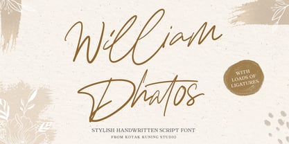 William Dhatos is a handwritten signature script with a natural and stylish flow. This font has a multitude of natural looking ligatures in its OpenType features - making the font look as close to natural handwriting as possible. William Dhatos is perfect for many different projects such as logos and branding, invitation, stationery, wedding designs, social media posts, advertisements, product packaging, product designs, label, photography, watermark, special events and more.
 - Jolly by Sebastian Losch,
$- Jolly is a cheery, little display typeface that is suitable for headlines and informal body-copy. Being slightly slanted to the right, jolly has a fairly positive straightforward appearance which makes it pleasant to read. Its various Open Type features, such as swashy alternates for the capitals, ligatures and stylistic alternates as well as the small caps and the extended language support make it versatile and open for different applications.
 - FF Govan by FontFont,
$41.99 German type designers Erik Spiekermann and Ole Schäfer created this sans FontFont in 2001. The family contains 3 weights: Regular, Condensed, and Expanded and is ideally suited for advertising and packaging, film and tv as well as logo, branding and creative industries. FF Govan provides advanced typographical support with features such as ligatures, alternate characters, case-sensitive forms, super- and subscript characters, and stylistic alternates. It comes with proportional lining figures.
 - Mezz by Adobe,
$29.00Clarinetist Milton ?Mezz? Mezzrow (1899-1972) was a remarkable jazz musician, as becomes evident upon reading his autobiography Really the Blues. His sharp tone and serpentine lines inspired English lettering artist and jazz lover Michael Harvey to create a condensed, oblique display typeface with the look of a chiseled alphabet in the musician's honor. Vertical formats such as book jackets and posters will be invigorated by Mezz as the display face. - Leaders by Mans Greback,
$59.00 Leaders is a decorative blackletter typeface. Created by Måns Grebäck during 2020, this medieval style lettering can be used for modern contexts that require a touch of flourishing, as well as any middle age art or festive occation. OpenType functions such as ligatures and alternates are present in the typeface. It contains numbers and all symbols and punctuation you'll ever need. The font also has support for European, Latin-based languages.
 - Realvish by Picatype,
$12.00 Realvish is a handwritten brush font, a contemporary approach to design, handmade natural, suitable for use in title design such as clothing, invitations, book titles, stationery designs, quotes, branding, logos, greeting cards, T-shirts, packaging designs, posters, and more. Realvish has one normal, complete with uppercase and lowercase letters, as well as multi-language support, numbers, punctuation. Thanks very much for finding and let me know if you have any questions.
 - Migoan by Surotype,
$20.00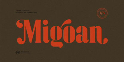 Migoan Serif is a display typeface with dynamic curve ,very suitable as to make a design choice for Headline, Movie Title, packaging, branding and more other creative project. Migoan's also has alternative characters such as Stylistic Alternates, Stylistic Set, and Swash variant. To enable the OpenType Stylistic alternates, you need a program that supports OpenType features such as Adobe Illustrator CS, Adobe Indesign & CorelDraw X6-X7. and more
 - Blunch by Estudio Calderon,
$35.00 Blunch is a new glyphic typeface that has flared slightly strokes. The design is based on many typographic references as Basilea, Stettler and Pascal. It includes three styles: Upright, slanted and backslanted. Blunch is equipped with an extended character set to support Central and Eastern European as well as Western European languages. I recommended use Blunch in the following design concepts: Brewing company Can beer desing Sports Branding Packaging design
 - Beliber by Ridtype,
$15.00 Beliber is a Serif Font Family, this font is specially designed to get the best feel and high quality to get the touch of a high end product This font supports Opentype Features, such as Alternate and Ligatures, as well as other forms of support symbols, numeric, mathematical symbols and others characters to be used. Thank you for your support of our product and using it in your project.
 - Designer RD by Kostic,
$40.00 Designer RD was created in 1999, at the same time as Just Square and Why Square typefaces, and envisioned to be their rounded alternative. Zoran based the font on the logotype his son Nikola made and its primary purpose is to be used in logotypes, headlines, fliers, websites, etc. that are going for a hard geometric look. Designer RD’s character set supports Western European languages, as well as the Cyrillic script.
 - Quintana by Jonahfonts,
$35.00 Quintana is a font that reflects urgency. Suitable for logos and packaging statements. Invoking the Opentype / CONTEXTUAL variant produces the word terminals for all lower-case letterforms as well as diacritic letters. This can be done individually for each letter as well. (Check out the pdf in the Gallery section for details.) Quintana also contain alternative Swashes and OldStyle numerals. (Opentype-Variants may only be accessible via Opentype-aware applications.
 - Orchestra BT by Bitstream,
$50.99Created by Italian graphic designer and illustrator Lorenzo Lalatta, Orchestra brings a whimsical yet elegant spin to Latin typography. Every letterform is cleverly adapted from the shape of a musical instrument or musician. Mr. Lalatta has even disguised himself as the bullet glyph. Perfect for use as initial letters or in special invitations, these caricatures allow for delightful color embellishment as well. Don't be shy about wielding this baton! - Angel Face by RCKY Studio,
$16.00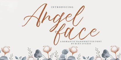 Angel Face is a romantic handwritten font with contemporary, sophisticated accents. Suitable for use in watercolor designs. Such as Novel tittle, Apparel, Invitations, Quotes, Books tittle, Stationery Design, Branding, Logos, Greeting Card, T-shirt, Packaging design, Poster and more. Angel Face Font includes a complete set of uppercase and lowercase letters, as well as multi-language support, numbers, punctuation, ligatures and alternative character,also with additional Angel Face extra swashes.
 - Minty Breeze by Creativemedialab,
$20.00 Minty Breeze is a modern serif with lots of ornamental alternatives that allows you to design expressive logos or titles for all types of your projects. The vintage yet elegant style combined with modern typographic art is the main attraction of this font, from Branding to fashion-related concepts. Thanks to its beautiful character. The fonts come in 7 styles, from thin to black, as well as variable formats as well.