10,000 search results
(0.026 seconds)
- Figment by Scholtz Fonts,
$10.00 Like a figment of the imagination, this very readable font wafts across the page, leading the reader into a world of enchantment. Ethereal and fluid, it is reminiscent of sorcerer's spells written on ancient parchment. It manages, by the distortion of its characters, to transform a simple serif font into something quite different. Wavy outlines and an uneven baseline create an impression of fluidity and magic, while retaining the essential clarity of the classic serif body font. Use Figment for: -- Children's books -- Halloween advertising media -- book covers -- movie titles -- swing tickets -- posters Figment is available in two styles, Figment Regular and Figment Force (a wider and bolder style) The font has been professionally letterspaced and kerned. All upper and lower case characters, punctuation, numerals and accented characters are present.
 - Bewilderment by SavoringSurprises,
$10.00 Bewilderment is a hand lettered sans-serif font. The perfectly simple font could be used for a variety of projects, such as a design on a t-shirt, car decal, or tumbler! - Contains over 200 accented characters for language support. Some of the languages supported are: English, Spanish, Portuguese, German, Italian, French, Polish, Catalan, Irish, Norwegian, Croatian, Gaelic, and more! If you would like to know if a certain language is supported, please contact me with the language and/or any special characters you wanted to know about.
 - Alexandrya by Hackberry Font Foundry,
$24.95 Alexandrya is a subtly modulated block serif font family with a humanist sensibility and all of my personal style for font design. A distant ancestor of the basic letterforms is Minister (a German font of the 1920s) through my first font in the mid-1990s, Diaconia. There are many OpenType features with over 600 characters: Caps, lower case, small caps, ligatures, discretionary ligatures, swashes, small cap figures, old style figures, numerators, denominators, accent characters (including CE), ordinal numbers (1st-infinity: lining and oldstyle), and so on. It is designed for text use in body copy.
 - Flounder Pro by Dominik Krotscheck,
$10.00 The Flounder Pro is a simple and clean condensed all-caps sans serif font. It is a close relative of the Floz, but has rounded edges. It comes with Cyrillic, Greek and Latin alphabets, the latter including loads of accented characters. It is also equipped with a bunch of ligatures, as well as alternates for the letters J, W, Q, Z, Ω and Ξ. Those features are easily accessible via opentype features. This family includes three weights with their respective italics and backslanted versions. The Flounder works well for Logos, Headlines, or short texts.
 - Hondo Grunge by Fontasmic,
$16.99 The Hondo Grunge fonts are a collection of ultrabold eroded slab serif typefaces with a dynamic look and extended functionality. Accented with decorative and functional inktraps and complete with Slant and Backslant styles, this heavyweight has a high performance hardcore edge to it. Ideal for titling, poster work, logos, and small bits of copy. For the Opentype savvy, the Opentype version contains a complete alternate set of base characters, which by enabling contextual alternates option will force the typeface to continually alternate between the original & alternate character sets for a more spontaneous look.
 - Cronisse by Almarkha Type,
$35.00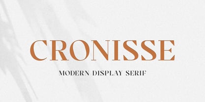 Introducing Cronisse – Modern Display Serif inspired by the famous minimalist logo, perfect for the purposes of designing templates, brochures, videos, advertising branding, logos and more. What’s Included : + Standard glyphs + Web Font + International Accent + Works on PC & Mac + Simple installations Accessible in the Adobe Illustrator, Adobe Photoshop, Adobe InDesign, even work on Microsoft Word. PUA Encoded Characters – Fully accessible without additional design software. Fonts include multilingual support Image used : All photographs/pictures/vector used in the preview are not included, they are intended for illustration purpose only. Cheers! Thank You
 - SUE by Typeskets,
$15.00 SUE is a sans serif category with 18 styles or 9 weights with Oblique, this font is also included in the Variable font, with a minimalist appearance of course you can use it in various designs such as headlines, posters, invitations, labels, logos, to make the body text pretty good. . , and many designs that you can apply with this font. You will feel it when you have it as a font collection on your computer SUE OTF (18Font Style) SUE Variable with Oblique version Latin Extended characters accents
 - Alphonse by RagamKata,
$16.00 Alphonse Script Font exudes charm with its distinctive letter details. Crafted with a bold yet modern style, this font presents characters that are not just clear but also invite the eye to explore the beauty of its typography. With available alternate swash accents, each word comes alive, allowing users to express their creativity in an elegant and captivating manner. This font is good for logo design, Social media, Movie Titles, Books Titles, a short text even a long text letter and good for your secondary text font with sans or serif.
 - Yavome by Arterfak Project,
$26.00 Spread your love with Yavome :) Yavome is a quirky Serif font, with modern experimental shapes. Designed with high contrast and artistic curves, it gives a dynamic impression and graceful movement with additional special characters! Yavome is inspired by medieval typography, developed into an elegant and unique form, making it especially suitable for use in display, branding, logos, and quotes. The font can be used on flyers, posters, stories, invitations, t-shirts, stickers, and more. What you will get: Uppercase Lowercase Numbers & punctuation Symbols Stylistic alternates Ligatures (lowercase) Accented characters. Thank you for all your support!
 - Helnore by Owl king project,
$39.00 Helnore is a sans serif font family with tapered accents in some of the letters giving it a modern and bold character, even being quite prominent in thin characters. This font aims to give an elegant impression and also looks so luxurious in short words for a letter-based title and logo. Helnore bring 20 style/Italic and support multi-languages, this font provides a wider range of exploration, which can be useful also for reading sentences and giving variety in each sentence by combining it with several sizes.
 - Gateway Heaven by Graphicxell,
$19.00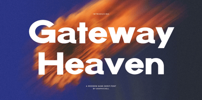 Gateway Heaven Modern Bold Sans serif Font inspired by the famous minimalist logo perfect for the purposes of designing templates, brochures, videos, advertising branding, logos, invitation, layout design, elegant crafting, beauty design and other What's Included : Standard glyphs International Accent Works on PC & Mac Simple installations Accessible in the Adobe Illustrator, Adobe Photoshop, Corel Draw. PUA Encoded Characters - Fully accessible without additional design software. Fonts include multilingual support Image used : All photographs/pictures/vector used in the preview are not included, they are intended for illustration purpose only. Thank You
 - Wiley by Molly Suber Thorpe,
$17.99 Wiley is a ligature-rich, decorative typeface with full support for both Latin and Modern Greek. It's a modern twist on vintage Western serif fonts that makes unique logos, personal stationery, and monograms. Wiley has over 80 ligatures and alternates (for Greek, too!), so it's extremely customizable and versatile. Its 500+ glyphs include: the complete Latin alphabet (with all accent marks), the complete Modern Greek alphabet, 80 standard and discretionary ligatures in both Latin and Greek, numerals, ordinals, and fractions, decorative ornaments and finials, extensive punctuation and diacritical markings.
 - Wilkysta by Graphicxell,
$19.00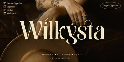 Wilkista Ligature Serif Typeface inspired by the famous minimalist logo perfect for the purposes of designing templates, brochures, videos, advertising branding, logos and more. What's Included : + Standard glyphs + Web Font + Ligatures + International Accent + Works on PC & Mac + Simple installations Accessible in the Adobe Illustrator, Adobe Photoshop, Adobe InDesign, even work on Microsoft Word. PUA Encoded Characters - Fully accessible without additional design software. Fonts include multilingual support Image used : All photographs/pictures/vector used in the preview are not included, they are intended for illustration purpose only. Thank You
 - Tropical Trouble by SavoringSurprises,
$10.00 Tropical Trouble is a hand lettered sans-serif font. The super tall and super skinny font could be used for a variety of projects, such as labels for a jar or a name on a tumbler! Contains over 200 accented characters for language support. Some of the languages supported are: English, Spanish, Portuguese, German, Italian, French, Polish, Catalan, Irish, Norwegian, Croatian, Gaelic, and more! If you would like to know if a certain language is supported, please contact me with the language and/or any special characters you want to know about.
 - Attic Antique by Three Islands Press,
$29.00 Attic Antique by Three Islands Press. Flipping through a friend’s old hardbound collection of John Burroughs nature essays a while back, I thought it'd be fun to try to develop a typeface with the same uneven, imperfect look to it. I picked and chose among various printed characters, enlarged them somewhat with a photocopier, then hand-rendered each. Had to custom-make some of the accents and symbols, then added a couple goofy dingbats just for the heck of it. The result: an amazingly legible serif family akin to the Century faces.
 - Gaming Sporty by Graphicxell,
$19.00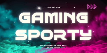 Gaming Sporty futuristic Display Sans serif Font inspired by the famous minimalist logo perfect for the purposes of designing templates, brochures, videos, advertising branding, logos, invitation, layout design, elegant crafting, beauty design and other What's Included : + Standard glyphs + International Accent + Works on PC & Mac + Simple installations Accessible in the Adobe Illustrator, Adobe Photoshop, Corel Draw. PUA Encoded Characters - Fully accessible without additional design software. Fonts include multilingual support Image used : All photographs/pictures/vector used in the preview are not included, they are intended for illustration purpose only. Thank You
 - Farewell Angelina by Ana's Fonts,
$15.00 Farewell Angelina is an elegant font family with a feminine flair. It includes: - a display font with 3 weights and 2 styles: regular, bold and black in serif and sans, which look great at large sizes; - a text font in 2 styles: regular and italic, which look great at small sizes and in longer texts. Each font includes: - A-Z, a-z, 0-9 - accents - punctuation and symbols - ligatures - stylistic alternates - small caps Farewell Angelina is perfect for magazine layouts, creating logotypes, social media posts, branding and packaging.
 - Banery by Arterfak Project,
$28.00 Banery is a minimalist serif in modern style. Made with geometric shapes and high contrast of strokes, also accompanied by alternates characters with unique shapes, and full of beautiful twists which give a pretty, elegant, and exclusive impression. Banery is very suitable for use on various media such as posters, magazines, catalogs, logos, logotypes, labels, flyers, and branding. You can use this font, especially on minimalist themes such as furniture, invitation, wedding, fashion, beauty, real estate, perfumery, and many more. What you'll get : Uppercase & lowercase Numbers & punctuation Accented characters Stylistic sets Ligatures. Thank you!
 - Westack by Almarkha Type,
$35.00 Introducing Westack – Modern Display Serif inspired by the famous minimalist logo, perfect for the purposes of designing templates, brochures, videos, advertising branding, logos and more. What’s Included : Westack (OTF/TTF) Standard glyphs Ligatures Web Font International Accent Works on PC & Mac Simple installations Accessible in the Adobe Illustrator, Adobe Photoshop, Adobe InDesign, even work on Microsoft Word. PUA Encoded Characters – Fully accessible without additional design software. Fonts include multilingual support +Image used : All photographs/pictures/vector used in the preview are not included, they are intended for illustration purpose only. Cheers! Thank You
 - Klamp 105 by Talbot Type,
$19.50 Talbot Type Klamp 105 is an elegant and streamlined, geometric sans-serif. A legible text font, its narrow proportions mean it’s economical with space; while at larger sizes it makes a confident, modern display face. Klamp 105 is available in a comprehensive family of seven weights, featuring an extended character set to include old style numerals, as well as accented characters for Central European languages. It is also available with some character variations as Klamp 205, most notably featuring a traditional, double-storey lower case a and g.
 - Klamp 205 by Talbot Type,
$19.50 Talbot Type Klamp 205 is an elegant and streamlined, geometric sans-serif. A legible text font, its narrow proportions mean it’s economical with space; while at larger sizes it makes a confident, modern display face. Klamp 205 is available in a comprehensive family of seven weights, featuring an extended character set to include old style numerals, as well as accented characters for Central European languages. It is also available with some character variations as Klamp 105, most notably featuring a more modern, single-storey lower case a and g.
 - Old Times American by Baseline Fonts,
$29.00The Old Times American Family is derived from several letterpress books from the 1880s in the midwest. The fonts were painstakingly compiled from over 100 pages of text and optically balanced for optimum results. Old Times American is part of the Grit History Series A font set. The set encompasses serif and sans-serif fonts in varying weights to meet the needs of designers. The less-than-perfect letterforms evoke a sense of the non-digital. - Astoria Sans by Alan Meeks,
$45.00 The Sans serif companion to Astoria. Based heavily on Gill especially in the mid weights and with a consistant series of condensed weights. Designed specifically as a text face it still works very well as a headline font. There are 6 weights with accompanying Italics.
 - Amica Pro by Eclectotype,
$40.00 Welcome Amica Pro, a workhorse sans designed to give your branding a friendly, approachable look. What is it that makes a typeface friendly? Eclectotype undertook extensive research* in this and the results are in! To cut a long story short, friendliness in sans serif fonts can be summed up in two words – short and fat. Basically, think Danny DeVito in letter form. The shortness in Amica Pro is achieved (somewhat counterintuitively) by pushing up the x-height. This, coupled with short ascenders and descenders, gives the text a squat appearance. For the fatness, that's easy in the bolder weights, but how to carry this through to the lights? Here, the fatness equates to roundness, so the letterforms, even if the stroke weight is light, have a rotund appearance from the wideness and roundness of the circular glyphs. When thinking about friendliness, we think about inclusiveness. To this end, Amica Pro supports a super wide range of latin-based languages, as it uses Underware's Latin Plus character set, as well as extra support for Vietnamese. Amica Pro is best used for branding, logos, infographics etc. It will give your UI a friendlier feel, but that doesn't mean it's not serious. There are many useful typographic features, including alternates, numerous figure styles, automatic fractions and case-sensitive forms. The italics are carefully optically corrected "sloped romans" and as such they are the same width as their upright equivalent, so changing your copy to italics will not mess around with the spacing. *I looked at a few fonts and drew some lazy conclusions.
 - URW Geometric Extended by URW Type Foundry,
$35.99 URW Geometric Extended is the matching complement for the URW Geometric, including 20 additional extended styles. URW Geometric is a sans serif typeface inspired by the German geometric typefaces of the 1920s but designed for modern usability. The character shapes have optimized proportions and an improved balance, the x-height is increased, ascenders and descenders are decreased. Special glyphs, which are often designed afterwards for the original geometric typefaces from the 1920s, are perfectly integrated in the URW Geometric. These design characteristics increase the usability and legibility tremendously. With its 10 weights ranging from Thin to Black, plus 10 additional oblique styles, it has a great versatility in mind. The extreme light styles shine bright in large sizes, the middle weights are perfect for body copy and the bolder variants for the use of emphasis information or bring a strong impact to headlines and information. The optically balanced styles are designed to work in perfect harmony together. URW Geometric is functional, strong, simple and harmonized in form, and at a glance appears as a modern variant of its predecessors. Apart from the basic characters the design has an extra focus on the special glyphs. These are designed for today’s needs. For example: the email glyph looks modern and unique, including a perfectly balanced spacing. The number sign, in modern use called “hashtag”, is space saving and optically balanced for body text. Additionally, various extra and alternate glyphs are designed to provide a friendly usability. Including a wide Latin language support and character sets, URW Geometric is perfectly designed for today’s requirements.
 - Agilita by Linotype,
$29.99 Created by German designer Jürgen Weltin, Linotype’s Agilita is a contemporary humanist sans serif family with a wide variety of weights, including both ultra thin hairline options and heavier, dark type. Agilita has rather classical proportions; its clear ascenders and descenders lend more distinct word shapes. Weltin’s design has a dynamic, yet strong and very functional appearance with a fine but clear emphasis on the horizontals. This traditional approach makes it a versatile typeface for large-scale text setting, but it can also be used in complex information design projects, and orientation systems, for example. Hence it was developed carefully into a wide range type family system consisting of 32 styles. This even covers the requirements for display and headline setting. Corresponding condensed weights are suitable where horizontal space is scarce, as in narrow columns and tables, for example. The Agilta Hairline and Agilta Ultra Thin styles were especially made for display use. These fonts should be set at a minimum size of 20 pt for printed project, and about 40 pt on output to laser printers, depending on the paper used. Agilita’s character sets include special symbols and signs that may be used in dictionaries; like arrows for lemmata and signs for cross references, idioms or colloquial language. There are two sets of arrows available in each weight for use in orientation systems. Each font in the Agilta family is built according to Linotype’s Extended European character set guidelines. These offer support for more than 48 Latin-based languages used in Western, Central, and Eastern Europe, including Baltics and Turkey.
 - Dolsáb by Kent Barns,
$20.00 Dolsáb was designed from scratch with uniqueness in mind. The subtle movement from thick to thin and the variants of sharp to rounded make this cutting edge san serif a must have. The inspiration for Dolsab was a simple pairing of a rhombus and calligraphy. While neither of those two elements can be seen in their entirety in any instance, the influence of both is strong. The rhombus can be notice on most ascenders like on the lowercase t & l, for example. And the calligraphy inspiration is most easily captured on the descenders such as the lowercase y & g. The most beautiful characteristics of Dolsab is definitely the calligraphy-influenced movement. These features really stand out on the lowercase a & e. It's almost amusing to let your eye follow the contours of those two letter forms as they travel from thick to thin, sharp to rounded and back again. Users are welcomed to try all font styles of Dolsab in any applique of their choosing. However, it will be quickly noticeable that only Dolsab Air & Demi (the thiner of the styles) will be best suited for body copy. Personally I like to see these letterforms as large as they can be to really showcase the subtle movement, especially in Dolsab Heavy where these movements become much more dramatic. You'll never know what really works best unless you experiment. Dolsab surely isn't the answer to all projects, but it's certainly worth trying. No other typeface moves quite like Dolsáb.
 - Aretino by Eurotypo,
$24.00 Pietro Aretino (1492 – 1556) Was an Italian author, playwright, poet, satirist and blackmailer, who wielded influence on contemporary art and politics. The most vigorous and versatile vernacular writer of the 16th century He was a very versatile writer, famous for his Lascivious Sonnets – which caused great scandal at the time – but also for his satirical verses, addressed to all the powerful people in Italy, without forgetting the many plays that he wrote for the theatre. Part of the charm of his letters is that through them you may know the whole of Venetian society from the top to the bottom. The little-known church of San Luca in Venice (in St Mark's district) has been a place of pilgrimage for centuries for people who are decidedly not devout: journalists, writers, free thinkers. In 1556 Pietro Aretino, a unique character of the Italian and Venetian Renaissance period was buried there. Such strong of personality, has contributed to generate the powerful wind of change that emerged from the italian renaissance. We have inspired on that talent searching for a new sight the famous Venetian typefaces. Probably looking for more vigour and contemporary digital style. This typeface is slightly condensed, lighter and has more contrast between the thick and thin letter-strokes, it has concave bracketed serif. Their ascender and descenders strokes are very shorts. Aretino family is completed by four weigh: Regular, SemiBold, Bold and ExtraBold, while Italics has three weighs. These fonts came with a full OpenType features and CE languages.
 - Blame by Haksen,
$15.00 Blame is a strong font family and sophisticated sans also serif Each font in the family can stand on its own, dynamic and authoritative in their own right. Bison includes ten all-caps fonts: a weight (clean and rough version), two outlines, four italics. - Blame Sans Clean and Rough Regular - Blame Serif Clean and Rough Regular - Blame Sans Clean and Rough Italic - Blame Serif Clean and Rough Italic - Blame Sans Outline Regular and Italic - Blame Serif Outline Regular and Italic FEATURES : a weight / Italics / Outlines / Numbers & Punctuation / Extensive Language Support USE Blame works great in any branding, logos, magazines, films. The different weights give you full range to explore a whole host of applications, while the outlined fonts give a real modern feel to any project. Thanks for having a peek at Blame. I hope you enjoy it and feel free to take it for a spin below! As always, if you have any questions just send me a message! I’m glad to help :) Haksen
 - Avalon by Lipton Letter Design,
$25.00 Friedrich Neugebauer is known for the cutting power of his calligraphic invention. As a prisoner of war in Egypt, he wrote with toothpaste when all else failed. The irrepressible style of this Austrian artist inspired Richard Lipton to capture his calligraphy as a typeface. Avalon plays sweeping freedom in the capitals against the vital discipline of a lowercase relieved by alternative ascending characters.
 - Monoline Script by Monotype,
$29.99Monoline Script font was designed for the Monotype Corporation in 1933. A medium-weight script, it has lowercase letters that are very close together and a profusion of loops in the ascenders. The capitals are very informal and also have loops and curlicues that give Monoline Script font a cheerful look. Monoline Script can be used for announcements, invitations, and other informal work. - Virgin - Unknown license

- Blackers by Black Studio,
$15.00 Blackers Serif is a modern vintage serif font packaged in a modern and classy style, complete with access to your OpenType features to access a large selection of alternative letters and ligatures, the choice of letters you like from various upper and lowercase letters for a luxurious and elegant look. A unique, fun and versatile series of serifs with 60 ligatures and 101 alternatives to perfect any design you like. This font is perfect for branding projects, logo design, clothing branding, packaging, magazine titles, advertisements, t-shirts, postcards and more. Features • All upper and lowercase letters • Numbers & Symbols • Supported Languages • Alternatives and Ligatures • PUA Encoded
 - Gessetto by Resistenza,
$39.00 Gessetto is an extensive chalk font family, containing script, sans, roman, figures and ornaments. One of the things most charming about chalkboard lettering is the variation; in both texture and style. Our goal was to achieve a real chalk effect using the varied typographic genres in a digital format. With flexibility and control for the designer in mind, we built a digital chalk toolkit. The script is a fusion of Italic Roman and cursive, it contains swashy alternates for each capital letters with some long and extended flair on some ascendent and descendent letters. An all caps high contrast sans is in 5 complimentary styles. The Roman is precisely proportioned and maintains elegance while being bold. There is a set of Figures and ornaments. Gessetto is perfect to grab attention on signage, print advertising and editorial applications like book covers, but suits branding applications too. The diverse styles and subtle handcrafted textures in this display type family will well serve any designer looking for the authentic chalkboard aesthetic. We recommend to combine Timberline with: Turquoise
 - Heinemann by Heinemann Collection,
$39.00 The Heinemann fonts were initially developed by the in-house design team at Heinemann educational publishing out of the necessity to find the perfect font for use in early primary reading books and literacy products. Basic Heinemann is defined by longer ascenders and descenders which help children to distinguish between letters; rounded edges on all letterforms help focus the reader on the individual letter shape; and modified characters (eg. a, g,) ensure instant recognition of letterforms. Heinemann Special offers further modified characters and kerning pairs ideal for dyslexic or special needs use (eg a, d, b). The Heinemann fonts were developed in partnership with children, literacy advisors, teachers of special needs/dyslexia and primary school teachers, and are now released in response to hundreds of requests from publishers, designers and teachers to purchase them. They have been trialled in schools and learning institutions over an 8 year period, and are a favorite for use in both print and electronic product. The modern, clean aesthetic of the fonts ensures that their use can span beyond educational application.
 - Synthica by Volcano Type,
$35.00 Synthica is the advanced version of a geometrically constructed typeface – designed for a thesis project in summer 2010 in Pforzheim. In the context of electronic music and the profound analysis of its parameters, this typeface is primarly based on a strict modular grid. Additionally, the ascender, descender and the x height had slightly been increased in order to even out a visual difference in size between the glyphs. The name „Synthica“ dervives from a basic principle in electronic sound synthesis. Sinus, triangle and square are some of the basic waveforms in the synthesizers’ oscillator section and were thus used as geometric modules for the grid. The modularity and geometry also derive from different structures of electronic music. The strong emphasis on diagonal lines creates a rhythmic typeface that connotates electronic music patterns with highly recognisable glyphs. The contrast between digital and analog is another basic idea of this typeface: while Synthica Outline has a more synthetic and fragile character, the filled version Synthica Black serves as the analog counterpart.
 - Futura Maxi by Monotype,
$29.00 First presented by the Bauer Type Foundry in 1928, Futura is commonly considered the major typeface development to come out of the Constructivist orientation of the Bauhaus.movement in Germany. Paul Renner (type designer, painter, author and teacher) sketched the original drawings and based them loosely on the simple forms of circle, triangle and square. The design office at Bauer assisted him in turning these geometric forms into a sturdy, functioning type family, and over time, Renner made changes to make the Futura fonts even more legible. Its long ascenders and descenders benefit from generous line spacing. The range of weights and styles make it a versatile family. Futura is timelessly modern; in 1928 it was striking, tasteful, radical - and today it continues to be a popular typographic choice to express strength, elegance, and conceptual clarity. The PL Futura Maxi font family was created by Victor Caruso in 1960 to add more display weights to Paul Renner's 1927 Futura family. Typefaces in the same style like Futura are: Avenir, Metromedium, Neuzeit Grotesk,
 - Sam Suliman by K-Type,
$20.00 Sam Suliman is a condensed display face supplied in three weights – Regular, Medium and Bold – plus a set of handy italics (obliques). All six fonts are included in the value family pack. The fonts are inspired by lowercase lettering on a Sarah Vaughan album cover designed by Sam Suliman in 1962, a style which contrasts sharp tight outer corners with soft rounded counters. The letters were perhaps influenced by a Solotype font called Herald Square, but without that font’s aversion to diagonals, and adding distinctive perky ascenders/descenders on the lowercase r, a, u, g and n. The Sam Suliman fonts also add the nubs to d, m, p, and q. Suliman was born in Manchester, England in 1927. After working for McCann Erikson in London, he moved to New York where he took on freelance work designing album covers, particularly celebrated are his striking minimalist designs for jazz records. He moved back to England in the early 1960s, designing many book jackets, film titles and fabrics, also working in Spain and India before settling in Oxford in the 1980s.
 - Heinemann Special by Heinemann Collection,
$39.00 The Heinemann fonts were initially developed by the in-house design team at Heinemann educational publishing out of the necessity to find the perfect font for use in early primary reading books and literacy products. Basic Heinemann is defined by longer ascenders and descenders, which help children to distinguish between letters; rounded edges on all letterforms, which help the reader focus on the individual letter shape; and modified characters (eg., a and g), which ensure instant recognition of letterforms. Heinemann Special offers further modified characters and kerning pairs ideal for dyslexic or special-needs use (eg., a, d, and b). The Heinemann fonts were developed in partnership with children, literacy advisors, teachers of special needs/dyslexia, and primary-school teachers and are now available in response to hundreds of requests from publishers, designers, and teachers to purchase them. They have been tested in schools and learning institutions over an 8-year period, and they are a favorite for use in both print and electronic products. The modern, clean aesthetic of the fonts ensures that their use can spread beyond educational applications.
 - Pendulum by Canada Type,
$24.95Pendulum is the much-anticipated digitization and swashy expansion of Americana, an amazing yet long overlooked treasure from the Nebiolo foundry, circa 1945. With heavy descenders and seemingly floating ascenders emanating from one of the most classical attempts at connected upright calligraphy, never did a font have this much charm and complexity at once. To complement the beauty of the original letters, Pendulum comes with two additional sets of swashed ending lowercase we call Swings. These Swings help Pendulum become a fantastic calligraphic plate making tool, as well as a great personalizing headline font. Plenty of alternates and extra custom endings are included for extra choice and variety. The OpenType version of Pendulum comes with the Swings included in the stylistic alternates and contextual alternates features. One click of a button and you have a nice swash ending for your word, or a nice mix of swash lowercase for a calligraphic plate. Pendulum can take your design anywhere your imagination goes. Its use can efficiently vary from simple slogans to richer layouts such as music sleeves or movie posters, and everything in between.
