10,000 search results
(0.027 seconds)
- CONFORMITY PERSONAL USE - Personal use only

- Droid Sans by Ascender,
$92.99 Droid Sans Pro Font Family (2 fonts) are a humanist sans serif typeface designed by Steve Matteson, Type Director of Ascender Corp. The Font Family is an approachable, friendly set of typefaces optimized for display on screen. It was designed to provide optimal quality and legibility. It features upright stress, open forms and a neutral appearance. The font was optimized for user interfaces and to be comfortable for reading on a mobile handset in menus, web browser and other screen text. The font family contains Old Style Figures (requires an application that support advanced OpenType typographic features) and extensive character set coverage including Western Europe, Eastern/Central Europe, Baltic, Cyrillic, Greek and Turkish support. Contains: Droid Sans Pro Regular & Droid Sans Pro Bold
 - Sparko by Locomotype,
$19.00 Sparko is a display sans serif typeface with a distinctive geometric shape. Lowercase have a small x-height and tall ascenders make the font look great in titles and short paragraphs. While capital letters has a unique character that reminds us of the old typographic style but has been modernized. But don't worry, alternative caps are already prepared in case you want a different look in your creations. This font is available in 7 weights, from Thin to Black. In addition to standard characters that support multi-language, it also provides stylistic sets for more exploration in your design projects. Sparko is suitable for big headlines, promotional posters, movie titles, games, logotypes, packaging designs, aesthetic typography, personal quotes and more.
 - Weiss by Linotype,
$29.99The German poet, painter, calligrapher and type designer Emil Rudolf Weiß originally created this eponymous typeface for the Bauer Foundry of Frankfurt. Long known and loved by metal type enthusiasts under the name "Weiss Antiqua," this design was inspired by typefaces from the Italian Renaissance while still distinctly reflecting the artistic and poetic personality of its twentieth-century designer. Weiss has tall ascenders, sharp apex points, and a low-slung midsection on the caps. The italic moves like a classical ballerina. Weiss is one of the earliest contemporary serif types to have italics based on the chancery style of writing. The Weiss family works well for warmly legible text typography; and it's also an original choice for refined headline and display graphics." - Slowglass by Adam Jagosz,
$29.00 Slowglass is a geometric semi-serif accompanied by geohumanist italics. Softly rounded edges lend it a friendly tone. The typeface includes two categories of stylistic alternates, available as font features as well as complementary font subfamilies. Text forms for increased legibility (Slowglass Text) and uncial-inspired unicase variants (Slowglass Alt). At over 1500 glyphs per weight, the fonts support 80+ Latin-based languages (incl. Vietnamese), 14 Cyrillic-based languages and polytonic Greek. OpenType features: Six sets of figures: proportional / tabular × oldstyle / lining / petite (ss20) Superscript and subscript figures Fractions, numerators, denominators Optional slashed zero Case-sensitive forms Glyph composition/decomposition (support for Navajo and Greek) Localization (Dutch, Marshallese, Bulgarian) Stylistic Sets: ss01 Roman: Two-story a, loopy α / Italic: Loopy α ss02 Roman: Simple g / Italic: Simple k ss03 Unicase r ss04 Alt f t г п т γ ss05 Descending η χ ss06 Unicase β ζ θ ξ ss07 Alt в г д ж з к п т ю ss08 Latinized ς, cursive и й ss09 Round Δ Λ Д д Л л Љ љ ss10 Full-stem a q ss11 Seriffed I ss12 Unicase A ss13 Unicase E Ω ss14 Descending F T Г П ss15 Descending G P Q Y ss16 Unicase M N И H Y ss17 Extending Φ Ψ ss20 Petite figures
 - PAG Novembris by Prop-a-ganda,
$19.99Prop-a-ganda offers retro-flavored fonts inspired by lettering on retro propaganda posters, retro advertising posters, retro packages all the world over. This is perfect font for your retrospective project. PAG Novembris is narrow and serif font with art deco look. “A”, “G”, “H” and “M” have different letter form in uppercase and lowercase, and they give decorative accents on your typography. PAG Novembris is perfect font for your retrospective project. - Krok by ParaType,
$30.00 Krok is an experimental geometric sans serif designed by Zhanar Bereketova. It’s suitable for posters, packaging, brand elements and short memorable texts. Each character of this font adds a visual accent to the message. There are many alternative forms, designed in two stylistic sets and one contextual set that allow you to create a different mood of the text -- from electronic folk to science fiction. The font was released by ParaType in 2018.
 - Macing by Issam Type,
$19.00 Macing is a gorgeous sans-serif typeface consisting of 8 weights that is both classically elegant and inherently modern. Macing is perfect to create beautiful wedding invitations, use it as an elegant solution for your next magazine layout, branding projects, Logo design, product packaging, and more! Features: 8 Weights font Uppercase & Lowercase Numerals & Punctuation Accented characters If you have any questions, before or after purchase, please feel free to get in touch. Thank you
 - EFCO Overhold by Ephemera Fonts,
$19.00 EFCO Overhold, a family of 25 fonts, block allcaps with spur serif accent, created as a font pair with other font collections. available with height and width axes which make a lot of possible layouts. and also available in variable font format for unlimited possible layouts. EFCO Overhold is a great typeface for typography logo composition, branding, packaging, signage, print, headline, pair with your illustration, or pair with other ephemera fonts collections, etc.
 - Kamryn by Sharkshock,
$115.00 Kamryn is an updated overhaul of an earlier project. This version retains a distinct retro look with swashes and rounded serifs. This gives it a wholesome feel that will work well in children’s books, 80’s era apparel, or scrapbooking. European accents and extended punctuation were added along with improved kerning and alternates. Overlap may occur in certain uppercase/lowercase combinations. The 3D versions are equipped with several ligatures that correct this.
 - Valo by Illushvara,
$14.00 Hello, We are so excited to announce our new fonts "Valo" is a classy and adaptable sans serif font. Whatever the topic, this font will be a wonderful asset to your font library, as it has the potential to enhance any creation from letterheads and titles, to the best branding. Features : Uppercase and lowercase Numbers Symbols Multilingual Accent If you have any question, don’t hesitate to contact me. Happy Designing !!! Thank You, Bayu Suwirya
 - March by Din Studio,
$25.00 March is a modern and clean display (Serif) font create from our talented font designer. The design of March will make your design more beautiful and inspiring. This font will suitable for any project, like branding, print template, logo and etc. The font also available in a rough version. Features: Accents (Multilingual characters) 66 Alternates PUA encoded Numerals and Punctuation (OpenType Standard) Thanks for visiting and purchasing my font! Donis M Din Studio
 - Monotype Scotch by Monotype,
$29.00Scottish typefounders exerted a strong influence on the development of "transitional" typefaces, the bridge from "oldstyle" (Jenson, Garamond) to "modern" (Bodoni, Didot) designs. Scotch Roman designs were first cut by Englishman Richard Austin and cast by the Scottish typefounder Alexander Wilson and Son in Glasgow. Scotch Roman font has wide proportions, short descenders, bracketed serifs, and large, strong capitals. Its subtle charm makes it suitable for any text setting, particularly books and magazines. - Graffix by Studio K,
$45.00 Graffix is best described as a modern classic. A crisp geometric sans serif with just a hint of Art Deco in the roll of the capital A, D & R, and the curvaceous lines of the capital M, V & W. The distinctive tear shaped counters of the lower case a, b, d, p & q give it its essential character, together with such quirky features as the angular descenders of the lower case g and j.
 - Recoiled by Luhop Creative,
$20.00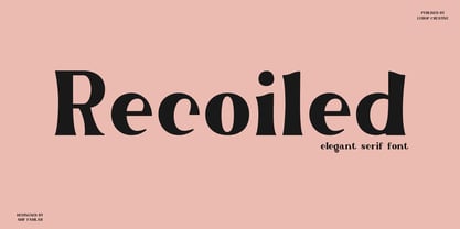 Recoiled is a elegant serif font. Made for any professional project branding. It is the best for logos, branding and quotes. Every letter has a unique and beautiful touch. a great choice for branding, logos, stickers, svg designs, shirts, social media, advertisements, product packaging and more! Font Features : Character set A-Z in uppercase and lowercase Ligatures Numerals & Punctuation Accented Characters Multilingual Support Thank you for downloading premium fonts from Luhop Creative
 - Fiscal by Hackberry Font Foundry,
$24.95 This is a squared sans serif font family developed out of a taller Bank Gothic model plus a true lower case with many OpenType features and over 600 characters: Caps, lower case, small caps, ligatures, discretionary ligatures, swashes, small cap figures, old style figures, numerators, denominators, accent characters (including CE), ordinal numbers (1st-infinity: lining and oldstyle), and so on. It is designed for text use in body copy. For display tighten the tracking.
 - Tight Hand by Gerald Gallo,
$20.00 Tight Hand is a hand-lettered serif font set. Tight Hand Regular is vertical while Tight Hand Oblique is the oblique version. Both fonts have the same uppercase and small caps lowercase alphabet, numbers, accented characters, punctuation, symbols, and miscellaneous characters. The Tight Hand fonts are ideal for use where a casual, loose feel is desirable. Tight Hand Regular and Tight Hand Oblique are to be sold only as a set priced a $20.
 - Midas Style by Sensatype Studio,
$15.00 Midas Vintage Retro Ligature Font is a well-balanced contemporary font with a fancy, unique, and versatile vintage serif, font that you can combine to get any variations and unique shapes easily just in seconds with choose alternates of them. I What's Included: Character set A-Z Uppercase & Lowercase Numerals & Punctuation Accented Characters (West Europe) Stylistic alternates Works on PC & Mac Recommended using Adobe Illustrator or Adobe Photoshop. Wish you enjoy our font. :)
 - Cotton Kindly by Clevus,
$14.00 Proudly present Cotton Kindly Typeface, created by ClevUs, A serif modern and classic typeface that has own unique style & modern look. This typeface is perfect for an elegant & luxury logo, book or movie title design, fashion brand, magazine, clothes, lettering, quotes, and so much more. Product Content : Features : Uppercase and Lowercase Numerals Punctuations (OpenType Standard) Accents (Multilingual Characters) Ligatures and Alternative Style Stylistic Set Works on PC and Mac Simple installations Thank You.
 - BoRock by Fontforecast,
$19.00 BoRock is a handcrafted font that comes in two pigheaded styles, inspired by the rock music scene. You can use BoRock instead of the usual neat serif fonts. BoRock Grunge is a rough crispy serif font, excellently suited for use in both display and body text. The BoRock Slick is what the name implies, a more smooth serif font, ideal for use in body text, but also suitable for titles and headings. You can use BoRock Grunge and BoRock Slick for magazines, advertising, T-shirts, posters and so on. By activating Discretionary Ligatures and typing _1 to _9 and *1 to *8 you can get your hands on some nifty bonus symbols. So get creative with BoRock and the stage is yours.
 - APF Lagoon Regular by Pomegranate,
$30.00 In 2007-8, Carolyn Puzzovio developed this OpenType typeface: Lagoon which is based on an Armenian model from the Mechitarist monastery, Venice, 1810. This project was supported by a grant from the AHRC (Arts & Humanities Research Council, UK) and won a first prize in the Granshan 08 type design competition. Oſten, Armenian digital types are designed to match the forms of Latin type characters and ‘Latinized’, by uprighting the forms; truncating ascenders and descenders and raising the x-height – but in this case the Latin characters in the OpenType font have been designed to blend in with the traditional Armenian proportions which are based on cursive forms – also incorporating some of the quirky shapes from the original model. Faithfully following the original created difficulties of ‘clashing’ characters, particularly those with long descenders, so the font contains over 100 alternative characters in the Armenian part, which will normally substitute automatically where necessary. The sloping lower case characters and upright capitals are traditional in Armenian – capitals are used less in the Armenian language. Three new characters for the Armenian unicode range are included: the Armenian dram (currency) symbol; the eternity symbol; and the index number symbol. This font which will be one of the first OpenType fonts to incorporate these newly unicoded characters.
 - Imagine a font that sneaked out of a design studio after consuming an entire pot of espresso, bouncing off the walls, and decided to throw a one-letter rave on your page. That's Outta Control Caps fo...
- Oman by Par Défaut,
$35.00 With five weights and four contrasts, all grouped in three version : sans-serif, slab, serif and all this doubled by a true italic, Oman regroup 120 different styles declined in four variables. Perfect from headlines to text, Oman will meet your needs with a many languages to support (Latin pro, Cyrillic), 14 OpenType features (Fraction, Numerator, Denominator, Tabular figure, Oldstyle figure, Small capital, Small capital from capital, Ordinal, Stylistic set, Case sensitive, Discretionary ligature, Contextual alternate and All access alternate). • Numerator and Denominator includes numerals and currency • Tabular Figure includes : numerals, currency, OldStyle numerals, small capital numerals, small capital currency. • Small Capital features includes the Latin & Cyrillic alphabet with the accents. • Ordinal feature includes the Latin & Cyrillic alphabet. • Two Stylistic set for “a” & “g” includes accents. • Discretionary Ligature includes “AE”, “AÉ”, “IJ”,“OE”, available in lowercase, small capital and ordinal. • Contextual Alternate includes ligatures for arrows : <-->^|v|<->v^|. Add n, d or +, for numerator, denominator or case arrows. All Case sensitive characters become after the uppercase and number.
 - Brotherly by Creativework Studio,
$14.00 Brotherly is a modern san serif font that is very different from the standard san serief form in general, this font is more artistic so it is very flexible to use for various design project needs, both formal and non-formal, but this font is based on the basic san serief font. easy to read and clear.
 - Park Avenue Script by Linotype,
$29.99Park Avenue is a lighthearted contemporary script designed by Robert E. Smith in 1933 for American Type Founders. This unique design has small x-height lowercase letters with very long ribbon-like ascenders. Park Avenue is a good design for occasional pieces such as invitations and menus. - Courier New OS by Monotype,
$50.99 Designed as a typewriter face for IBM, Courier New was re drawn by Adrian Frutiger for IBM Selectric series. A typical fixed pitch design, monotone in weight and slab serif in concept.
 - Julietrose by Monotype,
$29.99Julietrose debuted in May of 2006 and was quickly embraced by members of the graphic design community, who found it as charming as its name. The playful, full-bodied script began to show up in all forms of graphic communication. However, it soon became apparent that a bold weight would add more versatility to the design. Martin Wait, Julietrose’s designer, happily obliged by drawing a new and more forceful weight of the typeface. Where Julietrose is vivacious and lighthearted, Julietrose Bold is assertive and speaks with authority. They are clearly sisters, though – both weights feature flamboyant swashes and elegantly long ascenders and descenders. Both designs also offer a suite of swash and alternate characters, and are available in OpenType format The Julietrose family is small but irresistible. This pair can easily charm their way into such diverse uses as posters, restaurant menus, social announcements and even product brochures. - Chonky by Typesenses,
$39.00 Chonky is a bold script font based on English calligraphy but with touches of the vitality that the commercial lettering of 1950s had, and it is mostly inspired in the work of the master Doyald Young and his lessons. Its rounded terminals, friendly look and heavy weight make Chonky a perfect option for advertising, packaging and visual identities. In the Regular font, the ascenders, descenders and capitals are the shorter they could be; while in Poster, they are larger, in order to achieve more graceful forms. Both options include stylistic sets and ligatures to embellish the words. Use professional software that widely support Open Type features. Otherwise, you may not have access to some glyphs. Keep the Standard Ligatures and Contextual Alternates features always active. For further information about features and alternates, see the User Guide Chonky has extensive Western, Central and Eastern European language support. Enjoy!
 - Lectio by Eurotypo,
$14.00 Lectio is a Roman font based on a Venetian Renaissance early typefaces, but with a modern and expressive design. His obvious calligraphic influence favors continuous text reading. The generous internal "eye" gives Lectio an appropriate legibility, its soft and organic modulation avoids fatigue, its robust character is attractive and stimulating in large bodies, especially for use in headlines. Lectio comes in two versions: Lectio and Lectio B. Lectio has seven weight and their corresponding slanted variables (true italics). Lectio B is composed only of Italics in six weight. The ascenders are slightly lower, the descending are more regular and the oblique trace of some letters have a more constant rhythm. Each of these faces has the optimum amount of contrast agains the background and clear and open internal letter shape. These fonts include diacritics for CE languages, Old Style figures, standard and discretional ligatures.
 - Gina by Tipo Pèpel,
$22.00 Gina is an unbiased humanist sans. The simple skeleton of the characters and the organic strokes are essential features to the design. It is a typeface that looks to the future while keeping an eye on classic letterforms. If we have a closer look, we will notice there is a tendency towards vertical proportions. Ascenders and descenders are long, making for a light texture in small text sizes. The type family includes 8 weights and 8 italics. There is a clear link between styles, both in the structure and shape of the letterforms. The italic counterpart uses a moderate inclination and some letters adopt characteristics of cursive forms. Besides Latin, the character set of Gina includes Cyrillic and essential features for covering current typographic needs. Gina has a wonderful set of ligatures, which indeed will catch the attention of those who love connected letterforms.
 - Keiss Title by DSType,
$50.00 The Keiss type family is our interpretation of the popular nineteen century Scotch Roman typefaces. We intended to keep a very classic approach while introducing a couple of new elements that differentiate this type family from it’s ancestors. This design, with short descenders and ascenders, along with three very distinct optical sizes makes this type family well suited for contemporary newspapers. The Title and Big versions range from Thin to Heavy, with matching italics, in order to be used in big sizes and stand out in the design. The Text ranges from Thin to ExtraBold and is a standalone type family for text usage, with narrow proportions and wider and open italics for improved text setting. The Condensed versions, ranging from Thin to Bold, don’t have italics, although they can be matched with the italics of the Title and Big versions, due to the fact they are very condensed.
 - Keiss Big by DSType,
$50.00 The Keiss type family is our interpretation of the popular nineteen century Scotch Roman typefaces. We intended to keep a very classic approach while introducing a couple of new elements that differentiate this type family from it’s ancestors. This design, with short descenders and ascenders, along with three very distinct optical sizes makes this type family well suited for contemporary newspapers. The Title and Big versions range from Thin to Heavy, with matching italics, in order to be used in big sizes and stand out in the design. The Text ranges from Thin to ExtraBold and is a standalone type family for text usage, with narrow proportions and wider and open italics for improved text setting. The Condensed versions, ranging from Thin to Bold, don’t have italics, although they can be matched with the italics of the Title and Big versions, due to the fact they are very condensed.
 - Snuggels by Ingrimayne Type,
$9.95 Snuggles began as a set of hexagons and hour-glass shapes that fit together. Letters were formed from these shapes with effort made to preserve as much as possible the original outlines. The result is two sets of letters that by themselves are awkward and misshapen and that only look good when mixed together. The OpenType contextual alternatives (calt) feature automatically alternates the sets in computer programs that support this feature. Snuggles-Lower replaces the letters of Snuggles-Regular with lower-case shapes, but without ascenders or descenders, and the results are jarring. Several of these lower-case shapes (D, N, T, W, and Y) are available as OpenType stylistic-set alternatives in the Snuggels-Regular font. Both Snuggels-Regular and Snuggels-Lower have light versions. Snuggels loves to be noticed so it likes to be large and it considers foolish anyone who would use it as body text.
 - Geometrica by PeGGO Fonts,
$24.00 Behance presentation https://www.behance.net/gallery/51305239/Geometrica Geometrica is a low contrast rounded geometric Sans with a mid 19th/early 20th century simplicity air yet modern and minimalist. The font was inspired by the idea of creating a typeface with uppercase/lowercase characters and small caps having the same proportion. The result is a font with a moderate width, generous x-height, and short ascenders and descenders, giving it a compact and clean look. Geometrica comes in 10 weights plus italics—each variant with 589 glyphs—and contains a number of OpenType features that allow you to create very ‘good looking’ designs. Geometrica provides a wide range of choices for any design project and it is especially recommended for UI/UX and app design, branding and corporate design, in 2017 it was selected as one of the 10 best Sans of the year by FontShop.
 - Keiss Condensed by DSType,
$50.00 The Keiss type family is our interpretation of the popular nineteen century Scotch Roman typefaces. We intended to keep a very classic approach while introducing a couple of new elements that differentiate this type family from it’s ancestors. This design, with short descenders and ascenders, along with three very distinct optical sizes makes this type family well suited for contemporary newspapers. The Title and Big versions range from Thin to Heavy, with matching italics, in order to be used in big sizes and stand out in the design. The Text ranges from Thin to ExtraBold and is a standalone type family for text usage, with narrow proportions and wider and open italics for improved text setting. The Condensed versions, ranging from Thin to Bold, don’t have italics, although they can be matched with the italics of the Title and Big versions, due to the fact they are very condensed.
 - Poruka by Tour De Force,
$30.00 Poruka is slanted script typeface with connected letters with gently condensed look. Letters are designed as monoline forms with decent dose of elegancy and stylistic uniformity. Poruka is imagined mainly as typeface for shorter texts or headlines, where text needs to stand out from other elements of content. It can be used successfully both as webfont and on printed materials – all kinds of invitations, labels, packages, posters and editorial use. Poruka comes with two Stylistic Sets – 01 which activates uppercase letters with full font height (from the top of ascender to the bottom of descender) and 02 – which activates handwritten forms on "b", "d", "h" and "l" letters. Also, Poruka is equipped with Swashes and Discretionary Ligatures which doesn't really represent classical pack of expected ligatures, but more as graphical version of a couple of words like "yes", "no", "wait", "ciao" and a few more.
 - OBO Star by Juri Zaech,
$19.00 OBO Star is a fat, subtly flared display typeface with a not so subtle groove factor. The letters are based on a square and do not have ascenders or descenders. This way the typeface can be used for horizontal and vertical settings, or mixed like crosswords. There are a few exceptions for certain punctuation and special characters that are half the width for better spacing; and the word space’s width can easily be adjusted through OpenType stylistic sets. Talking about spacing, for strictly horizontal typesetting there is the option to turn on kerning for a number of characters to create a more optimal texture across words and phrases. But that’s all just technical talk. The true character of OBO Star is the funky look, amplified by the wide 1x1 format that creates space for unconventional shapes, mostly pronounced in the letters R, K and G.
 - Keiss Condensed Big by DSType,
$50.00 The Keiss type family is our interpretation of the popular nineteen century Scotch Roman typefaces. We intended to keep a very classic approach while introducing a couple of new elements that differentiate this type family from it’s ancestors. This design, with short descenders and ascenders, along with three very distinct optical sizes makes this type family well suited for contemporary newspapers. The Title and Big versions range from Thin to Heavy, with matching italics, in order to be used in big sizes and stand out in the design. The Text ranges from Thin to ExtraBold and is a standalone type family for text usage, with narrow proportions and wider and open italics for improved text setting. The Condensed versions, ranging from Thin to Bold, don’t have italics, although they can be matched with the italics of the Title and Big versions, due to the fact they are very condensed.
 - ALS Klinkopis by Art. Lebedev Studio,
$63.00 Yana Klink is an illustrator at Art. Lebedev Studio, whose works are often accompanied by lines of fancy text written in her own recognizable manner with long strokes and “beauty spots.” Once we needed to apply that style to a number of pieces of text, we decided to design a decorative script called Klinkopis. It comes in one weight (regular). Text set in Klinkopis looks best when arranged in waves, like the original. It is recommended to use large sizes—from 24 pt and up—and have no more than just a couple of lines that become an essential part of the artwork. Klinkopis is designed to use OpenType Contextual Alternates. To beautify your project even further, some characters can be manually replaced with their more intricate or plainer variations depending on the neighboring letters. Klinkopis features long descenders and ascenders, which requires large leading to avoid congestion.
 - Keiss Text by DSType,
$50.00 The Keiss type family is our interpretation of the popular nineteen century Scotch Roman typefaces. We intended to keep a very classic approach while introducing a couple of new elements that differentiate this type family from it’s ancestors. This design, with short descenders and ascenders, along with three very distinct optical sizes makes this type family well suited for contemporary newspapers. The Title and Big versions range from Thin to Heavy, with matching italics, in order to be used in big sizes and stand out in the design. The Text ranges from Thin to ExtraBold and is a standalone type family for text usage, with narrow proportions and wider and open italics for improved text setting. The Condensed versions, ranging from Thin to Bold, don’t have italics, although they can be matched with the italics of the Title and Big versions, due to the fact they are very condensed.
