10,000 search results
(0.074 seconds)
- Thinna Bell by Allouse Studio,
$16.00 Proudly PresentingTinna Bell, a Bold Script Font. Tinna Bell is perfect on any tittle, product packaging, branding project, megazine, social media, wedding, or just used to express words above the background. Enjoy the font, feel free to comment or feedback, send me PM or email. Thank You!
 - Rolasand by Balpirick,
$15.00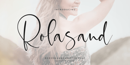 Rolasand is a Modern Handwritten Font. Rolasand is perfect for product packaging, branding project, megazine, social media, wedding, or just used to express words above the background. Rolasand also multilingual support. Enjoy the font, feel free to comment or feedback, send me PM or email. Thank you!
 - Brand Stylist by PeachCreme,
$15.00 Looking for perfectly paired branding fonts? Check out our new baby "brand stylist". Not boring display font combined with a sassy script font can become your casual logo designing font. If you have questions, just send us a message and we’re happy to help:) Happy designing, Gulya
 - Magic Clause by Balpirick,
$15.00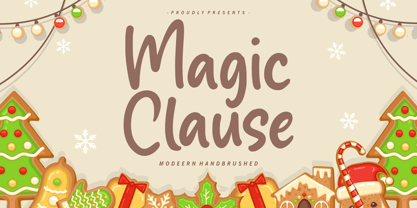 Magic Clause is a Modern Handbrushed Font. Magic Clause is a cute and friendly handwritten font. Get creative with its childlike playfulness, and use it to Magic Clause also multilingual support. Enjoy the font, feel free to comment or feedback, send me PM or email. Thank you!
 - Malpicamoln by Allouse Studio,
$16.00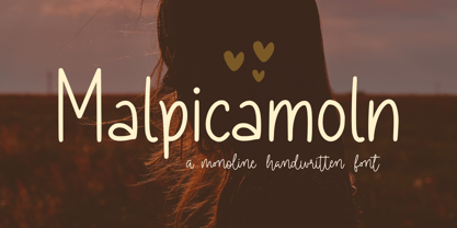 Proudly Presenting, Malpicamoln A Monoline Handwritten Font Malpicamoln is perfect for product packaging, branding project, megazine, social media, wedding, or just used to express words above the background. Malpicamoln also multilingual support. Enjoy the font, feel free to comment or feedback, send me PM or email.
 - Preissig Antikva Pro by Storm Type Foundry,
$39.00 This vintage, iconic typeface of original Czech letter-founding has been faithfully revised, extended and newly rendered in 2012. The majority of Vojtěch Preissig’s type faces have been, from their very creation, subject to controversial evaluations which might perhaps fill more pages than have been set in these type faces so far. The considerable technological backwardness of Czech typography between the world wars intensified the author’s creative effort even more. He had been devoting thought to his Antikva type face from 1912 onwards and dozens of hardly perceptible nuances of the same design have been preserved in his drawings. It was his only book type face, but it shows no signs of any hard struggle in creating it. Its extraordinary vividness and elegance are really surprising. It may be still indebted to the forms of Art Nouveau, which was withering away at that time, but its proportions, colour and expression inspire other Czech type designers. Preissig’s Antikva, Menhart’s Figural (and also Růžička’s Fairfield) and Týfa’s Antikva represent a clear line of development, very far away from the soft aesthetics of Tusar, Dyrynk or Brunner. The co-author of the modification for computer composition is Otakar Karlas. Without his experience the work would remain only a shadow of Preissig’s design. Our aim was to produce a large family of type faces for the setting of both books and jobbing works. The digital transcription of Preissig’s Antikva came into existence from summer till winter 1998. The direct model for this type face is the most successful, two-cicero (24 pt.) design dating from 1925. The designs of other sizes (12 pt., 14 pt., 16 pt. and then 36 pt. and 49 pt.) lack vividness and are the source of the widespread mistaken belief that Preissig’s Antikva consists of straight lines. That is, unfortunately, how even Muzika and Menhart describe it. Neither is it a Cubist type face as many of the semi-educated think today. Special attention had to be paid to italics. It is apparent that their design is not as perfect as that of Preissig’s Antikva. In contradistinction to the original we have deleted almost all lower serifs in the lower-case letters, enlarged the angle of inclination and completely redesigned the letters a, e, g, s, k, x, ... All crotches have been lightened by marked incisions. In other words, none of the italic letters corresponds to Preissig’s model. The signs which were missing have been supplemented with regard to the overall character of the alphabet. Preissig did not deal with bold designs, but the crystal-clear logic of his “chopping-off” of the round strokes enabled us to complete the type face family without any greater doubts. An excessively fragile type face, however, cannot be used for setting in smaller sizes; that is why we have prepared a separate family of text designs which has shortened ascenders, normal accents, slightly thickened strokes, and is, in general, optically more quiet and robust. We recommend it for sizes under 12 points. By contrast, the elegance of the basic design will be appreciated most in the sizes used for headlines and posters. Preissig’s Antikva is suitable not only for art books and festive prints, but also for poetry and shorter texts.
 - FF Info Pict by FontFont,
$62.99 Erik Spiekermann, working in collaboration with Ole Schäfer, originally designed FF Info® Display for use in the context of wayfinding systems. The variants FF Info™ Text and FF Info™ Correspondence were developed later for text setting and office communication. FF Info Display The sober and clear forms of the sans serif FF Info Display have been deliberately molded to make them perfect for use on wayfinding systems. The font by Ole Schäfer and Erik Spiekermann not only takes the problem of lack of space into account - it is some 15% narrower than comparable typefaces - the characters have also been designed to ensure they remain legible even in adverse conditions for reading. As text on signs often contains words with which readers are unfamiliar and which are thus deciphered letter for letter rather than perceived as whole words, it is essential to provide for a clear differentiation between glyphs. Additional serifs on the lowercase "i" and uppercase "I" and a small arch on the terminal of the lowercase "l" ensure that it is possible to readily discriminate between these particularly problematic letters. Moreover, sharp corners on glyphs can also make it difficult to read signs with backlighting or when driving past. The rounded corners of FF Info Display counteract this effect and make sure that the character forms remain well defined.FF Info Display is available in five carefully coordinated weights, from Regular to Bold. In the corresponding italic variants, the letters appear overall more rounded while the lowercase "a" has a closed form and the "f" has a descender. Also included among the glyphs of FF Info Display are several ligatures and arrow symbols. Pictograms with different themes that complement the typeface are also available in four weights. FF Info Text Thanks to his know-how gained through designing other typefaces, Erik Spiekermann became aware that fonts created for use in problematic environments can be used in many different situations. In smaller point sizes, FF Info Display cuts a fine figure when used to set longer texts. So Spiekermann carefully reworked FF Info Display to produce FF Info Text, a font perfected for use in this context. Not only can the characters be more generously proportioned, certain features, such as additional serifs to aid with the differentiation of problematic letters, are also no longer necessary in textual surroundings. The upright styles have a double-story "g" while Spiekermann has added oldstyle figures and small caps. FF Info Correspondence FF Info Correspondence has also been designed for setting block text although it recalls the style of old typewriter characters and is specifically intended for use in office communication. The characters of this third member of the family are thus more formal, without rounded terminals but with rectangular punctuation marks. The narrower letters are provided with large serifs to give them more space although, at the same time, this reduces the differences in terms of letter width among the alphabet. In contrast with its two siblings, FF Info Correspondence has only three weights, each with corresponding italic.The three styles of the FF Info super family cover an extensive range of potential applications. If the different kerning is adjusted manually, the three styles harmonize happily with each other and can be readily used in combination to set, for example, headlines and texts and also creative display options.
 - Gundrada ML by HiH,
$12.00 Gundrada ML was inspired by the lettering on the tomb of Gundrada de Warenne. She was buried at Southover Church at Lewes, Sussex, in the south of England in 1085. The Latin inscription on her tomb, STIRPS GUNDRADA DUCUM, meaning “Gundrada, descendant of the Duke” may have led to the speculation that she was the daughter of William, Duke of Normandy and bastard son of Robert the Devil of Normandy and Arletta, daughter of a tanner in Falaise. In 1066 William defeated Harold at the Battle of Hastings and was crowned William I of England. More commonly known as William the Conquerer, he commissioned a string of forts around the kingdom and charged trusted Norman Barons to control the contentious Anglo-Saxon population. William de Warenne, husband of Gundrada, was one of these Barons. There has also been the suggestion that Gundrada may have been the daughter of William’s wife, Matilda of Flanders, by a previous marriage. According to the Dictionary of National Biography (Oxford University Press, Oxford, England 1921-22), both of these contentions are in dispute. Searching the past of a thousand years ago is like wandering in a heavy fog: facts are only dimly in view. Regardless, I know that I found these letterforms immediately engaging in their simplicity. Unadorned and unsophisticated, they have a direct honesty that rests well in the company of humanistic sans serifs like Franklin Gothic or Gill Sans, appealing to a contemporary sensibility. The lettering on the tomb is in upper case only. Although Gundrada does not sound Norman French to me, her husband certainly and her father probably were Norman French. Nonetheless, the man that carved her tombstone was probably Anglo-Saxon, like most of the people. For that reason, we are quite comfortable with a fairly generic lower case from an Anglo-Saxon document of the time. The time was a time of transition, of contending language influences. This font reflects some of that tension. Features 1. Multi-Lingual Font with 389 glyphs and 698 Kerning Pairs. 2. OpenType GSUB layout features: onum, dlig, liga, salt & hist. 3. Tabular Figures and Alternate Old-Style Figures. 4. Alternate Ruled Caps (line above and below, matching to brackets). 5. Central Europe, Western Europe, Turkish and Baltic Code Pages. 6. Additional accents for Cornish and Old Gaelic. 7. Stylistic alternates A, E, y and #. 8. Ligatures ST, Th, fi and fl. 9. Historic alternate longs. The zip package includes two versions of the font at no extra charge. There is an OTF version which is in Open PS (Post Script Type 1) format and a TTF version which is in Open TT (True Type)format. Use whichever works best for your applications.
 - Ah, the Grandiose Grantham! Crafted by the whimsical hands of Paul Lloyd Fonts, Grantham is not your average character (pun intended) in the world of typography. Imagine if the letters decided to thr...
- Ah, Roskell, the font with more character than your quirky uncle at a family reunion! Crafted by the talented Dieter Steffmann, a maestro in the symphony of typefaces, Roskell pirouettes onto the sce...
- Ah, the font Oohlalalulucurvy. Imagine, if you will, a font so lively and flamboyant that each letter seems to be thrown into a dance party from the moment it hits the page. This is no ordinary colle...
- Just Sans by JUST Creative,
$14.97 JUST Sans is a highly versatile sans serif typeface with endearing, modernist warmth, geometric legibility, and a distinctive friendly bite. Designed as a professional modern geometric sans serif, JUST Sans is both serious and friendly, neutral but warmly expressive, technical but not overt, and familiar but unique enough to stand on its own. With open-airy characters and a generous width, JUST Sans has an elegant contemporary feel, with sharp angled terminals that give it grip and make it so expressively endearing. With a clean, simple, and minimal aesthetic, JUST Sans is a functional workhorse with 7 weights, complete Latin extended language support, precise hand-adjusted kerning, and a variable version for maximum versatility. JUST Sans includes hand-hinted web fonts optimized for clear, legible text on screens making JUST Sans perfect for the web as well as logos, branding, headlines, paragraph text, UI, signage, packaging, posters, and industries rooted in technology, new media, architecture, fashion & design. With its universal functionality & characteristic bite, the JUST Sans family is an essential addition to your type arsenal, even if just for those beautiful stylistic numbers. For lovers of modern sans serif fonts who are looking for something a tad more warm, open & expressive, JUST Sans is for you.
 - Peach Lotus by Nathatype,
$29.00 It can be a tough challenge to present the best display for your projects, especially in limited options of fonts. For that reason, let us introduce you to our display serif font to amaze your audience with your projects. Peach Lotus is a display serif font we created by mixing the classical serif elements with big, bold-sized letters for you to impress and attract your audience. On top of that, it gives you more artistic, creative touches as a result of the display font combinations. A display font with thickly-lined and high contrast capital letters will produce a prominent display to strengthen the impressions delivered. In addition, you can apply this font for big-sized texts to be legible. Also, you can enjoy the available features here. Features: Multilingual support PUA encoded Numerals and punctuations Peach Lotus fits best for various design projects, such as brandings, posters, banners, headings, magazine covers, quotes, printed products, merchandise, social media, etc. Find out more ways to use this font by taking a look at the font preview. Thanks for purchasing our fonts. Hopefully, you have a great time using our font. Feel free to contact us anytime for further information or when you have trouble with the font. Thanks a lot and happy designing.
 - Lapoya by Cuchi, qué tipo,
$9.95 “LAPOYA” (meaning in english “the coolest”) is a large slab serif typeface family, with a certain Italian inverted contrast touch. Specially designed for advertising big shows and commerces, Lapoya has 36 variables and four axes, including a text and decorative versions, where the drawing and width of its counterforms vary. It also has icons that remember the old aesthetics of wood types from the early 20th century, and more than 400 characters with a multitude of signs and ligatures, that make Lapoya ideal for up to 89 languages. It is clearly inspired by the large wood types designed for posters, advertisements and newspapers. Since they were introduced in the 19th century, slab serifs have become extremely popular. In fact, serifs are often enlarged, not so much to look like beautiful or balanced letters, but to be more graphic and visual powerful than others. Furthermore, in the case of this typeface, this idea has been applied not only to capital letters, but also to the lowercase, numbers and signs of all kinds. “That’s why this typeface is LAPOYA!” Designed by Carlos Campos in 2023. cuchi@cuchiquetipo.com OPENTYPE FONT 426 GLYPHS 388 CHARACTERS 4 AXES 36 INSTANCES 9 LAYOUT FEATURES 89 LANGUAGES
 - Galdien by Craft Supply Co,
$20.00 Introducing Galdien – Modern Sans Serif Font A Contemporary Typeface Galdien – Modern Sans Serif Font is, without a doubt, a testament to contemporary design simplicity and elegance. It seamlessly blends modernity with readability. Clean and Versatile Furthermore, Galdien’s clean lines and uncluttered appearance make it an extraordinarily versatile choice for a wide range of design applications. Its simplicity ensures it doesn’t overpower your message, making it a font suitable for various projects. Readability at its Core At its core, Galdien prioritizes readability. Each character is thoughtfully crafted to ensure clarity in both print and digital formats. This font’s legibility is especially essential for conveying your message effectively and effortlessly. Ideal for Modern Branding Additionally, Galdien is perfectly suited for modern branding initiatives. Its clean and sleek aesthetic aligns seamlessly with contemporary brand identities, offering a cohesive and professional look that resonates with today’s audience. In Conclusion Galdien – Modern Sans Serif Font is your unwavering companion for modern design endeavors. Its simplicity, versatility, and readability, combined with its adaptability to various media, make it an excellent choice for diverse projects. With Galdien, your message is not only communicated with clarity and style but also imbued with a contemporary touch that captivates your audience and leaves a lasting impression.
 - Broted Young Plant by Alit Design,
$12.00 Introducing Broted Young Plant Font Duo. Unique and fantastic duo fonts combined or they stand alone. Broted Young Plant Sans Serif font family consists of 14 families, from Thin to Heavy style. The elegant modern font creates a unique design and is sure to steal the eye of the design target audience. Besides being unique, the Broted Young Plant Sans Serif font also has a luxury simple character that makes the design charming and luxurious. Broted Young Plant Script is a signature script that has cool strokes. The line shape of Broted Young Plant Script is inspired by a unique elegant style. In addition, Broted Young Plant Script has an altenate ligature that looks natural and not stiff. Combining the two Broted Young Plant Script and Sans serif fonts will create a design that is charming, unique, elegant and cool. you can see from the design preview. These two fonts are perfect for designs with the concept of elegant, luxury, romance, fashion and so on. In order to use the beautiful swashes, you need a program that supports OpenType features such as Adobe Illustrator CS, Adobe Photoshop CC, Adobe Indesign and Corel Draw. but if your software doesn't have Glyphs panel, you can install additional swashes font files.
 - Wild Flowers by Jafar07,
$19.00 Wild Flowers is a unique and modern bold serif font that seamlessly blends traditional elements with contemporary style. Its bold and confident lines give it a strong presence, while the decorative serifs add a touch of elegance and sophistication. This font is perfect for a wide range of design projects, including branding, editorial, packaging, and headlines. Its versatility allows it to work well in both print and digital mediums, making it an ideal choice for both body text and larger display uses. One of the key benefits of "Wild Flowers" is its legibility. The clear, well-defined letterforms make it easy to read, even at smaller sizes, while its boldness and character make it ideal for designers looking to make an impact with their typography. In summary, "Wild Flowers" is a modern and unique serif font that will add a touch of sophistication and style to any design. Its blend of traditional and modern styles makes it a versatile font that will work well in a wide range of projects, and its legibility ensures that it will be easy to read no matter the application. What are you getting? - Special Ligatures & Alternates - Numbers & Punctuation - Multilingual Support Works onMac PC & Mobile - Simple Installations
 - Sister Pamella Font Cyrillic Duo by Ira Dvilyuk,
$18.00 Sister Pamella font duo Cyrillic is a pair of script and sans serif fonts, which perfectly complement one another. With a handwritten script font and a modern sans serif Sister Pamella font duo Cyrillic will be perfect for use in all your design projects be it logos, signatures, labels, packaging design, blog headlines. Also, it will look great on mugs, cards, gorgeous typographic designs, wedding stationery and much more. The Cyrillic part of the font contains the uppercase letters and lowercase letters and 17 ligatures, giving a realistic hand-lettered style. Sister Pamella script Cyrillic includes a full set of uppercase 2 sets of lowercase letters, numerals, a large range of punctuation and 38 ligatures, giving a realistic hand-lettered style. Sister Pamella sans serif containing uppercase only characters, numerals and a large range of punctuation. Creates a perfect contrast with the Sister Pamella script font. Multilingual Support for 32 languages: Afrikaans, Albanian, Basque, Bosnian, Catalan, Danish, Dutch, English, Estonian, Faroese, Filipino, Finnish, French, Galician, Indonesian, Irish, Italian, Malay, Norwegian Bokmål, Portuguese, Slovenian, Spanish, Swahili, Swedish, Turkish, Welsh, Zulu. And Cyrillic glyphs support for Russian, Belorussian, Bulgarian, Ukrainian and Kazakh languages. Works perfectly on the Canva platform. For Cricut & Silhouette recommended.
 - Mandrel Didone by insigne,
$24.00 A new family has sprung from the world of insigne. Mandrel Didone is his name. The face is well-liked by those with whom it seeks an audience because of its courtly demeanor and exquisite look. Mandrel Didone conducts itself beautifully in front of each set of eyes with a confident attitude, never wavering or tripping in its polished step. But, despite it’s gentility, this exquisite family is not weak in the face of adversity. Mandrel Didone is a powerful and conspicuous typeface that has towering x-heights, great contrast, confident bends, and sharp serifs. It is well-crafted for high-impact resistance. It uses its sharp serif ends deftly, cutting through opponents' clumsy clutter in the battle for the reader's attention. This noble family consists of nine weights and their matching italics, ranging from Thin to Black. Mandrel Didone also comes with a plethora of OpenType options to let you embellish your text. The family's 500 glyphs and support for more than 70 languages are accompanied with ligatures, old-style figures, and stylistic sets. Raise your glass in honor of the new Mandrel Didone! This champion, with its powerful serifs and great contrast, is ready to take on your challenge in many tests to come.
 - Epica Pro by Sudtipos,
$49.00 Epica is a contemporary interpretation of the Venetian Renaissance types. A humanist type family with a contemporary design. This family encompasses different typographic scenarios with emphasis in style and functional equilibrium. Its letterforms show the visual richness of Epica that includes some calligraphic reminiscences perfectly legible in small and display sizes. Its strong personality makes it distinguish, because it perfectly combines the elegance of antique typographies and the forcefulness of contemporary ones. This family has been designed in two different moments. Epica Serif, which have a more classical design, was finished 5 years ago in its first version. The first sketches were drew 8 years ago during the Master of Type Design at the University of Buenos Aires. Through the years was re design in several times to the point of reaching its current version. On the other hand, Epica Sans was completed in 2020 and is the counterpart of Epica Serif. A complementary system designed to enrich the serif version and give new options for hierarchy and composition. This is a versatile type family perfectly fit for books, editorial, and usage in print and on screens. It possesses great legibility in body texts, which makes it ideal for extended reading and supports a variety of languages.
 - Idealista by Suitcase Type Foundry,
$39.00 Idealista directly responds to its other members, Nudista and Kulturista. It shares the same proportions and the same set of weights, yet it enriches the expression means of the two typefaces with new themes — the character set is smooth, even round, and it boasts a number of special details and perky moves. Most of all, Idealista relishes juicy magazine titles, typographic logotypes and propagandist posters. Unlike cold, technicist typefaces, it has great zest for life, so there's no wonder that in each of the letters, intuition wins over intellect. Owing to this, the text set in Idealista has a special voluptuous quality and unmistakable temperament — in a single typeface Idealista combines the best of sans-serif, slab-serif, as well as geometric and calligraphic construction principles, coming down to one impressive, expressive cocktail. Some letters have serifs, some do not, some are sharp, some are smooth, and all this results in the nice hip-hop beat of the line of text. The typeface has five weights and ten styles in total, so it can easily accommodate to the needs of complex texts, unlike many of its display counterparts. Idealista is valuable partner for the more text-suited Nudista and, if need for tiny sizes arises, to Kulturista as well.
 - Recolors by Din Studio,
$29.00 It can be a time-consuming, difficult process to find an elegant font to present classic impressions to your audience despite the abundant options available for you. Moreover, it takes the risks to disappoint and to leave bad impressions to your audience without having the right font. Therefore, let us introduce you to our serif font, Recolor. It is a capitalized serif font to help you create elegant, classic nuances on your designs. Our serif font has tiny lines to add formal, professional touches on each quality, consistent letter to ease the reading process. However, such capitalized font designs are eligible to apply for big text sizes for a legibility reason. Additionally, you can enjoy the available features here. Features: Multilingual Supports PUA Encoded Numerals and Punctuations Recolor fits best for various design projects, such as brandings, posters, banners, headings, magazine covers, quotes, printed products, merchandise, social media, etc. Find out more ways to use this font by taking a look at the font preview. Thanks for purchasing our fonts. Hopefully, you have a great time using our font. Feel free to contact us anytime for further information or when you have trouble with the font. Thanks a lot and happy designing.
 - Religan by Dora Typefoundry,
$17.00 The new Religan serif font is luxurious and elegant which will bring a unique style and trendy look to your designs. This modern serif relogan has several on-trend ligature binders and special characters to make it look more unique in all design projects and work perfectly to pair with other fonts. It's perfect for logotypes, branding, wedding monograms and invitations, blog headlines and more. Here we prepare some fasteners: ab ar an am ah ara ap ti tr st tu tt ct et ff ty ffi fu ft fj fy th tm tn in im ir it ta ri er eh em en ch cr ra ng li eb cb fr ck fb fh fk jj gi and more.. Religan also includes the full set: Uppercase and lowercase Multilingual symbol Number Punctuation This type of family has become a work of true love, making it as easy and enjoyable as possible. I really hope you enjoy it! I can't wait to see what you do with Religan! Feel free to use the #Dora Typefoundry tag and # Religan Modern Serif Font to show what you've done. If you have any questions, you can contact us by email: doratypefoundry@gmail.com Thank You!
 - Mallong by Alit Design,
$21.00 Presenting 🍃Mallong Typeface🍃 by alitdesign. The "Mallong" font is a serif typeface that embodies elegance and naturalness. Its design features classic serif details, combined with graceful curves and a unique leaf-outline swash, that adds a touch of beauty to each character. This font is perfect for creating sophisticated designs with a touch of organic charm. The "Mallong" font is well-suited for a variety of design projects, including invitations, posters, logos, branding materials, and more. Its elegant serif details and organic-inspired swashes make it an excellent choice for businesses, events, and products that want to convey sophistication and a connection to nature. The multilingual support and PUA unicode features also make "Mallong" an ideal choice for global projects that need to support multiple languages. With its versatility, beauty, and practical features, "Mallong" is a must-have font for any designer's toolkit. The "Mallong" font has a total of 853 glyphs including symbol, multilingual. Language Support : Latin, Basic, Western European, Central European, South European,Vietnamese. In order to use the beautiful swashes, you need a program that supports OpenType features such as Adobe Illustrator CS, Adobe Photoshop CC, Adobe Indesign and Corel Draw. but if your software doesn't have Glyphs panel, you can install additional swashes font files.
 - Tumbasan by Look Minus Today,
$16.00 Introducing Tumbasan - Modern Minimalist Sans Serif by Look Minus Today. Tumbasan is designed with a modern and minimalist aesthetic in mind. This versatile font is perfect for all design needs, from print materials to digital media. Geometric shapes give it a contemporary feel that will add a touch of sophistication to any project. The font's design is based on a simple and legible sans serif style, with just the right balance of thickness and spacing to ensure clarity and ease of reading. Its simple, elegant lines and smooth curves make it a great choice for a variety of design applications, including branding, advertising, packaging, and editorial design. Our modern and minimalist sans serif font is a versatile and stylish choice for any design project. Its clean lines, geometric shapes, and legibility make it an excellent choice for a wide range of applications, while its modern aesthetic ensures it will stand out and make a bold statement in any design. Features: - Uppercase - Lowercase - Alternates & Ligatures - Numerals & Punctuation - Multilingual & Symbol - HOW TO ACCESS ALTERNATE CHARACTERS - Open glyphs panel: In Adobe Illustrator go to Window - Type – glyphs In Adobe Photoshop go to Window – glyphs For any further questions or assistance, please feel free to contact us at look.minus.today@gmail.com Thank you and have a nice day!
 - Duwal Pro by Volcano Type,
$76.00 The careful balance between the emotional swings and shapes set in strong contrast such as the burly serifs, or generally vertical and orderly appearance within the Duwal Pro determine the special look of this Antiqua typeface. All characters of the Duwal Pro are designed to be open and accessible. The lowercase letters are designed with a large x-height, which is why they are ideal for small font sizes. Many striking details give Duwal Pro a defined and firmer appearance with increasing font size so it is also suitable for use in headlines and work marks. The deliberately constructed and emphasized design of the serifs give the font a strong position and at the same time force the reading direction. Using Duwal Pro in Bold weight, the serifs look clearly striking, the design language is concise and the typeface receives an additional sympathetic force. The Italic weight draws on the expressive but not intrusive design of the Regular, but appears sharper and is ideal for text passages. The font family contains italics, small caps, lots of ligatures, swashes, another format set, contextual alternatives and special characters as well as other open-type features which allow the use of Duwal Pro in 48 languages.
 - Holy Cream by Shakira Studio,
$17.00 Say hello to new serif font, Holy Cream! Holy Cream is a font that takes you back to the trendy retro era. With a classic display serif style but with a modern feel, Holy Cream emphasizes the uniqueness and elegance of each letter. The bold, contoured serif design provides a strong vintage touch, while stylish and quirky alternatives add a charming creative dimension. When using Holy Cream, you will feel a touch of fun nostalgia, but also explore ongoing design trends at the same time. Whether you want to feature your headline in a print ad, poster, or other graphic design, Holy Cream delivers a trendy, retro vibe that grabs attention with its ability to adapt to a variety of visual styles. So, with Holy Cream, make your design speak in a stylish and unique retro style, captivate the audience and make an unforgettable impression. Here's what you get: Holy Cream Regular and Italic All Multilingual symbol Opentype features ( ligature, alternate ) Accessible in the Adobe Illustrator, Adobe Photoshop, Adobe InDesign, even work on Microsoft Word. PUA Encoded Characters - Fully accessible without additional design software. Multilingual character supports : (Afrikaans, Albanian, Catalan, Croatian, Czech, Danish, Dutch, English, Estonian, Finnish, French, German, Hungarian, Icelandic, Italian, Lithuanian, Maltese, Norwegian, Polish, Portuguese, Slovenian, Spanish, Swedish, Turkish, Zulu)
 - Rustery Mirages by Fikryal,
$25.00 Introducing Rustery Mirage, a striking modern serif font that effortlessly blends timeless elegance with contemporary flair. With its sleek and sophisticated design, Rustery Mirage is the perfect choice for projects that demand a touch of refinement and versatility. Crafted with meticulous attention to detail, Rustery Mirage exudes confidence and professionalism. Its clean lines and balanced proportions create a harmonious balance between classic charm and modern aesthetics. The font’s serifs add a touch of traditional grace, while it's sleek curves and subtle flourishes lend a fresh and stylish appeal. Rustery Mirage is highly legible, making it an excellent choice for various applications. Whether you’re designing branding materials, editorial layouts, website headers, or social media graphics, this font will effortlessly enhance your project’s visual impact. Its versatility allows it to shine in both print and digital mediums, adapting seamlessly to any design environment. Experience the allure of Rustery Mirage and elevate your designs to new heights. Captivate your audience with this modern serif font that exudes elegance, versatility, and a touch of contemporary sophistication. Let Rustery Mirage be your go-to choice for creating stunning typographic masterpieces that leave a lasting impression. If you have any questions please don’t hesitate to contact me follow my Instagram: @fkryall Thank you
 - Clover Font Duo by Pen Culture,
$15.00 Introducing The Clover, a stunning duo font that combines the timeless elegance of a serif typeface with the fluid grace of calligraphy. This versatile font set includes two complementary styles that work together seamlessly to add sophistication and charm to your design projects. The serif font is a classic and refined typeface that exudes elegance and professionalism. Its clean lines and sharp angles create a sense of precision and authority, making it perfect for formal documents, headlines, and branding materials. In contrast, the calligraphy font is a more decorative and ornate style that evokes a sense of fluidity and movement. Its graceful curves and flowing lines create a sense of beauty and grace, making it ideal for invitations, wedding materials, and other special occasions. When used together, the serif and calligraphy fonts complement each other perfectly to create a stunning visual contrast that captures attention and creates a lasting impression. Whether you're designing a logo, brochure, or wedding invitation, The Clover is the perfect choice for adding a touch of sophistication and style. I really hope you enjoy it – please do let me know what you think, comments & likes are always hugely welcomed and appreciated. More importantly, please don’t hesitate to drop me a message if you have any issues or queries. Thank you
 - Litore by Enfeeltype,
$22.00 This font represents the wonders of the sea, with an engraved design that brings waves to mind when reading. Litore is a clean and elegant font with clear strokes and a modern style. Life is just one big journey, and the path you choose has a great impact on your future and overall happiness. So if you're looking for inspiration on what represents beauty in life and love, Litore is the perfect font to spend some time with.
 - Zodchiy by Chvyalev,
$15.00 Cyrillic (and Latin) poster font is limited in composition by uppercase. Monumental, dry, ascetic. Designed for the design of posters, title pages of projects, signage, book covers, building facades. It is formed based on architectural and drawing fonts. It combines Russian traditions and modern trends. The shape of the letters varies from round wide to oblong narrow, in this contrast lies the idea of the font. At first glance, this contradictory decision finds harmony with closer acquaintance.
 - Studio Brush by Hanoded,
$15.00 I really enjoy making brush fonts. I usually just get my Chinese ink and a bunch of brushes and start drawing glyphs. It took some time to get Studio Brush right, but I think spending that extra time paid off. Studio Brush is quite a neat brush font: the glyphs of this all caps font are of equal height (more or less) and complement each other perfectly. Studio Brush comes with double letter ligatures and some alternate glyphs.
 - Ardina by Sensatype Studio,
$15.00 Ardina typeface is an old-style, retro, unique, and versatile vintage typeface with Special character, ready for branding and stand out. It is a display typeface with a unique curve that perfect for branding projects, logo, wedding designs, social media posts, advertisements, product packaging, product designs, label, photography, watermark, invitation, stationery, and any projects, it makes with a high level of legibility. What's Included: Character set A-Z Uppercase & Lowercase Numerals & Punctuation Accented Characters (West Europe) Ligature & Character alternate Works on PC & Mac Recommended using Adobe Illustrator or Adobe Photoshop and wish you enjoy our font. :)
 - K haus 105 by Talbot Type,
$19.50 K-haus 105 is inspired by the work of graphic designer and typographer, Herbert Bayer, during his time at the Bauhaus around 100 years ago — work that kick-started graphic design as we know it, to this day. It owes something to the simple geometry of Bayer’s hand-drawn, ‘universal typeface’, updated and expanded to deliver a clean, balanced, geometric sans for today. Also available as K-haus 205 , featuring a few, more 'daring' characters here and there, chiefly in the lower case set. Both variations include an extended character set, featuring accented characters for Central European languages.
 - Saya Satpol by Dumadi,
$20.00 Saya Satpol – Sketched Typeface made with a sketch-themed application that gives a relaxed and cool feel. Saya Satpol is perfect for design, logo, social media, branding, advertising, product design, handwritten quotes, product packaging, headers, posters, merchandise, and other designs. What’s Included : + Saya Satpol + Standard glyphs + All Caps + Multilingual Accent + Works on PC & Mac, Simple installations Accessible in Adobe Illustrator, Adobe Photoshop, Adobe InDesign, even work on Microsoft Word. PUA Encoded Characters – Fully accessible without additional design software. Fonts include multilingual support + Image used: All photographs/pictures/vectors used in the preview are not included, they are intended for illustration purposes only. Thanks
 - Bargain Hunter by Hanoded,
$15.00 I am somewhat of a bargain hunter. Not at all cost, mind you, but I like a discount! Having said that, I guess I am not a true bargain hunter, because I only buy stuff I need; not because it is a bargain. I also refuse to buy fake items or products that are unsustainably produced. Bargain Hunter is a font I made with a cheap pencil (a bargain!) and my trusted Chinese Ink (environment friendly). It comes with a set of alternates and all the accents you need. And at this price, it is a genuine bargain!
 - WL Rasteroids Old by Writ Large,
$5.00 Rasteroids Old is a typographic flashback to computing of the early 1980s, when 7-pin dot-matrix printers were the state of the art, and most home computer displays were TVs hooked up to RF modulators. Rasteroids Old not only captures the dot-matrix printer look, but recreates the rasterized appearance of text on those lower-resolution monitors. Rasteroids Old is a fixed width font lacking any descenders. Furthermore, the character set is limited to the subset of US-ASCII that would be available on a typical machine of 1980. As such, it is not intended for large areas of copy.
 - Bestoom by Arterfak Project,
$15.00 Bestoom is a playful handwritten font, made with dynamic letter strokes and a bouncy layout that makes your design looks more cheerful! Inspired by comic typography and kids' storybook. This font is available in regular and bold that you can use separated or combined. Bestoom is an all-caps font that has the gorgeous uppercase and lowercase also complete with alternates and playful ligatures that expand your possibility to get many variations of typographic design! Other features: Uppercase Lowercase Numbers Punctuations Accented characters : ÀÁÂÃÄÅÆÇÈÉÊËÌÍÎÏÑÒÓÔÕÖØÙÚÛÜÝÞßàáâãäåæçèéêëìíîïñòóôõöøùúûüýþÿĀāĆćĈĉĊċČčĎďĒēĖėĚě ĜĝĠġĢģĤĥĨĩĪīİıĴĵĶķĹĺĻļĽľŃńŅņŇňŌōŐőŒœŔŕŖŗŘřŚśŜŝŞşŠšŤťŨũŪūŮůŰűŴŵŶŷŸŹźŻżŽžȘșŢţ ẀẁẂẃẄẅ Stylistic alternates Custom ligatures Thank you for visiting and have a nice day!
 - Olivia Sans by Stabenfonts,
$45.00 The rounded Sans with edges. Olivia Sans got curves on the outlines and edges on the inlines. So it can be very legible and space efficient at the same time: the curves keep the distinctions between the letters, the corners keep the influences from broadnibbed pens with a subtle horizontal stress for great legibility. Olivia has personality without being obtrusive. Three weights (light, regular, bold) are equipped with real italics, SmallCaps, different sets of figures, accents for almost every latin script, arrows, symbols. A fourth weight (black) comes without italics or SmallCaps, but all the other features. Olivia: with or without.
 - Bolandes by Arterfak Project,
$17.00 Introducing Bolandes, a handcrafted vintage monoline font, inspired by the vintage signage which visualizes a letterpress/inky looks and modern calligraphy. Perfect for logos, apparel, labels, posters, quotes, signage, packaging, and more! This font is all-caps font, recommended for displays. Bolandes has 340+ glyphs including many OpenType features that you can mix and match each character to get the more playful vintage typographic design. Available in three styles: Light, Bold, Aged. What you'll get : Uppercase Smallcaps Numbers & punctuation Accented characters SS01 - SS06 Stylistic Alternates Custom Ligature A great choice for the new spirit. Good luck!