10,000 search results
(0.023 seconds)
- Bright Gesture DEMO - Personal use only

- LT Sip - 100% free

- Brontoburger - Personal use only

- Althera - Personal use only

- Valtoria - Personal use only

- LT Cushion Light - 100% free

- Banbury - Personal use only

- Klang MT by Monotype,
$29.99Will Carter, well known in connection with his private press in Cambridge, has combined the skills of a calligrapher with a practical knowledge of printing. His mastery of pen-drawn letterforms was put to practical use in the design of Klang. Klang is a slightly inclined and calligraphically shaped sans serif with short ascenders and descenders. The Klang font is useful for informal applications, such as invitations, greetings cards and posters, but can also be used in advertising. - URW Geometric Arabic by URW Type Foundry,
$35.99 URW Geometric is a sans serif typeface inspired by the German geometric typefaces of the 1920s but designed for modern usability. The character shapes have optimized proportions and an improved balance, the x-height is increased, ascenders and descenders are decreased. These design characteristics increase the usability and legibility tremendously. Accordingly to the URW Geometric, Boutros Fonts designed the URW Geometric Arabic. 10 weights, which harmonize perfectly with the Latin ones, were created – from Thin to Black.
 - Kamerik 105 Cyrillic by Talbot Type,
$19.50 Based on the popular Talbot Type Kamerik 105 , this Cyrillic variation is now available for the first time. Kamerik 105 is inspired by the classic, geometric sans-serifs such as Futura and Avant Garde, but has shallower ascenders and descenders for a more compact look. It's a versatile, modern sans, highly legible as a text font and with a clean, elegant look as a display font at larger sizes. The Kamerik 105 Cyrillic family comprises of five weights.
 - Gothic Special by Wooden Type Fonts,
$15.00 A revival of one of the popular wooden type fonts of the 19th century, suitable for text or display, short descenders, tall ascenders, the condensed bold version, completing the family of 4 fonts in total.
 - Novido by Autographis,
$39.50 Novido is a new very elegant – extremely slanted – joining script with long ascenders and descenders. It is the male partner of Novita which is the less elaborate female partner of the pair. Great job! Congratulations Ladies!
 - Mike Biro Script by Johannes Krenner,
$12.50 My uncle has a real fine handwriting. Especially the long ascender and descenders are very characteristic. It is dynamic and a good legibility. Try the font in a dark blue color (C90, M15, Y0, K60) and 22pt.
 - Copenhagen Grotesk Nova by David Engelby Foundry,
$15.00 Copenhagen Grotesk Nova is based on its 2015 predecessor (Copenhagen Grotesk). The Nova edition is carefully designed with new details, a simpler set of glyphs and with moderate descenders and ascenders in relation to less accentuated capitals.
 - XAabced by Ingrimayne Type,
$6.00 XAabced evolved gradually as I reworked earlier attempts to do a text face. It is quite condensed, but with fairly long ascenders and descenders. Blending it with JasperSqueeze resulted in JabcdHy, which I prefer to either parent.
 - Scenders by Juliane Bone,
$9.99 Scenders was inked first then digitized for the masses to use. Strong ascenders and descenders embellish the font, so the lowercase characters are quite compelling. Scenders is versatile, but it works very well in all caps headlines.
 - Naomi by Autographis,
$39.50 Naomi is a rough script with extremely long ascenders and descenders that make it elegant despite the roughness. The script is based on my script Nana but it cannot be mixed because Nana is not rough-edged.
 - Cerulean Love by Studio Indigo,
$15.00 Cerulean Love is a soft and clean sans serif font with a strong handwritten feeling. The letter shapes are based on letters written with a brush pen. Its rounded shapes, soft terminals and easy-to read letters adds a friendly look to it which makes it useful for many different kinds of purposes such as products for children, menus, posters, logos etc. It comes with dicritic letters for all European languages. It has quite tall uppercase letters and quite long ascenders and descenders.
 - Saffran by CAST,
$45.00 Saffran is a project of Erasmo Ciufo and Alessio D’Ellena. Saffran is a clear sans-serif with big x-height, short ascenders and descenders, that works well both for headlines and main bodies of text. The objective of the design is to improve readability of small size texts, by clearing the junctions and enlightening the structure of each letter as a consequence. The broken junctions, inspired from the hebrew alphabet, turn into spiky endings that connect to the flat sides only under 7pt.
 - Binner Gothic by Monotype,
$29.99Binner Gothic is a very narrow sans serif thought to have been cut by the Bruce Typefoundry, in New York, around the turn of the century. The capitals are rather heavy with an elongated appearance, accentuated by the high-waisted treatment of characters such as B E F H M N P and R. The lowercase ascenders and descenders of the Binner Gothic font are cut at an angle. Binner Gothic is a display face particularly useful where space is at a premium. - Ragazzi by Tour De Force,
$25.00 Ragazzi is well balanced serif with display impact. Contains 2 widths – Normal and Condensed and matching Italics for Normal in weight distribution from Light to Black. With gently rounded serifs, teardrop terminals, elegant hairline, equal ascender and descender heights, playful ear and smooth spur, Ragazzi represent distinctive serif family for respectable area of usage. Family's display elements are especially noticeable in headlines, but they handle longer paragraphs with same success, not effecting on legibility keeping right dose of display touch present. Ragazzi contains OpenType features: Small Caps, Initials, Standard Ligatures, Ordinals, Fractions, Superscript, Subscript, Oldstyle Figures, Tabular Figures and two decorative dingbats. Condensed and Italics font files don't contain Initials and dingbats. Ragazzi is our 104th release.
 - Novita by Autographis,
$39.50 Novita is a new something. This font is a new very elegant – extremely slanted – joining script with long ascenders and descenders. It is the fiancée of Novido which is the more elaborate male part of this font pair.
 - Pitch by Device,
$39.00 A heavy block sans in chrome and solid variants. The high lower-case x-height and short ascenders and descenders permit tight line spacing for an impactful, punchy effect. The chrome variant works well at larger sizes and in shorter settings.
 - GretchenHello by Ingrimayne Type,
$9.95 GretchenHello is a typeface family of informal hand printing that looks as if it were done with a calligraphic pen. It has tall ascenders and long descenders that give it a certain elegance. The family has three weights, each with italics.
 - Floris by LucasFonts,
$39.00 Floris was developed on a four-dimensional grid of several axes or parameters: weight, width, x-height and ascender/descender height. This makes it possible to allow for fast customization – i.e., the design of Floris versions made according to customers’ specifications.
 - Argentile by Scrowleyfonts,
$14.00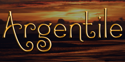 Argentile is a stylish, swirling, magical font with an organic, fairytale feel. Argentile is ideal for any project involving elves, goblins, wizards or suchlike. It includes contextual alternates for characters with swash elements or extravagant ascenders and descenders to avoid overlap.
 - Ines by DSType,
$40.00 Ines is a full featured typeface with seven weights and italics, including Small Capitals, smart fractions and several ligatures. Ines was specially designed for books, with a slight short x-height, making the ascenders and descenders more elegant and tall.
 - Sevoya by Jonahfonts,
$42.00 Sevoya a captivating robust script font designed with fat strokes for those strong brands and logos. Featuring short ascenders and descenders making it a bit more legible. Sevoya is perfect to create outstanding headings, logos, menus, graphics, and many more applications.
 - Amphibia by Storm Type Foundry,
$53.00 On a sans-serif basis it contains trapezoid ascenders, balls & rounded ears, which may resemble the serif feel in smaller sizes, thus long reading is surprisingly easy. Amphibia is suitable for everything from contemporary poetry to branding and informational systems.
 - Morocco by Linotype,
$29.99Morocco is a round, curvaceous font from Swiss designer Michael Parson. Many of the letterforms in Morocco are inspired by the Modern Greek alphabet. Five of the lowercase letters have additional ascenders/descenders that are not typical in the Roman alphabet (h, n, s, u, x). This experimentation continues into the uppercase as well; many capital letters in this font have been bequeathed with ascender or descender-like elements, and some capital letters, like the Q", only come up to the x-height of the lowercase letters. This experiment in type design is one of ten from Parson that has been included in the Take Type 5 collection from Linotype GmbH." - Marvelouz DSG - Unknown license

- Vanio by Eko Bimantara,
$24.00 Vanio is a wedge serif font family that crafted with precision, focused on both aesthetic and legibility. The letterforms and other typographic elements are made in a way to achieve optical recognition and fit for various typesetting. Its have a strong serif and spacious width letterforms on the upright styles. Its shown a medium contrast and caligraphic strokes. Its have a moderate vertical heights either at the x-height, caps, ascender or descender. Vanio consist of 10 styles from regular to extrabold with each matching italics. Its contain more than 460 glyphs which support broad latin languages. Also contain several opentype features; Ligature, oldstyle figures, fraction, and other variation of figures.
 - Alright by K-Type,
$20.00 Alright is a cursive font is based on the handwriting alphabets used in education, but with modern short ascenders and descenders. Most of the lowercase letters and half of the capitals join up smartly. A useful teaching alphabet and surprisingly stylish too.
 - Kursk 205 by Talbot Type,
$19.50 A text and display font with square proportions, inspired by the type styles of soviet-era Russia. Very shallow ascenders and descenders and a large relative x-height, exaggerate the compact and geometric look. Related to Kursk 105 , its squarer-edged cousin.
 - Kato by Autographis,
$39.50 Kato is a handwritten mostly-joining script with long, but not overly long ascenders and descenders, that make it a very elegant font. Scanned and finished carefully by hand on screen, with that little bit of extra effort to keep the "rough" touch.
 - Sevoya Pro by Jonahfonts,
$45.00 Sevoya Pro a captivating robust script font designed with fat strokes for those strong brands and logos. Featuring short ascenders and descenders making it a bit more legible. Sevoya Pro is perfect to create outstanding headings, logos, menus, graphics, and many more applications.
 - Rapsodia by Andinistas,
$59.00 @andinistas presents Rapsodia, an uncommon roman caps font with serif and high contrast, designed by #carlosfabiancg. Rapsodia was inspired by Stunt Roman, Speedball Textbook for Pen & Brush Lettering by Ross F. George. Rapsodia has a high and sweetened amount of contrast between thin and thick with drop-shaped finishes, reminiscent of Didot, Baskerville and Bodoni. Its artistic accent translates into Tuscan letters drawn with a flexible tip pen. In that order, Rapsodia combines the visual theatricality of an art nouveau corset, with creative historical classics such as Liza Minnelli, Gene Simmons and Freddie Mercury. Its calligraphic curlers full of Mannerist virtuosity are unnatural in Roman caps typefaces with serif. That is why its internal vein in ascending and descending flourishes protrudes with Chicano circus details like triangular diamonds located in vertical strokes. Rapsodia serves to design words and phrases in fine publications, for this reason most of its upper and lower case letters communicate feelings with classic and luxurious sensation through substitutes, ligatures and alternatives for beginning, middle or end of word, functioning as initials and terminals.
 - Park Avenue by URW Type Foundry,
$35.99 Park Avenue Park Avenue was designed by R.E. Smith in 1933 for American Type Founders. Park Avenue is an elegant and light script with freely drawn capitals. Park Avenues pen-drawn quality is particularly evident in the lowercase. The ascenders and descenders of this script font are long; the ascenders are bent-over at the top. Park Avenue has a small 'x' height with tall ascenders, giving the face a refined, elegant appearance. The full elegance and lightness of Park Avenue are only apparent when combining upper and lowercase. It would be worthwhile trying this script in display sizes, for personal messages, invitations, business cards and greetings cards.
 - Aircrew by Vanarchiv,
$28.00 Aircrew is a neutral, humanist sans-serif family optimized for signage applications in display sizes. Its large x-height enhances readability and its letterforms help distinguish characters from each other, increasing legibility. Aircrew has vertical terminals, low contrast, and short ascenders and descenders. The weight variations between uppercase and lowercase characters provide the perfect balance and its slightly condensed proportions allow more words to fit in less space. There are two different versions of Aircrew, positive and negative. This avoids optical effects that cause uneven thickness and unsteady readability in either light or dark backgrounds.
 - Silva Display by Blackletra,
$50.00 Designed primarily for editorial use, Silva is a superfamily ideal to typographically complex environments requiring a highly versatile typeface. With slightly condensed proportions, generous x-height, moderated ascenders and descenders and robust serifs, it is an extremely readable and economic type. Subdivided in two optical sizes, the family has a total of 26 fonts including italics. Silva has an extensive character set — with extensive language support — that provides both old style and lining figures as well as their respective tabular versions, fractions, various ligatures, small capitals, arrows and a number of different symbols.


