10,000 search results
(0.032 seconds)
- Brussels City by Mevstory Studio,
$20.00 Brussels City is Modern Slab Serif Font Brussels City font is perfect for your up coming projects. Such as logo branding, editorial design, stationery design, sport design, blog design, modern advertising design, card invitation, art quote, home decor, book/cover title, special events and any more. That's it! Have fun with Brussels City Serif Font. Thank you! Lettercorner Std
 - Garagum by Belli Creative,
$19.00 Garagum is a display font harmonizing traditional and modern vibes. It has beautifully crafted nine swashes. It’s fun, interesting and perfectly fits different kinds of design works, such as posters, book or album covers, digital spaces, or any other mediums that you want. It supports various Latin-based languages and comes with powerful open type and true type features.
 - Caorgen by Zeenesia Studio,
$17.00 Introducint Caorgen Caorgen is a Condensed modern display font with serif style. It's modern and classic font with a unique and deference look . Perfect if you need a dose of fun in your project. Perfect for editorial projects, Logo design, web font, clothing branding, product packaging, magazine headers, or simply as a stylish text overlay to any background image.
 - Amerio by Subectype,
$15.00 Amerio is a rough font that was made by Subectype Studio. It features a brush made feel and looks so fun. Every single letter has been naturally hand written, making this typeface unique. It was scanned and put together as a font. The font suits best for big headlines, logos, posters, book cover, quotes and much more.
 - Qolling by Dora Typefoundry,
$17.00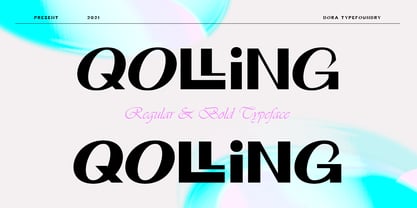 Introducing Qolling is a modern display font, designed for maximum visual and emotional impact. It has a classy and elegant look, Qolling gives your words a powerful sound and is fun to use in your graphic design and screen use projects such as branding, magazines, editorials. , wedding invitations, logo designs, posters, social media and more! Thank you
 - Danger Girl by Comicraft,
$19.00 Ancient Evil! Nazi Spies! High Adventure! Spandex! As the sun sets and the sky fades from 100Y, 50M to 100Y, Jeff Campbell's Warm and Friendly Display Letterforms are already receding over the far horizon in a Dakota, trailing a long broken red line all the way from Venice to Cairo! This font really does not belong in a museum!
 - On Fire by 3Wprotype,
$10.00 Introducing, On Fire Display Font. Concise typeface is fun, and relaxed with natural handwriting. This type of font is very suitable to be applied especially for the needs of letters and logos, and various other formal forms such as invitations, labels, magazines, books, greeting/wedding cards, packaging, fashion, make up, stationery, novels, labels or any type of advertising purpose.
 - Original Quotes by Balpirick,
$15.00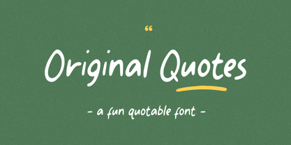 Original Quotes is a Fun Quotable Font. The font looks casual and playful. It's perfect for handwritten notes, sweet greeting cards, beautiful quotes, and stand-out branding as well. The set contains additional items for your design also multilingual support Enjoy the font, feel free to comment or feedback, send me PM or email. Thank you!
 - Theater Lights JNL by Jeff Levine,
$29.00 Vintage sheet music for the title song from the film "Forty Second Street" was the inspiration for Theater Lights JNL. While the idea of letters comprised of circles (to simulate bulbs) can be both vintage [as in marquee lights] or modern [simulating dot matrix printers], it is always a fun approach to a tried-and-true style.
 - Broman by Zeenesia Studio,
$17.00 NTRODUCING BROMAN!! BROMAN is a bold modern display font with serif style. It's modern and classic font with a unique and deference look . Perfect if you need a dose of fun in your project. Perfect for editorial projects, Logo design, web font, clothing branding, product packaging, magazine headers, or simply as a stylish text overlay to any background image.
 - Stellarum by 3Wprotype,
$10.00 Introducing, Stellarum Display Font. Concise typeface is fun, and relaxed with natural. This type of font is very suitable to be applied especially for the needs of letters and logos, and various other formal forms such as invitations, labels, magazines, books, greeting/wedding cards, packaging, fashion, make up, stationery, novels, labels or any type of advertising purpose.
 - Ayrton Pight by Attract Studio,
$12.00 Ayrton Pight is a calligraphic font that comes with beautiful characters, a type of modern hand-rubbed calligraphy script, designed with high detail to bring stylish elegance. Ayrton Pight is attractive as a type of font that is smooth, clean, feminine, sensual, glamorous, simple and very easy to read, because there are many fancy font connections.
 - Bionca by Zeenesia Studio,
$15.00 BIONCA is a bold modern display font with sans serif style. It's modern and classic font with a unique and deference look . Perfect if you need a dose of fun in your project. Perfect for editorial projects, Logo design, web font, clothing branding, product packaging, magazine headers, or simply as a stylish text overlay to any background image.
 - Delivery Note by Hanoded,
$15.00 I like fonts that look like scribbled notes… so I made one! Delivery note was made with a sharpie pen on paper. I didn’t ‘clean’ the glyphs too much, as I wanted it to look like a genuine note script. It comes with double letter ligatures for the lower case glyphs and a fun doodle pack!
 - Put My Foot Down by Ingrimayne Type,
$14.95 If you grew up in the north, you may have stomped out letters in the fresh snow during the winter. Memories of such winter fun helped inspire this typeface. If one can do the typeface with shoes or boots, one can also do it with bare feet and hands. Non-human variants are possible, such as bird tracks.
 - Saturday Detentions by Bogstav,
$18.00 Saturday Detentions is based on the classic serif "High School" style. However, this version is handmade and a bit rugged here and there - and loose in a legible/organic way. I've added 7 different versions of each letter and they automatically cycle as you type - or you can manually choose the one you prefer from the glyph menu.
 - Sayonachi by ActiveSphere,
$30.00 Sayonachi is a fun, curly font to use in a wide range of documents, and works best in display applications, such as posters, greeting cards, awards, invitations, logos and titles. Sayonachi font has a full upper and lower-case, accents, punctuation and a selection of monetary symbols. Currently Available for Mac and PC, in Open Type, PostScript or TrueType.
 - Deco Power JNL by Jeff Levine,
$29.00 A June 18, 1929 issue of the Hollywood trade paper “The Film Daily” ran an ad for a film called “The Power House”. The film’s title was hand lettered in an extra bold sans serif design with strong Art Deco influences. This is now available digitally as Deco Power JNL in both regular and oblique versions.
 - Blunder by 3Wprotype,
$10.00 Introducing, Blunder Display Font. Concise typeface is fun, and relaxed with natural handwriting. This type of font is very suitable to be applied especially for the needs of letters and logos, and various other formal forms such as invitations, labels, magazines, books, greeting/wedding cards, packaging, fashion, make up, stationery, novels, labels or any type of advertising purpose.
 - Retro Pica by Creativemedialab,
$18.00 Introducing Retro Pica, a bold and fun display font. Retro Pica features a bold retro style with many alternate characters ideal for design, such as posters, t-shirts, branding, logos, etc. Retro Pica Lite, with this style, we replaced the uppercase character with the alternate version for those who use applications that do not support open-type features.
 - Eskapade by TypeTogether,
$53.50 The Eskapade font family is the result of Alisa Nowak’s research into Roman and German blackletter forms, mainly Fraktur letters. The idea was to adapt these broken forms into a contemporary family instead of creating a faithful revival of a historical typeface. On one hand, the ten normal Eskapade styles are conceived for continuous text in books and magazines with good legibility in smaller sizes. On the other hand, the six angled Eskapade Fraktur styles capture the reader’s attention in headlines with its mixture of round and straight forms as seen in ‘e’, ‘g’, and ‘o’. Eskapade works exceptionally well for branding, logotypes, and visual identities, for editorials like magazines, fanzines, or posters, and for packaging. Eskapade roman adopts a humanist structure, but is more condensed than other oldstyle serifs. The reason behind this stems from the goal of closely resembling the Fraktur style to create harmony in mixed text settings. Legibility is enhanced by its low contrast between thick and thin strokes and its tall x-height. Eskapade offers an airy and light typographic colour with its smooth design. Eskapade italic is based on the Cancellaresca script and shows some particularities in its condensed and round forms. This structure also provided the base for Eskapade Fraktur italic. Eskapade Fraktur is more contrasted and slightly bolder than the usual darkness of a regular weight. The innovative Eskapade Fraktur italic, equally based on the Cancellaresca script previously mentioned, is secondarily influenced by the Sütterlin forms — an unique script practiced in Germany in the vanishingly short period between 1915 and 1941. The new ornaments are also hybrid Sütterlin forms to fit with the smooth roman styles. Although there are many Fraktur-style typefaces available today, they usually lack italics, and their italics are usually slanted uprights rather than proper italics. This motivated extensive experimentation with the italic Fraktur shapes and resulted in Eskapade Fraktur’s unusual and interesting solutions. In addition to standard capitals, it offers a second set of more decorative capitals with double-stroke lines to intensify creative application and encourage experimental use. The Thin and Black Fraktur styles are meant for display sizes (headlines, posters, branding, and signage). A typeface with this much tension needs to keep a good harmony between strokes and counters, so Eskapade Black has amplified inktraps and a more dynamic structure seen in the contrast between straight and round forms. These qualities make the family bolder and more enticing, especially with the included uppercase alternates. The Fraktur’s black weights are strident, refusing to let the white of the paper win the tug-of-war. It also won’t give away its secrets: Is it modern or historic, edgy or amicable, beguiling ornamentation or brutish presentation? That all depends on how the radically expanded Eskapade family is used, but its 16 fonts certainly aren’t tame.
 - Tuba by Canada Type,
$24.95 Initially commissioned in the summer of 2009 for a popular North American ice cream parlor chain we cannot name, Tuba started with a reconceptualization of a somewhat flawed '72 alphabet idea by Swiss graphic designer Erwin Poell. During the back-and-forth of the custom project, other ideas seeped into the design, mostly from other Canada Type fonts, like Fab, Jonah, Jojo and Teaspoon. The end result was what the client called a "sugar circuit trigger alphabet". This now is the retail version of that project. Tuba's main style is a straight-forward mix of 60s/70s art nouveau ideas and late-70s/early-80s tube aesthetic. The Highlight and Outline styles are almost necessary spinoffs for this kind of typeface. And the all-caps Black style is a nod to the fat font fad of the past couple of years. All styles contain many alternates – so many that each style is almost two fonts in one. Make sure to check out the character sets for a few nice and useful surprises. Life's too short. Seek sweetness. Get gooey.
 - Gerakent by Twinletter,
$18.00 Introducing our newest font Gerakent. What a fun font that brings a little sunshine to your day! Bring your next project to life with this retro-inspired typeface and create elegant typography that gives it a retro or vintage feel. You can use it for branding, product packaging, or even editorial work. It’s easy to use in any design program or even as a pre-cut vector and works best as text but you can also mix it with other fonts for added flair!
 - Purefell Script by Letterhend,
$14.00 Purefell Script is a natural handwritten made script which is suitable for anyone who needs a typeface for headlines, logotype, apparel, invitations, branding, packaging, advertising and more. This typeface is comes with uppercase, lowercase, punctuation, symbols, numerals, stylistic set alternate, ligatures, as well as multi-lingual support and PUA encoding. We hope you enjoy the font, please feel free to comment if you have any thoughts or feedback. Or simply send me a PM or email me at letterhend@gmail.com Thanks for purchasing and have fun!
 - Jazz Beat Stencil JNL by Jeff Levine,
$29.00 The 1960 British film “Beat Girl” (released in the U.S. as “Wild for Kicks”) was a typical [for its time] story of a teenage girl looking to have some fun by hanging out with SoHo beatniks and going against parental authority. One of the posters for the film features the title in a condensed slab serif stencil form, with eroded edges. The basic letter forms were smoothed out and cleaned up resulting in Jazz Beat Stencil JNL, which is available as in both regular and oblique versions.
 - Hello Girly by Good Java Studio,
$19.00 Hello Girly is the perfect font for all your fun designs. The main font file is equipped with ordinary characters (A-Z, a-z, 0-9, ligature), as well as more than 300+ glyphs to support most Latin-based languages. So you can be sure they will work well together with other fonts! It is suitable for you to use in making t-shirt designs, quotes, labels, packaging, logo type, or long writing. Because we have compiled kerning and matrices that are tailored to your needs.
 - Frunch by Nasir Udin,
$22.00 Starve for tasty bold font? Say hello to Frunch! A delicious bold script font with a vintage vibe. Frunch comes to you with several alternate letters for you to play with and the complete set of lowercase-letter swashes that make your words look delicious and stand out. It's especially created for food & beverages branding as well as product packaging typography (e.g.: snack, honey, breakfast meal, milk, bread and cake). It's also perfect for poster, business cards, headline, restaurant menus, and much more. Have fun with Frunch!
 - Wakerobin by Monotype,
$50.99 Wakerobin takes its charming swagger from the hand-painted billboard, poster and signage lettering of the mid-19th century. These showy styles did everything they could to stand out from the background cacophony of advertising, with signwriters using sharp and high contrast serif letters, squared block shapes, or art nouveau forms to grab the attention of passersby. Wakerobin embraces the spirit of these letterforms, bringing these various styles together in one typeface - as if users had their own sign painter on hand. Just as lettering artists had to adapt to a variety of sizes - from wide streetcar lettering to compressed forms that squeezed into narrow Victorian windows - the variable version of Wakerobin scales up and down in width to fit whatever environment the user’s working in. The static fonts come in three widths and five weights. As well as its adaptability, Wakerobin is bursting with vintage flavour, making it hard to ignore. Its distinctive, spiky serifs would be right at home on food and drinks packaging, as well as shop windows, adverts, and any other place that calls for some typographic showmanship. It performs particularly well in busy environments, or anywhere with a lot of visual noise - just as its historic predecessors did. And while Wakerobin is first and foremost a display typeface, it’s surprisingly elegant when used at text size, or in the lighter end of the weight spectrum.
 - Wakerobin Variable by Monotype,
$209.99Wakerobin takes its charming swagger from the hand-painted billboard, poster and signage lettering of the mid-19th century. These showy styles did everything they could to stand out from the background cacophony of advertising, with signwriters using sharp and high contrast serif letters, squared block shapes, or art nouveau forms to grab the attention of passersby. Wakerobin embraces the spirit of these letterforms, bringing these various styles together in one typeface - as if users had their own sign painter on hand. Just as lettering artists had to adapt to a variety of sizes - from wide streetcar lettering to compressed forms that squeezed into narrow Victorian windows - the variable version of Wakerobin scales up and down in width to fit whatever environment the user’s working in. The static fonts come in three widths and five weights. As well as its adaptability, Wakerobin is bursting with vintage flavour, making it hard to ignore. Its distinctive, spiky serifs would be right at home on food and drinks packaging, as well as shop windows, adverts, and any other place that calls for some typographic showmanship. It performs particularly well in busy environments, or anywhere with a lot of visual noise - just as its historic predecessors did. And while Wakerobin is first and foremost a display typeface, it’s surprisingly elegant when used at text size, or in the lighter end of the weight spectrum. - Saral Devanagari by Linotype,
$187.99Saral, meaning simple in Hindi, is a monolinear design supporting most Devanagari based languages. Derived from the older Linotype typeface Rohini, it has been greatly expanded into three weights and a wide character set. Saral Light, Regular, and Bold are made to coordinate with the respective weights of Helvetica. This design works well in many environments, such as corporate designs, advertising, packaging, signage, and especially for bi-lingual texts. The OpenType font format accommodates hundreds of pre-composed conjuncts, accurate placement of vowel signs, and supports varying length matras. Saral's Unicode encoding guarantees your text is rendered correctly and is compatible across different software and computer platforms. Please note that due to current operating system and application limitations the OpenType features in complex scripts such as Davanagari are not universally supported. Saral is designed to be rendered correctly in Microsoft Word on Windows running the latest version of Uniscribe. If using a Mac or Adobe products such as InDesign then many features may not function as expected. This is including glyph reordering, substitutions, and mark positioning. In the case of small passages of text, alternate input methods can be employed. Apple's character palette and Adobe's glyph palettes are two readily available options that can be used to manually insert glyphs as needed." - Rendering JNL by Jeff Levine,
$29.00 Rendering JNL was inspired by European-style plastic stencils which emulate the block lettering with rounded ends used for years by architectural draftspersons.
 - BuggyFont by Ingrimayne Type,
$14.95 AntsyPantsy, BuggyFont, and MousyFont are based on the same design; only the building blocks—ants, bugs, and a stylized mouse—have been changed.
 - Lenorah JNL by Jeff Levine,
$29.00Lenorah JNL is a block-like design with spur serifs and is one of a number of wood type revivals by Jeff Levine. - AntsyPantsy by Ingrimayne Type,
$14.95 AntsyPantsy, BuggyFont, and MousyFont are based on the same design; only the building blocks—ants, bugs, and a stylized mouse—have been changed.
 - Model Railroad JNL by Jeff Levine,
$29.00 The block style lettering with rounded corners found on a package for model railroad kit parts was the inspiration for Model Railroad JNL.
 - MousyFont by Ingrimayne Type,
$14.00 AntsyPantsy, BuggyFont, and MousyFont are based on the same design; only the building blocks—ants, bugs, and a stylized mouse—have been changed.
 - Blackberry Macarons by PeachCreme,
$13.00 Say hello to the Blackberry Macarons Font Trio! Heart-warming Script, Display, and Sans Serif fonts that will brighten your design. Blackberry Macarons Display - includes all caps regular and multilingual letters, punctuation, numbers, and as a bonus the letters A, K, M, Q, R with beautiful swashes to keep your designs attractive :) Blackberry Macarons Script - has all uppercase and lowercase letters, numerals, punctuation, and 42 fancy ligatures as well to add a cheesy flair to your words. Blackberry Macarons Sans - a cute and fun hand-drawn typeface with a little imperfect look that works great to add a handmade touch to your projects. Includes a full set of regular letters, numbers, and punctuation. Sweet and quirky, the Blackberry Macarons Font trio is perfect for recipes, book illustrations, lettering, fun packaging, greeting cards and so much more!
 - NT Brick Sans by Nurrontype,
$17.00 Back to the future! NT Brick Sans is a pixelated sans serif. Inspired by the Pixel Art phenomenon and Lego bricks, bringing back the good old 16-bit era with open-type features. It's bold, soft rounded, supports multi-language, featuring low caps option. Brick Sans will make your project special. Grab it now.
 - Madani by NamelaType,
$49.00 Madani is a geometric sans serif consisting of 9 weights ranging from Thin to Black and matching Oblique. With a touch of character choice, adding tails to some glyphs on the stylistic set 1 and pointing joined at some of the tapered characters in the stylistic set 2, suitable for display and body text font.
 - Iamblock by wearecolt,
$- Free Font Iamblock is a super heavy display font that makes a statement. In the family, you get a monospace and a naturally spaced version of Iamblock. Iamblock was developed with the rave and party scene in mind, with lots of bright, bold colors mixed with blacks and whites... it's about the heavy contrast.