10,000 search results
(0.053 seconds)
- JH Mabel by JH Fonts,
$40.00 JH Mabel is a modern cursive typeface; it has three weights: light, medium and bold. It is a smart type and consists of extra characters to simulate real handwriting. Typical use: branding, greeting cards, long runing text.
 - Cartoonic by ZetDesign,
$12.00 Cartoonic is a fun and cute display font. This enchanting font will turn any creative idea into a true standout. Get creative with its childlike playfulness, and use it to brighten up any kids and school project!
 - Bucktooth by Tymime Fonts,
$35.00 Bucktooth is a cartoony typeface, inspired by vintage funny-animal comic books, suitable for children's entertainment, packaging or movie titles. Fancier and more upscale than your usual toon font, Bucktooth is fun with a touch of class.
 - Ephemera Sickles by Ephemera Fonts,
$35.00 A debut from the most anticipated vintage digital typefoundry by Gilang Purnama and Ilham Herry, who stucked their mind, body and soul back into the first era of 18th century. They build this intense visual-time machine that no one capable before. Started by the visual branding of the Ephemera Fonts, they bring every letters of it to the another level of journey. They called it Ephemera Sickles. Ephemera Sickles is a ornamented letterhead style typeface-inspired by the era of victorian (1800-1900) and this style was commonly used by engrossers at the turn of the century to embellish official documents, such as diplomas and other certificates. Carefully crafted for every single letters with the soul of Sickels Lettering, Spencerian, and some research from the Penmanship Journal book. The style is named after Charles Sickels, who headed the art department of Electro-Light Engraving Co. in New York City during the early 20th century. There’s no doubt that such a very strong presence typeface like Ephemera Sickles will bring a powerful identity to your visual project. Will be a perfect joint for a logo, visual branding, poster, beer label, packaging, classic bar decor, vintage hotel, et cetera.
 - Bembo MT by Monotype,
$45.99 The origins of Bembo go back to one of the most famous printers of the Italian Renaissance, Aldus Manutius. In 1496, he used a new roman typeface to print the book de Aetna, a travelogue by the popular writer Pietro Bembo. This type was designed by Francesco Griffo, a prolific punchcutter who was one of the first to depart from the heavier pen-drawn look of humanist calligraphy to develop the more stylized look we associate with roman types today. In 1929, Stanley Morison and the design staff at the Monotype Corporation used Griffo's roman as the model for a revival type design named Bembo. They made a number of changes to the fifteenth-century letters to make the font more adaptable to machine composition. The italic is based on letters cut by the Renaissance scribe Giovanni Tagliente. Because of their quiet presence and graceful stability, the lighter weights of Bembo are popular for book typography. The heavier weights impart a look of conservative dependability to advertising and packaging projects. With 31 weights, including small caps, Old style figures, expert characters, and an alternate cap R, Bembo makes an excellent all-purpose font family.
 - Sunetta by Linotype,
$29.99An inkstone, a brush, ink, and paper. In China, one speaks of “wenfang sibao” — the four treasures of the scholar’s study. With these centuries-old hand tools, Werner Schneider created a calligraphic type trilogy of the highest aesthetic order; he named this typeface family after Buddha’s stepbrother, Sunetta. Sunetta is an outstanding choice for contemporary display type purposes. Its combination of lively forms overcome sterile text passages, lending them a more personal note and feeling. But Sunetta is not only recommended for documents bestowing distinction and accolades; the fonts are superb for shorter text passages as well. Sunetta’s spirited flow raises it above the fray that so many generic letterforms find themselves mired in, creating an unforgettable impression. Sunetta’s three complementary styles, Sunetta Flair, Sunetta Charme, and Sunetta Magic, offer three varying degrees of calligraphic verve. The family’s base font, Sunetta Flair, harkens back to the showcard lettering styles of the 1950s, while remaining distinctly European in taste. Sunetta Charme has a more swash-type appearance, while Sunetta Magic is joyfully decorative — its brush-written strokes dance across the line. Together, they may help you reach typographic nirvana. - Railway Gank by IKIIKOWRK,
$17.00 Proudly Present Railway Gank - Street Marker Type, created by ikiiko The free-spirited brush strokes of hand lettering and the strong, urban attitude of street markings combine electrifyingly to create Railway Gank. This font effortlessly jumps out and attracts attention because it embodies the fervor of the streets and the unvarnished reality of graffiti. Railway Gank's brush-style aesthetics give it a handcrafted, real charm. Its flaws and differences give it a unique personality and capture the actual spirit of street art, where each stroke is distinctive. Railway Gank uppercase letters exude confidence and flare, while the lowercase letters give off a more laid-back and welcoming vibe. It is a versatile option for numerous design concepts because of the contrast's ability to create a pleasing equilibrium. This typeface is perfect for an poster event, book cover, movie title, streetwear stuff, magazine layout, quotes, or simply as a stylish text overlay to any background image. What's Included? Uppercase & Lowercase Numbers & Punctuation Alternates Multilingual Support Works on PC & Mac Get also a good offer & FREEBIE at our site : www.ikiiko.com Enjoy our font and if you have any questions, you can contact us by email : ikiikowrk@gmail.com
 - Bembo Infant by Monotype,
$45.99The origins of Bembo go back to one of the most famous printers of the Italian Renaissance, Aldus Manutius. In 1496, he used a new roman typeface to print the book de Aetna, a travelogue by the popular writer Pietro Bembo. This type was designed by Francesco Griffo, a prolific punchcutter who was one of the first to depart from the heavier pen-drawn look of humanist calligraphy to develop the more stylized look we associate with roman types today. In 1929, Stanley Morison and the design staff at the Monotype Corporation used Griffo's roman as the model for a revival type design named Bembo. They made a number of changes to the fifteenth-century letters to make the font more adaptable to machine composition. The italic is based on letters cut by the Renaissance scribe Giovanni Tagliente. Because of their quiet presence and graceful stability, the lighter weights of Bembo are popular for book typography. The heavier weights impart a look of conservative dependability to advertising and packaging projects. With 31 weights, including small caps, Old style figures, expert characters, and an alternate cap R, Bembo makes an excellent all-purpose font family. - Plethora by Sudtipos,
$49.00 A few years ago I've discovered the work of one of the most prolific typeface designers of the Bruce type Foundry in NYC during late nineteenth century. Browsing Julius Herriet's work I found a very unique kind of ligatures in his patented "Old Style Ornamented" type design. Some letters were designed with a little top tail that allowed them to connect to each other. After that, I found that he also designed a single italic weight of the same font 7 years later. Since the beginning of the Opentype days I’ve been deeply obsessed with exploring different ways to build ligatures, so that lead me up to this point where I felt the need to create “Plethora”, this new font inspired by Herriet’s work. Extrapolating weights, adding variable technology and playing with additional interconnected letters and alternates. Definitely, Plethora means a large or excessive amount of something, and this font tries to bring back this abundance of details two centuries later. Available in 9 weights, from roman to italic, and also as variable format, “Plethora” supports plenty of latin languages and is a perfect choice for today’s design tides.
 - Square Beat by Hanoded,
$15.00 After a lot of time sitting at my desk, creating fonts and trying to figure out how my new software works, I really like to work out a bit. The only thing that I do not like is the music they play at the gym; it is usually a selection of poppy tunes that appeals to a large audience. But not to me. I prefer my death metal - and eighties music, as it brings back a lot of good memories. So, I bought myself some ear buds and installed a music streaming app on my phone. Yes, I know, I am probably the last person on earth who discovered streaming... One day, during a workout session, I listened to a list of eighties music and one song that I had forgotten about started playing: Rappers Delight by The Sugarhill Gang. When I started working on the font, I had to think about the song and named it Square Beat. Square Beat font, other than the name implies, is a rounded, handmade font, ideally suited for books and magazines aimed at a young audience, toy packaging or posters. It comes with great language support, including Vietnamese.
 - Troback regular by Alit Design,
$20.00 Introducing Troback - A Vintage Display Font Step into a realm of timeless elegance with Troback, a meticulously crafted vintage display font that pays homage to the design aesthetics of the past. With its distinctive retro charm, Troback encapsulates the spirit of a bygone era, where every letter tells a story. Inspired by the ornate typography of vintage signage, Troback is a masterful blend of boldness and sophistication. Its characters are imbued with intricate details, from the delicate serifs that harken back to a more refined age, to the captivating curves that dance along the baseline with a sense of purpose. This font conjures nostalgia with every stroke, summoning memories of old cigar box labels, antique shop signage, and classic posters that once adorned bustling city streets. Troback isn't just a font; it's a journey through history, a bridge between the craftsmanship of yesterday and the creativity of today. Ideal for branding that craves a touch of vintage authenticity, for designs seeking to recapture the allure of a vintage era, Troback stands as a testament to the enduring power of timeless typography. Let your words resonate with the elegance of a bygone time - let them speak through Troback.
 - Chopper by Canada Type,
$24.95 In 1972, VGC released two typefaces by designer friends Dick Jensen and Harry Villhardt. Jensen’s was called Serpentine, and Villhardt’s was called Venture. Even though both faces had the same elements and a somewhat similar construct, one of them became very popular and chased the other away from the spotlight. Serpentine went on to become the James Bond font, the Pepsi and every other soda pop font, the everything font, all the way through the glories of digital lala-land where it was hacked, imitated and overused by hundreds of designers. But the only advantage it really had over Venture was being a 4-style family, including the bold italic that made it all the rage, as opposed to Venture’s lone upright style. One must wonder how differently things would have played if a Venture Italic was around back then. Chopper is Canada Type’s revival of Venture, that underdog of 1972. This time around it comes with a roman, an italic, and corresponding biform styles to make it a much more attractive and refreshing alternative to Serpentine. Chopper comes in all popular formats, boasts extended language support, and contains a ton of alternate characters sprinkled throughout the character map.
 - VVDS Fifties by Vintage Voyage Design Supply,
$15.00Fifties is a mix of classic geometric and a bit of humanistic grotesque. The goal was to create the font for present with look to the past. In other words, I tried to came back the Modernism aesthetics of XX century into nowadays. The result gives you 60 styles including Italic (Slanted). Your typography may be airy and elegant with Expanded Thin, catchy and expressive with Condensed Bold or dynamic and sharp with Expanded Bold Italic. You will find your way to use this family certainly. Theatre posters or party flyers, vintage t-shirt or modern web service, movie titles or magazine header and even infographic – Fifties will suit you everywhere. You may use the completed styles or may use a Variable Font. To make it as you want to. Weights: Thin / Light / Regular / Medium / Semi Bold / Bold. Widths: Condensed / SemiCondensed / Medium / SemiExpanded / Expanded OTF and Variable Font (TTF) OpenType features: Stylistic alternates for A, G, K, M, N, R, W, a, e, g, j, m, n, r, t, u, w, y; Fraction figures; Subscript and Superscript figures; Tabular figures; Typographic spaces: Em / En / Third / Quarter / Thin / Sixth / Hair - Les Tulipes Pro by Fontforecast,
$29.00 We present Les Tulipes Pro. A smart, classy, modern calligraphy layered type system that offers an array of versatility. Les Tulipes Pro is hand drawn with dip pen and ink, with great attention for details. To name a few: - Elongated entrance and exit strokes ( type ++1 to ++10 in front and __1 to __10 at the back of any letter) - 5 different connecting spaces that make it appear as if the pen was never lifted from the paper (type space1 to space5 wherever you want the connecting spaces to appear) - 9 alternate ampersands (type &1 to &9) - 2 alternate at signs (type @1 or @2) - 5 stylistic sets for alternate characters Note: Discretionary ligatures must be ON The various designs of Les Tulipes Pro harmonize beautifully. Les Tulipes Pro Sans was designed to complement and support the other styles. The more straight forward appearance of the Sans styles enable you to balance out your designs perfectly. The Bold and Closed versions offer even more possibilities to combine or highlight words and phrases. On top of that Les Tulipes Pro Extra, with its 85 gorgeous swirls and swashes tempts you to further embellish your design.
 - Last Dance by Wing's Art Studio,
$10.00 Last Dance: Redux - The 80s Feel-Good Script Font - Updated! Welcome to Last Dance: Redux, a new and improved version of my popular brush-script font inspired by 80s movie posters, VHS covers and Friday nights at the video store! This hand-drawn script aims to capture the feel-good vibes of movie blockbusters that won our teenage imaginations, while serving as the go-to font for recreating this unique and nostalgic period. The original Last Dance font features a gritty, hand-drawn texture that looks equally at home on an aerobics competition poster or steamy urban thriller - making great titles that look distinctly cinematic. Last Dance: Redux takes that original design and strips it back to it’s bare essentials resulting in a clean, uniform look that improves letter flow and readability. It’s also much lighter on system resources making it the preferred choice when using extensively across print and web projects. Both versions come with upper and lowercase characters along with punctuation, numerals and language support, plus two full sets of alternatives and a selection of underlines. Check out the visuals to see it in action!
 - Gemini Type Fontpack by Chank,
$49.00 INTRODUCING THE GEMINI TYPE FONTPACK, an industrial-strength OpenType font bundle inspired by and optimized for dimensional type. Chank Co is proud to introduce the new “Gemini Type Fontpack,” a collection of ten fonts available for use on your desktop computer or web pages, but also optimized for use as exterior cast-metal signage in bronze or aluminum in collaboration with Gemini, a family-owned industry leader in the wholesale manufacture of dimensional letters, logo and plaques based in Cannon Falls, MN. Gemini collaborated with Chank Co to assemble a line of fonts that would work well as dimensional, cast-letter signage for use on the sides of buildings, in stores, and other public spaces. The fonts included in the “Gemini Type Fontpack” are reinterpretations of previous Chank Fonts, now optimized for dimensional signage display, but then also repackaged and presented for your use as an OpenType desktop computer font collection: GT-Adrianna DemiBold GT-Adrianna Bold GT-Adrianna ExtraBold GT-Fairbanks GT-Forward Thinking GT-Hydropower ExtraCondensed GT-Kegger GT-Shopaganda GT-Shopaganda Condensed GT-Timeless Geometric. This is a multi-purpose collection of heavy-lifting fonts to convey your message strong and clearly, full of legibility and clarity, but also displaying personality and distinction. You can purchase and download these fonts in OpenType format for your desktop computer right now via MyFonts. Get it today and you'll also get a great introductory special sale price. These exclusive typefaces are also available as dimensional letters, manufactured by Gemini in bronze or aluminum, from 6" tall up to 18" tall, with a variety of finish options, for use in public signage and wayfinding systems. Gemini manufacture their products in 20 plants through out the US, Canada and Mexico, and all their products are backed by a lifetime guarantee. Chank Co is excited to offer these ten strong, industrial font designs in durable cast metal format via Gemini. ----- More about the fonts in the Gemini Type Fontpack: GT-Adrianna DemiBold, Bold, and Adrianna ExtraBold Clear, invisible, no-nonsense, multi-purpose. A versatile sans-serif heavy-lifting font family. GT-Fairbanks Vintage, silent film, speedball, old-timey, old-fashioned, retro. Based upon the lettering in the 1914 silent film, “The Good Bad Man.” GT-Forward Thinking Futuristic, semi-serif, clean, distinctive, contemporary, idiosyncratic. A font for tomorrow and the future. GT-Hydropower ExtraCondensed Extra-condensed, compressed, strong, rigid and concise. GT-Kegger Strong, sporty, collegiate, athletic. Nothing says “GO TEAM” quite like a big, bold slab-serif font. GT-Shopaganda and GT-Shopaganda Condensed Industrial, geometric, constructivist, propaganda, oh there’s so much to love about the strength and clarity of these two fonts. Based on Chank’s Liquorstore and Nicotine fonts, which have been married and unified here, with a few new twists and turns to their letterforms. GT-Timeless Geometric Bauhaus, anyone? The geometric and minimalist alphabet here is about as clean and straight-forward as a semi-condensed sans can get. ----- All of the fonts in this package are available individually, or save money when you purchase all ten of them as a collection. Download this digital font package from MyFonts today and you'll receive both OpenType and TrueType formats in your download for your desktop computer. Webfont format is also available. (If you'd like to use these fonts as cast-metal letters for exterior, architectural purposes, visit the Gemini website to learn more about how you can find a signage retailer near you.)
 - Chess-7 - Personal use only

- Ainslie by insigne,
$- Get your Aussie on! The new typeface, Ainslie, with its mix of influences from Oz, makes its mark as the first semi-serif from insigne Design. Ainslie, named for Mt. Ainslie and Canberra’s inner suburb of the same name, was originally developed for the Canberra Australia Centennial Typeface Competition. Canberra is Australia’s capital, and it’s a planned city designed by American Walter Burley Griffin, a contemporary and one-time associate of Frank Lloyd Wright. Griffin’s plan involved a distinctly geometric design with several focal points--one of which was Mt. Ainslie. This same purely geometric scheme is now the basis for insigne’s new release. Similar to the Chatype project in its scope, its challenge, and the way its concept was developed, Ainslie incorporates influences from Canberra and surrounding areas to form a font that is uniquely Australian. In comparison, Chatype was developed for the city of Chattanooga, Tennessee by insigne in conjunction with designer Robbie de Villiers. Chatype took elements from Chattanooga’s industrial character and Cherokee past and merged them with the area’s technological influences. Likewise, Ainslie takes Canberra’s distinct, geometric design and blends it with the organic, flowing effect of aboriginal art. Add in touches from the smooth, aerodynamic design of the boomerang and Ainslie gives you a look uniquely Australian yet usable in a wide range of applications. The fashionable typeface includes a multitude of alternates that can be accessed in any OpenType-enabled application. These stylish alternates along with a number of swashes as well as meticulously refined details with ball terminals and alternate titling caps keep the font well accessorized. Also included are capital swash alternates, old style figures, and small caps. Peruse the PDF brochure to see these features in action. OpenType enabled applications such as the Adobe suite or Quark can take full advantage of the automatic replacing ligatures and alternates. This family also offers the glyphs to support a wide range of languages. While Ainslie wasn't selected as the final font in the Canberra competition, the outcome allowed for additional adjustments to the typeface. Several approaches were attempted for the final product including a technological hexagonal concept, which may still be developed to another form later. Some of the organic forms were removed and substituted with more abrupt endings, leaving the face looking pretty spiffy and a fair bit more legible. In the end, Ainslie was pulled back to the basic forms from which it was started. Give it a go for your next project. It’s guaranteed to be anything but a barbeque stopper.
 - ITC Stone Sans II by ITC,
$45.99 The ITC Stone Sans II typeface family is new from the drawing board up. Sumner Stone, who designed the original faces in 1988, recently collaborated with Delve Withrington and Jim Wasco of Monotype Imaging to update the family of faces that bears his name. Sumner was the lead designer and project director for the full-blown reworking – and his own greatest critic. The collaborative design effort began as a relatively simple upgrade to the ITC Stone Sans family. As so often happens, however, the upgrade proved to be not so simple, and grew into a major design undertaking. “My initial intent,” recalls Sumner, “was to provide ITC Stone Sans with even greater versatility. I planned to add an additional weight, maybe two, and to give the family some condensed designs.” As Sumner began to look more closely at his twenty-year-old typeface, he decided that it would benefit from more extensive design improvements. “I found myself making numerous refinements to character shapes and proportions,” says Sumner. “The project scope expanded dramatically, and I’m pleased with the final result. The redesign has improved both the legibility and the overall appearance of the face.” The original ITC Stone Sans is part of the ITC Stone super family, along with ITC Stone Serif and ITC Stone Informal. In 2005 ITC Stone Humanist joined the family. All of these designs have always offered the same three weights: Medium, Semibold, and Bold – each with an italic counterpart. Over time, Stone Sans has emerged as the godfather of the family, a powerful design used for everything from fine books, annual reports and corporate identity programs, to restaurant menus, movie credits and advertising campaigns. ITC Stone Sans, however, lacked one attribute of many sans serif families: a large range of widths and weights. “These fonts had enjoyed great popularity for many years – during which graphic designers repeatedly asked for more weights and condensed designs in the family,” says Sumner. “Their comments were the impetus.” ITC Stone Sans II includes six weights ranging from an elegant Light to a commanding Extra Bold. An italic counterpart and suite of condensed designs complements every weight. In all, the new family encompasses 24 typefaces. The ITC Stone Sans II family is also available as a suite of OpenType Pro fonts, allowing graphic communicators to pair its versatile design with the capabilities of OpenType. These fonts offer automatic insertion of ligatures, small caps and use-sensitive figure designs; their extended character set also supports most Central European and many Eastern European languages. ITC Stone® Sans II font field guide including best practices, font pairings and alternatives.
 - Mobius by Asterisk,
$33.00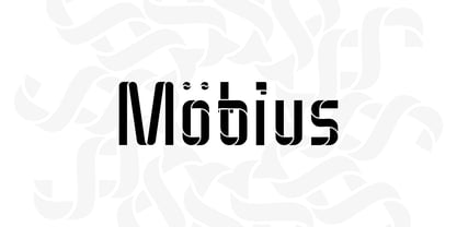 Beautiful font stylized as a ribbon.
 - Posey by Graphicfresh,
$8.00 Posey is a vintage display family (All Caps) including Regular (Clean), Textured versions as well as Italic versions of each. It's perfect for logos, name card, magazine layouts, invitations, headers, or even large-scale artwork.
 - Ghostly forest by RodrigoTypo,
$29.00 Ghostly Forest, is an entertaining font that has many options such as ligatures, alternatives, layers, it is special for titles related to halloween or informal design, it contains its extended version as a basic one.
 - Teuton by Storm Type Foundry,
$31.00 The present font project is inspired by a tombstone inscription on one German grave in northern Bohemia. Suitable combination: Plagwitz, Modell. Teuton is ideal typeface for graves and posters, for advertising as well as magazines.
 - Bagorly by Tadiar,
$9.00 Bagorly is Font Family of SMOOTH and SHARP fonts. It is good to use as a header, text, logo, lettering composition etc. Use it in such areas as Clothing, Luxury, Fashion, Alcohol, Jewelry, Vintage Retro.
 - Alvairo Brilliante by Wildan Type,
$15.00 Introducing Alvairo Brilliante This font was created to look as close to a natural handwritten signature as possible by including lowercase swash, ligature and underlines. Perfect for any awesome projects that need hand writing taste.
 - Clic by Jonahfonts,
$35.00 Clic is an upgrade with new alternates and improved kerning with an added styles ’Thin and Thin Italic’. Applications include Headlines, logos, ads, captions, packaging, bulletins, posters, and greeting cards as well as short texts.
 - Scriptonite by Jonahfonts,
$30.00 A freehand OpenType face, including 20 ligatures as well as the most popular discretionary ligatures. (ft, ct and st) Usage recommendations: Posters, titles, book covers, books, greeting cards, packaging, invitations, magazine articles, titling and advertising.
 - Kis Antiqua Pro by RMU,
$45.00 These Typoart fonts were redesigned and revived for modern use. The italic style got an entire set of swash caps, and both styles contain superior and inferior numerals as well as the historical long s.
 - Edmund by Graphicfresh,
$8.00 Edmund is a vintage display family (All Caps) including Textured, Rough & Clean versions as well as Italic versions of each. It's perfect for logos, name card, magazine layouts, invitations, headers, or even large-scale artwork.
 - Potter Alaska by Aldedesign,
$18.00 Potter Alaska is Nice Bold Script Font - A stylish and quirky new bold script. Potter Alaska font was created to look as close to a readable bold script as possible by including a couple ligatures.
 - FF Justlefthand by FontFont,
$65.99 Dutch type designer Just van Rossum created this script FontFont in 1990. The font is ideally suited for advertising and packaging, festive occasions, editorial and publishing as well as poster and billboards. FF Justlefthand provides advanced typographical support with features such as ligatures, small capitals, alternate characters, case-sensitive forms, fractions, and super- and subscript characters. It comes with tabular oldstyle and proportional oldstyle figures.
 - DF Staple TXT by Dutchfonts,
$33.00 StapleTXT is a transformation from the monospaced typewriter font Staple mono into a text type. The 'mono' skeleton was used as much as possible but some characters were slightly altered in order to obtain more regularity without losing its specific typewriter atmosphere: little variation in character widths. The font has lining figures and works very well as text system in combination with the Staple mono.
 - Massiva GrotesQ by Dawnland,
$13.00 A massive grotesque in four weights + obliques! Perfect for your massive poster or news paper headlines as well as your massive text chunks. The four weights elegantly complete each other as the obliques add tension to your work. Each font consists of a 241 glyph character set with beautiful ligatures for ff ffi ffl fi fl st ts es tt ST ET TT and ES.
 - Ambition & Ink by Brittney Murphy Design,
$8.00 Ambition & Ink is a driven hand-drawn font with lots of customization options. It includes contextual alternates, stylistic alternates for a-z and A-Z, and ligatures. It can also easily be used as a unicase font by subbing the lower case letters that have ascenders and descenders (bdfghjklpqty) for uppercase ones. The font has 546 characters, including lots of accented letters, as well as Greek & Cyrillic.
 - Dartybe Script by Tebaltipis Studio,
$15.00 Introducing new latest from TebTipsudio, Dartybe is a script typeface with personality. You can use it as a logo, badge, insignia, packaging, headline, poster, etc The alternative characters in this font were divided into several OpenType features such as Stylistic Alternates, Stylistic Sets, and Ligature. The OpenType features can be accessed by using OpenType program such as Adobe Illustrator, Adobe Photoshop, and Adobe InDesign.
 - Fairfield by Linotype,
$41.99 Rudolph Ruzicka designed his font Fairfield as a legible text font. His philosophy: The reader expects optical assistance with reading. He does not want to be distracted while interpreting and understanding the ideas of a text." Fairfield font is based on the forms of Venecian Old Face fonts as well as on the designs and details of Art Deco, giving the font a distinctive appearance"
 - FF Rosetta by FontFont,
$41.99 Dutch type designer Max Kisman created this display FontFont in 1991. The family contains 4 weights: Regular, Italic, Bold, and Bold Italic and is ideally suited for advertising and packaging, logo, branding and creative industries, poster and billboards, software and gaming as well as sports. FF Rosetta provides advanced typographical support with features such as ligatures and case-sensitive forms. It comes with proportional lining figures.
 - FF FontSoup by FontFont,
$41.99 Spanish type designers Andreu Balius and Joan Carles Pérez Casasín created this display FontFont in 1997. The family has 6 weights, ranging from Regular to Extra Bold and is ideally suited for festive occasions, editorial and publishing as well as poster and billboards. FF FontSoup provides advanced typographical support with features such as ligatures, alternate characters, and case-sensitive forms. It comes with proportional lining figures.
 - Bestromello Script by Lucky Type,
$12.00 Bestromello is a new modern brush font with an irregular baseline. It's a contemporary approach to design, with handmade and natural curves, suitable for use in title design such as clothing, invitations, book titles, stationery designs, quotes, branding, logos, greeting cards, T-shirts, packaging designs, posters, and more. Complete with uppercase and lowercase letters, as well as multi-language support, numbers, punctuation and some ligatures.
 - Valery by Letteralle,
$23.00 Introducing, Valery! a serif display font with a modern yet luxurious style. Aesthetic and unique letterforms, as well as soft curves are the hallmark of this font. Valery is a versatile and multigender font. Perfect for editorial projects, Logo design, Wedding, Clothing Branding, product packaging, magazine headers, or simply as a stylish text overlay to any background image I hope you enjoy! Letteralle Studios
