10,000 search results
(0.028 seconds)
- Janda Fabulous by Kimberly Geswein,
$5.00 This doodled font features a variety of unique, fun letters.
 - LDJ Ho Ho Snow by Illustration Ink,
$3.00A fun and creative font by Jillustration for the holidays. - LD Fundamental by Illustration Ink,
$3.00LD Fundamental brings energy and fun to any journaling need. - Massi by Komet & Flicker,
$10.00 Massi is a fun, funky and retro all-caps font.
 - Kong Lupasem by Maulana Creative,
$15.00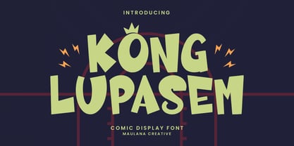 Kong Lupasem comic display font. Heavy stroke, fun character with a bit of ligatures. To give you an extra creative work. Kong Lupasem fun display font support multilingual more than 100+ language. This font is good for logo design, Social media, Movie Titles, Books Titles, a short text even a long text letter and good for your secondary text font with script or serif. Make a stunning work with Kong Lupasem fun display font. Cheers, Maulana Creative
 - Sign Paintoh by Letterhend,
$19.00 The Sign Paintoh is a retro bold script which will bring you back to 60s feel. The swashes makes this font looks great for retro lettering which you can create in a sec! This font perfectly made to be applied especially in logo, and the other various formal forms such as invitations, labels, logos, magazines, books, greeting / wedding cards, packaging, fashion, make up, stationery, novels, labels or any type of advertising purpose. Features : uppercase & lowercase numbers and punctuation multilingual ligatures alternates swashes PUA encoded We highly recommend using a program that supports OpenType features and Glyphs panels like many of Adobe apps and Corel Draw, so you can see and access all Glyph variations. For accessing opentype feature, kindly check this link letterhend.com/tutorials/using-opentype-feature-in-any-software/
 - Cooraline by Scratch Design,
$9.00 Introducing to you, Cooraline! Comes with 2 fonts style! Cooraline it's retro, psychedelic, bold, playful, and really unity together in your design to give it that retro feel. This font has an authentic groovy style that is perfect for making any project like a header, logo, quote, layout magazine, poster, packaging and label design, etc. Better which is use it on the 60s until 80s design project, this font will give some old-school touch to your design projects. Back in the psychedelia era Cooraline came with open-type features such as ligatures and extra clip art, and the other alternative Cooraline Shadow consists of underwater elements that suit with underwater atmosphere, so you can combine these two fonts to make an amazing retro, psychedelic with undersea vibes in your project designs.
 - Acid Green by The Flying Type,
$26.00 Acid Green has quite a psychedelic flair, but its origins are from long before the sixties psychedelia. Its roots date back to 1914, from an unnamed alphabet by J.M. Bergling, the amazing jewelry engraver and 'letterform inventor'—as he considered himself—whose books of art alphabets and lettering influenced countless artists, including, not surprisingly, those involved with the genesis of Art Nouveau and Art Deco movements. Perfect for multiple display uses, including retro designs and trippy letterings, Acid Green has an extensive character set, with multilingual support covering 208 languages. There are yet some handy stylistic alternatives for some extra grooviness. Acid Green is somewhat retro looking, for sure, but it can sound perfectly contemporary too. Tune in and enjoy a creative trip! [Pizza illustration on the first graphic by our neighbor @pedrocorrea84]
 - Melliyan by Sulthan Studio,
$12.00 Melliyan is a new, fresh, funny, interesting, and cute calligraphy font with heart that can be connected front and back. You will have an amazing idea when you make greeting cards, branding materials, business cards, quotes, posters, and more! Melliyan includes many alternative characters. It is coded with Unicode PUA, which allows full access to all additional characters without having special design software. Mac users can use Font Book. Windows users can use the Character Map to view and copy one of the additional characters to paste into your favorite text editor. For people who have opentype-capable software: Alternatives can be accessed by turning on the "Alternative Style" and "Ligature" buttons on the Photoshop Characters panel, or through any software with glyph panels, such as Adobe Illustrator, Photoshop CC, Inkscape.
 - Lichtspiele by Typocalypse,
$29.00 Cinemas from the early 20th century are called “Lichtspiele” in Germany. “Lichtspiele” transports you back to a time where neon lights and marquee letters decorated cinema façades. Of the five styles, three have two versions of italics — the left-leaning italic evokes looking up from lower-left, the right-leaning italic is as if we are looking from lower-right. Display is the basic style, while Neon is inspired by the old neon letters found outside cinemas. Try placing Neon Outline on top of Display or Neon to add another layer to your artwork. Neon 3D is a extruded version of Neon. The Screen Credits style is based on the notes — producers, cast, crew and so on — on movie posters. Get more out of life, go out to a movie.
 - Headhunter Two by Barlov,
$25.00 The original Headhunter shareware font was created in ©1992 by the famous D. Rakowski. It consisted of 63 unique skeletal Glyphs, including Capital A-Z, and a few bone symbols, but lacked lowercase and numerals. He has since abandoned his fonts to pursue other things. (You can download it from FontSquirrel for free.) I've always enjoyed this limited Halloween font, but its incompleteness had to be rectified; thus I took it upon myself to delve slightly into the world of typography, resulting in the birth of HeadhunterTwo. I've slightly reworked his original contribution and "fleshed out" more of the font than necessary. As of this writing, it consists of 777+ Glyphs and passes Underware's compatibility test for Latin Plus (Supporting 219 Latin based languages, which are spoken in 212 countries.)
 - AJSHA by Fontex,
$49.00 AJSHA font, even though being our newest font, is inspired by ancient Japanese and Chinese culture, eastern style of life of about 5000 years before present day, when honor and a good sword were respected. Japanese special sword Katana is known to be handcrafted to be extremely sharp and deadly. Therefore, the shapes of the AJSHA font accompanies the moves of a Katana master when he uses the power of his sword. The font comes in two styles, light and medium. Medium is a bit bolder style while the exact bold or strong version lacks due to the fact that the font's lines needed to be sharp as a swordsman's cuts. We expect this font to be a great asset tool for top-notch designer companies that put quality before everything else.
 - Boldistrike by Letterhend,
$19.00 Boldstrike is a retro bold script which will bring you back to 60s feel. The bold letterform with swash makes this typeface looks standout to be used for your retro theme project. This font perfectly made to be applied especially in logo, and the other various formal forms such as invitations, labels, logos, magazines, books, greeting / wedding cards, packaging, fashion, make up, stationery, novels, labels or any type of advertising purpose. Features : uppercase & lowercase numbers and punctuation multilingual ligatures alternates swashes PUA encoded We highly recommend using a program that supports OpenType features and Glyphs panels like many of Adobe apps and Corel Draw, so you can see and access all Glyph variations. For accessing opentype feature, kindly check this link letterhend.com/tutorials/using-opentype-feature-in-any-software/
 - Seria Pro by Martin Majoor,
$49.00 The multi award-winning Seria (1996) is Martin Majoor’s second comprehensive typeface family and the successor to his popular text letter Scala. Seria explores the proportions of classical text typefaces. Its degree of sophistication is perfect to be used for poetry and other refined literature, its eye-catching details however makes Seria also suitable as a display typeface. The first sketches for Seria emerged in the summer of 1996 on the train from Berlin to Warsaw, to be precise, on July 25 – the date Majoor noted on the napkins of the train’s on-board restaurant, which he used for lack of suitable drawing paper. The italics are almost upright which contributes much to Seria’s delicately proportioned appearance. The Seria family consists of Seria Serif and Seria Sans. Combining the two creates countless possibilities of expression.
 - TwentyFourNinetyOne by steve mehallo,
$19.91 TwentyFourNinetyOne [2491] is a reinterpretation of the alphabet of 1919 by Theo van Doesburg; the original a true rendering of the thinking of the Dutch-based art movement “de Stijl.” Jump forward to 1980 and prop lettering used on the Buck Rogers in the 25th Century television series; a vernacular typeface that was a utilitarian mix of geometry and pixel-based forms, used to symbolize the futuristic universe of 2491. At times it would appear on spaceships, laser guns, signage at space ports or in one episode, a Spandex tapestry. It only seemed logical to combine and rethink the letterforms, add ligatures + other extras, and see what the results would be. Futuristic, fun and bold to read! 2491: In the future, all type will look like this.
 - Hombre by Monotype,
$50.99 Hombre™ is a sure-fire attention-getter for projects requiring a straight out of the old west flavor. Authentic, weather-beaten, time-ravaged, and a bit haphazard, it’s also a sure-fire attention-getter. Drawn by Thomas Oldfield and loosely based on popular typefaces of the 19th century, Hombre offers all the gun-slinging swagger and rugged style of Jesse James and his crew of outlaws. But don’t typecast this design. The Hombre typefaces are equally at home in ads, banners, headlines and subheads – in both hard copy and digital environments. Add to this, a large character set supporting most Western European and many Eastern European languages, including Cyrillic and Greek, and you can bring a rustic and timeworn look to a passel of applications.
 - Retro Checkbook JNL by Jeff Levine,
$29.00 By the 1990s, the availability of font creation software opened the door to an explosion of creativity, experimentation and exploration into the world of digital typography by amateur and professional alike. The undisputed king of the freeware fonts was Ray Larabie through his Larabie Fonts website. It seemed at the time that Ray’s output was endless, and he amassed dozens upon dozens of fonts that ranged from the ridiculous to the sublime. In fact, Ray was the driving force of encouragement and a behind-the-scenes “mentor” who helped Jeff Levine Fonts get underway in January of 2006. As Larabie’s focus changed to higher-quality commercial type design with the launch of Typodermic, Inc., many of his “less than perfect” font experiments were withdrawn and shelved. Ray eventually turned those lost (and sometimes questionable) typefaces into a bundled zip archive released into the public domain through Creative Commons. One particular design “Boron” (circa 1996) featured computer-oriented lettering as if etched onto a circuit board. Running with this idea, and with Ray's approval, the electronic elements were stripped away, the characters cleaned up and modified, and the font reworked in Retro Checkbook JNL, which is available in both regular and oblique versions.
 - Rusty Forest by Mans Greback,
$69.00 Rusty Forest is a typeface that takes you back to the days of golden design, when travel and adventure were celebrated in striking posters. This font's rustic appearance, created by its brush-style strokes, evokes images of a cabin in the woods, surrounded by the beauty of nature. It's as if you can smell the campfire smoke and hear the rustling of leaves in the wind. This font is perfect for designers looking to add a touch of vintage charm to their projects, whether it be a poster for a national park or a logo for a wilderness-themed brand. Its 1950s-inspired style will transport viewers back in time to a simpler era, where the call of the wild was all one needed to feel free. The Rusty Forest family includes Bold, Italic, Bold Italic, and Regular, offer a range of options to suit different design needs. The font is built with advanced OpenType functionality and has a guaranteed top-notch quality, containing stylistic and contextual alternates, ligatures and more features; all to give you full control and customizability. It has extensive lingual support, covering all Latin-based languages, from Northern Europe to South Africa, from America to South-East Asia. It contains all characters and symbols you'll ever need, including all punctuation and numbers.
 - Rabsy by D&K Project,
$15.00 Rabsy is a unique cartoon font with a doodles concept. The included dingbat doodles pattern makes it easy for you to make unique patterns, and make fun display tittle. A mixed-case font (Rabsy and Rabsy Pattern) with lots of combination possibilities, makes for great fun! It is good for logotype, stickers, fun kids signs, and other lettering projects. This fun is perfect combination uppercase and lowercase. Rabsy File Downloaded: - UPPERCASE and lowercase - Lots of doodles Rabsy Pattern 1-9, A-Z and a-z (more fun with lots of combination possibilities) - Punctuation and numeral - Extended Latin characters for language support. Please let me know in the comments what you think or if you have any issues or queries, If you have any questions about licensing, need help with a typeface, or would like to request a new feature, drop me a message. Thank you, D&K Project
 - TE Nastaaliq by Tharwat Emara,
$59.00 TE Nastaaliq Font It is one of the Persian calligraphy or ta'liq line that appeared in Persia in the seventh century AH (thirteenth century AD), as it was extracted from the lines of naskh, patch and thuluth. It is a beautiful font whose letters are distinguished by precision and extension. It is also characterized by its ease, clarity and lack of complexity. It does not tolerate diacritics, despite its difference with the line of the patch, as it is one of the best fonts in the world and the best without a competitor and admires many Arab calligraphers, and no cultural or literary exhibition is devoid of a painting written in Persian script. It is one of the most beautiful lines that has a special character that distinguishes it from others, as it is characterized by gracefulness in its letters, so it appears as if it descends in one direction, and its beauty is increased by the soft and rounded lines in it, because it is more flexible in drawing and more flexible, especially if it is drawn with precision, elegance and good distribution, and the calligrapher may baptize In his use of decoration to reach strength in expression by taking advantage of arches and circles, in addition to the grace of painting, the artist may link the letters of one word and the two words to reach the composition of a frame or curved and wrapped lines in which he shows his genius in imagination and creativity.
 - Dolsáb by Kent Barns,
$20.00 Dolsáb was designed from scratch with uniqueness in mind. The subtle movement from thick to thin and the variants of sharp to rounded make this cutting edge san serif a must have. The inspiration for Dolsab was a simple pairing of a rhombus and calligraphy. While neither of those two elements can be seen in their entirety in any instance, the influence of both is strong. The rhombus can be notice on most ascenders like on the lowercase t & l, for example. And the calligraphy inspiration is most easily captured on the descenders such as the lowercase y & g. The most beautiful characteristics of Dolsab is definitely the calligraphy-influenced movement. These features really stand out on the lowercase a & e. It's almost amusing to let your eye follow the contours of those two letter forms as they travel from thick to thin, sharp to rounded and back again. Users are welcomed to try all font styles of Dolsab in any applique of their choosing. However, it will be quickly noticeable that only Dolsab Air & Demi (the thiner of the styles) will be best suited for body copy. Personally I like to see these letterforms as large as they can be to really showcase the subtle movement, especially in Dolsab Heavy where these movements become much more dramatic. You'll never know what really works best unless you experiment. Dolsab surely isn't the answer to all projects, but it's certainly worth trying. No other typeface moves quite like Dolsáb.
 - Floral Decay by Mircea Boboc,
$22.00 This is Floral Decay, your seasonal autumn font with jaded, weathered, and earthy contours of rustic lettering. As they blend into words, the characters evoke floral arrangements of a decaying beauty. It is versatile, playful, and perfect for Graphic Design decorations! This font is unique because, in order to create it, I had to answer some tricky questions: What makes autumn… autumn? Capturing the essence of the other seasons into your letters comes easier. For instance, in order to suggest summer, you only need to draw a few flowers. How about autumn? You could garnish your letters with a few grapes, you might think, but it would only result in a grape-themed font. The notion that is more directly associated with autumn is the image of falling and withering leaves, which brought me to the second question. How exactly are you going to create something beautiful out of a somewhat morbid premise, like wilted leaves? Well, I soon realized that by creating a handwritten font and preserving the right imperfections, you can actually portray collateral beauty. In this context, asymmetry is important because it suggests decay. Further on, the design concept required the letters to come very close together, so that every typed word can be regarded as a floral arrangement. How close together, though? As much as possible without confusing one with the other, risking a lack of legibility. Therefore, in contrast with the demo version of this font, this actual version provides the ideal kerning.
 - Kisba Nova by Identity Letters,
$29.00 Kisba Nova – A character actor that turns heads. Spiky serifs, soft ball terminals. All eyes on Kisba Nova: enter a typeface designed to arouse attention. Kisba Nova is that one guest who joins a party, and a murmur goes through the crowd. Kisba Nova is pure charisma. Opposites attract: Kisba Nova combines sharp wedge serifs and spiky spurs with round and soft ball terminals. Infuse this with a neoclassical stroke contrast and you get a thrilling typeface driven by visual extremes. Sure: Kisba Nova is a diva. But it’s a pro, after all. That’s why it comes in two optical sizes: Headline and Text. This makes sure it looks gorgeous in any situation. The Kisba Nova Headline subfamily is flaunts the trademark flamboyant looks and extravagant letters like f and k. They bring you all of the excitement of the showbiz in large applications—use it for sizes of 24 Pt. and more. The extraordinarily designed, thin and monolinear diacritics, punctuation marks, and symbols of Kisba Nova Headline add to this modern and elegant character. Kisba Nova Headline consists of seven weights from Thin to Black, offering plenty of possibilities to set headlines and titles. With about 600 characters per weight, it contains enough functionality for the demands of a skilled typographer. OpenType features, such as a large set of ligatures, extended language support, case-sensitive forms, different sets of figures, and arrows, enable sensational designs both in web & print layouts. The Kisba Nova Text subfamily comes with decreased contrast, more generous letter proportions, and wider spacing. Instead of employing flashy thin and monolinear diacritics, punctuation marks, and symbols, Kisba Nova Text aims for a more even texture on the page. It retains the true, elegant Kisba DNA while allowing you to set legible copy in sizes between 9 and 18 Pt. Nothing will distract your reader–Kisba Nova Text aims to please. Kisba Nova Text consists of seven weights from Thin to Black, offering plenty of possibilities to set body copy and subheadlines. With about 600 characters per weight, it contains enough functionality for the demands of a skilled typographer. OpenType features, such as a large set of ligatures, extended language support, case-sensitive forms, different sets of figures, and arrows, enable sensational designs both in web & print layouts. Kisba Nova celebrates the dual nature of softness and sharpness in a single typeface. It’s a character actor that turns heads.
 - Anaglyph by Luxfont,
$18.00 Introducing incredible COLOR ANAGLYPH font. Unique font family with anaglyph stereo effect - a novelty in the field of color fonts. Inspired by global trends in contemporary design with a touch of retro 90s, electric music and minimalistic purity of glyphs. Truly a reflection of modern POP culture. Font is ideal in entertainment design. Night club poster design, fashionable business card, website title, magazine illustration - there are countless options for using it. Font family has two thicknesses - bold & regular, 3 types of stereo effect, 2 font colors with stereo effect (black and white). Font consists of letters of the same height without division into uppercase and lowercase glyphs. This font family is based on the Regular & Bold fonts Boldini - which means that if necessary you can combine these two families and they will be absolutely stylistically identical and complement each other. Check the quality before purchasing and try the FREE DEMO version of the font to make sure your software supports color fonts. Features: Free Demo font to check it works. 36 OTF SVG fonts in the family 2 thicknesses: Bold, Regular 3 types of stereo anaglyph effect 6 font colors with stereo effect Kerning IMPORTANT: - OTF SVG fonts contain vector letters with gradients and transparency. - Multicolor OTF version of this font will show up only in apps that are compatible with color fonts, like Adobe Photoshop CC 2017.0.1 and above, Illustrator CC 2018. Learn more about color fonts & their support in third-party apps on www.colorfonts.wtf - Don't worry about what you see all fonts in black and not in multicolor in the tab “Individual Styles” - all fonts are working and have passed technical inspection, but not displayed in multicolor they, just because the website MyFonts is not yet able to show a preview of colored fonts. Then if you have software with support colored fonts - you can be sure that after installing fonts into the system you will be able to use them like every other classic font. Question/answer: How to install a font? The procedure for installing the font in the system has not changed. Install the font as you would install the classic OTF | TTF fonts. How can I change the font color to my color? · Adobe Illustrator: Convert text to outline and easily change color to your taste as if you were repainting a simple vector shape. · Adobe Photoshop: You can easily repaint text layer with Layer effects and color overlay. ld.luxfont@gmail.com
 - Design Or Die by Type-Ø-Tones,
$40.00 Many people asked why we removed Design or Die of our collection. After years of hibernation in our vault, one of the sexiest italics of the Classic Type-Ø-Tones is back. New subtle changes for a definitive version of this Luis Mendo type.
 - Charmer JNL by Jeff Levine,
$29.00 Found on the back of some sheet music to promote another song was the hand-lettered title "The Snake Charmer". While not everyone likes snakes, many designers do like the lettering of the Art Deco era, so Charmer JNL is designed from that lettering.
 - Sennetarium JNL by Jeff Levine,
$29.00Jeff Levine first designed Sennetarium JNL back in 2004; based on the large drop caps found on intertitle cards from an old Charlie Chaplin film. The font’s name is a nod to Mack Sennett, king of the screwball comedies of the silent film era. - Easter Chalk by Yoga Letter,
$14.00 "Easter Chalk" is handwritten in chalk. This font is very easy to use because it has been specially designed. This font is equipped with uppercase, lowercase, numerals, punctuations, and multilingual support. It is suitable for Easter, summer, spring, back-to-school themes, and others.
 - RM Tubes by Ray Meadows,
$19.00 This is an unusual family of 3D designs that will add impact to your design. Due to the modular nature of this design there may be a very slight lack of smoothness to the curves at extremely large point sizes (around 100 pt and above).
 - Evening Paper JNL by Jeff Levine,
$29.00 Evening Paper JNL, one could say, was "culled from the headlines". It was. The front page headlines from some 1938 newspapers archived online were the basic model for this font. The typeface design goes back to a font first issued by Ludlow in the 1920s.
 - Waykers Amor by Maulana Creative,
$15.00 Introducing Waykers Amor Blackletter Font Waykers Amor Blackletter Font is a handmade Modern Victorian handlettering, which is combining modern and classic typography with some awesome alternates. Yes we back to early 1800s, bring classic touch on this decade. Thanks for use this font. MaulanaCreative.
 - MC Allaize by Maulana Creative,
$14.00 Introducing Allaize Blackletter Display Font. Allaize Blackletter Font is a handmade Modern Victorian handlettering, which is combining modern and classic typography with some awesome alternates. Yes we back to early 1800s, bring classic touch on this decade. Thanks for use this font. Maulana Creative.
 - Breite Kanzlei by URW Type Foundry,
$39.99 Ralph M. Unger, known for his preference for blackletter designs, brought this beautiful blackletter variant back to life. Based on artwork from old catalogues, he redesigned, digitally remastered and completed the character set for this typeface. Breite Kanzlei cannot be avoided by blackletter lovers!
 - Sticky Brash by PizzaDude.dk,
$15.00 Sticky Brash is my laid back kids comic book font - suitable for anything that needs a fresh and quirky attitude, and super legible at the same time. Originally handdrawn, and then manually traced digitally, in order to make those insane clean curves and lines!
 - Bahud Aroyek by Maulana Creative,
$22.00 Bahud Aroyek Decorative Display Font Blackletter Bahud Aroyek Vintage is a handmade Modern Victorian handlettering, which is combining modern and classic typography with some awesome alternates. Yes we back to early 1800s, bring classic touch on this decade. Thanks for use this font. MaulanaCreative.
 - RM Squarial by Ray Meadows,
$19.00 Based loosely on a square, this hair line design works best at 24pt and above. Due to the modular nature of this design there may be a slight lack of smoothness to the curves at very large point sizes (around 100 pt and above).
 - TF Silence by Teenage Foundry,
$19.00 TF Silence - The awesome bold display font is back for your design projects. There are 2 styles available (Regular & Outline). Suitable to be applied to clothing designs, posters, logos etc. Features: Uppercase, Lowercase, Numeral, Punctuation & Multilingual. For any questions please contact me 🙂 Thanks!
 - Wickenburg by VersusTwin,
$21.99 Wickenburg is a rough and tumble grunge slab typeface that has taken a lickin' but keeps on coming back for more. It is a powerful heavyweight serif that makes a strong design statement. Pick up this bad boy and take him for a ride!
 - MC Claist by Maulana Creative,
$17.00 Introducing Claist Decorative Display Font. Claist Decorative Display Font is a handmade Modern Victorian handlettering, which is combining modern and classic typography with some awesome alternates. Yes we back to early 1800s, bring classic touch on this decade. Thanks for use this font. Maulana Creative.
 - Mife Althar Font by Maulana Creative,
$22.00 Mife Althar Blackletter Display Font Mife Althar Blackletter Font is a handmade Modern Victorian handlettering, which is combining modern and classic typography with some awesome alternates. Yes we back to early 1800s, bring classic touch on this decade. Thanks for use this font. Maulana Creative.