10,000 search results
(0.019 seconds)
- ROBO - Personal use only

- Love Wins by Resistenza,
$19.00 In 2007 we shared our first pride together. More than 1 million people took the streets of Madrid for this huge celebration … seeing the diversity of people supporting love was incredibly touching. Gay Pride is a celebration of freedom, human rights and the right to love whoever we want. It’s a memorial for the battles, the lives lost and the pain suffered while fighting for a growing list of equal rights. But let’s not forget there are still places where LGTBQ community is repressed and persecuted. As Letter crafters we love seeing the signs people design for their different pride parades, and we wondered… Why don’t we create a collection of handcrafted lettering to share some love and to add a typographic realness to the party? Love Wins Font is a series of 60 phrases handwritten with expertise and love specially designed to celebrate diversity. The lettering was crafted with different calligraphic tools creating diverse aesthetics. You can use them to create your signs, t-shirts, stickers, poster, banners.. all you need is to spread love during your Pride Celebrations (or day-to-day life!).
 - Voluptate by Fontscafe,
$39.00 The "Voluptate Pack" font is a smart sophisticated handwriting pack that includes ‘Voluptate’, ‘Voluptate Classic’ and ‘Voluptate Elements.’ Every single character in our ‘Voluptate’ font distinct and given every letter a unique identity – very much like a person’s handwriting. Of course the characters are similar enough to work hand in hand, but not so similar as to appear as an obviously computer generated type set. The ‘Voluptate Classic’ is very similar in design and ever so slightly informal in its appearance. A thoughtful mix-and-match of both these fonts can give a delightful appearance to your designs. You could use the Voluptate on most areas of the text for example, and the ‘classic’ to emphasize a more personal touch to certain areas, say for example where you may be quoting somebody’s word. When you get the pack you also get a handy ‘Voluptate Elements’ set of designs that can enhance your creations in so many ways. All 3 are available individually, but it's like getting the elements for free when you buy the pack.
 - Lemon - Unknown license

- Gitchgitch by Weknow,
$5.00 Give a simple rounded fun groovy, fancy, to any text project. Also good for a logotype or brand name. This is a gift to my graphic designer friend Gita from Indonesia, I call her gitch gitch, so I made it the name on this font.
 - Rough Therapy by Hanoded,
$15.00 No, I don’t need therapy - at least, not that I’m aware of. I needed a bold and rough name for this bold and rough font. Rough Therapy is a strong display font. Comes in a clean and a dirty version, so take your pick!
 - Amoebica by Hanoded,
$15.00 Amoebica font was created during a nasty bout of the flu. If you think it looks weird, well, I must have been hallucinating when I drew the glyphs! Amoebica is a fun, weird, unusual, happy, crazy kind of font which comes with all diacritics.
 - Argento by Librito.de,
$10.00 The design for this typeface is based upon four sheets of an old latin book I purchased in Hanover (Germany) a couple of years ago. The letters preserve the rough edges of the original printing, I just added a few missing letters and some ligatures.
 - March Evoked by SilverStag,
$12.00 March Evoked is a brand new display font pack that includes regular and outlined version. march Evoked is inspired by an early spring in Spain, with flowers in full bloom all over the capital city - Madrid. With contrast lines & curves it will give your design that chic & modern appeal you are looking for. It is perfect for logos, branding, posters, social media & all other creative projects. I invite you to check out the preview images, and I hope you will be immersed in my vision for this creative typeface that, I am sure, will work for all kinds of interesting projects you might be working on this year. If you end up publishing your designs on Instagram, tag me - https://instagram.com/silverstagco and I will make sure to showcase your design and work to my audience as well! March Evoked - Creaive Display Font Includes: Numerals & punctuation Full language support Would you like to get 5 completely free fonts worth over $75? No tricks, no hidden words, terms or anything. Just subscribe to my newsletter, make sure to check your email to approve the subscription, add me to your contacts so that the emails don't end up in spam folder and you will get 5 fonts for free. The fonts are packed with alternates, ligatures and some even come with extra goodies. https://view.flodesk.com/pages/63594052b967a943dd6cc528 Happy creating everyone!
 - Polin Sans by Borutta Group,
$39.00 For several years I have been thinking about the design of a type family that explores, on the one hand, the modernist aesthetic that we know, from the Alphabet "a.r." designed by Władysław Strzemiński, and on the other, to the multiscript pre-war Warsaw. This is how the idea of creating the Polin Sans typeface was born. After researching on geometric variants of the Cyrillic alphabet, I was inspired by the text "Towards an open layout: A letter to Volodya Yefimov". I was intrigued by the fact that circular forms, which we are mostly familiar with in the Bulgarian Cyrillic, can be implemented in the classical version, without disrupting the reading process. At the same time, while working on typoteka.pl, I was fascinated by the Hebrew typeface jaffa, published by the Idźkowski & Sk-a foundry, which at some points looks like the Hebrew equivalent of the Alphabet "a.r.". Ben Nathan from Israel joined the project and was responsible for creating his native script. The idea of creating a multiscript family expanded to include Greek and Vietnamese. As a result, Polin Sans is a historical journey through the nooks and crannies of Polish modernism, which was created by people with diverse cultural backgrounds. The Polin Sans family was designed by Mateusz Machalski and Ben Nathan with the support of Michał Gorczyca and Małgorzata Bartosik.
 - LC Trinidad by Compañía Tipográfica de Chile,
$34.00 Lc Trinidad is the result of a series of wonderings regarding geometric Sans Serif typography design, in particular; Futura of Paul Renner. A “conversation” arose between me and the designer – actually there was no conversation, it is an euphemism for “I saw his designs, I draw them and discussed with myself some of his decisions – that ended up being the origin of this font firsts glyphs: A, H, N, O, R and S. I started with uppercase letters, and here is when Rudolf Koch with Kabel and his “Das schreibbuchlein” joined the conversation. This is how I could develop some alternative lowercase letters so as to illustrate this imaginary discussion. The result is a sans serif, geometric, modern typeface with classical Roman proportion in the uppercase letters; two stylistic sets for lowercase letters (setKoch and setRenner), rational, open and sharp ends. It is ideal to form titles, medium length texts, branding, exhibitions and animations. The family consists of 9 weight variants and their corresponding oblique versions and small caps. With more than 900 glyphs, it covers more than 190 Latin languages and together with its Opentype functions it creates a modern and versatile family. Besides, it has powerful OpenType features for each style, including stylistic sets, extended language support, ligatures, contextual alternates, lining figures, oldstyle figures, small caps numbers, arrows, fractions, superscripts, subscripts and many more.
 - Cutout by Adobe,
$29.00Matisse's paper cutouts inspired Gail Blumberg, Adobe art director, to create a typeface of figures. Her biggest challenge: keeping each Cutout design in scale. It's not easy to make a standing figure, like 'Y,' to be the same size as a curled up figure, like 'G,'" Gail says." - Sun Plumps by holyline design,
$19.00 Sun Plumps is friendly and playfull sans serif family. This font comes in 10 weight with Slanted and Reslanted , there are a total 30 fonts. This font is great for display projects such as posters, stickers, packaging and branding. Get the all style and play with the all style!
 - Black Raven by The Design Speak,
$100.00 Black Raven is a sans serif font that has an eerie feel to it. It is meant to be used as a contemporary take on anti-design. It maintains an eclectic design and something that you normally wouldn't see every day. Use it for movie posters, book covers, etc.
 - Hassan by Linotype,
$187.99Hassan is a traditional-style Arabic text face designed by Hassan Sobhi Mourad, an experienced calligrapher and teacher of the art and first produced by the Linotype Design Studio (U.K.) as a PostScript font in 1993. An individual Naskh style, Hassan cleverly combines elegant proportions, echoing an inscriptional Thuluth in its tall vertical stems and deeply rounded final jim and ain. The effect of verticality is enhanced by the tense, reined-in kerning strokes of ra and waw, the well-poised lam-alif, and the compactly drawn ligatures. The broad-band strokes of Hassan Bold smooth some of the angularity and relax the tension apparent in the Light. The traditional-style ligatures are rendered with an easy flow. Because of the economical character count, Hassan Light and Bold text may be headed by the compact titling styles (Hisham, Mariam) as well as designs like Ahmed or Kufi which answer to the inscriptional qualities of Hassan. In addition to other uses, Hassan would be particularly suited to document text-setting. Hassan’s two OpenType weights include Latin glyphs from Janson Text Roman, and Janson Text Bold, respectively, inside the font files, allowing a single font to set text in both most Western European and Arabic languages. The OpenType glyph ranges incorporate Basic Latin and the Arabic character set, which supports Arabic, Persian, and Urdu. The fonts include tabular and proportional Arabic, Persian, and Urdu numerals, as well as a set of tabular European (Latin) numerals. - MGT Vallery Hills by Magetype,
$15.00 When I was surfing the internet, with rock n 'roll music. I accidentally found a picture of a hotel sign with a very unique style, namely: Mid-century Modern (MCM). It looks very pretty and charming to me. And inspired me to create Font Family. And I am proud to present the Vallery Hills Font Family. This font is in the Retro style of the 50s to 60s. Okay, here are the specifications. 1. Vallery Hills Schrift There is one unique thing about this font. Usually, script fonts with Retro style always have an angled anatomical shape, but I made this font upright. The goal is to make a difference with other script fonts I've seen. By the way, this font comes in two styles, namely: Regular and Bouncy. Why do I make it like that? Because I want to make this font into two different functions, namely: If you want to make it a Display Font, which is usually used for Headings, then use the Bouncy style. And if you want to use it as Bodytext, then use Regular. 2. Vallery Hills Sherift This second font is a font that is very synonymous with the Mid-century Modern (MCM) era. A very distinctive form of the serif font of that era. Similar to the first font, this font also has 2 styles, namely: Regular and Bouncy. You can combine this font with the other two fonts in Vallery Hills. It could be Title, or Bodytext. And you can also combine two styles, namely: Regular and Bouncy. Try! 3. Vallery Hills Suns Sherift This last font is Sans Serif. Also has 2 styles like his two brothers, namely: Regular and Bouncy. The goal is actually the same. I am sure you are cooler to create a design that uses this font family. Well, there is one advantage of this font from its two siblings, which is that it has a feature, namely: SMALLCAPS. Which will be an option when you are bored with the mediocre shape or style of Lowercase. Try combining the Smallcaps with Uppercase or Lowercase. Must be cool! : D Oops, almost forgot. This font consists of several font formats, namely: OTF, TTF, and Webfonts. And of course everything is MULTILANGUAGE. OK, friends. That's all I can describe about the Vallery Hills Family. Hopefully it will please all of you. Cheers!
 - Inlow by Harvester Type,
$10.00 Inlow is a font that evokes a sense of retromodernity, aesthetics, and something perfect. When developing it, I wanted to convey a touch of retro design and modern design. It can be used in the design of posters, logos, covers, Instagram, just in the text and many other ideas, all just border on your ideas. I think I can see this font on the covers of books. It's exciting. Inspirations were book covers and cars from the 60s and 80s. I wanted to convey retro and modernism. The use of the font is unlimited, and the support of many European languages and not only gives a huge scope for creativity! Design By Eugene Bunin.
 - Gertrud by T4 Foundry,
$21.00First place in a spelling-bee competition, a Harvard University diploma or the Nobel Peace Prize? You can't go wrong with this classic Swedish calligraphy font, created by veteran designer Bo Berndal. He named Gertrud after his better half, but was also inspired by old handwritten documents: "Gertrud is a calligraphic letter design from the 16th century. I used it when I engrossed diplomas with a flat-nibbed pen in the 1980's. When I got my Mac I generated the typeface in Fontographer." Gertrud (the typeface) comes in three weights, with roman and italic. It is an OpenType creation, for both PC and Mac. Swedish type foundry T4 premieres new fonts every month. Gertrud is our sixth introduction. - Full English by Hanoded,
$15.00 I have always been fascinated by the ‘Full English Breakfast’. A Full English usually consists of toast, baked beans, sausages, fried eggs, fried tomatoes, fried mushrooms and sometimes blackpudding (a kind of sausage made from pig’s blood). When I lived in England, my friends were always quite happy to stow away a big full breakfast, but I, on the other hand, could not really set myself to eating one. Full English is a hand made stencil font. If you own a pub and you serve breakfast, you could use it for your signs, but I guess this font looks good on anything that needs a bit of attention. For attention, it will get!
 - Aeronic by Hanoded,
$15.00 Aeronic is a work of love. I stumbled upon a fantastic Japanese poster for Nikke Coat by Gihachiro Okuyama (1907 - 1981). Gihachiro Okuyama (also: Okayama) was a very prolific Japanese print artist who started his career making woodblock prints, but later moved on to posters and advertisements. I tried to recreate the hand lettering in the original 1937 Nikke Coat poster, but since I had to work with a few glyphs only, I designed the remaining ones myself. The outline of Aeronic is rather thin, with thicker bits in some glyphs. It is quite rough in places, but it all adds to its unique look. Aeronic comes with a bonanza of diacritics.
 - Geneo Std by Typofonderie,
$59.00 A robust oldstyle, an elegant slab, 8 styles Geneo, created by Stéphane Elbaz, is a synthesis of historic and present-day visions of typography, a slab serif constructed on an oblique axis. Its subtle contrast evokes both Renaissance elegance and the robustness of the Egyptian typefaces that were in vogue during the 19th century. Geneo falls halfway between the classic styles of Garamond and Transitionnals, with aspects of contemporary slab serifs like Rockwell, Boton, as well a bit informal. From this blend of styles and genres, it emerges with a singular identity perfectly suited for modern illustrations of quality, savoir-faire, and culture. Geneo’s limited contrast has been carefully crafted to make the font adaptable for use as both text and headlines, as well as for small-print elements like footnotes, appendices, and captions. The variety and precision of certain weights, like Regular, allow minute adjustments of the font color in text compositions. This flexibility is especially useful for displaying on devices with high pixel densities such as the latest iPhone or iPad, on which text may appear too thin. Flexibility and sturdiness The sturdiness of Geneo makes it a perfect choice for posters, logos, print and any project that requires finesse and sophistication. It provides alternate versions of some letters such as g and a to give you the flexibility you need for your typographic projects. Geneo pairs perfectly with contemporary typeface genre. Geneo, a new typeface designed by Stéphane Elbaz Tokyo TDC 2014 Type Directors Club 2009
 - Lido STF - Personal use only

- Avion by Fenotype,
$25.00 Despite what some might say, you can’t just always go for that most ubiquitous font in the world, can you? Avion font family channels those cool modernist vibes yet brings something new to the table. With a slightly more rectangular approach and some clever detailing, Avion has a distinct look of its own, yet provokes a calming familiarity of neutrality and objectiveness. As goes without saying, it’s also equipped with a sensible amount of features that make it a true, versatile workhorse. Get on board.
 - ITC Gema by ITC,
$29.99ITC Gema is the work of Brazilian graphic designer Claudio Rocha. It was first written in a small size to keep the surface irregularity of a non-coated paper when enlarged for use as a display font," says Rocha. Many strokes do not quite join, giving Gema the visual effect of a stencil typeface, the distinguishing characteristic of the font. "Some characters have my own handwriting gestures," says Rocha, like elongated endings and angular shapes. Gema comes complete with an unusual variety of ligatures and alternate characters." - Thickset by Josh Grzybowski,
$19.99 She may not be the heaviest font on the street but Thickset can throw her weight around with the best of them. Designed as a display font, Thickset is a solid slab-serif with thin counters that makes it ideal for publications like fashion and editorial magazines. But don’t get me wrong, she’s more than willing to give anything a try. Just as long as you respect her in the morning. In addition to ligatures and fractions, Thickset’s other OpenType features include old style numbers and small caps.
 - 1350 Primitive Russian by GLC,
$44.00 This rough font was inspired by a Russian Cyrillic hand of the 1350s “Russkaja Pravda” (a Russian text of common Laws). As a Pro font, it supports Western and Northern European, Icelandic, Baltic, Eastern, Central European and Turkish specific characters, as well as Old Russian glyphs, including many which fell out of use in the 1700s, except in religious texts — in all over 136 Russian glyphs. The upper and lower case have the same form and almost same size, like in the original texts, which had only one size and style.
 - Vododeo JNL by Jeff Levine,
$29.00 Vododeo JNL is directly named for the free-form sheet music title lettering from Jack Yellen and Milton Ager's "Vo-Do-De-O". The term itself was a catchphrase made popular during the era known as the "Roaring 20s". Yellen and Ager were responsible for such hits as "Ain't She Sweet" (1927) and "Happy Days Are Here Again" (1930) along with countless others. During his career, Jack Yellen provided lyrics to over 200 songs. As a side note, Yellen was married to a distant cousin of type designer Jeff Levine's late mother.
 - Broadletter JNL by Jeff Levine,
$29.00Modern digital typography pushes many designers to try and achieve visual perfection with their lettering. In the days of wooden type, the premise was more in creating a font that "sold" the message (possibly, in part due to the lack of advanced tooling to achieve uniformity). In many styles of wood type (such as the one used as a model for Broadletter JNL), there are vast differences within the character design, weight and symmetry from letter to letter. This is now looked upon as "old fashioned" and "charming" - part of the appeal of this typeface. - Abigail Script by Roland Hüse Design,
$15.00 Abigail Script is a handwritten, monoline cursive font. All the uppercase letters has stylistic alternates and some lowercase letters as well, ligatures and positional forms. Also have a few ornaments in place of numbers 1-9 best fit under words up to 5-6 characters long. See the gallery for preview. It contains Eastern and Western European accented characters. I hope you like this font, good luck with your project and let the creativity flow!
 - Spoiler by PizzaDude.dk,
$16.00 Now here's a font that won't spoil anything! It's my ALL CAPS brush font with slightly uneven and quirky lines. Just enough to make font look lively and fresh, but not overdoing it. Every letter has 7 different versions, which automatically cycles as you type - and I have added an extra SMALL CAPS for each letter. Exchange every letter here and there with SMALL CAPS, and you will get an even more authentic result!
 - Hesster Mofet by JOEBOB graphics,
$20.00 Hesster Mofet is what I got after writing with an old and weathered calligraphic marker on textured paper. The characters were smoothened for a clean result, but since the original sketches had such a nice rough, edgy feel to them, they were also made into a complete font set. A couple of ligatures and a Hannibal Lecter reference were thrown in the mix as well. You can get both versions at a discount.
 - Gmbh Sans by EchadType,
$9.99 GMBH SANS The architectural sans-serif in sharp junctions silhouette. Designed as a display typeface for headline sizes. Typeface maintains it's unique identity even in all lowercase letters due to 21 degrees slanted stems (vertical strokes of letters). Variable typefaces provides subtle gradation of 6 weights. Each weight retains the same character width (except character i and l). Typeface supports: Latin characters with diacritical marks; Cyrillic characters (Ukrainian, Russian); Hebrew; Contains additional monetary symbols (₿Ξ₴₹₪)
 - Numpty by Hanoded,
$15.00 Numpty is a word of Scottish origin and means ‘someone who, by speech or action, demonstrates a lack of knowledge’. I use this word quite often (as this world, unfortunately, seems to be full of numpties). And guess what? Now you know what it means, you can use it too! Hooray! Numpty is a fat, rounded display font. A little uneven, a little weird, but with enough panache to make your designs stand out.
 - Hi Barbie by Areatype,
$21.00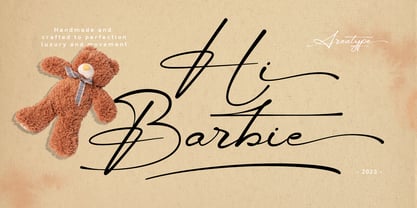 Hi Barbie, modern handmade script. It features dynamic and pretty swashes and can be used for many purpose, such as titles, signatures, logos, wedding invitations, letterhead, signage, labels, newsletters, posters, badges, and more. Files included: Hi Barbie Regular Numerals & Punctuation Stylistic Alternates & Ligatures PUA Encoded Characters Thanks so much for looking, I really hope you enjoy it and please don't hesitate to drop me a message if you have any issues or queries :)
 - The Poisoned Heart by Din Studio,
$29.00 The Poisoned Heart is a beautiful retro script. It's made with a naturally handwritten style. This font will make your design more beautiful and powerful, and is suitable for any design such as branding, quotes, wedding invitations, lettering projects and more. Features: - 76 Alternates - Accents (Multilingual Characters) - 10 Ligatures - PUA encoded - Numerals and Punctuation (OpenType Standard) I hope you enjoy it! Thanks for visiting and purchasing my font! Regards Donis M Din Studio
 - Folkner by Garisman Studio,
$18.00 Folkner born from an inspiring vintage display. This font gives a feel of a vintage, classic, old, and based on handmade. With messy line stamp touch in Folkner Stamp give you a vintage taste. Already PUA Encoded and I think this font is perfect for people looking for vintage aesthetic or logo-type. Suitable for any graphic designs such as branding materials, t-shirt, print, business cards, logo, poster, t-shirt, photography, quotes .etc.
 - Adimlara by Queenop Studio,
$12.00 Adimlara is attractive because it is sleek, clean, feminine, sensual, glamorous, simple and very easy to read, thanks to its many luxurious letter joints. I also offer a number of viable alternative styles for all letters. Classic style is very suitable to be applied in various formal forms such as invitations, labels, restaurant menus, logos, fashion, make up, stationery, novels, magazines, books, greeting cards/weddings, packaging, labels or all kinds of advertisements. for your purposes.
 - Graficz by MAC Rhino Fonts,
$36.00 The origin of this typeface is a Polish catalog cover dated 1936, made by I. Rubin. The word ”Graficz” (included in the poster copy) seemed appropriate as a name for this typeface with its typical ”Central European look”. The original letters are more ”thin” (light weight) than the MRF interpretation and only consists of capital letters. Lower cases and almost all standard character signs have been added, in order to make it more functional.
 - Nevoa by Océane Moutot,
$32.99 Nevoa is a typeface inspired by the vernacular calligraphy from the streets of Brazil. While walking in the streets of some small towns, I felt so inspired by those rounded letters painted on the walls. That is what inspired Nevoa. Nevoa is a soft and smooth serif typeface, with dynamic curves. It is available in Condensed, Semi Condensed, Regular, Semi Extended and Extended to adapt to various uses, such as visual identity, magazine, branding, ...
 - Colcothar by Fabulous Rice,
$30.00 Colcothar is a font based on a calligraphic alphabet I ofter use for my comic books, my film title sequences, or my notebooks. It made sense to turn it into a font, especially since it looks hand-written and quality fonts that look hand-written are sometimes hard to find. It will look great as a header for an article, for a logo, the title of a film… or for anything you think appropriate!


