10,000 search results
(0.025 seconds)
- PF Lindemann Sans by Parachute,
$49.00 Lindemann Sans is an immediately-inviting typeface with a pleasing distinct visual voice grounded by geometry and golden proportions. This modern geometric san serif typeface serves the interpretive needs of modern design through its legibility. This legibility is achieved through proportional balance of each letter based on the golden ratio, open counters, high x-height and wider individual shapes. In addition, a high level of legibility is arrived through distinctive glyphs like a, e, @, and f, which are engaging and add to Lindemann Sans visual voice. Being a modern, spirited, tech-savvy typeface, Lindemann Sans has many of the features demanded by today's designers. These features include 800 characters within each font, many ligatures, full numbers sets, small caps, alternative characters and other niceties found in opentype fonts. Due to Lindemann Sans high legibility, geometric sans tradition, and a large feature set list, it is a very versatile typeface and can be used in replacement of the more commonly used sans. Specifically, Lindemann Sans can be used by technology corporations, architectural firms in their supporting materials, in magazines as headers and key-points, as the typeface for professional keynotes, for the package design industry as a whole, in automotive concept projects, and for cosmetic branding for high class hair products. With its inviting nature it may also be used for liberal arts promotional materials. In addition, this typeface can be used by green industries because of its nature derived proportions. Each style and weight of Lindemann Sans adheres to the same geometric and golden proportions, however, each weight is innately noteworthy. For example, there is a charm that is found in the ultralight weight's elegant geometry and lights impressive use as oversized headlines. It shines with true clarity of vision with the book weight and the versatility of the medium. One cannot overlook the power and pacing of the bold and extra bold weights with its clear counters and restrained letter forms. Within Lindemann Sans family each weight has a distinctive role to play but stays true to its purpose.
 - Oceanwide Pro by California Type Foundry,
$47.00 A font perfect for not just one, but many projects! Introducing Oceanwide Pro, a sans that loves to be used in just about any situation! Designed with ultra clean lines and versatility in mind, Oceanwide wants to be your new favorite sans! Oceanwide’s ultra clean letters work anywhere you want to communicate orderliness and competence, and designed to build trust and rapport with your audience. Its wide proportions make it ideal for display and logo use. Oceanwide especially shines for white/bright letters on black/dark backgrounds! That’s because the inside shapes are nearly perfect circles in many weights. Here's a quick video tour of Oceanwide Pro by Dave Lawrence, including all the great things Oceanwide can be used for! We've tested Oceanwide for these industries, with stunning results!: Tech Arts Fashion & Style Business & Branding Corporations Logistics Architecture Food and many more... Oceanwide can be used for: Headers Subheadlines Logos Even body text, if tracked. Print & Screen The styles it can take are also many. It's great for: Modern/minimalist design Flat design Cut out design User Interface (UI) Technical designs In combination with text effects, even for grunge and other situations. And many others... DESIGN FEATURES Simplicity Tall x-height Hand-sloped obliques (italics) Narrow spacing Semi-wide proportions Expert kerning Well proportioned, usable lights & extra lights Large caps Great ALL CAPS MODE Uppercase punctuation Uppercase spacing with California Type Foundry’s Smart Tracking™ Advanced fraction support Proportional lining figures Thick joins Smooth curves Sturdy—great for textures and effects Variable font available Latin Pro character set for Central European languages. That's the writing for over 782 languages and transliterations worldwide! DESIGN STORY—THE FORGOTTEN SANS by Dave Lawrence, Lead Designer, California Type Foundry Adrian Frutiger was the 20th century master of sans, but I didn't realize he had made—not one—but TWO geometric sans! It wasn't until I had purchased the book “Adrian Frutiger: Typefaces”. I had hoped to someday meet Adrian Frutiger, but he passed away that very same year. Here is the story of Frutiger's forgotten sans. Back in 1968, Frutiger was approached by Pentagram to make a design for British Petroleum. They wanted a "new version of Futura". However, they wanted him to make a couple adjustments. First, they felt that Futura was "too fiddly." By this, they meant that it narrowed too much at the joins. (Joins are for example where the round and straight parts of the 'd' meet.) This is something that is necessary for small print text (to prevent ink clogging), but is not necessary at large sizes. Second, they wanted it to be entirely geometric, using the circular shape with minimal optical corrections. Unfortunately this font was not even used very consistently in the BP brand. A haphazard mix of Futura and Frutiger's BP font ensued. It was then replaced by another font design very soon after. My design is different in several ways. First, the commas and quotes are a more modern style. I tried his original commas, but these just didn’t work to 21st century eyes. Second, in his drawings, Frutiger went for a more standard u with a downstroke on the right. However, Oceanwide has a simpler u. Third, I made more optical adjustments. At the direction of his employer, Frutiger reluctantly put no font optical corrections into the letters. So I think my optical adjustments are similar to what Frutiger would have wanted. Fourth, I extended the weight into the light and extra light ranges. Fifth, the rest of the font I created according to the principles of Adrian Frutiger, but with no sources for inspiration. Here is Frutiger’s design philosophy, in his own words: “If you remember the shape of your spoon at lunch, it has to be the wrong shape. The spoon and the letter are tools; one to take food from the bowl, the other to take information off the page... When it is a good design, the reader has to feel comfortable because the letter is both banal and beautiful.” The words about the spoon were the ones I kept in my mind as I tried to make the curves ultra smooth, and the shapes ultra simple. Hopefully this font is a worthy successor to the font that inspired it. Released on the 93rd birthday of Adrian Frutiger, to celebrate the life and achievements of this amazing designer. ——————— Simplicity. Versatility. Oceanwide.
 - Teen - Unknown license

- Zebbadee - Unknown license

- Toybox - Unknown license

- Mandalay - Unknown license

- Pot roaster - Unknown license

- The _a e i o u font by Pia Frauss is a visually striking typeface that embodies a unique blend of artistry and emotion, drawing its inspiration from the elemental sounds of the human voice. Crafted w...
- V-Dub - Unknown license

- Zeroes - Unknown license

- Effloresce - Unknown license

- Glamourgirl - Unknown license

- Unispace - Unknown license

- Tork - Unknown license

- Bazzomba - Unknown license

- Zrnic - Unknown license

- Hurontario - Unknown license

- Angostura - Unknown license

- LazyBird by Autographis,
$39.50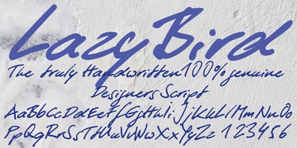 LazyBird is a script with a slick, lazy character.
 - Silentina by Typodermic,
$11.95 Silent films evoke a sense of nostalgia that is as timeless as the era itself. While the stars of silent cinema may have faded into the past, their influence is still felt in modern-day art, fashion, and design. Silentina is a typeface that embodies the spirit of the silent film era, inspired by the intertitles that were used to convey crucial information to audiences during these films. Buster Keaton, Mary Pickford, Clara Bow, and Rudolph Valentino all graced the silver screen with their emotive faces during the silent film era. These icons used their expressions to convey a range of emotions that captivated audiences and made them fall in love with the magic of cinema. Intertitles, the brief messages that would appear on-screen during the film, were just as essential in conveying information to moviegoers. Silentina is a typeface that pays homage to the unsung heroes of the silent film era—the intertitles. It channels the glitz and glamour of the roaring twenties, taking us back to a time of flapper dresses, jazz music, and speakeasies. But Silentina isn’t just a typeface—it’s a portal to another era. It transports us to a time when movies were an escape from reality, and each trip to the cinema was a chance to lose ourselves in a world of adventure and romance. With Silentina, you can project your message in the same way that the stars of silent cinema projected theirs. This typeface captures the essence of a bygone era, bringing it to life in the modern world. Use it to convey plot information, set the scene, or add a touch of vintage charm to your design. Whatever your message, Silentina will help you communicate it in the same glitzy way as the intertitles of the silent film era. Most Latin-based European writing systems are supported, including the following languages. Afaan Oromo, Afar, Afrikaans, Albanian, Alsatian, Aromanian, Aymara, Bashkir (Latin), Basque, Belarusian (Latin), Bemba, Bikol, Bosnian, Breton, Cape Verdean, Creole, Catalan, Cebuano, Chamorro, Chavacano, Chichewa, Crimean Tatar (Latin), Croatian, Czech, Danish, Dawan, Dholuo, Dutch, English, Estonian, Faroese, Fijian, Filipino, Finnish, French, Frisian, Friulian, Gagauz (Latin), Galician, Ganda, Genoese, German, Greenlandic, Guadeloupean Creole, Haitian Creole, Hawaiian, Hiligaynon, Hungarian, Icelandic, Ilocano, Indonesian, Irish, Italian, Jamaican, Kaqchikel, Karakalpak (Latin), Kashubian, Kikongo, Kinyarwanda, Kirundi, Kurdish (Latin), Latvian, Lithuanian, Lombard, Low Saxon, Luxembourgish, Maasai, Makhuwa, Malay, Maltese, Māori, Moldovan, Montenegrin, Ndebele, Neapolitan, Norwegian, Novial, Occitan, Ossetian (Latin), Papiamento, Piedmontese, Polish, Portuguese, Quechua, Rarotongan, Romanian, Romansh, Sami, Sango, Saramaccan, Sardinian, Scottish Gaelic, Serbian (Latin), Shona, Sicilian, Silesian, Slovak, Slovenian, Somali, Sorbian, Sotho, Spanish, Swahili, Swazi, Swedish, Tagalog, Tahitian, Tetum, Tongan, Tshiluba, Tsonga, Tswana, Tumbuka, Turkish, Turkmen (Latin), Tuvaluan, Uzbek (Latin), Venetian, Vepsian, Võro, Walloon, Waray-Waray, Wayuu, Welsh, Wolof, Xhosa, Yapese, Zapotec Zulu and Zuni.
 - Saint Petersburg by Haksen,
$14.00 "Saint Petersburg" fonts were created to look as close to a natural handwritten script as possible by including over 20 ligatures. With built-in OpenType features, this script comes to life as if you are writing it yourself. It's highly recommended to use it in OpenType capable software - there are plenty out there nowadays as technology catches up with design. Other than Photoshop, Illustrator and Indesign, many standard simple programs now come with Opentype capabilities - even the most basic ones such as Apple’s TextEdit, Pages, Keynote, iBooks Author, etc. Even Word has found ways to incorporate it. Your download will receive 4 font files, designed to work as perfect companions or simply as strong standalone typefaces. WHAT'S INCLUDED : 1. Saint Petersburg • A clean, free-flowing script font containing upper & lowercase characters, numerals and a large range of punctuation. 2. Saint Petersburg Alt • This is a second version of Saint Petersburg Script, with a completely new set of upper & lowercase characters. If you wanted to avoid letters looking the same each time to recreate a custom-made style, or try a different word shape, simply switch to this font for an additional layout option. 3. Saint Petersburg Slant • The Slant Version of the point 1. 4. Saint Petersburg Slant Alt • The Slant Version of the point 2. I surveyed mostly common letter combinations and made 20 Discretionary ligatures with following letter combos: aa bb ee ff ll ss tt at et it ot sl st rt ut att ett itt ott utt (in Saint Petersburg & Slant Version) aa bb ee ff ll ss tt at et it ot sl st rt ut att ett itt ott utt (in Saint Petersburg Alt & Slant Version) By using these ligatures, you can give realistic handlettered style, escaping font "pattern" effect.
 - Shamrock - 100% free

- Persian Grunge by Si47ash Fonts,
$19.00 The only Persian Arabic font featured on Behance [Graphic Design / Typography] Published in multiple books including New Illustration With Type and DesignAndDesign Vol. II Carefully and meticulously designed by selecting, choosing, vectorizing and editing so many different Persian and Arabic calligraphic scripts and old typefaces glyphs forms to create this one of a type [pun intended!] font. And if it's not enough, it's got patterns, textures, artistic elements, ornaments, in a grunge and dirty style. But it not over yet! Persian Grunge [Dirty] font has two styles: Dirty and Neat. Not only the Neat style is cleaner, but also a lot of same glyphs are different from the Dirty style. This Arabic grunge font is a great choice for all graphic designers, typographers and visual artists. Your posters, banners, artistic typographic projects are gonna be awesome with these fonts! Shahab Siavash, the designer has done more than 30 fonts and got featured on Behance, Microsoft, McGill University research website, Hackernoon, Fontself, FontsInUse,... Astaneh text and headline font which is one of his latest designs, already got professional typographers, lay-out and book designers' attention as well as some of the most recognizable publications in Arabic/Persian communities.
 - Etruria by Dima Pole,
$34.00 Font Etruria is based on a real Etruscan inscriptions and realistic accurately simulates the writing of the Etruscans. The idea of the font Etruria is to give an opportunity for anyone to touch the past of mankind! The character of the Etruscan alphabet involves the creation of a font with only uppercase letters. However, I did not limit this font by that. Etruria has not only a lowercase is different from uppercase, but an additional sets of alternative characters. In General, the main characteristic of Etruscan writing is randomness and diversity of characters. Differs from lowercase to uppercase is only the first step on the road to make randomness effect. Next to the aid of the OT features. To recreate the randomness effect, in Etruria there are several OT features (Contextual Alternates, Stylistic Alternates and Stylistic Sets), which built a script to simulate randomness. Additionally, another script creates the effect of random positioning. Together they create incredibly realistic Etruscan inscription. Thus, any of these features can be disabled at will. I also used a small line spacing, because it is characteristic of the Etruscan writing. Actually the Etruscan writings is a mirror of the writings compared with the current European alphabets. I didn't use this feature all the letters, because this would make the font difficult to perceive, but to make the font characteristic of the Etruscan style, Etruria has a few letters in mirror image. However, if for someone it may seem unusual, mirrored letters can be disabled instead of them will appear more familiar to them. Another feature of Etruscan writing is the use instead of a space dotacentered. Font Etruria has this feature, there is a OT feature Stylistic set ss03. Naturally, it also can optionally be disabled. All these features can be used together, separately, or turn it off. The main goal achieved! The text typed in Etruria, creates full impression of these Etruscan inscriptions.
 - Leidener by Talavera,
$40.00 This font family is inspired by printed work made by the Elzevir family back in the XVIIth century at Leiden (NL). They worked with material from several type designers, but further investigations sends us to the tracks of one in particular: Robert Granjon. Granjon italics were way ahead of his time, making some really beautiful signs like swashy ampersands and minuscule v letters. This font also contains old style figures in the same fashion as they were printed, like the flipped number 8 and open forms in 6 and 9. This is as much a revival as an original design, because of their weights bold and heavy (both with italics) that were inspired on some titles. In this font you can also find a lot of ligatures, small caps, diacritics and even a fleuron for each weight and variation. Leidener came up from two books: Constantini Imperiatoris (1611) and Exercitationum Mathematicarum (1657), printed by Louis and John Elzevir on their Leiden Workshop, back in the day.
 - Quaint Gothic SG by Spiece Graphics,
$39.00 Distinctively Art Nouveau with a touch of Arts & Crafts, Quaint Gothic is a typographic gem from the late nineteenth century. Also known as Desdemona, this undulating and organic typeface is a versatile and refreshing alternative to many of the font designs on the market today. Quaint Gothic comes complete with an alternate set of caps and a new set of lowercase characters. And for your convenience, a nifty set of small caps and small figures are included in this version. You may also want to access the word-on-a-wave logotypes like “to” and “and” located in the special character slots. They’re great for constructing provocative headlines and titles. Quaint Gothic is also available as an OpenType font. It contains lining and oldstyle figures, prebuilt fractions, stylistic alternates, a wide variety of discretionary ligatures and word ornaments. These advanced features currently work in Adobe Creative Suite InDesign and Illustrator. Check for OpenType advanced feature support in other applications as it gradually becomes available with upgrades.
 - Catarina by alphArt,
$15.00 Catarina - a Handwritten Font is a handwritten script font with a simple and classy style, this font is great for your next creative projects such as watermark on photography, quotes, album cover, logo, business card, and many other design project. From business cards to photo watermarks, Catarina is here to elevate your work to the highest level. Catarina comes with uppercase letters, lowercase letters, lowercase alternative letters, numbers, punctuation, ligature tt and multi lingual support What's inclued : - Catarina.otf note : to use alternative end text is just block end letters and select alternative letters on glyphs option. it may be used in almost any program by using your Operating System’s utilities (CharacterMap for Windows and Font Book for Mac.), as well as Illustrator, Photoshop CC 2017 and several other applications. we hope you enjoy this font. If you have any questions please don't hesitate to drop me a message :) Thank you, Best regards alphArt
 - Cadmium by AVP,
$- Cadmium has a comprehensive latin character set and many Opentype features to enhance text, including small capitals, case-sensitive forms, superscript and subscript. Plenty of numeral variants include old-style figures, lining figures and fractions. Default numerals are proportionally spaced. Alternative styles for a handful of key characters provide some useful variations where stylistic sets can be implemented. The fonts are presented as four width-based sub-families: Expanded, Normal, Condensed and Compressed. Each width has a matching range of six weights and italics (obliques). Regular and Bold weights are style-linked, together with their respective oblique forms. Each width differs in its basic construction but all fonts share the same vertical metrics and may be used in combination with each other. Letter spacing is optimised for text sizes but is tolerant of significant tracking changes. Cadmium is good for signage, publicity and packaging, screen credits and titling, general print and publication, as well as web and screen applications.
 - P22 Counter by IHOF,
$39.95 Canadian designer Patrick Griffin made P22 Counter as an exercise in exploring the limits of counter-space and interchangeability between extremely geometric and standard calligraphic forms. Within a field of solid stems and horizontal strokes, parallel lines and curves play the role of counterparts to define square and round shapes, making what’s revealed just as interesting as what’s withheld. Each of the three basic Counter fonts stakes its own aesthetic territory, from clean basic minimalism, through the nostalgia of exuberantly pixel-based design, and on to calligraphic-cum-typographic, all within clear and precise geometric parameters. Counter Pro comes with that entire range included in a single font, giving its user the ability to move freely in a visual space and counter-space that can be defined by more than 1450 glyphs. While all the fonts come with extended Latin language support, P22 Counter Pro includes all three fonts in one font, many alternates, swashes and ending forms that are not available in the basic fonts.
 - Ongunkan Adinkra Script by Runic World Tamgacı,
$80.00 The Adinkra alphabet is a way to write some of the languages spoken in Ghana and Ivory Coast, such as Akan, Dagbani, Ewe and Ga. It is a simplified version of the Adinkra symbols, and was introduced in 2015 by Charles M. Korankye, who has written a number of books about it. According to tradition, the Adinkra symbols were created by Nana Kwadwo Agyemang Adinkra, the King Gyaman people in the Ashanti region of Ghana from 1810 to 1820. Or they were created by Gyaman people, and the king liked them so much that he wore them on his clothes and named that after himself. The Adinkra symbols are used as decoration, logos, arts, sculpture, pottery and so on. The symbols represent sayings, proverbs or concepts, such as wisdom, authority, strength, unity, love adaptability, wealth, peace, war or agreement. Since Unicode codes have not been assigned yet, it is designed on a latin-based font. Please contact me if you want changes to the keyboard layout.
 - Pennyroyal Pro by Stiggy & Sands,
$39.00 A Historical Revival for Modern Typesetting Flair Pennyroyal began as a Barnhart Brothers & Spindler typeface called Plymouth Bold, first cut in 1900. What began as a straightforward rustic typestyle has been revived to include a more extensive character set. But this font wasn’t just revived, it has come alive with character and personality. Taking things further, Pennyroyal Pro adds in Unicase (stylistic alternates), Swashes (swash alternates), and a collection of grunge alternates from the original source and additional alternates included (PUA encoded). You’ll find that Pennyroyal Pro contains 1476 characters. The expanded SmallCaps option for Pennyroyal Pro gives the typestyle a more sophisticated option, while the expansive options like Unicase and Swashes allow for more uniqueness, play, and experimenting far beyond the original typeface inspiration. Opentype features include: A collection of ligatures. Smallcaps. Full set of Inferiors and Superiors. Proportional figures and Oldstyle figure sets. Unicase Capitals as Stylistic Alternates Swash Caps & Lowercase alternates Smallcap Swash Caps & Lowercase alternates Grunge Alternates for Capitals Additional Swash Alternates
 - ITC Kendo by ITC,
$29.99 ITC Kendo is the work of British designer Phill Grimshaw, suggesting the dash and verve of quick, sketchy calligraphy, complete with splatters of ink. Grimshaw says he worked deliberately against his own habits to create the forms, drawing the letters with slow deliberation" and a pointed pen. He overloaded the pen with ink and drew on rough paper, "applying a lot of pressure at the beginning of a stroke and easing off towards the terminals. Accidental splashes occurred frequently owing to the nib catching the 'tooth' of the paper." Those splashes were refined into features which enhance but do not overwhelm the characters and carefully worked so as not to leave an obvious white strip of unsplattered space between lines and letters. The initial capitals can be used alone or combined with the lowercase alphabet, and the font includes a full set of f-ligatures and some extra ligatures as well as decorative elements."
 - CT Ausetan by Cosmos Type,
$27.00 CT Ausetan is a typeface designed for perfect reading in continuous text. With humanist proportions and calligraphic details but actual, both in appearance and in function. Its asymmetric serifs and slightly curved stems recall the warmth, dynamism and character of the first humanist typefaces built according to the logic of the flat pen. It has a high x-height and its moderate contrast make reading in small bodies comfortable. The many OpenType features make it a versatile typeface that fits into any publishing project. To cover present-day needs, CT Ausetan consists of six weights and their corresponding italics. Each font includes small caps, ligatures, old-style, lining, proportional and tabular figures, superscript, subscript, numerators, denominators, and fractions as well as various geometric figures and stylistic sets. With an extensive Latin character set, CT Ausetan covers a large number of Latin-based languages. Initially designed for small texts, below 14 pt, its calligraphic details accentuate its personality when used in larger bodies such as headlines.
 - Southaste by alphArt,
$15.00 Southaste - a Signature Font is a handwritten script font with a simple and modern style, this font is great for your next creative projects such as watermark on photography, signature or signature logo design, quotes, album cover, business card, and many other design project. From business cards to photo watermarks, Southaste is here to elevate your work to the highest level. Southaste comes with uppercase letters, lowercase letters, lowercase alternative letters, numbers, punctuation, 47 ligature and multi lingual support note : to use alternative end text is just block end letters and select alternative letters on glyphs option. it may be used in almost any program by using your Operating System’s utilities (CharacterMap for Windows and Font Book for Mac.), as well as Illustrator, Photoshop CC 2017 and several other applications. We hope you enjoy this font. If you have any questions please don't hesitate to drop me a message :) Thank you, Best regards alphArt
 - Lemony by Din Studio,
$29.00 Lemony is a serif font family in 8 different volume options expressing formality and elegance in your designs. Its family character is that it has small lines in horizontal or vertical forms on the letter body, easing readers to read the letter as the lines guide readers’ attention to the reading directions. As a result, you may use this font on any text sizes. In addition to the font weight variations, you will have freedom of how and where you should use the font. Enjoy the available features here. Features: Ligatures Multilingual Supports PUA Encoded Numerals and Punctuations Lemony fits for various design projects, such as posters, banners, logos, magazine covers, quotes, invitations, greeting cards, merchandise social media, etc. Find out more ways to use this font by taking a look at the font preview. Hopefully, you have a great experience using our font. Feel free to contact us if you require more information when you are dealing with a problem. Thank you. Happy designing.
 - Alisha by alphArt,
$15.00 Hello everyone, this time we would like to introduce a sweet calligraphy font that we just made with passion and enthusiastic, this font comes with a touch of lovely font. Introducing this sweet calligraphy font called "alisha | Sweet Calligraphy Font", this lovely font comes with uppercase letters, lowercase letters, multilingual support, numbers and punctuation. This sweet calligraphy font is suitable for you to use as quotes, instagram posts, invitations, magazines, cards, product packaging, headers and whatever your imagination. This is the file you get on the download page: - alisha.otf - alisha.ttf note : to use alternative end text is just block end letters and select alternative letters on glyphs option. it may be used in almost any program by using your Operating System’s utilities (CharacterMap for Windows and Font Book for Mac.), as well as Illustrator, Photoshop CC 2017 and several other applications. we hope you enjoy this font. If you have any questions please don't hesitate to drop me a message :) Thank you, Best regards alphArt
 - Pamithais Script by Creative Lafont,
$8.00 Pamithais Script is a unique blend of classic and modern font. It includes an imperfect style of ups and downs, like a dancing letters, smooth, clean and simple. Pamithais Script font perfect for wedding, event, invitation, escort card, table number, header menus, display, logos, slider blog, custom address, stamps, packaging, greeting card, etc. Pamithais Script comes with a complete set of standard characters, eastern diacritic symbols, consist 902 glyphs in total, and 501 alternative characters as OpenType features to play with. The alternative characters were divided into several OpenType features such as Ligature and Stylistic Sets. You can create an attractive message by using the alternate characters in your design. If you don't have a program that supports OpenType features such as Adobe Illustrator and CorelDraw X Versions, you can access all the alternate glyphs using Font Book (Mac) or Character Map (Windows). If you have any question, don't hesitate to contact me by email: Creative.lafont@gmail.com Thank You !
 - Engria by Eclectotype,
$40.00 Engria is a type family of four weights with corresponding italics that treads the fine line between sans and serif. There are serifs, of a sort, inspired by the brush. Not the marks made by a brush, but the actual splayed shape the bristles make when clamped together. Wedge-like chunks that resemble engraved forms, as the name Engria hints at. But it also has the appearance of a stressed, flared sans. This mixed approach lends a unique voice. Highly legible at text sizes, as indeed it is optimized for, Engria does however shine at display sizes thanks to its characteristic details – flared stems, angular counterforms, rugged ink traps and fluid curves. (I would recommend tracking it a little tighter at larger sizes.) Engria started life way back in 2014, and has been worked and reworked tirelessly to get to this finished product. My intent was to really push the idea of the white shapes being as important, if not more so, than the black. Engria is equipped for typographically demanding applications, boasting as it does an array of OpenType features, including small caps, automatic fractions, stylistic sets, various figure styles, arrows, case sensitive forms and more. It will make a very useful addition to your typographic arsenal, with a flare (ahem) for editorial work, but the individuality for packaging, branding, and logo work.
 - FoxScript - Unknown license

- Langó - Unknown license


