10,000 search results
(0.022 seconds)
- PF Stamps Pro by Parachute,
$79.00 PF Stamps covers a wide range of applications which require the stamp effect. This is a form of lettering which was very popular in the mid-twentieth century for product labeling. Special machinery was developed by mainly two companies, one in the United States and the other in Germany. This machinery produced paper die cuts which were later used as a base for the marking with a paintbrush. PF Stamps Paint was developed to simulate this type of lettering. Two other styles, Metal and Flex, have been very popular since its original release. The first one was developed from a metallic stamp imprint, whereas the second one with its slight 3-D look simulates letters stamped on plastic. To insure realistic results, uppercase letters are different from lowercase. This is very useful when two similar letters sit next to each other. There 3 more styles: Solid (the stencil in its regular clean form), Rough and the very interesting Blur. The all new “Pro” version comes to complete this series with what was missing: 93 matching frames and frames parts which will satisfy the most demanding designer. This is a bonus font which is available only with the purchase of the whole family. Use these frames “as is” at any size, or connect the frame parts to each other to create longer frames. Finally, this series supports more than hundred languages which are based on the Latin, Greek or Cyrillic scripts.
 - FF Stamp Gothic by FontFont,
$62.99 Dutch type designer Just van Rossum created this display FontFont in 1992. The font is ideally suited for advertising and packaging, film and tv, editorial and publishing, music and nightlife as well as software and gaming. FF Stamp Gothic provides advanced typographical support with features such as ligatures, alternate characters, case-sensitive forms, and stylistic alternates. It comes with proportional lining figures. As well as Latin-based languages, the typeface family also supports the Greek writing system.
 - KG Tribeca Stamp by Kimberly Geswein,
$5.00 A chunky stamped font with lots of texture. Best used at large sizes for detail. "This font is heavy to load and may freeze or crash in some programs. Windows Users: You should avoid previewing it before installing it (do not double-click on the font file, but right-click > Install)"
 - STAMP MARK Stencil by WAP Type,
$19.00 This font is suitable for military or urban theme headlines with the Gruge stencil style. Features: Uppercase, Lowercase Punctuation & Number, Support in Mac and Windows OS Multilingual Support ÀÁÂÃÄÅÆÇÈÉÊËÌÍÎÏÐÑÒÓÔÕÖØÙÚÛÜÝ
 - DB Post Stamp by Illustration Ink,
$3.00DB Post Stamp is a fun DoodleBat designed after a post office stamp and the distressed look gives it a unique style. - Swamp Witch - 100% free

- Bloody Stump - Unknown license

- Yellow Swamp - Unknown license

- Medina by Hatftype,
$15.00 Medina - Cute Valentine Display Font is a font with distinctive handwritten characters perfect for branding projects, logos, wedding designs, media posts, advertisements, product packaging, product designs, labels, photography, watermarks, invitations, stationery, and any project who need handwritten dishes. Features : • Character Set A-Z • Numerals & Punctuations (OpenType Standard) • Accents (Multilingual characters) • Ligature. Multilingual Support : Afrikaans, Albanian, Asu, Basque, Bemba, Bena, Catalan, Chiga, Cornish, Danish, English, Estonian, Faroese, Filipino, Finnish, French, Friulian, Galician, German, Gusii, Icelandic, Indonesian, Irish, Italian, Kabuverdianu, Kalenjin, Kinyarwanda, Low German, Luo, Luxembourgish, Luyia, Machame, Makhuwa-Meetto, Makonde, Malagasy, Malay, Manx, Morisyen, North Ndebele, Norwegian Bokmål, Norwegian Nynorsk, Nyankole, Oromo, Portuguese, Romansh, Rombo, Rundi, Rwa, Samburu, Sango, Sangu, Scottish Gaelic, Sena, Shambala, Shona, Soga, Somali, Spanish, Swahili, Swedish, Swiss German, Taita, Teso, Vunjo, Zulu. There it is. I really hope you enjoy it. Comments & likes are always welcome and accepted.
 - Helium by Red Rooster Collection,
$45.00 Re-tooled from the QBF Collection.
 - Medika by MC Creative,
$15.00 Medika is a sweet and a natural script stylish script. Medika Modern Calligraphy is perfect for branding wedding designs, invitation, social media posts, advertisements, product packaging, product designs, label, projects, logo, photography, watermark,stationery and any projects that need handwriting taste. What’s Included : · Standard glyphs · Ligature · Works on PC & Mac · Simple installations · Accessible in the Adobe Illustrator, Adobe Photoshop, Adobe InDesign, even work on Microsoft Word. · PUA Encoded Characters – Fully accessible without additional design software. · Fonts include multilingual support for; ä ö ü Ä Ö Ü ß ¿ ¡ Thank you for your purchase! Hope you enjoy with our font!
 - Radium by Typespec,
$32.00 Radium is a futuristic display face with a robust attitude and sharp geometric ideals. Drawing inspiration from computer games, graffiti and nineties dance music, Radium is a versatile typeface for branding, posters, packaging and point of sale. Radium is available in three weights and comes in OpenType (.otf) format for Mac and Windows. Features: Radium supports the following OpenType features: Standard ligatures, discretionary ligatures, ordinals, custom fractions, numerators, denominators, superscript, scientific inferiors, proportional and tabular lining figures, and a slashed zero. Supported Languages: Each weight has a 528 glyph character set for use in the following Latin languages: Albanian, Afrikaans, Basque, Bosnian, Breton, Catalan, Croatian, Czech, Danish, Dutch, English, Esperanto, Estonian, Faroese, Finnish, French, Gaelic, German, Greenlandic, Hungarian, Icelandic, Indonesian, Irish, Italian, Latvian, Lithuanian, Luxembourgish, Maltese, Norwegian, Occitan, Polish, Portuguese, Romanian, Sami, Serbian (Latin), Slovak, Slovene, Sorbian, Spanish, Swedish, Swahili, Turkish, Walloon and Welsh.
 - Mediator by ParaType,
$30.00 Mediator is a balanced contemporary sans serif typeface that performs well both in display sizes and body text. The family contains 30 fonts in 3 widths: 8 romans with matching italics, of slightly extended proportions, from Thin to Black; 7 narrow and 7 condensed, from Thin to ExtraBold. The character set in normal upright faces was expanded to include small caps and all faces include old style figures. The typeface was designed by Manvel Shmavonyan with the participation of Alexander Lubovenko and released by ParaType in 2016.
 - Cesium by Hoefler & Co.,
$51.99 An inline adaptation of a distinctive slab serif, Cesium is an unusually responsive display face that maintains its high energy across a range of different moods. The Cesium typeface was designed by Jonathan Hoefler in 2020. An energetic inline adaptation of Hoefler’s broad-shouldered Vitesse Black typeface (2000), Cesium is named for the fifty-fifth member of the periodic table of the elements, a volatile liquid metal that presents as a scintillating quicksilver. From the desk of the designer, Jonathan Hoefler: I always felt that our Vitesse typeface, an unusual species of slab serif, would take well to an inline. Vitesse is based not on the circle or the ellipse, but on a less familiar shape that has no common name, a variation on the ‘stadium’ that has two opposing flat edges, and two gently rounded sides. In place of sharp corners, Vitesse uses a continuously flowing stroke to manage the transition between upright and diagonal lines, most apparent on letters like M and N. A year of making this gesture with my wrist, both when drawing letterforms and miming their intentions during design critiques, left me thinking about a reduced version of the typeface, in which letters would be defined not by inside and outside contours, but by a single, fluid raceway. Like most straightforward ideas, this one proved challenging to execute, but its puzzles were immensely satisfying to solve. Adding an inline to a typeface is the quickest way to reveal its secrets. All the furtive adjustments in weight and size that a type designer makes — relieving congestion by thinning the center arm of a bold E, or lightening the intersecting strokes of a W — are instantly exposed with the addition of a centerline. Adapting an existing alphabet to accommodate this inline called for renovating every single character (down to the capital I, the period, and even the space), in some cases making small adjustments to reallocate weight, at other times redesigning whole parts of the character set. The longer we worked on the typeface, the more we discovered opportunities to turn these constraints into advantages, solving stubbornly complex characters like € and § by redefining how an inline should behave, and using these new patterns to reshape the rest of the alphabet. The New Typeface The outcome is a typeface we’re calling Cesium. It shares many of Vitesse’s qualities, its heartbeat an energetic thrum of motorsports and industry, and it will doubtless be welcome in both hardware stores and Hollywood. But we’ve been surprised by Cesium’s more reflective moods, its ability to be alert and softspoken at the same time. Much in the way that vibrant colors can animate a typeface, we’ve found that Cesium’s sensitivity to spacing most effectively changes its voice. Tighter leading and tracking turns up the heat, heightening Cesium’s sporty, high-tech associations, but with the addition of letterspacing it achieves an almost literary repose. This range of voices recommends Cesium not only to logos, book covers, and title sequences, but to projects that regularly must adjust their volume, such as identities, packaging, and editorial design. Read more about how to use Cesium. About the Name Cesium is a chemical element, one of only five metals that’s liquid at room temperature. Resembling quicksilver, cesium is typically stored in a glass ampule, where the tension between a sturdy outer vessel and its volatile contents is scintillating. The Cesium typeface hopes to capture this quality, its bright and insistent inline restrained by a strong and sinuous container. Cesium is one of only three H&Co typefaces whose name comes from the periodic table, a distinction it shares with Mercury and Tungsten. At a time when I considered a more sci-fi name for the typeface, I learned that these three elements have an unusual connection: they’re used together in the propulsion system of nasa’s Deep Space 1, the first interplanetary spacecraft powered by an ion drive. I found the association compelling, and adopted the name at once, with the hope that designers might employ the typeface in the same spirit of discovery, optimism, and invention. —JH Featured in: Best Fonts for Logos
 - Reditum by Mans Greback,
$59.00
- Modicum by Elemeno,
$10.00 - Podium by Identikal Collection,
$23.00 - Hebrew Stam by Samtype,
$34.00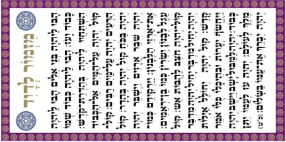 Beautiful Caligraphic font and also readable font.
 - Harting - Unknown license

- Parts - Unknown license

- Krt - Unknown license

- Artz by Hackberry Font Foundry,
$24.95Artz is a highly stylized sans serif with a Deco look in Narrow, Plain and Wide. It has oldstyle numbers and many special characters. - Arta by Olivier Blanc,
$34.00 ARTA is an ArtDeco style font, inspired by classic font like Newport Classic with elongated typeface with high waisted uppercase letters which curve in an geometric and elegant way. It consisted of really condensed lettering which had little space available. It's a well complet font with 315 Glyphs for most latin languages as "English, French, Spanish, German, Icelandic, Afrikaans, Catalan, Czech, Esperanto, Hungarian, Latin, Latvian, Lithuanian, Maltese, Northern Sami, Polish, Serbo-Croatian, Slovak, Slovene, Sorbian, Turkish and Welsh". ARTA will give to your design an chic presentation, you will be able to generate beautiful writings,thanks to 3 differents type "Light, Regular & Bold". It can be used for Shop, Restaurant, Jewelry, Cosmetic, Press identity & more. I started to work on this typeface at the creation of a logo in 2017 for the butcher shop of my uncle in Luchon in France named "Le Louchébem". I always had in mind to complete & share it. So after some years, I decided that it was time to finish it. This was my first Typography creation and I wanted to make it as an Art Deco typeface. I really love this elegant, high & classy lettering style. I want to bring this 1910's vibes back to be more use in our days.
 - Aros by Jonahfonts,
$40.00 Usage recommendations: Captions, fliers, packaging, cards, posters, ads, book jackets, manuals, menus, bulletins, magazines, greetings, announcements.
 - Zart by DSType,
$40.00 Zart is a heavy yet delicately sensitive display typeface filled with character, a free interpretation of the classical French styles from the late eighteenth century, reimagined for modern use. While it’s vertical strokes carry the typical weight of this style, the thinness of the horizontal strokes is further extended into the characters with the introduction of large vertical ink traps. This allowed us to design slightly narrower letters which, coupled with shorter serifs, result in a overall darker expression, creating really impactful headlines. Zart is available in three versions: Regular, Italic and Script.
 - Tart by Suomi,
$35.00 Headline font with extremely tight kerning with more than 1600 kerning pairs. Also with some discretionary ligatures and lining figures. That’s Tart. Sweet.
 - Ark by Fenotype,
$25.00 Let Ark, an Art Nouveau-infused high-contrast serif, transport your designs into the realm of elegant psychedelia. Ark draws deep inspiration from Heinz Keune's Edda, a remarkable design from 1900. While its vibe might evoke the groovy 70s and the mesmerizing world of trippy album covers, Ark transcends any assumed historical shabbiness. It trims the style into a refined and neatly cut serif, suitable for gallery-worthy presentations, all while maintaining a strong and unmistakable connection to its original roots. The standard letters of Ark maintain a respectable demeanor, only scratching the surface of the font's psychedelic potential. To truly unlock its full potency, try the Swash or Stylistic Alternates, or dig for even more Alternates from the Character palette. Needless to say, that Ark is a natural match for anything trendy, artsy, wierd and fun.
 - Cartes by insigne,
$39.00 Cartes has a bit of a strange origin story, as far as fonts go. It’s a combination of ideas from 1920’s advertising and hand-painted letters from the 1500s. The typeface was designed to flow with elegance and speed yet retain a sense of the handmade. The serifs flow with indentations implying movement and terminate with inky globules that lend your copy a sense of gravitas. This typeface can be used for headlines, short texts, posters, logos, headlines, headlines in big sizes or just as easily for ad text. At large sizes, pen strokes can be seen that give the typeface a touch of humanity and vigor. At smaller sizes the type is still unique, but readable.
 - Arp by W Type Foundry,
$35.00 Arp is a neo-grotesk type system exploring the relations between contrast, functionality, and graphic character in one family. This typography comes in 5 different weights including fine strokes with inverted contrast (20), a sharp sans serif (80), and a high contrast heavyweight (240). Moreover, its design is formed by short ascenders and descenders aiming higher legibility, ink traps for display-functional purposes, and includes a wide range of icons, arrows, and symbols which allow creating consistent compositions in digital and print designs. All styles of 640 characters include a display weight with geometric and glyphic style alternates, which expand the proprieties and versatility of the system.
 - Arx by Superfried,
$32.50 Arx by Superfried is an elegant and intricate display typeface designed for use at large scale. Its Latin name - meaning citadel - connects with the classical features, whilst the phonetic pronunciation nods to the arcs which characterise each glyph. This caps typeface is available in two formats: fade and solid, each featuring two distinct character styles switched via the shift key. Fade features delicate incisions to add depth and the illusion of 3D shading to the arcs. Solid, as its name suggests, is a cleaner, flat alternative.
 - Aries by FontHaus,
$19.00 In 1995, FontHaus came upon a rare opportunity to create a revival of Aries, a little known and previously unavailable typeface designed by the legendary Eric Gill in 1931. Discovering a lost typeface by one of the major designers of the 20th Century, was the discovery of a buried treasure, and being the first type company to release it in a digital format was an honor. Aries® is now in the fonts catalog of GroupType who owns the the registered trademark and has licensed this historical typeface exclusively to FontHaus as distributor.
 - Aries by GroupType,
$19.00 In 1995, FontHaus came upon a rare opportunity to create a revival of Aries, a little known and previously unavailable typeface designed by the legendary Eric Gill in 1931. Discovering a lost typeface by one of the major designers of the 20th Century, was like the discovery of buried treasure, and being the first type company to release it in a digital format was an honor. Aries® is now in the fonts catalog of GroupType who owns the the registered trademark and has licensed this historical typeface to FontHaus as distributor.
 - Acting by Ahmad Jamaludin,
$17.00 Introducing Acting! A robust slab typeface that effortlessly combines nostalgia with contemporary boldness. What sets Acting apart is its distinctive circular elements within each letter, adding a unique touch while maintaining clean and balanced shapes. With alternative glyphs, it truly comes to life. Acting offers versatility with three widths: Condensed, Normal, and Expanded, along with an oblique version, resulting in a total of six styles. Whether you're working on branding, titles, or headlines, Acting is your perfect choice for your project! What's included? Acting Main File Unique Letterforms Works on PC & Mac Simple Installations Accessible in Adobe Illustrator, Adobe Photoshop, Microsoft Word even Canva! PUA Encoded Characters. Fully accessible without additional design software. Multilingual Supports: (Afrikaans, Albanian, Catalan, Croatian, Czech, Danish, Dutch, English, Estonian, Finnish, French, German, Hungarian, Icelandic, Italian, Lithuanian, Maltese, Norwegian, Polish, Portuguese, Slovenian, Spanish, Swedish, Turkish, Zulu) Come and say hello over on Instagram! https://www.instagram.com/dharmas.studio/
 - LT Festive Medium - 100% free

- Wiegel Latein Medium - 100% free

- Tt-Kp Medium - Unknown license

- COM4t Sans Medium - Unknown license

- SF Espionage Medium - Unknown license

- SF Arborcrest Medium - Unknown license

- Wiegel Kurrent Medium - 100% free


