10,000 search results
(0.024 seconds)
- Deco Eccentrique JNL by Jeff Levine,
$29.00 The inspiration for Deco Eccentrique JNL was initially hand drawn contoured lettering from a mid-1920s piece of sheet music; the style of the letters showing influences of the upcoming Art Deco movement. This was made into a digital font entitled Poster Contoured JNL. Once all of the excess parts of the previous design were stripped away to only the inner letters, the pre-Art Deco influences remained along with characters of varying stroke widths and shapes. This non-conformist type face is available in both regular and oblique versions.
 - Wasser - Unknown license

- Riddleprint - Unknown license

- SK Fencer by Shriftovik,
$10.00 SK Fencer™ is a typeface inspired by the fine art of fencing. Its light linear features contrast with the angular thicknesses, creating a unique image of the font and influencing its behavior in the line. Using alternative uppercase characters, you can implement a lot of typographic ideas that will decorate your design. A large selection of weights will also be a great help in your work. The SK Fencer typeface is suitable for both headers and small text arrays, and its widest set of glyphs supports both extended Latin, Cyrillic and many other languages. SK Fencer – elegant, practical, dynamic, unusual!
 - Ladoga by ParaType,
$30.00 Ladoga — one of the most beautiful Russian designs from the soviet period. The type family was developed in Polygraphmash in 1968 by Anatoly Shchukin on the base of his own lettering for book covers and titles. It was one of the first attempts in Cyrillic typography to create text face in a style of renaissance antiqua. Stylization to broad pen calligraphy resembles early forms of Latin types that were based on handwritten humanistic minuscule. Unique in its character set digital version of Ladoga was designed by Viktor Kharik on the base of artworks of Shchukin for ParaType. The family consists of roman and italic styles in text and display versions. Character set includes characters of original shapes as well as more modern alternatives. Besides there are a set of additional characters, old style figures and small caps. The fonts cover all modern languages based on Latin and Cyrillic scripts, Greek alphabet (including polytonic extension), Hebrew and historical Cyrillic letters. Ladoga is gorgeous in display sizes and pretty readable in texts. It’s well suitable for fiction literature, historical books, art criticism, religious and philologist works. It will be extreme helpful for multilingual issues and for inclusions into body text historical passages in original orthography. The family was released in 2010.
 - Dopis by Tour De Force,
$25.00 Dopis (Допис on Cyrillic) is neo grotesque family available in four weights and in two widths. It is universal and neutral typeface, fully applicable in every situation. Contains extended Latin character set with Cyrillic support.
 - Sign Studio by Jeff Levine,
$29.00 The French lettering book Album de Lettres Arti (1949) displayed a number of examples of unique, stylized typefaces. One in particular features a multi-line sans serif in a classic Art Deco style with open-ended characters. This design is now available as Sign Studio JNL in both regular and oblique versions.
 - Doobie by Canada Type,
$24.95One would think the whole hippy thing would have died out after the knighting of Mick Jagger and the selling out of the The Who. Not at Canada Type. We still occasionally read Burroughs and Ginsberg, listen to Dylan and Hendrix, and use the backyard to pretend (um, like run barefoot with the dog). And we're always happy to make another psychedelic font. This one is based on an early 1970s film type that went by the names Hoopla and Scorpio. Doobie is a typical hippy font that uses the simplest elements of the art nouveau genre. Bubbly and wavy, Doobie exudes an almost child-like innocence, the ever laid back, optimistic simplicity of flower power. It is right at home alongside the many other psychedelic fonts that make Canada Type the definite home of the groovy alphabet. Far out! - Klear by Ahmad Jamaludin,
$15.00 Introducing Klear - A typeface that's turning design conventions on its head! Inspired by the graceful flow of art nouveau, Klear is a perfect blend of quirkiness and elegance. Whether you're working on a formal project or something more avant-garde, Klear has you covered. With two styles to choose from - Regular and Outline, Klear gives your creativity a fresh canvas to shine What's Included? Klear Main File Regular and Outline Family Instructions (Access special characters, even in Cricut Design) Unique Letterforms Works on PC & Mac Simple Installations Accessible in Adobe Illustrator, Adobe Photoshop, Microsoft Word even Canva! PUA Encoded Characters. Fully accessible without additional design software. Language Support: Danish, English, Estonian, Filipino, Finnish, French, Friulian, Galician, German, Gusii, Indonesian, Irish, Italian, Luxembourgish, Norwegian Bokmål, Norwegian Nynorsk, Nyankole, Oromo, Portuguese, Romansh, Rombo, Spanish, Swedish, Swiss-German, Uzbek (Latin) Thank you Dharmas Studio
 - Galette by Paragraph,
$- Galette is a contemporary all-purpose sans-serif for printing and online delivery, allowing the use of one layout both as printed material and online without loss of quality or legibility. Not only a high resolution printing font with extensive kerning, it was designed from the ground up for clear and uniform display on the computer screen. It displays more predictably than the traditional fonts: no overhangs are used, the stroke thickness of capitals and lower case letters is identical, making hinting or antialiasing smoother at any point size and zoom combination. The hint of Art Nouveau makes the font more expressive and individualistic. A number of alternative capitals allows the font’s expression to be turned up or down at will. A generous complement of accented characters (Western & Eastern European, Baltic, Turkish) enables multi-lingual use.
 - Bright Gabbemy Cyr Gr by Ira Dvilyuk,
$20.00 The Bright Gabbemy Cyrillic Greek is handwritten monoline signature script font and additional symbols font with extras. It is the font pair with will be the best option for branding, logos, wedding invitations, social media, packaging, business cards, DIY projects, social media, and many others. Bright Gabbemy Symbols is the font with 36 lovely hand-drawn flourishes and illustrations. Bright Gabbemy Cyrillic script font contains the Cyrillic and Greek glyphs too. Bright Gabbemy script Latin part contains a full set of uppercase letters and 2 full sets of lowercase letters, (standard, and final forms with flourishes or teils. To make a needed form just type a letter with a number such as a1, b1, c1...after that select the word and apply the Open Type Features in programs such as Adobe Illustrator, Photoshop, and others) And 53 ligatures - which can be used to create a handwritten calligraphy look. The Cyrillic part of the font contains uppercase letters and 2 full sets of lowercase letters, (standard, initial and final form. To make a needed form just type a letter with a number such as a1, б1 в1... After that select the word and apply the Open Type Features in programmes such as Adobe Illustrator, Photoshop, and others) Bright Gabbemy Symbols is a font with over 36 hand-drawn elements, floral illustrations, and swashes and can help to make your design unique and matchless. Combine and merge swashes and illustrations to create your own designs and make borders, frames, dividers, logos, and more (just use A-Z or a-z and 0-9 keys in the included Bright Gabbemy Symbols font). A different symbol is assigned to each uppercase or lowercase standard character, so you do not need graphics software, just type the letter you need. Multilingual Support for 33 languages: Latin glyphs for Afrikaans, Albanian, Basque, Bosnian, Catalan, Danish, Dutch, English, Estonian, Faroese, Filipino, Finnish, French, Galician, Greek, Indonesian, Irish, Italian, Malay, Norwegian Bokmål, Portuguese, Slovenian, Spanish, Swahili, Swedish, Turkish, Welsh, Zulu. And Cyrillic glyphs support Russian, Belorussian, Bulgarian, Ukrainian, and Kazakh languages.
 - Music Festival JNL by Jeff Levine,
$29.00 The Federal Music Project was part of Franklin D. Roosevelt's WPA (Works Progress Administration), putting many people back to work in the Depression years of the 1930s. A hand-lettered poster advertising an "American Music Festival" featuring the Bridgeport Symphony Orchestra offered up the extra bold Art Deco inspiration which became Music Festival JNL
 - Averta by Intelligent Design,
$15.00 Bringing together features from early European grotesques and American gothics, Kostas Bartokas’ Averta (Greek: ‘αβέρτα’ – to act or speak openly, bluntly or without moderation, without hiding) is a new geometric sans serif family with a simple, yet appealing, personality. The purely geometric rounds, open apertures, and its low contrast strokes manage to express an unmoderated, straightforward tone resulting in a modernist, neutral and friendly typeface. Averta is intended for use in a variety of media. The central styles (Light through Bold) are drawn to perform at text sizes, while the extremes are spaced tighter to form more coherent headlines. The dynamism of the true italics adds a complementary touch to the whole family and provides extra versatility, making Averta an EXCELLENT tool for a range of uses, from signage to branding and editorial design. Take advantage of Averta’s extended OpenType features including alternate glyphs, small caps, fractions, case sensitive forms, contextual alternates, oldstyle and lining (proportional and tabular) numerals, small cap numerals, numerators/denominators, superiors/inferiors, and a variety of symbols. Averta comes in eight weights with matching italics and supports over two hundred languages with an extended Latin, Cyrillic (Russian, Bulgarian, and Serbian/Macedonian alternates), Greek and Vietnamese character set. It ships in three different packages offering different script coverage according to your needs: Averta PE (Pan-European: Latin, Cyrillic, Greek), Averta CY (Latin and Cyrillic), and Averta (Latin and Greek). Averta's Cyrillic have received the 3rd Prize in the 2017 Granshan Awards in the Cyrillic Category.
 - IRR3V3RSIBL3 - Unknown license

- Willamette SF - Unknown license

- Prymityv by Malgorzata Bartosik,
$29.00 Prymityv is inspired by brutalist architecture from the Eastern Bloc. It's heavy and massive, perfect for display purposes. Prymityv contains Latin and Cyrillic alphabet, Latin with Western, Central and South Eastern European diacritics, Cyrillic with Russian, Bulgarian, Serbian and Macedonian and Ukrainian diacritics.
 - FE Gigant by Egor Stremousov,
$50.00 The font has a pronounced decorative effect and is suitable for the gaming, publishing and film industry. The Cyrillic alphabet conveys the spirit and atmosphere of Soviet constructivism. It is well suited for names of Soviet (or pseudo-Soviet) trademarks, large headings, signs, giant letter structures, etc. The Latin part is not tied to the Soviet period and can be applied in a wider range. Sharp angles and unnatural proportions create dynamics, strength and heaviness.
 - Kette Pro by Tilde,
$39.75 The design of Kette evolved from searching new ways to make cool and semi-formal type. Study of aspects of legibility was part of the process when designing Kette. It suits posters, slogans. Condensed, Regular and Extended styles of Kette allow fitting variable long text in headlines retaining the style and feel of the original design. This Pro font is packed with all European and Cyrillic alphabets, small caps, variable figure sets and features.
 - Miss McGee by The Ampersand Forest,
$35.00 Miss McGee is equal parts Grotesque and Geometric, which gives here a no-nonsense, midcentury feel. Her letterforms are strong, wide in profile, and legible, making her a great choice for both text and display! She supports Western European, Cyrillic, and monotonic Greek, and has a full set of true small caps in each. She also has useful ligatures and alternates! Miss McGee is a companion typeface to Mr Chips, also from The Ampersand Forest!
 - Newland - Unknown license

- Margit - Unknown license

- Homenko by Apostrof,
$35.00 Homenko was the only Ukrainian typeface for metal type casting developed in the last century. It has already become a 'classic'. Vasyl Homenko worked on it from 1964 to 1967. The typeface successfully combines the qualities of lineal humanist typefaces with the Ukrainian tradition of asymmetrical slab serif. The works on its digitization and further development has been in progress since 2000. The present version contains Latin Extended characters, Cyrillic with stressed alternates and several ornaments based on Vasyl Homenko's works. It works perfectly for books for children and is ideal for publications related to culture, history, literature and traditional art of Ukraine and other nations of Eastern Europe.
 - P22 Cezanne by P22 Type Foundry,
$79.94 This font set, created for the Philadelphia Museum of Art, celebrates the work of influential French artist Paul Cézanne. P22’s Cezanne font allows you to beautify your documents with a faithful rendition of the artist’s handwriting, while Cezanne Sketches recreates a variety of imagery from the artist’s work. Cezanne Pro includes full western and central European character sets and Cyrillic for typesetting in dozens of languages. It features several types of numerals, ligatures, snap-on swashes, and word glyphs. The Pro version includes over 1,200 glyphs and “smart features” that will automatically substitute letter combination's to create an even more natural handwriting effect than was possible with Cezanne Regular.
 - Patent Reclame by HiH,
$10.00 Patent Reclame manages to be light-hearted, while clearly showing its blackletter roots both in the shape of the individual letters and the rhythm of text on a page. The designer is unknown. Schriftgeisserei Flinsch of Frankfurt a.M. cast the face around 1895. Nicolete Gray shows a quite similar face called “Graphic,” from Stephenson Blake in 1896. Personally, I don't think that Patent Reclame looks like an English design, but I do not have any proof one way or the other. The numbers are proportional, intended for posters, not spreadsheets. Two ornaments are included, an art nouveau rose at #172 and a lilypad with long tendril at #177. Great for invitations, posters and flyers announcing fun events. Do not use for obituaries. Quite readable in smaller sizes for short blocks of text. I really like the buoyant quality -- a nice combination of discipline and enthusiasm.
 - Quadrim by Artisticandunique,
$40.00 Quadrim - Serif Font Family - Multilingual -12 Style (2020) On the basis of Quadrim, it is a mix of the old-fashioned Roman serif family. The old style serif combination combines, modern aesthetics with fantasy and Art Nouveau serif fonts, making Quadrim a versatile family that can be used in many different design projects. This font offers a wide variety of styles to help you discover the best mood for your projects, from body text to large titles, from classic styles to modern and bold styles. It is very suitable for book and magazines, magazine covers, editorial, titles, websites, logos, invitations, branding, advertising and more. CHARACTER RANGES : Basic Latin, Latin-1 Supplement, Latin Extended-A, Latin Extended-B, General Punctuation, Currency Symbols, CJK Symbols And Punctuation, Private Use Area (plane 0), With this font you can create your unique designs. If you have a question, please contact me. Have a good time.
 - Clockmaker by Sudtipos,
$49.00 Sudtipos is proud to announce the release of Clockmaker, an 8-weight family that takes initial inspiration from typography around the turn of the twentieth century. Clockmaker takes aesthetic references from Victorian, Art Nouveau and Art Deco advertising and typography, taking special influence from John F. Cummings’ all-caps – and never digitized – type design Elandkay. Clockmaker is a robust multi-weight family that includes an array of ligatures as well as alternate characters and support for all latin languages. The design process began with developing and modernizing the uppercase letterforms, followed by designing the lowercase and additional weights. Creating a diverse and playful set of uppercase ligatures was an almost endlessly enjoyable task; they are one of Clockmaker’s most charming features. Clockmaker is an impeccable choice for designs requiring a vintage flair such as a luxury liquor labels, restaurant identities, lavish hotels and many other applications where elegance and grace are needed. In addition to its historical references, Clockmaker is an homage to my grandfather who was a master craftsman, repairing antique clocks and fine watches with great skill and mathematical precision. Watching him work was fascinating and it has been a joy to remember those quiet and curious moments from my childhood while designing this font.
 - ITC Outpost by ITC,
$29.99Hal Taylor's ITC Outpost was not the result of a detailed design brief, nor was there a methodical development of key concepts or characters. Outpost just seemed to emerge all at once during a brief sketching session," says Taylor. "I guess what I was thinking of was an antiquated Western perception of some sort of Middle Eastern hand lettering - a 'mysterious East' sort of thing." ITC Outpost's sense of the exotic has an almost Art Nouveau quality, with its sensuous curves and sweeping strokes. The open bowls and opposing weight bias in many of the characters add to the design's striking personality. A suite of alternate and swash letters enables the setting of distinctive display copy. ITC Outpost's family of roman, italic, and swash characters is compact but versatile. The caps have the grace and authority of a titling face. Add in the lowercase and swash letters and copy is transformed into something lighthearted and full of verve. ITC Outpost creates dramatic headlines and adds a flourish to invitations, menus, logos and packaging An accomplished designer, Taylor has spent most of his career in the lettering and typographic arts. He began as a photo-lettering typographer, setting headlines and creating custom lettering, and now works in the publishing industry. " - Mayonez by Sardiez,
$29.00 Mayonez is a typeface with rational structure and axis but softened with rounded contours and cupped serifs, getting as result a balance between seriousness and friendliness. The shapes have a soft appearance but without lacking definition. A more fluid structure influenced by calligraphy is proposed for the italic variants, in this case the uppercase letters adopted a simplified semiserif structure that works better with the lowercase letters. Also the figures are very different from the roman version and follow more faithfully the italic style. In an attempt to give Cyrillic lowercase romans a fresh look, symmetrical serifs inherited from the versal tendency are mostly avoided thus getting simpler structures closer to the latin forms. This type is good for commercial and editorial uses like advertising, packaging and pages with showy headlines where a warm touch wants to be given. The character set includes a group of figures and currency symbols with standard height and another suited to match better with lowercase letters. Mayonez was selected to be part of the Communication Arts Typography annual in 2015.
 - Fleur by Lián Types,
$39.00 La vie est une fleur dont l'amour est le miel Fleur is the French for flower and I've chosen this language for a good reason. Over the past 5 years, I've had the opportunity to travel a lot to Paris and I've always tried to catch every moment and detail of this delightful city through the eyes of the designer inside me. Paris is full of surprises, mainly for us, artists. In fact, I believe the city is a museum itself. Every corner of any street has something inspiring. But, there’s something I particularly love and I want to address here: The Palais Garnier. Built between 1861 and 1875, this opera house is a dream made true for many of us, who love somptuosité. Garnier, the architect of this magnificent building, said that the style he proposed was not Grecian nor Roman/baroque, he created something new and called it Napoleonic: Luxurious at its best. Fleur is inspired in this palace which, in fact, has some similar letters inside. Garnier put his name at the ceiling of the Rotonde des Abonnés: Letters are interlacing each other with nicely done art nouveau curves. I thought I could take this idea and achieve something very delicate and imposing at the same time if the font consisted entirely of caps with the logic of a didone and a bit of art-nouveau. This mix of elegance and flamboyance gave birth to Fleur which has a wide range of uses but was mainly intended for perfumes, fashion magazines, storefronts, book covers or logos. Not only you'll find many decorative glyphs, but also a vast amount of unique ligatures will make you really adore this font. Get Fleur and profite de la vie TECHNICAL As suggested above, the font has many open-type coded alternates and a vast amount of unique ligatures. Install the font in applications that support them, like Adobe Illustrator or Photoshop.
 - Chalga VPoutline by VP Creative Shop,
$20.00 Introducing Chalga Serif Typeface - 3 weighs - Latin and Cyrillic support Chalga is elegant, vintage typeface that contains 3 weights to enchant your next project. They have basic latin, advanced latin, basic Cyrillic and advanced Cyrillic character sets. Very versatile fonts that works great in large and small sizes. Chalga is perfect for branding projects, home-ware designs, product packaging, magazine headers - or simply as a stylish text overlay to any background image. Uppercase, numeral, punctuation & Symbol Light Regular Bold Basic and advanced latin character sets Basic and advanced Cyrillic character sets Alternate Glyphs Ligature Glyphs Feel free to contact me if you have any questions! Mock ups and backgrounds used are not included. Thank you! Enjoy!
 - Basquiat Irregular by Cuda Wianki,
$29.00 Basquiat Irregular is a font inspired by graffitti and children's writing. Contains 3 alternative characters for each letter, multilanguage support including cyryllic. It's perfect for creating artistic publications, writing quotes and many other designs. The family also has two fonts with frames, lines and ornaments. Its apperance is rough, hand painted and casual. Perfect for music and street art designs. Frames and lines are created by typing uppercase letters for starting or ending frame or creating an arrow and lowercase letters for typing lines.
 - Palitura by Michael Rafailyk,
$9.00 Palitura is a display typeface designed to translate Cyrillic flavor into the Latin script. Palitura means lacquered book cover in Old Ukrainian. The design of letter shapes is inspired by Early Cyrillic handwritten letters and Ukrainian patterns that are conveyed through the sharpness of form, vertical strokes that are narrower at the bottom, stylized oblique hooks at the top, and triangular accents. Languages: 480+. Scripts: Latin, Greek, Cyrillic. Specimen: michaelrafailyk.com/typeface/specimen/Palitura.pdf The promo images used photo of Tima Miroshnichenko from Pexels.
 - Rubber B by TwelveTimesTwo,
$40.00 Rubber B is a heavy display typeface with very tight open counters & character spacing and non-existent closed counters. It is an amalgam of styles and influences that demands attention. It is comparable with the highly geometric experimental fonts of the '90s and early '00s, but also heavily inspired by decorative fonts of the '60s and the psychedelic poster art of the '70s. Bold and loud, yet delicate, almost calligraphic in some cases. It works with Latin & Extended Latin, Cyrillic & Extended Cyrillic and Greek. It comes with 1,500+ glyphs, with more than half of them being ligatures. It also contains several Stylistic Alternates as well as Localised forms (available through the Open Type Features and also as ligatures). All these features are available in order to not only make sure that it works with as many languages as possible, but also that depending on the specific glyph or ligature one chooses to use, they have the ability to alter the emotional character of the word(s) they’re setting. Ideal for titles and logos, as it works best in medium and large sizes.
 - Bobbin Cyrllic by Typoforge Studio,
$25.00 To design the font Bobbin Cyrillic I was inspired by the You And Me Monthly published by National Magazines Publisher RSW Prasa that appeared from Mai 1960 till December 1973 in Poland. In the Bobbin Cyrillic family, every variety contains 3 alternative characters with automatic replacement.
 - Faktor by MacCampus,
$20.00A sans serif headline font with full Latin plus Cyrillic character sets - Chaos1996 by Dawnland,
$9.00 Graphite/4b pen illustrations from the past resurrected as vector/tattoo-art! The detailed illustrations can be displayed at large sizes/full magazine layout page down to thumbnail size! a-l: The full Zodiac of Chaos m-u: Parts from the Tarot of Chaos v-z: Faces of Chaos A total of 26 unique illustrations. Upper case A-Z hold mirrored versions. Enjoy!
 - Inerta by Mint Type,
$35.00 Inerta is a neutral, but not flavourless, cross between a geometric sans and a neo-grotesk. It is designed to work perfectly in UI/UX applications, and to remain readable in smallest font sizes. With over 950 glyphs, the font family offers extensive language support and many typesetting options to choose from. The typeface can be customised with several sets of alternate glyphs and OpenType features. The Cyrillic part contains alternates for Bulgarian as well as alternative Ukrainian forms.
 - Black Apostle by Chekart,
$17.00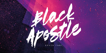 Black Apostle is a hand drawn brush font. It comes with uppercase and lowercase characters, set of punctuation glyphs, numerals, Cyrillic characters, some Cyrillic ligatures and multilingual support. Perfect for logos, quotes, posters, branding projects, product packaging, t-shirt, book cover, greeting cards and applicable for any graphic design.
 - QR Hiykaya by QR Type,
$45.00 All uppercase typeface for comic book lettering. Designed by Abay Emes. Supports extended Cyrillic and Latin characters. Has a stylistic set alternate L and D for Cyrillic and a stylistic set for languages with dotless i and i with dot (like Turkish). "Hiykäyä" translates from Qazaq as "Story".
 - Diegeometrische by Michael Browers,
$25.00Diegeometrische is an all uppercase geometric-based serif typeface featuring Latin, Extended Latin and Cyrillic character sets. - Latin, Extended Latin and Cyrillic character sets offer multilingual support. - Over 1000 kerning pairs for optimal letter spacing. - Unique combination of serif, geometric, and stencil design elements provides a distinct design.


