10,000 search results
(0.028 seconds)
- Jeunesse by Monotype,
$29.99The design of the Jeunesse font family derives from a study of primers which the designer undertook earlier in his career. Jeunesse was designed with the intention of combining excellent legibility and character recognition with the ability to create compact, distinctive words and lines while maintaining basic flourishless letterforms. The sans serif style is pre-dominant in this design, but serifs or rather parts have been added where necessary, mostly at the top left hand parts of the characters, to aid readability. Use Jeunesse as a text and display face. There are also fully sans serif and slab serif versions available which can be used on their own or mixed with each other and the parent fonts. - Typex by Device,
$39.00 Based on the lettering used on Alan Turing’s famous code-breaking machine at Bletchley Park, the “Bombe”, and the subsequent British answer to the German Enigma machine, the Typex. Research done at Bletchley Park on their restored and antique machines provided the inspiration. The unusual shapes for the capitals have all been retained - the square O, the monospaced characters and other eccentricities that make it unique. This reference material was then extended to the numerals (which did not exist in the original) and a full international character complement. The initial design of the bombe was produced in 1939 at the UK Government Code and Cypher School (GC&CS) at Bletchley Park by Alan Turing, with an important refinement devised in 1940 by Gordon Welchman. It was based on a device that had been designed in 1938 in Poland at the Biuro Szyfrów (Cipher Bureau) by cryptologist Marian Rejewski, and known as the "cryptologic bomb" (Polish: bomba kryptologiczna). The Bombe was used to break the German Enigma code on a daily basis, and was a vital part of the Allied war effort. The British “Typex" (alternatively, Type X or TypeX) machines were an adaptation of the commercial German Enigma with a number of enhancements that greatly increased its security. It was used from 1937 until the mid-1950s, when other more modern military encryption systems came into use.
 - Maiola by TypeTogether,
$49.00 Being inspired by early Czech type design, Maiola is clearly a contemporary typeface, that is mindful of its historical heritage, implementing old-style features and calligraphic reminiscence, more frankly so in the Italic. Nevertheless, through its personality, it attempts to create a welcoming tension on the page, without shouting too loudly at the reader. It handles its expressive tendencies with care and in doing so increases its usability, with legibility being of great importance. Subtle irregularities of the letterforms enhance furthermore the dynamic spirit and liveliness of the typeface. With the advent of Opentype, allowing for bigger character-sets and better language support, as a natural consequence, Maiola Multiscript covers Latin A, Cyrillic and Greek. Although basically independent from each other, they are, however, designed in the same spirit as the Latin, and harmonize well in multilingual text settings. The update to this beautiful font family includes the addition of over 240 glyphs featuring new ornaments, stylistic alternates, ligatures, superior letters, fractions and more. Furthermore, several glyphs were significantly improved and the kerning was fine tuned for better performance. Originally released in 2005, Maiola was an immediate success. It won the renowned TDC competition in 2004 where it was also recognized as a “judge’s choice”, was part of the touring exhibition e-a-t, and was selected in the Creative Review design competition in 2005.
 - ION A by Setup,
$19.95 ION A is a part of the ION superfamily, which consists of 3 families: condensed (ION A), normal (ION B) and wide (ION C), each having a compelling range of 10 weights. Styles Thin to Black have 436 glyphs supporting more than 70 Latin-based languages and the three heaviest weights, named U1, U2 and U3 have 94 basic glyphs. ION glyphs are based on the classic 7-segment display, but for readability and aesthetic reasons, some alphabetic characters don't follow this matrix strictly. In case you like things in order, don't worry, there's a stylistic set that replaces all characters with their strict alternatives. The special characters, such as #, @ or % are composed of special segments, but are designed to fit seamlessly within the whole character set. ION was designed with the needs of contemporary graphic design in mind. There are alternative characters, discretionary ligatures, slashed zero, superior & inferior numbers, fractions, ordinals and three handy stylistic sets. The ten styles of ION A are accompanied with a special 11th style called Cells, allowing you to design a special underlying layer of black or outlined cells. This way you can create various containers and boxes for your text, highlight what's important or go wild and draw a space invader, using the cells as building blocks. Learn more about the OpenType features and Cells at www.urtd.net/ion.
 - ITC Vineyard by ITC,
$29.99Although inspired by the engraved lettering on eighteenth-century English trade-cards, ITC Vineyard has unusual characteristics of its own. The type retains some quality of copperplate scripts, but the differentiation between thicks and hairlines is not very sharp. There are a few cursive forms, but most of the letters are romanized: they are almost upright and not joining. Occasional flourishes are casually interpreted from various sources such as the lettering on trade-cards and writing masters' copybooks. “I think it is a new kind of 'copperplate script' which is not too formal and easier to read,” claims designer Akira Kobayshi. Irregularities are apparent in the angle of caps and numerals, but the face's quirkiness gives a type page some friendliness rather than cold brilliancy. ITC Vineyard is designed in two weights: regular and bold. Each variation includes several extra characters such as an alternative lowercase 'd' with a long arm, a T-h ligature, swelled rules, and a pair of flourishes. Swash caps are available for both weights. The swash caps variation also includes oldstyle figures. Kobayashi notes: “There are a few swash-cap lowercase combinations that collide or look awkward. In that case, I recommend using the plain caps. Setting all swash cap copy should also be discouraged.” Featured in: Best Fonts for Tattoos - ION C by Setup,
$19.95 ION C is a part of the ION superfamily, which consists of 3 families: condensed (ION A), normal (ION B) and wide (ION C), each having a compelling range of 10 weights. Styles Thin to Black have 436 glyphs supporting more than 70 Latin-based languages and the three heaviest weights, named U1, U2 and U3 have 94 basic glyphs. ION glyphs are based on the classic 7-segment display, but for readability and aesthetic reasons, some alphabetic characters don't follow this matrix strictly. In case you like things in order, don't worry, there's a stylistic set that replaces all characters with their strict alternatives. The special characters, such as #, @ or % are composed of special segments, but are designed to fit seamlessly within the whole character set. ION was designed with the needs of contemporary graphic design in mind. There are alternative characters, discretionary ligatures, slashed zero, superior & inferior numbers, fractions, ordinals and three handy stylistic sets. The ten styles of ION C are accompanied with a special 11th style called Cells, allowing you to design a special underlying layer of black or outlined cells. This way you can create various containers and boxes for your text, highlight what's important or go wild and draw a space invader, using the cells as building blocks. Learn more about the OpenType features and Cells at www.urtd.net/ion.
 - ION B by Setup,
$19.95 ION B is a part of the ION superfamily, which consists of 3 families: condensed (ION A), normal (ION B) and wide (ION C), each having a compelling range of 10 weights. Styles Thin to Black have 436 glyphs supporting more than 70 Latin-based languages and the three heaviest weights, named U1, U2 and U3 have 94 basic glyphs. ION glyphs are based on the classic 7-segment display, but for readability and aesthetic reasons, some alphabetic characters don't follow this matrix strictly. In case you like things in order, don't worry, there’s a stylistic set that replaces all characters with their strict alternatives. The special characters, such as #, @ or % are composed of special segments, but are designed to fit seamlessly within the whole character set. ION was designed with the needs of contemporary graphic design in mind. There are alternative characters, discretionary ligatures, slashed zero, superior & inferior numbers, fractions, ordinals and three handy stylistic sets. The ten styles of ION B are accompanied with a special 11th style called Cells, allowing you to design a special underlying layer of black or outlined cells. This way you can create various containers and boxes for your text, highlight what’s important or go wild and draw a space invader, using the cells as building blocks. Learn more about the OpenType features and Cells at www.urtd.net/ion.
 - Amorie by Kimmy Design,
$12.00 Amorie is a tall and skinny hand drawn font. It comes in various weight and styles, and with an array of opentype options. Built to appear completely hand crafted, different designers could produce completely different results, selecting either Modella (classic and chic), Nova (fun and fancy) or SC (Small Caps and all business.) Each style comes in light, medium and bold and has an accompanying italics version. Opentype for this font includes Contextual Alternatives, which produces three versions of each character, making sure no two identical letters appear next to each other thus giving your design a fully authentic look. There are also stylistic alternatives, which offer different style to a select few characters, including capital letters: A, K, R, Q, Y and lowercase letters: a, e, k, t, y. Lastly, is a large set of swashes, 3 for each letter they accompany. For the most part this includes the whole uppercase alphabet as well as lower case letters with an ascender or descender. Amorie includes a large set of graphic extras, including stylish frames, arrows, line breaks, corners, flourishes and more. The complete package gives you one unbeatable font family. If you do not use Opentype but are using a program that includes a full glyph panel, you will be able to access each of the style variations you want.
 - Minigap by Gravitype,
$19.90 Minigap is a geometric sans serif family that has a minimal height difference between upper and lower case. In other words for those who are into typography, it has a very high x-height. The choice was made to finally have a typeface that could appear very neat, reducing ascending and descending parts of the glyphs (b, d, g, j, l, ...) that could interfere with the lines above and below. All of that without going to extremes in a unicase style but also without renouncing to a great legibility. This aesthetic, in fact, translates into a pleasant visual effect that creates well-defined lines and enhances the layout, looking excellent also on small screens. The pointed corners of capital letters and numbers have been kept even in the heavier styles, to give consistency to the family. Stylistic alternates are included: “i” and “j” can be set to the x-height, to have a more common aesthetic; by default they are set in the lower version, fitting better the purpose of this typeface. the two-story “a” is also available, to give you one more customizable option and extend the range of use. Minigap is available in 14 styles (7 uprights + matching italics), has OpenType features and supports multiple languages. The Regular weight is offered for free, try it!
 - Banished GRP by Grype,
$16.00 Banished was inspired by posters for the 1968 Cult Cinema Classic, “Astro Zombies”, but it exudes the rough and tumble, chewed up and spit out Old West era. Banished dives head first into all of the nostalgic clichés of the old west, as well as the cult classic that inspired it. Here's what's included with Banished: 388 glyphs - including Capitals, Lowercase (Alt. Capitals), Numerals, Alt. Numerals, Punctuation and an extensive character set that covers multilingual support of latin based languages. (see the 6th graphic for a preview of the characters included) Contextual Alternates that auto-switches between Capitals & Lowercase (Alt Capitals) glyphs, as well as Numerals and Alt Numerals for visual randomness. To access the Contextual Alternates feature, you will need to be using software with Opentype compatibility otherwise you can access the alternate glyphs via a Glyphs panel. Stylistic Alternates feature that swaps all default Numerals with their Alternates Numerals Font is provided in TTF & OTF formats. The TTF format is the standard go to for most users, although the OTF and TTF function exactly the same. Here's why Banished is for you: You're in need of a good rustic slab serif typestyle with a narrow width and gritty feel You're planning a Western themed party and need a unique western typeface You're a fan of the 1968 Cult Classic "Astro Zombies" as just have to have the font to match You've got one of those Old West photography studios and need a great Wanted poster font You just like to collect quality fonts to add to your design arsenal
 - Wedding by HiH,
$10.00 Wedding Regular was originally designed by Morris Fuller Benton for ATF and released as Wedding Text in 1901. It is a lighter version of his ENGRAVER'S OLD ENGLISH of the same period. Wedding Regular is based on the Textura style of blackletter that continued in popularity in England into the 16th century, long after the Dutch, French and Italians had moved to a Roman model that expressed the Renaissance humanism of the period. Wedding Headline is a still lighter version of the regular text face, suitable for setting larger sizes while still preserving the delicacy of the decorative hairlines. Textura continues in use in England and the United States for newspaper mastheads, gift shop signs, wedding invitations and programs and other applications where a feeling of tradition is desired. I recently saw an 1980ish photo of a “Tubby Isaac” sign in London using textura. I believe Benton’s design captures that feeling without being heavy-handed and still remaining quite readable for eyes accustomed to Roman lettering. Both Wedding Regular and Wedding Headline convey a comfortable familiarity. These two fonts may be purchased together at an attractive discount or they may be purchased separately. The full character set may be found in the pdf file that you can download from the gallery section. The two monks (alt-0172 and alt-0177) are from a set of sixteenth century decorative initial letters by Gering and Renbolt. Please note that there are two different eszetts, the blackletter style at alt-0126 and the antiqua style at the alt-0223.
 - Octin Sports Free - 100% free

- Octin Prison Free - 100% free

- Octin College Free - 100% free

- Octin Vintage Free - 100% free

- Octin Spraypaint Free - 100% free

- Stoehr numbers - Personal use only

- Ratherbe by Zane Studio,
$15.00 Ratherbe is a new modern brush font with an irregular baseline. A contemporary approach to design, natural handmade, suitable for use in designs for clothing, invitations, book titles, stationery designs, quotes, branding, logos, greeting cards, T-shirts, packaging designs, posters, and more. Complete with upper and lower case letters, and multi-language support, numbers, punctuation and several ligature. Thank you very much for searching and letting me know if you have questions.
 - ITC Atmosphere by ITC,
$29.00The Algerian designer Taouffik Semmad created the fonts in 1997. Taouffik Semmad grew up speaking Algerian-Arabic dialect and French, studied Russian, and is now living in Montreal. This could perhaps explain his current passion, to "find a universal writing", which he admits is a Utopian idea. Created with brush and Chinese ink, the characters of ITC Atmosphere came from Semmad's hand but only after they were fully formed in his mind's eye. - Sextan Cyrillic by deFharo,
$12.00 Sextan serif is a Cyrillic typeface family with 10 styles designed for editorial, corporate, advertising or web use. The excellent readability allows the use in long texts, the coherence of forms make these fonts have a great personality. The fonts have an extra set of lower case letters accessible through the Discretional Ligatures. Also support for Open Type Functions such as Old Style Number, Superiors, Inferiors, Dynamic Fractions, etc. Includes the Bitcoin symbol: b #
 - Jukotha by Twinletter,
$10.00 Jukotha is a casual retro from the san serif font family that carries a vintage theme, this font is designed with care so that it can produce a blend of letters and become a sweet and elegant word but still natural. by using this font, your work will become stronger and more extraordinary. This font is suitable for various graphic promotion media, banners, posters, logos, typography, hand lettering, packaging, t-shirts, labels, and much more.
 - Choowee by Vova Egoshin,
$24.00 Funky decorative display typeface with a curvy eye catching character. Choowee can solve many graphical problems. Features and alternates add personality and let you create unique logos, rad graphic identitys and stunning headlines! Package design for food or any kind of products. Posters or music covers. Prints on sweatshirts or t-shirts. Children’s book-covers or comics. Features: ligatures, alternates, case sensitive punctuation. Support: cyrillic, cyrillic extended, latin, latin extended... 1000+ glyphs! Have fun!
 - FF Wunderlich by FontFont,
$41.99 German type designer Martin Wunderlich created this sans FontFont in 1993. The family has 6 weights, ranging from Regular to Bold (including italics) and is ideally suited for editorial and publishing and logo, branding and creative industries. FF Wunderlich provides advanced typographical support with features such as ligatures, alternate characters, and case-sensitive forms. It comes with a complete range of figure set options – oldstyle and lining figures, each in tabular and proportional widths.
 - FF Antithesis by FontFont,
$62.99 German type designer Yanone created this FontFont in 2013. The family has 3 weights and is ideally suited for advertising, packaging, logo, and branding as well as web and screen design. FF Antithesis provides advanced typographical support with features such as ligatures, small capitals, alternate characters, case-sensitive forms, fractions, and super- and subscript characters. It comes with a complete range of figure set options – oldstyle and lining figures, each in tabular and proportional widths.
 - FF Market by FontFont,
$76.99 German type designer H. A. Simon created this script FontFont in 1996. The family contains 3 weights: Regular, Condensed, and Bold and is ideally suited for advertising and packaging, festive occasions, editorial and publishing, poster and billboards as well as software and gaming. FF Market provides advanced typographical support with features such as ligatures, alternate characters, case-sensitive forms, fractions, super- and subscript characters, and stylistic alternates. It comes with tabular lining figures.
 - Albe Sans by Hackberry Font Foundry,
$24.95Albe Sans is a font family that began life when I was struck by a full-color back page ad in a 1935 copy of Better Homes & Gardens. I loved the readability and general cleanliness of the design. This font is drawn from memory after that experience. It is loosely based on Palton for proportion, but heaviily modified (not to mention, Palton is serif): Lower case numbers, Euro, ballot box in the section slot. - Mavblis by Aga Silva,
$34.99 Mavblis fonts have playful and fancy look, which may recall that seen in fifties ads. The look, which is quite bold may well allow for using this font in titles, packaging, or catchphrases. There are also some ligatures and alternates encoded, so you are not stuck with one look in case you require to add some variety to your text. There are over 900 characters in each font, and many languages are served.
 - FF Cartonnage by FontFont,
$41.99 Israeli type designer Yanek Iontef created this display FontFont between 2003 and 2011. The family contains 2 weights and is ideally suited for advertising and packaging, film and tv, logo, branding and creative industries, poster and billboards as well as sports. FF Cartonnage provides advanced typographical support with features such as ligatures, alternate characters, case-sensitive forms, fractions, super- and subscript characters, and stylistic alternates. It comes with proportional oldstyle and proportional lining figures.
 - Cripto Font by Intellecta Design,
$18.90The CriptoFont and CriptoFont Ornamental were to be used alone or together, providing a nice solution to the project, be it a book, an invitation, or many others. Cripto Font Ornamental has two kinds of ornaments, one used in the beginning of words or sentences (using the uppercase keys), and other to be used to close words or sentences (using the lowers case keys). See the samples in PDF guide and in gallery - Dunelm by MADType,
$21.00 Dunelm is a typeface that was inspired by the type used in an English book from 1636. The typeface used in the book was unique and the goal in creating this font was to emulate the printing feel of the 17th century. The authentic ink-blotted and imperfect feel of the letter-pressed type was preserved with care. For best effect, this font should be used at text and smaller title sizes.
 - Calligra by Fo Da,
$16.00 Calligra is a single weight display font derived from a serif roman. It works well for headlines and can be used also well in text. It supports English, Spanish, French, German, Extended Latin, Greek and more. The name Calligra came from calligraphy which was the main style we followed during creating this font. Main Features: • 813 glyphs • 622 ligatures • 29 “Number” ligatures • Support for many languages • Perfect for logos and headlines • Latin support expanded
 - Umbilical Noose by Hanoded,
$15.00 Umbilical Noose is a rather scary typeface. It is quite similar to an older font of mine: Nyctophobia. The name comes from a Nirvana song called Heart Shaped Box, in which Kurt Cobain sings: "throw down your umbilical noose, so I can climb right back". I have always liked that phrase a lot. Umbilical Noose is an all caps font, but upper and lower case are different and you can easily interchange the glyphs.
 - Aplomb by Scholtz Fonts,
$18.20Aplomb was designed to fill the "contemporary fantasy" niche, hinting at Celtic magic overlaying a solid, legible contemporary font. Aplomb is intended for book covers, movie posters and advertisements, DVD covers, magazine pages, fantasy comic pages, in fact wherever contemporary and fantasy meet! The font comes in two styles - smallcaps and regular. Aplomb is fully professional, carefully letterspaced and kerned. All upper and lower case characters, punctuation, numerals and accented characters are present. - Fada by Gaslight,
$25.00 Fada is a unicase geometric grotesque that was made on the basis of a logo for a bar, which we have designed. We were inspired by the license plate, in which the letters have specific heats in places conjoined. The only difference between upper or lower case characters is reduced and increased waist. This is characteristic not only for letters and digits. Fada - good for fashion, editorial, posters, logos and so on.
 - Decima Pro by TipografiaRamis,
$39.00 Decima – condensed geometric Sans Serif typeface, released back in 2009 and quite successful ever since (MyFonts Rising Star, February 2009). Decima Pro – an upgraded version of Decima, with careful refinements to glyph shapes and extension of glyph amounts, which enabled support of more Latin languages as well as support of Cyrillic. Six more alternate styles have been added to the original six styles. Typeface is released in OpenType format with some OpenType features.
 - ITC Arid by ITC,
$29.99ITC Arid was designed by Rob Leuschke in 1997 as a lively calligraphy typeface which looks as though it was put to paper with a piece of charcoal. Generous capitals mix harmoniously with the more reserved lower case characters and the forward slant of both create a dynamic impression. Arid should be used in point sizes of 12 and larger and is well-suited for headlines and short to middle-length texts. - Shadowfield by Hanoded,
$15.00 hadowfield is a fantasy font which was inspired by the hand lettering on the Spiderwick movie posters (which itself was apparently based on Hand Skript One). Every glyph was drawn by hand, using a gel pen on 160 grams paper. Shadowfield will look good on anything fairy-like - book covers, toy packaging and even bottles of home-made mead! Comes with swashed alternates for all capital letters and some lower case ones as well.
 - Shabaq by Bohloul Arabic Type Design,
$25.00 Shabaq is a heavy, ultra black Arabic font. It is suitable for 'Display' and large print use cases, especially billboards and advertisement. It also performs well as a title and header font. Shabaq is a geometrical font based on the charactristics of the traditional Naskh typeface with a perfectly fresh and modern appearance. Shabaq is super-black, dazzles the eyes of the beholder and leaves them deeply influenced. Shabaq supports Arabic, Persian and Kurdish languages.
 - P22 Bangersfield by IHOF,
$29.95 Bangersfield is a four-member font family from Robby Woodard. With line treatments clearly inspired by cased meat products, these fonts function as a healtier alternative to Comic Sans. The casual hand lettering works well for light-hearted design and comic lettering. These fonts are stuffed with opentype features, extra ornaments, and a full Central European character set—over 400 characters per serving. Satisfy your hunger for a fresh take on a stale genre!
 - Fabulous Sunday by Balpirick,
$15.00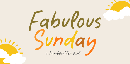 Fabulous Sunday is a Handwritten font that's perfect for adding a personal touch to your design projects! With its natural, organic feel and unique character. Crafted with care and attention to detail, this font is incredibly versatile and can be used for a range of design projects, including logos, branding, invitations, and more. Its modern, handwritten style gives it a unique character that's sure to make an impact. - also multilingual support Thank you!


