10,000 search results
(0.028 seconds)
- Beautiful Christmas Monogram by Yoga Letter,
$20.00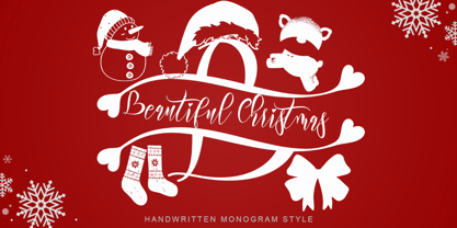 "Beautiful Christmas Monogram" is a beautiful and unique monogram font. This font is equipped with monograms, uppercase, lowercase, numerals, punctuation, and multilingual support. Very suitable for Christmas, winter, Christmas invitations, Christmas parties, Christmas ornaments, Christmas decorations, and others.
 - Wilhelmschrift by Aerotype,
$29.00 The 1927 Klingspor Foundry specimen book debuted one of Rudolf Koch's greatest achievements, the original Wilhelm-Klingspor-Schrift, the source for the patinaed Wilhelmschrift. Companion Wilhelmschrift Ornaments features 36 flowers and other decorative elements also designed by Koch.
 - Unadorned JNL by Jeff Levine,
$29.00 Unadorned JNL is the stripped down version of 2011's Troubador JNL; an ornate wood type font. With the inner ornamentation removed, this Western-influenced type design takes on a bolder look, yet retains its Victorian decorative charm.
 - Beverly Hills by Monotype,
$29.99Beverly Hills is an all-caps display face in the Art Deco style. Its design features dramatically low crossbars, and each letter has a fine inline highlight. The most prominent letters in this typeface are clearly the E, F, G, and K, while the elegantly narrow S is sure to delight. A classy offering like Beverly Hills should only be set very large, either as a magazine headline, a store sign, or on the cover of a fine invitation. If you like Beverly Hills, you make enjoy other high-contrast Art Deco designs in Linotype's library, including ITC Anna, Avenida, Broadway, Jazz, and ITC Manhattan. - Pinkhoff Caps by TypeFaith Fonts,
$10.00 This fantastic beautiful Amsterdam School fonts brings alive the roaring twenties and crashing thirties. An art deco typeface from the Netherlands that summons a thirties vibe for a nostalgic twist on chic lines. It's the work of designer Leon Hulst, and you can see from the layout examples here that nostalgia means ruin, and it has become super cool to use a ruin vibe in retro aesthetics. Yep, there's a touch of class to that worn out look and feel, and the beautiful lines of the typography and numerals show how the barely restrained charisma of art deco can be coupled with the new obsession with all things vintage.
 - Rocketeers by IKIIKOWRK,
$17.00 Introducing Rocketeers - Art Deco Type, created by ikiiko. Rocketeers is a condensed type with a simple Art Deco vibes. Inspired by the writing style of the 1930s era. A bold and sturdy aesthetic style characterizes this font. Some alternates styles can be adjust to explore different shapes. This typeface is perfect for an brand logo, vintage stuff, fashion stuff, clean design, magazine cover, invitation, poster & flyer, or simply as a stylish text overlay to any background image. What's included? Uppercase & Lowercase Number & Punctuation Alternates & Stylistic Multilingual Support Enjoy our font and if you have any questions, you can contact us by email : ikiikowrk@gmail.com
 - Grace by Linotype,
$29.99Grace was designed by Elisabeth Megnet and appeared with Linotype in 1992. The font is a part of the package Calligraphy for Print, which also contains Ruling Script and Wiesbaden Swing. Calligraphy for Print 2 completes the set. These packages offer modern calligraphy fonts particularly well-suited to use in posters, magazines and advertisements. The basic style of Grace is based on the Gothic miniscule of the 13th century. It represents a modern philosophy held by Andre Guertler, Professor of Typography in Basel with whom Megnet once studied. With this philosophy, calligraphy is not to be seen as a decorative art, and fonts created according to this tenet have far fewer ornamental strokes. They are eccentric, drawn out and almost bulky. Like Gothic forms, one of the predecessors of this font, Grace gives vertical lines a particular emphasis. This font is not meant for long texts but makes a distinctive impression in shorter texts or headlines. - Snowflake by Jessica Hische,
$59.00 Snowflake is a new typeface by Jessica Hische, released in September of 2010. Inspired by cut paper snowflakes, this whimsical face is perfect for the holidays! It also resembles Mexican papel picado, so it is as at home in Summer designs as it is in wintery ones. The full typeface includes full alphabet, numbers, punctuation, accent characters as well as over a dozen snowflake ornaments which can be used to create amazing decorative borders or to just sprinkle about! You can also purchase just the snowflake ornaments separately, if it is just the ornaments you are after.
 - Charlot by Molly Suber Thorpe,
$17.99 Charlot is a decorative display font with dozens of beautiful ligatures and ornaments. The vast selection of ligatures and stylistic alternates makes this font extremely customizable. Charlot is perfect for unique branding and title treatments, personal monograms, and vintage-inspired layouts. Charlot has over 150 ligatures in Latin and Greek consisting of: the complete Latin alphabet (with all accent marks), the complete Modern Greek alphabet, 60 ligatures, 33 stylistic alternates, 15 decorative ornaments, borders, and frames, numerals and math symbols, extensive punctuation and diacritical markings. The OpenType ligatures are the fun part. To get the most out of Charlot, use software that supports Open Type fonts (Adobe programs, Corel Draw, Affinity Designer, etc). This type family has tons of built-in OpenType ligatures and alternates, which are what make it so customizable and decorative. You can always access the ligatures, alternates, and dingbats through your software's glyphs panel. For a complete preview of all the ligatures, please look at the 4th image in this product listing. Languages Charlot includes the Latin and Greek alphabets with all accent markings. The most common languages it supports are: English, Catalan, Danish, Dutch, French, German, Greek, Italian, Norwegian, Portuguese, Spanish, and Swedish.
 - Asteroid by ryan creative,
$9.00 Asteroid is a script typeface with hand-drawn strokes and a monoline which makes this font look natural and modern. Get a touch of a simple, and fun, signature script font with glyphs and open type features with styles and binders, Swash, and the addition of Alternative and Ornament. This font is more decorative and artistic suitable for art or fashion brands. It can be used for various purposes. such as brand name, signature, logo, etc. Features; -Uppercase, Lowercase, Foreign Support, Numbers and Punctuation. -Alternative, Swash, Ligature and Ornament. -Works on PC. -Simple installation. -Accessible in Adobe Illustrator, Adobe Photoshop. Adobe InDesign, even works in Microsoft Word. -Fully accessible without additional design software. Asteroids is coded with Unicode PUA, which allows full access to all additional characters without having to design any special software. Mac users can use the Font book, and Windows users can use the Character map to view and copy any extra characters to paste into your favorite text editor/app. Thanks for visiting ;)
 - P22 Dwiggins by IHOF,
$24.95 Dwiggins Uncial is based on calligraphy by William Addison Dwiggins that he created for a self-penned short story, which appeared as an insert in the book-arts publication The Dolphin in 1935. This self-described “experimental uncial” lettering features rather unusual treatments of letterforms which combine manuscript calligraphy with modern idiosyncrasies. Dwiggins Extras is a set of decorative extras features 62 stencil and woodblock motifs adapted from abstract and representational Dwiggins designs. Although Dwiggins illustrated a number of books using conventional media, he is best known for his method of illustration that uses a series of hand-cut celluloid stencils or what he called “machine ornaments.” With these stencils Dwiggins (and other designers who use his ornaments) build-up repeated motifs and patterns into abstract designs and/or representational images which have a look that is uniquely Dwiggins’ own. Unlike other illustrators, Dwiggins’ style has not been commonly imitated and therefore his style is as distinctive today as it was 70 years ago.
 - Centennial Script Fancy by Intellecta Design,
$29.90 Centennial Script Easy is the Intellecta digitization of the classic font from Hermann Ihlenburg in 1876 developed originally for the MacKellar, Smiths & Jordan typefoundry. We decided to digitize only the uppercases to this work, and to create a different version to this anciente design, we joined the uppercase to the lowercase set of another classic font, Pentagraph. This is a fraction of the global project, which is complete with the Centennial Script Fancy and Centennial Ornaments fonts, making a complete ornamental family of lettering solutions with genuine and original art-noveau taste.
 - Fehlian by SIAS,
$39.90 In Fehlian I blended features of my earlier Arthur and Lindau releases. Fehlian is a sturdy yet sophisticated Art Deco style Roman semi-serif. It is an excellent choice for titlings, headlines, labels, shopfronts and any other display usage which needs to be typographically furnished with something special. Moreover, besides the plain Fehlian font you have the option of yet another two wonderfully decorated versions which lend even more beauty to your designs. Note that Fehlian is a capitals-only product. It has no lowercase but the uppercase is completed for multilingual usage and supports every Euro-Latin language.
 - Nocturne by Scholtz Fonts,
$19.95 The font is based on an alphabet from a mid1920s art deco book. The original seemed to have tapering strokes but it was too small to be sure; I made all strokes parallel & orthogonal and slightly modified the original in a number of other ways to bring it into the 21st Century. The designers of the original were Paul Carlyle and Guy Oring. Nocturne has all the elegance of the Deco fonts of the 1930s. It recalls the romantic, sophisticated Zeitgeist of the early 20th century, that nostalgic time "between the wars". Nocturne comes in two styles: Nocturne Regular, which uses the Art Deco convention of small x height, and long ascenders. This style is perfect for headers, posters, labels etc. Nocturne Book, which, with its higher x height and slightly wider characters, is extremely legible and suitable for small size text.
 - Dyer - Unknown license

- Frail&Bedazzled - Personal use only

- Haunting Attraction - Unknown license

- Gabrielle - Personal use only

- Pilsen Plakat - Unknown license

- Fletcher-Gothic - Unknown license

- Stocks and Bonds JNL by Jeff Levine,
$29.00 The hand lettered opening title for the 1935 movie “Thanks a Million” is rendered in a condensed, thick and thin Art Deco sans serif design. It is now available as the digital typeface Stocks and Bonds JNL – in both regular and oblique versions.
 - Semarang by Hanoded,
$15.00 Semarang is a stylish, all caps Art Deco font. It is not a recreation of a particular typeface; merely my salute to a bygone era and to the birthplace of my father in law, who recently passed away. Semarang comes with all diacritics.
 - Vocalist JNL by Jeff Levine,
$29.00 Vocalist JNL is a bit of a novelty Art Deco typeface based on hand lettering from some 1940s sheet music. Using the classic "thick and thin" style of the day, a number of letters and numbers have wedges cut out of their designs.
 - Flower Shop JNL by Jeff Levine,
$29.00 A piece of sheet music for “Broken Blossoms” circa the 1920s or early 1930s has its cover title hand lettered in a wide thick-and-thin Art Deco design. This is now available as Flower Shop JNL, in both regular and oblique versions.
 - Evening Dress JNL by Jeff Levine,
$29.00 Thin, elegant and thoroughly Art Deco is the thick-and-thin (slightly flared) alphabet found on page 31 of Samuel Welo’s 1930 instructional book “Lettering Practical and Foreign”. Redrawn digitally as Evening Dress JNL, it is available in both regular and oblique versions.
 - Song Folio JNL by Jeff Levine,
$29.00 A 1940s Australian song folio featuring tunes performed by singer-actress Deanna Durbin had her name hand lettered in an interesting Art Deco style sans. This became the basis for Song Folio JNL, capturing all the nuances of the original in digital form.
 - French Geometric JNL by Jeff Levine,
$29.00 An Art Deco geometric alphabet found within the pages of the 1939 French lettering book "Modèles de lettres modernes par Georges Léculier" ("Models of Modern Letters by Georges Léculier") is the basis for French Geometric JNL; available in both regular and oblique versions.
 - Classic Comics JNL by Jeff Levine,
$29.00 A comic book feature entitled “Foe of the Borgias” appeared in 1937’s New Adventure Comics. The hand lettered title was done in a slab serif Art Deco style and is recreated digitally as Classic Comics JNL in both regular and oblique versions.
 - RMU Omega by RMU,
$30.00 Friedrich Kleukens font design, influenced by the then prevailing Art Deco style, and released by Stempel in 1926, has been revived for modern use. To get access to all ligatures, it is recommended to activate both OT features standard and discretionary ligatures.
 - Uptown JNL by Jeff Levine,
$29.00 Uptown JNL was found amidst the pages of a 1944 edition of the vintage lettering design book entitled "Sixty Alphabets". This lovely Art Deco typeface has slight curvature to the straight lines of the letter forms and a wonderful hand-lettered look.
 - Summerhaven JNL by Jeff Levine,
$29.00Summerhaven JNL and Summerhaven Italic JNL were partially inspired by sign lettering spotted in an old black and white movie. These fonts are somewhat reminiscent of the Art Deco style, and their casual look can be applied to both formal and informal messages. - Paducah JNL by Jeff Levine,
$29.00 The hand lettered screen credits for the 1940 film “The Proud Valley” feature a bold, hand lettered sans serif type design with strong Art Deco influences. This is now available as Paducah JNL, which is available in both regular and oblique versions.
 - Dolmen by ITC,
$29.99Dolmen font from Max Salzmann revives the look of the 1920s and suggests all the glamour and culture of the jazz age. Dolmen can be used in all capital or upper and lower case settings and gives any work an Art Deco look. - Comic Opera JNL by Jeff Levine,
$29.00 Comic Opera JNL (and its oblique version) is a wide, bold sans serif type design with an Art Deco influence based on a 1930s namesake poster from the WPA (Works Progress Administration) advertising a performance put on by the Federal Music Project.
 - National Parks JNL by Jeff Levine,
$29.00 National Parks JNL was based on a 1930s WPA (Works Progress Administration) poster where the word "National Parks" was hand lettered in an unusual and eclectic Art Deco style. Bold and non-conformist, the typeface is available in both regular and oblique versions.
 - Eccentric Sans JNL by Jeff Levine,
$29.00 An instructional page from a vintage lettering book displayed online showed the construction of an Art Deco sans design with varying widths and stylized character shapes. This was the basis for Eccentric Sans JNL, which is available in both regular and oblique versions.
 - Dancing Girl JNL by Jeff Levine,
$29.00 The poster for the 1930 film “Show Girl in Hollywood” had the title hand lettered in a squared Art Deco style with some angled cross strokes. This became the basis for Dancing Girl JNL, which is available in both regular and oblique versions.
 - RMU Luchs by RMU,
$35.00 Jakob Erbar’s Art Deco font ‚Lux‘, released by Ludwig & Mayer in 1929, completely redrawn and redesign. The German umlaut glyphs Ä, Ö, and Ü come in their original form in the uppercases; in the lowercases the dieresis was placed above the letters.
 - Iris by ITC,
$39.00Iris font was designed in the late 1930s for American Typefounders. It is an all capital sans serif typeface whose slender geometric letter forms suggest the Art Deco period without limiting its application potential. Iris font creates a look of refined elegance. - Poultry And Fish JNL by Jeff Levine,
$29.00 The image of an old enamel sign advertising poultry inspired Poultry and Fish JNL, which is available in both regular and oblique versions. Horizontal cut-through lines within the Art Deco-era hand lettering adds to the uniqueness of this type design.


