10,000 search results
(0.018 seconds)
- English Garden SG by Spiece Graphics,
$39.00 Here is a wonderfully charming typeface similar in style to the folklore lettering created by Walter Crane, the prolific children’s book illustrator. This English artist created many beautiful, flower-decorated works during the Arts and Crafts movement that flourished between 1860 and 1910. English Garden SG Regular contains many of Crane’s original whimsical and quirky characters. Note the inclusion of a spurred capital G, a squat lowercase g, a bending floral lowercase d, and the quaint old style figures. All of which are a delight to use when casting a medieval storybook tone to your project. You might also take advantage of the enchanting small capitals when setting logos, headlines, and decks. English Garden SG Regular is now available in the OpenType format. Some new characters have been added to this OpenType version including stylistic alternates, discretionary ligatures, historical forms, and petite figures. Advanced features currently work in Adobe Creative Suite InDesign, Creative Suite Illustrator, and Quark XPress 8. Check for OpenType advanced feature support in other applications as it gradually becomes available with upgrades.
 - Lichtspielhaus by Typocalypse,
$19.00 Lichtspielhaus is an ultra condensed Lichtspiele spin-Off with 8 weights. It still transports you back to a time where neon lights and marquee letters decorated cinema facades. There are 8 styles: Hairline, Thin, Light, Regular, Medium, Bold, Black and Heavy. "Lichtspielhaus" is the first part of a new Type Noir Quadrilogy.
 - Vaudevillian JNL by Jeff Levine,
$29.00 The place for a family to be entertained by comedians, dancers, acrobats, animal acts, singers and just about any other acts that fit the bill at the time was the vaudeville theater. Prior to radio becoming the major source of entertainment for the American public, popular songs were introduced on the stages of these entertainment venues. One such song from 1916 with a World War I patriotic sentiment was "A Yankee Doodle Boy Is Good Enough for Me". The sheet music featured the title hand lettered in Art Nouveau style. This became the design source for Vaudevillian JNL, available in both regular and oblique versions.
 - Lexis by Typedepot,
$29.00 You can Download All 36 Demo Fonts The Lexis font family is a sans serif “super” family consisting of two sub-families - Lextis & Lexis Alt. While the first one follows the humanist model, its alternative version Lexis Alt dives way deeper into the geometric aesthetic. It’s simple yet versatile, packing great amount of well balanced weights, extensive character set and numerous Opentype features. The Lexis typefamily comes in 9 weights plus their italics, two distinctive styles and support for over 200 languages.
 - Orchis by Intellecta Design,
$14.95an art nouveau experiment - Saint Carell by Mans Greback,
$69.00 Saint Carell is a decorative serif typeface. With Victorian letterforms, this elegant font has great contrast, a classic appearance and floral details. Drawn and created by Mans Greback in 2022, it is a fancy typeface with a luxurious style and a chic personality. The Saint Carell typeface family consists of six professional styles: The clean Regular font, the ornamental Deco style, plus four more decorated versions for the greatest variability in your design. The font is built with advanced OpenType functionality and has a guaranteed top-notch quality, containing stylistic and contextual alternates, ligatures and more features; all to give you full control and customizability. It has extensive lingual support, covering all Latin-based languages, from Northern Europe to South Africa, from America to South-East Asia. It contains all characters and symbols you'll ever need, including all punctuation and numbers.
 - Scentogram by PizzaDude.dk,
$20.00Scentogram is a deco font inspired by some 1950-60 ads. - Arthur Sans by SIAS,
$34.90 Arthur Sans is a new font design in the spirit of the Art Deco era, the age of elegance, stylishness and refinement. Use this unique typeface for distinctive personal stationary, outstanding business papers, captivating brochures and invitations; for marvellous posters, wonderful menus, hotel leaflets, exciting ads … for outstanding designs. You’ll find out that Arthur Sans is your friend for more than just fine typography. Five weights plus Italics – all equipped with a comprehensive Euro-Latin character set – will hardly leave anything to be desired. Additionally, the font Arthur Sans Regular contains an outstanding extra range of 70 ornamental characters, carefully designed to the very tone of the typeface, to give you a very special kick of extra value to enchant your designs. Alternatively, you can get this set of ornaments seperately, look at the Arthur Ornaments! Arthur Sans is but one part of a greater suite of exciting fonts: you may wish to also check out the sister fonts of the gorgeous Arthur Cabinet family, which will offer you another wonderful scope of fascinating typographic possibilities. For a matching Greek font go to Artemis. And finally, Arthur’s Irish friend is the fabulous Ardagh. __________________________________________________________________________________________
 - Arthur Ornaments by SIAS,
$44.90 Arthur Ornaments offers a range of about 70 unique ornaments and pictographs in the sophisticated style of the Art Deco era: lavish floral compositions and leaves, borderpieces and geometric elements – and a stunning set of period lifestyle, sports and travel pics. Arthur Ornaments lend a breath of elegance and exclusivity to your designs. Arthur Ornaments is the perfect compagnon to all fonts of the Arthur Sans, Arthur Cabinet, Ardagh and Artemis font series. Use Arthur Ornaments to create posters, banners, menus, invitations and title pages of distinctive noblesse and beauty. Combine them with other Arthur fonts for a perfect match. The Arthur Ornaments set of characters is the very same as the respective part of Arthur Sans Regular (if you already have Arthur Sans Regular you don’t need this one!). Technical remark: Many of the characters in this font are encoded in the 26xx, 27xx and 1Fxxx ranges. However, for the ease of use most of the glyphs are doubled to the a–z, A–Z and 1–9 positions. _________________________________________________________________________________ If you like fine ornaments you should also have a look at Behrens Ornaments, Andron Ornaments and Leipziger Ornamente.
 - Hastings by MKGD,
$13.00 Hastings was inspired by my appreciation for old fashioned English murder mysteries set in the early part of the twentieth century. No one seems to capture the ambience of the roaring twenties or thirties better than the Brits. Everything from the clothing, to the cars, to the telephones, down to the smallest accessories like the pens, all seem to have been appropriated from the local museum. I'm hopeful that this typeface also embodies similar feelings with its sleek and streamlined Art Deco features. Hastings has a glyph count of 389 and supports the following languages; Afrikaans, Albanian, Asu, Basque, Bemba, Bena, Bosnian, Catalan, Chiga, Colognian, Cornish, Croatian, Czech, Danish, Embu, English, Esperanto, Estonian, Faroese, Filipino, Finnish, French, Friulian, Galician, German, Gusii, Hungarian, Icelandic, Indonesian, Irish, Italian, Kabuverdianu, Kalaallisut, Kalenjin, Kamba, Kikuyu, Kinyarwanda, Latvian, Lithuanian, Low German, Lower Sorbian, Luo, Luxembourgish, Luyia, Machame, Makhuwa-Meetto, Makonde, Malagasy, Malay, Maltese, Manx, Meru, Morisyen, North Ndebele, Norwegian Bokmål, Norwegian Nynorsk, Nyankole, Oromo, Polish, Portuguese, Romanian, Romansh, Rombo, Rundi, Rwa, Samburu, Sango, Sangu, Scottish Gaelic, Sena, Shambala, Shona, Slovak, Slovenian, Soga, Somali, Spanish, Swahili, Swedish, Swiss German, Taita, Teso, Turkmen, Upper Sorbian, Vunjo, Walser, Zulu
 - HWT Catchwords by Hamilton Wood Type Collection,
$24.95 Catchwords have always been offered alongside standard alphabets in wood type catalogs and so often appear on posters as a decorative punch that they have become part of the wood type vernacular. Words like 'The', 'And', 'To', 'For', and less common abbreviations could be inserted into a design along with decorative ornaments or stars when space was tight or to add variety in the design. HWT Catchwords features over 80 words based directly on designs offered by Hamilton and other wood type manufacturers of the 19th and early 20th Century.
 - Bongani by Scholtz Fonts,
$19.95Bongani has its origins in wood-carved African design and art. The letter forms are informal and asymmetric and the "decorative" elements are matched to each letter shape and have no mechanical rigidity. It is was designed for situations that require: -- the look and feel of Africa -- strong ornamental headlines It can be effectively used in advertising and in applications such as greeting cards and book covers. The font is fully professional: carefully letterspaced and kerned. It contains over 235 characters - (upper and lower case characters, punctuation, numerals, symbols and accented characters are present). - Inner Shadow by Ably Creative,
$15.00 inner shadow is a great display font that brings out a street art vibe. the inner shadow appears in capital letters and a unique variety of ligatures. Inner Shadow is a graffiti font that combines the improvised qualities of urban graffiti with the subtlety and regularity of typeface. the inner shadow is spaced letter to letter individually so spacing will work smoothly, regardless of irregular shape expression and also includes a decorative font, which has clouds, underlines, arrows, crowns, halos, and more to add flavor. on your design.
 - Lovelyn by Craft Supply Co,
$15.00 Lovelyn Font is an elegant serif font that offers a wide range of possibilities, especially for a lot of alternative. Lovelyn Font offers an attractive tool for producing elegant decorative lettering, for example, for book covers or for posters and packaging. You want to make a greeting card or a package design, or even a brand identity, craft design, any DIY project, book title, wedding font, pop vintage design, retro design or any purpose to make your art / design project look Elegant and Classy? Feel free to play with this font!
 - Frozenflare by Balpirick,
$15.00 FROZENFLARE is a Sweet and Soft Handbrushed Font. It is suitable for svg designs, mug decorations, pottery, shirts, hats, tote bags, card making, wall art, interior prints, and various other creations. Whatever the topic, this font will be a wonderful asset to your font library, as it has the potential to enhance any creation. This font only has all uppercase letters, but if accessed with lowercase letters it will automatically become uppercase. also multilingual support Enjoy the font, feel free to comment or feedback, send me PM or email. Thank you!
 - Fox Mine by Fox7,
$12.00 Fox Mine It’s a decorative font and Color Font, a cute style, and fun. It is perfect for your Valentine's Day designs - or any design!. Fall in love with its authentic feel and use it to create gorgeous invitations, beautiful stationary art, eye-catching social media posts, and cute greeting cards. Add it now to your fonts library, and start creating spectacular designs! --- Learn more about color font support on third-party apps here: https://www.colorfonts.wtf/ --- 🌺🌺Please note that the Canva do not support color fonts! 🌺🌺
 - Tiki Tangle by Shakira Studio,
$19.00 Introducing Tiki Tangle - A Decorative and Classic Font Full of Retro Fun! Tiki Tangle is the answer for designers looking for a retro touch and uniqueness in their designs. This decorative font captures the retro fun that's all the rage right now, creating a balance between nostalgic memories of the past and timeless uniqueness. Each letter in Tiki Tangle is a work of art in itself, embracing a cute and unconventional retro aesthetic. Suitable for designers who want to add a touch of uniqueness to their projects, in line with contemporary design trends. With Tiki Tangle, you have the creative freedom to turn your designs into eye-catching works of art. Whether you're designing a classic poster, eye-catching product labels, or unique social media graphics. Here's what you get: Regular and Italic Version All Multilingual symbol Opentype features ( ligature, alternate ) Accessible in the Adobe Illustrator, Adobe Photoshop, Adobe InDesign, even work on Microsoft Word. PUA Encoded Characters - Fully accessible without additional design software. Multilingual character supports : (Afrikaans, Albanian, Catalan, Croatian, Czech, Danish, Dutch, English, Estonian, Finnish, French, German, Hungarian, Icelandic, Italian, Lithuanian, Maltese, Norwegian, Polish, Portuguese, Slovenian, Spanish, Swedish, Turkish, Zulu) Follow my shop for upcoming updates, and for more of my work, Thank you!
 - Drunken Pixel by TypoGraphicDesign,
$- The typeface Drunken Pixel is designed from 2021 for the font foundry Typo Graphic Design by Manuel Viergutz. The font system (sans-serif, slab serif, small caps & unicase) of the display typeface is inspired in the past and present. 20 font-styles (Bottle, BottleCorkBottle, BottleCork, Crown Cork × Sans Serif, Small Caps, Slab Serif, Unicase) + 4 icon-styles with 903 glyphs (Adobe Latin 3) incl. 300+ decorative extras like icons, arrows, dingbats, emojis, symbols, geometric shapes, catchwords, decorative ligatures (type the word #LOVE for ♥︎ or #SMILE for ☺ as OpenType-Feature dlig) and stylistic alternates (6 stylistic sets). PROST! For use in logos, magazines, posters, advertisement and packaging plus as webfont for decorative headlines. The font works best for display size. Have fun with this font & use the DEMO-FONT (with reduced glyph-set) FOR FREE!
 - Artifact by Monotype,
$29.99Raised in Flagstaff, Arizona, Carolyn Gibbs used her uniquely Southwestern perspective in designing the Artifact art fonts. The Artifact fonts are interpretations of rock art and symbols found in Southwestern Native American culture. - Posterama by Monotype,
$40.99 The Posterama™ typeface family contains 63 fonts and is a true journey through space and time. Designed by Jim Ford, each Posterama family contains 7 weights from Thin to Ultra Black, in 9 distinct families. What makes Posterama so unique and versatile are the eight alternative display families. By making use of a collection of alternative glyphs, Posterama sets an evocative flavor to visualize an entire century of futuristic reference points from art, architecture, poster design and science fiction into one family. Posterama Text is the base family. It has the most robust character set including upper and lowercase glyphs and pan-European language support (including Greek and Cyrillic). Note: all the other Posterama variants described below do not have lowercase letters or Greek and Cyrillic support. Posterama 1901 recalls the decoratively geometric style of Art Nouveau from the turn of the 20th century. Letterforms such as the slender, snaking ‘S’, the high-waisted ‘E’ and the underlined ‘O’ revive the spirit of Charles Rennie Mackintosh and the designers of the Viennese Secession. Posterama 1913 pays homage to the Armory Show, or 1913 Exhibition of Modern Art, which brought the revolutionary work of European artists such as Picasso, Duchamp and Kandinsky to the US for the first time to the shock and astonishment of press and public. Near-abstract, angular characters such as the ‘A’, ‘E’ and ‘N’ hint at cubism’s jagged and clashing planes. Posterama 1919 uses a small, but important, variation to set a tone when the Bauhaus was founded, and the surge in radical European typography that followed. The straight-sided, roundheaded ‘A’ adds a flavor of 1919 – this style of ‘A’ can still be seen in the Braun logo, designed in 1934. Posterama 1927 captures the year of Metropolis, The Jazz Singer and Paul Renner’s pioneering, geometric Futura typeface from 1927, which had a profound influence on design in the US and Europe. Posterama 1933 – With its low-waisted, sinuous designs, the Posterama 1933 typeface family echoes lettering of the Art Deco period, which in turn had its roots in Art Nouveau, the key influence on Posterama 1901. The two fonts make a great team and can be used interchangeably. Posterama 1945 features a few Cyrillic characters to conjure up an era when Russian art and political posters made their mark in cold war propaganda, espionage and also giant aliens and monsters. Posterama 1984 takes its typographic influences from George Orwell’s classic novel, publicity for the dystopian action and sci-fi movies (Blade Runner, Videodrome and Terminator) and games like Space Invaders and Pac-Man that made an impact at that time. Posterama 2001 was inspired by Stanley Kubrick’s science fiction masterpiece, which made extensive use of the Futura typeface. Posterama 2001 finds its cosmic orbit with its nosecone-style ‘A’ from NASA’s much-missed ‘worm’ logotype. There’s an echo, too, in Bauhaus designs from as early as 1920, whose minimalist, geometric lettering also featured a crossbar-less ‘A’.
 - Radar.one by Srdjan Kuzmanovic,
$50.00I started creating this font at my university while studying graphic design. It's constructed using nails in different sizes and various parts of floppy-disks. It's a highly decorative font and the best way of using it is for posters, flyers and ads. It can also be used for your own website; see example below. - Loventica by Second Son Radiance,
$19.00 Loventica - Beauty Fashion Serif - Chic and Elegant Font Loventica is a beauty fashion serif font with a touch of elegance and charm. With same height for uppercase and lowercase, you can mix and match as you wish. Comes with condensed alternates and symbols It is perfect for your upcoming projects such as luxury logo and branding, classy editorial designs, woman’s magazines, cosmetic brands, art gallery branding, boutique branding, stationery design, blog design, modern advertising designs, card invitations, art quotes, home decor, book/cover titles, special events, and more. Loventica also support multilingual! Features : Basic Latin A-Z and a-z Numbers Punctuation Symbols Opentype Features Condensed Alternates PUA Encode Multilanguage Support I really hope you'll get pleasure using Loventica font and it will be perfect for your daily design! Contact me with an inbox message If you have any issue or question. Thank you! Second Son Radiance Std
 - Fugal by Pedroglifos,
$10.00 Fugil is a high-contrast flared-serif humanist typeface with art nouveau influences for elegante and edgy projects. Perfect for identity of many sorts, from concerts, festival names, art exhibitions, films and even products.
 - BoiTu by Vei Vei,
$16.00 BoiTu is a typeface in the BoiTu project designed by Vei Vei. BoiTu has a strong contrast between bold bars and long sharp hook strokes inspired by pheasant feathers on the hat in Hat Boi costume. "Tuong or Hat Boi is a form of Vietnamese classic opera, combining various elements of arts such as stage, music, fine art, literature, dancing, and martial arts. Older Tuong plays are usually about historical events or tales. Allegories, melodramas, soliloquies, modes of expression, forms of performance, repartee singing and recitative conventions, etc., are constantly updated and elevated, and are quintessential elements in the art of Tuong." Boi Tu is a classic design to bring traditional art and culture closer to everyone. Boi Tu is a Vietnamese font that supports multiple languages.
 - Tiverton by Adam Fathony,
$15.00 The idea behind this typefaces was to combine something retro and vintage with a style of this century. A reference from Vintage Typography, Art Deco, Neo Deco. With an improvised and create something in between those styling. Tiverton created in Serif, Sans-Serif and Script. Within 3 Style, it more helping and easier for create something without "thinking" the font compartment. Features of Sans Serif and Serif are comes with stylistic alternates and you can activated with Contextual Swash button on Adobe Illustrator or Adobe Photoshop, And Catchword such as the preview above, activated with underscore in the beginning and end of the letters, for example : _ the _ (underscore)the(underscore). Features of Tiverton Script are Ligatures, Contextual alternates, Contextual Swashes. no alternates. but Tiverton Script available with 2 Weight, Light and Regular. For a bonus, I create an Ornament Fonts. Special shout for the ornament fonts are for the borders. on the Number Character 0-9 are created for connected borders. for Beginning and end the lines you can press Shift on the Number Character. For example : type !2222@ on the text preview below and see on the Tiverton Ornament.
 - Aviano Future Variable by insigne,
$99.99 Because you demanded it, the Aviano series is back with a variable version of the futuristic sans serif Aviano Future. Aviano Future’s strong letterforms will make you look like a rock star. Aviano Future Variable is a medium-contrast sans serif titling face that has a bold and futuristic look. It has a bowed square shape which gives it an interesting appearance that is both unique and eye-catching. Given that it has a variable axis any weight can be selected with no loss of clarity or legibility. Aviano Future's expanded forms give the letterforms heft and intensity. Aviano Future is a powerful yet adaptable title face that builds on the award-winning traits of Aviano and elevates them. Aviano Future Variable contains a ton of OpenType capabilities and comes in ten different defined weight instances with "fast" italic forms for emphasis. Want to use more traditional rounded forms? Need swash forms? Art Deco alternates? Aviano Future includes 400 alternate characters. Twelve style sets are available, two sets of art deco inspired alternates, small forms, tough swash, constructivist titling and traditional stylistic alternates. Aviano Future also includes 40 discretionary ligatures for artistic typographic compositions. Additionally, there are glyphs in this family to accommodate a variety of languages, and Cyrillic support was added in 2022. An extensive selection of sans serif typographic systems can be found in the Aviano family. The typefaces can be used alone or in combination to suit the needs of any project. The family's fonts have all been meticulously designed to assist ensure maximum impact and usability at any size. Aviano, Aviano Serif, Aviano Sans, Aviano Didone, Aviano Flare, Aviano Copper, and Aviano Slab are presently part of the Aviano collection. A skilled designer who wishes to create a technological, futuristic, or epic design should consider Aviano Future. Aviano Future Variable will make your design stand out from the competition, regardless of whether you are designing a logo, poster, flyer, website header, or banner ad. Why wait? With the exciting and versatile Aviano Future Variable at your disposal, reach new heights and create a brand that stands out from the rest.
 - Lichtspielhaus Slab by Typocalypse,
$19.00 Lichtspielhaus Slab is an ultra condensed handwritten typeface based on Lichtspielhaus. It still transports you back to a time where neon lights and marquee letters decorated cinema facades. This time with Slab. There are 8 styles: Hairline, Thin, Light, Regular, Medium, Bold, Black and Heavy. “Lichtspielhaus Slab” is the third part of a Type Noir Quadrilogy.
 - Zuider Postduif by Roland Hüse Design,
$25.00 Zuider Postduif was my very first font design 3 years ago and I decided to remake and extend it including the Cyrillic alphabet and some OpenType features. It looks pretty cool as printed text(lyrics, poems) and fits best for decorations, posters, menu carts for restaurants, brochures, newspaper headlines or logos. It’s comfortable to read above 12 px.
 - Pani Sans by Alessio Laiso Type,
$19.99 Pani Sans is a contemporary type family in 18 styles designed by Alessio Laiso. It takes inspiration from Italian rationalist and art deco typefaces, bringing them into the present with the mix of its reliable geometric structure and distinctive warm personality. The italics add to the unique character of the family by featuring distinguishing calligraphic touches. Pani Sans is fully equipped for intense professional use for both print and digital applications. It supports 219 languages, covering 100% of the Latin Plus character set, and it ships with powerful OpenType features including beautiful small caps, ligatures, stylistic alternates, fractions, tabular figures, old-style figures, and more. The variable fonts included in the family package allow you to pick the perfect weight, for unlimited design freedom.
 - Circus Didot by ParaType,
$25.00 Circus Didot typeface presents a rework of a typical neoclassical serif type in a constructivist style. Analyzing the shapes of characters author placed basic geometric figures — triangles, rectangles, circles… above the contours of letters. Resulting constructions staying recognizable letters at the same time bore a resemblance to pictures of Russian avant-garde artists from 20th century. This discovery has brought an idea to design a typeface where the tendency of a modern serif type to rationalism and geometry is realized in maximum possible extent. The prototypes for the project were taken from the works of Didot, lettering experiments of Russian constructivists and art deco artworks. The technique of juggling with shapes and overall grotesque approach to the design explains the selection of the name for the font.
 - Jubileum by Hanoded,
$15.00 Some time ago, I found myself in a clinic with my wife: at the time she was 20 weeks pregnant and had to do an ultrasound. To pass the time, I leafed through some (ladies') magazines which were lying around. Most of them tackled big issues like which shoes to wear and what type of foundation to plaster on, but one glossy featured a photo shoot. The photographer had found an old building with a beautiful art deco tile mural and had placed his skinny model in front of it. Fortunately for me, the mural featured a lot of text in a beautiful frilly style. I re-created the font I saw and it became "Jubileum" - which just means Jubilee in Dutch.
 - Divided Highway JNL by Jeff Levine,
$29.00 The Narsinh Series (from the 1940 Gujarati Type Foundry of Bombay, India) is a modular metal font comprised of 32 basic shape pieces which would be assembled into any configuration to form various letters and numbers. Examples of the alphabet and numerals were set in an Art Deco, condensed sans serif and were the basis for this type revival. Strongly resembling a stencil design, the typeface was named after the revered 15th-century poet-saint of Gujarat, India Narsinh Mehta, and the foundry itself gets its name from the language and script of Gujarati [spoken by the Indo-Aryan residents of the Indian state of Gujarat]. Divided Highway JNL is the digital version of this design, and is available in both regular and oblique versions.
 - Millwright by 10four,
$24.95 Millwright is a display typeface family inspired by spunky DIY attitude and Industrial era hardware… an exercise in rendering glyphs with a rudimentary, hand-cut flavour. The type family’s built in Open Type features allow for easy substitution of glyphs… creating plenty of diversification for letter combinations, and multiple glyph variations. Millwright results in designs that are packed with bold character and Do-it-yourself pizzazz. Millwright’s quirky letterforms lend itself to a multitude of graphic applications; from serious branding applications, to light-hearted packaging, to children’s book publishing, to hand-crafted DIY projects. Millwright comprises a family of 4 styles; the utilitarian “Regular” weight, a brash “Black” weight, to the art-deco inspired "Inline" and the accompanying “Inside” for layering multiple colours.
 - FF Bauer Grotesk by FontFont,
$50.99 FF Bauer Grotesk is a revival of the metal type Friedrich Bauer Grotesk, released between 1933 and 1934 by the foundry Trennert & Sohn in Hamburg Altona, Germany. The geometric construction of the typeface, infused with the art déco zeitgeist of that era, is closely related to such famous German designs as Futura, Erbar, Kabel and Super Grotesk that debuted a few years earlier. However, Bauer Grotesk stands out for not being so dogmatic with the geometry, lending the design a warmer, more homogenous feeling. The oval “O” is a good example of that, as well as characteristic shapes like the capital M or the unconventionally differing endings of “c” and “s” which make for a less constructed look. Watch the FF Bauer Grotesk introduction video on Vimeo
 - Festival Script Pro by Sudtipos,
$69.00 Festival Script is a logical evolution within the deco script territory previously explored by Koziupa and Paul in efforts like Aranjuez, Bellas Artes, Heraldica and Tanguera. In Festival Script, strong bilinear contrast and ornamental swashes combine to convey a sense of modern luxury. This combination echoes the current trend in consumer goods of elevating simple, everyday products to objects of desire. Festival’s basic structure is the familiar Koziupa aesthetic of tapering stems and sharp endings, but this time informed by a more geometric sensibility. A wide variety of thin, ribbonlike strokes add a beautifully ornamental feel, evoking Argentine “filete” motifs. Almost every letterform includes multiple alternates, providing design possibilities from minimal to exuberant. Festival Script Pro is loaded with alternates, swashes, endings and Latin-based language support.
 - Novante by Arterfak Project,
$28.00 Novante is a luxury display serif, a beautifully smooth and elegant typeface with high contrast of the letterforms that represents glamour and magnificence. Inspired by the luxurious Art Deco and modern minimalist of the design trends. Novante is an All-caps font equipped with lots of stylish ligatures and classy alternates that you can mix and match to get an elegant typographic look. This versatile font can be used for branding, logos, labels, quotes, magazines, cards, or short body text. The fonts features: Uppercase Small-caps Numbers Symbols Punctuations Accents (26 languages) Stylistic alternates Stylistic set 01-04 Discretionary Ligatures I hope you enjoy this elegant font as much as I was excited making it. Ramz. Check out Ranille which is a great pair for Novante.
 - Arboria by Type-Ø-Tones,
$60.00 Arboria has been a long-term project. Starting with the commission of a custom ‘architect’ font, this typeface has been changing over the years to its current form, which is its public debut. The source is named after the capital of planet Mongo, a futuristic city with art decó influences in their buildings. Arboria maintains that tension but is influenced by all elements of concern to his author. The result is a hybrid Grotesque with nods to the XXII century. Arboria family consists of six weights and matching italics, aside from many characters (it covers Latin and CE languages), the wide range OpenType features allows Arboria to perform great as a text and as a display typeface. Please check the ‘Read me’ file for more specifications.
 - Ingram BT by Bitstream,
$50.99Ingram BT might be described as Deco, or Arts & Crafts, in style. Created by Alex Marshall, it is a very condensed design with high-waisted uppercase glyphs that feature dots rather than straight lines for the middle hairlines. There are two sets of alternate glyphs accessible via stylistic and contextual OpenType features. The contextual alternates offer the most interesting glyph substitutions. There are also oldstyle and tabular figures, superiors and inferiors, as well as unlimited fractions. Ingram is a very handsome, casual typeface, with a slightly rough finish. The compact lowercase remains very readable at text sizes and it is a pleasure to turn on the earth tone colors and typeset left and right justified paragraphs! The extended character set supports Baltic and Central European languages. - Garnet Euro Typewriter by Coniglio Type,
$19.95Garnet is a rare TT typewriter face, made digital from analog samples gathered with great care by Coniglio Type. A time and place; type and life. Garnet Euro Typewriter is the first new release by designer Joseph V Coniglio in over 5 years. It is contemporary designer type, made from the struck steel hammers of an art deco san serif face transferred from a mechanical 1926 Royal Portable typewriter. It has an obsessively complete commercial roman character set ––for the pre-opentype environment of the late 1990's. Yes, it has that great “Monopoly Game” question mark -- and all on a period-piece typewriter! You should have no trouble grafting that sorely needed Euro symbol.” –And he very well did! - Sign Crafters JNL by Jeff Levine,
$29.00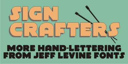 Sign Crafters JNL is a solidified version of the Deco-flavored Eckhardt Dualine JNL.