10,000 search results
(0.018 seconds)
- Belgravia by Scriptorium,
$24.00Belgravia is an Art Nouveau period design based on hand lettering from the 1890s. Like our popular Pantagruel font it has a lot of the elements which would influence later Psychedelic poster lettering in the 1960s. Very nice looking with a good weight for title designs. - Discotheque JNL by Jeff Levine,
$29.00 A 1930s casual Art Deco type style with as much influence in 1970s graphic design as in its day was found within the pages of the 1930s French publication L'Art du Tracé Rationnel de la Lettre. Discotheque JNL is available in both regular and oblique versions.
 - Brand X JNL by Jeff Levine,
$29.00 Brand X JNL is a retro-inspired Art Deco typeface with its name being derived from the generic label given to competitor's brands. Whenever a product wishes to extol its virtues without directly naming its competitors and thereby giving reverse publicity to them, "Brand X" is mentioned.
 - The Overcook by Arendxstudio,
$22.00 The Overcook is a free style font that has the characteristics of street art that shows freedom and is filled with unique characters Features : • Character Set A-Z • Numerals & Punctuations (OpenType Standard) • Accents (Multilingual characters) • Ligature • Alternate There it is! I really hope you enjoy it
 - Horror Hustle by Seemly Fonts,
$14.00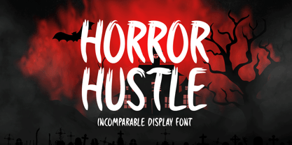 Horror Hustle is a casual display font. It is perfectly suitable for any Halloween-related project or crafty idea! The only limit is your imagination.
 - Clawmark by Putracetol,
$24.00 Clawmark - Strong Brush Font.The modern and powerful hand painted font you've been looking for. Each character is carefully crafted until the result is perfect. A lot of detail is preserved when characters are digitized, so uppercase looks fantastic up close Clawmark combines attractive curves with a fresh urban edge; delivering a stylish script which is guaranteed to add an eye-catching appeal to your story books, illustrations, comic books, t-shirts, posters, greeting cards, logos, branding, stickers, svg, crafting and all for display purposes. The alternative characters were divided into several Open Type features such as Swash, Stylistic Sets, Stylistic Alternates, Contextual Alternates, and Ligature. The Open Type features can be accessed by using Open Type savvy programs such as Adobe Illustrator, Adobe InDesign, Adobe Photoshop Corel Draw X version, And Microsoft Word. This font is also support multi language.
 - Meristmas by HansCo,
$17.00 Meristmas is a beautiful and sweet handwritten font. It is fresh, clean, and elegant. This font will look amazing in a great amount of projects, both formal and informal. Meristmas is the perfect font for making craft original and outstanding designs. Its casual charm makes it appear wonderfully down-to-earth, readable and, ultimately, incredibly versatile. You can also get alternate ornament / swashes in this font. Just type 0 - 9 and block one characters ( number ) / highlight and you can get alternate swash in here. If you use character Map please convert to .ttf format to get swash alternate. Comes with a full uppercase, lowercase, numbers and punctuation + standard multilingual support. It’s great for branding, logo designs, lettering, logotype, craft, posters, packaging and much more. We recommend using Adobe Illustrator or Photoshop. Tutorial how to Install & use Alternate / Special Character : https://hanscostudio.com/tutorial/ Enjoy!
 - Oxya by Nantia.co,
$24.00 OXYA Cyrillic Greek Handcrafted Font is a handwritten, multilingual display font. Of course, with this typeface you have access to Greek, Cyrillic and Extended Latin set of characters. With this fun font, you can achieve on the spot a real handmade aesthetic for your projects. The authentic handwritten style of this typeface is perfect for your modern graphic design needs. In addition, this messy handwriting font is the perfect addition for baby shower invitations or any craft project. Similarly, you can use it on Instagram quote posts or any other social media content. Not to mention that designing restaurant menus or any natural organic product packaging has never been easier with the help of the OXYA Handcrafted Font. Again, if you are a crafting aficionado this is the ideal scrapbooking font to have in your collection! Made with love with a fountain pen.
 - My Sweet Farmhouse by Mozatype,
$17.00 My Sweet Farmhouse is a sweet and quirky handwritten font. Its natural and unique style makes it incredibly fitting to a large pool of designs. Use this font for any crafting project that requires a personalized look! It is PUA encoded which means you can access all of the glyphs and swashes with ease! This font is ideal for crafting, branding, and decorates your any project. This font is perfect for wedding invitations or your blog. Also with their help, you can create a logo or beautiful frame for your home. Or just use it for your business, book covers, stationery, marketing, magazines, and more. Fall in love with its incredibly versatile style and use it to create spectacular designs! The only limit is your imagination! Thank you for purchasing this font. Please appreciate, if you like this. ENJOY it :)
 - Sellia by Scoothtype,
$9.00 "Sellia," a delightful handwritten font meticulously crafted with love and attention to detail. This font encapsulates the essence of joy and brings a touch of whimsy to your design projects. "Sellia" embodies the playful nature of handwritten script, with its charming curves and natural stroke variations. Every letter reflects the genuine warmth and sincerity of my handwriting, infusing your designs with a sense of individuality and happiness. With its elegant yet cheerful style, "Sellia" is versatile and perfect for a wide range of creative applications. Whether you're designing logos, branding materials, invitations, greeting cards, or any project that calls for a lighthearted touch, this font will add a touch of enchantment. The meticulously designed letterforms of "Sellia" ensure both legibility and artistic appeal. Its balanced proportions and thoughtfully crafted characters make it a pleasure to work with, whether on digital or printed mediums.
 - Kuryin by Twinletter,
$13.00 Introducing “Kuryin Font” – Where Playful Typography Meets Creativity! Unleash your design’s full potential with Kuryin Font, a lively and whimsical typeface that adds a touch of playfulness to your projects. Kuryin Font is your go-to choice for designs that need a fun and vibrant personality. Its unique, playful characters are perfect for children’s books, captivating posters, and standout branding that grabs attention. With Kuryin Font, your designs will instantly exude a sense of joy and creativity, drawing your audience in. Whether you’re crafting a cheerful invitation or crafting a memorable logo, this font infuses a playful spirit into your work. Elevate your creative projects and let your imagination run wild with Kuryin Font. Embrace the whimsical charm of this typeface today and watch your designs come to life! – PUA Encoded Characters – Fully accessible without additional design software.
 - Marioline Barnard by Asd Studio,
$14.00 Introducing my Marioline Barnard Script, a passionatly crafted fancy script. Marioline Barnard script fully meets my expectations for a script that gives you luxurious vibes as much as casual vibes, elegant but simple, strong but light vibes. Marioline Barnard comes with beautiful uppercase and lowercase alternates (up to 11 level alternates, ligatures include), and swashes. Marioline Barnard has Multilingual support (Western European characters) and works with following languages: English, French, Italian, Portuguese, German, Swedish, Norweigan, Danish, Dutch, Finnish, Indonesian, Filipino, and Malay. Marioline Barnard is modern script font, every single letters has been carefully crafted to make your text looks beautiful. With modern script style this font will perfect for many different project, example: invitations, greeting cards, posters, name card, quotes, blog header, branding, logo, book cover, fashion, apparel, letter, logotypes, wedding invitations, product labels, and clothing product, stationery and more. Thank you.
 - Break Parquet by Gassstype,
$22.00 Here comes our new font Break Parquet this is a Unique Display Font that is written casually and quickly.this a Authentic Style and classy style This font are handmade with unique font . Then crafted carefully drawn into vector format.this font is great for your creative projects such as watermar.k on photography, and perfect for logos & branding, photography, invitation, watermark,advertisements,product designs, stationery, wedding designs,label ,product packaging, special events or anything that need handwritting taste. That is a natural handwritten feel. This handmade font will make your design has a beautiful natural touch for each details. It is perfect for any design project as Invitation,logo, book cover, craft or any design purposes. That is why Break Parquet is strong characteristic more natural look to your text with a more modern look to your text.
 - PM Outpost by Paper Moon Type & Graphic Supply,
$17.00 Part pirate, part BBQ, all fun. Our new adventure inspired retro showcard font. Outpost was inspired by retro hand-lettered type used on vintage movie tiles, midnight movie posters, and pulp adventure magazines. But don't let that limit your creativity. Part pirate, part BBQ, all fun. Outpost is perfect for gaming titles, casual food packaging, and of course, Halloween projects.
 - Jugendstil Initials by HiH,
$16.00 Jugendstil Initials were designed by Heinrich Vogeler around 1905, based on the German blackletter tradition. A similar set of initials by Vogeler, but based on roman letters was released by Rudhardsche Geisserei of Offenbach at about this time. I believe the originals were woodcuts. The backgrounds to the letterforms may be seen as examples of Heimatkunst, an art movement within Germany that drew deliberate inspiration from the rural countryside. Like the Arts and Crafts Movement in England a little earlier, Heimatkunst may be seen, in part, as a romantic rejection of urban industrialization, while at the same time representing a back-to-roots nationalism. Like any river, it was fed by many streams. Jugendstil Initials is an experiment with which I am most pleased. It is far and away the most complex font HiH has produced and I was uncertain whether or not it could be done successfully. To oversimplify, a font is produced by creating outlines of each character, using points along the outline to define the contour. A simple sans-serif letter A with crossbar can be created using as few as 10 points. We decided to make a comparison of the number of points we used to define the uppercase A in various fonts. Cori, Gaiety Girl and Page No 508 all use 12 points. Patent Reclame uses 39 and Publicity Headline uses 43. All the rest of the A’s, except the decorative initials, fall somewhere in between. The initial letters run from 48 points for Schnorr Initials to 255 for Morris Initials Two, with 150 being about average. Then there is a jump to 418 points for Morris Initials One and, finally, to 1626 points for Jugendstil Initials. And this was only after we selectively simplified the designs so our font creation software (Fontographer) could render them. The average was 1678, not including X and Y. There was no X and Y in the original design and we have provided simple stand-ins to fill out the alphabet, without trying to imitate the style of the orginal design. We did a lot of looking to find a compatible lower case. We decided that Morris Gothic from the same period was the best match in color, design and historical context. We felt so strongly about the choice that we decided to produce our Morris Gothic font for the purpose of providing a lower case for Jugendstil Initials. The long s, as well as the ligatures ch and ck are provided. at 181, 123 (leftbrace) and 125 (rightbrace) respectively. This font was a lot of work, but I think it was worth it. I hope you agree.
 - Rosso by W Type Foundry,
$29.00 Rosso is a condensed geometric Sans with a retro style, inspired by various typographic styles. It features the Roslyn Gothic structure, which was popularly used for the covers of Philip K. Dick's books in the 1970s. Rosso has 10 variants from Ultra Light to Black with their respective Italics. In addition, it is divided into two Subfamilies, Normal and Alt. The normal one remains faithful to the proportions of Roslyn Gothic and classic geometric fonts, while the Alternative version expands its round shapes, generating a striking and unique rhythm and contrast, classic of Art Deco fonts. In addition, it has alternative glyphs and discretionary ligatures inspired by the work of Herb Lubalin, which add greater possibilities to face any design project. All this makes Rosso a font full of personality, striking and recognizable. Ideal for the construction of logos, eye-catching headlines, movie posters, volumetric posters, etc.
 - Juxta by NaumType,
$19.00 Juxta is a unique experimental and futuristic script. It was born from the idea to combine two antipodes: programming fonts aesthetics and handwritten script. Juxta has witty and jagged character combined with a perfect grid structure and certain decorative elements, such as cross out letters, that gives it the spirit of Nordic minimalistic design. Juxta script is a part of Juxta superfamily, united by the same aesthetics, which currently also includes Juxta sans. Juxta script is available in 7 weights, including Thin, Light, Regular, Medium, SemiBold, Bold, and Black. It is a potential leitmotif of graphic design projects that need a creative breakthrough, including logos, labels, branding, identity, website design, album art, posters, advertising. Juxta offers standard ligatures, contextual and stylistic alternates. It extends multilingual support to Basic Latin, Western European, Euro, Catalan, Baltic, Turkish, Central European, Pan African Latin, Afrikaans, and Basic Cyrillic for exceptionally far-reaching global accessibility.
 - Naive Sans by S&C Type,
$8.00 Naïve Sans is a sans serif handwritten font designed by Fanny Coulez and Julien Saurin in Paris. Our goal was to draw a font with finely irregular lines that give a human and whimsical feeling. We drew five finely balanced weights to assure a good readability whatever the size, with contrasting upstrokes and downstrokes to add an unusual, fancy touch. We also designed five shaked versions with different lowercases and uppercases, to improve your designs and bring a more organic and playful feeling. Mixed or not, both styles can be used for various purposes, such as headings, logos, posters, wedding invitations... This font is part of our Naïve superfamily that contains lot of variations: Line, Inline, Serif, Sans Serif, and a special Art Deco one. Just click on our foundry name to see them all! We hope you will enjoy our work. Merci beaucoup!
 - Melkslijter by PintassilgoPrints,
$29.00 With a stylish Dutch accent, this font draws inspiration from a 1935 brochure by the talented graphic designer and artist Dirk Hart. Carrying different hand-drawn lettershapes on upper and lower case slots despite being a unicase typeface, this font also brings a nice set of ornaments and complete sets of initial and terminal swash forms. When working with OpenType savvy applications these can conveniently be applied at the click of a button, thanks to the smart swashes programming, which will change the first and last letters in words with its corresponding initial or terminal forms. There are also some stylistic alternates for a (yet) more decorated look. The black version, with a somewhat art-deco feeling with added boldness, is also very decorative and contains the same features as the regular cut: smart swashes, different letterforms on upper and lowercase slots, ornaments and stylistic alternates.
 - Mixcoatl Mono by URW Type Foundry,
$19.99 The Typeface «Mixcoatl» by Elia Salvisberg was developed as a part of a course at the Lucerne School of Design and Art in 2016. Based on the book «The Empire of the Inca», a display-font has been created, which is inspired by the graphic language of the South American Empire of the Incas. At the beginning, only capital letters were designed but there was the desire for a complete typeface – which is why the missing signs were added. The font is based on a grid, so the characters are constructed equivalently and a uniform geometric font arose. The name was adopted from the god of hunting who plays an important role in the mythology of the Aztecs and appears in various forms. The uppercase letters can also be represented and combined in two alternative character-sets, so there are a lot of opportunities to combine uppercase words in different forms.
 - Naive Inline Sans by S&C Type,
$8.00 Naïve Inline Sans is a layered sans serif handwritten font designed by Fanny Coulez and Julien Saurin in Paris. Our goal was to draw a font with finely irregular lines that give a human and whimsical feeling. We designed three weights to assure a good readability whatever the size. They can be enhanced with five different interior patterns and three shadows to improve your designs and bring a charming and unusual feeling. To do so, you can simply superimpose the layers with a compatible software like Photoshop, the weight above and the pattern(s) below, then choose a color for each. This font is part of our Naïve superfamily that contains lot of variations: Line, Inline, Serif, Sans Serif, and a special Art Deco one. Just click on our foundry name to see them all! We hope you will enjoy our work. Merci beaucoup!
 - ALS Klinkopis by Art. Lebedev Studio,
$63.00 Yana Klink is an illustrator at Art. Lebedev Studio, whose works are often accompanied by lines of fancy text written in her own recognizable manner with long strokes and “beauty spots.” Once we needed to apply that style to a number of pieces of text, we decided to design a decorative script called Klinkopis. It comes in one weight (regular). Text set in Klinkopis looks best when arranged in waves, like the original. It is recommended to use large sizes—from 24 pt and up—and have no more than just a couple of lines that become an essential part of the artwork. Klinkopis is designed to use OpenType Contextual Alternates. To beautify your project even further, some characters can be manually replaced with their more intricate or plainer variations depending on the neighboring letters. Klinkopis features long descenders and ascenders, which requires large leading to avoid congestion.
 - Short Films by Dharma Type,
$19.99 Short Films is an all-new-styled family, which kind of looks like Art Deco Style. Wide opened counters and softly rounded bowls create a new feeling – Retro but futuristic, geometric but humanistic. Exquisite contrast between thin and bold parts of glyphs make mixed feeling – Pop and feminine, formal and casual, strong and soft. The most distinctive feature is a coexistence of decorativeness and Readability. This coexistence expands the range of font usage. You can use this font for not only titling but also body-text. Short Films consists of 6 weights and their matching Italics for a wide range of usages. Further, Short Films supports international Latin languages and basic Cyrillic languages including Basic Latin, Western Europe, Central and South-Eastern Europe. Also, Short Films covers Mac Roman, Windows1252, Adobe1 to 3. This wide range of international characters expands the capability of your works.
 - DEAD SECRETARY - Personal use only

- Kiperman by Harbor Type,
$29.00 🏆 Selected for Tipos Latinos 9. 🏆 Selected for the 13th Biennial of Brazilian Graphic Design. 🏆 Hiii Typography 2018 Merit Award. Kiperman is a text typeface designed in honor of Henrique Leão Kiperman, founder of the publishing house Artmed, now Grupo A. Its forms are simple and straightforward, with no unnecessary embellishments that could disturb the reading. The fonts are slightly narrower than normal, which yields higher efficiency without compromising reading comfort. Besides that, its italics are not just a slanted version of the romans, but rather a separate drawing. With a slope of 8°, its calligraphic structure provides the right amount of emphasis when necessary. The Kiperman typeface works best when setting books, magazines, ebooks and websites. It will also work very well in branding and packaging projects where a sober typeface is needed. The inspiration for the design came from the personality of the honoree. Just as Henrique always wanted to stay away from spotlights, the Kiperman typeface was designed so that it would not call attention to itself or impose any obstacles in the understanding of the text. In this way, the fonts revere Henrique’s legacy by respecting and honoring the published content. Henrique Leão Kiperman began his career in 1958, selling medical books in travels through the interior of the Brazilian states of Paraná and Santa Catarina. In 1973, he opened a bookstore in downtown Porto Alegre, the Artes Médicas Sul, and a few years later edited his first book. Since then, his company has grown to become one of the most important publishers in Brazil in the area of scientific, technical and professional books, with more than 2400 active titles distributed among the McGraw Hill, Bookman, Artmed, Penso and Artes Médicas imprints. Henrique passed away in 2017 at the age of 79. The Kiperman type family has been commissioned by Grupo A and is available for licensing. This was the way found for the fonts to be read by more people, spreading some of his spirit around the world.
 - Liga Sans by Linotype,
$29.99The German designer Alexander Dosiehn developed the Liga Sans type family as part of his graduate thesis at the Fachhochschule Düsseldorf in 2001. Liga Sans is a sans serif typeface that acts as a bridge between classical modern styles. Traces of pen forms and brush strokes can be seen mixed together with the most legible elements from grotesk-style faces in the alphabet’s letterforms. These features work together to create a style that works very in many sizes, including smaller ones! Liga Sans is an original, lively addition to the porfolio from Linotype suitable for text, magazines, and corporate identity work. - Baking Pastry by Illushvara,
$10.00 Baking Pastry embodies fun, quirkiness and authenticity. This handwritten font is the perfect fit for all of your logos, branding, social media, and crafty DIY projects.
 - Witchat by Rashatype,
$9.00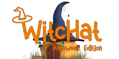 Witchat is a cool and spooky display font. It is perfectly suitable for any Halloween-related project or crafty idea! The only limit is your imagination.
 - Lemon Melon by RahagitaType,
$16.00 Lemon Melon is a cute & fun display font. This font is the perfect fit for all of your logos, branding, social media, and crafty DIY projects.
 - Bellatrix by Rockboys Studio,
$19.00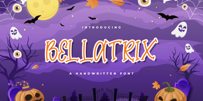 Bellatrix is a cool and spooky display font. It is perfectly suitable for any Halloween-related project or crafty idea! The only limit is your imagination.
 - RMU Belvedere by RMU,
$30.00 RMU Belvedere is a revival of Heinrich Wieyncks design, which was released by Bauer in 1906. The font was completely redrawn and redesigned, and comes with a long s, two framing elements and two tailpieces. Get the long s by typing [alt] + b or turn the round s into a long s by using the OT feature Historical Alternative. Start making the frame by typing [alt] + >, and continue with [alt] +
 - Theater Nouveau JNL by Jeff Levine,
$29.00 Sheet music from the 1911 stage production of the comic opera “The Enchantress” featured the hand lettered names of both the star and composer in a monoline Art Nouveau style. This sans serif type design is now available as Theater Nouveau JNL in both regular and oblique versions.
 - Roman Nouveau JNL by Jeff Levine,
$29.00 In the 1904 book “Letters & Lettering” by Frank C. Brown is a page of Roman style upper case letters entitled “Modern American Capitals – after Will Brady”. The slab serif, Art-Nouveau-influenced alphabet inspired a digital version. Roman Nouveau JNL, is available in both regular and oblique versions.
 - Celtic Spiral by Kaer,
$19.00 Hi! This is a new classic Celtic font. With spirals, knots and animals’ faces. СelticSpiral font is perfect for printing of graphic arts, posters, packaging and t-shirts. The font is presented in usual and color versions. Only uppercase letters from A to Z and numbers set (36 characters)
 - Weekend Plans JNL by Jeff Levine,
$29.00 A piece of vintage British sheet music from 1941 entitled “That Lovely Week-End” featured the song’s name in a bold Art Deco sans serif with rounded edges. This lettering design is now the digital type face Weekend Plans JNL, which is available in both regular and oblique versions.
 - Outdoor Cafe JNL by Jeff Levine,
$29.00 The movie poster for the 1937 film “Cafe Metropole” served as the basis for Outdoor Cafe JNL, which is available in both regular and oblique versions. The extra bold, stylized letter forms with their rounded corners typify the wide variety of typographic styles the Art Deco period offered.
 - Foreign Tourist JNL by Jeff Levine,
$29.00 A 1929 German travel poster had the caption “Wer schlafwagen reist spart zdeit und geld” (“Whoever travels in a sleeping car saves time and money”) hand lettered in an Art Deco sans serif style. This is now available as Foreign Tourist JNL, in both regular and oblique versions.
 - RMU Herkules by RMU,
$25.00 At the end of the 19th century, the fin de siècle, both Bauer and Berthold released ‚Herkules‘, a heavy Art Nouveau font for ads and posters. This font was carefully redesigned and makes it a great font in Jugendstil surroundings and a splendid partner of the Carlsbad font family.
 - Bumper by HVD Fonts,
$19.00 Bumper is the ideal ultra-black Sans Serif if you wanna make noise. The three widths could even be mixed in one single word, which creates a hand-made, edgy look. Bumper falls between glossy mags and poster art, and has a great effect when used for flyers.
 - Kallisty by Creaditive Design,
$12.00 Kallisty is a thin lettered and graceful script font. Fall for its ravishing style and use it to create gorgeous wedding invitations, beautiful stationary art, eye-catching social media posts, and your branding project! Kallisty is PUA encoded which means you can access all glyphs and swashes with ease!
