10,000 search results
(0.05 seconds)
- Praxis Next by Linotype,
$57.99 Praxis® Next has the same robust shapes and proportions as the original 1976 Praxis design. Its large x-height, substantial counters and open apertures guarantee high levels of legibility and reading ease in print and on screen. More weights, condensed designs and true cursive italics differentiate Praxis Next from the older design. Praxis Next shines where space is at a premium. The regular designs are modestly narrow while the condensed typefaces perform with grace in the most crowded of environments. The bold designs create powerful headlines and banners and the lighter weights are ideal for both long and short-form text copy. Because of its many weights and proportions, Praxis Next is also an ideal design to build a brand identity. Praxis Next Variables are font files which are featuring two axis and have a preset instance from Light to Ultra and Condensed to Roman. Pair Praxis Next with old-style designs like Bembo® Book and Stempel Garamond™ to create a dynamic typographic contrast. Or complement the design with its serifed counterpart, Demos® Next . Unger also drew ITC Flora® as an alternative italic design. Looking for something a little different? Pair Praxis Next with Masqualero™ .
 - TT Supermolot by TypeType,
$29.00 You are on the page of the old display version of the TT Supermolot font. In 2019, we released an entirely new, completely redesigned and significantly expanded version of the typeface called TT Supermolot Neue. In addition to 54 styles, TT Supermolot Neue has stylistic alternates, ligatures, old-style figures and many other useful OpenType features. Before you buy the old display version of the font, we suggest that you pay attention to the new superfamily TT Supermolot Neue and study it in more detail. - TT Supermolot Condensed is the narrow version of the TT Supermolot font family. Thanks to its open forms, TT Supermolot Condensed fits perfectly into any contemporary technological design and navigation systems. We've already seen this font family in the sports theme (as the main font for hockey teams branding), we've seen TT Supermolot as the main font inside the gameplay of a popular 3D-shooter. Information transfer in the high-tech areas is the ideal environment for this font family, also TT Supermolot Condensed fits well into army, space, and innovation themes. We've tried to create a maximum number of convenient weights (Thin, Light, Regular, Bold, Black) for you to be able to use this family anywhere, from mobile apps and web pages to big state fairs branding.
 - Tablet Gothic by TypeTogether,
$35.00 Graphic designers of any nationality and background know very well that the art of composing titles correctly is not easy, Especially when it comes to periodical publications where there is need for both flexibility and graphic coherence. Tablet Gothic was originally engineered as a titling type family, meant to help designers working on publications that require output as hard copies and a variety of digital platforms at the same time. As such, it is a grotesque sans serif that looks to the future of publishing with a clear understanding of its history, and reminiscences that go back to nineteenth century Britain and Germany. Tablet Gothic delivers the sturdy, straightforward and clean appearance expected from a grotesque, but it allows itself a good measure of personality to make it stand out on the page. Its 84 styles –six series of condensation and seven weights in each series plus obliques– guarantee that, whatever the publication format is, there's a Tablet Gothic font that will do the job and perform well both technically and aesthetically. Furthermore, the rounder styles, Tablet Gothic Wide, Normal and Narrow achieved amazing results at very small sizes, producing a beautiful texture and highly readable text blocks. Tablet Gothic fonts can be purchased individually, by series or as a complete bundle (best value!)
 - Thystle by Scholtz Fonts,
$25.00 Thystle is a "font for all seasons". It has six styles ranging from fine to in-your-face, from delicate mono-weight pen strokes to fully calligraphic lines, from delicate, narrow characters to bold, powerful statements. Characteristically, all the styles abound with Anton Scholtz's energetic "creative common" style - extravagant capitals, clear characters, and bursting-with-life swashes. Three Thystle styles are calligraphic. You can use: - Regular for invitations, poems, greeting cards and body text - Black for swing tags, music media, menus and sub-headings - Fat for posters, book covers and headings Three Thystle styles are monolinear. You can use: - Mono1, which is both delicate and condensed in width, for invitations, poems, greeting cards and body text - Mono2, which is of medium weight and condensed in width, for swing tags, music media, menus and sub-headings - Mono3, which is heavier and of standard width, for posters, book covers and headings. Opentype features include alternative upper case characters, as well as a number of ligatures. (These can be used in applications that access OpenType features.) Thystle contains over 283 characters - (upper and lower case characters, punctuation, numerals, symbols and accented characters for both Text and Display caps). It has all the accented characters used in the major European languages.
 - Big Vesta by Linotype,
$29.99Vesta™ was originally designed as an orientation and information system for the city of Rome, the birthplace of the roman alphabet. The forms are inspired by letterforms found on a frieze in the Vesta temple in Tivoli. Vesta has more contrast than the average sans serif but, like many of other designs of Gerard Unger, let in a lot of light - the letterforms are open, the counters generous. Relatively narrow and hence economical - without feeling too compressed - Vesta is an ideal solution for newspapers and magazines, and numerous other applications, including corporate identity and more. Big Vesta was intended as Vesta's display partner. However, it also performs very well at small sizes - its large x-height and short ascenders and descenders make it particularly economical, making it ideal when space is limited; for example on a mobile display. Vesta and Big Vesta are now available in seven weights - from Light to Black - and include everything necessary for setting extended texts well: italics, small caps, and a range of figures, including old style, lining, and tabular figures. All in addition, Vesta is available as a family of OpenType fonts with a very large Pro character set and supports most Central European and many Eastern European languages. - Bunday Slab by Buntype,
$22.50 The new Bunday™ Slab Font Family consist of three main states with different moods: the crisp and distinctive slab serif, the cute script styled italic and the matching upright italic. All states of Bunday™ Slab share the same contemporary, clear and open base forms and create a space-saving and pretty homogeneous text colour with good legibility. The font was manually hinted and contains extensive handcrafted kerning tables to ensure perfect appearance in all media. Bunday™ Slab ships with 9 standard, 9 upright italic and 8 italic styles from a considerable thin “Hair” to a pretty fat “Heavy” weight. It supports at least 99 languages and provides OpenType® features for ligatures, alternative glyphs, localised forms and more. Please take a look at the other members of the Bunday superfamily: Bunday™ Clean Bunday™ Slab Further information: Bunday Slab Specimen PDF Feature Summary: 9 weights: Hair, Light, Thin, SemiLight, Regular, SemiBold, Bold, ExtraBold and Heavy 3 Moods: Sans, Upright and Upright Italic Overall width: Narrow or Space-Saving Advanced “f” ligature set* “s” and “c” ligatures* Alternates Characters: a, ç, e, f, g, l, t, y and more* Capital German Esszett* Supports at least 99 Languages * Only available applications with advanced OpenType® support
 - Le Monde Sans Std by Typofonderie,
$59.00 Humanist sans in 8 styles Designed by Jean François Porchez, Le Monde Sans is a sanserif based on Le Monde Journal — a practice that become commonplace from early nineties. Designed originally in 1994 for the Le Monde newspapers, it was expended over the years to the large family we know today. Le Monde Sans features a “traditional g” in addition to the usual 1994’s g. Le Monde Sans is offered in numerous weights — in roman, italic to meet all kinds of situations. It will help designers to select the best weights depending their needs, from glossy paper printing to high resolution screen. Superfamily The design of Le Monde Sans continues the basic common structure found in the members of the Le Monde family: its proportions, a relatively narrow width, a fairly oblique axis, etc. The typographer can, at all times, switch between Sans & Journal or Courrier without any disruption in the composition. The verticals metrics and proportions of Le Monde Sans are calibrated to match perfectly others Typofonderie families. This family was designed in 1994 as bespoke typeface family for the French newspaper Le Monde. The family is not used any more by this newspaper from November 2005. Type Directors Club .44 1998 European Design Awards 1998
 - TT Squares Condensed by TypeType,
$29.00 You are on the page of the old display version of the TT Squares Condensed typeface. In 2020, we released an entirely new, completely redesigned, and significantly expanded version of the typeface called TT Octosquares. In addition to 73 styles, TT Octosquares has 3-axis variable version, stylistic alternates, ligatures, old-style figures and many other useful OpenType features. Before you buy the old display version of the font, we suggest that you pay attention to the new superfamily TT Octosquares and study it in more detail. - We've expanded the TT Squares font family and created a narrow version of the typeface. Just as its older brother, TT Squares Condensed fits perfectly for any engineering, military, and technological theme. The family is ideal for implementation in interior design, packaging design, creation of uniforms with inscriptions, and for logos and headlines. Fonts belonging to the TT Squares font family look manly and have a strong character that instantly tunes in the spectators and makes them perceive the information seriously. If we were to compare fonts to people’s professions, TT Squares Condensed would most definitely be a first-class technical engineer whose talented hands are adorned with calluses and machinery oil spots. TT Squares Condensed is optimized or web and mobile applications.
 - TT Supermolot Condensed by TypeType,
$29.00 You are on the page of the old display version of the TT Supermolot Condensed font. In 2019, we released an entirely new, completely redesigned, and significantly expanded version of the typeface called TT Supermolot Neue. In addition to 54 styles, TT Supermolot Neue has stylistic alternates, ligatures, old-style figures and many other useful OpenType features. Before you buy the old display version of the font, we suggest that you pay attention to the new superfamily TT Supermolot Neue and study it in more detail. - TT Supermolot Condensed is the narrow version of the TT Supermolot font family. Thanks to its open forms, TT Supermolot Condensed fits perfectly into any contemporary technological design and navigation systems. We've already seen this font family in the sports theme (as the main font for hockey teams branding), we've seen TT Supermolot as the main font inside the gameplay of a popular 3D-shooter. Information transfer in the high-tech areas is the ideal environment for this font family, also TT Supermolot Condensed fits well into army, space, and innovation themes. We've tried to create a maximum number of convenient weights (Thin, Light, Regular, Bold, Black) for you to be able to use this family anywhere, from mobile apps and web pages to big state fairs branding.
 - Termit by Ditatype,
$29.00 Termit is a striking display font designed with a game theme, featuring large letters with a fairly thick weight and a rectangular shape with sharp corners. This font shows large letters that demand attention and create a bold statement. The rectangular shape with sharp corners in Termit adds a sense of structure and stability to the font. The clean lines and defined angles create a visually bold and impactful appearance. This unique feature evokes a sense of strength and resilience, reflecting the competitive and strategic nature of the gaming world. Each character shares the same height and width, creating a cohesive and pleasing visual experience. With its low-contrast design, it offers a subtle and understated look. The minimal variation in stroke width adds a sense of uniformity and simplicity to the font, allowing the overall design to take center stage. This feature ensures that the focus remains on the content while still maintaining a strong visual impact. Enjoy the available features here. Features: Stylistic Sets Multilingual Supports PUA Encoded Numerals and Punctuations Termit fits in headlines, logos, posters, titles, branding materials, print media, editorial layouts, website headers, and any other game-themed projects. Find out more ways to use this font by taking a look at the font preview. Thanks for purchasing our fonts. Hopefully, you have a great time using our font. Feel free to contact us anytime for further information or when you have trouble with the font. Thanks a lot and happy designing.
 - ITC Werkstatt by ITC,
$29.99ITC Werkstatt is a result of the combined talents of Alphabet Soup's Paul Crome and Satwinder Sehmi, along with Ilene Strizver and Colin Brignall. It is inspired by the work of Rudolph Koch, the renowned German calligrapher, punchcutter, and type designer of the first third of this century, without being based directly on any of Koch's typefaces. Werkstatt has obvious affinities with the heavy, woodcut look of Koch's popular Neuland, but also with display faces like Wallau and even the light, delicate Koch Antiqua. Brignall began by drawing formal letters with a 55mm cap height, which Sehmi reinterpreted using a pen with a broad-edge nib. “Not an easy process,” says Brignall, “since one of the features of Koch's style is that while it was calligraphic in spirit, most of the time his counter shapes did not bear any resemblance to the external shapes, as they would in normal calligraphy. This meant that Sehmi could not complete a whole character in one go, but had to create the outside and inside shapes separately and then ink in the center of the letters.” The process was repeated, only without entirely filling in the outlines, for the Engraved version. Crome handled the scanning and digitization, maintaining the hand-made feel while creating usable digital outlines. “The collaboration of artisans with particular skills,” says Brignall, “in a modern-day, computer-aided studio environment, seems very much in step with the 'workshop' ethos that Rudolph Koch encouraged and promoted so much.” - Reiner Hand by Canada Type,
$24.95One of the earliest fonts published by Canada Type was Almanac, Phil Rutter's digitization of Imre Reiner's 1957 calligraphic typeface, London Script. In 2007, when the font was revisited for an update, it was shown that it too light for applications under 24 pt, and too irregular for applications over 64 pt. So the face was redigitized from scratch, using larger originals. This new digitization maintains a soft contour and, slightly darker and steadier stroke, and much better outlines for use at both extremes of scaling. Language support was also greatly expanded, and many alternates and ligatures were added to the redigitized character set. The name was also changed to Reiner Hand, to better reflect the origins of the design. Reiner Hand is soft and irregular jolts from a calligraphy master's hand. In a very Reineresque fashion, most characters include the one finishing stroke that makes professional calligraphers pause and ponder this additional touch to a letter's personality. Reiner Hand comes in all popular formats. The TrueType and PostScript versions come with 2 fonts, one of them loaded with alternates and ligatures. The OpenType version combines both fonts into one, and includes features for intelligent substitution in software that supports advanced typography. Language support includes Western, Central and Eastern European character sets, as well as Baltic, Esperanto, Maltese, Turkish, and Celtic/Welsh languages. - TT Ricordi Greto by TypeType,
$29.00TT Ricordi Greto useful links: Specimen | Graphic presentation | Customization options TT Ricordi Greto is the 5th project from the TT Ricordi collection of fonts, the main task of which is to find gems in old tablets and on stones and bring these inscriptions back to life in the form of contemporary fonts under the general name TT Ricordi. TT Ricordi Greto is Kseniya Karataeva’s original experimental project, inspired by a floor plaque dating from 1423 found in the Basilica di Santa Croce, Florence. When working on the typeface, we wanted to do something new and modern, but at the same time find details or artifacts in the source that could be exaggerated to the maximum. TT Ricordi Greto is a non-contrasting Florentine sans-serif with dynamic proportions and a hint on what would be serifs. The main features of the typeface are the closed aperture, dynamic proportions, and the combination of historical forms with modern visual solutions, flowing terminals with curling dash ends and flared ends, and subtle serifs that hint at the historical material. Another feature of the typeface is a large set of graphic icons (characters and objects), margin markers (flowers, stars and drops) and thirteen catchwords. All icons and spacing have been carefully selected and rendered in order to best match the visual plasticity of the font and interact well with it. The TT Ricordi Greto font family consists of 4 styles: Regular, Medium, Demibold + the Variable font. Each style includes 678 glyphs and 14 OpenType features. In addition to wide language support (extended Latin and basic Cyrillic), each style has two sets of figures and currencies (proportional and tabular), a set of arrows alternative versions of the letter M (flared and straight versions) and the letter Ф (round and oval) and the same a set of icons, margin markers and catchwords. TT Ricordi Greto OpenType features list: aalt, ccmp, locl, numr, ordn, tnum, pnum, case, ss01, ss02, ss03, ss04, ss05, calt. TT Ricordi Greto language support: Acehnese, Afar, Albanian+, Aleut (lat), Alsatian, Aragonese, Arumanian+, Asu, Aymara, Azerbaijani +, Banjar, Basque +, Belarusian (lat), Bemba, Bena, Betawi, Bislama+, Boholano+, Bosnian (lat), Breton +, Catalan+, Cebuano+, Chamorro+, Chichewa, Chiga, Colognian+, Cornish, Corsican +, Cree, Croatian, Czech+, Danish, Dutch+, Embu, English+, Esperanto, Estonian+, Faroese+, Fijian, Filipino+, Finnish, French, Frisian, Friulian+, Gaelic, Gagauz (lat), Galician+, Ganda, German+, Gikuyu, Guarani, Gusii, Haitian Creole, Hawaiian, Hiri Motu, Hungarian+, Icelandic+, Ilocano, Indonesian+, Innu-aimun, Interlingua, Irish, Italian+, Javanese, Jola-Fonyi, Judaeo-Spanish, Kabuverdianu, Kalenjin, Kamba, Karachay-Balkar (lat), Karaim (lat), Karakalpak (lat), Karelian, Kashubian, Kazakh (lat), Khasi, Kikuyu, Kinyarwanda, Kirundi, Kongo, Kurdish (lat), Ladin, Latvian, Leonese, Lithuanian+, Livvi-Karelian, Luba-Kasai, Ludic, Luganda+, Luo, Luxembourgish+, Luyia, Machame, Makhuwa-Meetto, Makonde, Malagasy, Malay+, Maltese, Manx, Maori, Marshallese, Mauritian Creole, Meru, Minangkabau+, Moldavian (lat), Montenegrin (lat), Morisyen, Nahuatl, Nauruan, Ndebele, Nias, Norwegian, Nyankole, Occitan, Oromo, Palauan, Polish+, Portuguese+, Quechua+, Rheto-Romance, Rohingya, Romanian +, Romansh+, Rombo, Rundi, Rwa, Salar, Samburu, Samoan, Sango, Sangu, Sasak, Scots, Sena, Serbian (lat)+, Seychellois Creole, Shambala, Shona, Silesian, Slovak+, Slovenian+, Soga, Somali, Sorbian, Sotho+, Spanish+, Sundanese, Swahili, Swazi, Swedish+, Swiss, German +, Tagalog+, Tahitian, Taita, Talysh (lat), Tatar+, Teso, Tetum, Tok Pisin, Tongan+, Tsakhur (Azerbaijan), Tsonga, Tswana +, Turkish+, Turkmen (lat), Uyghur, Valencian+, Vastese, Vepsian, Volapük, Võro, Vunjo, Walloon, Walser+, Welsh+, Wolof, Xhosa, Zaza, Zulu+, Belarusian (cyr), Bosnian (cyr), Bulgarian (cyr), Erzya, Karachay-Balkar (cyr), Khvarshi, Kumyk, Macedonian+, Montenegrin (cyr), Mordvin-moksha, Nogai, Russian+, Rusyn, Serbian (cyr)+, Ukrainian. - Erotique Sans by Zetafonts,
$39.00 Designed by Cosimo Lorenzo Pancini and Maria Chiara Fantini with the help of Solenn Bordeau, Erotique Sans is the sans serif version of Erotique: a typeface that evolved the original design of Lovelace mixing its romantic curves with the glitchy & fluid aesthetic of trans-modern neo-brutalist typography with the aim of creating a design that was feminine in an assertive and self conscious way. With its restrained, didonesque elegance, Erotique Sans is mostly thought for display use. Its high-contrast design is ready to take center stage in projects where a subtle elegance and an edgy, contemporary touch are required. All its weights (regular, medium, bold and monoline) have been paired with an Alternate version to give immediate access to a wide array of exotic alternate letterforms, available as Open Type Stylistic Sets in the standard family. For logo design and titling use Erotique Sans is paired by Erotique Flourishes, a set of whiplike fleurons that can not only be added to some letters, but also be used as interlocking patterns. For editorial use, since its high contrast requires big text size, the family is complemented by the Erotique Text weight that allows for longer text typesetting thanks to streamlined design, lower contrast and better readability. With a character set of over 500 glyphs, all the the weights of Erotique cover almost 200 languages using extended latin, and include advanced Open Type features as Stylistic Alternates, Standard and Discretionary Ligatures, Positional Numerals, Swash and Case Sensitive Forms. If you liked Erotique, you won't be able to avoid falling in love with Erotique Sans - the font that can't keep its serifs on...
 - Swily Bright by Jolicia Type,
$19.00 Say Hello to Swily Bright. Trendy, classy & modern style serif font for your fancy projects. Elegant, fashion and classic style on Swily Bright font will be great for any branding project. With 2 style Regular and Italic, alternates and ligatures will help you to create unique letters
 - The Spring by Sakha Design,
$14.00 The Spring is a romantic and sweet handwritten font. It looks astonishing on love letters, greeting cards, logos, business cards, and every other design which needs a personalized touch. This font is PUA encoded which means you can access all of the glyphs and swashes with ease!
 - Mundenge Rock by Holland Fonts,
$30.00Borrowed vernacular from African hair studio signs. manually drawn with drop shadow. Used first as cover and label lettering of a cd with music from Zimbabwe, and completed later as a full character set for the typographic issue 'National Typographica' of I-Juici Magazine, in South Afrika. - Beba by Eurotypo,
$28.00 Beba is based on geometric structures, where the same formal characteristics are applied to as many letters as possible. It is a sans-serif monoline typeface. It has a modern, clean and minimalist image; ideal to use for advertising, printed or digital graphics and signage system design.
 - South Paradise by Fikryal,
$18.00 South Paradise is a beautiful script font perfect for crafting, branding, invitation, stationery, wedding designs, social media posts, advertisements, product packaging, product designs, label, photography, watermark, special events, or anything. South Paradise with a full set of uppercase and lowercase letters, ligatures, multilingual symbols, numerals, and punctuation.
 - Hash And Beans JNL by Jeff Levine,
$29.00Sitting in a diner and looking upon a wall full of nostalgia, there hangs a picture of another older diner in some Northern city. The lettering from it's rooftop sign almost screams "Make a font out of this!"... so Jeff Levine did... "Hash and Beans JNL". - Hello Dark by Andrey Font Design,
$9.00 Hello Dark is a thick-lettered and spooky decorative font. It is perfectly suitable for any Halloween-related project or crafty idea! The only limit is your imagination. Hello Dark is PUA encoded which means you can access all of the amazing glyphs and ligatures with ease!
 - Pleasant Show Card JNL by Jeff Levine,
$29.00 A beautiful and stylish pen lettered alphabet appears within the pages of the 1921 publication “How to Write Show Cards” and its Art Nouveau stylings made it a perfect candidate for a digital revival. Pleasant Show Card JNL is available in both regular and oblique versions.
 - Margarita Ville NF by Nick's Fonts,
$10.00A whimsical monoline slab-serif font with understated elegance, based on lettering from an old ad discovered by a friend in Spain. Both versions of this font contain the complete Unicode 1252 (Latin) and Unicode 1250 (Central European) character sets, with localization for Romanian and Moldovan. - LD Old Country by Illustration Ink,
$3.00This old fashion font looks like it belongs on a saloon sign. If you've got old west style photos, finish up your scrapbook page with title and journaling done in this cool font. It's perfect for lettering on western themed invitations, newsletters, sign, flyers, even menus. - Citadel Script by Monotype,
$29.99Citadel Script is based on script handwriting and engraving used in formal announcements and invitations. The Citadel Script font lends itself to typesetting in which an elegant mood is desired. Citadel, Flemish Script, Florentine Script, and Old Fashion Script have similar lowercase letters, but unique flourished capitals. - Praitor by Scriptorium,
$18.00Praitor is based on a devotional inscription to the goddess Diana found a short distance from Rome in 1887. It is an early style from before 100 BC and has some characteristics of Etruscan lettering. It's a rough, strong font which works very well for distinctive titles. - Sweet Brownie by Yumna Type,
$16.00 Sweet Brownie is a elegant handwritten font. Made for any professional project branding. It is the best for logos, branding and quotes. Every letter has a unique and beautiful touch. Includes: Sweet Brownie (OTF) Features: Standard Ligatures PUA Encoded Multilingual Support Numerals and Punctuation by Yumnatype
 - Prospect by ParaType,
$25.00 PT Prospect™. An original serif family designed in 1997-2001 by Natalia Vasilyeva and licensed by ParaType. A face of wide proportions and free lettershapes. The serifs have slanted edges. Based partially on the hand lettering of the author. For use in titling and display composition.
 - Infrastructure JNL by Jeff Levine,
$29.00 A 1930s-era poster to "See America - Welcome to Montana" was issued by the United States Travel Bureau; one of the WPA (Works Progress Administrations) projects promoting travel and tourism within the country. The hexagon-inspired angular lettering on the poster provided the inspiration for Infrastructure JNL.
 - Brown Sugar by Muntab Art,
$18.00 Brown Sugar fonts includes uppercase letters, numerals, a large range of punctuation. Serif font with modern stylish style. Created for poster, web design, branding, illustrations, badges and some other works. Please contact us if you have any question, we are happy to help you! Thank you!
 - California Bound JNL by Jeff Levine,
$29.00 California Bound JNL is based on the hand lettering found on the side of the old California Zephyr passenger trains; the route now being a part of Amtrak. This somewhat unusual Art Deco design is more utilitarian than decorative, yet it still captures the "Streamline Era" perfectly.
 - Park Avenue Script by Linotype,
$29.99Park Avenue is a lighthearted contemporary script designed by Robert E. Smith in 1933 for American Type Founders. This unique design has small x-height lowercase letters with very long ribbon-like ascenders. Park Avenue is a good design for occasional pieces such as invitations and menus. - Radio Interference by Jeff Levine,
$29.00 The font Antique Slabserif JNL was run through a filter to create a design that looks like worn type at smaller settings or jaggedly distressed lettering in larger type heights. The end result is Radio Interference JNL, which is available in both regular and oblique versions.
 - Popy Jelly by Yumna Type,
$16.00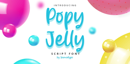 Popy Jelly is a elegant handwritten font. Made for any professional project branding. It is the best for logos, branding and quotes. Every letter has a unique and beautiful touch. Includes: Popy Jelly (OTF) Features: Standard Ligatures PUA Encoded Multilingual Support Numerals and Punctuation by Yumnatype
 - Solitude JNL by Jeff Levine,
$29.00 A piece of vintage sheet music with the hand lettered title "Solitude" is the namesake and inspiration for Solitude JNL. Purely Art Deco in its typographic curves and angles of the period, this typeface typifies the "Streamline" style that permeated designs of the 30s and 40s.
 - Chriselda by Fikryal,
$15.00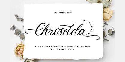 Chriselda is a beautiful calligraphy font perfect for crafting, branding, invitation, stationery, wedding designs, social media posts, advertisements, product packaging, product designs, label, photography, watermark, special events or anything. Chriselda comes with full set of uppercase and lowercase letters, swash alternates, ligatures,multilingual symbols, numerals and punctuation.
 - Cat Blvck by The Design Speak,
$100.00 Another experimental typeface by Marshall. This typeface is almost difficult to read but that is almost the point. It features words or almost enclosed circles as well as thick strokes around the letter forms. The font has an mysterious edge while providing shock to whomever views it.
 - Nombueang by Jipatype,
$17.00 Nombueang is an informal headline typeface with a bold appearance and loop-headed Thai letters, giving it a fun, friendly, and warm feeling. It is suitable for use in various media and is especially effective in emphasizing special importance, such as in posters, packaging, and more.
 - King of August by Tour De Force,
$25.00 King of August is single weight script font. Simple, elegant, designed letters with power to fit and lead any project. It is ideal for product names, labels, packages, King of August works well in titles and shorter paragraphs as well. Comes with Swashes as OpenType feature.
 - Amartha by Fikryal,
$15.00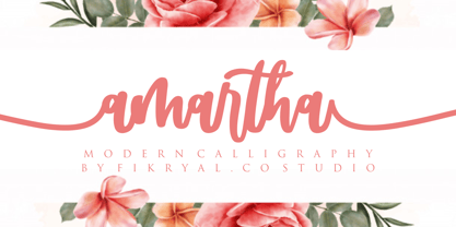 Amartha is a natural script font perfect for crafting, branding, invitation, stationery, wedding designs, social media posts, advertisements, product packaging, product designs, label, photography, watermark, special events, or anything. Amartha comes with full set of uppercase and lowercase letters, swash alternates, ligatures,multilingual symbols, numerals and punctuation.