5,484 search results
(0.23 seconds)
- Tasci Kufi by Abdullah Tasci,
$50.00Tasci Kufi is the today’s commentary of the minimalist comprehension of the geometric balance in the epigraphs of the Seljuk period. The typeface offers innumerable alternatives for the balance component needed for headlines and logotypes. - Muirne by Typomancer,
$20.00 Muirne, a cheerful semi-serif inspired by a Celtic calligraphy and figure. Font family contains from Light to Black weights and suitable Italic. With a dozen of alternates to enhance your typesetting with a Celtic touch.
 - BrushPenMK-Medium - Unknown license

- Boromir by GRIN3 (Nowak),
$19.00 Boromir is a hand-drawn, serif, layered, vintage font family. Each font features over 440 Glyphs, 5 Stylistic Sets, Standard and Discretionary Ligatures. The flow and vintage style works perfectly on invitations, blog headers, branding, art quote, posters, book cover and so much more! Language support includes Western, Central and Eastern European character sets, as well as Baltic and Turkish languages.
 - Lisboa Swash by Vanarchiv,
$45.00 Lisboa Swash is a display humanist sans-serif typeface and it was designed for big sizes purposes. The uppercase letterforms are much more decorative than the lowercase, but both contain hook-head terminals and few contrast. This typeface family contain stylish alternates characters which are more calligraphic than the main version. This typeface family has different encoding languages (Latin, Central Europe and Baltic).
 - Bridgewater by GRIN3 (Nowak),
$19.00 Bridgewater is a hand-drawn, brush font with contextual alternates to help with flow and readability. Each letter and number has three variations. When the font is used in OpenType-savvy applications, the 3 variants of glyphs are automatically alternated to achieve a random-like effect. Language support includes Western, Central and Eastern European character sets, as well as Baltic and Turkish languages.
 - Hostil by Intellecta Design,
$34.95Hostil is a modern typeface ready to fight for you. In any territory. Hostil has complete sets in Latin, Hebrew, Cyrillic, and Greek chracters. Plus Central European, Vietnamese, Baltic, Turkish complete sets with all diacritic signs and punctuation marks and extra characters belonging this ranges. Hostil has a wide variety of presentations, like Regular, Bold, Italic, Outline Wide, ExtraWide, Shadow and Compressed. - Maryland Bawlmer by Cititype,
$17.00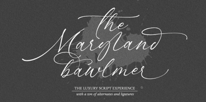 Maryland Bawlmer is a modern and luxurious calligraphy with a natural look. perfect for wedding invitations, calligraphy logos for branding, elegant websites, personalized gifts, social media posts, photography and more! Featuring 81 ligatures, 7 Alternate Set Styles (SS01-SS07) and Supports Western European, Central/Eastern European, Baltic, Turkish, Romanian Language Elegant, modern, luxurious, stylish and a natural touch blended in Maryland Bawlmer
 - Laramie by profonts,
$51.99 Laramie Pro is a new profonts script typeface family supplied in the OpenType Pro font format. The character set covers about 1,500 glyphs for the complete Latin character set (West, East, Baltic, Turkish, Romanian), and a huge number of handmade ligatures and stylistic alternates to make it a perfect OpenType Pro script. Laramie is a very distinguished, modern and versatile script font.
 - Madison Squared NF by Nick's Fonts,
$10.00Theater posters of the 1930s were often exuberant exercises in Art Deco lettering sensibilities, and the handiwork which inspired this typeface is no different. Big, bold and oddly elegant, this face is an excellent choice for enticing and commanding headlines. Both versions contain the complete Latin 1252, Central European 1250, Turkish 1254 and Baltic 1257 character sets, with several language-specific localizations. - Unjustified NF by Nick's Fonts,
$10.00 No secret here: this typeface was inspired by the opening credits for the television series "Justified." Alternate upper and lowercase letter to achieve the effect, or—in OpenType-savvy programs—activate the Contextual Alternates (calt) feature. Thin numbers can be found in these positions: ~^{}[]|\<>. Both versions of this font support the Latin 1262, Central European 1250, Turkish 1254 and Baltic 1257 codepages.
 - Telecomm NF by Nick's Fonts,
$10.00 This font is actually two different fonts. The uppercase mimics the typeface used once upon a time in Teletypes, and the lowercase is patterned after the face used during the first half of the twentieth century by Western Union for their telegrams. Both flavors of this font feature the 1252 Latin, 1250 Central European, 1254 Turkish and 1257 Baltic character sets.
 - Baltasar by GRIN3 (Nowak),
$22.00 Baltasar is a handwritten, brush script with ligatures and contextual alternates to help with flow and readability. Every lowercase letter has three variations. When the font is used in OpenType-savvy applications, the 3 variants of glyphs are automatically alternated to achieve a random-like effect. Language support includes Western, Central and Eastern European character sets, as well as Baltic and Turkish languages.
 - Derailer by Aerotype,
$29.00 Derailer’s eclectic character set is comprised mainly of disparate sans serif characters that claim to play well together. OpenType users also benefit from 52 ligature features that automatically substitute a unique pairing of letters when any upper or lower case character is keyed twice in a row. Derailer Pro extends the character set to support Eastern European Latin, Baltic, Greek and Turkish.
 - Jeremy by GRIN3 (Nowak),
$22.00 Jeremy is a handwritten, brush script with ligatures and contextual alternates to help with flow and readability. Every lowercase letter has three variations. When the font is used in OpenType-savvy applications, the 3 variants of glyphs are automatically alternated to achieve a random-like effect. Language support includes Western, Central and Eastern European character sets, as well as Baltic and Turkish languages.
 - Easter Parade - Unknown license

- Claridge by Monotype,
$29.99Claridge was designed by Adrian Williams and released in 1979. The lowercase g of the Claridge font has a distinctive central join to the loop. - Silk Script by Canada Type,
$29.95Silk Script is a revival and elaborate expansion of a 1956 Helmut Matheis script called Primadonna, which strangely remained a metal face and never made the leap into the film age. Silk Script has the unmistakable high contrast and elegance of formal scripts, yet both its majuscules and minuscules show much more complex and visually appealing art than traditional copperplate or Spencerian calligraphy. When set properly, it adds just the needed extra touch of artistic flair to designs that are not visually satisfying with the usual high-contrast elegant scripts. Silk Script comes in two styles, with the Alt font containing form variations on almost every letter, allowing for flexibility and precision in choice typesetting. Plenty of more alternates are available throughout the character sets of both fonts. Both styles also boast expanded character sets that include support for Central and Eastern European languages, as well as Baltic, Celtic, Esperanto, Maltese and Turkish. Silk Script Pro unifies both styles in one font, for 550 characters of sheer elegance and handy OpenType features including stylistic alternates, discretionary ligatures and class-based kerning. - 1456 Gutenberg B42 Pro by GLC,
$42.00 Is it necessary to tell the Gutenberg story? 1456 Gutenberg Pro is the second Gutenberg typeface produced by GLC foundry (look at our 1456 Gutenberg). This font was created from the so called "B42" character set used for the two Gutenberg Latin Bibles (42 and 36 lines), but with a better and finer design than in our first version, more faithful to the finest original printed books appearance. We offer also now a larger choice of the original ligatures and Latin abbreviations, as complete as possible to be usable with OTF specifications. The complete basic alphabet (with "long s" naturally)is strictly looking like the real one (including the curious twisted "X"). We have only recreated the capitals W and J, who was not existing in the time. The numerals, no more existing in the original type set, were inspired from those in use a few years later by early following printers, but matching with the Gutenberg font's pattern. The font includes West (including Celtic), East, Central European, Baltic and Turkish glyphs.
 - 1499 Alde Manuce Pro by GLC,
$42.00 This family was inspired by the beautiful roman font used by Aldus Manutius in Venice (1499) to print for the first time Hypnerotomachia Poliphili..., the well known book attributed to Francesco Colonna. Francesco Griffo was the punchcutter. The present font contains all of the specific latin abbreviations and other ligatures used in the original. The Italic style, carved by Francesco Colonna, the so called "Aldine" style, was inspired from various documents, all printed with this first Italic font. We offer the complete set of ligatures (about 60) we have been able to find, contained in the original font. In the two styles, we have made differences between I and J, V and U, to make easier a modern use. Added are the accented characters and a few others not in use in this early period of printing. The Italic style may be used as a complement to our 1470 Jenson Latin. The font contains all characters for West European (including Celtic), Baltic, East and Central European and Turkish language.
 - Donut - Unknown license

- Duel by Subversive Type,
$13.00 An epic battle between celtic and blackletter typography.
 - Roman Wood Type JNL by Jeff Levine,
$29.00 Roman Wood Type JNL is based on a partial set of wood type in the style of Clarendon Condensed that was seen in an online auction.
 - Nassim Latin by Rosetta,
$60.00 Nassim is a contemporary typeface for multilingual text-setting. With its lively texture and balanced rhythm, Nassim is a proven workhorse for a vast array of applications, from literature to the sciences, scholarly publications to contemporary news. Nassim Latin is stout in colour and resolute in its construction, standing up to the demands of long-form reading. But the heartiness that keeps it going is balanced with lively details: the asymmetric serifs and calligraphic modulation allude just enough to broad-nib flourishes to keep the reader alert and looking for what comes next. Nassim has always been ahead of the curve, bridging the distinct typographic traditions of Arabic and Latin without forcing the typographer into compromise. Nassim Latin offers upright and true italic styles across five weights, supporting more than 110 languages, and designed to pair harmoniously in multi-script settings with Nassim Arabic. Beyond that, it is equipped with smart OpenType features like small caps, case-sensitive punctuation, and a full palette of ranging numerals, fractions, and superior and inferior figures ensure that Nassim Latin is up to any task, be it print publications or delivering late-breaking online news.
 - Bricius by Typefactory,
$14.00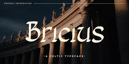 Bricius is a celtic style display font combined with a modern design, this font is modern, elegant and looks aesthetic. This unique display typeface is inspired by celtic styles. Use it for any design project that requires a personalized appearance!
 - GrekoDeco - Unknown license

- Zone23_zazen matrix - Unknown license

- QTSApril by QafType,
$30.00 April font was initially designed with a different style compared to other Arabic typefaces
 - Cadence by Elemeno,
$25.00Cadence was designed for a computer consulting company called Shamrock Solutions. The logo needed a Celtic font for the word "shamrock" that complimented the tech font used for the word "solutions." Most Celtic fonts didn't hold up well next to the tech font, which led to the creation of Cadence. Although inspired by Irish designs, Cadence is a sharp departure from traditional Celtic typefaces and in most contexts the inspiration isn't immediately obvious. - Epoch by Jonahfonts,
$25.00 A very graphic font with emphasis on legibility, dynamics and modern. Recommended for posters, titles, book covers, books, greeting cards, signage, packaging, invitations, magazine articles and advertising.
 - Snip Tuck by BA Graphics,
$45.00A well balanced distinctive look; great for all applications. - Rancho Grande by BA Graphics,
$45.00A well balanced distinctive look; great for all applications. - Nosta by Protimient,
$29.95Nosta is a modern text typeface. It was designed to be easily legible and therefore expressly suitable for setting sizeable lengths of continuous text such as magazine articles, books and essays. It achieves this through, amongst other things, finely balanced proportions, optimal character spacing and an adherence to predictable letter forms. Despite this, however, Nosta manages to retain a contemporary look and feel by using a variety of modern type design devices such as the efficacious wedge serif. The italic avoids using too many of the cursive elements that are often found in traditional italics and has only a modest slant, giving it a modern look that does not overly disrupt the text while still providing emphasis. While designed for continuous text, Nosta can also be used as a display face, making it a good all round typeface, suitable for many applications. - Merced by Latinotype,
$49.00 A fresh, curly and delicious sans serif. Designed by Daniel Hernandez, Merced is a sans serif font that can be given different uses due to its wide variety of alternate types. Its main virtue is the endless number of possibilities for you to write words, texts or paragraphs. Languages include: Basic Latin, Western European, Euro, Catalan, Baltic, Turkish, Central European, Romanian and Pan Africa Latin.
 - NATRON Rough by Posterizer KG,
$25.00 NATRON Rough is the textured version of NATRON (rounded and condensed sans serif), in two weights, medium and bold. It features stylistic alternates and ligatures. Both fonts support Latin and Cyrillic codepages for Western, East and Central European, and Baltic countries. Designed for tight-fitting text, NATRON Rough is great for display, branding, labels, packaging, advertising, food, sports, titles, and any other type of visual communication projects.
 - RM Almanack by Ray Meadows,
$19.00 Based on William Caslon’s design (c1720) which was itself based on Dutch Baroque typefaces. The old saying “when in doubt, use Caslon.” can now be updated ... “use RM Almanack instead!” Includes: Western European, Central European, Baltic & Turkish sets Due to the modular nature of this design there may be a slight lack of smoothness to the curves at very large point sizes (around 100 pt and above).
 - FP Head Pro by Fontpartners,
$29.00 Architectural yet human, as if the letter forms had been delicately carved in stone; their rounded stroke edges and corners lovingly eroded by the surf of the Baltic Sea; slightly overexposed, radiating comforting warmth, giving the impression one was looking at the characters against the setting sun. FP Head Pro reviewed by Yves Peters and Typographica.org: One of the most noteworthy typefaces for 2008.
 - Vintage Fonts Collection by GRIN3 (Nowak),
$15.00 Vintage Fonts Collection is a set of 18 hand-drawn fonts inspired by vintage ads, old newspapers and retro sign painting. Every lowercase letter has three variations. When the font is used in OpenType-savvy applications, the 3 variants of glyphs are automatically alternated to achieve a random-like effect. Language support includes Western, Central and Eastern European character sets, as well as Baltic and Turkish languages.
 - Morgow by Scriptorium,
$18.00Morgow is a decorative Celtic uncial font based on original hand lettering. It is similar to other uncial fonts, but the characters are embellished with traditional Celtic spiral designs. The font is appropriately named after a species of legendary Cornish sea serpent. - Radio Broadcast JNL by Jeff Levine,
$29.00 An interesting hand lettered sans serif type style with a “brush stroke” feel was used for various article headlines in the October, 1938 issue of “Radio Stars” magazine.


