10,000 search results
(0.107 seconds)
- Kobely by Partnrz,
$15.00 Kobely is a reproduction of a local broadcaster's real handwriting. My daughter thought her boss's handwriting was so neat and uniform, it would make a great font and asked if I would be willing to create it. I agreed. She had him write out all the basic characters, which he gladly did with both a standard ink pen and a Sharpie¨ marker. I then turned it into a three weight family, perfect for use on post-it notes, shopping and to-do lists - anywhere you need the natural feel of real handwriting. I created it in various weights to spare you from adding a stroke to make it bolder. Adding a stroke can often compromise the small details of a font. Kobely is designed to be readable in even the boldest weight!
 - Basting Brush by Stripes Studio,
$20.00 Basting Brush is a modern brush font, organic, dynamic and energetic sytle.Can used for various purposes. such as the title, signature, logo, correspondence, wedding invitations, letterhead, signage, labels, newsletters, posters, badges, etc. How to access all alternative characters, using Windows Character Map with Photoshop: https://www.youtube.com/watch?v=Go9vacoYmBw How to access all alternative characters using Adobe Illustrator: https://www.youtube.com/watch?v=XzwjMkbB-wQ Basting Brush Script is coded with PUA Unicode, which allows full access to all the extra characters without having special designing software. Mac users can use Font Book , and Windows users can use Character Map to view and copy any of the extra characters to paste into your favourite text editor/app. Thanks so much for looking and please let me know if you have any questions.
 - Hugtophia by Maculinc,
$18.00 This font creation is inspired by a fairy tale from a modern fantasy country but does not eliminate their culture, a country full of love and peace removes people's minds to commit evil. Hugtophia is a simple typography and easy to read so comfortable to wear. You can use them as logos, badges, badges, packaging, headlines, posters, t-shirts / clothing, greeting cards, business cards, and wedding invitations and more. The flowing character is ideal for creating interesting messages to your taste. mix and match a group of alternate characters to fit your project. It will be more interesting if you add swash. Alternate characters in this font are divided into several OpenType features such as Stylistic Alternate, Ligature and Ligature Alternates. Email support: maculinc@gmail.com Thank you! Maculinc
 - Matrixoid by Haksen,
$13.00 Matrixoid come with natural taste of letters. with the real hand done I created them, also additional variation in outline font to make good sensation feel. When you type with this font, I believe you will enjoy the sensation of the natural feel of this font, equipped with ligature and outline version features make the display even stronger for your projects such as posters, logos, advertisements, book covers and all brands for your requirement. I recommend for you to use photoshop or illustrator to make design with this font and let see when you will say WOW :) So what include when You want to use them ? OTF files Ligatures Numbers + Punctuation Non-English support Ligatures Please contact me if anything question, I'm glad to help :) Happy Designing, Haksen
 - Galactic Core by Thomas Käding,
$9.00 A clean and easy-to-read Aurebesh font, inspired by writing in the Star Wars (TM) movies and at Disney's Hollywood Studios (TM). Includes special characters for CH, AE, EO, KH, NG, OO, SH, and TH. If your software supports this feature, then these replacements are automatically made while you type. If you do not want to use them, and you are unable to disable the feature in your software, then please use the GalacticCore_NoSubs file. That file has automatic replacements disabled. It has a different font name, so both files can be installed at the same time. Also includes both styles of numerals, Sabacc dice faces, and card suits. We created this font to be used for typesetting books and stories. But feel free to use it for t-shirts, artwork, or whatever.
 - Claudium NB by No Bodoni,
$35.00Claudium started as an attempt to create a sans serif version of Garamond. As time went on it gradually became a meditation on the nature of French typography from Garamond to Excoffon. It was especially influenced by Cassandre's type for the Orly airport which seems to epitomize certain aspects of the French character�at least in typography. Attempts to create an italic met with disaster. Gradually, after lots of Cotes du Rhone, a cursive, based on Garamond�s Greek forms, emerged. It came at a time when I was looking at lot at Victor Hammer�s uncial and Andromaque cursive. So Claudium Cursive was developed as a lower case only and mated to the Claudium Regular caps ala Griffo�s original italic type. In keeping with the cursive lowercase there are cursive oldstyle numbers. - KillJoy by Comicraft,
$19.00 S P O I L E R A L E R T ! We don't want to be a drag, a wet blanket or a spoilsport, but we're here to tell you that everything before “but” is bulls*it! Yep, if you're a merrymaker, a carouser, a jester, a reveler or a live wire, we're here to poop your party with our latest knicker-twister, KILLJOY! Call us cynics, call us crabs, grouches, grumpy old men, sourpusses or bores, but we're the kind of Killjoys who just have to make some noise... sound effects (sic) everybody, so listen up even if you can't handle the truth... and here’s OUR truth; Keep Calm and be a Fabulous Killjoy! Yes, it’s easy to be mean -- but why should anybody else have all the fun? Or all the fonts?
 - Liebling by Font-o-Rama,
$25.00Liebling (in English: Sweetheart) was developed according to the sans serif font Mein Schatz with the purpose of having two typefaces which match perfectly. The contrast between thicks and thins was set very low. Just enough to contrast with same-weight Mein Schatz. One of the typeface’s characteristic features, also like its partner, is the availability of ligatures within an expert set. Liebling offers the characters sh, sp, st, ty among others and alternative letters for v and w. The majuscules of the expert set have curved elements allowing the designer to put the typeface to a highly individualistic use for displays and headlines. Another feature of the typeface are two different figure systems. In addition to the old style figures for use in continuous text, Liebling offers regular table figures within the expert set. - Roc Grotesk by Kostic,
$40.00 Roc is a sans serif grotesk inspired by American wood types from the end of the 19th century. With nine weights in five widths, this family contains 45 fonts in total. The character set supports Western and Central European languages, as well as Turkish. Roc Grotesk comes in a range of five widths: Compressed, Condensed, Normal, Wide and ExtraWide, in order to cover a wide scope of applications. Although the styles at both ends of each range are made in their most pronounced form in terms of width and weight, they are not taken to such extremes as to become absurd, and are quite usable in display settings. The Normal width keeps all its nine styles in proportionally similar widths. The Compressed width, however, is deliberately made to be disproportionate, so that every style takes the least possible horizontal space. That is why the contrast between Compressed Thin and Compressed Heavy style is substantial. As the weights progress from Thin to Heavy, the stroke contrast becomes more prominent. It is intentionally exaggerated in heavier weights, which is particularly apparent in the uppercase E and R of the Black and Heavy style. Roc has a large x-height and relatively short descenders and ascenders. No uppercase letter descends below the baseline, so the lines of an all-caps text can be packed tightly on a poster or a headline. The Regular style is somewhat generously spaced, as it is most likely to be used for setting longer passages of text. Its Bold counterpart is spaced in such a way that the width of the text column will be similar to the text set in Regular. Tabular figures in these two styles have exact matching widths, so for example, you could emphasize one row of numbers in a data column without visually disrupting the vertical order of the table. The lowercase g and r have alternatives to accommodate what most designers expect from a typical Grotesk typeface. The single-story g and the cut-off r are accessible via the OpenType feature.
 - Brotherhood by 38-lineart,
$19.00 The current trend is social media, friendship connection applications and personal web portfolios. This media is used to tell about existence, most people like to upload photos on social media networks, even for personal web portfolios, sometimes people prefer to see the side of daily activities rather than products which are offered. Photos are visual responses, and there are many stories that can be told from a photo. But it will look more interesting if it is added with captions. The very appropriate caption is a text in handwriting. This is what inspired us to create attractive handwriting for social media and networking. We started to do a little research to see the trends of this type of font. Here are some of our notes; 1. Texts are usually in the form of relaxed, non-connected handwriting. 2. There are several connected glyphs, usually by the letters 'o', 'i' and 'y'. And double letters like ‘ll’ and ‘tt’. We anticipate this by making ligature for common texts written concatenated. 3. For personal web portfolio needs, provide affirmation as a characteristic. So the first letter is usually in the form of uppercase which is more prominent than the lowercase rhythm. Prominent but still in proportion. So this is "Brotherhood", a handwritten font that you can use for personal brands, captions and even paragraph writing. Expand your friendship and make your business more closely to your customers as a "Brotherhood" with this font.
 - Lust by Positype,
$49.00 Lust’s original masters were completely redrawn, expanded, with a new optical size added based on customer requests. Lust now sports 6 fonts, instead of the original 4: Standard, Display, Fine, and complementing Italics. The character set has been expanded as well to include more OpenType features and more swashes. The Lust Collection is the culmination of 5 years of exploration and development, and I am very excited to share it with everyone. When the original Lust was first conceived in 2010 and released a year and half later, I had planned for a Script and a Sans to accompany it. The Script was released about a year later, but I paused the Sans. The primary reason was the amount of feedback and requests I was receiving for alternate versions, expansions, and ‘hey, have you considered making?’ and so on. I listen to my customers and what they are needing… and besides, I was stalling with the Sans. Like Optima and other earlier high-contrast sans, they are difficult to deliver responsibly without suffering from ill-conceived excess or timidity. The new Lust Collection aggregates all of that past customer feedback and distills it into 6 separate families, each adhering to the original Lust precept of exercises in indulgence and each based in large part on the original 2010 exemplars produced for Lust. I just hate that it took so long to deliver, but better right, than rushed, I imagine.
 - FM Bolyar Sans Pro by The Fontmaker,
$29.00 This is Bolyar Sans font family. For us it is a dream-come-true. It took more than 1 year hard work to transform the existing Bolyar Pro from Serif to Sans Serif version. The result really surprised even us from The Fontmaker and we decided to develop it in 9 instead of 7 weights. So at the end we created 7 different styles of Bolyar sans each consisting from 9 precise weights. Bolyar Sans is not just another font family in our portfolio - it is the essence from all our efforts thru the past 5 years to create a powerful type tool that could easily meet very diverse and complex demands of modern design. Furthermore, like all its predecessors, Bolyar Sans is a type concept created by Designers for Designers. If you are in wine and spirits industry, packaging design, or you just love to work with strong headlines that effortlessly could turn into brand logos, then you should definitely try our Bolyar Sans. It is designed for this. Of course there are plenty of different features like multilingual support, ligatures, alternates, we even added adaptive over- and underlining to make it even more complex in its use. Bolyar Sans pairs perfectly with other members of Bolyar Family - Pro , Ornate and Typecraft . So as you see Bolyar is developed as a type platform with own character and style. By using it you could be vintage, classic, modern, soft, even bold, rough and ornate. It is a visual bridge between different typographic periods united under Bolyar name. With our Sans version we aim to be contemporary and to provide powerful type tool to those designers who often love to swim between past and modernity.
 - Mochita Display by Sign Studio,
$15.00 Mochita Display is indeed a font made to give a fun, funny and cute impression. Even so, it still maintains good detail and balances the negative space. This font would be perfect for logo designs, titles, product names, labeling, or anything with a fun design theme.
 - Glossy Sheen by Ali Hamidi,
$10.00 Glossy Sheen is a shine layered font. A fun thick font with 4 layers of fonts to choose from! There are shine, shadow and outline that you can pick. This font is perfect for t-shirt, packaging, branding, posters, greeting cards, quotes and so much more.
 - Blasqer by Yoga Letter,
$25.00 "Blasqer" is a retro font that has a unique and elegant shape. This font is very easy to use because it has been specially designed. Equipped with uppercase, lowercase, numerals, punctuations and multilingual support. It is suitable for logos, invitations, certificates, awards, film titles and so on.
 - Great Lakes Shadow NF by Nick's Fonts,
$10.00Handlettering on a 1930s travel poster for the Canadian Pacific Railway provided the pattern for this distinctive Deco typeface. A strong dropshadow treatment has been added so you can create can't-miss headlines easily. Both versions of the font contain characters to support all major European languages. - Qallegro by Rochart,
$12.00 Qallegro typeface is original handcrafted font. Qallegro typeface is great for Branding, Logo Design, Lettering,Logotype, Clothing, Poster, magazine and other design project. Qallegro has 8 styles, one of which gives you the ability to change colors in one style, so that makes your design more amazing!
 - Fragment by Ali Güzel,
$9.00 The font is designed inspired by the pieces. While it is being designed, it is aimed to give a sharp feeling and look balanced rather than being legible. So on logos, T-shirts, and all things printed, this font can be used if the content is appropriate.
 - Pigalle Swing by Autographis,
$39.50 Pigalle Swing is a very elegant script from the 1950s which I found some time ago in a similar but not so elegant version on Place Pigalle in Paris. I designed lots of alternate capitals and lowercase letters to make the font more usable and interesting. Enjoy!
 - Paviljoen by Hanoded,
$15.00 Paviljoen (meaning Pavilion or Gazebo in Dutch) is an Art Deco typeface which was modeled on cast-iron lettering on some monumental buildings in Amsterdam. I only had a few glyphs to work with, so I designed the remaining ones myself. Paviljoen comes with extensive language support.
 - Burnin Water by Supfonts,
$18.00 Burning Water - a fun and modern marker font. Ideal for creating bright and catchy designs. Clear lines, dense structure, playful mood. Bold font for bold projects Language support: All European languages Don't forget to subscribe so you don't miss out on the new awesome fonts Dima
 - Rayters by skillyas studio,
$23.00 The Rayters is a Modern bold script. Rayters is handcrafted Carefully with smooth curves so this font is great for Branding, Logo Design, Lettering, Logotype, Clothing, Poster, magazine, and other design project. The Rayters Character Set : to see more of our work visit our website: skillyasstudio.com
 - Skull by Ake,
$18.00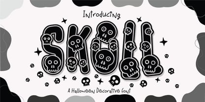 Skull Font is a captivating and Cute Halloween decorative font that adds a playful and enchanting touch to your designs. This delightful font features charmingly designed skulls with a whimsical twist, making it perfect for Halloween-themed projects, spooky invitations, eerie decorations, and so much more.
 - Oyster Lake by Olivetype,
$18.00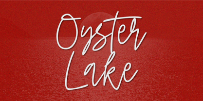 Oyster Lake is an elegant signature script font. This versatile script font has a wide spectrum of applications ranging from greeting cards, product branding to headlines and more. So what’s included : Basic Latin A-Z & a-z Numbers, symbols, and punctuations Ligatures Accented Characters : ÀÁÂÃÄÅÆÇÈÉÊËÌÍÎÏÑÒÓÔÕÖØŒŠÙÚÛÜŸÝŽàáâãäåæçèéêëìíîïñòóôõöøœšùúûüýÿžß Thank you
 - Adagietto by Hanoded,
$15.00 Adagietto is a musical term and means: ‘fairly slow’. I wasn’t in a rush to create this font, so the name kind of suits! Adagietto is a classic font, ideally suited for posters, book covers and product packaging - and just about everything that needs a classy look.
 - Hebrew Latino by Wiescher Design,
$39.50 Hebrew Latino was started out of frustration. I could not find a font that looked like Hebrew - actually I found one, but it had only capitals. So I decided to make my own. Strangely enough it looks a little bit Jugendstylish! Here it is. Shalom! Gert Wiescher
 - Wolf Paul by Olivetype,
$18.00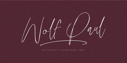 Wolf Paul is an elegant signature script font. This versatile script font has a wide spectrum of applications ranging from greeting cards, product branding to headlines and more. So what’s included : Basic Latin A-Z & a-z Numbers, symbols, and punctuations Ligatures Accented Characters : ÀÁÂÃÄÅÆÇÈÉÊËÌÍÎÏÑÒÓÔÕÖØŒŠÙÚÛÜŸÝŽàáâãäåæçèéêëìíîïñòóôõöøœšùúûüýÿžß Thank you
 - Montgrove by Surplus Type Co,
$9.00 Montgrove is a beautiful serif font that includes an extensive set of ligatures that's too long to list! Montgrove features large extended serifs that help make it a memorable display font. This font works really well for branding projects, editorial layouts, stationery & so many other projects.
 - Autoprom Pro by Stefan Stoychev,
$29.88 AutopromPro is a modern sans serif display font with a geometric touch contains 24 styles. It comes in 6 weights and its matching rounded and italics. The Thin weight and Black Rounded Italic is a free of charge, so you can use them to your projects.
 - Deltarbo by Aah Yes,
$16.00Deltarbo is a medium-heavy sans-serif typeface that is designed primarily for great legibilty in graphics and display situations, with clean lines and a modern "rounded-rectangle" feel. Please note that this font is not intended to be formal, the characters are ever so slightly casual. - Walanor by Konstantine Studio,
$10.00 Jump back to the retro vintage vibes with WALANOR. A bold, casual, and fun display font. Inspired by the visual trends of so-called retro and vintages from the 80s era. We talk about disco, pop culture, vinyl records, sign painting, magazines, posters, labels, and many more.
 - Megatura by Haksen,
$19.00 Megatura is a Bold elegant modern vintage with upper and lowercase feel nice balanced curves. This font is inspired by lettering from couple of the good talent artist, but it still has a strong modern appearance. Its wide range of stylistic alternates allows versatile design options and works perfectly for headlines, logos, posters, packaging, T-shirts, postcards and much more. Font Features : Regular and Italic version Character set A-Z Stylistic Alternates & Ligatures Numerals & Punctuation Accented Characters Multiple Languages Supported Recommended to use in Adobe Illustrator or Adobe Photoshop with opentype feature. How to access Alternate Characters? Open glyphs panel : - In Adobe Photoshop choose tool Window > glyphs - In Adobe Illustrator choose tool Type > glyphs If you have questions, just send me a message and I'm glad to help Have a great day Haksen Std
 - Today - Unknown license

- Moho by John Moore Type Foundry,
$40.00 Moho is a broad family of types inspired by the burgeoning modernism of the early twentieth century. Moho introduces an unconventional style in the form of his glyphs which aims to impregnate the text compounds thus a distinctive aesthetic sobriety and elegance while creating a flow of practical reading. The Moho family consists of a wide range of various weights. Thought for innovative text composition, Moho covers all shades of Medium, Regular, Light, ExtraLight to delicate Thin. Moho has a square shape letter style, provided with a competent OpenType programming for Moho OT family and basic functions for Moho Std family. Among the family characteristics OT has features such as small caps for letters and numbers, stylistics alternates, swash letters where "t" is extend over others, giving the typeface that particular style ideal for headlines, ligatures for pairs and triplets of letters, fractions and ordinals. In addition, each comes with its weight set italics. Moho has a character set to compose texts in European languages of east and west with over 600 glyphs. Moho is a letter in resonance for general topics like sports, art. technology trends, fashion, tourism and transport. There exist two groups of Moho Family OT = Full OpenType Features and full set of glyphs Std= Basic OpenType Features and less glyphs
 - Deltras by Abbasy Studio,
$17.00 Deltras is handmade modern vintage display typefaces, which is combining the style of classic typography with an modern handlettering style. The font have smooth edges to make vintage printing, so it will bring a handdrawn classic look feels. It easily cooperating together and perfect for creating the traditional style logos, labels, package design, lettering for t-shirts and much others. There are more than 355 glyphs in the font including Stylistic sets, Contextual Alternates etc. OpenType features with Stylistic Alternates, Contextual Alternate in some characters that allows you to mix and match pairs of letters to fit your design.
 - Garvis Pro by James Todd,
$40.00 Inspired by both turn of the century neoclassical forms and Dutch Fleischmann Type, Garvis is designed to bring the character of those typefaces into more modern times by increasing the sturdiness of the forms without losing their character. At display sizes, this typeface displays the subtle inconsistencies commonly found in traditional metal type printing. This detail is designed to virtually disappear at text size so as not to become distracting while still giving the text a warm, human quality. Garvis includes support for all contemporary (and many historic) Latin orthographies as well as complete IPA support.
 - Alegros by Letterara,
$16.00 Alegros is a stylish and elegant serif font. It is suitable for a wide variety of designs due to its neat and clean style. Incredibly versatile, this font fits a vast pool of designs, elevating them to the highest levels. Comes with some alternates and ligatures, so you can combine them to make a perfect typography design. It is ideal for your upcoming projects. Such as luxury logo and branding, classy editorial design, magazines, Packaging, poster, movie, cosmetic brand, fashion promotions, art gallery branding, and more. This font is PUA encoded which means you can access all of the glyphs.
 - Shyest by Twinletter,
$12.00 Shyest is a handwritten typeface that has a dramatic, natural feel to it. This typeface is ideal for your unique projects, particularly those that demand a human touch; of course, this font is the answer to all of your amazing projects! This font is designed with a natural touch of handwriting which is refined to create a portion and composition that suits your needs. So this font is suitable for craft, children’s writing, adventure posters, food banner titles, wedding invitations, product packaging logos, quotes, social media page covers, furniture banner headlines, book covers, and much more.
 - Natural Curves OG by Kingpin Designs,
$9.00 'Natural Curves OG' is a friendly typeface that works seamlessly without any trimmings. It's perfect for giving any work a hand-drawn look and feel. The typeface is balanced so the eye doesn't move straight to any singular letter, which means that creating a hierarchy with other elements in your design is simple. Colour blocking to support brand identity is easy with this typeface, and it adds character simply and authentically. This typeface was created for my own brand's identity, and it's been great to add splashes of art in the form of type all over my website and collateral.
 - Tokyo Geisha by Kitchen Table Type Foundry,
$15.00 My wife was watching ‘Memoirs Of A Geisha’ the other day, and I am going to take my son Sam to see Japan in May this year, so when I started drawing out the glyphs for this font, the name was already chosen! Tokyo Geisha is a handmade brush font. I made it with Chinese ink and one of the Chinese brushes my late father in law gave me. Tokyo Geisha is a font with speed and a certain flamboyance. It comes with extensive language support and a cool .notdef glyph. I am sure you will put it to good use! Arigato Kozaimasu!
