8,492 search results
(0.039 seconds)
- Art Lesson JNL by Jeff Levine,
$29.00The hand-lettered title of a vintage Walter Foster "how to draw" book inspired the Deco-influenced alphabet of Art Lesson JNL. Bold and retro in nature, this typeface gets the message across in a straightforward way, yet still has a bit of a casual feel to it. - Eilis by Agnieszka Ewa Olszewska,
$25.00 Another modern, fun, and experimental display font in my library. Looks like made with a strong gesture. A bit constructive with cursive elements. Contains 2 uppercase sets, and some extra characters. You can play with them and mix them at your will. Contains European languages diacritics and punctuation signs.
 - P22 Chatham by IHOF,
$24.95 Chatham is part of the "Staunton Script Family" of fonts designed by Ted Staunton for his historic novel centered around a family bible and the handwritten annotation through 7 generations. The Chatham font is overtly crooked and has an extreme right-leaning slant—perhaps we should call it "Cheney".
 - Tired Sunday by Bogstav,
$18.00 Ever been tired on a Sunday? I have...and actually that was the feeling I had, when I started making this font. Nevertheless, when working on this font, my Sunday just got a whole lot better! Hope it'll make your Sunday (or any other day!) good as well! :)
 - Andovai by Eurotypo,
$39.00 Andovai, a modern Roman cursive family, fast and slightly aggressive as today's Rome, deriving its name in Roman dialect of the phrase "Ma 'ndo vai...", the meaning of which in Italian is "Dove vai?" (Where are you going?) ... in a game to define a current and irreverent gestural typography.
 - Attomi Gilbert by Motokiwo,
$16.00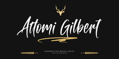 Organic handwriting gesture from a cool brush that useful for multipurpose projects. This is Attomi Gilbert, an elegant script font with passionate handmade feels in each characters. You can use it for vintage or urban projects style. Features: Ligatures Swashes Access All Alternates Special Characters (Multilingual) PUA Encoded
 - Palmilla by RodrigoTypo,
$25.00 Palmilla is a very gestural Sans font that contains 7 fonts (Thin, Light, Regular, Medium, Bold, Black as well as a set of dingbats, it is perfect for informal or children's titles, it contains many Alternatives such as Ligatures, to have more options at the time of writing.
 - Harpo by Elemeno,
$25.00Harpo is a naturally condensed font, better at large sizes. Harpo Wide is a more versatile version of the same font. Part of The Algonquin Collection, Harpo was named for occasional Round Table member, Harpo Marx. Light, narrow and discreet this font brought to mind the silent Marx brother. - Display Prominent by Gerald Gallo,
$20.00 Display Prominent is a display font not intended for text use. It was designed specifically for display, headline, logotype, branding, and similar applications. In place of a lowercase there are short caps that are centered horizontally on the tall caps. There are also short numbers, punctuation, and miscellaneous characters.
 - Mares by Alex Camacho Studio,
$24.00 Mares is an unicase typeface inspired by the American psychedelic movement from the mid 1960’s where capitals and lowercase used to be mixed and distorted to become part of the image. Mares is a bold and modern psychedelic font for use on special occasions. The bigger the better.
 - Bouclettes by JBFoundry,
$19.50 Bouclettes is a decorative typeface family with funny and original serifs. It creates a casual and playful vibe to your documents : magazines, brochures, flyers, advertising, greeting cards, logotypes. The combination between the two weights and italics is very interesting to work with Bouclettes. It looks better in large sizes.
 - P22 Grenville by IHOF,
$24.95 Grenville is part of the Staunton Script Family of fonts designed by Ted Staunton for his historic novel centered around a family bible and the handwritten annotation through seven generations. The Grenville font is a graceful Italique hand similar in style to the classic designs of Arrighi's Operina.
 - Waylom by Eurotypo,
$26.00 Waylom is based on 19th century letters written in calligraphy. These writings had some glyphs of a height higher than the others, which together with the flowing lines, the elegant curves and the flourishes, gave it a very interesting rhythm and a lot of personality. Using this font you will achieve a very elegant, and warm style. This font is slim, feminine, friendly and sexy. Waylom includes a wide range of latin languages, 720 glyphs with many stylistic variations, initial forms, swashes and ligatures, which you can mix and match to achieve a more interesting effect. I separated the highest glyphs to create Waylom Pro, to which I added some very useful ornaments to improve its possibilities, with a total of 823 glyphs. Waylom is very versatile and is ideal for high-end logos, magazines and book covers, fashion, headlines, cards, posters, websites, and packaging.
 - Siren Script by Canada Type,
$49.95 Siren Script takes its cue from BB&S's Stationers Semiscript (metal, 1899) and its countless imitations/inspirations from throughout the 20th century, particularly a variety of uncredited film faces from the 1960s. What makes this kind of script stand out in the genre is its mixing of flourished majuscules with mostly subdued, traditional minuscules. The result is a balance between formal and informal lettering, as if the letterer is applying his or her learned art without going into full-throttle calligraphy. The message is clearly and gracefully delivered, and the artistic endeavor is fully appreciated without causing coronaries. The Siren Script family comes in four full fonts, and a fifth one that contains alternates, ending letters, and some ligatures. Siren Script Pro combines all five fonts into a single one of over 880 characters, which includes programming for push-button stylistic alternates, class-based kerning, and other glyph palette conveniences.
 - Tanger Serif by Typolar,
$72.00 Inspired by New Transitional and Egyptian fonts, Tanger Serif has elements of a sturdy work-horse text face and finely detailed headline font. A wide variety of widths and weights support many text sizes. Typically Narrow is used in headlines, Medium in body and Wide in smaller print. Nothing is predefined, though. By combining the right widths with the right weights this traditional approach can easily be challenged. Let’s take an oversized (over 10 pt) body copy for instance. In conjunction with using a bigger size to enhance readability, a narrow and slightly lighter weight will save space and brighten text color. Tanger Serif Narrow is a slim normal rather than a condensed face. As an Open Type “Pro” font each weight includes an expanded character set, small caps, old style figures, tabular figures, ligatures, fractions etc. All these are easily accessible through OpenType features.
 - Brioso by Adobe,
$35.00Brioso Pro is a new typeface family designed in the calligraphic tradition of the Latin alphabet. Brioso displays the look of a finely-penned roman and italic script, retaining the immediacy of hand lettering while having the scope and functionality of a contemporary composition family. Brioso blends the humanity of written forms with the clarity of digital design, allowing designers to set pages of refined elegance. Designed by Robert Slimbach, this energetic type family is modeled on his formal roman and italic script. In the modern calligrapher?s repertoire of lettering styles, roman script is the hand that most closely mirrors the oldstyle types that we commonly use today; it is also among the most challenging styles to master. Named after the Italian word for ?lively,? Brioso moves rhythmically across the page with an energy that is tempered by an ordered structure and lucidity of form. - FF Nort Headline by FontFont,
$50.99 The FF Nort™Headline is the ideal companion to the already released FF Nort typeface family. It is open, inviting, highly legible, strikingly handsome and a comfortable performer on screen and in print. As a powerful display type tool, it is perfect for headlines, navigational links and banners. OpenType® Pro fonts of FF Nort Headline, have extended character sets that support most Central European and several Eastern European languages – including Greek and Cyrillic. Graphic communicators will also benefit from the additional ligatures, and suite of symbols and signs. FF Nort’s designer Jörg Hemker has a background in corporate and governmental design and has received a variety of awards for his work – including the prestigious German Red Dot Design Award. He works as a freelance graphic and branding designer and is a lecturer in type and typography at the University of Applied Science in Hamburg
 - Moonlight And Wine by The Gelato,
$12.00 The Moonlight & Wine Font is a Handwritten Monoline Font that is perfect for the Neon effect! It can be used as a Neon Handwritten Script Font, Monoline Script Font, Signature Script Font, Summer Handwriting Font, Neon Party Font, Neon Signboard Font, Neon Banner Font, Neon Font for Party Invitations, DJ Logo Font, Y2K Neon Font, Neon Sign Font, Neon Light Font, Neon Wedding Font Perfectly suitable for numerous use such as quotations, banners, logos, product packaging, titles, headers, Business cards, menu lists, and invitation cards! _________________________________ Language Support: Multilingual Support _________________________________ **The preview images are to showcase fonts only and are NOT included.** **The Font comes with a solid version. To add a NEON effect, You can use programs like Canva, Illustrator, Photoshop etc.** _________________________________ 🍦COMPATIBLE PROGRAMS (NOT LIMITED TO): Canva Pro, GoodNotes, Notability, Keynote, Pages, Numbers, Procreate, Photoshop, Illustrator, Cricut, Silhouette, InDesign, Microsoft Word, and more! ++ _________________________________
 - Opal by Linotype,
$29.99 Opal Pro is a text family designed by Hannes von Döhren in 2008. It gives every text a noble character. The typeface has long ascenders that clearly rise above the capital letters and a low x-height. Opal’s letters sport inktraps at stroke junctions, which on one hand create a cutout feeling and on the other hand strengthens the image in larger point sizes. In total, the letterforms have clear emphasis on their verticals and horizontals; they do not fear the weight on their curves. In addition to the Italic and Bold, the Opal type family includes a Script face, whose letterforms include connections, similar to handwriting. On top of that, the typeface possesses swash letters for italic and script, small caps, many ligatures and borders & ornaments. With a little bit of care, designers will be able to create the finest of traditional, elegant work with this family.
 - Archie by Canada Type,
$39.95 Archie is a wide attention-grabber based on a simple geometric alphabet drawn in the early 1930s by Dutch calligrapher and lettering artist Martin Meijer. This digital family expands considerably on the original letters, adding biform shapes, small caps, italics across the board, and support for many Latin-based languages. Archie's eye-catching forms are meant for clear, seamless and strong message delivery. In its upright styles, strong vertical strokes emphasize the sense of confidence and importance, and in its italics, that emphasis is further affirmed by a natural sense of urgency. This kind of alphabet is perfect for display typography aiming at the glance-and-go crowd. When used properly and placed prominently, no eye can escape it. The basic Archie family is comprised of six basic fonts, while the Pro set combines all three uprights in one font and all three italics in another.
 - East by Tarallo Design,
$22.99 East is a simple and confident typeface. It is timeless and current, but with a subtle nostalgia of vintage Jazz albums, film credits, newspapers, and signage. The light weight has excellent legibility at small sizes. The Extra Bold weight will capture attention. Its condensed width allows a lot of text in little space. East is versatile, but would be a good choice for film titles, labels + packages, posters, publications or any design where space is limited. It has six weights between Light and Extra Bold. A variable font with weight and slant axes is available and included in a full family purchase. The OpenType features include; stylistic sets, a one story ‘a’, hooked letters, seriffed uppercase I and 1, a slashed zero, raised colon and punctuation (Spanish), several German eszetts, ligatures, diverse bullets, and vertically stacked pre-built fractions. It will support western and central European languages as well as other Latin-based written languages. Read on if you are not familiar with variable fonts. What makes a variable font special is that all font weights are inside of one file and you can incrementally control the width and italic slant between Light (300) and ExtraBold (800). These changes are commonly made with slide controls in the font/type palette of the software. Variable fonts are also smaller in file size, which benefit both web and software performance. Currently variable fonts are supported by Adobe, Sketch, Corel Draw, and most web browsers. Check for your software support here: www.v-fonts.com/support.
 - Gryffensee by Catharsis Fonts,
$30.00 Gryffensee is designed to be the Futura of blackletter, combining the time-honored gravity and relentlessness of the Gothic script with the clean, contemporary freshness of the geometric sans. Built from a tightly controlled inventory of lines, arcs, sharp cuts, and OpenType features, Gryffensee was born and raised in the digital age, yet retains the powerful charisma and human warmth of its mediaeval blackletter ancestors. As a result, it excels in a wide range of display settings, logotypes, and short text. Unlike most conventional blackletters, it even handles all-caps usage with grace, and includes an extensive Cyrillic character set (in the Pro version). Apart from a generous range of automatic ligatures and contextual alternates, Gryffensee offers stylistic alternates that allow users to customize its appearance to their tastes. The capital letters |AGHIKZ| come in alternate cuts that trade traditional shapes for increased legibility, while the letter |s| appears in three cuts, each with a unique, distinct flavor. All these options are accessible through OpenType stylistic sets in the main Latin font, Gryffensee Eins. For easy use in applications without OpenType support, we provide two additional Latin fonts (Gryffensee Zwei and Drei) in which these options replace the default cuts. Finally, Gryffensee Pro offers all the functionality of Gryffensee Eins, plus Cyrillic support. My intention to devise a contemporary geometric blackletter was inspired by four hand-painted letters, |ABCD|, in Sasha Prood�s online portfolio. I later found out that he had, in turn, taken those letters from an existing font, Bastard, by Jonathan Barnbrook. Luckily, by that time my project had taken on a life of its own. Gryffensee is an original design that bears only the most superficial resemblance to Bastard. Gryffensee is a mediaeval spelling of the lake Greifensee near which I grew up. It is pronounced [?gri?f?n?se?], or "GRIEF-un-say" in English approximation. This font is dedicated to Simone.
 - Biblia by Hackberry Font Foundry,
$24.95 This all started with a love for Minister. This is a font designed by Carl Albert Fahrenwaldt in 1929. In the specimen booklet there’s a scan from Linotype’s page many years ago. They no longer carry the font. I’ve gone quite a ways from the original. It was dark and a bit heavy. But I loved the look and the readability. This came to a head when I started my first book on all-digital printing written from 1994-1995, and published early in 1996. I needed fonts to show the typography I was talking about. At that point oldstyle figures, true small caps, and discretionary ligatures were rare. More than that text fonts for book design had lining OR oldstyle figures, lowercase OR small caps—never both. So, I designed the Diaconia family (using the Greek word for minister). It was fairly rough. I knew very little. I later redesigned and updated Diaconia into Bergsland Pro —released in 2004. It was still rough (though I impressed myself). In 2006, I found myself needing a readable sans serif. So I went to Bergsland Pro, and eliminated the serifs. I named the font Brinar. I kept a flare in place for the serifs and cupped the ends. I was stunned. People loved it. It’s remained my bestseller until very recently. So, at the end of 2016 I decided that Brinar really needed some help. The flares were basically random. The stem width and modulation variances all needed to be fixed. My old OpenType feature code was quite limited and clumsy. So, I created the 6-font Biblia family. I cleaned up or redesigned all the glyphs. I updated the fonts to the 2017 set of features: small caps, small cap figures, oldstyle figures, fractions, lining figures, ligatures and discretionary ligatures. These are fonts designed for book production and work well for text or heads.
 - Masqualero by Monotype,
$50.99 The Masqualero™ family is a versatile solution for a deep and broad range of applications. In large sizes, the heavier designs are dark and handsome, while the lighter weights are charming and friendly in text copy. Thanks to its many variations and distinctive demeanor, both print and interactive designers will find that Masqualero expands their creative options, while setting the perfect tone to catch and hold readers’ attention. It’s About the Design Like the legendary jazz song of the same name, Masqualero is haunting and sophisticated. Drawn as a tribute to Miles Davis, its letterforms are as beautiful as his “Masqualero” composition. “I approached drawing the letters as if they were marble sculptures,” Says Jim Ford about his typeface. “Many sharp, black, modern sculptures filling a large park. All of them created with the same qualities – the flair of Miles' electric funk and rock sounds, the sparkly smooth finish and serifs like trumpet bells, the sweet lyricism and the tone and clarity of Miles’ horn.” What’s Available With six weights and italics, in addition to Stencil and Groove display designs, Masqualero is available as a suite of OpenType Pro fonts, providing for the automatic insertion of small caps, ligatures and alternate characters. Pro fonts also offer an extended character set supporting most Central European and many Eastern European languages. Thoughts About Use A book or album cover set in the Masqualero design sends a message: what’s inside is of value. Like jazz, the Masqualero typeface takes ordinary basic concepts and slips them into something special. Readers take notice and immediately recognize that what they’re viewing is a cut above – and radiates quality. “I see Masqualero as a luxurious typeface for exquisite typography,” says Ford. “I wouldn’t use it to sell toys or hot dogs. Masqualero sells diamonds, boats, real estate and champagne.” Perfect Pairings Antique Olive™ Neue Kabel® Neue Frutiger® Quire Sans™ Trade Gothic®
 - Code Next by Fontfabric,
$39.00 10 years later, one of the first geometric typefaces in our portfolio and a popular favorite of yours is rising to a whole new level! We’re revealing the stand-alone type family Code Next—a staggering evolution from Code Pro in functionality, versatility, and application. The transformation includes 6 new weights, 10 new Italics, full support of Extended Cyrillic and Greek, full redesign and glyphs refinement, 2 variable fonts, to name but a few. Going back to 2011, the grotesque-inspired Code Pro was designed to complement memorable pieces that make a statement. Balancing between stylization and simplification, it was encoded with the distinct voice of basic organic shapes to stand the test of time. Little did we know, it would expand and live up to the potential of a “font from the future” as the new Code Next. Today, a type family of 22 styles, this geometric sans solidifies its relevance and carries a strong constructive aesthetic through simplified forms with a twist. These fit any modern design in print, web, and display visualization. Developed to go above and beyond, Code Next comes prepared for multi-script projects with Extended Latin, Extended Cyrillic, and Greek. Explore Code Next’s versatility and switch things up with the help of 2 variable fonts, more than 1280 glyphs, and an extensive OpenType features set including small caps, standard and discretionary ligatures, contextual and stylistic alternates, stylistic sets, case sensitive forms, and much more. Overview: • Font family of 22 fonts • 10 weights • Languages - Full support of Extended Latin; Extended Cyrillic; Greek • Entirely refined design and metrics • Glyph count - 1288 • Variable fonts - 2 fonts OpenType features: • Small Caps • Standard Ligatures • Discretionary Ligatures • Contextual Alternates • Stylistic Alternates • Stylistic Sets • Case-Sensitive Forms • Ordinals • Localized Forms • Lining Figures • Proportional Figures • Tabular Figures • Oldstyle Figures • Subscripts • Scientific Inferiors • Superscripts • Numerators and Denominators • Fractions • Roman figures • Extensive mathematical support • Navigation symbols
 - Avenir Next by Linotype,
$97.99 Avenir Next Pro is a new take on a classic face—it’s the result of a project whose goal was to take a beautifully designed sans and update it so that its technical standards surpass the status quo, leaving us with a truly superior sans family. This family is not only an update though, in fact it is the expansion of the original concept that takes the Avenir Next design to the next level. In addition to the standard styles ranging from UltraLight to Heavy, this 32-font collection offers condensed faces that rival any other sans on the market in on and off—screen readability at any size alongside heavy weights that would make excellent display faces in their own right and have the ability to pair well with so many contemporary serif body types. Overall, the family’s design is clean, straightforward and works brilliantly for blocks of copy and headlines alike. Akira Kobayashi worked alongside Avenir’s esteemed creator Adrian Frutiger to bring Avenir Next Pro to life. It was Akira’s ability to bring his own finesse and ideas for expansion into the project while remaining true to Frutiger’s original intent, that makes this not just a modern typeface, but one ahead of its time. Complete your designs with these perfect pairings: Dante™, Joanna® Nova, Kairos™, Menhart™, Soho® and ITC New Veljovic®. Avenir Next Variables are font files which are featuring two axis, weight and width. They have a preset instance from UltraLight to Heavy and Condensed to Roman width. The preset instances are: Condensed UltraLight, Condensed UltraLight Italic, Condensed Thin, Condensed Thin Italic, Condensed Light, Condensed Light Italic, Condensed, Condensed Italic, Condensed Demi, Condensed Demi Italic, Condensed Medium, Condensed Medium Italic, Condensed Bold, Condensed Bold Italic, Condensed Heavy, Condensed Heavy Italic, UltraLight, UltraLight Italic, Thin, Thin Italic, Light, Light Italic, Regular, Italic, Demi, Demi Italic, Medium, Medium Italic, Bold, Bold Italic, Heavy, Heavy Italic. Featured in: Best Fonts for PowerPoints
 - Archive Garamond by Archive Type,
$59.99Archive Garamond is a typeface roughly based on the designs of Claude Garamond (ca. 1480 – 1561), a French publisher and a leading typeface designer of that period. Garamond’s influence on type design is reflected in many typefaces that are today known under different commercial names. While the majority of contemporary digital interpretations of the “Garamond types” are cleaner and more polished versions of that genre, Archive Garamond tries to keep the rough nature which was typical in the early days of printing. Archive Garamond has a rather unique, distinctive temperament which is even more emphasised with the preserved non-uniformity, such as irregular glyph shapes or a variable baseline. Although Archive Garamond was clearly made to be used for display sizes it works surprisingly well in text. Archive Garamond is availale in three versions, each containing approximately 600 glyphs (in Pro versions). Archive Garamond Pro A Professional version of the typeface contains all glyphs, including the advanced typographic forms, such as different sets of figures, small caps, swashes, historical forms, etc. The font also enables full use of the OpenType features. It fully supports the languages listed in the language list. Archive Garamond Std A Standard version of the typeface is meant to be used for the basic typographic work. It typically contains the most common glyphs. The standard figures are proportional lining. Besides kerning this version does not contain any advanced OpenType features. A Standard file type fully supports the languages listed in the Language list. Archive Garamond Exp An Expert version contains glyphs that are supposed to be used in advanced typographic works. This type of file contains uppercase and small cap glyphs with the proportional oldstyle figures as the default set. Besides kerning this version does not contain any advanced OpenType features (all OTF features have to be replaced manually). An Expert file type fully supports the languages listed in the Language list. - Birthday by Canada Type,
$34.95What do you imagine the ideal casual invitation font would look like? It has to be cheerful, inviting, legible, creative, and loads of fun. But first and foremost, it has to look like real handwriting. Fonts seeming like real handwriting are always a major task, and although Canada Type already has plenty of fonts that solve the “looks like handwriting” issue in a variety of ways, we're once again raising the bar a little higher with this one. Birthday is a massive package that crosses the traditional font/handwriting solution of 2-letter ligatures and waltzes into the land of 3-letter combinations. Plenty of them, too! The complete Postscript and True Type versions of Birthday ship with no less than five separate fonts full of nothing but ligatures. And for even more realism, an alternates font is also included in the package, for a total of seven fonts of happy handwriting that can be used anywhere and everywhere personalization is of importance to a layout. For layout artists with advanced typography tools that take advantage of the power of OpenType, Birthday Pro is a wunderkind. All the individual letter alternates are accessible through the Stylistic Alternates feature, the 2-letter ligatures through the standard Ligatures feature, and the 3-letter ligatures via the Discretionary Ligatures feature (for the technically inclined: this includes a nice liga-to-dlig crossover, where the maximum number of possible ligated letters is automatically chosen at the push of a button). If you enjoy using OpenType, Birthday Pro is definitely for you. If on the other hand you like your fonts in Postsript or True Type, it is advisable to keep a character map handy while using Birthday. You will need it to take advantage of the many, many alternates and ligatures distributed over the fonts. The next time someone asks you for the perfect casual invitation font is, look no further. And as usually is with Canada Type, quality fonts are more affordable than ever. - Begin Play by Yumna Type,
$12.00 The better your font, the better the result of your design will be. That’s a fact. Begin play is a font duo made from combination between script and serif font style you can mix, match, and call your own. The script style has a cute touch that is well pair with the elegant serif font. This font duo maintain the readability even at small sizes. In this package, you can also get illustrations as special extra. Features: Stylistic Sets Ligatures Multilingual Supports Numerals and Punctuations It is suitable for branding, logos, social media quotes, stickers, posters, vintage designs, wall art, merchandise, social media, and many more. Get more inspiration by seeing the preview. Thank you for purchasing our premium fonts! Happy Designing!
 - Renneal by Nathatype,
$29.00 The better your font, the better the result of your design will be. That’s a fact. Renneal is an uppercase font that comes in duo (serif and display) version. The unique strokes/curves at the particular part of the character give the serif style artistic vibes. On the other hand, the display version expresses more simple and clean looks than the serif. Overall, Renneal designed to be easy to read and works best in header/title text. Features: Alternates Swashes Multilingual Supports Numerals and Punctuations It is suitable for branding, logos, social media quotes, stickers, posters, vintage designs, wall art, merchandise, social media, and many more. Get more inspiration by seeing the preview. Thank you for purchasing our premium fonts! Happy Designing!
 - Point Of Sale JNL by Jeff Levine,
$29.00 Point of Sale JNL is a specialty font for producing retro-style price cards, tags, stickers, labels and similar items. Within this design are a large set of numerals and two smaller sets of numerals. Both of the smaller sets are centered against the larger ones with one set also having underscores. In addition, there are a number of price card designs provided for those who want a truly nostalgic feel to their price marks. The layout of Point of Sale JNL breaks down as follows: A through J = 1 through zero in large numbers K = a decimal point L = dollar sign M = cents sign N through Z = various price cards a through j = small centered numbers k through t = small numbers with underscores
 - Marking Stencil JNL by Jeff Levine,
$29.00 With electronics taking over virtually every aspect of manufacturing, packaging and shipping, it's almost difficult to envision a time when wooden crates were marked for identification by using brass stencils. Many of these stencils were hand-cut or manufactured with special punches that perforated the brass sheets with pre-formed letters and numbers. One such stencil was the design model for Marking Stencil JNL.
 - Caslon Antique by Linotype,
$40.99 Caslon Antique was designed by Berne Nadall and brought out by the American type foundry Barnhart Bros & Spindler in 1896 to 1898. It doesn’t bear any resemblance to Caslon, but has the quaint crudeness of what people imagine type looked like in the eighteenth century. Use Caslon Antique for that “old-timey” effect in graphic designs. It looks best in large sizes for titles or initials.
 - Old Union by Mysterylab,
$18.00 Old Union is a unique and creative modern font that is eye-catching and versatile. Elements of the design strongly reference Cyrillic typefaces of the early Soviet era, but with a distinctly modern look. Excellent for many uses including posters, banners, and logos. This design straddles the line between Didone-style elegance and vintage agit-prop. There are two variations in this package: Regular and Oblique.
 - Maccaroni by URW Type Foundry,
$39.99 David Kowalski’s typeface Maccaroni is based on a logo type and has been designed to a complete typeface in Prof. Veljovic’s Type Design course at HAW Hamburg. Maccaroni breaks the traditional brush scripts and offers a unique design. Each letter is present in triplicate in order to achieve the illusion of a hand-written typeface. The OpenType programming ensures that two identical letters won’t follow each other.
 - PAG Sottoterra by Prop-a-ganda,
$19.99Prop-a-ganda offers retro-flavored fonts inspired by lettering on retro propaganda posters, retro advertising posters, retro packages all the world over. This is perfect font for your retrospective project. PAG Sottoterra is heavy and high-contrast font, and you can see triangles in some letters. This font reminds us of old posters of science fiction movie. It works best for for display or titling. - Apres by Font Bureau,
$40.00 David Berlow and staff drew Apres as part of a series designed originally for the Palm Pre smart phone, for use both on the device and in print marketing. Simple, open letterforms and generous proportions provide a clear, comfortable, and inviting experience for navigation and readability. The plain-spoken geometry is regular and balanced, without being static or mechanical, for a friendly and forthright familiarity; FB 2008
 - Osgard by Anthony James,
$25.00 Osgard is a powerful luxurious Typeface, adopting the fluid curvaceous elements of Romanesque typography and combining them with the Gothic style of Blackletter. Forging the two creates a far softer, more versatile, fashion-based typeface; with beautifully distinct qualities. 1000 swashes, pre-made Conjunction Ligatures, Stylistic Alternates, Discretionary Ligatures, Contextual Alternates and all the OpenType features you need, make it perfect for any application.
 - Soup and Salad JNL by Jeff Levine,
$29.00 Within the 1893 edition of the Barnhart Bros. & Spindler type specimen book is “Bisque”, a text and headline type face with a charmingly eccentric look. Some upper case characters take on more of a squarer look than others, while the lower case has a higher ‘x’ height. This type revival is now available as Soup and Salad JNL in both regular and oblique versions.
 - PAG Club by Prop-a-ganda,
$19.99Prop-a-ganda offers retro-flavored fonts inspired by lettering on retro propaganda posters, retro advertising posters, retro packages all the world over. This is perfect font for your retrospective project. PAG Club is a condensed font with a funny and retro character. The features of the typeface is in unusual figures of unbalanced characters. Ideal font to all kinds of retro design project.