10,000 search results
(0.029 seconds)
- The Monster by Maulana Creative,
$10.00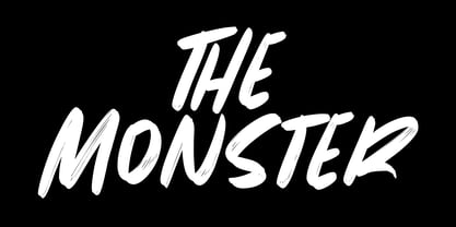 Give your designs an authentic brush handcrafted feel. The Monster is perfectly suited to signature, stationery, logo, typography quotes, magazine or book cover, website header, flyer, clothing, branding, packaging design and more.
 - Scripio C by AType,
$24.95This font from the same family as Scripio A and Scripio B. The truth it more likely their cousin, very much it is not similar to them. Though looks not so bad. - Molga by Creativemedialab,
$18.00 Molga is a modern and elegant sans serif font. It has a lot of stylistic alternates to create unique and beautiful words for Logos, headlines, Invitation cards, Wedding logo, and many more.
 - Manohara Pro by BBA Key,
$17.00 Introducing Manohara Pro Family, a new modern font. Manohara Pro is perfect for stationery, logos, t-shirts, paper, print designs, website headers, photo frames, leaflets, music covers, posters, image sliders and more.
 - Kellvin by AEN Creative Studio,
$14.00 Kellvin is a fun and friendly display font, that can easily stand out. Simple but with a strong visual effect, this font will instantly make your creation more appealing than any others.
 - Amoba by Linecreative,
$16.00 Amoba is a very thick slab-serif font type. This font has supported supporting languages: Latin Western Europe and also comes with uppercase, lowercase, and ligature, So it gives design without limits
 - Narrow Nouveau JNL by Jeff Levine,
$29.00 Narrow Nouveau JNL come from the hand lettered title on a 1907 song folio for George M. Cohan's "The Talk of New York", and is available in both regular and oblique versions.
 - Mykonos by Deniart Systems,
$20.00 A geometrical, modern, angular design inspired by the Greek Key. It's complex yet simple, creating smooth, continuously flowing print. This font is well suited for headlines, posters, greeting cards, and much more.
 - Pleasing Moment by Seemly Fonts,
$14.00 Pleasing Moment is a striking display font. It is perfectly suited for stationery, logos, t-shirt, paper, print designs, website headers, photo frames, flyers, music covers, posters, image sliders, and much more.
 - TXT Groovy Smooth by Illustration Ink,
$3.00Add some retro personality to scrapbooks, greeting cards, invitations, announcements, signs, and more. The round, thick lines of Groovy Smooth lend a playful 70s feel to the letters of this cool font. - Lights Of Athena by Epiclinez,
$18.00 Lights Of Athena is a bold and smooth stylish script font. It's fun and casual, but demanding attention. Very suitable for headlines, titles, magazines, packaging, branding, apparel, adverts, logos, apps, and more.
 - Maya Month Glyphs by Deniart Systems,
$15.00 Contains the 19 months of the Maya solar year (in outline and silhouette mode) as well as the 19 Maya numerals. NOTE: this font comes with an interpretation guide in pdf format.
 - Gold&Song by Letterena Studios,
$17.00 Gold&Song is a modern and classic serif font that has its own unique style. This typeface is perfect for luxury logos, books, fashion brands, magazines, apparel, quotes, and so much more.
 - Classical by Elemeno,
$10.00Classical has the look and feel of a simplified old English Swash font, but it's much more legible. It was created for use as drop caps and has a limited character set. - Tropical Nature by Skinny Type,
$15.00 Tropical Nature is a smoothie handwritten font perfect for your boho and farmhouse designs! This font is perfect for signs, shirts, wedding, home decor, branding, blogs, logos, invitations and more! Thank you!
 - Rounded Sans Wood JNL by Jeff Levine,
$29.00 Examples of a wood type alphabet for letterpress are the basis for Rounded Sans Wood JNL. Clean and bold, the rounded ends give a softer, more informal look to any display copy.
 - Orange Leaves by Crumphand,
$9.50 Orange Leaves Fresh Fonts. This font is very unique shape. Comes with some ligature make your graphic looks fresh. Perfect Contour, Easy to read. What's Included ? Uppercase Lowercase Symbols Numerals Multilingual Support
 - Overnight JNL by Jeff Levine,
$29.00 Hand lettering on the cover of the 1932 sheet music for "Sleep, Come On and Take Me" was the basis for Overnight JNL, which is available in both regular and oblique versions.
 - Amateur Lettering JNL by Jeff Levine,
$29.00 From a vintage textbook on "modern" lettering circa the 1930s or 1940s comes a simple chamfered sans with oddly irregular shapes. Amateur Lettering JNL is available in both regular and oblique versions.
 - Zentenar Fraktur - Unknown license

- Motor Mouth by T4 Foundry,
$31.00Motor Mouth provides racy type, oozing of high octane gasoline and selfconfidence. Designer Martin Fredrikson CORE, graffiti artist turned typeface designer and car paint expert, combines his sense of speed with raw power lettering. Sloped and cocky, Motor Mouth is an original design in the great tradition of Nascar and Indy 500 and makes you think of roaring muscle cars and hot asphalt. Swedish type foundry T4 premiere new fonts every month. Motor Mouth is our fourth introduction. - Franca by René Bieder,
$29.00 Franca is a neo-grotesk family in nine weights plus matching italics. The inspiration for the design came through the constant interest in new interpretations of the classic grotesk model and a study of "neutral“ typefaces like Helvetica, Univers or Normal Grotesk. During the studies, additional attention was given to the American representatives of the genre, resulting in the initial impetus for a reinterpretation, combining both paths into one contemporary design. This is reflected in the name, blending together the names of the most popular typefaces of each genres, (Fran)klin and Helveti(ca). Due to its large x-height and plain design, the family is perfectly suited for all kinds of text. Its mid-weights are optimized for usage in long paragraphs, while the bolder weights, due to a short descender and ascender, create a compact and confident look in headlines or short copy. In order to create strong and dynamic italics, the oblique glyph shapes come with a faint calligraphic hint, defined by a higher stroke contrast and a steeper connection between stems and arcs in, for example, h n m and u. This is followed by different standard shapes for a and y, supporting the dynamic movement of the lowercase in general. A wide range of OpenType features such as ligatures, old style figures, fractions, case-sensitive shapes and many more, are available for professional and contemporary typesetting. This is completed with eleven alternative glyph sets, enabling a quick customization of the typeface. The family supports up to 92 languages and comes with 500+ glyphs per font.
 - Nortune by Ardyanatypes,
$10.00 Nortune is inspired by modern style combined with retro style so that it has a dynamic and elegant shape. This will be very suitable for use in any design that has a modern, retro, and classic feel. Nortune also has 10 thicknesses so it will be very easy to use on any design you have in mind. It also comes with multiple languages, making it easy to use for any country and language. Nortune also comes with alternative Ligatures and styles to make your designs more attractive. Alternate fonts will also create lots of options to combine. This modern letter shape will be very suitable to be combined with various types of fonts. Nortune is suitable for branding projects and various design purposes such as business cards, name tags, advertisements, posters, invitations, branding, logos, magazines, merchandise, presentations, etc. Supports languages: Afrikaans, Albanian, Asturian, Asu, Azerbaijani, Basque, Bemba, Bena, Bosnian, Breton, Catalan, Chiga, Colognian, Cornish, Croatian, Czech, Danish, Dutch, Embu, English, Esperanto, Estonian, Faroese, Filipino, Finnish, French, Friulian, Galician, German, Gusii, Hungarian, Icelandic, Igbo, Indonesian, Irish, Italian, Kabuverdianu, Kalaallisut, Kalenjin, Kamba, Kikuyu, Kinyarwanda, Latvian, Lithuanian, Low German, Lower Sorbian, Luo, Luxembourgish, Luyia, Machame, Makhuwa-Meetto, Makonde, Malagasy, Malay, Maltese, Manx, Meru, Morisyen, North Ndebele, Norwegian Bokmål, Norwegian Nynorsk, Nyankole, Oromo, Polish, Portuguese, Quechua, Romanian, Romansh, Rombo, Rundi, Rwa, Samburu, Sango, Sangu, Scottish Gaelic, Sena, Shambala, Shona, Slovak, Slovenian, Soga, Somali, Spanish, Swahili, Swedish, Swiss German, Taita, Teso, Turkish, Turkmen, Upper Sorbian, Vietnamese, Vunjo, Walser, Welsh, Western Frisian, Yoruba, Zulu
 - Gunec by Twinletter,
$17.00 Introducing Gunec, a cutting-edge and futuristic font ideal for technology- and science-related designs. Gunec is the ideal choice for anyone looking to add a touch of futurism to their work thanks to its distinctive letterforms and svelte lines. The versatile font Gunec can be used for a variety of tasks, such as branding, packaging design, book covers, and more. However, Gunec is more than just a pretty face. This font is ideal for all of your design projects, from print to digital, as it is made to be highly legible and simple to read. Additionally, Gunec has all the elements required to produce a comprehensive and professional design, including a full set of upper- and lowercase letters, punctuation, and numerals. With Gunec font, you’ll be able to create designs that are both stylish and professional, with a futuristic look that’s sure to stand out. This font is perfect for those who want to be ahead of the curve in design, and for those who want to add a touch of innovation to their work. So don’t wait, make Gunec your font of choice today, and take your designs to the next level! What’s Included : - File font OTF, TTF, WOFF, WOFF2, CSS, HTML - All glyphs Iso Latin 1 - Alternate - Simple installations - We highly recommend using a program that supports OpenType features and Glyphs panels like many Adobe apps and Corel Draw so that you can see and access all Glyph variations. - PUA Encoded Characters – Fully accessible without additional design software. - Fonts include Multilingual support
 - Andante by Ckhans Fonts,
$34.00 Andante is a modern sans serif with a geometric touch that support for 87 languages. It comes in 6 weights, 12 uprights and its matching Italic, so you can use them to your heart’s content, in each of which there are more than 883+ glyphs. Andante comprises 24 fonts, consisting of three distinct optical sizes: Display. Each one has been carefully tailored to the demands of its size. The larger Display versions are drawn to show off the subtlety of Andante and spaced with headlines in mind, while the Text sizes focus on legibility, using robust strokes and comfortably loose spaces. In the typeface, each weight includes extended language support, icons, fractions, tabular figures, arrows, ligatures and more. Perfectly suited for graphic design and any display use. It could easily work for branding, web, signage, corporate as well as for editorial design. documents and folders, mobile interface. Support for 87 languages. Afrikaans Albanian Asu Basque Bemba Bena Breton Catalan Chiga Colognian Cornish Croatian Czech Danish Dutch English Estonian Faroese Filipino Finnish French Friulian Galician Ganda German Gusii Hungarian Inari Sami Indonesian Irish Italian Jola-Fonyi Kabuverdianu Kalenjin Kinyarwanda Latvian Lithuanian Lower Sorbian Luo Luxembourgish Luyia Machame Makhuwa-Meetto Makonde Malagasy Maltese Manx Morisyen Northern Sami North Ndebele Norwegian Bokmål Norwegian Nynorsk Nyankole Oromo Polish Portuguese Quechua Romanian Romansh Rombo Rundi Rwa Samburu Sango Sangu Scottish Gaelic Sena Serbian Shambala Shona Slovak Soga Somali Spanish Swahili Swedish Swiss German Taita Teso Turkish Upper Sorbian Uzbek (Latin) Volapük Vunjo Welsh Western Frisian Zulu
 - Hoolister by Ckhans Fonts,
$28.00 Hoolister is a modern sans serif with a geometric touch that support for 87 languages. It comes in 9 weights, 58 uprights and its matching obliques, outlines, glowe, shaded, so you can use them to your heart’s content, in each of which there are more than 512+ glyphs. Hoolister comprises 58 fonts, consisting of three distinct optical sizes: Display. Each one has been carefully tailored to the demands of its size. The larger Display versions are drawn to show off the subtlety of Hoolister and spaced with headlines in mind, while the Text sizes focus on legibility, using robust strokes and comfortably loose spaces. In the typeface, each weight includes extended language support, icons, fractions, tabular figures, arrows, ligatures and more. Perfectly suited for graphic design and any display use. It could easily work for branding, web, signage, corporate as well as for editorial design. documents and folders, mobile interface. Support for 87 languages. Afrikaans Albanian Asu Basque Bemba Bena Breton Catalan Chiga Colognian Cornish Croatian Czech Danish Dutch English Estonian Faroese Filipino Finnish French Friulian Galician Ganda German Gusii Hungarian Inari Sami Indonesian Irish Italian Jola-Fonyi Kabuverdianu Kalenjin Kinyarwanda Latvian Lithuanian Lower Sorbian Luo Luxembourgish Luyia Machame Makhuwa-Meetto Makonde Malagasy Maltese Manx Morisyen Northern Sami North Ndebele Norwegian Bokmål Norwegian Nynorsk Nyankole Oromo Polish Portuguese Quechua Romanian Romansh Rombo Rundi Rwa Samburu Sango Sangu Scottish Gaelic Sena Serbian Shambala Shona Slovak Soga Somali Spanish Swahili Swedish Swiss German Taita Teso Turkish Upper Sorbian Uzbek (Latin) Volapük Vunjo Welsh Western Frisian Zulu
 - Urbine by Ckhans Fonts,
$34.00 Urbine is a modern sans serif with a geometric touch that support for 87 languages. It comes in 10 weights, 20 uprights and its matching obliques, so you can use them to your heart’s content, in each of which there are more than 874+ glyphs. Urbine comprises 20 fonts, consisting of three distinct optical sizes: Display. Each one has been carefully tailored to the demands of its size. The larger Display versions are drawn to show off the subtlety of Urbine and spaced with headlines in mind, while the Text sizes focus on legibility, using robust strokes and comfortably loose spaces. In the typeface, each weight includes extended language support, icons, fractions, tabular figures, arrows, ligatures and more. Perfectly suited for graphic design and any display use. It could easily work for branding, web, signage, corporate as well as for editorial design. documents and folders, mobile interface. Support for 87 languages. Afrikaans Albanian Asu Basque Bemba Bena Breton Catalan Chiga Colognian Cornish Croatian Czech Danish Dutch English Estonian Faroese Filipino Finnish French Friulian Galician Ganda German Gusii Hungarian Inari Sami Indonesian Irish Italian Jola-Fonyi Kabuverdianu Kalenjin Kinyarwanda Latvian Lithuanian Lower Sorbian Luo Luxembourgish Luyia Machame Makhuwa-Meetto Makonde Malagasy Maltese Manx Morisyen Northern Sami North Ndebele Norwegian Bokmål Norwegian Nynorsk Nyankole Oromo Polish Portuguese Quechua Romanian Romansh Rombo Rundi Rwa Samburu Sango Sangu Scottish Gaelic Sena Serbian Shambala Shona Slovak Soga Somali Spanish Swahili Swedish Swiss German Taita Teso Turkish Upper Sorbian Uzbek (Latin) Volapük Vunjo Welsh Western Frisian Zulu
 - Gallos by W Type Foundry,
$25.00 What comes to your mind if I say Architype, Geometric, Gaelic, and Uncial? An impossible combination of features? An unrealistic setup of tastes as weird as your music list? Or some part of a joke told by your favourite comedian? Just chill and stick to the idea that is possible. Gallos combines the conceptual historical elegance of the Uncials with the practical rationalism of the Geometric style. Moreover, this typeface is composed by two sub families: Gallos Uncial and Gallos Architype. The letters “M”, “N”, “W”, “a”, “m”, “n”, “r”, and “w” differ between these two models. The first one is related to both: The Uncial script aspect displaying the leaned “a” with a closed bowl, and the classical geometric style depicting more conventional uppercase and lowercase letters “m” and “n”. The Architype one is inspired by Paul Renner’s Architype model, thus the leaned “a” has an open counter, the “r” is composed by a stem and a dot, and the rest of the mentioned letters were built using square rational features. Both models are connected by classical Uncial features such as the curved stroke “e” and curved shaft “t”, and with Gaelic vibes which can be seen in uppercase and lowercase letters “K” and “X”. Also, the curved descender “g” and “y”, alongside the curved stem “z” connect really well with the rest of the system and provide more uniqueness to the Gallos type family. Without further ado, we say to you: let’s make Uncials popular again!
 - Buckin by Ckhans Fonts,
$34.00 Buckin is a modern sans serif with a geometric touch that support for 87 languages. It comes in 10 weights, 20 uprights and its matching obliques, so you can use them to your heart’s content, in each of which there are more than 691+ glyphs. Buckin comprises 20 fonts, consisting of three distinct optical sizes: Display. Each one has been carefully tailored to the demands of its size. The larger Display versions are drawn to show off the subtlety of Geonik Pro and spaced with headlines in mind, while the Text sizes focus on legibility, using robust strokes and comfortably loose spaces. In the typeface, each weight includes extended language support, fractions, tabular figures, arrows, ligatures and more. Perfectly suited for graphic design and any display use. It could easily work for branding, web, signage, corporate as well as for editorial design. documents and folders, mobile interface. Support for 87 languages. Afrikaans Albanian Asu Basque Bemba Bena Breton Catalan Chiga Colognian Cornish Croatian Czech Danish Dutch English Estonian Faroese Filipino Finnish French Friulian Galician Ganda German Gusii Hungarian Inari Sami Indonesian Irish Italian Jola-Fonyi Kabuverdianu Kalenjin Kinyarwanda Latvian Lithuanian Lower Sorbian Luo Luxembourgish Luyia Machame Makhuwa-Meetto Makonde Malagasy Maltese Manx Morisyen Northern Sami North Ndebele Norwegian Bokmål Norwegian Nynorsk Nyankole Oromo Polish Portuguese Quechua Romanian Romansh Rombo Rundi Rwa Samburu Sango Sangu Scottish Gaelic Sena Serbian Shambala Shona Slovak Soga Somali Spanish Swahili Swedish Swiss German Taita Teso Turkish Upper Sorbian Uzbek (Latin) Volapük Vunjo Welsh Western Frisian Zulu
 - Regave by Wahyu and Sani Co.,
$25.00 Introducing Regave, a typeface inspired by Danish style lettering based off the work of Knud Valdemar Engelhardt (1882–1931) who designed the street signs for the Copenhagen suburb of Gentofte. The Engelhardt's design was loosely based on the lettering of two Danish architects of the time: Thorvald Bindesbøll (designer of the Carlsberg logo) and Anton Rosen. The signs were so successful that they’re still in use today. The most noticeable characteristic of Danish style are: a flat apex of the A the widening of diagonal terminals a double-storey g with its loop terminating before it forms the bottom most stroke (Erik Spiekermann coined this a Danish g) a single-story g with a stumpy tail a K with an almost laterally moved crotch, connected to the stem by an extra horizontal stroke widened diagonal connecting strokes forming flat apex or baseline strokes Regave comes in 11 weights from Thin to ExtraBlack with matching italics and also available in Variable Font format for more flexibility in weight selection. This family also equipped with useful OpenType features such as Ordinals, Superscripts, Subscripts, Stylistic Alternates, Stylistic Sets, Proportional Lining, Standard Ligatures, Fractions, Numerators & Denominators. Each font has 490+ glyphs which covers Western & Eastern Europe, and other Latin based languages – over 200 languages supported! Regave will be suitable for many creative projects. This masculine, strong and unique typeface will be suitable for logos, posters, presentations, headlines, lettering, branding, quotes, titles, magazines, headings, web banners, mobile applications, art quotes, advertising, packaging design, book title, and more!
 - ALS Scripticus by Art. Lebedev Studio,
$63.00 There are many script typefaces but there is only one Scripticus. Scripticus is like a chameleon: In whatever surroundings you put it, it adapts itself and looks like it couldn't be anywhere else. Be it a sales advertisement, a music Website, a comic strip or a journal with complex chemical formula – Scripticus always solves the problem in a natural and leisurely way. And it never makes compromises concerning clarity. But where does Scripticus come from? … From the good old high school blackboard! Blackboards have become almost obsolete in teaching, but be it a black or white background – clear, strong characters placed on the board while the facts are explained are still one of the best ways to make and keep things understandable. Scripticus is dedicated to my high school chemistry teacher who was an expert in just this. While the letterforms come from different inspirations, its aim is the same as the pedagogical aim of my teacher: Combining clarity with a strong personality. Scripticus has a special trick to give it its natural look: Four alternates for each letter and each number plus rotation coding make the glyphs appear in lively melodic flow. In this way even mathematic equations look nice! Scripticus has a lot of OT-features that help it do its job. They are: capital spacing, localized forms, subscript, scientific inferiors, superscript, numerators, denominators, fractions, ordinals, tabular figures, historical forms, ligatures, stylistic alternates, stylistic set and ornaments. Finally, as is my general goal in type design – Scripticus supports close to one hundred languages from Latin extended to Cyrillic extended.
 - Helonik by Ckhans Fonts,
$28.00 Helonik is a modern sans serif with a geometric touch that support for 87 languages. It comes in 11 weights, 22 uprights and its matching obliques, outlines, so you can use them to your heart’s content, in each of which there are more than 797+ glyphs. Helonik comprises 22 fonts, consisting of three distinct optical sizes: Display. Each one has been carefully tailored to the demands of its size. The larger Display versions are drawn to show off the subtlety of Helonik and spaced with headlines in mind, while the Text sizes focus on legibility, using robust strokes and comfortably loose spaces. In the typeface, each weight includes extended language support, icons, fractions, tabular figures, arrows, ligatures and more. Perfectly suited for graphic design and any display use. It could easily work for branding, web, signage, corporate as well as for editorial design. documents and folders, mobile interface. Support for 87 languages. Afrikaans Albanian Asu Basque Bemba Bena Breton Catalan Chiga Colognian Cornish Croatian Czech Danish Dutch English Estonian Faroese Filipino Finnish French Friulian Galician Ganda German Gusii Hungarian Inari Sami Indonesian Irish Italian Jola-Fonyi Kabuverdianu Kalenjin Kinyarwanda Latvian Lithuanian Lower Sorbian Luo Luxembourgish Luyia Machame Makhuwa-Meetto Makonde Malagasy Maltese Manx Morisyen Northern Sami North Ndebele Norwegian Bokmål Norwegian Nynorsk Nyankole Oromo Polish Portuguese Quechua Romanian Romansh Rombo Rundi Rwa Samburu Sango Sangu Scottish Gaelic Sena Serbian Shambala Shona Slovak Soga Somali Spanish Swahili Swedish Swiss German Taita Teso Turkish Upper Sorbian Uzbek (Latin) Volapük Vunjo Welsh Western Frisian Zulu
 - Safari Squad by Mix Fonts,
$13.00 Introducing SAFARI SQUAD, the bold and stylish font perfect for making a statement. With its solid and italicized design, this font is perfect for creating impactful and attention-grabbing headlines and logos. The unique selling point of SAFARI SQUAD is the quirky stylized animal print alternates for the uppercase and lowercase letters, which add a touch of personality and originality to your designs. These alternates give you the flexibility to switch up your design and make it stand out even more. For those who can’t access the alternates, SAFARI SQUAD SUB is the same font but using the alternates as the default, making it accessible for everyone. SAFARI SQUAD SUB also offers the same solid and italicized design, perfect for creating impactful and memorable designs that will leave a lasting impression. SAFARI SQUAD and SAFARI SQUAD SUB are perfect for a wide range of uses, from social media posts and website design to marketing materials and publishing projects. These versatile fonts are sure to make your content stand out, whether you’re creating a bold and striking headline or a unique and eye-catching logo. Make your designs stand out with SAFARI SQUAD and SAFARI SQUAD SUB, the bold and unique fonts that’s sure to elevate your design game. SAFARI SQUAD comes with the following glyphs: ABCDEFGHIJKLMNOPQRSTUVWXYZ abcdefghijklmnopqrstuvwxyz 0123456789 !@#$%^&*()`~♥✿•· ÷×+−±≈=≠≥≤[]<>:;'”,.\|/?{}“”‘’-–—_ …‚„©®™‹›«»°¹²³¡¿₱¢€£¥¶§† ÁÀÂÄȦÃÅĂĀĄÆĆĈČĊÇÐĐÉÈÊËĖĒĘḞǴĜǦḠĠĤȞḦḢ ÍÌÎÏĪĮĴḰǨŁḾṀŃÑŇÓÒÔÖÕŌŐØŒṔṖŔŘṘŚŜŠŞȘŤṪȚ ÚÙÛÜŨŮŬŪŰŲẂẀŴẄẆÝŶŸŹẐŽŻƵ áàâäȧãåăāąæćĉčċçðđéèêëėēęḟǵĝǧḡġĥȟḧḣ ıíìîïīįĵḱǩłḿṁńñňóòôöõōőøœṕṗŕřṙśŝšşșťṫț úùûüũůŭūűųẃẁŵẅẇýŷÿźẑžżƶ SAFARI SQUAD SUB comes with the following glyphs: ABCDEFGHIJKLMNOPQRSTUVWXYZ abcdefghijklmnopqrstuvwxyz 0123456789 !@#$%^&*()`~♥✿•· ÷×+−±≈=≠≥≤[]<>:;'”,.\|/?{}“”‘’-–—_ …‚„©®™‹›«»°¹²³¡¿₱¢€£¥¶§† ÁÀÂÄȦÃÅĂĀĄÆĆĈČĊÇÐĐÉÈÊËĖĒĘḞǴĜǦḠĠĤȞḦḢ ÍÌÎÏĪĮĴḰǨŁḾṀŃÑŇÓÒÔÖÕŌŐØŒṔṖŔŘṘŚŜŠŞȘŤṪȚ ÚÙÛÜŨŮŬŪŰŲẂẀŴẄẆÝŶŸŹẐŽŻƵ áàâäȧãåăāąæćĉčċçðđéèêëėēęḟǵĝǧḡġĥȟḧḣ ıíìîïīįĵḱǩłḿṁńñňóòôöõōőøœṕṗŕřṙśŝšşșťṫț úùûüũůŭūűųẃẁŵẅẇýŷÿźẑžżƶ
 - Andrial by Ckhans Fonts,
$25.00 Andrial is a modern sans serif with a geometric touch that support for 87 languages. It comes in 10 weights, 20 uprights and its matching obliques, so you can use them to your heart’s content, in each of which there are more than 691+ glyphs. Andrial comprises 20 fonts, consisting of three distinct optical sizes: Display. Each one has been carefully tailored to the demands of its size. The larger Display versions are drawn to show off the subtlety of Andrial and spaced with headlines in mind, while the Text sizes focus on legibility, using robust strokes and comfortably loose spaces. In the typeface, each weight includes extended language support, fractions, tabular figures, arrows, ligatures and more. Perfectly suited for graphic design and any display use. It could easily work for branding, web, signage, corporate as well as for editorial design. documents and folders, mobile interface. • Support for 87 languages. Afrikaans Albanian Asu Basque Bemba Bena Breton Catalan Chiga Colognian Cornish Croatian Czech Danish Dutch English Estonian Faroese Filipino Finnish French Friulian Galician Ganda German Gusii Hungarian Inari Sami Indonesian Irish Italian Jola-Fonyi Kabuverdianu Kalenjin Kinyarwanda Latvian Lithuanian Lower Sorbian Luo Luxembourgish Luyia Machame Makhuwa-Meetto Makonde Malagasy Maltese Manx Morisyen Northern Sami North Ndebele Norwegian Bokmål Norwegian Nynorsk Nyankole Oromo Polish Portuguese Quechua Romanian Romansh Rombo Rundi Rwa Samburu Sango Sangu Scottish Gaelic Sena Serbian Shambala Shona Slovak Soga Somali Spanish Swahili Swedish Swiss German Taita Teso Turkish Upper Sorbian Uzbek (Latin) Volapük Vunjo Welsh Western Frisian Zulu
 - Aure Nox by Aure Font Design,
$23.00 Aure Nox inspires the chill whimsy of a haunted forest. The roughhewn forms of this decorative, sans-serif font engage the reader with a subtext of rakish charm. Surprisingly legible, Nox adds a bit of rebelious sass to text and titles, and a daring stance to astrological expressions and chartwheels. Nox is an original design developed by Aurora Isaac. After more than a decade in development, 2018 marks the first release of the CJ and KB glyphsets in regular, italic, bold, and bold-italic. The CJ glyphset is a full text font supporting a variety of European languages. A matching set of small-caps complements the extended lowercase and uppercase glyphsets. Supporting glyphs include standard ligatures, four variations of the ampersand, and check-mark and happy-face with their companions x-mark and grumpy-face. Numbers are available in lining, oldstyle, and small versions with numerators and denominators for forming fractions. Companion glyphs include Roman numerals, specialized glyphs for indicating ordinals, and a variety of mathematical symbols and operators. The CJ glyphset also includes an extended set of glyphs for typesetting Western Astrology. These glyphs are also available separately in the KB glyphset: a symbol font re-coded to allow easy keyboard access for the most commonly used glyphs. Though Nox stands well on its own as a text font, the more traditional sans-serif forms of Aure Jane pair well as an innocuous foil to Nox's brazen presence. Give Aure Nox a trial run! You may discover a permanent place for this font family in your typographic palette. AureFontDesign.com
 - Helonik Extended by Ckhans Fonts,
$34.00 Helonik Extended is a modern sans serif with a geometric touch that support for 87 languages. It comes in 11 weights, 22 uprights and its matching obliques, outlines, so you can use them to your heart’s content, in each of which there are more than 797+ glyphs. Helonik Extended comprises 22 fonts, consisting of three distinct optical sizes: Display. Each one has been carefully tailored to the demands of its size. The larger Display versions are drawn to show off the subtlety of Helonik and spaced with headlines in mind, while the Text sizes focus on legibility, using robust strokes and comfortably loose spaces. In the typeface, each weight includes extended language support, icons, fractions, tabular figures, arrows, ligatures and more. Perfectly suited for graphic design and any display use. It could easily work for branding, web, signage, corporate as well as for editorial design. documents and folders, mobile interface. Support for 87 languages. Afrikaans Albanian Asu Basque Bemba Bena Breton Catalan Chiga Colognian Cornish Croatian Czech Danish Dutch English Estonian Faroese Filipino Finnish French Friulian Galician Ganda German Gusii Hungarian Inari Sami Indonesian Irish Italian Jola-Fonyi Kabuverdianu Kalenjin Kinyarwanda Latvian Lithuanian Lower Sorbian Luo Luxembourgish Luyia Machame Makhuwa-Meetto Makonde Malagasy Maltese Manx Morisyen Northern Sami North Ndebele Norwegian Bokmål Norwegian Nynorsk Nyankole Oromo Polish Portuguese Quechua Romanian Romansh Rombo Rundi Rwa Samburu Sango Sangu Scottish Gaelic Sena Serbian Shambala Shona Slovak Soga Somali Spanish Swahili Swedish Swiss German Taita Teso Turkish Upper Sorbian Uzbek (Latin) Volapük Vunjo Welsh Western Frisian Zulu
 - Whomp by Sudtipos,
$59.00 Whomp takes its inspiration from the work of an American master in sign painting and alphabet manipulation: Alf Becker . In 1932, Becker began designing a series of alphabets to be published in Signs of the Times magazine at the rate of one alphabet per month. Nine years later, 100 of those alphabets were compiled in one book that became an enormous success among sign painters. In the late 1990s and early 2000s, many Alf Becker alphabets were digitized with blurbs that falsely credit an “Alf Becker typeface”. Alf Becker was not really a typeface kind of guy. He was more of a calligrapher and sign painter. His alphabets were either incomplete or full of variations on different letters, and didn't become typefaces until the digital era. This particular Becker alphabet was quite incomplete. In fact, it wasn't a showing of an alphabet, but words on a poster. Alejandro Paul took the challenge of drawing, digitizing, restructuring, and finally building a complete usable typeface from that partial alphabet. He then extended his pleasure by once again playing with the wonderful possibilities of OpenType. Whomp comes with more than 100 alternates, tons of swashy endings and ligatures, all built into the font and accessible through OpenType palettes in programs that support such features. This is the in-your-face kind of font that stands among other Becker-based alphabets as paying most homage to the vision of this great American artist who saw letters as live ever-changing beings. Whomp is right at home when used on packaging, signage, posters, and entertainment related products.
 - Floral Decay by Mircea Boboc,
$22.00 This is Floral Decay, your seasonal autumn font with jaded, weathered, and earthy contours of rustic lettering. As they blend into words, the characters evoke floral arrangements of a decaying beauty. It is versatile, playful, and perfect for Graphic Design decorations! This font is unique because, in order to create it, I had to answer some tricky questions: What makes autumn… autumn? Capturing the essence of the other seasons into your letters comes easier. For instance, in order to suggest summer, you only need to draw a few flowers. How about autumn? You could garnish your letters with a few grapes, you might think, but it would only result in a grape-themed font. The notion that is more directly associated with autumn is the image of falling and withering leaves, which brought me to the second question. How exactly are you going to create something beautiful out of a somewhat morbid premise, like wilted leaves? Well, I soon realized that by creating a handwritten font and preserving the right imperfections, you can actually portray collateral beauty. In this context, asymmetry is important because it suggests decay. Further on, the design concept required the letters to come very close together, so that every typed word can be regarded as a floral arrangement. How close together, though? As much as possible without confusing one with the other, risking a lack of legibility. Therefore, in contrast with the demo version of this font, this actual version provides the ideal kerning.
 - Corpid by LucasFonts,
$49.00 The name Corpid derives from “Corporate Identity” — which is what this family of low-contrast sans-serifs was made for. Corpid was originally commissioned by Studio Dumbar in the Netherlands as a corporate typeface for the Dutch Ministry of Agriculture, Nature Management and Fishing. The font was designed to replace the existing standard typeface (a well-known business-like sans-serif) to provide the organization with a unique and strong identity. Although it was designed to fit strict technical requirements, Corpid has a personality all of its own. This was in part a result of what Luc(as) calls “creating tension” between the inner and outer curves of each character. “I tend to put a little more diagonal contrast into fonts than is the case in most neutral sans serif fonts. This brings a certain humanistic touch to the typeface. Much more subtle here than in Thesis – but although it is almost invisible, it is still palpable.” Corpid was gradually expanded into a five-weight, three-width family. The new Corpid SemiCondensed has double functionality. It is a no-frills, compact headline font that offers optimum legibility in sizes from small to huge. It is also a great space-saving text typeface for magazines, newsletters or annual reports: economic, versatile, and provided with several different numeral sets. In this OpenType type version, all weights come with Small Caps. With its wealth of numeral styles and complete character sets (including Central European) the Corpid family is now well equipped to tackle the most complex of typographic tasks.
 - Classical Calligraphy by HKL Studio,
$19.00 Classical Calligraphy Script With Ornament Is a calligraphy Vintage script font that comes with beautiful alternate characters. copper plate mix calligraphy with handlettering style. to show its performance. Classical Calligraphy is attractive as a typeface that is smooth, clean, feminine, sensual, glamorous, simple and very easy to read. Classical Calligraphy Script comes with a Clean and Aged version, beautifully binding upper and lower case, binding and loved by many finishes. It has Multilingual support (Western European characters) and works with the following languages: English, Danish, Dutch, Estonian, Finnish, French, German, Hungarian, Icelandic, Norwegian, Polish, Portuguese, Spanish, Swedish. In my example I show how this script can be used. It's perfect for logos, wedding invitations, alcohol labels, romantic cards, and more. Products include: Classical Calligraphy Script, Classical Calligraphy Extras Ornament Alternate Upper & Lower Case Style Binding, as well as a touch of ornament make this font look elegant. Recommended for use in Adobe Illustrator or Photoshop. Special features don't work in Microsoft Word. How to access all alternative characters using Adobe Illustrator: https://www.youtube.com/watch?v=XzwjMkbB-wQ How to use font style set in Microsoft Word 2010 or later version: https://www.youtube.com/watch?v=NVJlZQ3EZU0 There are additional ways to access the alternative/swash, using the Character Map (Windows), Nexus Font (Windows) Font Book (Mac) or a software program such as PopChar (for Windows and Mac). How to access all alternative characters, using Windows Character Map with Photoshop: https://www.youtube.com/watch?v=Go9vacoYmBw If you need any help or suggestions please contact me via email: creativescaleup@gmail.com
