10,000 search results
(0.033 seconds)
- Loose Pen by Pedro Teixeira,
$14.00 Do you suffer from OCD? Then this font is perfect for you. Or maybe not. Sometimes I like confusion, chaos, imperfect things, because I can often see beauty in them. In this font I drew the letters with a pen and or with just the index finger on a tablet, completely free, without improvement. The chaos ensuing. As if I was rushing notes just for me. Then, without changing the design any further, but to make the chaos minimally legible, I decided - look at this madness! - to organize the chaos. In other words, I aligned metrics and kerning, and the end result was this. I hope you like it and that it is very useful for you. Cheers.
 - Metal Pen by Khurasan,
$8.00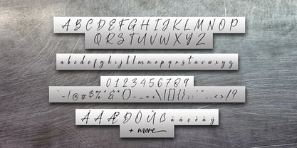 Introducing the Metal Pen script, a font that is very fresh and unique, handmade style. Metal Pen script is perfectly suited for logos, signatures, stationery, posters, apparel, branding, wedding invitations, cards, taglines, layout designs, and much more.
 - RealBook Pen by NorFonts,
$37.50 RealBook Pen are handwritten fonts with a unique lefty bounded shape, and can be used with any word processing program for text and display use, print and web projects, apps and ePub, Comic Books, graphic identities, branding, editorial, advertising, scrapbooking, cards, and invitations … or even just for fun! RealBook Pen can be also used for Comics and Casual lettering.
 - Winter Pen by Abo Daniel,
$13.00 Introducing WINTER PEN - simple signature font - This font is great for branding, logo, signature, packaging, t-shirt design, social media and anything your project that need an elegant taste. It came with two styles : Regular and Italic. Features: Uppercase Lowercase Number & Punctuations Multilingual Support PUA Encoded Hope you love it Grab it fast... regards, Abo Daniel Studio
 - NorB Pen by NorFonts,
$28.00 NorB Pen was inspired from Arial Round font, I use this font for my jazz lead-sheets. It's a handwritten text font emulating a round marker permanent pen. You can use this font with any word processing program for text and display use, print and web projects, apps and ePub, comic books, graphic identities, branding, editorial, advertising, scrapbooking, cards and invitations and any casual lettering purpose… or even just for fun! NorB Pen comes with 8 weights, each with their matching italics and in a Light, Normal, Bold and Heavy version.
 - Handy Pen by Gassstype,
$23.00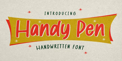 Hello Everyone, introduce our new product Font Handy Pen it is Handwritten Font,This is a Textured Natural Style and classy style with a clear style and dramatic movement. This font Handy Pen is great for your next creative project such as logos, Logotype, Letterhead, Poster, Design this font is great for your creative projects such as watermark on photography, and perfect for logos & branding, invitation,advertisements,product designs, stationery, wedding designs,label ,product packaging, special events or anything that need handwritting taste.
 - Bold Pen by Authentic,
$39.50 BoldPen is based on an ancestor of the German DIN-Schrift. The font was traced with a plastic template on transparent paper, scanned and worked over carefully to keep the handmade, authentic touch.
 - Silver Pen by Khurasan,
$8.00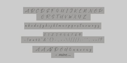 Introducing the Silver Pen script, a font that is very fresh and unique style handmade. Silver Pen script is perfectly suited to logos, signature, stationery, posters, apparel, branding, wedding invitations, cards, tagline, layout design, and much more.
 - Pep O Mint Normal - Unknown license

- Gothic Special Normal Italic by Wooden Type Fonts,
$15.00 A revival of one of the popular wooden type fonts of the 19th century, suitable for text or display, short descenders, tall ascenders, the narrow, italic version, completing the Gothic Special family of 5 fonts in total, sans serif.
 - Formal Notice JNL by Jeff Levine,
$29.00 Samuel Welo’s “Studio Handbook for Artists and Advertisers” was a popular book of inspiration for sign painters, graphic artists and designers from the 1920s through the 1960s. Many digital revivals of Welo’s hand lettered typography have been made available. Formal Notice JNL is one such revival, and is available in both regular and oblique versions.
 - Cross Stitch Formal by Gerald Gallo,
$20.00 Cross Stitch Formal is based on upper case characters 20 stitches tall and contains upper case characters A-Z. All characters are linked by at least one stitch.
 - Nouveau Formal JNL by Jeff Levine,
$29.00 Lettering found on the cover of 1915 textbook pamphlets from the Woman’s Institute of Domestic Arts and Sciences, Inc. [of Scranton, PA] inspired the creation of Nouveau Formal JNL. This attractive serif typeface is available in both regular and oblique versions.
 - Formal Dance JNL by Jeff Levine,
$29.00 A vintage Canadian-published music book circa the 1940s had the title "Strauss Waltzes" hand lettered in a bold Art Deco sans serif that featured block style letters with rounded corners. This was the working model for Formal Dance JNL, which is available in both regular and oblique versions.
 - Formal Invite JNL by Jeff Levine,
$29.00 The thin, condensed serif lettering found in a 1937 magazine ad for Chris Craft boats inspired Formal Invite JNL, which is available in both regular and oblique versions.
 - David Hadash Formal by Monotype,
$50.99Monotype Imaging is pleased to present David Hadash (New" David), the full family of typefaces by Ismar David, in its intended authentic form. The Estate of Ismar David has sought to revive this jewel of Twentieth-Century design by granting an exclusive license to Monotype Imaging to implement it in industry-standard format. Never before has the typeface in its full set of sub-styles been made available to the design community. David Hadash consists of three style families, Formal, Script, and Sans. Each of these appears in three weigths: regular, medium, and bold. Originally devised as a companion to the upright Formal style, the Script style has a beauty and grace all its own that allows it to be used for full-page settings also. While it is forward-leaning and dynamic, it does not match any of the existing cursive styles of Hebrew script. Ismar David created an eminently readable hybrid style which is like no other by inclining the forms of the upright while blending in some features of Rashi style softened with gentle curves. One can say that the Script style is the first truly italic, not just oblique, typeface for Hebrew script. Although the proportions of the Sans style are very similar to those of the Formal style, its visual impression is stunningly different. If the Formal style is believably written with a broad-point pen, the Sans is chiseled in stone. Rounded angles turn angular and stark. The end result is an informal style that evokes both ancient and contemporary impressions. David Hadash (Modern) supports the writing conventions of Modern Hebrew (including fully vocalized text) in addition to Yiddish and Ladino. David Hadash Biblical is a version of the Formal style that supports all the complexities of Biblical Hebrew, including vocalization and cantillation marks. " - Formal Event JNL by Jeff Levine,
$29.00 The hand lettered actors’ credits on a title card from the 1937 film “Shall We Dance” served as the model for Formal Event JNL – an Art Deco sans serif font available in both regular and oblique versions.
 - CType AOE - Unknown license

- Ticker Tape - Unknown license

- Flat tyre - Unknown license

- Typo Negative - Unknown license

- Tape Loop - Unknown license

- Tape Font by Vladimir & vladimir,
$- Although this condensed type is ideal for titles and headlines, it has small caps and letters with diacritical marks included as well. It keeps readability at mind, while trying to be as much "done-by-hand" as it can. It has unique tears on each edge of each letter and tilting on certain "slices of tape".
 - Rip TAPE by TypoGraphicDesign,
$19.00 CONCEPT/CHARACTERISTICS The handmade, dirty and yet modern character of the font was designed with analog tape on paper and later digitized. The motto is sticky, wrinkled and rough APPLICATION AREA The dirty, rough and fancy font „rip TAPE“ would look good at display size for poster, flyer, comics and graphic novel lettering and logos. Headlines in magazines or websites, packaging, music covers or webbanner etc. TECHNICAL SPECIFICATIONS Headline Font | Display Font | Grunge/DIY Font „rip TAPE“ OpenType Font with & 78 glyphs & 2 styles (regular, fixed).
 - Tape Up by Ingrimayne Type,
$9.00 The letters in TapedUp are constructed from straight pieces of what could be masking tape. The letters have a unsophisticated or unpolished quality to them. The typeface is caps-only but many of the shapes on the lower-case keys differ from those on the upper-case keys. It was formed with a template used for several letterbat fonts and also typefaces Rumpled and Tinkerer. The family has six styles: regular, bold, shadowed, oblique. bold oblique, and shadowed oblique.
 - Tape One by Volcano Type,
$29.00 - Typer Pro by (v) design,
$25.00 Typer Pro (formerly Consul Typewriter Pro) is a modern OpenType font family reviving the look of old typewriters. Its carefully converted forms are detailed enough even for high pointsizes while keeping a reasonable number of outline points. Typer Pro comes in two variants: Typer Pro Mono is strictly monospaced (all characters occupy the same amount of horizontal space – this way old typewriters usually operated). However, sometimes a more even appearance may be desirable. Therefore, Typer Pro Text has been proportionally altered for a more pleasant and balanced look. Moreover, it is possible to achieve both proportional and monospaced look in both families via Stylistic Sets. You can choose from four different weights in each family and pick characters from its extensive glyph set. Typer also contains a number of Stylistic alternates, randomly replaced alternative letters to avoid the repetition of letters in a word. Typer Pro is a versatile typeface and is perfectly legible even at small sizes and on-screen. When printed, it looks best at its original size around 11–12 pt. Typer supports many OpenType features and offers great multilingual support for most of Latin-based languages. Feel free to download the detailed PDF Specimen.
 - Typo Upright by Bitstream,
$29.99A faithful reproduction of the common French Ronde of the nineteenth century; the design originates at the Inland Typefoundry in St. Louis as French Script and was revised by Morris Fuller Benton in 1905 and made popular by ATF under the name Typo Upright. Stephenson Blake also had a version available as Parisian Ronde. - Tape Back by Adam Ladd,
$5.00 The Tape Back family comes in three weights. Each are monoline in weight and have a modern yet slightly quirky appearance. It is informal but has some stability with its linear forms. The slant backwards makes it unique, and it displays well even for body text.
 - Funky Hype by Hatftype,
$15.00 Funky Hype - Street Art Graffiti Font is a free style font that has the characteristics of street art that shows freedom and is filled with unique characters. Features : • Character Set A-Z • Numerals & Punctuations (OpenType Standard) • Accents (Multilingual characters) • Ligature • Alternate There it is. I really hope you enjoy it.
 - Roman Tyres by Red Rooster Collection,
$45.00An original design, based on a very early turn-of-the-century typeface from the defunct Keystone Type Foundry, Philadelphia. - FF QType by FontFont,
$62.99 German type designer Achaz Reuss created this display and sans FontFont in 2004. The family has 26 weights, ranging from Extra Light to Black in Compressed, Condensed, Normal, Semi Extended, and Extended and is ideally suited for advertising and packaging, logo, branding and creative industries, poster and billboards as well as sports. FF QType provides advanced typographical support with features such as ligatures, alternate characters, case-sensitive forms, fractions, super- and subscript characters, and stylistic alternates. It comes with tabular lining and proportional lining figures.
 - Mixed Tape by Ksenia Belobrova,
$35.00 Mixed Tape is a brush typefamily inspired by music and based on calligraphy. It has 3 different styles so that you can choose which you need or combine them as you like. Mixed Tape Regular is a casual neutral brush script, Mixed Tape Small is a more elegant variation and Mixed Tape Capitals is an energetic, probably even brutal brush script. You can freely play with the three of them creating your typographic compositions. You can use Mixed Tape for posters, prints, menus, packaging, book covers and headlines, cards and as a starting point for logotypes. Mixed Tape has a lot of alternates and ligatures which are built into the ‘Liga’ feature that is turned on by default. It also has swashes, titles, fractions, ordinals and case sensitive forms. Let’s all enjoy good music and typography!
 - Electrical Tape by PBinns,
$20.00 Electrical Tape is a mono-case display type. The idea came from generating custom letters using pieces of electrical tape. The over all design was then influenced by the graffiti subgenre as well as a hint of constructivist influence. Recommended applications of the font are for display purposes as well as digital media.
 - ITC Tyke by ITC,
$29.99Tomi Haaparanta got the idea for the Tyke typeface family after using Cooper Black for a design project. He liked Cooper's chubby design, but longed for a wider range of weights. “I wanted a typeface that was cuddly and friendly,” recalls Haaparanta, “but also one that was readable at text sizes.” He started tinkering with the idea, and Tyke began to emerge. Even though Haaparanta knew his boldest weight would equal the heft of Cooper Black, he began drawing the Tyke family with the medium. His goal was to refine the characteristics of the design at this moderate weight, and then build on it to create the light and bold extremes. Haaparanta got the spark to design type in 1990, when he attended a workshop held by Phil Baines at the National College of Art and Design in Dublin. “I've been working and playing with type ever since,” Haaparanta recalls. He released his first commercial font in 1996, while working as an Art Director in Helsinki. After about two dozen more releases, he founded his own type studio, Suomi Type Foundry, early in 2004. At five weights plus corresponding italics, Tyke easily fulfills Haaparanta's goal of creating a wide range of distinctive, completely usable designs. The light through bold weights perform well at both large and small sizes, while the Black is an outstanding alternative to Cooper for display copy. - Hype Marker by Mvmet,
$14.00 Hype Marker is a cool marker hand lettered font. You can use it for anything ranging from t-shirts, book designs, and greeting cards to stickers and posters, packaging designs, or anything that needs a casual touch, it will be your perfect font to pick. Fall in love with its incredibly versatile style, and use it to create lovely designs!
 - Single Tyne by Jonahfonts,
$35.00 A single top serif creates a modern look between serifs and a single weight font. SingleTyne contains short ascenders and descenders for tight line spacing designed as a display face that also works well for short sentences and paragraphs.
 - Hype Runner by Invasi Studio,
$17.00 Hype Runner is a bold and stylish brush font that is perfect for sports and anything that requires strength and power. With its unique style and edgy look, Hype Runner is ideal for a wide range of design projects, including headings, flyers, greeting cards, product packaging, book covers, printed quotes, logotypes, and album covers. This font features alternate glyphs, ligatures, and support for Latin Multilingual, giving you plenty of design options to create unique and eye-catching designs. Whether you're creating designs for sports or simply want a strong and impactful font, Hype Runner is a great choice.
 - Red Tape by Wiescher Design,
$39.50 Red Tape is three fonts that were designed by sticking letters together with red tape. It makes for a wonderful makeshift set of fonts. And I really enjoyed sticking those letters together. Of course I did it on screen using bits and pieces of scanned red tape. Just use it as you like, I won't give you any red tape in how to use the fonts. »Red Tape« is since February 2012 on permanent display in the »German National Library« – next to the likes of »Bodoni«, »Garamond« and »Helvetica« – being part of the exhibition about type through the ages. Your (now a little famous) unproblematic type designer, Gert.
 - Vital Formations - Unknown license


