10,000 search results
(0.08 seconds)
- NoweAteny by Linotype,
$29.99Linotype Nowe Ateny is part of the Take Type Library, which features the winners of Linotype’s International Digital Type Design Contest from 1994 to 1997. Designed by Dariusz Nowak-Nova, Nowe Ateny is a frantic handwriting font whose capital letters include technical-looking grid lines and end points. These seem to anchor the letters without reducing their volatility. The font consciously lacks elements which increase legibility, sacrificing them for the sake of more design oriented ideals. Nowe Ateny is thus good for headlines in larger point sizes, especially when the look of the text is as important as its content. - Kuunari by Melvastype,
$16.00 Kuunari is structured square sans type family of 42 fonts. It has three widths and 7 weights in both upright and italic versions. The base form is a round cornered rectangle and this form constructs the glyphs throughout the fonts. Kuunari is a straightforward sans serif. It doesn't make any fuss about itself, it just does the job proudly and with confidence. It is very versatile; it can be used for titles and logos to make a statement or more delicately for body text and lead paragraphs. All in all you can achieve diverse and rich typography with the Kuunari type family.
 - FF Clifford by FontFont,
$68.99 Japanese type designer Akira Kobayashi created this serif FontFont in 1999. The family has 6 weights, (including italics) and is ideally suited for book text, editorial and publishing as well as small text. FF Clifford provides advanced typographical support with features such as ligatures, small capitals, case-sensitive forms, fractions, super- and subscript characters, and stylistic alternates. It comes with a complete range of figure set options – oldstyle and lining figures, each in tabular and proportional widths. FF Clifford received several awards: the U&lc Type Design NY award in 1998 and the TDC2 award in 2000.
 - Linotype Vision by Linotype,
$29.99Linotype Vision is part of the Take Type Library, chosen from the entries of the Linotype-sponsored International Digital Type Design Contests of 1994 and 1997. Created by German designer Dan-André Neimeyer, the font contains five weights. The characters look as though they are constructed of fragments fitted only loosely together. Just enough of each character is put onto paper so that the eye of the reader can complete the conventional form. Based loosely on sans serif forms, the font has a futuristic, mathematical feel. Linotype Vision is exclusively for headlines in point sizes of 18 and larger. - Diamonds by HVD Fonts,
$30.00 The Diamonds type family was designed by Hannes von Döhren in 2012. It is an experimental search for geometric new letterforms, which are still easy to read and generate some unexpected attention. Hannes wanted to create a straight and clear typeface but pull away from the path of classic and well learned letter shapes. The Diamonds type family is equipped for complex, professional typography. The OpenType fonts have an extended character set to support Central and Eastern European as well as Western European languages. Each font includes alternate letters, fractions, scientific superior/inferior figures and a set of arrows and geometric forms.
 - Nibbles by Typogama,
$19.00 Nibbles is a linear dingbat typeface inspired by the theme of food and food trucks. With symbols ranging from burgers, pancakes, or desserts, to food trucks and toilet signs, this font aims to cover all your hungry design needs! To help with its application, each pictogram can either be found through its glyph placement or by simply typing out the name of the food item. Type burger and presto, your burger pictogram will appear! With its simple application and extensive symbols, Nibbles can be used for branding, menus, editorial layouts, posters, and any food related projects.
 - Rimeland by Letterhend,
$19.00 Introducing, Rimeland Script - A beautiful modern calligraphy script based on manual hand writing. The natural flow with the swashes make this font looks even more prettier. This type of font perfectly made to be applied especially in wedding invitation, labels, logos, magazines, books, greeting / wedding cards, packaging, fashion, make up, stationery, novels, labels or any type of advertising purpose. Features : uppercase & lowercase numbers and punctuation multilingual swash and ligature alternates PUA encoded We highly recommend using a program that supports OpenType features and Glyphs panels like many of Adobe apps and Corel Draw, so you can see and access all Glyph variations.
 - Al Bizantheum by Aluyeah Studio,
$120.00 Bizantheum, remarkable new modern display font. Inspired by the majesty and mystique of the Byzantine era buildings. Coming with 130+ stunning and super easy to use alternates. Very suitable for magazine, headline, website, ads, product package and all type of design project you have. Features: OpenType support Multilingual support (15 languages) PUA Encoded Super Easy to Use alternates - It's OpenType support but you can easily call alternates character using special combination like A.2 R.3 h.5 etc. so you don't need special software. To get results like the preview just type B.3iz.2ant.2he.2um
 - Loristta by Javatypestd,
$12.00 Introducing Loristta is Vintage Monoline Font. This font is created with a new monoline style that always follows the growing trends. This Monoline type font has a strong character for each letter, so it is suitable for the needs of any type of work. so immediately have this font so that your product looks more elegant and cool. They work perfectly for you who need a typeface for Fashion, headline, logotype, apparel, Marchandise, branding, packaging, advertising, etc. Loristta Font has several character letters in between Uppercase Lowercase Numeral and Punctuation Ligature Unique stylish set and Alternate Multilingual Support
 - LTC Archive Ornaments by Lanston Type Co.,
$24.95 Unlike previous dingbat fonts released from Lanston Type Co., Archive Ornaments derives from a unique collection of brass ornament plates that were originally used in creating the matrices for casting metal type. Using the plates as a reference point allowed for a more precise rendering of the ornaments. Letterpress prints were made directly from the brass plates, which were then re-drawn and digitized. Each character has been optimized for the combination of decorative borders and patterns as well as individual accentuation. The completed digitized font contains over 100 glyphs, ranging in style from geometric to organic designs.
 - Special Elite Pro by Stiggy & Sands,
$29.00 Our Special Elite Pro brings the unique individuality of the Special Elite Type No. NR6 vintage typewriter keyset to the digital age. Antique typewriters would type with a warmth and appeal to them, primarily because of their unpredictable “grunge” results from force of keystrokes to ribbon and paper. The SmallCaps and extensive figure sets add a more serious note to the nature of the typeface. OpenType features include: - SmallCaps. - Full set of Inferiors and Superiors for limitless fractions. - Tabular, Proportional, and Oldstyle figure sets (along with SmallCaps versions of the figures). - Stylistic Alternates for Caps to SmallCaps conversion.
 - Captivate by Letterhend,
$19.00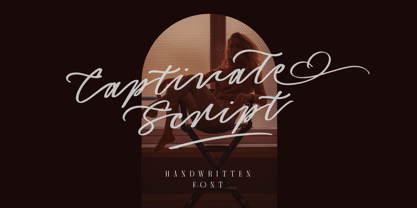 Introducing, Captivate Script - A beautiful modern calligraphy script based on manual hand writing. The natural flow with the swashes make this font looks even more prettier. This type of font perfectly made to be applied especially in wedding invitation, labels, logos, magazines, books, greeting / wedding cards, packaging, fashion, make up, stationery, novels, labels or any type of advertising purpose. Features : uppercase & lowercase numbers and punctuation multilingual swash and ligature alternates PUA encoded We highly recommend using a program that supports OpenType features and Glyphs panels like many of Adobe apps and Corel Draw, so you can see and access all Glyph variations.
 - Linotype Sjablony by Linotype,
$29.99Linotype Sjablony is part of the Take Type Library, chosen from the entries of the Linotype-sponsored International Digital Type Design Contests of 1994 and 1997. Designed by Dutch artist Mark van Wageningen, the typeface with its interrupted strokes has the characteristics of the stencils seen on crates and barrels. The difference lies in the raw contours of this font, which make the characters look as though they were slowly eroded away by water and wind. Linotype Sjablony is composed exclusively of heavy capital letters and is particular suitable for initials and headlines with point sizes of 18 and larger. - Newsprint JNL by Jeff Levine,
$29.00 Newsprint JNL has its origins in an online auction image of wood type. Only the lower case a-z were shown and the type design included an extra-wide 'g' and 's'. Expanding on this idea but narrowing the 's' a bit, Jeff Levine created a capitals set and all of the necessary additional characters - even adding a generous selection of accented characters not usually found in his display fonts. Regular, oblique, narrow, narrow oblique, wide and wide oblique versions are available. All styles offer crisp, clean lettering for headlines, window signage and other display text applications.
 - Linotype Laika by Linotype,
$29.99Linotype Laika is part of the Take Type Library, chosen from the entries of the Linotype-sponsored International Digital Type Design Contests of 1994 and 1997. This fun font was created by Dutch designer Mark van Wageningen, who based its forms on those of a sans serif font but gave them wavy, irregular contours. They look almost as though they lie just under the surface of a pool and the movement of the water gives them their undulating appearance. The dynamic Linotype Laika is especially good for headlines in larger point sizes or shorter texts in point sizes of 14 or larger. - Noyh A by Typesketchbook,
$39.00 Noyh A is altered from the form of the original Noyh to give an addition to the Handmade type. It’s delightful being used alone or in combination with Noyh. You may find it on art publications, in fancy cafes, or even on marriage invitation card. Features include Bistro which has rough edge and the smoother edge Cafe with options of texture to add variations to the type. It also comes with Manuscript and Handdrawn designs that match to them and support caption texts. Element and Handdrawn patterns are available to complement the 17 letters of Noyh A.
 - Tips by Linotype,
$29.00The symbol family Tips, (which stands for “Type-Image-Piktogramm-Schrift” in German, or type-image-pictogram-font in English) contains six different fonts of pictograms and stylized icons. Tips Active is full of sports pictograms, which are similar to those that were designed for the 1972 Olympic Games in Munich. Tips Astro contains astrological signs. Tips BCom depicts icons for use in business communication or web design. Tips Count is a font featuring numbers inside of various circles. Tips This Way and Tips Travel are both collections of pictograms for use in navigation and other signage systems. - Turkeyes by IKIIKOWRK,
$17.00 Introducing Turkeyes - Bohemian Type, created by ikiiko. Turkeyes is a vintage stylish display type that has both a modern and retro look. This font is inspired by the bohemian era, the perfect one to create layout design in the 60s or 70s. This font have unique shape that to give to your brand logo, poster, food & beverages, and another project to a have unique or vintage look. What's included? Uppercase & Lowercase Number & Punctuation Multilingual Support Works on PC & Mac Enjoy our font and if you have any questions, you can contact us by email : ikiikowrk@gmail.com
 - Vaquero by Scriptorium,
$24.00Vaquero is a Wild West style font. It is characteristic of a lot of western era signage, with super-narrow characters and unusual decorative spurs and serifs. There are some similarities in Vaquero to some of our other western fonts. It sort of ties together the historic tradition of western era type and the more fanciful tradition of romantic type derived from the era of the wild west. It has the width, height and general letter shapes of Academy, but the decorative elements are similar to more fanciful fonts like Riudoso. The result is very evocative of the old west. - Copenhagen Grotesk by David Engelby Foundry,
$- From Weimar to København/Copenhagen, picking up some decadent traits on its journey. The design of Copenhagen Grotesk is inspired by the great German grotesque type design history, although it will not fall into ranks in all aspects. Indeed, Copenhagen Grotesk will not be put into one single time pocket of style, so you'll notice that there's a hint of art deco style in its capital letters. The visual expression is first and foremost firmly rooted in the style of Scandinavian design, so feel free to use Copenhagen Grotesk for functional typographic design in relation to multiple media types.
 - Modica by Monotype,
$25.99 Modica is a strong and agile Geometric Sans type family comprising 18 fonts. This typeface began life as “Meccanica” – a quirky, heavy, engineering typeface, that later evolved into the more conservative “Technica” type family. And now, the typeface has been distilled down to its simplest and most perfect form to become “Modica”. Modica is a nimble typeface that can handle a multitude of applications – everything from body copy to retail fashion to corporate identities... why not put Modica to task today? Key features: • 9 weights in Roman and Italic • Full European character set (Latin only) • 450+ glyphs per font.
 - Calypso I by Typolar,
$65.00 Calypso I (Italian) draws its inspiration from type founders' plentiful show-off-letters, which were typical on title pages and lithographs in the early 19th century. It borrows luscious details from these but inherits a stiff modern backbone from its parent, Calypso E (Egyptian). Within the Calypso type family all fonts share the same dimensions and work together consistently. Calypso I supports many languages and includes, for example, four sets of basic numerals, circled numbers, alternative characters, case sensitive forms and dingbats. Give it a go on drop caps and headlines or even set short paragraphs with it. It loves colour and effects.
 - Pistol Twelve JNL by Jeff Levine,
$29.00Pistol Twelve JNL is a novelty version of Jeff Levine's Twelve Oaks JNL wood type font, with the addition of random bullet holes in the upper case characters. The font design was suggested by fellow type designer Ray Larabie. Pistol Twelve JNL is a two-fold pun. Initially, this conveys the obvious fact that the design is a variation of Twelve Oaks JNL with bullet holes... but the name is also a play on an old, old joke. One person asks the other: "Would you care to join the Pistol Club? You drink 'til twelve and..." Well, you get the picture! - Milleniapolis by IKIIKOWRK,
$17.00 Introducing Milleniapolis - Futuristic Type, created by ikiiko. Milleniapolis is a condensed type with a simple and playable font. Thin and tall font characters make it easy to adjust and fun to explore different shapes and layouts. This typeface is perfect for an brand logo, fashion stuff, clean design, magazine cover, poster & flyer, or simply as a stylish text overlay to any background image. What's included? Uppercase & Lowercase Number & Punctuation Alternates & Stylistic Ligature Multilingual Support Get also a good offer & FREEBIE at our site : www.ikiiko.com Enjoy our font and if you have any questions, you can contact us by email : ikiikowrk@gmail.com
 - LTC Jenson by Lanston Type Co.,
$24.95 Jenson Oldstyle was designed by J. W. Phinney of the Dickinson Type Foundry in 1893. Jenson is based on the 'Golden Type' designed by William Morris in 1890 for his private press editions under the imprint of the Kelmscott Press. The original digital Lanston version of this face included a companion Oblique. This remastered set instead features a true italic based on the 1893 ATF italic version as well as a newly digitized Jenson Heavyface based on Phinney's design of 1899. Jenson Italic Pro features alternate lowercase forms based on ATFs then contemporary Cushing Oldstyle Italic.
 - Glow Better by Ergibi Studio,
$22.00 Glow Better Modern Duo, these fonts are of two types serif and script. Display Serif inspired by famous logo, This typeface has been made carefully to make sure its premium quality and luxury feel. The ligatures on serif makes this typeface unique and stands out rather than the regular serif font, perfectly for headlines, wedding, social media, logos, posters, packaging, T-shirts, coffee shops, restaurants, magazine’s headers, signs or gift/post cards, cafe’s and weddings or any type of advertising purpose. What's Included : Standard glyphs Web Font Ligatures International Accent Works on PC & Mac Simple installations
 - Hagemann JNL by Jeff Levine,
$29.00 One of the most enduring type styles of the Art Deco era is Huxley Vertical. Its clean lines and stylish appeal have transcended changing times and tastes. Many typefaces have been inspired by the original, including the model used to create this font. The design was found in the book "Lettering and Alphabets", first published in 1946 by J. Albert Cavanagh. By re-drawing it from scratch, the missing numerals, punctuation, special characters and accents were added. Hagemann JNL and its oblique version are named in honor of one of Jeff Levine's friends within the type design community -- Michael Hagemann of Font Mesa.
 - Malliandra Script by Letterhend,
$19.00 Introducing, Malliandra Script - A beautiful modern calligraphy script based on manual hand writing. The natural flow with the swashes make this font looks even more prettier. This type of font perfectly made to be applied especially in wedding invitation, labels, logos, magazines, books, greeting / wedding cards, packaging, fashion, make up, stationery, novels, labels or any type of advertising purpose. Features : uppercase & lowercase numbers and punctuation multilingual swash and ligature alternates PUA encoded We highly recommend using a program that supports OpenType features and Glyphs panels like many of Adobe apps and Corel Draw, so you can see and access all Glyph variations.
 - LHF Broadway Panels 3 by Letterhead Fonts,
$53.0036 expertly-crafted and unique panels from Golden Era Studios. Typing each letter generates a different design. Special Note: Due to the large file size of these fonts, they will not convert for use in Gerber Omega. Instead, Omega users may wish to use an alternate program to type the characters and import them into Omega as .eps files. CorelDraw users should use the "Weld" command rather than "Convert to Curves" command to convert these fonts to vector outlines. Otherwise, the program may crash due to the sheer number of points in some of the panels. - Buena by mazefonts,
$53.00 Hello Buena - From Wood to Digital Type Buena is the first word I read on a letterpress paper, printed by my colleague and friend Wolfgang Wick. I was fascinated by the power of this fat wooden letters at first glance. So I started to create a digital version of it and »Buena Black« was born. Due to the fact that the original punches had only upper- case glyphs, I created the lowercase characters by myself. After that it was time to design the family... Buena is full of OpenType features. To get fully acces, go to www.mazefonts.de and Download the Type Specimen.
 - Numbers With Rings by Typodermic,
$11.95 Numbers with Rings uses an OpenType system that allows you to generate numbers in rings up to 999999. You can even have ringed letters or letter/digit combinations. If your application supports OpenType ligatures, you can type letters or digits on your keyboard, and they’ll automatically squeeze into rings. First, select a ring which can hold the number of digits you want, then type the digits; the rest happens automatically. There’s also a filled ring which can be used to give your ring a colored background. For more details on how Numbers with Rings works, check the PDF guide .
 - LTC Pabst Oldstyle by Lanston Type Co.,
$24.95 Frederic W. Goudy originally designed Pabst in 1902. This lettering was used by the Pabst Brewing Company for their promotional materials. It was later developed into type for ATF. Goudy later licensed Pabst Oldstyle to the Lanston Type Library. Lanston Pabst Oldstyle features several differences from the more familiar ATF version. Some caps are narrower while some lower case characters are wider than the ATF version. The descenders are also shorter in the Lanston version. Logotypes of italic words and, of, and the are included as originally designed as well as ligatures including the unusual tt ligature.
 - Linotype Killer by Linotype,
$29.99Linotype Killer is part of the Take Type Library, selected from the contestants of Linotype’s International Digital Type Design Contests from 1994 and 1997. Designed by German artist Andre Nossek, the font seems to describe the Technosound of the 1990s with its electronically produced sights and sounds. It represents repetition, mass production and conformity. The alphabet consists exclusively of capital letters, all based on a rectangular form, all of the same height, and, with the exception of the I’, all of the same width. The cool and distant Linotype Killer is best suited to short headlines. - Roadie PB by Pink Broccoli,
$16.00 Roadie was inspired by a 1981 Hallmark card with lettering that was full of frolicking fun. Filled with a childish persona and a playful bounce, this Roadie has a lot to offer. As with some of my previous type designs, it is a typographic dance, wonderfully skipping across designs, surprising with each letter typed. With an extensive character set, and clean sharpie marker-like look, Roadie is a joy to typeset with, and it comes with a stylistic alternates feature that shuffles the Capitals and lowercase that share similar unicase forms that add to the quirky playfulness.
 - Linotype Russisch Brot by Linotype,
$29.00Linotype Russisch Brot is part of the Take Type Library, chosen from the entries of the Linotype-sponsored International Digital Type Design Contests of 1994 and 1997. The inspiration of German designer Markus Remscheid is not hard to see for those who are familiar with the chocolate cookies in the form of letters which are called Russisches Brot. The font is available in six weights. The basic weight is perfectly legible and is good for both headlines and shorter texts and from there the weights become more and more nibbled away, leaving the basic form of the characters and a few crumbs. - Victorixel by Quatype,
$35.00 Victorixel is a pixel font that incorporates the Victorian wood-type style. In order to organically combine these two styles, I abandon the exaggerated and ornate shape, yet the essence of the wood type was retained, such as the forked serif at the beginning and end of the letter stem. Victorixel family has over 800 glyphs (including emojis) and it supports lots of Latin-alphabet-based languages. It is suitable for the title, poster, etc. *EASTER EGG* Turn on the ligature OpenType features and input MBTI+emoji will output the MBTI emojis. For instance: ENTPemoji Enjoy!
 - Linotype Sketch by Linotype,
$29.99 Linotype Sketch is part of the Take Type Library, chosen from the contestants of Linotype’s International Digital Type Design Contests of 1994 and 1997. German designer Dieter Kurz gave his display font a calligraphic character. The forms lean slightly to the right and have a spontaneous and individual look. This light, cheerful font also displays a harmony among the forms and gives text a personal touch. Linotype Sketch combines well with modern text fonts which have the same narrow proportions. This font is well-suited for headlines and short and middle length texts with point size 12 or larger.
 - Editors Note by Jen Wagner Co.,
$17.00 Say hello to the Editor's Note Family, an editorial serif display that includes 16 fonts, regular and italic, from Hairline weight to Bold, and still has all the clean lines, tight curves, and trendy minimalist vibes! I've been loving the clean, editorial type trend happening in design right now (let's be real, there's always a place for timeless editorial type). Editor's Note is a stunningly crisp upper and lowercase typeface that looks incredible in both large settings as a display text (think big headers, pretty quotes, calls to action, etc.). I've been loving combining the regular and italic, especially in big, bold quotes.
 - Karol by Type-Ø-Tones,
$60.00 Karol was designed in 2011 as a project in the MA in Advanced Typography from EINA/UAB, in Barcelona. It was born as text typeface inspired by the work of East European type designers. Two years later, Karol is ready for public release, in a collection of eight styles (four weights and matching italics) with high readability, strength and character. A few days before its publication, we received the news that Karol had been awarded the Certificate of Typographic Excellence (Judges’ Choice) of the Type Directors Club. Please check the ‘Read me’ file located in the gallery for more specifications.
 - Androgino by Cititype,
$17.00 Androgino is a unique handwritten font with deconstruction concept, where each letters connected to others with different spaces and sizes and sometimes overlaps. This font has an abstract 'dual interpretation'. On the one hand, the unique design of the letters does not have a stylistic tendency. On the other hand, the letters are combined in a unique form when they become sentences. Coupled with several ligatures that add diversity and give a certain surprise and impression when typed. Unique and stand out is the right definition for Androgino. It’s another word of Androgynous, Feminism which is masculine, suitable for all types of branding.