10,000 search results
(0.059 seconds)
- Watermint Script by Mans Greback,
$79.00 Watermint Script is a formal typeface that epitomizes the essence of elegance and sophistication. Envisioned for formal settings, its calligraphic strokes evoke a sense of classic beauty, making it an ideal choice for invitations or logotypes that demand a touch of class. Watermint Script is a harmonious blend of cute and lovely, wrapped in a feminine and romantic design. Its light and fresh appearance breathes life into each word, offering a clean and flawless presentation. The font's perfection lies in its attention to detail, with each character exuding a classy aura that enhances the overall visual experience. The font is built with advanced OpenType functionality and guaranteed top-notch quality, containing stylistic and contextual alternates, ligatures and more automatic and manual features; all to give you full control and customizability. It has extensive lingual support, covering all Latin-based languages, from North Europa to South Africa, from America to South-East Asia. It contains all characters and symbols you'll ever need, including all punctuation and numbers. Designed by Mans Greback, Watermint Script is a testament to his commitment to creating fonts that are not just tools of communication, but artworks that enrich the visual landscape.
 - Dewave by Luxfont,
$12.00 Introducing a distorted wavy Sans Serif font family. Interesting combination of elongation and distortion is embodied in the Dewave typeface. This font family is best suited for headlines and short text as an eye-catching accent. Due to its appearance, the font is well suited for the entertainment industry and everything connected with it both in offline life and in online projects. Dewave family has two types of tilt in different directions and 2 types of distortion - calm and strong, and all this is done in 3 types of thickness - this gives a lot of freedom of choice for the use of the font in the design. Features: Distorted letters in waveform 12 fonts in family: - 2 types of tilt - 3 thicknesses - 2 types of distortion Kerning ld.luxfont@gmail.com
 - AmpleAlt by Soneri Type,
$50.00 AmpleAlt is a alternate version derived from Ample type family. AmpleAlt is a display type family, optical mono linear and a bit squarish in nature. It has smooth curve instead of sharp angle formed by the junction of two strokes, which is a prominent feature of its design. It is designed to be a little eye-catching yet legible. It has clear and distinguishable letterforms, which helps to elaborate and emphasis the message. It is graphically strong and command viewer's attention. The overall appearance of type is suitable in setting it as heading, title, headline, etc. The type family consists of six weights viz. Thin, ExLight, Light, Regular, Medium and Bold. Considering the nature of this type family, italics have been excluded. AmpleAlt is designed by Aakash Soneri in the year 2014.
 - AmpleSoft by Soneri Type,
$50.00 AmpleSoft is a softer version derived from Ample type family. AmpleSoft is a display type family, optical mono linear and a bit squarish in nature. It has smooth curve instead of sharp angle formed by the junction of two strokes, which is a prominent feature of its design. It is designed to be a little eye-catching yet legible. It has clear and distinguishable letterforms, which helps to elaborate and emphasis the message. It is graphically strong and command viewerís attention. The overall appearance of type is suitable in setting it as heading, title, headline, etc. The type family consists of six weights viz. Thin, ExLight, Light, Regular, Medium and Bold. Considering the nature of this type family, italics have been excluded. AmpleSoft is designed by Aakash Soneri in the year 2014.
 - Museum Tertia Cursive by T4 Foundry,
$21.00Museum Tertia Cursive is inspired by a beautiful set of 126 matrices in the Swedish Norstedts type collection. These types were probably manufactured in Germany before 1750. The matrices are part of a set imported to Sweden by J.P. Lindh from Breitkopf & Härtel 1818. Now this exquisite design is available again, thanks to type designer Torbjörn Olsson. Please note modern additions like the ?-mark, @-sign and €-sign. Museum Tertia Cursive is an OpenType creation, for both PC and Mac. Swedish type foundry T4 premiere new fonts every month. Museum Tertia Cursive is our eighth introduction. Museum Tertia Cursive is part of the growing Museum type family. Museum also includes three different border fonts, an ornament font with some of Granjon's arabesques and a flowery Fournier font with Rococo capitals. - MFC Pantomime Monogram by Monogram Fonts Co.,
$19.95 The inspiration source for Pantomime Monogram is an unusual Art Deco design from a vintage embroidery publication which combines both sans-serif and flare serif styles to create a diamond monogram format. This monogram, which evokes visions of it etched into bakelite, was originally intended to adorn handkerchiefs and towels, but it has so many other possibilities. It is one of many monogram designs from the early 1900’s which fall into a two letter format that is either adorned or interwoven with framing styles. Pantomime Monogram is only capable to two letter monograms due to its unique design. Download and view the MFC Pantomime Monogram Guidebook if you would like to learn a little more.
 - Bromello by Alit Design,
$10.00 Introducing Bromello modern script typeface, using style hand made with brushing. Bromello is beautiful for wedding card design, logotype, blog or website header, fashion design, YouTube video thumbnails and any more. Bromello uses classic handwriting techniques to create a beautiful, modern design. Bromello is very popular at the moment and unique for so many reasons. People use the font to create and express their own style, create beautiful projects, promote their brands and projects and more. Remember, be inspired with your own styles and ideas and have fun! Product Content : • bromello typeface (OTF & TTF Format) • bromello italic typeface (OTF & TTF Format) Features : • Character Set A-Z • Numerals & Punctuations (OpenType Standard) • Accents (Multilingual characters) • Contextual Alternates • Swash • Stylistic Alternates
 - Nicolas Jenson SG by Spiece Graphics,
$39.00 It was the original work of fifteenth century designer Nicolas Jenson that formed the basis for this roman serif style developed by Ernst Detterer in 1923. Similar in spirit to other early twentieth century revivals such as Centaur, Cloister Old Style, and Italian Old Style, Nicolas Jenson is distinguished by its pristine and delicate nature. A gifted young apprentice to Detterer, Robert Hunter Middleton, greatly expanded the family. And by 1929, bold, italic, and open were part of the Ludlow Foundry’s beautiful Nicolas Jenson Series. It was reintroduced under a new name, Eusebius, in 1941. This digital version includes a new medium and extrabold weight with intermediate small caps and swash alternates throughout the family. There is also a regular expert version with a variety of currency symbols plus a regular petite caps (regular x-height small caps) and old style figures version. Nicolas Jenson is now available in the OpenType Std format. Small caps, old style figures, and swash alternates have all been combined into one style for ease of use. You will also find an additional regular petite caps version included with the regular style. Some new characters have been added as stylistic alternates and historical forms. These advanced features work in current versions of Adobe Creative Suite InDesign, Creative Suite Illustrator, and Quark XPress. Check for OpenType advanced feature support in other applications as it gradually becomes available with upgrades.
 - Jeff Script by ParaType,
$30.00Jeff Script is based on original handwriting of renowned Russian type designer Vladimir Yefimov. Vladimir designed a plenty of Cyrillic fonts that became the classical ones between contemporary Cyrillic type designs. Being extreme busy with type projects, he never had time to digitize his own script and this lacuna was filled by Gennady Fridman. The font was developed to the 60th anniversary of Maestro and released by ParaType in 2009. - Garstang Engraved by Greater Albion Typefounders,
$18.00 Garstang Engraved is the latest in Greater Albion's series of ‘wood type’ inspired fonts. Garstang Engraved is a hand-cut Roman, suggesting the late Victorian era, but the type of thing that continued in use well into the twentieth century. If you want a title face that has versatility and suggests a past history, as well as the art of finely cut wood type, then this is it!
 - PH Font by Fontfabric,
$29.00 PH from Fontfabric Type Foundry is a multifaceted font system consisting of different font weights and type of condensation. Every one of these font weights contains a number of extension types - Condensed, Narrow, Regular, Extended and Wide. Along with all of this, you will also discover added groups of extras which could serve as a foundation or add that extra "cherry on the cake" to each unique design.
 - Selina by ParaType,
$30.00 A universal text type was designed by Natalia Vasilyeva for ParaType in 2007. The type family is consist of 8 styles. Also corresponding decorative italic with calligraphic swash capitals was developed. The type has low contrast characters and narrow proportion. It is rather space-saved but very legible even in small sizes. For use in text and display typography. The upgraded version with extended character set was released in 2010.
 - NewRocker - 100% free

- Pabellona (B) Dúplex - Personal use only

- Pabellona (A) Símplex - Personal use only

- Pabellona (C) Tríplex - Personal use only

- Oaxaqueña Tall - Personal use only

- Monotone - Unknown license

- DuckyCowgrrrlLuvsRudyCowboy - Unknown license

- Arcaro JNL by Jeff Levine,
$29.00 There are times when a typeface is used so consistently that it becomes somewhat synonymous with the subject it's used in. The opening and end titles for the ABC-TV series "Naked City" (1958-1963) were set in a bold version of a popular font emulating the look of calligraphic hand lettering. Arcaro JNL is a somewhat lighter and slightly modified version of this typeface and is offered in both regular and oblique versions. The name Arcaro comes from one of the regular characters in this superbly-written police drama, Detective Frank Arcaro.
 - Bergsland Display by Hackberry Font Foundry,
$24.95 This is a display version of a stylized sans serif font family that is very high-waisted and sleek called Bergsland Fashion. This four-font set has a Regular and a Black plus the italics. The stroke is only slightly modulated. The letterforms are higher, with a more open aperture, and sprinkled with breaks to add light and sparkle. This an attempt at a readable sans serif for text. It has many OpenType features and 465 characters per font: Caps, lower case, small caps, old style figures, numerators, denominators, accents characters and so on.
 - Module 4-4 by Sébastien Truchet,
$40.00 Sébastien Truchet designed a modular typographic system during his last year in the School of Fine Arts of Besançon. The system is made of a unique grid and 6 modules which are the components to build several typefaces. The most radical is the "2-2". The last one is the "10-12". This is the 4-4. It is built into a square grid. Four modules in width and in height. This font proposes to you two appearances : the caps are blackest and the small letters are more open.
 - Mocacino by Arkalandara,
$120.00 The elegant handwritten font for this brand exudes sophistication and timeless charm. Its strokes are fluid and graceful, reminiscent of a skilled calligrapher's penmanship. The letters are carefully crafted with a balance of curves and straight lines, creating a harmonious and refined look. The font maintains a moderate size, allowing for readability without sacrificing the delicate details that make it elegant. Each letter flows seamlessly into the next, creating a sense of continuity and grace. The spacing between characters is thoughtfully considered, striking the right balance between openness and cohesion.
 - Dunk City by Epiclinez,
$18.00 Bring the street to your design projects with this cool brush typeface. Dunk City is a hand brush font that's perfect for poster, branding, and packaging. With a graffiti-style calligraphy feel, its letters feature a unique style to your designs. The subtle imperfections are designed to make the typeface more lively: it's the key to opening a whole new world of brushwork. So what’s included : Basic Latin Uppercase and Lowercase Numbers, symbols, and punctuations Multilingual Support. PUA Encoded and fully accessible without additional design software Simple Installations works on PC & Mac Thank You!
 - Clover Display by FoxType,
$10.00 Clover Display is a Unique Modern Elegant Typeface with Web-fonts which derived from Olive Font Family. It's a very versatile font that works great in large and small sizes. Clover Font would perfect for branding, logos, headlines, Captions. or simply as a stylish text overlay to any background image. Strong capitals and a smooth, open lowercase are effective in a variety of applications. It's shown a clean, minimalist, warmth, quirky, yet still purposed to be versatile and easy to read. 08 Weights with 16 Styles Included. Free updates and feature additions.
 - Orgovan by Suitcase Type Foundry,
$39.00Orgovan is based on calligraphic script models lettered with a flat brush, which have been a mainstay in the sign makers' and display artists' handbooks since the beginning of the 1960s. Careful adjustments to the construction of the character shapes made the glyphs more open. This ensures that the face is well legible in small sizes, making it suitable for more demanding typographic applications. The Punk and Rounded variations of the base model offer an even broader range of possible applications, while the Fat Cap, Flower Power and Hairy cuts are contemporary decorative alternatives. - Shorai Sans Variable by Monotype,
$1,049.99 Shorai™ Sans balances the subtlety of traditional hand-drawn brushstrokes with clean, geometric outlines. An intellectual-looking sans serif, Shorai’s simplified letterforms and vast weight ranges provide creatives with a holistic branding solution. Shorai Sans was designed as a companion typeface to Avenir® Next, built to work harmoniously in modern global designs, while preserving the essence of Japanese handwriting. Shorai goes beyond existing Japanese sans serifs to provide a wide spectrum of expression and personality for designers to play with. Shorai Sans is opening new horizons in Japanese typography.
 - Metablue by Qaratype,
$17.00 Metablue is a geometric sans font family who dares the modernism and the harmony of the curves. It has very rounded curves with very open terminals that makes this font family elegant, friendly and contemporary. The typeface is versatile and can be successfully used in Magazines, Posters, Branding, Websites etc. It can meet the needs of professionals who want a family of clean geometric font; elegant with a wide character set for more than 130 languages of Western Europe, Europe Eastern, Central Europe, Greek and Cyrillic for international communication.
 - Delima by Monotype,
$29.99The Delima font family has something of the Clarendon or Ionic influence but is distinguished by a lighter serif treatment. The contrast between thick and thin strokes is not pronounced, weight stress is vertical. Delima's serifs are short but strong, allowing close letter spacing to give good economy. Lowercase x-height is very generous, internal counters are open. This combines to give Delima excellent legibility in small sizes and an overall even colour when set in text. Delima works well for magazines, periodicals and display work in advertising, flyers and catalogues. - Bhamious by Rometheme,
$18.00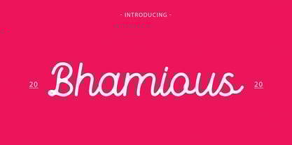 Bhamious is a Monoline Font, It has a elegant, classy look and cool. It’s a great font for fashion, apparel projects, signature, album cover, logo, branding, magazine, social media, & advertisements, but also works great for other projects. Highlights: Standard glyphs (Uppercase, Lowercase, Numeral & Punction) Work on PC or Mac PUA Encoded Support Fonts include multilingual support for; ä ö ü Ä Ö Ü ß ¿ ¡ No special software is required, The fonts can be opened and used in Adobe Illustrator, Adobe Photoshop, Adobe InDesign, even work on Microsoft Word.
 - Alaysa by Axara Creative,
$10.00 Alaysa Script is retro signage font, bold and clean. There are so many variations on each character. Include OpenType stylistic alternates. You are able to create so many different typographical layouts easily and quickly. Make sure you use OpenType savvy program and simply open Glyph Palette to access all of the glyphs. This font is suitable for t-shirts, signage, logos, headlines, branding, packaging, etc. Accessible in the Adobe Illustrator, Adobe Photoshop, Adobe InDesign, even work on Microsoft Word. PUA Encoded Characters – Fully accessible without additional design software.
 - Ondo by JAM Type Design,
$23.00 Ondo is a low contrast geometric sans serif with large open counters which give the typeface a somewhat bold and contemporary appearance. This feature gives Ondo a fun yet sensible feel which can be used for both large chunks of text as well as for short headlines. Ondo comes with more than 370 glyphs, supporting a wide range of languages. With its 10 fonts, Ondo is an ideal font family for text, branding, signage, print and digital design. Give Ondo Demo Medium a try on your personal projects – completely FREE.
 - Shorai Sans by Monotype,
$188.99 Shorai™ Sans balances the subtlety of traditional hand-drawn brushstrokes with clean, geometric outlines. An intellectual-looking sans serif, Shorai’s simplified letterforms and vast weight ranges provide creatives with a holistic branding solution. Shorai Sans was designed as a companion typeface to Avenir® Next, built to work harmoniously in modern global designs, while preserving the essence of Japanese handwriting. Shorai goes beyond existing Japanese sans serifs to provide a wide spectrum of expression and personality for designers to play with. Shorai Sans is opening new horizons in Japanese typography.
 - Burdigala Semi Serif by Asgeir Pedersen,
$19.99Burdigala is a clean-cut, modern yet classic typeface inspired by Didones and Aicher’s Rotis family. The Semi Serif is ideal for larger amounts of (printed) texts in brochures, magazines and books. It is slighty narrow in order to conserve space, but spacious enough to faciliate reading and overall clarity. The expanded versions of the semi serif, being wider and more open, works equally well in media intended both for print and on-screen reading, e.g. in Pdf-documents etc. Burdigala is the ancient Roman name of the city of Bordeaux France. - Litera by ITC,
$29.99Litera was designed in 1983 by Michael Neugebauer, who used the same strict constructed design found in his typeface Circulus. In its figures are the clear geometric forms of the circle, triangle and rectangle, which were also the main forms of Bauhaus designs. The overall look of Litera is modern, clear and light. Distinguishing characteristics are the openness and the e and P and the particularly long cross stroke of the G. The cool Litera is best for middle length texts and headlines. Similar typefaces include Futura from Paul Renner and Avenir from Adrian Frutiger. - Hoxton North by The Northern Block,
$32.00 Hoxton North came out of the concept to create something distinctly British, drawing on modernist influences such as Edward Johnston's typeface for the London Underground and Gill Sans. A humanistic san serif typeface with a British modern quality. Open forms with subtle contrast promote good readability across a wide range of media in both print and screen. The compact letterforms give it a strong lateral dynamic that is space efficient across design layouts. Details include 620 characters, seven weights with true italics, small caps, manually edited kerning and Opentype features.
 - Knobbly Knees by Comicraft,
$- Comicraft's latest joint has us swollen with pride! This one caps 'em all! Yes, it may look a little bony and stick out at right angles to our shins, but we reckon we'll win the a whole bunch of contests with this one... if we get up off our haunches and hobble up on stage. Trust your knee jerk reaction and download KnobblyKnees now, they look good on Kate and Angelina, they'll look good on you too! Features: Five fonts (Regular, Bold, Light, Broken & Open) with upper and lower case characters.
 - Linotype Fehrle Display by Linotype,
$29.99Erich Fehrle designed this robust alphabet for headlines and titles in 1976. The constructed figures of Linotype Fehrle Display were built on the geometric form of the rectangle. Lines of text look closed and compact. The letter forms are the result of fine open spaces. Design-specific characteristics of Linotype Fehrle Display are its serif-like additions to the strokes of the figures a, c, G or M, and the alternating rounded and angular outlines of the figures a, e, s and others. Typefaces similar to Linotype Fehrle Display: Bigband, Frutiger 95. - Sidenty by Lady Rose,
$10.00 Sidenty is a wild calligraphy script. The typeface was drawn and created by Lady Rose between 2020 and 2021. Its open shapes are inspired by mid-century advertising, is full of life and emits liberty and optimism. The handwritten family consists of two weights: It is completed with a full alternate alphabet and a big set of ligatures, which together give the handwriting genuine dynamics and a natural flow. It has extensive lingual support, covering all European Latin scripts and contains all characters you'll ever need, including all punctuation and numbers.
 - Laca Text by Nova Type Foundry,
$21.99 Laca Text is a sans-serif version of Laca. It was designed starting from the shapes of Laca. It is a cleaner version of Laca. Laca Text has characteristics like a bigger x-height, open counters, and smaller ascenders. It works better in smaller text than Laca because it keeps the structure without the stylistic features of Laca. Laca Text has more straight lines and follows the round shapes of Laca. Laca Text, as the name says, is more proper for long text but also for identity and branding.


