10,000 search results
(0.183 seconds)
- Hexa by Hexa,
$19.00 The font HEXA is inspired by the Hexagon. The HEXA fonts are dynamically and uniquely designed typefaces based on the grid systems of the hexagon that extends infinitely. From this image, we have created the HEXA font. Hexa is Latin-based and a completely crafted font that consists of 3 typefaces. Each typeface contains 190 sets of characters. This font family is in all-caps fonts, and we provide different styles of uppercase and lowercase glyphs with the exception of letters c, ç, and comma/ single low-9 quotation mark. In lowercase glyphs, we emphasize the image, character, and identities of Hexa. The font family includes regular, black, and thin. We created the witty expression with Hexa’s regular identity; thin emphasizes the lines; black fills in the blanks. Hexa is a monospaced fonts. So kerning is not applied. We recommend using our fonts for big-sized uses. This typeface is a display font and looks more attractive in larger formats than on main texts. Features: -190 characters -Monospaced fonts -All-caps fonts (different styles provide uppercase and lowercase)
 - Altra Two by Hackberry Font Foundry,
$24.95AltraTwo is a complete redraw of a family based on a tracing of a clip art font from an old printed book. The AltraTwo family adds italic, black, and black italic. I liked the gentle calligraphic look. Consider it a sans serif with style. This is a typical NuevoDeco OpenType pro font with caps, lowercase, small caps, lining, oldstyle, and small cap figures, numerators, denominators, fractions, swashes, and so on. There aren't many unusal ligatures for this one, though. It does have the Latin 2 character set or what Adobe calls CE, Central European characters. Altra has been my preferred header face for sevral years. it also works very well for body copy. I usually use it for my contrasting tip and quote paragraphs with Bergsland Pro as my normal body copy. - Boromir by GRIN3 (Nowak),
$19.00 Boromir is a hand-drawn, serif, layered, vintage font family. Each font features over 440 Glyphs, 5 Stylistic Sets, Standard and Discretionary Ligatures. The flow and vintage style works perfectly on invitations, blog headers, branding, art quote, posters, book cover and so much more! Language support includes Western, Central and Eastern European character sets, as well as Baltic and Turkish languages.
 - Aligant by Malgorzata Bartosik,
$29.00 Aligant is very fancy and rich sans serif typeface. It's perfect for graphic design of luxury products - fashion, jewelry, cars, cosmetics, entertainment, food, furniture. It contains diacritics from Western, Central and South Eastern Europe. It can be used especially as a display, but also as a body text. Aligant is both classic and modern, so it can be widely used.
 - Bridgewater by GRIN3 (Nowak),
$19.00 Bridgewater is a hand-drawn, brush font with contextual alternates to help with flow and readability. Each letter and number has three variations. When the font is used in OpenType-savvy applications, the 3 variants of glyphs are automatically alternated to achieve a random-like effect. Language support includes Western, Central and Eastern European character sets, as well as Baltic and Turkish languages.
 - Maryland Bawlmer by Cititype,
$17.00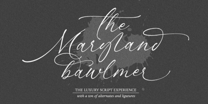 Maryland Bawlmer is a modern and luxurious calligraphy with a natural look. perfect for wedding invitations, calligraphy logos for branding, elegant websites, personalized gifts, social media posts, photography and more! Featuring 81 ligatures, 7 Alternate Set Styles (SS01-SS07) and Supports Western European, Central/Eastern European, Baltic, Turkish, Romanian Language Elegant, modern, luxurious, stylish and a natural touch blended in Maryland Bawlmer
 - Ruden by Panatype Studio,
$9.00 RUDEN is a condensed rounded rough typeface, with an organic hand-written style, come with 4 family style ( Regular, Italic, Outline, Outline Italic ) which is perfect for your designs that want a rough style, modern vintage, elegant, soft, and carefully crafted for all graphic design needs. File Includes : Following Language Support : LATIN EXTENDED ( Western European, Central European, South Eastern European ) Thank You
 - Czech Tales by Pisto Casero,
$29.00 Czech Tales font is a fantasy curly typeface inspired by the traditional Czech fairy tales. With a wide range of accented characters it supports the Basic Latin and the Western, Central and Eastern European groups of languages. It also includes some Open Type features such as alternates and over 100 ligatures. Designed in the Czech Republic at the end of 2012.
 - Ajuice Script by Panatype Studio,
$9.00 Ajuice Script Font is a high contrast script font with a romantic theme with two font styles ( Regular & Round ) which is perfect for your designs that want a romantic style, modern vintage, elegant, soft, and carefully crafted for all graphic design needs. File Includes : OPENTYPE FEATURE Contextual Alternates Following Language Support : LATIN EXTENDED ( Western European, Central European, South Eastern European )
 - Baltasar by GRIN3 (Nowak),
$22.00 Baltasar is a handwritten, brush script with ligatures and contextual alternates to help with flow and readability. Every lowercase letter has three variations. When the font is used in OpenType-savvy applications, the 3 variants of glyphs are automatically alternated to achieve a random-like effect. Language support includes Western, Central and Eastern European character sets, as well as Baltic and Turkish languages.
 - Fusione by Paweł Burgiel,
$38.00 Fusione is a handwritten, informal, sketch-like typeface drawn by hand using ink and a sharp nib pen on smooth paper. It is useful for display, poster, books titling, advertising, and magazine work. Best used in Open Type apps, it has automatically exchanging alternates for better simulate true handlettering. Character set support Central and Eastern European as well as Western European languages.
 - Jeremy by GRIN3 (Nowak),
$22.00 Jeremy is a handwritten, brush script with ligatures and contextual alternates to help with flow and readability. Every lowercase letter has three variations. When the font is used in OpenType-savvy applications, the 3 variants of glyphs are automatically alternated to achieve a random-like effect. Language support includes Western, Central and Eastern European character sets, as well as Baltic and Turkish languages.
 - Melange by Calamar,
$18.00 Melange is my new serif font inspired by the good old past, but it still has a strong modern appearance. The font includes stylish alternate upper and lowercase characters. And that is why it's perfect match for logotypes, branding, wedding monograms and invitations, blog headlines, posters and much more. Font is available for Western European, Central European and South Eastern European Languages.
 - AddCityboy - Unknown license

- Slave - Unknown license

- Lindsay Narrow - Personal use only

- Rosango - Unknown license

- TeknikohlRemix01 - Unknown license

- Elicit Script by Monotype,
$40.99 Elicit Script is a hybrid script family, that can be as casual or formal as the occasion demands. Created by Laura Worthington and Jim Wasco, the design is based on pointed pen Spencerian Script handwriting. “It’s like one of those German italics from the early 20th century, that have beautiful shapes that hold their own,” says Wasco. Elicit Script spans five weights, from Extra Light to Bold, and three styles – Formal, Normal and Casual. This makes it an incredibly versatile script design, easily paired with other typefaces and able to be dressed up or down, depending on what it’s used for. The monoline Casual style offers a more relaxed tone of voice, while Formal sits at the more decorative end of the spectrum. Designers can keep things straightforward, tidy and practical with the typeface’s simple caps, or add in swash caps if they need more exuberance and expression. Generous spacing means Elicit Script works well at smaller sizes as well. Elicit Script Variable Set is a single font file that features two axes: Weight and Contrast. The Weight axis has instances from Extra Light to Bold. The Contrast axis has instances from Casual (low contrast) to Formal (high contrast).
 - Tablet Gothic by TypeTogether,
$35.00 Graphic designers of any nationality and background know very well that the art of composing titles correctly is not easy, Especially when it comes to periodical publications where there is need for both flexibility and graphic coherence. Tablet Gothic was originally engineered as a titling type family, meant to help designers working on publications that require output as hard copies and a variety of digital platforms at the same time. As such, it is a grotesque sans serif that looks to the future of publishing with a clear understanding of its history, and reminiscences that go back to nineteenth century Britain and Germany. Tablet Gothic delivers the sturdy, straightforward and clean appearance expected from a grotesque, but it allows itself a good measure of personality to make it stand out on the page. Its 84 styles –six series of condensation and seven weights in each series plus obliques– guarantee that, whatever the publication format is, there's a Tablet Gothic font that will do the job and perform well both technically and aesthetically. Furthermore, the rounder styles, Tablet Gothic Wide, Normal and Narrow achieved amazing results at very small sizes, producing a beautiful texture and highly readable text blocks. Tablet Gothic fonts can be purchased individually, by series or as a complete bundle (best value!)
 - Dignus by Eurotypo,
$28.00 Dignus was inspired in two clever and famous typefaces: Bank Gothic and Microgramma. Bank Gothic designed by Morris Fuller Benton for ATF in 1930. Microgramma typeface designed by Alessandro Butti and Aldo Novarese for Nebiolo in 1952. Those typefaces were based on a stable rectangular shape with rounded corners, denoting the constructivist heritage and technological spirit of '50. We'd intended to review that typographic scenery with our contemporary point of view, aiming to obtain the formal synthesis of the signs and increase its legibility. Dignus fonts support Central, Eastern and Western European languages. Each font comes with full OpenType features like: standard and discretional ligatures, swashes, stylistic alternates, old style numerals, Tabular figures, numerators, denominators, scientific superior - inferiors, Case sensitive forms and vectors. The Dignus fonts include 7 weights, from Thin to ExtraBlack. The family is completed with condensed and expanded version all with their corresponding italics.
 - Short Films by Dharma Type,
$19.99 Short Films is an all-new-styled family, which kind of looks like Art Deco Style. Wide opened counters and softly rounded bowls create a new feeling – Retro but futuristic, geometric but humanistic. Exquisite contrast between thin and bold parts of glyphs make mixed feeling – Pop and feminine, formal and casual, strong and soft. The most distinctive feature is a coexistence of decorativeness and Readability. This coexistence expands the range of font usage. You can use this font for not only titling but also body-text. Short Films consists of 6 weights and their matching Italics for a wide range of usages. Further, Short Films supports international Latin languages and basic Cyrillic languages including Basic Latin, Western Europe, Central and South-Eastern Europe. Also, Short Films covers Mac Roman, Windows1252, Adobe1 to 3. This wide range of international characters expands the capability of your works.
 - HUBlueocean by Heummdesign,
$15.00 HU Blueocean is a headline typeface created by imagining waves in a square glass tube. It iis designed to be used in various environments by adding decorative elements, the swaying form of waves, to the Gothic style of a full square module. There is 1 weight of HU Blueocean : Black Features : Uppercase & lowercase Numbers and punctuation Multilanguage (Basic Latin, Western European, Euro, Catalan, Baltic, Turkish, Central European, Romanian, Pan African Latin, Dutch, Afrikaans, Basic Greek, Basic Cyrillic, Mathematical Operators) 882 Glyphs
 - Rajjah Familia by Creativemedialab,
$20.00 Rajjah Familia - Blackletter font family Blackletter (sometimes black letter), also known as Gothic script, Gothic minuscule, or Textura, was a script used throughout Western Europe from approximately 1150 until the 17th century. Blackletter is currently widely used in modern creative design trends ranging from tattoo lettering, calligraphy, clothing brands, music, sports, labels and much more. Rajjah Familia looks gothic but easy to read, neat and beautiful. Comes with light, regular, medium and bold version. Rajjah is the right choice for your next projects!
 - Smilly - Unknown license

- Yusyad by Eyad Al-Samman,
$20.00 The typeface Yusyad is designed mainly for a very sentimental and emotional reason. Metaphorically, it is a modest artistic gift offered virtually from the designer to one of his beloved and cherished persons in this life, namely, his loyal and devoting wife. She represents one of the most essential motives for many artistic and non-artistic works that the designer achieved during his life. This was done through her tranquil personality, infinite patience, sincere support, and endless encouragement. The designer's partner (i.e., the significant other) lives with him along with their three children looking both always for a life full of peace, achievements, philanthropy, and of course love. The typeface's name Yusyad is a portmanteau word consists of two morphemes. It is a simple name-meshing for two different names. Those names represent the name of the designer's wife (Yusra) and the name of the designer (Eyad). Yusyad is like an epithet that ties the two partners' honest and eternal relationship until the last day of their lives. Technically, Yusyad is a sans-serif condensed and display typeface. It comprises seven fonts with dual styles and multiple weights. Specifically, it has two main styles, namely, the normal and the inline design. The normal style comes in five weights (i.e., thin, light, regular, bold, and black) whereas the inline style has two weights (i.e., regular and bold). The typeface is designed with more than 700 glyphs or characters. Its character set supports nearly most of the Central, Eastern, and Western European languages using Latin scripts including the Irish and the Vietnamese languages. The typeface is appropriate for any type of typographic and graphic designs in the web, print, and other media. It is also absolutely preferable to be used in the wide fields related to publication, press, services, and production industries. It can create a very impressive impact when used in movies' or TV-series titles, posters, products’ surfaces, logos, signage, novels, books, and magazines covers, medical packages, as well as the product and corporate branding. It has also both of lining and old-style numerals which makes it more suitable for any printing or designing purposes. To end, Yusyad's condensed appearance—especially the inline style—makes it very memorable, eye-catching, and striking for advertising, marketing, and promotional purposes.
 - Patmos Serif by DimitriAna,
$35.00 Patmos Serif is a hand drawn serif font, inspired by the art of the cyrillic calligraphy, as well as the script of the Greek Orthodox art. The font contains Latin, Greek and Cyrillic alphabets and it is delivered in Opentype and Truetype format. It supports Central, Eastern, Western European, Baltic, Turkish, Greek and Russian languages. Patmos Serif has a variety of stylistic alternates and classes, titling altrenates, discretionary and standard ligatures and it is fully unicode-mapped (PUA encoded). The standard ligatures of the font are 4 decorative ornaments, that you may add at the end of a word and they match perfectly with the titling alternates. All you have to do is to make sure that ‘standard ligatures’ are activated in your application and then type "d" and a number from 1 to 4.
 - Checker by Shinntype,
$29.00 Checker is an all-cap ‘three-D’ font which automatically alternates white letters on black tiles with black letters on white tiles, by means of the Contextual Alternates feature. Checker is an attention grabber suitable for logos, titles and short headings. With its tiled construction, it's a natural for colorful interpretation. The letters are properly italicized and back-slanted, and adjusted for maximum readability within the constraints of the font’s concept. The letter style is bold grotesque, so Checker will mix smoothly with any other fonts in a layout.
 - Benoa by Creativemedialab,
$20.00 Benoa is a versatile font family for your design, consist of 6 weights from thin to black with dozens of alternates. Benoa works well with any style of design concept, from branding to a nice bold modern look! Benoa also available in Variable format, multilingual support, numbers, and currency symbols, and dozens of alternates.
 - Romance Fatal Serif Std - Personal use only

- Maestro by Canada Type,
$24.95 Out of a lifelong inner struggle, Philip Bouwsma unleashes a masterpiece that reconciles classic calligraphy with type in a way never before attempted. Maestro takes its cue from the Italian chancery cursive of the early sixteenth century. By this time type ruled the publishing world, but official court documents were still presented in calligraphy, in a new formal style of the high Renaissance that was integrated with Roman letters and matched the refined order of type. The copybooks of Arrighi and others, printed from engraved wood blocks, spread the Italian cancellaresca across Europe, but the medium was too clumsy and the size too small to show what was really happening in the stroke. Arrighi and others also made metal fonts that pushed type in the direction of calligraphy, but again the medium did not support the superb artistry of these masters or sustain the vitality in their work. As the elegant sensitive moving stroke of the broad pen was reduced to a static outline, the human quality, the variety and the excitement of a living act were lost. Because the high level of skill could not be reproduced, the broad pen was largely replaced by the pointed tool. The modern italic handwriting revival is based on a simplified model and does not approach the level of this formal calligraphy with its relationship to the Roman forms. Maestro is the font that Arrighi and his colleagues would have made if they had had digital technology. Like the calligraphic system of the papal chancery on which it is modelled, it was not drawn as a single finished alphabet, but evolved from a confluence of script and Roman; the script is formalized by the Roman to stand proudly in a world of type. Maestro came together on screen over the course of several years, through many versions ranging widely in style, formality, width, slant, weight and other parameters. On one end of the spectrum, looking back to tradition it embodies the formal harmony of the Roman capitals and the minuscule which became the lower case. On the other it is a flowing script letter drawing on the spirit of later pointed pen and engravers scripts. As its original designers intended, it works with simple Roman capitals and serifs or swash capitals and baroque flourishes. The broad pen supplies weight and substance to the stroke which carries energy through tension in balanced s-curves. Above all it is meant to convey the life and motion of formal calligraphy as a worthy counterbalance to the stolid gravity of metal type. The Maestro family consists of forty fonts distributed over two weights. The OpenType version compresses the family considerably down to two fonts, regular and bold, each containing the entire character set of twenty fonts, for a total of more than 3350 characters per font. These include a wide variety of stylistic alternates, ligatures, beginning and ending letters, flourishes, borders, rules, and other extras. The Pro version also includes extended linguistic support for Latin-based scripts (Western, Central and Eastern European, Baltic, Turkish, Welsh/Celtic, Maltese) as well as Greek. For more thoughts on Maestro, its background and character sets, please read the PDF accompanying the family.
 - Lichtspielhaus by Typocalypse,
$19.00 Lichtspielhaus is an ultra condensed Lichtspiele spin-Off with 8 weights. It still transports you back to a time where neon lights and marquee letters decorated cinema facades. There are 8 styles: Hairline, Thin, Light, Regular, Medium, Bold, Black and Heavy. "Lichtspielhaus" is the first part of a new Type Noir Quadrilogy.
 - DOCK11 - Personal use only

- Existence Light - 100% free

- Days - 100% free

- decorative fontFINAL - Unknown license

- LT Starlight - 100% free

- Pianaforma - 100% free

- Sanskrit Roman - Unknown license

- Janda Apple Cobbler - Personal use only


