10,000 search results
(0.036 seconds)
- Brodaers Expanded by Trustha,
$17.00 Brodaers Expanded is a display sans serif font. With the initial concept of the inner shape, made round. Comes in six styles, which makes it easier for the project you are working on, as well as alternative glyphs as an attractive option. Brodaers Expanded is an expanded version of Brodaers typeface. It comes with 400+ glyphs, which also include multilingual languages. Brodaers is perfect for headlines, branding, and many more.
 - Fields by Adam Ladd,
$25.00 Fields is a versatile, soft serif family blending casual, retro tones with modern vibes. Details like rounded serifs, teardrop terminals, and subtle tails make this typeface friendly and approachable. Drawing inspiration from familiar classics such as Cooper and Souvenir, Fields is a contemporary expression of this style. Fields exudes pleasant, plumper characters with its medium contrast, while the high contrast in the Fields Display family presents something more fashionable and sophisticated.
 - Cocaine by Chank,
$39.95Chank worked with Josh Eshbach, an intern from Minneapolis College of Art and Design, to create Cocaine as the Chank Font of the Month for November 2000. Inspired by Speedball type designs of the ’20s and ’30s, Cocaine has been redrawn and streamlined for use in the digital age. Curvy and round and relishing in its idiosyncrasies, Cocaine recalls vintage French wine posters and antique sheet music covers. - Honey Bumbles by Rachel White Art,
$18.00 I am crazy about my font, Honey Bumbles! It has sweet curls, very round loops, and lots of fun alternates and ligatures to create amazing designs. It is super smooth. Every character is special, and has unique curves, swirls, and loops. Includes: - alternate glyphs for selected characters - initial lowercase alternates for shown characters - terminal lowercase alternates for shown characters - ligatures for selected double letter combinations - 4 options for ampersands
 - Unicorn Couple by Stefani Letter,
$12.00 Unicorn Couple is a cute, fun yet chunky letter display font. Its well-rounded and slightly chunky characters make this typeface an extremely versatile one! Its unique shape is very suitable for game designs, animation, product packaging, posters, sports, music and much more! It can elevate the look of almost any of your beautiful creations! This font is PUA encoded which means you can access all of the glyphs.
 - Forest Trophy Textured by Sronstudio,
$10.00 Forest Trophy - Classic Display Font comes with a rough texture that gives a natural and vintage impression, suitable for the needs of outdoor apparel, merchandise, event posters, movies, etc Features: Uppercase and lowercase letters Multilingual, numerals, and punctuation Available in 3 styles: Clean, Rounded & Textured Style Note: the design in the preview images is not included If you have any questions feel free to drop me a message Thank You!
 - Epicentrum by 38-lineart,
$5.00 Epicentrum is a universal sans serif with a minimal style of strokes, a closed aperture and geometric shapes. It comes with four rounded styles which are perfect for large arrays of texts. The individually developed design of each glyph makes it possible to use it successfully as a display font. All weights can be combined perfectly which gives you the opportunity to create endless unique designs with just this one download.
 - Eastern by me55enjah,
$14.00 Eastern family, sans serif fonts designed with a vintage print look. Rounded edges and imperfections were added to the characters to give a vintage vibe. The font family also works great for creating quotes, title, and still legible in a bunch of text. For those looking for some peculiar characters, available on Blind and Rusty texture versions as well. Add some Ornament to complete your vintage print look.
 - MC Byrdens by Maulana Creative,
$23.00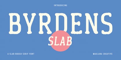 Byrdens is a retro slab serif font. With regular rounded stroke, fun character. To give you an extra creative work. Byrdens font support multilingual more than 100+ language. This font is good for logo design, Social media, Movie Titles, Books Titles, a short text even a long text letter and good for your secondary text font with script typeface. Make a stunning work with Byrdens font. Cheers, Maulana Creative
 - Fun Write by FunFont,
$19.00 Fun Write is a font characterized by a playful and enjoyable nature, much like letters inscribed with full-hearted merriment, as implied by its name. With its simple and naive font structure, rounded edges, and an absence of sharp angles, it eschews the pointed facets typical of expressive marker strokes. This font is exceptionally well-suited for your design projects requiring a whimsical and delightful character reminiscent of a child's world
 - Vivala Unicase by Johannes Hoffmann,
$15.00 Vivala Unicase is a modern, rounded linear grotesque that is easy to read even in small font sizes. The composition of uppercase and lowercase letters results in a unique typeface. The new version contains five weights, including a boldface, which greatly expands the design possibilities. With an extensive set of characters and symbols, it is ideal for posters, t-shirt design, promotional products, car design, labeling, trademarks and headlines.
 - Winkell by Paavola Type Studio,
$10.00 Winkell family is a futuristic all caps four width opentype™ font family of 16 fonts featuring multilanguage support. Winkell is heavily inspired by dystopian futuristic settings in science fiction especially subgenres like cyberpunk and other futuristic visuals. Simple all caps display design based on straight forms connected by 45° rounded angles. Winkell Mix+Match Letters™ system allows you to mix letters from same weight but different widths.
 - Jester Script by Paul O'Connell,
$9.95This comical styled Jester Script font was created to suit various design applications within the typeface market and is aimed at people looking for a clown styled brush script typeface that is very unconventional indeed. Designed and produced by Paul O'Connell of POCT, it is a distinct styled font script, loosely drawn with irregular rounded edges and curves to create a free flowing handwritten font that will appeal to everyone. - Natalya Monoline by insigne,
$21.99 Natalya Monoline is the rounded monolinear companion to Natalya. Like its predecessor, Natalya Monoline has a smooth rhythm and flows fluidly, due in no small part to its reliance on the golden spiral for its ornate swirls. This makes for an especially harmonious script with timeless appeal. The typeface family includes five weights with three alternate variations of the ascenders and descenders and includes OpenType ligatures, oldstyle figures and ending swashes.
 - Menaka Serif by Gunjan,
$49.00 Menaka is a high contrast type family. The main feature of the typeface is round shaped stroke ends, which distinct it with other serif fonts. Menaka solves problem in many design areas such as books, fashion brands and beauty products. Thought behind Menaka is to give classic yet modern form to a font. Menaka also serves well in short texts, article introductions, brands identity and packaging. Have fun with Menaka!
 - Enge Journal Antiqua by RMU,
$30.00 Hermann Zehnpfundt’s Enge Journal Antiqua, released by the Emil Gursch Foundry, Berlin, in 1910, revived and redesigned. This font contains also a long s, which can be reached by typing option + b, or turning the round s into the long one by using the OT feature historical forms. It is recommended to also use the OT feature discretionary ligatures to get access to all ligatures in this font.
 - Rottko by Aronetiv,
$9.99 Rottko is a strong, static grotesque. Round shapes tend to square. The smooth silhouette of the letters contrasts with the clear rhythm of the composition. Diagonal strokes are a bright accent. The font contains a standard set of Latin, mathematical symbols. Rottko is designed for poster slogans and bright headlines. This typeface suit for modern logo and branding. It's clear and memorable. The family set consist 12 style.
 - Dalcora by Linotype,
$29.99Dalcora was designed by Erwin Koch in 1989 in a single weight. The most distinguishing characteristic of this font is its unusual proportions. Text fonts are usually designed with more delicate horizontal strokes as the verticals, but Dalcora is exactly the opposite. Its slight slant to the right and the round forms of the letters make the font dynamic and cheerful. Dalcora is intended exclusively for headlines in larger point sizes. - Miraversa by Caligrafê,
$15.00 Miraversa is a display font inspired by calligraphic capitals. It's a typeface with characters of remarkable width, delicate serifs, and beautiful contrast. Most of the letterforms are round, with generous curves. It works as charming drop caps, beautiful titles, and nostalgic compositions. You can use this font on book/cover title designs, product labels, logos, posters and stationery. Features: Basic Alphabet All Uppercase and Punctuation Numbers and Symbols Language Support
 - Luengo by Hashtag Type,
$25.00 Luengo is a modern geometric sans serif font family. Rounded corners give a natural and overall home-felt feel with an accessible air and an elegant touch. Luengo is for display purpose, but it also looks great in longer copy, making this family of 5 weights perfect for a range of uses such as brand identities, packaging and editorial. Luengo offers ligatures and alternatives with manual kerning and spacing.
 - FF Carina by FontFont,
$68.99 Carina is based on the Modern serifs from the 18th and 19th centuries. With high contrast and proportions, the font has a pronounced feminine nature tailored by its stylish details and ornamental swashes and ligatures. The round letter shapes evoke the impression of pointed pen calligraphy. Carina s most striking feature is the Cyrillic glyph set (together with swashes and ligatures) that is created by a native Russian designer.
 - Cruz Cantera BT by Bitstream,
$50.99 Cruz Cantera is a crisp and stylish yet informal sans serif typeface created by NYC type designer Ray Cruz. It is a slightly condensed design. The vertical strokes have rounded terminals, and there are some characters with serifs. Notable characters include the upper and lowercase E. There are three weights and each works equally well alone, or together for both display and text. Original design by Ramon Cruz completed in 2002.
 - Talking Cat by Bogstav,
$12.00 There is no such thing as a talking cat, however, you can often find these in adventures, movies and other stories. At least, now you can have your own font called "Talking Cat", and perhaps even your cat will like it! Mine did! Talking Cat works very well with packaging, toys, posters, postcards or perhaps even flyers - the smoothly rounded edges makes sure your design keeps that handmade look!
 - Gelegar by Locomotype,
$19.00 Introducing Gelegar, the extraordinary ultra-wide display sans serif font meticulously crafted for commanding visual and emotional impact. Gelegar offers three distinctive styles – expanded regular, rounded, and press – each exuding its own unique character to suit your creative vision. Whether you're designing posters, social media posts, headlines, titling, or large-format prints, Gelegar ensures you stand out from the crowd. Embrace the font that demands attention and amplifies your message.
 - SK Primo by Shriftovik,
$16.00 SK Primo is a monumental geometric grotesque created to stand out. An unusual combination of smooth rounded contours and sharp square shapes creates a visual contrast that is noticeable. Carefully adjusted shape and attention to detail make this font a great help in the work of the designer. SK Primo is ideal for headlines, posters, banners, and text highlighting. Two styles, solid and outline, were developed to address all communication needs.
 - Fanny by Hatftype,
$15.00 Rounded Sans Serif Font is a font with 2 STYLE FONT, perfect for branding projects, logos, wedding designs, media posts, advertisements, product packaging, product designs, labels, photography, watermarks, invitations, stationery, and any project who need handwritten dishes. Features : 1. Uppercase & Lowercase 2. Multilingual support 3. Number 4. Symbol 5. Punctuation 6. Support in Mac and Windows OS -Support in design application (photoshop, illustrator, and more) I really hope you enjoy it.
 - Helena Handbasket NF by Nick's Fonts,
$10.00The 1888 edtion of James Conner's Sons United States Type Foundry specimen book listed this little gem simply as "Antique Light". Its original, rather anemic outlines have been beefed up and its serifs have been rounded, with the result that this face will get noticed wherever it goes. Both versions of this font include the complete Latin 1252 and CE 1250 character sets, with localization for Romanian and Moldovan. - Kticha by Typink,
$11.00 Excellent futuristic font with pretty rounded angles will fit any title or heading. It supports more than 20 European languages. This font is unique for it's elegant and thin letters. Font's idea came to the designer in the late autumn when tender yellow leaves fell to his hands. The combination of straight lines and bows had sparked a thought about the font, that could be used as awesome decoration.
 - Neue Northwest by Kaligra.co,
$19.00 Neue Northwest is a vintage sans serif family, Inspired by Vintage Wild west culture and combining with modern vintage touch. An All-Caps Sans Serif pairing with a Clean, Rounded & textured version of each. Choose between varying texture strength for your desired effect. This font is great for logo print, Restaurant Menus & Signage, Pubs, Bars, Tattoo Shops, Barber Shops, Butcher Shops, Handmade Brands, BBQ, Anything vintage styles related, etc
 - Middle Earth by Mans Greback,
$59.00 Middle Earth is a Medieval calligraphy serif font. With the historic charm of ancient manuscripts and the ethereal beauty of elven realms, Middle Earth typeface weaves tales of valor and legends. Its calligraphic allure is accentuated by rounded contours, reminiscent of Tolkien's enchanted worlds. The unusually large lowercase, almost circular in its form, seems to echo the undulating hills of the Shire, while its Irish-inspired design lends a timeless elegance.
 - Typist Slab Mono by VanderKeur,
$25.00 The typeface Typist originated during an extensive research on the origin and development of typewriter typestyles. The first commercially manufactured typewriter came on the market in 1878 by Remington. The typestyles on these machines were only possible in capitals, the combination of capitals and lowercase came available around the end of the nineteenth century. Apart from a few exceptions, most typestyles had a fixed letter width and a more or less unambiguous design that resembled a thread-like structure. A lot of this mechanical structure was due to the method the typestyles were produced. Looking at type-specimens for print before the first typewriters were good enough to came on the market we can see that in 1853 and in 1882 Bruce’s Type Foundry already had printing type that had a structure of the typewriter typestyles. Of course printing types were proportional designed as typewriter typestyles had a fixed width. So it is possible that except from the method of production for typewriter typestyles, the design of printing types were copied. In the design of the Typist, the purpose was – next to the monospace feature – to include some of the features of the early typewriter typestyles. Features such as the ball terminals and the remarkable design of the letter Q. This new typeface lacks the mechanical and cold look of the early typewriter typestyles. The Typist comes in six weights with matching italics in two versions. One that resembled the early typewriter typestyles (Typist Slab) and a version designed with coding programmers in mind (Typist Code).
 - Typist Code Mono by VanderKeur,
$25.00 The typeface Typist originated during an extensive research on the origin and development of typewriter typestyles. The first commercially manufactured typewriter came on the market in 1878 by Remington. The typestyles on these machines were only possible in capitals, the combination of capitals and lowercase came available around the end of the nineteenth century. Apart from a few exceptions, most typestyles had a fixed letter width and a more or less unambiguous design that resembled a thread-like structure. A lot of this mechanical structure was due to the method the typestyles were produced. Looking at type-specimens for print before the first typewriters were good enough to came on the market we can see that in 1853 and in 1882 Bruce’s Type Foundry already had printing type that had a structure of the typewriter typestyles. Of course printing types were proportional designed as typewriter typestyles had a fixed width. So it is possible that except from the method of production for typewriter typestyles, the design of printing types were copied. In the design of the Typist, the purpose was – next to the monospace feature – to include some of the features of the early typewriter typestyles. Features such as the ball terminals and the remarkable design of the letter Q. This new typeface laks the mechanical and cold look of the early typewriter typestyles. The Typist comes in six weights with matching italics in two versions. One that resembled the early typewriter typestyles (Typist Slab) and a version designed with coding programmers in mind (Typist Code).
 - FS Siena by Fontsmith,
$80.00 Eclectic FS Siena is a typeface with history, and not just in the sense of having its origins in classical Roman lettering. Fontsmith founder Jason Smith first committed it to tracing paper while still at college, instinctively redrawing letterforms based on Hermann Zapf’s Optima according to ‘what felt right’. When Krista Radoeva took up the challenge to edit and extend the typeface, she and Jason were determined to preserve its subtly nonconformist and eclectic spirit. Like a great dish, there are individual components throughout the character set that all add flavour, and need to be balanced in order to work together. The smooth connection of the ‘h’ ‘m’ ‘n’ and ‘r’ contrasts with the corners of the ‘b’ and ‘p’. The instantly recognisable double-storey ‘a’ – the starting point of the design – contrasts with the single-storey ‘g’ and the more cursive ‘y’. And only certain characters – ‘k’, ‘w’, ‘v’ and ‘x’ in the lowercase and ‘K’, ‘V’, ‘W’, ‘X’ and ‘Y’ in the caps – have curved strokes. Transitional FS Siena is a contrasted sans-serif typeface, blending classical elegance and modern simplicity. Its construction and proportions are descended from classical broad-nib calligraphy and humanist typefaces, with a high contrast between the thick and thin strokes. The angle of the contrast, though, is vertical, more in the character of pointed-nib calligraphy and modernist typefaces. This vertical stress helps to give FS Siena a strong, cultured presence on the page. Idiosyncratic italics The italics for FS Siena were developed by Krista to complement the roman upper and lower-case alphabets first drawn by Jason. Many of the letterforms are built differently to their roman counterparts: there’s a single-tier ‘a’, a looped ‘k’ and connections more towards the middle of stems, such as in the ‘m’, ‘n’ and ‘u’. These distinctions, along with generally much narrower forms than the roman, give the italics extra emphasis within body copy, where the two are side-by-side. In editorial, especially, the combination can be powerful. To cap it all… In his original draft of the typeface, Jason found inspiration in Roman square capitals of the kind most famously found on Trajan’s Column in Rome. In keeping with those ancient inscriptions, he intended the capitals of FS Siena to also work in all-upper-case text, in logotypes for luxury consumer brands and property developments, for example. A little added space between the upper-case letters lets the capitals maintain their poise in a caps-only setting, while still allowing them to work alongside the lower-case letterforms. The caps-only setting also triggers a feature called case punctuation, which adapts hyphens, brackets and other punctuation to complement the all-caps text.
 - Demine by Craft Supply Co,
$20.00 Introducing Demine – Condensed Bold Sans Serif Font The Perfect Typeface for Large Displays Demine – Condensed Bold Sans Serif Font is an ideal choice for meeting your large display typography needs. With its distinct features, this font stands out in the world of design. Bold Impact for Attention Demine’s bold design unquestionably captures attention. Whether it’s billboards, posters, or signage, this font excels in conveying a powerful message that can’t be ignored. Furthermore, it ensures that your content immediately seizes the viewer’s gaze. Optimal Readability Even at Scale Despite its condensed form, Demine prioritizes readability. Each character is thoughtfully crafted to remain clear and legible, ensuring your message is effectively communicated, even at larger sizes. Consequently, it guarantees that your audience can easily comprehend the content. Versatile Design Applications Demine’s versatility shines through in various design applications. It’s not limited to headlines; it also excels in branding, packaging, and any project where making a bold statement is essential. As a result, it can adapt to a wide range of creative endeavors. In Conclusion Demine – Condensed Bold Sans Serif Font epitomizes typography that marries boldness with clarity. When you need your message to shine large and clear, Demine is your go-to choice. Elevate your designs with Demine’s impactful presence, and witness your message soar to new heights, leaving an indelible impression on your audience.
 - Rafaella by Lián Types,
$37.00 To Rafaella, a menina dos cachos. We, designers, have grown accustomed to seeing that lowercase letters—not only in calligraphy but also in typography (1)—may be very playful and decorative. Almost every part of them can become a potential swash, ligature or decorative accolade (2) if the designer has some expertise regarding this matter. However, since we are living in an era that elevates the status of handcrafts, lettering has gained a lot of ground in different kinds of mediums, and with it there’s a sort of overuse of capitals. This may be due to the reason that lettering pieces need a high impact to convey their messages and many times why big capitals are the only solution. With this in mind, I started Rafaella: A font consisting entirely of capitals which go from unadorned to very decorative. Rafaella has ductus and forms vaguely based on the 1970s Bookman-like styled fonts. The presence and behaviour of serifs and ball terminals in this style were the perfect excuse to make really attractive aternates which the user can choose from the glyphs panel. The result is a font full of life. Able to be both very playful and formal due to its roman style which can be combined with (and between) a wide range of other styles of expressive scripts or geometric fonts with nice results (3). Also try Rafaella Shade Solo combined with Rafaella or Rafaella Bold for a layer effect to emphasize any given word or phrase. NOTES (1) See my fonts Erotica from 2013 or Dream from 2014. (2) Accolades is a wonderful word that refers to the ornaments made around the words in the spencerian style of calligraphy (3) Combinations often seen in different pieces of lettering were usually a contrast of style is wanted.
 - Rundig Pencil by Ingrimayne Type,
$9.95 RundigPencil has a semi-informal but very neat and rigidly upright handwritten look. It comes in three weights, each with italics. The calligraphic typeface Rundigsburg is based on similar letter shapes.
 - Natom Pro Variable by Mostardesign,
$66.00 Pour ceux qui souhaitent utiliser la famille de fontes Natom Pro en version variable, cette famille se décline en 3 fichiers avec la Roman, la Roman italic et la version Title.
 - Saskia Pro by RMU,
$30.00 A tribute to Jan Tschichold. His hot-metal font Saskia was released in 1931 by Schelter & Giesecke. This elegant italic font was finally redrawn, extended and digitized for present-day use.
 - Civolis by Furiosum,
$- Civolis is a small and modest humanist sans family. Accompanied by a friendly italic, wide latin language support, oldstyle figures and ligatures, it is ready for a wide array of applications.
 - Gazeta Stencil Ds by Vanarchiv,
$31.00 This display stencil typeface is extension from Gazeta font family, where the letterform cuts are more mechanical without loosing their own natural structure. Italic versions are not available, only roman characters.