5,000 search results
(0.033 seconds)
- Bleheri by Gatra Std,
$15.00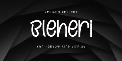 Introducing a cute handwriting "Bleheri" display font If you are needing a touch of casual modern calligraphy for your designs, this font was created for you! What's Included: - Uppercase and Lowercase - Number and Punctuation - Support Language This font works best in a program that supports OpenType features such as Adobe Indesign, Adobe Illustrator CC and CS, or Adobe Photoshop CC and CS also CorelDraw More Questions? Here are some (potential) answers! Do not to resell this font in any way. Multilingual Support is included for Western European Languages Have a Wonderful Day!
 - Klepon by Gatra Std,
$15.00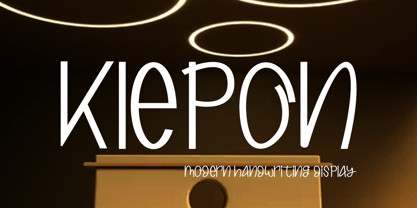 Introducing a cute handwriting "Klepon" display font If you are needing a touch of casual modern calligraphy for your designs, this font was created for you! What's Included: - Uppercase and Lowercase - Number and Punctuation - Support Language This font works best in a program that supports OpenType features such as Adobe Indesign, Adobe Illustrator CC and CS, or Adobe Photoshop CC and CS also CorelDraw More Questions? Here are some (potential) answers! Do not to resell this font in any way. Multilingual Support is included for Western European Languages Have a Wonderful Day, Gatra Std
 - Gaisma by Lamatas un Slazdi,
$59.00 Art Nouveau typeface "Gaisma" ("Light" in Latvian) contains characters for all the European languages, Cyrillic and modern Greek as well as a huge set of contextual and stylistic alternates and historical characters to replicate the texts of the era. It draws inspiration from Vienna Secession movement and Nordic National Romanticism. The work on the design started as drawings of several characters for the graphic standard for the Jugendstil museum in Riga. To use it more effectively and to get acquainted with the possible stylistic sets download the Gaisma specimen in pdf format.
 - Federico by Olga Umpeleva,
$30.00 Federico is a typeface based on the handwriting of Federico Garcia Lorca, the eminent Spanish poet and playwright (1898-1936). Original version was designed for a book about Lorca. The face has two styles. One looks like an original poets writing, the second looks like if Lorca would write with a ball pen. Federico includes many alternative glyphs and ligatures, which make it look like a real writing of an emotional, negligent, creative man. Despite the fact that Garcia Lorca has written in spanish, the font has western and eastern european, cyrillic, turkish letters.
 - Limboek by Gatra Std,
$10.00 Introducing a cute handwriting "Limboek" Handwritten Display Font! If you are needing a touch of casual modern display for your designs, this font was created for you! What's Included: Uppercase and Lowercase Number and Punctuation Support Language This font works best in a program that supports OpenType features such as Adobe Indesign, Adobe Illustrator CC and CS, or Adobe Photoshop CC and CS also CorelDraw More Questions? Here are some (potential) answers! Do not to resell this font in any way. Multilingual Support is included for Western European Languages Have a Wonderful Day, Gatra Std
 - Rantang by Gatra Std,
$12.00 Introducing a modern&elegant "Rantang" signature script If you are needing a touch of casual elegant signature script for your designs, this font was created for you! What's Included: Uppercase and Lowercase Ligatures Alternates Number and Punctuation Support Language This font works best in a program that supports OpenType features such as Adobe Indesign, Adobe Illustrator CC and CS, or Adobe Photoshop CC and CS also CorelDraw More Questions? Here are some (potential) answers! Do not to resell this font in any way. Multilingual Support is included for Western European Languages
 - Ponzastura by Matyáš Bartoň,
$39.99 Ponzastura typeface was inspired by Aldo Novarese's Eurostile, but in this case, monolinear strokes took on contrast and stress. The classical appearance of Ponzastura, whose name is inspired by the Italian city Pontestura where A. Novarese was born, is more of a reaction and interplay. The character set supports most European languages and contains ligatures as well as symbols, figures and alternative characters. Its strength is in a simplicity and format; recommended for use in headlines or short sentences. Ponzastura typeface can fill in a gap of high-contrasted fonts of nowadays.
 - Spydolls by SemutHitam,
$15.00 Introducing Spydolls a playful monoline script font inspired by the handwriting of marker pen, highly recommended for your design projects. You can use it for: logo design, t-shirt, branding, prints, and much more. A total of 600 glyph with a great selection of each glyph multilingual language support comes with a standard european made you not difficult to use. We hope to always keep making products more attractive. Don't hesitate to ask us if there are things you want to tell them:) Thanks and havefun with Spydolls
 - Alternasci by Morganismi,
$9.00 The Alternasci family consists of five consists of five individual fonts in the spirit of renaissance. Alternasci Regular is a handmade typeface resembling markings in old manuscripts. It supports most European languages. Alternasci Alchemia comes with the uppercase Alternasci letters and (in Latin) explained alchemy symbols. Alternasci Magia comes with lowercase Alternasci letters. The upper case is the so called Theban or Witch's Alphabet. It has also got some magical idols. Alternasci Picturae gives you by its four hundred pictures an imagery of good old science, mostly related with alchemy and occultism.
 - Crostini by Scholtz Fonts,
$19.00 Crostini was designed as a fun-filled, vigorous brush script, originally intended for restaurant logos and menus. As it evolved, I realized that it was more versatile than I'd thought - great for feminine, girly media as well as for more “in your face” marketing. While the characters are bold and dramatic, they are also feminine and rounded. Crostini contains all the accented characters used in the major European languages. Use Crostini for invitations, scrap-booking, advertising media, fashion media, restaurant media, food media, greeting cards - it’s great fun!
 - Linotype Centennial by Linotype,
$29.99 Centennial appeared in 1986 in honor of Linotype’s 100th birthday. The roman and light cuts of the font are reminiscent of the Century typeface, particularly on that of Linn B. Benton and Morris F. Benton, designed around the turn of the 19th century for the American Type Founders. Like Century, Centennial too embodies a cool, reserved neutrality.
 - Amina by Wayne Fearnley,
$40.00 Amina was created using the DNA of Metrik. A neutral grotesque sans serif, chopped and remixed to create Amino. The ink traps have been raised to create a dynamic typographic language that makes Amina contemporary and dynamic. Amina works great for bold, typographic treatments and still maintains readability in body copy. Includes language support, stylistic alternates.
 - P22 Coda by IHOF,
$39.95 Coda Pro is a simple but decorative and controlled sans serif design. Coda literally means ‘tail’ (Italian, from latin cauda) and refers to the way the letters h, m and n stretch below the writing line towards the end of a sentence or before a final stop. Coda Pro is an elegant and contemporary font suited for display purposes.
 - Nodhe by Wontenart,
$18.00 Fonts with special characters in lowercase vowels: a, i, u, e, o Make sentences more colourful. This font is neutral for use in any product. Especially for happy things, or life motivational words. or contemporary like the teenage years, discover the beauty of harmony in your work with this font. The right choice of fonts, makes a great product.
 - Gildan by Sign Studio,
$15.00 Gildan fonts come in 7 measured thicknesses. Inspired by a charming classic style. Equipped with several OpenType features (plain version); Discretionary Ligatures, Small Caps, Stylistic Sets, Oldstyle Figures. We made the italic version simpler but with controlled thickness on each side. Everything is made with the aim of complementing each other and supporting the design well. Regards
 - Antartida by Latinotype,
$26.00 Antartida is a sans serif typeface, while it is monolinear simple structure give it a kind of neutral feeling, is functional, clean and minimal. Is a family of 8 fonts, 4 weights and italics. This typeface contains alternate glyphs that help to emphasize text or headlines. You can also see AntartidaEssential, a simpler and less expensive version.
 - Tarpon Springs JNL by Jeff Levine,
$29.00 An early-1960s Canadian magazine ad for a brand of birth control pills featured the least likely spokesperson – Annette Funicello (“starring in “Beach Blanket Bingo” and “How to Stuff A Wild Bikini”). The text was hand lettered in an Art Deco-inspired sans serif type design. Tarpon Spring JNL is available in both regular and oblique versions.
 - Bassen by SRS Type,
$25.00 Bassen is a contemporary neo-grotesque typefaces that offers 10 uprights and matching italics. This typeface harmoniously combines classic respect with modern inspiration. Bassen is polite, neutral, highly legible, and aesthetically pleasing. Its low cap height makes it particularly versatile for mobile and website applications. Bassen seamlessly blends with any project, providing natural elegance, harmony, and perfect balance.
 - Fyra by Jonathan Hughes,
$- Fyra is a family of fonts ideal for diagrams and signage. Included in the family are versions with uppercase letters in circles and squares, as well as numbers 0-99 in circles and squares. The characters themselves were designed to be very neutral, so they should pair well with whatever other typefaces you are using on your project.
 - Closer by Mint Type,
$35.00 Closer is a highly customizable Swiss Grotesque with overclosed aperture. Being a bit wider than the average grotesque and featuring some humanistic shapes, Closer feels less bland though still relatively neutral. Closer comes in 9 weights (18 styles altogether), features extensive language support including Cyrillic and is highly customizable with 7 stylistic sets to mix and match.
 - Just Deine by URW Type Foundry,
$39.99 The idea was to create a fully equipped handwriting script. Thus equipped with all kinds of typographic features like for example true small caps, lots of special characters, different sets of figures, real underlining, all characters as sub- and subscripts, the cap variations, OpenType-features for controlled character string modulations ... In a nutshell: a fully equipped handwriting script.
 - Creata by Ivan Petrov,
$25.00 Creata is a sans serif typeface with a wide range of application. The font family contains 14 weights (7 straight with match italics). The overall design is neutral but some letters has pretty unusual appearance (for example @, &). Creata has its own personality, its own integrity and a unique voice. Recommended for corporate branding and editorial exercises.
 - Skie by Adam Ladd,
$25.00 Skie is a simple gothic sans serif with normal, condensed, and wide widths. Its distinguishing characteristics are the small x-height with tall ascenders and a minimal amount of contrast, while the apertures are semi-open to help in readability. The simple design keeps the appearance fairly neutral and presents a blend of modern and vintage qualities.
 - Clinica Pro by Mint Type,
$- Clinica Pro is a modern take on Swiss grotesques, with a little bit of an added personality. It features 8 weights, italics, 6 sets of figures, small caps and a bunch of ligatures. Still relatively neutral, it lets a brand stand out of the grotesque-crowded environment with support for multiple languages as well as Cyrillic script.
 - Baron by Juraj Chrastina,
$39.00 After Baronessa - funny but not crazy cartoon style font, Baron is an other handmade typeface, warm and friendly but not excessively childish. If Baronessa is a little feminine, Baron is neutral and it's funny and serious at the same time. Baron can tell jokes without smiling. Because a joke can be funny even if the teller doesn't smile.
 - Memphis Soft Rounded by Linotype,
$29.99 Because of the geometric basis of its forms, Memphis is often thought of as a font for technical fields, making a rational, purposeful impression. This emphasis on objectivity is well-suited to technical texts, but Memphis is appropriate for any text which should exhibit a clear, neutral character. Some weights are available as soft rounded versions.
 - Olpal by Bunny Dojo,
$16.00 A Display Serif, a Monoweight Sans, and an Inline form combining the two, Olpal is a versatile companion for your next adventure. With surprising vitality for a workhorse font, Olpal embraces any job – and whistles while it works. Neutral – with a hint of pizzazz – the font's strong legibility and compressed footprint make it a brilliant fit in any environment.
 - Noad Sans by Groteskly Yours,
$60.00 Noad Sans is an experimental sans serif typeface with a strong character and some very unique visual features. At the core of Noad Sans is a sturdy sans serif with closed apertures and fairly simple letterforms. The defining feature of Noad Sans, however, is its visualised nodes: all control points of Bézier curves in each of the fonts in the family are intentionally visualised. The effect of this feature is largely defined by the usage: in titles and larger bodies of text, the visualised nodes stand out and create a rhythmic pattern of their own. In smaller sizes, the sans serif base of the font becomes more prominent and the nodes create a visual fuzz. Noad Sans comes in 6 styles and as a Variable Font with two axes–Optical Size and Slant. The size of each node can be changed from the smallest (Mini and Mini Italic) to the largest (Extra and Extra Italic). Variable Font technology allows you to fine tune the size of the nodes and the slant angle, so that your version of Noad Sans can be truly unique. Noad Sans has a large character set of 570+ glyphs, covering the vast majority of Latin based languages. In addition to that there are dozens of special characters, punctuation, numbers, and symbols. Noad Sans is equipped with a number of useful OpenType features, such as Case-Sensitive Punctuation, Stylistic Alternates, Ligatures, Fractions and many more. Noad Sans began as an experimental project, and during its development the spirit of experimentation was at the heart of the project. Thanks to the unique nature of the typeface, it can feel at home in a variety of settings: from web development, graphic and product design to more novel uses like 3D and NFTs. Noad Sans type family includes 6 static fonts (Mini, Mini Italic, Regular, Regular Italic, Extra and Extra Italic) and one variable font. Each style can be purchased separately. There is a free trial version of Noad Sans that can be downloaded free of charge on MyFonts. For more information on the typeface, feel free to download Noad Sans PDF Specimen.
 - Clementine by Okaycat,
$24.50Clementine, from Okaycat, is a font designed to be expressive. First, we wanted Clementine to be uplifting, friendly and warm. Secondly, we wanted it to be familiar, but neither staid nor boring. To make Clementine more warm and friendly, 90 degree corners and cubic forms were not allowed. All straight edges are either subtly curved or lightly tapered (with the small exception of the serif foundations, to create a secure base). To add an uplifting feel, all tapering flows towards the apex of the forms and the ascenders were allowed extra rising freedom above the capital height, similar to the effect intended in the architecture of old European churches -- to point all elements gently upwards towards heaven. To keep Clementine familiar, traditional type setting shapes were used throughout the font. To avoid the usual coldness of typical typewritten fonts, all forms were opened up, calligraphic touches were introduced, and any unnecessary serif elements were omitted. The result is a look that brings a touch of nostalgia or a "retro" feel. Clementine is highly appropriate anywhere a soft and friendly feel is desired. Can work well as a body text, or as ad copy. Clementine is extended, containing the full West European diacritics & a full set of ligatures, making it suitable for multilingual environments & publications. - Evoque Text by Monotype,
$40.00 Evoque Text is a humanist serif type family specifically designed for a comfortable reading experience. This has been achieved by optically adjusting the regular weights from my original Evoque family (released November 2021). You will notice a significantly reduced x-height and longer ascenders and descenders, complemented by adjustments to weight and spacing. This makes Evoque Text a perfect choice for any long passages of text. All OpenType features have been retained from Evoque. A plethora of swash alternates and discretionary ligatures enhance Evoque Text, giving you the opportunity to embellish your typography. Simply activate Stylistic Sets to start adding these flourishes to your text. Other useful features include Small Caps at the click of a button, and Old Style Figures are an option to the default proportional figure style. There are 14 fonts altogether over 7 weights in roman and italic, you can also avail of two variable fonts which allow you to fine tune the weight to your exact liking. Evoque Text has an extensive character set (900+ glyphs) that covers every Latin European language. Key features: 7 weights in both roman and italic 80 Alternates 26 Ligatures Small Caps Variable fonts included with full family Full European character set (Latin only) 900+ glyphs per font.
 - Ahmed by Linotype,
$187.99Ahmed is a modern Arabic headline face, first produced by Linotype-Hell Ltd. in the early 1980s. Originally developed as a simplified face, its design recalls the inscriptional and decorative tile work lettering of the medieval period. The strong treatment of the tails of certain characters departs from the more traditional style of tapering these finials, introducing a modern feel to the design. The contrasting proportions of the tall vertical strokes and the rather elongated counters lend a monumental look to Ahmed, allowing its effective use in titling. During the later 1980s Ahmed was developed into a traditional typeface, with the introduction of medial forms to improve character spacing and balance. Recently, Ahmed has been converted into the OpenType font format, ensuring its continued popularity as a heading face for newspaper typesetting. The Ahmed typeface contains two weights, Ahmed and Ahmed Outline. Both of the OpenType fonts include Latin glyphs from Clearface Gothic Roman inside the font files, allowing a single font to set text in both most Western European and Arabic languages. The two Ahmed fonts include the Basic Latin character set and the Arabic character set, which supports Arabic, Persian, and Urdu. They include tabular and proportional Arabic, Persian, and Urdu numerals, as well as a set of tabular European (Latin) numerals. - Evoque by Monotype,
$40.00 Evoque is a humanist serif type family designed for both text and display purposes. Its appearance is crisp and modern while echoing a classical Garamond heritage. The inspiration for Evoque came after reminiscing over Apple’s advertising of the eighties and nineties that utilised incredibly tightly-spaced headlines set in Apple Garamond. I wanted to create a typeface that evoked nostalgia of those times and that distinctive typographic style. A number of swash alternates and discretionary ligatures enhance Evoque, giving you the opportunity to add more flair and personality to your title and branding designs. Simply activate Stylistic Sets to start adding these flourishes to your typography. Other useful features include Small Caps at the click of a button, and Old Style Figures are an option to the default proportional figure style. There are 36 fonts altogether, with 6 weights in roman and italic from Thin to Heavy weights across Condensed, Narrow, and Regular widths. Evoque has an extensive character set (900+ glyphs) that covers every Latin European language. Please also take a look at Evoque Text which is specifically designed for the publishing sector. Key features: 6 weights in both roman and italic 3 widths – Regular, Narrow, Condensed 80 Alternates 26 Ligatures Small Caps Full European character set (Latin only) 900+ glyphs per font.
 - Astro Serif by Typehead Studio,
$15.00 Introducing Astro, a charming serif font designed to bring an elegant and classic touch to your designs. Crafted with meticulous attention to detail and inspired by mid-millennium Serifs, Astro seamlessly blends traditional sophistication with contemporary elements, making it suitable for a variety of design projects, both print and digital. Enchanting Letter Shape Designs: Astro exudes charm with its letter design that is heavily inspired by the mid-millennium Serifs often found in European and American designs. Each letter is carefully carved to create a charming and luxurious impression. Unique Alternative Glyphs: Astro is not just a font; it is a standout typographic masterpiece. By offering several unique alternative glyphs, such as the letters a, g, and k, Astro gives designers the freedom to express their creativity in a unique and personal way. Mid-Millennium Serif Elegance: Astro features smooth lines and proportions, creating an elegant impression characteristic of mid-millennium Serifs. This design provides a timeless classic touch making it suitable for a variety of design needs, including books, magazines, posters and other printed materials. Ease Readability: While the Astro exudes striking elegance, its design also prioritizes readability and comfort. Each letter is created with balanced proportions and optimal contrast, ensuring text appears clear and easy to read, whether on a large or small scale. Flexible Use: Astro is designed to provide flexible use across a variety of design platforms. From the logo design to the magazine layout, Astro adapts beautifully, maintaining a consistent feel that enhances the aesthetic quality of the design. European and American inspiration: Astro creates a bridge between European and American typographic styles, combining the best elements of both traditions. This makes it the perfect choice for projects that combine elements from both continents. Astro is more than just a font, it is an artistic statement that leaves an unforgettable impression on any design project. Suitable for designers who appreciate classic beauty and modern uniqueness, Astro brings a special and charming feel to every character it creates.
 - Padraig Nua by Tony Fahy Font Foundry,
$25.00 Padraig Nua is a font conceptualized and designed by Tony Fahy. It is a European Celtic font, contemporary to many languages, not just of Europe but of the world. It’s origin is influenced by events in Ireland in the 1960s when it was decided that the uncial letterform should not be used further in Irish schools for the Irish language—Gaelic—and that it should be replaced by the Roman letterform—the Cló Romhanach as it was called afterwards. This happened overnight without any apparent discussion. It probably had a lot to do with Ireland joining the EEC, as the EU was called then. It had a massive effect on the Irish language and culture, in that the distinguishing factor that gave the language it’s identity—the half uncial/uncial fonts that were in use in all school, government and society documentation and merchandise—were lost overnight. No one said how or why. It was just done. To this day, all documentation is bi-lingual in government and Gaelic is taught in schools and universities—and decreed so by the European Union—but the presentation for both languages is the Roman letterform. Throughout the world, there are millions of Irish Americans and Irish Canadians, Irish Europeans, Australian Irish, African Irish and many living in the Middle East and Asia—and this new font—Padraig Nua, will appeal to many of them, visually recalling their roots. No one had thought, in those days, of commissioning a design that might update the Gaelic language to a more contemporary appearance that would keep the cultural nature of it intact with a revised and updated font—at one with Europe, the US and the world. Tony Fahy designed Padraig Nua (New Patrick) to address the problem. It keeps an appearance that lends towards the Gaelic language but steers it in the direction of Roman fonts. Some characters reflect letterforms from the Irish/Gaelic manuscripts and uncial fonts.
 - Ollivette by Chank,
$59.00The new distressed typewriter font Ollivette is inspired by a beatnik poet sitting on a beach in Mexico pecking away at his brand new, imported, Italian portable typewriter in 1954. That's where the basic letterforms for this font hearken from. The grungey patina has been added over the years and is now available for you to download in font format. If you prefer the basic TrueType or PostScript versions, you'll enjoy a new standard retro typewriter style. Users of the advanced OpenType features will appreciate stylistic alternates for almost every letter, and contextual alternates for a randomizing organic effect. Support for Western & Central Europe? Yeah! We put that in there, too. So go global, and go vintage, here's a classic new type for you. - Bilokos by AukimVisuel,
$9.00 Bilokos is a cool and modern display font. Expertly designed to make your creation look out of this world, this font has the potential to take your creative ideas far further. This is a condensed sans serif display font. On the one hand, it has rounded curves with very open terminals that make this font family elegant, user-friendly and contemporary and on the other hand very useful for writing titles in any medium. It also comes with stylistic alternates of 0-9, A-Z and a-z to satisfy the most demanding professionals. With its large character set, it meets the needs of professionals because it will support several languages of Western Europe, Eastern Europe, Central Europe, Greek and Cyrillic for international communication.
 - Dining Car JNL by Jeff Levine,
$29.00 A 1929 German travel poster espoused the benefits of using a sleeping car with the caption “Wer Schlafwagen reist spart Zeit und Geld” (which translates to “Whoever travels in a sleeping car saves time and money”). Pictured on the poster is a passing train with the name "Mitropa" lettered on the side of a railway car in a bold, stylized font with thin slab serifs. "Mitropa" was an acronym of “Mitteleuropa” (German for Central Europe), and was used by a catering company than ran the sleeping and dining cars of numerous German railways for a good portion of the 20th Century. The lettering was modified and redrawn as Dining Car JNL, which is available in both regular and oblique versions.
 - 1470 Sorbonne by GLC,
$21.00 This family was created inspired from the first font carved and cast in France, for the Sorbonne University’s printing workshop (Paris). The characters were drawn by Jean Heynlin, rector of the university - inspired from Pannartz’s - and in all probability was carved by Adolf Rusch. It has only one style, in one size (about 14 Didots points). We have added the U, J, W and Y, some accented characters and others not in use in the original, but the standard and historical ligatures and the numerous Latins abbreviations are these of the original font. The font is proposed in two choices : Basic Latin, MacTT & TTF, free for a private use, and “Pro”, TTF/OTF, available for standard basic Latin plus Central Europe, Baltic, Turkish, Croatian, Romanian, Celtic.
 - Ongunkan Kensington Runestone by Runic World Tamgacı,
$70.00 The Kensington Runestone is a rune-covered slab of brownstone that was claimed to have been discovered in central Minnesota in the United States in 1898. Olof Öhman, a Swedish immigrant, reported that he dug it out of a field in the largely rural town of Solem in Douglas County. It was then named after the nearest settlement, Kensington. The inscription claims to be a record left behind by Scandinavian explorers in the 14th century (internally dated to 1362). There has been a long-standing debate as to the stone's authenticity, but since the first scientific review in 1910, scientific consensus has classified it as a 19th-century hoax, and some critics have directly accused Öhman of fabricating it. there is community.
 - Sans Skript by Felitasari Rekso,
$25.00 Sans-Skript is a display typeface that is inspired by Javanese Script (or Sanskerta in Bahasa Indonesia). Javanese script is one of Indonesia’s many traditional scripts that were commonly used by Javanese people from mid-15th CE to mid-20th CE. Though not commonly used anymore, it is still taught and used in cities across East and Central Java. Sans-Skript translates the high-contrast, modular and organic features of the Javanese Script into the Latin alphabet. (Hence the not-script naming) The typeface is aimed to be used for large format prints, above 100 pt, and can be used alongside Javanese script. Typefaces that pair nicely mimic features of Javanese script, and Hatton by Pangram Pangram Foundry is an example.