10,000 search results
(0.033 seconds)
- Friends by W Type Foundry,
$25.00 Friends is a complete and contemporary language system for postmodern graphics. Inspired by the idea of making new art and graphic design keeping in mind new ways of visual language like emojis as a formal way of communication and contemporary graphic arts. Friends is perfect for web design, postmodern arts, book design, posters, editorial design, branding, advertising, headlines, and short texts. Friends includes 14 style typeface plus italics, icons, emojis, arrows, ligatures, fractions, special numbers, etc.
 - Havin Bride by Letterhend,
$17.00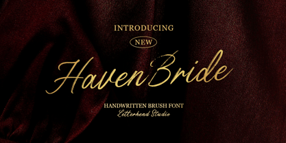 Haven Bride is the beautiful brush script font that perfectly captures the casual of a handwritten. With its natural feel and casual, chic style, it's the perfect choice for branding, logos, and the other various formal forms such as invitations, labels, logos, magazines, books, greeting / wedding cards, packaging, fashion, make up, stationery, novels, labels or any type of advertising purpose where a personal touch is needed. Features : Uppercase & lowercase Numbers and punctuation Alternates & Ligatures Multilingual PUA encoded
 - Mosse Thai by Deltatype,
$59.00 Mosse Thai is an extraordinary sans-serif typeface that designed for improve readability, formal but casual, with straight cut at terminal and reverse angled at spur and finial give a little bit sweet. Mosse is simple and identical, come with nine weights allowed you to use the right weight to the right proportions. Mosse Thai also support many languages, thanks to extended latin glyphs. Mosse Thai come with standard Adobe Latin 4 glyphs, world-ready and mark2mark support.
 - Shining Holiday by Zeenesia Studio,
$15.00 Shining Holiday is a calligraphic script font that comes with a lovely alternative character. mix of copper calligraphy in a handlettering style. Designed to convey an elegant style. Shocking Script is attractive because it is smooth, clean, feminine, sensual, glamorous, simple and very legible. Its classic style is very suitable to be applied to all types of formal items such as invitations, labels, menus, logos, fashion, make up, stationery, letterpresses, romantic novels, magazines, books, greeting / wedding cards, packaging, labels.
 - Quirked by Letterhend,
$17.00 Quirked is a quirky bold font with unique letterform. You can playaround to fit the form using standard character with alternate character to create new looks. This font perfectly made to be applied especially in logo, and the other various formal forms such as invitations, labels, logos, magazines, books, greeting / wedding cards, packaging, fashion, make up, stationery, novels, labels or any type of advertising purpose. Features : Uppercase & lowercase Numbers and punctuation Alternates/Ligatures Multilingual PUA encoded
 - Gargamoth by Letterhend,
$17.00 Introducing, Gargamoth - A modern blackletter typeface. This type of font perfectly made to be applied especially in logo, and the other various formal forms such as Logo, Clothing, Fashion, Headline, or any type of advertising purpose. Features : uppercase & lowercase layered fonts numbers and punctuation stylistic alternate multilingual PUA encoded We highly recommend using a program that supports OpenType features and Glyphs panels like many of Adobe apps and Corel Draw, so you can see and access all Glyph variations.
 - Fountencil by Letterhend,
$19.00 Introducing, Fountencil - A blackletter stencil typeface. This type of font perfectly made to be applied especially in logo, and the other various formal forms such as Logo, Clothing, Fashion, Headline, or any type of advertising purpose. Features : uppercase & lowercase numbers and punctuation stylistic alternate multilingual PUA encoded We highly recommend using a program that supports OpenType features and Glyphs panels like many of Adobe apps and Corel Draw, so you can see and access all Glyph variations.
 - Original Surfer Pro by Stiggy & Sands,
$29.00 Our Original Surfer Pro is an offbeat sans serif font bursting at the seams with lively personality. Inspired by a vintage advertisement for the "California Cliffs Caravan Park", this font exudes all of the fun of a summer vacation anytime of the year. The letterforms are clear and cleanly legible, while nothing is formal or uptight about this font. The SmallCaps and extensive figure sets offer Original Surfer Pro an even wider range of design options.
 - Cern by Wordshape,
$20.00 Cern is a family of20 weights of neutral, yet formally nuanced grotesk typefaces that takes inspiration from the original metal types from Switzerland, yet had a slightly larger x-height for more pronounced legibility. Cern is designed to be highly readable in print and on-screen. The italic variations are true italics and have been designed for smooth, fluid reading and text-setting. The Cern family works equally well for text typesetting and for display design work.
 - Bilany by Letterhend,
$14.00 The Bilany is a font duo package contain a classic script and slab serif which looks great to be paired especially for vintage and adventure theme! This font duo is purposely made for headline, display or logotype, and the other various formal forms such as invitations, labels, logos, magazines, books, greeting / wedding cards, packaging, fashion, make up, stationery, novels, labels or any type of advertising purpose. Features : Uppercase & lowercase Numbers and punctuation Alternates & Ligatures Multilingual PUA encoded
 - Jackipur by HGB fonts,
$20.00 The motivation for Jackipur was: to achieve more openness and thus more clarity. That's why I created more clarity in the structure of the letters in order to avoid formal ambiguities that arise especially with small degrees. I found it important to open up the round letters so that they are straight and horizontal along the center and baselines so that the eye can connect the letters directly and quickly. A simple font, but neither plain nor without elegance.
 - Adriane Lux by Typefolio,
$49.00 Adriane Lux is the decorative, "inline" or "openface" titling companion to Marconi Lima's acclaimed Adriane Text family. This single weight offering is modeled after the Regular weight of the primary family. While Adriane Text is intended for thoroughly classical book design, Adriane Lux enters the fold as an equally traditional display face. Have it foil-stamped on your next faux-leather book cover design or embossed on your personal calling card for a touch of well-behaved, regal formalism.
 - Golden Way by Typehill Studio,
$12.00 Golden Way Family attracts such a subtle, clean, feminine, sensual, glamorous, simple and very readable typeface. The classic style is perfect to apply in various formal forms such as invitations, labels, menus, Logos, fashion, make up, stationery, letterpress, romantic novels, magazines, books, greeting / wedding cards, packaging, labels Golden Way Family also features a strong neoclassical serif typeface with high contrast, cool, stylish and unique look with alternative fonts, Ligatures, and multilingual support Thank you for your visit.
 - Edberd by Juliawan90,
$15.00 Edberd is a beautiful font. This font perfectly made to be applied especially in logo, and the other various formal forms such as invitations, labels, logos, magazines, books, greeting / wedding cards, packaging, fashion, make up, stationery, novels, labels or any type of advertising purpose. We highly recommend using a program that supports OpenType features and Glyphs panels like many of Adobe apps and Corel Draw, so you can see and access all Glyph variations. Happy Designing!
 - Killviners by Letterhend,
$19.00 Introducing, Killviners - A modern blackletter typeface. This type of font perfectly made to be applied especially in logo, and the other various formal forms such as Logo, Clothing, Fashion, Headline, or any type of advertising purpose. Features : uppercase & lowercase numbers and punctuation stylistic alternate multilingual PUA encoded We highly recommend using a program that supports OpenType features and Glyphs panels like many of Adobe apps and Corel Draw, so you can see and access all Glyph variations.
 - The Morydane by Letterhend,
$19.00 Introducing Morydane a script font perfect for designers looking for a modern and casual style. With its clean lines and flowing curves, this font is ideal for adding an interesting touch to your designs,especially in logo, and the other various formal forms such as invitations, labels, logos, magazines, books, greeting / wedding cards, packaging, fashion, make up, stationery, novels, labels or any type of advertising purpose. Features : Uppercase & lowercase Numbers and punctuation Alternates & Ligatures Multilingual PUA encoded
 - Drawlers by Letterhend,
$14.00 Drawlers is a organic sans with stencil versionthat effortlessly infuses your designs with a touch casual and a dash of classic. Its unique type- maekt it perfect choice for any projects especially in logo, and the other various formal forms such as invitations, labels, logos, magazines, books, greeting / wedding cards, packaging, fashion, make up, stationery, novels, labels or any type of advertising purpose. Features : Regular & Stencil Version Uppercase & lowercase Numbers and punctuation Alternates & Ligatures Multilingual PUA encoded
 - Shaliya by Juliawan90,
$15.00 Shaliya is a beautiful font. This font perfectly made to be applied especially in logo, and the other various formal forms such as invitations, labels, logos, magazines, books, greeting / wedding cards, packaging, fashion, make up, stationery, novels, labels or any type of advertising purpose. We highly recommend using a program that supports OpenType features and Glyphs panels like many of Adobe apps and Corel Draw, so you can see and access all Glyph variations. Happy Designing!
 - Avantime by Supfonts,
$16.00 Charming 80's retro inspired typeface with wonderful versatility given it includes 30 fonts. This is a perfect for any project Inspired by magazine adverts from the 70's and 80's - this family fit right in with bringing retro back into the 21st century. Super-versatile - have a scroll through all the preview to see the very wide range of variety the Avantime back can manifest the possibilities are really quite endless :) Avantime Font Features: 30 fonts Full Set of standard alphabet and punctuation PUA Encoded - no special software needed to access extra characters Language support: All European languages Multilingual Characters
 - Kaikoura by Hanoded,
$15.00 Kaikoura is a small town on the east coast of the South Island of New Zealand. It is a very pleasant, laid-back place where the mountains meet the sea. Kaikoura is also the best place in the world to spot sperm whales. Kaikoura font is quite similar in appearance: it is laid-back and beautiful, has sharp peaks and generous curves. I am still trying to find out how to add whale watching to this description… Kaikoura is an all caps font with a lower case alternative for the o and y. It comes with an ocean of diacritics.
 - Smooth Soul by Get Studio,
$15.00 SmoothSoul is a display sans-serif font with a smooth shape and a retro style characterized by its lack of decorative lines, which gives it a clean and modern-retro appearance. The smooth curves of this font create a sense of fluidity and ease, while the lack of serifs makes it feel relaxed and informal. The retro style of this font is evocative of the 1960s and 70s, with a nod to the playful and carefree design sensibilities of that era. Overall, this font is perfect for conveying a sense of fun and approachability, while still maintaining a sense of professionalism and modernity.
 - Rufina STD by TipoType,
$13.00 Rufina was as tall and thin as a reed. Elegant but with that distance that well-defined forms seem to impose. Her voice, however, was sweeter, closer, and when she spoke her name, like a slow whisper, one felt like what she had come to say could be read in her image. Rufina's story can only be told through a detour because her origin does not coincide with her birth. Rufina was born on a Sunday afternoon while her father was drawing black letters on a white background, and her mother was trying to join those same letters to form words that could tell a story. But her origin goes much further back, and that is why she is pierced by a story that precedes her, even though it is not her own. Maybe her origin can be traced back to that autumn night in which that tall man with that distant demeanor ran into that woman with that sweet smile and elegant aspect. He looked at her in such a way that he was trapped by that gaze, even though they found no words to say to each other, and they stayed in silence. Somehow, some words leaked into that gaze because since that moment they were never apart again. Later, after they started talking, projects started coming up and then coexistence and arguments, routines and mismatches. But in that chaos of crossed words in their life together, something was stable through the silence of the gazes. In those gazes, the silent words sustained that indescribable love that they didn't even try to understand. And in one of those silences, Rufina appeared, when that man told that woman that he needed a text to try out his new font, and she saw him look at her with that same fascination of the first time, and she started to write something with those forms that he was giving her as a gift. Rufina was as tall and thin as a reed, wrote her mother when Rufina was born.
 - Prosaic Std by Typofonderie,
$59.00 A Postmodern vernacular sanserif in 8 fonts Prosaic designed by Aurélien Vret is a Postmodern typographic tribute to the french vernacular signs created by local producers in order to directly market their products visible along the roads. These signs drawn with a brush on artisanal billboards do not respect any typographic rules. The construction of these letterforms is hybrid and does not respect any ductus. Nevertheless the use of certain tools provokes a certain mechanism in the development of letter shapes. It’s after many experiments with a flat brush, that’s these letterforms have been reconstructed and perfected by Aurélien Vret. This is the starting point for the development of an easily reproducible sanserif with different contemporary writing tools. From non-typographical references of Prosaic towards readability innovation The influence of the tool is revealed in the letterforms: angular counterforms contrasting to the smoothed external shapes. This formal contrast gives to Prosaic a good legibility in small sizes. These internal angles indirectly influenced by the tool, open the counterforms. In the past, to deal with phototype limitations in typeface production, some foundries modified the final design by adding ink traps. In our high resolution digital world, these ink traps — now fashionable among some designers — have little or no effect when literally added to any design. Should one see in it a tribute to the previous limitations? Difficult to say. Meanwhile, there are typeface designers such as Ladislas Mandel, Roger Excoffon, and Gerard Unger who have long tried to push the limits of readability by opening the counters of their typefaces. Whatever the technology, such design research for a large counters have a positive impact on visual perception of typefaces in a small body text. The innovative design of counter-forms of the Prosaic appears in this second approach. Itself reinforced by an exaggerated x-height as if attempting to go beyond the formal limits of the Latin typography. It is interesting to note how the analysis of a non-typographical letters process has led to the development of a new typographic concept by improving legibility in small sizes. Disconnected to typical typographic roots in its elaboration, Prosaic is somewhat unclassifiable. The formal result could easily be described as a sturdy Postmodern humanistic sanserif! Humanistic sanserif because of its open endings. Sturdy because of its monumental x-height, featuring a “finish” mixing structured endings details. The visual interplay of angles and roundness produces a design without concessions. Finally, Prosaic is Postmodern in the sense it is a skeptical interpretation of vernacular sign paintings. Starting from a reconstruction of them in order to re-structure new forms with the objective of designing a new typeface. Referring to typographic analogy, the Prosaic Black is comparable to the Antique Olive Nord, while the thinner versions can refer to Frutiger or some versions of the Ladislas Mandel typefaces intended for telephone directories. Prosaic, a Postmodern vernacular sanserif Prosaic is radical, because it comes from a long artistic reflection of its designer, Aurélien Vret, as well a multidisciplinary artist. The Prosaic is also a dual tone typeface because it helps to serve the readability in very small sizes and brings a sturdy typographic power to large sizes. Prosaic, a Postmodern vernacular sanserif
 - Bloco Pro by CheapProFonts,
$10.00 Geometric elements combined to create solid square letters. Makes for interesting blocks of text - and headings. All the diacritical letters have the diacritic embedded into the base letter, so every glyph in this font is within a square. Start stacking your text! ALL fonts from CheapProFonts have very extensive language support: They contain some unusual diacritic letters (some of which are contained in the Latin Extended-B Unicode block) supporting: Cornish, Filipino (Tagalog), Guarani, Luxembourgian, Malagasy, Romanian, Ulithian and Welsh. They also contain all glyphs in the Latin Extended-A Unicode block (which among others cover the Central European and Baltic areas) supporting: Afrikaans, Belarusian (Lacinka), Bosnian, Catalan, Chichewa, Croatian, Czech, Dutch, Esperanto, Greenlandic, Hungarian, Kashubian, Kurdish (Kurmanji), Latvian, Lithuanian, Maltese, Maori, Polish, Saami (Inari), Saami (North), Serbian (latin), Slovak(ian), Slovene, Sorbian (Lower), Sorbian (Upper), Turkish and Turkmen. And they of course contain all the usual "western" glyphs supporting: Albanian, Basque, Breton, Chamorro, Danish, Estonian, Faroese, Finnish, French, Frisian, Galican, German, Icelandic, Indonesian, Irish (Gaelic), Italian, Northern Sotho, Norwegian, Occitan, Portuguese, Rhaeto-Romance, Sami (Lule), Sami (South), Scots (Gaelic), Spanish, Swedish, Tswana, Walloon and Yapese.
 - Adversary BB by Blambot,
$8.00 Blambot's Adversary BB family is a robust sans with a hint of retro-futurism. It was initially created for use in Blambot founder, Nate Piekos's pesonal title block for design projects. It's therefor very clean and extremely legible. The set includes regular, italic, bold, and bold italic.
 - Swipe Write by Something and Nothing,
$10.00 The Swipe Write letterforms are casual yet also look neat in a paragraph block of display copy. Available in both Regular and Solid styles, it is a powerful font that can be used for, posters, T-shirts, signage & design projects with a freehand and artistic feel.
 - Thornback by Lauren Ashpole,
$15.00 Thornback is a hand-drawn font that uses quick, scribbled strokes to create it's slightly messy sans-serif characters. The detailed letters make it a good choice for headlines but it's also bold enough to add a homemade touch to smaller text blocks while keeping things legible.
 - Stickball JNL by Jeff Levine,
$29.00 Using examples of antique street signs from New York City, Stickball JNL recreates the iconic lettering in a digital typeface and is available in both regular and oblique versions. For a nostalgic touch, a blank street sign is located on either the solid or broken bar keystrokes.
 - Quirthy by Brithos Type,
$11.00 Quirthy is a textured brush handwritten font. This fantastic font is best suited for headlines of all sizes, as well as for blocks of text that have both maximum and minimum variations. Whether it’s for web, print, moving images or anything else – Quirthy will look spectacular.
 - HT Qays Sans by HadiTypeStudio,
$85.00 HT Qays Sans New Arabic Font performs equally well in print and on-screen and the designs can be used at very small sizes in packaging and catalogs, while massive print headlines – even complicated way-finding projects pose no stumbling blocks to the family’s typographic dexterity.
 - Margate JNL by Jeff Levine,
$29.00 A set of water-applied decals manufactured in 1962 by the American Decalcomania Company for Goodyear serves as the basis for Margate JNL. This block-style letter (with a hint of the Art Deco era) is bold, uniform in weight and commands attention in any titling application.
 - Quinie SS by Sensatype Studio,
$15.00 Quinie is Modern Retro Fancy Font is a well-balanced contemporary font with a fancy, unique, and versatile vintage serif, font that you can combine to get any variations and unique shapes easily just in seconds with choose alternates of them. It is a serif display font with moderate contrast that perfect for branding projects, logo, wedding designs, social media posts, advertisements, product packaging, product designs, label, photography, watermark, invitation, stationery, and any projects, it makes with a high level of legibility. What's Included: Character set A-Z Normal & Italic Style Numerals & Punctuation Accented Characters (West Europe) Stylistic alternates Works on PC & Mac Recommended using Adobe Illustrator or Adobe Photoshop. Wish you enjoy our font. :)
 - Malnor Sans by Sikifonts,
$24.00 Malnor Sans is a normal sans serif family of 18 fonts. With modern style or neo-grotesque, Malnor sans has balanced proportions in every letter, and it's clean, minimal and cool. There are several alternative letters that can be used in both upright and oblique styles. Single story 'a' can give a more geometric impression, even though it is not purely geometric. There is also an alternative double story 'a' with a tail, a double story 'g' and an alternative 'l' that can be applied together via the 'salt' or 'stylistic sets' features for a slightly warmer feel. Malnor Sans currently has around 900 glyphs, including diacritical marks, that support a broad Latin-based language.
 - Andron 2 ABC by SIAS,
$44.90 Andron 2 ABC is a product developed especially for children’s literature. It is an ideal choice for primers and other books for the age when children are learning to read. The typeface has the same peak typographic quality as any other font of the praised Andron series—the very best is just good enough for our kids, is it not? As a difference from the normal glyph set (as in Andron 1 Latin or Andron Mega), the letters a, g and y have those simpler single-story shapes that resemble the forms usually taught in writing, which are sometimes called infant letterforms. Now, Andron 2 ABC is available in a full four-font family set.
 - NorB Type Writer Roughen by NorFonts,
$25.00 NorB TypeWriter Roughen is the roughen version of my NorB TypeWriter typeface witch's my emulation of the IBM Selectric 'Light Italic' ball witch was used by my grand-brother for his correspondance during the 70’s and 80’s. It's however a slanted mono-spaced looking typewriter font. You may want to use this font with any word processing program for text and display use, print and web projects, apps and ePub, comic books, graphic identities, branding, editorial, advertising, scrapbooking, cards and invitations and any casual lettering purpose… or even just for fun! NorB TypeWriter Roughen features 677 glyphs, OpenType features and comes in 6 weights each with their matching italics and in a Light, Normal and Bold version.
 - Aceituna by Hanoded,
$15.00 Aceituna means ‘olive’ in Spanish. It comes from the Arabic Al-Zeitoun. I am multi-tasking today: finishing this font and thinking about what to cook for my family tonight (yes, I am the one who cooks!). We normally eat Asian food, but I was toying with the idea of serving something Mediterranean and realised we had run out of olives. So there you have it: the super simple trick of naming a new font! But enough of cooking: Aceituna font was made with a Japanese brush pen. It is a very versatile font: tall and thin, elegant and a little messy. A hint of texture and, like olives, it goes with almost anything.
 - FT Massachusettz by Foxys Forest Foundry,
$9.00 FT Massachusetts is a dense, hand-drawn sans-serif typeface with uneven edges and a dancing baseline. It creates a vivid impression, feels friendly, playful, and communicative. The font is full of alternate letters, symbols, and graphics. It easily adapts, confidently engages with the customer, and transforms slightly depending on the space and purpose. Change letters to alternates for the uniqueness of spellings. For convenience, alternative characters are used when typing in lowercase, and normal letters are used when typing in uppercase. Additionally, you can always switch letters to additional alternative ones and insert symbols. Furthermore, to add visual interest, the font is equipped with auto-replacements for prepositions and word endings.
 - Roclante Display by FoxType,
$12.00 Roclante Display is a Brand New Elegant Typeface with a powerful font family. It has a dependable and uncompromising style, with controlled letterforms and modern touches. It looks amazing in logos, magazines, and movies. Roclante Font would be perfect for branding, headlines, Captions, paragraph, and posters. The various weights allow you to experiment with a wide range of applications. It's created to make an impression without sacrificing its beauty and readability. It's shown a clean, minimalist, warmth, quirky, yet still purposed to be versatile The Typeface includes Six Weights - UltraLight, Light, Normal, Medium, DemiBold, & Bold. All offer wide language support, upper and lower cases, numerals and extended punctuation. Thank you for taking the time to look into the font.
 - Sica Condensed by dooType,
$30.00 The Sica Family was designed in order to address issues related to technology, while maintaining humanistic forms. Thus, a font with square shapes emerged, but with smooth curves and slightly rounded terminals making it friendly. The family has three widths – condensed, normal and expanded – each of them with six weights and their respective italics, resulting in 36 fonts. With particular details and open shapes that increase legibility, it can be used for both text compositions as well for display sizes. It has 774 glyphs, covering more than 50 languages, as well as ligatures, lining, oldstyle, tabular and proportional figures, fractions, superiors, inferiors, and small caps, all of them accessible through OpenType features.
 - Skiltmaler by Imagi Type,
$15.00 Skiltmaler is the typeface that refers to the style of decorative arts during the Victorian era 1837 to 1901, the Victorian era was the period in which fly poster typography emerged. The large amount of colour in combination with large font sizes were created from movable metal type. As well as being made from wood, this was used to create the two-coloured typefaces. You would imagine this would be specific to the '3D' styled type seen on the poster to create the drop shadow. Skiltmaler works well with normal size text, but it works even better for large displays, short words, or even just to incorporate a few or single characters in a design.