7,511 search results
(0.017 seconds)
- Skorid by Totem,
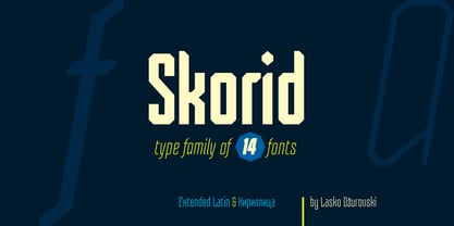
$20.00Skorid is a geometric condensed sans serif font family, constructed only out of straight lines. Coming in 7 weights, regular and italic, from thin to black, you have a wide array of possibilities of using Skorid for any purpose you need. Skorid speaks around 70 languages, including Cyrillic. Contains a lot of alternative letters to boost your creativity. - Tact by Pesic,
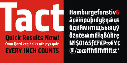
$35.00Tact is a geometrically sans serif font, black and condensed looking glyphs, with an alternative glyph set to improve its use in different graphic contexts. It is suitable for use in the fields of science, art, architecture, urban planning, techniques, electronics, advertising, futuristic themes, sport, film, computers, phones, video games, magazines... Contains all Latin and Cyrillic glyphs. - Pinatas Marks by Piñata,
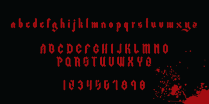
$12.00Original Foundry: TypeType Original name: TT Marks The typeface Pinatas Marks is made in the style of the traditional American sign painting, which is the traditional art of painting on buildings, billboards and signage for the purpose of announcing or advertising of products, services, and activities. Font family Pinatas Marks consists of 32 fonts and has 8 different weights: Thin, ExtraLight, Light, Regular, Medium, Bold, ExtraBold, Black. Pinatas Marks is looking great on all the modern information media, ranging from small labels to entire text blocks. - CloisterBlack BT - Unknown license
- Burned Rubber - Unknown license
- Huova by VP Creative Shop,
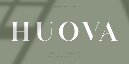
$20.00Huova is classic, sophisticated typeface with 4 fonts to enchant your next project. Very versatile fonts that works great in large and small sizes. Basic latin, advanced latin, basic Cyrillic and advanced Cyrillic character sets are supported! Huova is perfect for branding projects, home-ware designs, product packaging, magazine headers - or simply as a stylish text overlay to any background image. Uppercase numeral, punctuation & Symbol Light, Regular, Bold, Black Multilingual support Basic and Advanced Cyrillic support Feel free to contact me if you have any questions! Mock ups and backgrounds used are not included. Thank you! Enjoy! - Hakan by Typefactory,
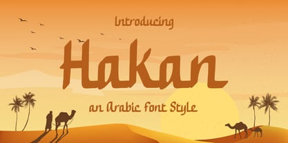
$14.00Hakan is an modern display font with an Arabian look. This font particularly for those not native to Arabic languages. Hakan try to bring back the Baghdad and Alladin memories to your design or typography. The font suits creative titling on both web and print, perfect for scroll text. Well balanced letters make for readable blocks of copy or headings. - Stanzer by FaceType,
$35.00Stanzer is an interpretation of wood type combined with the idea of modern stencils. Instead of cutting every letter, we are presenting an example of how a modern stencil typeface could look like, as we have come to the conclusion that almost every letter works without cutting it. Stanzer is a Unicase typeface, available in three OpenType weights: Black, Shadow and Block. Stanzer first started as part of our diploma 2010 (it was called Stanley at that time). The basic idea behind this typeface is that it is fully stencil usable, and, unlike other stencil fonts, does not require any bridges (except for the O and Q). Almost every letter can be sprayed without inserting planks. However, Stanzer also offers the display weight Block, which is only suitable for print or online usage. - Schwarz by Miguel Ibarra Design,
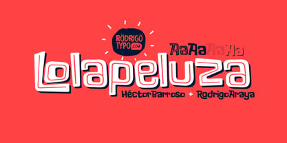
$20.00 - Lolapeluza by RodrigoTypo,
$45.00Inspired by the logo from “Lollapalooza”. The intention was to design a cheerful, entertaining typeface. Lolapeluza works perfectly for designs for children and youth. 4 variants are also included: -Regular: Basic set -Black: Heavy -line. Lolapeluza can run over or behind a text -Shadow. A Cyrillic alphabet is also included to enhance but the typography is more a set of alternatives. - Hatchway by Rômulo Gobira,
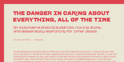
$15.00Hatchway is a monospaced display typeface with rounded corners, suitable for headlines and short passages of text. Hatchway has a tall x-height and unusually short ascenders and descenders. The family contains seven weights from Thin to Black and five widths from Ultra Condensed to Ultra Extended. This version (1.0) comes with Multiple Language Support, including Extended Cyrillic, and Opentype Features. - Russian - 100% free
- GOST type A - Unknown license
- Elise by Context,
$12.00Elise is a sweet natured, layered display typeface, with a few layers but a wealth of options. From the feminine to the fun to the nostalgic, Elise is a capable and personable set. Best used BIG and with color, you’ll always find an occasion for Elise’s charm. To use this typeface, once you have your copy in place in the design program of your choice, copy your text block and paste it directly on top of your existing text block. Set this new text block to a different Elise layer and voila! You’ll already start to see some interesting effects take place. In some cases, different effects are achieved by bringing The Elise Ribbed layer to the front or to the back. Also available is a free ornament set to get you started. - Marketing Strategy JNL by Jeff Levine,
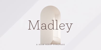
$29.00Marketing Strategy JNL was inspired by some display signage used in an episode of the classic "Alfred Hitchcock Hour". Evoking the early-60s feel of kitchy advertising, this display font has a limited character set and is specifically designed for creating retro ad banners and point-of-sale attention getters as well as period piece signage. For those preferring a blank hexagon for spaces between words, one is located on the equal key. Marketing Strategy JNL is available in both regular (outline) and solid (white letters on black) versions. - Madley by Kimmy Design,
$25.00Madley is a contemporary slab serif typeface. Featuring monolinear stems, elongated block serifs and teardrop terminals, the type family goes from a delicate Hairline weight to a heavy Black weight. Because of its range in weights and extensive Opentype features, it’s a perfect font for both text and display text settings. Alternative features include a wide array of swashes assigned up to 11 for select characters, combining ligatures in capital unicase settings, and stylistic alternates for some letters. To see more, please check out the User Guide and Specimen booklet. - Croissant by ITC,
$39.00Phillip Kelly first drew the Croissant typeface in 1978 for Letraset. Back in the 1970s and 80s, Letraset's rubdown lettersheets were a popular means of designing with type. Today, many of these nostalgic classics are available in digital format. Linotype is pleased to re-present Croissant. This experimental typeface is built up out of round, brush-like strokes, creating heavy, and black letters. These forms are best used for display signage and headline text. If you are designing for a local bakery or donut shop, this typeface may be the perfect fit. The dark, heavy character that Croissant lends to the page is similar to Cooper Black , one of the most renowned American type designs ever produced. If you are looking for a typeface with Croissant's feel, but need to set smaller headlines or text, check out that family's offerings." - Cascabel by Sudtipos,
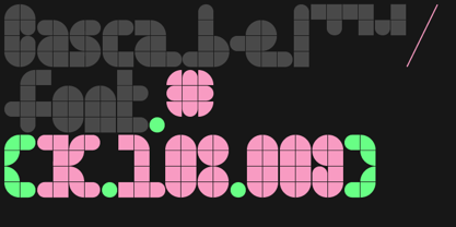
$39.00Cascabel was built on a modular harmony and creates visibly maze-like geometric structures. When typeset in complete words, it conveys an unmistakable architectural approach to a design project. Ideal for magazines, posters or flyers, Cascabel is an alphabet functionally defined by a concept similar to that of building blocks. Designed by Ariel Di Lisio and digitized by Ale Paul. - Arrow Callouts JNL by Jeff Levine,
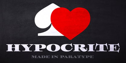
$29.00Here’s a set of arrow shaped callouts in two varieties within one font. The black-on-white letters are on the upper case keys, and the white-on-black characters are on the lower case keys. The numerals 1 thru 10 in black-on-white are in the standard key positions, while the white-on-black numbers are on the same keys when engaging the “shift” key. The 'zero' key houses the number '10'. For a more dynamic look, the font is also available in an oblique version. - Hypocrite by ParaType,
$30.00 - Ray Johnson by K-Type,
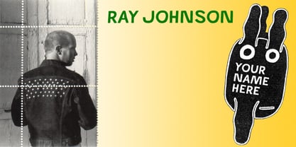
$20.00The Ray Johnson font was inspired by the Father of Mail Art. It's based on the block lettering style used by Ray to add the names of his correspondents to their bunny head portraits (the film How to Draw a Bunny is a superb introduction). The font includes blank bunny heads and other Ray Johnson graphics as scalable vector images, and separate bitmap images are also provided as jpegs and gifs. - Cattyfox by Popskraft,
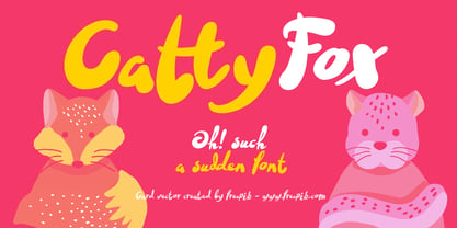
$19.00Everyone loves black, strict stylish and elegant shapes. We strive to be perfect. Right? But ... don't you think we have lost something? Maybe childish spontaneity? The Cattyfox font will take you back to those wonderful times when there was no need to be serious, when the whole world was not so serious. If you want to have some uncompromising fun, hover above the crowd to show everyone how free you are, just create something in Cattyfox font and you will understand what true freedom is. - Yardbird Numerals by Coniglio Type,
$9.95Yardbird, insinuating prison numerals, was lifted from a wooden block print poster press, that would have indeed besides providing dates for the local carnival would have just as easily ink-chucked them over the backs of those denim blues. Part of Market LTD, a collection of limited faces, mostly alpha-numeric and some just plain numeric, used primarily in retail and display situations and titling. - Flyer by Linotype,
$40.99The Flyer font family consists of two very heavy condensed sans serif faces, Black Condensed and Extra Black Condensed. Excellent for headlines or packaging, Flyer font is geometric and quite similar to Tempo Heavy Condensed. - Tozuna - Personal use only
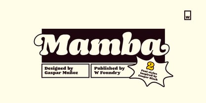
- Mamba by W Type Foundry,
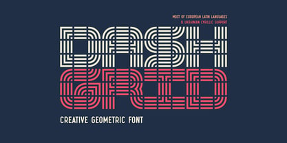
$19.50 - Dash Grid by Gleb Guralnyk,
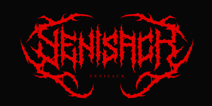
$13.00 - Yenisack by Madhaline Studio,
$29.00 - Mak by Tkachenko design,
$21.00Mak is a display font with a Ukrainian feeling inspired by Ukrainian music. This is a big update of the first free two styles of Mak (SemiBold High & Black High) that were created in 2019 and become widespread among free display fonts. The big update wasn't been only adding more weights and contrasts but also changing a lot of glyphs and adding new ones. Now Mak supports all Latin-based languages and European Cyrillic. Experiments with historical forms, contrasts, and daring shapes to create a new image of Ukrainian Cyrillic and Latin based on it. - Ljubljana by Glyphobet,
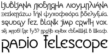
$19.99Ljubljana was inspired by art deco lettering seen in Slovenia, Croatia and Romania. It includes the Latin, Greek, and Cyrillic alphabets. It is named after the capital of Slovenia. Ljubljana is unicase, composed of as few basic glyphs as possible. The basic glyphs are shown in black, and the derived or duplicated glyphs in grey. Ljubljana attempts to encapsulate the essence of both upper and lower case designs in a single glyph. It also explores the common origins of the Greek, Latin, and Cyrillic alphabets, using the same glyph in more than one alphabet. - Leksa by Alexandra Korolkova,
$50.00Leksa is an oldstyle, even a bit old-fashioned text family in 12 faces, including six upright and six italic ones, from Light to Black, with both oldstyle and tabular digits and true small caps. The typeface works best in the books of classical style, and looks good in both small and large point sizes. One of the main features of the typeface is its professionally-designed Cyrillic which (together with sans-serif companion Leksa Sans) was awarded for excellence in type design at Modern Cyrillic competition in Superfamilies category. - Leksa Sans by Alexandra Korolkova,
$50.00Leksa Sans is a humanist sans-serif face with some contrast. The family consists of 14 faces (upright & true italic in seven weights from Extralight to Black). Designed as a sans-serif companion for Leksa, Leksa Sans works perfectly either with it or alone. It is suitable both for text setting and for short inscriptions. One of the main features of the typeface is its professionally-designed Cyrillic which (together with serif companion Leksa) was awarded for excellence in type design at Modern Cyrillic competition in Superfamilies category. - Constellation Pro by Tilde,
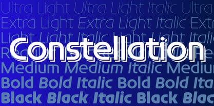
$39.75Constellation started with a simple geometric concept in the manner of Art Deco which gradually developed to a complete typeface, both upright and italic, total of seven weights. The concept allowed the font to be designed from Ultra Light in both very light and quite black styles. This Pro font is packed with all European and Cyrillic alphabets, small caps, variable figure sets and features . - Tact Slab by Pesic,
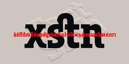
$35.00Tact Slab is geometrically slab serif font, black and condensed looks glyphs, with an alternative glyph set to improve its use in different graphic contexts. Tact Slab is compatible with the sans serif font Tact. It is suitable for use in the fields of science, art, architecture, urban planning, techniques, electronics, advertising, futuristic themes, sport, film, computers, phones, video games, magazines... Contains all Latin and Cyrillic glyphs. - Mozer by Fontfabric,
$29.00Mozer is a semi-condensed neo-grotesque type family of 16 styles ranging from Thin to Black matched with true italics. With a generous x-height, economical width, moderate contrast and overall solid appearance this typeface shows an uncompromising legibility merged with a contemporary spirit that has not lost its individuality, even in the small details like the discreet ink traps. Mozer covers Extended Latin, Cyrillic and Greek and is suited with plenty of OpenType features, such as localisations, ligatures; four type of numerals including figures and tabular; case-sensitive forms; alternatives etc. Mozer comes accessible and closer to all designer’s needs. Features: • Over 790 glyphs in 16 styles (Thin to Black); • Extended Latin, Cyrillic and Greek scripts for more than 130 languages; • Tall and balanced x-height; • Semi-condensed width proportions; • Moderate contrast and vertical stress; • Neo-grotesque characteristics and terminals with humanistic flavor. Designers: Ani Petrova, Mirela Belova, Nikolay Petroussenko - Squad by Fontfabric,
$-Squad is a humanist sans serif with semi condensed proportions. Inspired by Adrian Frutiger’s perfectionist style this typeface is a harmonious breed of humanist heritage and contemporary simplicity. The balanced characteristics, clear and legible silhouette and simultaneously vivid appearance of Squad makes it perfect for any design purpose. The figures are evident — it consists of 18 styles from Thin to Black; covers Extended Latin, Cyrillic and Greek with span for more than 130 languages; flawless functionality and supporting many OpenType features, such as localizations, tabular numerals, inferiors & superiors, numerators & denominators, fractions, discretionary liga- tures, case sensitivity etc. Designers: Svetlin Balezdrov, Svet Simov Features: • Over 780 glyphs in 18 styles (Thin to Black) • Extended Latin, Cyrillic and Greek scripts for more than 130 languages; • High x-height and Semi Condensed proportions; • Moderate contrast and vertical stress; • Humanistic characteristics and open vertical terminals; • True form of italics; • Coverage of multiple OpenType features; • Perfect for text, headlines and web; - Royal Grande by Subqi Studio,
$20.00Introducing our first old english black letter Royal Grande. Quite basic anatomy not the contemporary style. With this not too complicated black letter that make this font good for general display projects. We also make it a black letter family because we rarely see this kind of option in the market. Another good news , we also offer the variable format this time for the new font enthusias community. - Blippo by Linotype,
$40.99Blippo Black with its constructed style is a typical headline typeface. Its robust figures with their even strokes were composed using the basic forms of the circle and rectangle. Its curves are often not completely closed. The figures of Blippo Black form dark, heavy lines, making the typeface suitable only in middle and larger point sizes. Blippo Black will make an impression when used for flyers and correspondence. - Rough Riders Redux by FontMesa,
$35.00Rough Riders Redux along with our Rough Riders font, got its start from a small sample of letters used in the logo for the Beach Creek Railroad Co. dating back to the early 1860’s. I studied the design for one year before drawing the letters. Rough Riders and the Redux version are simply the most Wildest Western looking fonts you'll find. The Rough Riders fill font is not meant to be used as a stand alone black typeface, the fill font is designed to be layered behind the regular Rough Riders font. - Rough Riders by FontMesa,
$35.00Rough Riders, along with our Rough Riders Redux font, got its start from a small sample of letters used in the logo for the Beach Creek Railroad Co. dating back to the early 1860’s. I studied the design for one year before drawing the letters. Rough Riders and the Redux version are simply the most Wildest Western looking fonts you'll find. The Rough Riders fill font is not meant to be used as a stand alone black typeface, the fill font is designed to be layered behind the regular Rough Riders font.
