10,000 search results
(0.039 seconds)
- Rumble Born by Letterhend,
$19.00 Rumble Born is a retro bold script which will bring you back to 60s feel but still with fun and playful look. This font perfectly made to be applied especially in logo, and the other various formal forms such as invitations, labels, logos, magazines, books, greeting / wedding cards, packaging, fashion, make up, stationery, novels, labels or any type of advertising purpose. Features : uppercase & lowercase numbers and punctuation multilingual ligatures alternates swashes PUA encoded We highly recommend using a program that supports OpenType features and Glyphs panels like many of Adobe apps and Corel Draw, so you can see and access all Glyph variations. For accessing opentype feature, kindly check this link letterhend.com/tutorials/using-opentype-feature-in-any-software/ Email us to letterhend@gmail.com if you need something! Happy Designing!
 - Amderais by Sealoung,
$15.00 Give your typographic designs a touch of retro style with Amderais! Amderais is one of our 2022 fonts inspired by the famous retro typographic designs of the late 60s to 70s. This font has an extruded version so you can easily create retro effect fonts. This typeface is very suitable to be applied especially to logos, and various other formal forms such as invitations, labels, logos, magazines, books, greeting/wedding cards, packaging, fashion, make-up, stationery, novels, and labels or other types of fonts. advertising purposes. Feature : - upper & lower case - numbers and punctuation - multilingual - ligature - alternative - swashes - PUA encoded We highly recommend using a program that supports the OpenType feature and the Glyphs pane like many Adobe and Corel Draw applications, so that you can view and access all variations of Glyphs.
 - Achiever by Letterhend,
$19.00 Introducing, The Achiever- a unique display script with reverse contrast. The unusual reverse contrast make this typeface one of a kind. This type of font perfectly made to be applied especially in logo, and the other various formal forms such as invitations, labels, logos, magazines, books, greeting / wedding cards, packaging, fashion, make up, stationery, novels, labels or any type of advertising purpose. Features : uppercase & lowercase numbers and punctuation multilingual alternates and ligatures PUA encoded We highly recommend using a program that supports OpenType features and Glyphs panels like many of Adobe apps and Corel Draw, so you can see and access all Glyph variations. How to access opentype feature : letterhend.com/tutorials/using-opentype-feature-in-any-software/ Email us to letterhend@gmail.com if you need something! Happy Designing!
 - Holiday Meladine by Bungletter,
$12.00 Holiday Meladine is a modern script font that features a classic and elegant touch. Holiday Meladines are attractive because they are sleek, clean, feminine, sensual, glamorous, simple and very easy to read, thanks to their many fancy letter joints. I also offer a decent number of stylistic alternatives for some of the letters. Classic style is very suitable to be applied in various formal forms such as invitations, labels, restaurant menus, logos, fashion, make up, stationery, novels, magazines, books, greeting/wedding cards, packaging, labels or all kinds of advertising purposes. . . . . . . . Files include: • Holiday Meladine • Holiday Meladine Slant Contains full set: -Has 2 font models, Regular and Slant -Uppercase -Lowercase -Alternative -Punctuation -Number -Multilingual support. need help or have questions let me know. I'm happy to help. Thanks & Congratulations on the Design!
 - Stract by Look Minus Today,
$14.00 Present to you for New Modern Serif, Stract! Stract is a sophisticated ligature and alternate serif from us. This typeface has been made carefully to make sure its premium quality and luxury feel. The ligatures and alternates makes this typeface unique and stands out rather than the regular serif font. This font is very suitable for logo, headline, tittle, and the other various formal forms such as invitations, labels, logos, magazines, books, greeting / wedding cards, packaging, fashion, make up, stationery, novels, labels or any type of advertising purpose. Features : - Ligatures & Alternates - Letters, numbers, symbols, and punctuation - No special software is required to use this typeface even work in Canva - Multilingual Support Please contact us if you have any questions. Enjoy crafting and thanks for supporting us! Thank you.
 - Annette Bradford by Letterhend,
$22.00 Introducing, Annette Bradford - Ballpoint Signature Script. This typeface made from a natural ballpoint handwriting, so if you need digital signature or natural hand writing for quotes, this is the perfect typeface for you! This font perfectly made to be applied especially in logo, and the other various formal forms such as invitations, labels, logos, magazines, books, greeting / wedding cards, packaging, fashion, make up, stationery, novels, labels or any type of advertising purpose. Features : uppercase & lowercase numbers and punctuation multilingual ligatures alternates extra doodle (in glyphs panel) PUA encoded We highly recommend using a program that supports OpenType features and Glyphs panels like many of Adobe apps and Corel Draw, so you can see and access all Glyph variations. Email us to letterhend@gmail.com if you need something! Happy Designing!
 - Valegan by Letterhend,
$17.00 Introducing, Valegan Display Font, display font with a touch of vintage look and feel. This font duo is also perfectly made to be applied especially in logo, headline, signage and the other various formal forms such as invitations, labels, logos, magazines, books, greeting / wedding cards, packaging, fashion, make up, stationery, novels, labels or any type of advertising purpose. Features : Regular & Stamp Style uppercase & lowercase numbers and punctuation multilingual alternates / swashes and ligatures PUA encoded We highly recommend using a program that supports OpenType features and Glyphs panels like many of Adobe apps and Corel Draw, so you can see and access all Glyph variations. How to access opentype feature : letterhend.com/tutorials/using-opentype-feature-in-any-software/ Email us to letterhend@gmail.com if you need something! Happy Designing!
 - Winter Rosetta by Letterhend,
$19.00 Winter Rosetta is a pretty script font based on authentic hand writing with natural signature style with winter theme. It comes with floral / botanical hand drawn illustration object in vector. This type of font perfectly made to be applied especially in logo, and the other various formal forms such as invitations, labels, logos, magazines, books, greeting / wedding cards, packaging, fashion, make up, stationery, novels, labels or any type of advertising purpose. Features : uppercase & lowercase numbers and punctuation multilingual alternates and ligatures swashes PUA encoded free ornament vector We highly recommend using a program that supports OpenType features and Glyphs panels like many of Adobe apps and Corel Draw, so you can see and access all Glyph variations. How to access opentype feature : letterhend.com/tutorials/using-opentype-feature-in-any-software/
 - Logirent by Letterhend,
$17.00 Logirent is a unique typeface which is speciality made for a logotype. The customized ligatures is what makes this font unique. This type of font perfectly made to be applied especially in logo, headline, signage and the other various formal forms such as invitations, labels, logos, magazines, books, greeting / wedding cards, packaging, fashion, make up, stationery, novels, labels or any type of advertising purpose. Features : numbers and punctuation ligatures multilingual alternates / swashes and ligatures PUA encoded We highly recommend using a program that supports OpenType features and Glyphs panels like many of Adobe apps and Corel Draw, so you can see and access all Glyph variations. How to access opentype feature : letterhend.com/tutorials/using-opentype-feature-in-any-software/ Email us to letterhend@gmail.com if you need something! Happy Designing!
 - Crescent by TrendGFX Design Studios,
$20.00 The most sensational design of the decade is now at large. These high-definition fonts can be used for titles, banners, tattooing, logotypes and many more places. Be it domestic or industrial, formal or informal, it can be used in every field imaginable. It has a sensational, funky style and remarks the current youth's style. Such a font style has never been seen by the world, until today. These designs are 100% original and handmade. I searched a million miles but found this as the most appropriate idea for the world of font types at this time. It's the coolest, funkiest and the best font ever made. It's the era of graffiti and 3D, and we've combined both to give you CRESCENT.. So, use it, love it, buy it!
 - The Dorrington by Letterhend,
$17.00 The Dorrington is a font trio package contain a monoline script and sans serif which looks great to be paired especially for vintage and adventure theme! This font trio is purposely made for headline, display or logotype, and signature which need a standout appearing. This font is also suitable to be applied especially in logo, and the other various formal forms such as invitations, labels, logos, magazines, books, greeting / wedding cards, packaging, fashion, make up, stationery, novels, labels or any type of advertising purpose. Features : 2 Monoline Script Font and 1 Sans serif font uppercase & lowercase numbers and punctuation multilingual alternates & ligatures PUA encoded We highly recommend using a program that supports OpenType features and Glyphs panels like many of Adobe apps and Corel Draw, so you can see and access all Glyph variations.\
 - Generis Slab by Linotype,
$29.00The idea for the Generis type system came to Erik Faulhaber while he was traveling in the USA. Seeing typefaces mixed together in a business district motivated him to create a new type system with interrelated forms. The first design scheme came about in 1997, following the space saving model of these American Gothics. Faulhaber then examined the demands of legibility and various communications media before finally developing the plan behind this type system. Generis’s design includes two individually designed styles; each of with is available with and without serifs, giving the type system four separate families. Each includes at least four basic weights: Light, Regular, Medium, and Bold. Further weights, small caps, old style figures, and true italics were added to each family where needed. The Generis type system is designed to meet both optical criteria and the highest possible measure of technical precision. Harmony, rhythm, legibility, and formal restraint make up the foreground. Generis combines aesthetic, technical, and economic advantages, which purposefully and efficiently cover the whole range of corporate communication needs. The unified basic form and the individual peculiarity of the styles lead to Generis’ systematic, total-package concept. The clear formal language of the Generis type system resides beneath the information, bringing appropriate typographic expression to high-level corporate identity systems, both in print and on screen. The condensed and aspiring nature of the letterforms allows for the efficient setting of body copy, and the economic use of the page. A range of accented characters allows text to be set in 48 Latin-based languages, offering maximal typographic free range. This previously unknown level of technical and design execution helps create higher quality typography in all areas of corporate communication. Optimal combinations within the type system: Generis Serif or Generis Slab with Generis Sans or Generis Simple. - Generis Serif by Linotype,
$29.00The idea for the Generis type system came to Erik Faulhaber while he was traveling in the USA. Seeing typefaces mixed together in a business district motivated him to create a new type system with interrelated forms. The first design scheme came about in 1997, following the space saving model of these American Gothics. Faulhaber then examined the demands of legibility and various communications media before finally developing the plan behind this type system. Generis’s design includes two individually designed styles; each of with is available with and without serifs, giving the type system four separate families. Each includes at least four basic weights: Light, Regular, Medium, and Bold. Further weights, small caps, old style figures, and true italics were added to each family where needed. The Generis type system is designed to meet both optical criteria and the highest possible measure of technical precision. Harmony, rhythm, legibility, and formal restraint make up the foreground. Generis combines aesthetic, technical, and economic advantages, which purposefully and efficiently cover the whole range of corporate communication needs. The unified basic form and the individual peculiarity of the styles lead to Generis’ systematic, total-package concept. The clear formal language of the Generis type system resides beneath the information, bringing appropriate typographic expression to high-level corporate identity systems, both in print and on screen. The condensed and aspiring nature of the letterforms allows for the efficient setting of body copy, and the economic use of the page. A range of accented characters allows text to be set in 48 Latin-based languages, offering maximal typographic free range. This previously unknown level of technical and design execution helps create higher quality typography in all areas of corporate communication. Optimal combinations within the type system: Generis Serif or Generis Slab with Generis Sans or Generis Simple. - Generis Simple by Linotype,
$39.00The idea for the Generis type system came to Erik Faulhaber while he was traveling in the USA. Seeing typefaces mixed together in a business district motivated him to create a new type system with interrelated forms. The first design scheme came about in 1997, following the space saving model of these American Gothics. Faulhaber then examined the demands of legibility and various communications media before finally developing the plan behind this type system. Generis’s design includes two individually designed styles; each of with is available with and without serifs, giving the type system four separate families. Each includes at least four basic weights: Light, Regular, Medium, and Bold. Further weights, small caps, old style figures, and true italics were added to each family where needed. The Generis type system is designed to meet both optical criteria and the highest possible measure of technical precision. Harmony, rhythm, legibility, and formal restraint make up the foreground. Generis combines aesthetic, technical, and economic advantages, which purposefully and efficiently cover the whole range of corporate communication needs. The unified basic form and the individual peculiarity of the styles lead to Generis’ systematic, total-package concept. The clear formal language of the Generis type system resides beneath the information, bringing appropriate typographic expression to high-level corporate identity systems, both in print and on screen. The condensed and aspiring nature of the letterforms allows for the efficient setting of body copy, and the economic use of the page. A range of accented characters allows text to be set in 48 Latin-based languages, offering maximal typographic free range. This previously unknown level of technical and design execution helps create higher quality typography in all areas of corporate communication. Optimal combinations within the type system: Generis Serif or Generis Slab with Generis Sans or Generis Simple. - Generis Sans by Linotype,
$29.00The idea for the Generis type system came to Erik Faulhaber while he was traveling in the USA. Seeing typefaces mixed together in a business district motivated him to create a new type system with interrelated forms. The first design scheme came about in 1997, following the space saving model of these American Gothics. Faulhaber then examined the demands of legibility and various communications media before finally developing the plan behind this type system. Generis’s design includes two individually designed styles; each of with is available with and without serifs, giving the type system four separate families. Each includes at least four basic weights: Light, Regular, Medium, and Bold. Further weights, small caps, old style figures, and true italics were added to each family where needed. The Generis type system is designed to meet both optical criteria and the highest possible measure of technical precision. Harmony, rhythm, legibility, and formal restraint make up the foreground. Generis combines aesthetic, technical, and economic advantages, which purposefully and efficiently cover the whole range of corporate communication needs. The unified basic form and the individual peculiarity of the styles lead to Generis’ systematic, total-package concept. The clear formal language of the Generis type system resides beneath the information, bringing appropriate typographic expression to high-level corporate identity systems, both in print and on screen. The condensed and aspiring nature of the letterforms allows for the efficient setting of body copy, and the economic use of the page. A range of accented characters allows text to be set in 48 Latin-based languages, offering maximal typographic free range. This previously unknown level of technical and design execution helps create higher quality typography in all areas of corporate communication. Optimal combinations within the type system: Generis Serif or Generis Slab with Generis Sans or Generis Simple. - Dynatype by Alphabet Soup,
$60.00 Suddenly...it’s the World of Tomorrow! With the push of a button Dynatype automates your typesetting experience. Dynatype is actually Two fonts in One–without switching fonts you can instantly change from Dynatype’s “regular” style to its alternate connecting version with the simple push of a button. For more details download “The Dynatype Manual” from the Gallery Section. What is Dynatype? Dynatype is the upright, slightly more formal cousin of Dynascript. It shares many of the characteristics of it’s slightly older relation, but is drawn entirely from scratch and has it’s own unique character. Dynatype may be reminiscent of various mid-century neon signage, and of sign writing, Speedball alphabets and even baseball scripts. Its design also takes some cues from a historical typographic curiosity that began in Germany in the ‘20s and which lasted into the ‘60s—when Photo-Lettering gave it the name "Zip-Top". Basically it was believed to be the wave of the future—that by weighting an alphabet heavier in its top half, one could increase legibility and reading speed. The jury’s still out on whether or not there’s any validity to this notion, but I think you’ll agree that in the context of this design, the heavier weighting at the top of the letters helps to create some uniquely pleasing forms, and a font unlike any other. Typesetters across the planet will also be able to set copy in their language of choice. Dynatype’s 677 glyphs can be used to set copy in: Albanian, Basque, Catalan, Cornish, Croatian, Czech, Danish, Dutch, Esperanto, Estonian, Faroese, Finnish, French, Galician, German, Hungarian, Icelandic, Indonesian, Irish, Italian, Kalaallisut, Latvian, Lithuanian, Malay, Maltese, Manx, Norwegian Bokmål, Norwegian Nynorsk, Oromo, Polish, Portuguese, Slovak, Slovenian, Somali, Spanish, Swahili, Swedish, Turkish, and Welsh—and of course English. Sorry! Off-world languages not yet supported. PLEASE NOTE: When setting Dynatype one should ALWAYS select the “Standard Ligatures” and “Contextual Alternates” buttons in your OpenType palette. See the “Read Me First!” file in the Gallery section.
 - Copperplate New by Caron twice,
$39.00 Imagine America in the 1930s. A gangster flick with Al Capone, a crime novel featuring Philip Marlowe. Our hero in a fedora sits in a classy bar, orders a double bourbon, lights a cigar and eyes the evening paper. He turns the pages, reading about a bank heist over on Third Avenue, a scandal involving a baseball player, a small ad for a general practitioner and a large spread about a famous law firm. What do the bottle of booze and the majestic facade of the bank have in common? The elegant baseball uniform and trustworthy attorneys? - Copperplate Gothic - When Frederick William Goudy created his legendary typeface in 1901, it went on to literally become the symbol of early 20th century America. Tiny serifs, characteristically broad letterforms, and particularly bold titles decorated calling cards at 6-point size, enormous bronze-cast logos, newspaper headlines, restaurant menus and more. This was the golden age of Copperplate, lasting up until the arrival of die neue Typografie and monospaced grotesques in the 1960s. Then the typeface almost completely disappeared. It made a partial comeback with the advent of the personal computer; digitizations of varying quality appeared, and one version even became a standard font in Adobe programs. This may have played a role in Copperplate later being used in DIY projects and amateur designs, which harmed its reputation. Copperplate New has been created to revive the faded glory of the original design. Formally, the new typeface expands the existing weight and proportional extremes. The slight serifs are reduced even further, making the typeface sans-like at smaller point sizes and improving readability. In contrast, at large point sizes it retains all of its original character. Decorative inline & shadow styles have been added and both have been created in all five proportions, making it easy to adapt the typesetting to the format you need. Despite these changes and innovations, Copperplate New remains true to Goudy’s original design and represents a snazzy way to evoke a golden era in American culture. Specimen: http://carontwice.com/files/specimen_Copperplate_New.pdf
 - Ambra Sans by Zetafonts,
$39.00 Designed by Cosimo Lorenzo Pancini with Francesco Canovaro as a development and reinvention of Tarif by Andrea Tartarelli, Ambra Sans is a humanist sans typeface family, drawn around a lively, expressive skeleton but developed with a contemporary, post-digital sensibility that implies low contrast and tall x-height. In designing Ambra Sans, the authors wanted to research the elusive natural signature of handmade humanist letter shapes, in the effort of preserving it while still developing all the capabilities of type as a technical tool in the digital age. Like a frail insect preserved in amber, humanist design is the "ghost in the machine" of this font, that aims at seducing the viewers with its soft, welcoming text flow, firmly opposing the rigid, formal tone of most sans serif fonts. Born to provide a useful tool to graphic designers with branding and editorial needs, Ambra Sans develops around two subfamilies with slight but fundamental differences. The display family offers a taller x-height, optimizing readability and spacing in headings and display use, while offering a single story lowercase g to provide more consistent branding usage. The text family, on the other side, goes for a smaller x-height to give more traditional proportion to the text and removes the slight tapering in the stems to provide better rendering on screen in small formats. Both subfamilies of Ambra Sans develop around a wide range of seven weights with corresponding true italics, with Ambra Display sporting an extra heavy weight for maximum versatility. In total the family counts 30 fonts, each with over 600 glyphs for a wide language coverage. Open type features and glyph alternates further enrich the usage possibility of this typeface that wants to offer contemporary designer an alternative, unexpectedly human approach to contemporary sans type, softly preserving the spirit of handmade calligraphy while encasing its frail nature in a transparent, strong and powerful design language.
 - Skapa by Fontoura,
$24.00 Skapa is all about creation (translation from Old Norse: "to create"). It's simply the font I always needed and wanted. A well balanced, modern with delicate round corners sans serif, comprised of 5 weights with matching italics. Great for varied graphic design projects and perfect for logos and headlines, print art, billboards etc. Extended support for Central, Eastern and Western European languages. OpenType layout features: Fractions, oldstyle figures, ligatures, slashed zero, superscript, subscript, numerator, denominator and combining diacriticals (Mark Positioning) plus tabular figures for standard figures ,oldstyle figures & currency symbols. Think. Design. Create.
 - Barwastu by IbraCreative,
$17.00 Barwastu, a refined serif typeface, epitomizes timeless elegance with its meticulous design and sophisticated aesthetic. The graceful curves and distinctive serifs of Barwastu convey a sense of tradition and authority, making it an ideal choice for projects that demand a touch of class and professionalism. The well-balanced letterforms and subtle variations in stroke width contribute to its readability and versatility across various applications, from editorial layouts to branding. Barwastu seamlessly blends a classic sensibility with a contemporary edge, ensuring that it stands out as a distinguished and tasteful typeface in the realm of typography.
 - Dupont Gothic by Hexagon Foundry,
$19.00 Dupont Gothic is a sleek and contemporary sans-serif font that embodies elegance, clarity, and modernity. With its clean lines, balanced proportions, and distinctive character, Dupont Gothic is a versatile typeface that can be used in many ways. The simplicity of Dupont Gothic lends itself to a wide range of applications. Whether used for headlines, body text, or branding, this font possesses a quality to effortlessly adapt to different design contexts. The font comes in 10 weights with matching oblique characters, 2 widths, and 2 style sets that ensure the endless combinations and possibilities.
 - Neumatic Gothic by Arkitype,
$20.00 Nuematic Gothic is a condensed sans-serif family. It has a tall Cap Height and an x-height to balance it. Neumatic Gothic is versatile in use as a Headline font or as a text font. Neumatic Gothic has loads of options to play around with, included in the glyph set is small caps a stylistic uppercase superscript, stylistic alternates and circled numbers to name some. The typeface was designed with the graphic designer in mind to make beautiful typographic pieces with more ease with all the options you have in Neumatic Gothic.
 - Olio by Little Fonts,
$15.00 Olio is a chunky geometric sans serif typeface. The bold version takes inspiration from classic geometric fonts like Futura and works well when creating clean, balanced typography. The inline version is the same font with a stylish and decorative stripe effect to each character. Olio inline is a nod towards graphic design champion Lance Wyman and his typographic treatment for the iconic Mexico 68 Olympic identity. Although both versions are designed in reference to great (timeless) graphic design from the past, they have a contemporary finish making them suitable for any design purpose or application.
 - Hildera by Sronstudio,
$23.00 Introducing "Hildera," a script font that beautifully embraces the harmony of elegance and raw texture. This unique typeface effortlessly blends delicate, graceful strokes with a touch of rough authenticity, creating a perfect balance between beauty and character. Ideal for projects that seek a distinctive and handcrafted aesthetic, "Hildera" adds a touch of sophistication with a hint of rugged charm, making it perfect for a wide range of creative endeavors. Features: - Lowercase Swash Alternates - Numeral & Punctuation - PUA Encoded - Multilingual support - Simple Installation - Work both on Mac and Windows Thank you very much :)
 - Operandi by Tour De Force,
$30.00 Operandi is geometric sans family available in 6 weights inspired with vintage posters design from period between two great wars. Unpretentious family guided by simple design solutions – slightly wide by its character, decently recognizable, fully capable to lead any project – Operandi offers combination of functionality and visual balance that should be enough to recommend it as right choice. From Light to Black, packed in extended Latin character map, Operandi also contains a few OpenType features such as Ligatures, Fractions and 2x Stylistic Sets – one for complete uppercase alternatives and one for “a” and “g”.
 - Aircrew by Vanarchiv,
$28.00 Aircrew is a neutral, humanist sans-serif family optimized for signage applications in display sizes. Its large x-height enhances readability and its letterforms help distinguish characters from each other, increasing legibility. Aircrew has vertical terminals, low contrast, and short ascenders and descenders. The weight variations between uppercase and lowercase characters provide the perfect balance and its slightly condensed proportions allow more words to fit in less space. There are two different versions of Aircrew, positive and negative. This avoids optical effects that cause uneven thickness and unsteady readability in either light or dark backgrounds.
 - Paris Metro by Studio K,
$45.00 Nothing is more iconic of Paris than its antique Metro signs, which are the inspiration for this typeface. The signs vary from station to station, some featuring plain block capitals, others the most exquisite Art Nouveau. This example falls somewhere in between. and should inject a strong gallic flavour into any design or publishing project. To recreate the Metro effect in Photoshop, set your text white on red, then go to Layer Style> Inner Shadow. Or with Paris Metro Reverse set your text red on white, then go to Layer Style> Drop Shadow.
 - Little Bubbly by Supersemarletter,
$10.00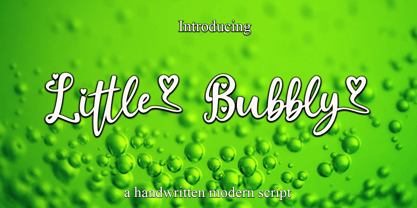 Little Bubbly is a script style in Uppercase and Lowercase feel nice balanced. Provide ligatures with special character make the design letter looks incredible. Honestly it works perfectly for headlines, logos, posters, packaging, T-shirts and much more. Font Features : • Regular version • Character set A-Z in uppercase and lowercase • Ligatures in Lowercase and special • Numerals & Punctuation • Accented Characters • Multiple Languages Supported Recommended to use in Adobe Illustrator or Adobe Photoshop with opentype feature. If you have questions, just send me a message and I'm glad to help.
 - NuOrder by The Northern Block,
$29.00 NuOrder is a modern-day sans-serif typeface with humanist bones. The design incorporates a dynamic structure with minimal contrast and a natural stroke path to promote easy reading—resulting in a warm well-balanced typeface best suited for a wide range of applications in a hi-tech era. Details include nine weights with matching italics and over 550 characters per style. Opentype features consist of five variations of numerals, including inferiors, superiors, fractions, alternate lowercase a and g, and language support covering Western, South, and Central Europe.
 - Sophia by Bosstypestudio,
$18.00 Sophia is a display font that strikes the perfect balance between classic and modern, combining serif and sans serif styles in a unique way. Its timeless appeal makes Sophia a great choice for stylish and impactful designs. The font family includes 5 different weights, uppercase, lowercase, punctuation, and multilingual support. Includes: Sophia Regular (uppercase & lowercase) Sophia Italic (uppercase & lowercase) Sophia Outline (uppercase & lowercase) Sophia Bold (uppercase & lowercase Sophia Heavy (uppercase & lowercase) Numbers & punctuation Foreign language support If you have any question, don't hesitate to contact me by email :bosstypestudio@gmail.com Thank you!
 - PF Haus Square Pro by Parachute,
$79.00The minimal character of this typeface with its direct reference to Bauhaus, manages to keep the balance between strict geometric structure and elegance. It strays from monotonous repetitions and works equally well with Latin and Greek, while it really hits home with Cyrillic. Now, in its 3rd major upgrade comes equipped with all that’s needed for an international career. In total 602 characters offer support for all European languages in six different variations. Finally, five special OpenType features offer typographic solutions which includes a stylistic alternate set for Greek and Cyrillic. - Naive Line Sans by S&C Type,
$8.00 Naïve Line Sans is an unusual handwritten sans serif font designed by Fanny Coulez and Julien Saurin in Paris. Our goal was to draw a font with finely irregular lines that give a human and whimsical feeling. We designed five weights, finely balanced, to assure a good readability whatever the size. This font is part of our Naïve superfamily that contains lot of variations: Line, Inline, Serif, Sans Serif, and a special Art Deco one. Just click on our foundry name to see them all! We hope you will enjoy our work. Merci beaucoup!
 - Newgrange by Scriptorium,
$24.00Newgrange is a distinctive Celtic-style font designed as a companion to our Stonecross font. It has the same size and weight as Stonecross and the same carved/chipped style, but rather than being based on traditional insular minuscule letter forms, it's based on a squared uncial style similar to our Lindisfarne font. The result is unusual and rather more modern looking than we expected, but it's great for stylized titles. The name comes from the giant prehistoric stone tomb at Newgrange which some have called Ireland's answer to Stonehenge. - Shorai Sans Variable by Monotype,
$1,049.99 Shorai™ Sans balances the subtlety of traditional hand-drawn brushstrokes with clean, geometric outlines. An intellectual-looking sans serif, Shorai’s simplified letterforms and vast weight ranges provide creatives with a holistic branding solution. Shorai Sans was designed as a companion typeface to Avenir® Next, built to work harmoniously in modern global designs, while preserving the essence of Japanese handwriting. Shorai goes beyond existing Japanese sans serifs to provide a wide spectrum of expression and personality for designers to play with. Shorai Sans is opening new horizons in Japanese typography.
 - NCS Rogueland by Namara Creative Studio,
$8.00 NCS Rogueland is Modern extended sans serif font that is out of this world. A strong balance between pointed corners and smooth curves with luxurious styles. Perfect for all purposes but especially for headlines. With 10 Variant to choose : NCS Rogueland Light NCS Rogueland Light Italic NCS Rogueland Light Rounded NCS Rogueland Regular NCS Rogueland Italic NCS Rogueland Rounded NCS Rogueland Outline NCS Rogueland Bold NCS Rogueland Bold Italic NCS Rogueland Bold Rounded Include uppercase, lowecase, numeral and punctuation. This font also includes alternative glyphs, ligatures and multilingual support.
 - Freya by MysticalType,
$10.00 Freya is a strong font family and sophisticated sans serif. His firm and uncompromising style are felt through letters that are controlled with a modern touch. Hardline balance and smooth curves. Each font in the family can stand alone, dynamic, and authoritative as they wish. It offers extensive language support, ALL Central & Western European Languages, Vietnamese and African languages. Freya works very well in all brands, logos, magazines, films. Different weights give you a full range to explore a number of applications, while the fonts described giving a real modern feel to any project.
 - Historica by Letteralle,
$23.00 Introducing, Historica! the perfect font for those seeking a balance between classic and modern design. This display font boasts a unique blend of traditional and contemporary elements. With its abundance of ligatures, Historica offers endless opportunities for creativity and customization. Whether you're designing a logo, creating a menu, fashion, merchandise, poster, book cover, magazine, or crafting any other type of branding material. Historica is super versatile and can bring a unique touch to any project. So if you want to make a statement and stand out from the crowd, give Historica a try!
 - Green Peas by Four Lines Std,
$15.00 Crafted with meticulous attention to detail, Green Peas Font offers a harmonious balance between beauty and elegance of nature. Green Peas Font combines legibility adnd Readibility with a touch of whimsy, making it perfect for both digital and print mediums. Its versatility allows you to seamlessly incorporate it into various projects, from website headers, quotes, inspirational messages, posters, stickers, social media graphics, or personal journals, to book covers, ensuring a consistent and visually striking presence. Unlock the extraordinary power of Green Peas Font and witness the transformative effect it has on your designs.
 - Hottera by Gian Studio,
$16.00 Hottera elegant serif with a creative atmosphere and perfect shape, inspired by today's beautiful Display serifs. thick, balanced and varied, born for luxury and beauty. In my example I show how this Serif can be used. It's great for logotypes, branding, wedding invitations, romantic cards, retro labels, packaging, name spelling and more. Hottera comes with beautiful upper and lower case letters, numbers, and punctuation. In addition to the main character set, there are many alternative characters, start and end sweeps. If you have any questions please feel free to contact me! Thank You,
 - Deca Serif by ParaType,
$30.00 Super family Deca consists of ten fonts. Six sans serif styles form the Deca Sans family and four styles of serif family named Deca Serif . These are low contrast fonts of pure design with ovals bent to rectangular shapes. They are nicely readable in small sizes and can be recommended for scientific, legal, official and business documents. Serif and sans serif fonts were designed in comparable proportions, they are balanced by color and have similar details in basic shapes. These features provide high compatibility and assume collective usage of the fonts in documents.