10,000 search results
(0.04 seconds)
- SF Chromium 24 SC - Unknown license

- SF Zero Gravity Condensed - Unknown license

- SF Espresso Shack Condensed - Unknown license

- SF Burlington Script SC - Unknown license

- Headline by Monotype,
$29.99 Headline Bold is a sans serif face in the nineteenth century English Grotesque tradition. The Headline Bold font is based on types from the Stephenson Blake type foundry called Grotesque no. 9. A bold and compact font, its name gives a strong indication of its primary use.
 - Marbellya by Namara Creative Studio,
$5.00 Marbellya an Condensed Sans Serif Font with luxurious style. Available in 6 styles : Regular, Italic, Outline, Bold, Bold Italic and Bold Outline. Included alternates, ligatures and multilingual support. It's perfect for headlines, logos, quotes, packaging, magazine covers, editorial design, and many more project with suitable purpose!
 - 161 Vergilius by GLC,
$38.00 This font was inspired by the rare manuscript Roman Quadrata used by an unknown scribe to inscribe a copy of the Roman poet Virgil’s GEORGICS, somehwere around 161 to 180 AD. Only a few sheets have survived, now preserved by different libraries around the world. In creating this font, we have adapted it for contemporary users, making differences between U and V; I and J (which made no difference at all to ancient Latin scribes) and naturally adding the glyphs for Thorn, Oslash, Lslash, W, Y, as well as the usual accented characters and punctuation, none of which existed at the time. Only capitals are present in the original; but we have provided alternates: so alternating each character A-Z/a-z will give a pleasant appearance of manual script. We have added the Roman numerals “I V X L C D M” in the OTF/TTF versions usable as “Old Style Numerals” alternates.
 - Duepuntozero Pro by Zetafonts,
$39.00 Created as a logo typeface in 2004 by Francesco Canovaro, Duepuntozero is one of Zetafonts classic typefaces. A monolinear sans serif typeface with rounded corners and condensed proportions, strictly based on modular geometric design, it was at first designed in five weights to be used as a condensed companion typeface to the rounded display family Arista. In 2019 the family was completely redesigned by the Zetafonts Team, expanding the original character set to include cyrillic and greek glyphs and adding four extra weights and italics to the original weight range. This restored and revamped version, named Duepuntozero Pro, also includes full Open Type features for positional figures, fractions and Small Caps. With his rounded, minimal aesthetic, Duepuntozero embodies the desire for simplicity and playfulness of contemporary mobile applications, making it a perfect choice for gaming and app interface design. Its compact design allow for maximum space saving on mobile screens when used as a text typeface, while the strictly geometric design and the extreme range of weights (including thin and black) make it excel in display, logo and editorial use. A complementary set of free icons in the same range of weights of the font is provided to help designers build consistent branding through pictograms in infographics, interfaces and editorial products.
 - Ruff N Ready by Typadelic,
$14.95 Ruff N Ready is a little bit rough around the edges and is ready for use on any project! This font has an innocent charm about it but is a bit of a non-conformist. Is it a serif font? Sans serif? A script font? It’s all of those and more! It’s legible enough to be used for body copy but holds its own in a headline or title. You’ll find a few unusual ligatures in the font and some fun alternates. I hope you enjoy using Ruff N Ready as much as I enjoyed designing it!
 - Holistic Haircut by Kitchen Table Type Foundry,
$16.00 My son Sam turned 12 and all of a sudden he cares for his hairdo. It needs to be just so, not too long, not too short, with a lot of gel to hold it in place. ;-) He just had a haircut when I was creating this font, so now you know where the Haircut part comes from. The Holistic part is something that sort of sounded ok. Holistic Haircut is a nice, handmade display font. It comes with wider and narrower glyphs for the upper and lower case AND a set of alternates that likes to party with the rest.
 - VTC Elmwood by Vintage Type Company,
$12.00 VTC Elmwood is a modernized blackletter font family from Vintage Type Company. What's old is new again. Elmwood comes in 4 styles, including regular, 8-bit, outline, and spurred. Drawing inspiration from calligraphic techniques of the past, Elmwood strips away any flourishes that would typically be found in a similar textura typeface, and offers a more modern, stylized old english font. The styles that come included save you a bit of time from having to stylize the regular version yourself, and allow you to tailor the font to more niche and customized projects. Saving time is good, and you're sure to love these options. VTC Elmwood makes the perfect font for branding & logo projects, package design, title design, print & e-publications, and the list goes on.
 - Letterpress Text by Chris Costello,
$22.75 This font is based on the popular and timeless Caslon design and was carefully digitized from the pages of an early 19th century book. I was excited to see some unique design treatments of characters such as the lower case italic 'p', the question mark, and various swash caps that I had never seen before. During the conversion process, I made sure to preserve the worn look of faded ink on old paper by maintaining a subtle level of decay and opacity with each character. For missing characters not found in the book, I created new characters that were faithful to the style of the rest of the family. Used as a text font, The Letterpress Text Family successfully reproduces the appearance of old letterpress lithography.
 - Okojo Pro by Wordshape,
$20.00 The Okojo Pro Complete family is a reworking of Wordshape’s immensely popular Okojo family of typefaces. It includes Okojo Pro, a semi-geometric sans serif, Okojo Slab Pro, a semi-geometric slab serif, Okojo Pro Display, a round-cornered sans serif variation, and Okojo Slab Pro Display, a round-cornered slab serif. The entire Okojo Pro family looks great at small or large sizes. The Okojo Pro family is designed for readability in long texts while simultaneously functioning as effective display type. Features of Okojo Pro Display: - all lowercase characters have an enlarged x-height, creating less optical dazzle than typefaces like Futura, Neutra or Avant Garde - more humanist numerals and punctuation for enhanced readability - complete Western, Central and Eastern European characters sets - radically improved spacing guaranteeing beautiful results in print and on screen for the Czech, English, Hungarian, Croatian, Esperanto, Maltese, Romanian, Turkish, Albanian, French, Portuguese, Spanish, Basque, Bulgarian, Finnish, Swedish, Norwegian languages The Okojo Pro Display family is influenced by the type designs of Paul Renner and Herb Lubalin, but smoothed over with more than a bit of Americana. Both work well on-screen as webfonts and in print as book type. Each is hinted with accuracy and kerned with precision.The lighter weights are slightly slimmer than the regular and bold weights to give the typeface more of a vertical feel, inviting readers' to rapidly read typeset text with a maximum of contrast and a minimum of optical distortion. Okojo: it’s a little bit country and a little bit rock’n’roll.
 - Obschepit by Zaporozhan Dmitriy,
$15.00 When did it start. One day I was designing some stuff for a fast food café. By style the Café was made as an old Soviet canteen. So I had to do a special accent on this in menu, advertising posters and other print products. I decided to do this by interesting old school font. There are many cool retro fonts on the Internet, but not one of them satisfied me on 100%. The next step was to look at the old posters and find some inspiration. So I found some cool pictures with exact letters that I needed, but there were no typefaces to buy so that I can print some text with this exact letters. That's why I decided to do such typeface for my own. You can use this typeface in the field of nutrition, and it also will suit for cinema posters.
 - Retrosey by Garisman Studio,
$20.00 Inspired by the old style of letters used for signs or signs in the 60s era, Retrosey was born with two main styles; Retrosey One (Bold) and Retrosey Two (Inline). Born with the old spirit and evoking new styles from the past. Retrosey is able to fulfill your desire to feel the era again. Make it in your style with happiness! You can use Retrosey for the needs of making signs, signpainting, advertisements, price lists in stores, menu lists, posters, movie titles, book covers, main text in titles, clothing designs, or whatever you want by returning to the 60s era.
 - Melancholia by Barnbrook Fonts,
$75.00 Melancholia is a subtle and beautiful sans-serif inspired by calligraphic letterforms. The name describes a feeling of deep sadness, an intense sensitivity to the world. The design of Melancholia is an attempt to introduce some of that wistfulness into the sans-serif form, a typographic classification that is often characterised by an austere functionality. Melancholia includes a set of true italics influenced by old-style serif italics, such as those found in Claude Garamond’s eponymous typeface, as well as a set of stylistic alternates and calligraphic-style swash characters.
 - Thickset by Josh Grzybowski,
$19.99 She may not be the heaviest font on the street but Thickset can throw her weight around with the best of them. Designed as a display font, Thickset is a solid slab-serif with thin counters that makes it ideal for publications like fashion and editorial magazines. But don’t get me wrong, she’s more than willing to give anything a try. Just as long as you respect her in the morning. In addition to ligatures and fractions, Thickset’s other OpenType features include old style numbers and small caps.
 - Lucrezia by Florence,
$19.95 A decorative capitalis font inspired by the renaissance font Rotunda and old calligraphic foundings. From the beginning my aim was to design a font which focusses on simplyfing historical typography. I wanted to give people the possiblity to write with letters which refer to history but still are readable and modern. It is perfect for headlines and logos that need a historical touch. The font Lucrezia and its dangerous forms (the stitchy endings) are also inspired by the history of Lucrezia Borgia, who as we know, was a very mysterious person.
 - Ongunkan Swedish Runes by Runic World Tamgacı,
$60.00 Swedish Runes Swedish Runes is a way to write Swedish with medieval runes devised by Sven Salvenson. Proto-Norse was written with Elder Futhark runes, and viking age runes were in Younger Futhark (an adaptation of Elder Futhark). Then early Old Norse was written in medieval runes (an adaption of Younger Futhark). Sven decided to carry on that tradition and adapt the medieval runic alphabet for modern Swedish. General information can be found on this site. I used the data here while working on the font. https://omniglot.com/conscripts/swedishrunes.htm
 - Mogand by Soerat Company,
$19.99 Mogand is a contemporary serif typeface that combines a humanist writing style. Mogand family is very suitable for various design needs such as a display font for editorial design, packaging, branding, broadcasting purposes and for any project that requires a clean, modern font with a strong character. This 9-weight family includes oblique and support around 200+ languages as well as several sets of figures. This font provides advanced typographic support with features such as ligatures, alternate characters, old-style figures, fractions, numerator/denominator, superior/inferior, and various symbols.
 - Parma Typewriter Pro by No Bodoni,
$35.00 PARMA is a type-writer style face with the form and elegance of a Bodoni. Functional beauty was the aim of mating the two disparate ideas in one type, creating a utilitarian face with graceful features. We�re even converting the keys on our beloved old Olivetti portable to type in Parma Typowriter. And then we�re going to get a Lambretta scooter to go zipping around in and maybe one of those front opening Fiat cars for drives in the countryside. Hey, waiter! Where�s my order of Giambotti? And more Sangiovese for everyone!
 - Monumental Gothic by Scriptorium,
$18.00For Monumental Gothic, we delved into the archives and found some old rubbings and photos of monumental brasses from British tombs of the 12th and 13th centuries. The sources included famous monuments like the tomb of Richard II and less well known inscriptions with similar style lettering. The rubbings were made by Dave Nalle in the 1970s (when they still let you have access to the the brasses). Monumental Gothic includes some alternate characters, plus upper and lower case characters, numbers and a selection of very interesting decorative emblems to complement the text. - Breuer Headline by TypeTrust,
$30.00 Breuer Headline exhibits a modern geometric structure tempered with subtle strokes of friendly humanism. Its neutral forms and sturdy rhythm are convincing without being forceful. The lowercase has a slightly casual feel. Set in all caps for a sterner message. Breuer Headline is the display complement to the Breuer Text family. Differences are found in the inside curvature of the lowercase arms and the simplified Oblique as opposed to the Text Italics. Breuer Headline is equipped with Small Caps, Old Style Figures, Tabular Figures, and a selection of dingbats.
 - Greenaway Mignonettes by Wiescher Design,
$29.50 Kate Greenaway was a very famous British (1846-1901) author and illustrator of childrens books. Her books were an outstanding success in English publishing during the Victorian period. Recently I found these sweet Mignonettes in an old foundry specimen book. Mignonettes is derived from the French word "mignon" which stands for lovely, charming, sweet, delightful, pleasant and that does exactly describe these little drawings. I already published a Kate Greenaway's Alphabet a couple of years ago. So here is my second installment. Yours, Kate Greenaway fan Gert Wiescher
 - Biscayne by JVB Fonts,
$39.00 Biscayne is inspired by the old and classic Art Deco art and architecture found in some building ads from the 1930's in the Art Deco District of Miami. The name of the font family is one of the most emblematic and representative places in Miami City. Biscayne can be used mainly in titles, display and short texts. This typeface family supports East Europe languages. It also includes standard and discretionary ligatures, alternative style of uppercase, fractions, numerators and denominators, end and/or terminal forms and other OpenType features.
 - Quandary by Winnie Tan,
$39.00 The Quandary Font is created for a horror theme in use with an illustrated book ‘The Predicament’ by Edgar Allan Poe. It is designed as a highly expressive face to accentuate a sense of mystery and the macabre. A comparatively more carefree and free-spirited face, it comes as a uni-case single weight family used exclusively as the main face for the book. The characters are developed from the numeric glyphs found on the astronomical clock-face at Prague Old Town Square, Czech Republic. http://www.behance.net/gallery/Quandary/383204
 - Ellington Manor by BA Graphics,
$45.00A great look for formal announcements, book work, business, high-end ads and terrific for text as well as headlines. - Generica Condensed by Monotype,
$29.99Generica Condensed is based on mid-20th century geometric sans designs, but is less formal, with a touch of playfullness. - Casual Lunch JNL by Jeff Levine,
$29.00Casual Lunch JNL is a friendly, relaxed typeface that's perfect for headlines where legibility is important, but formality is optional. - HK Nova by Hanken Design Co.,
$30.00 HK Nova is a geometric sans inspired by the Century Gothic and Futura. It formalizes Century Gothic and softens Futura.
 - RF Dewi by Russian Fonts,
$32.00 Dewi is a modern neo-grotesque multi-typeface family with closed forms. It includes 4 versions: condensed, normal, extended, expanded. In each version there are 16 font styles: 8 regulars and 8 italics (64 styles in total). The family contains weights from thin to black. Everything is ready to solve absolutely any graphic tasks. Dewi helps to create a unique and vibrant design consonant with the spirit of our days. Сontours remains neutral in a small size but when you work with large sizes Dewi shows his strong and confident character. Ideally suited for web design, logos and branding, navigation, printing, advertising and packaging, infographic, poster design, music covers and so many more. This typeface will be a real workhorse for you. Opentype features: old-style figures, tabular and tabular old-style, slashed zero, ligatures, fractions and automatic frations, circuled numbers, arrows and stylistic alternates for arrows, superscript and subscript. Multilingual support: Latin, latin extended, cyrillic and cyrillic extended (more than 70+ languages)
 - Ledare by Mans Greback,
$39.00 Ledare is a dynamic sans-serif typeface. Created by Mans Greback between years 2019-2021, this expressive font leads the way of your message with confidence and determination. It has a soft, easy-going outlook, yet is formal and rigid. The Ledare family consists of 14 fonts: Thin, ExtraLight, Light, Medium, Bold, ExtraBold and Black, with each weight as italic. The font is built with advanced OpenType functionality and has a guaranteed top-notch quality, containing alternates, ligatures and more features; all to give you full control and customizability. It has extensive lingual support, covering all Latin-based languages, from North Europa to South Africa, from America to South-East Asia. It contains all characters and symbols you'll ever need, including all punctuation and numbers.
 - Stumble by Letterhend,
$19.00 The Stumble is a retro bold script which will bring you back to 60s feel. This font perfectly made to be applied especially in logo, and the other various formal forms such as invitations, labels, logos, magazines, books, greeting / wedding cards, packaging, fashion, make up, stationery, novels, labels or any type of advertising purpose. Features : uppercase & lowercase numbers and punctuation multilingual ligatures alternates swashes PUA encoded We highly recommend using a program that supports OpenType features and Glyphs panels like many of Adobe apps and Corel Draw, so you can see and access all Glyph variations. For accessing opentype feature, kindly check this link letterhend.com/tutorials/using-opentype-feature-in-any-software/ Email us to letterhend@gmail.com if you need something! Happy Designing!
 - Duke Charming by Letterhend,
$19.00 Introducing, Duke Charming - A Modern Seri bold serif font. This font is one of our best product ever, carefully made to make sure its quality. The stylistic alternates and ligatures make this font event more unique and stands from the crowd. This font perfectly made to be applied especially in logo, and the other various formal forms such as invitations, labels, logos, magazines, books, greeting / wedding cards, packaging, fashion, make up, stationery, novels, labels or any type of advertising purpose. Features : uppercase & lowercase numbers and punctuation multilingual alternates & ligatures PUA encoded We highly recommend using a program that supports OpenType features and Glyphs panels like many of Adobe apps and Corel Draw, so you can see and access all Glyph variations.
 - Billanta by Letterhend,
$19.00 Billanta is a retro bold script which will bring you back to 60s feel. This font perfectly made to be applied especially in logo, and the other various formal forms such as invitations, labels, logos, magazines, books, greeting / wedding cards, packaging, fashion, make up, stationery, novels, labels or any type of advertising purpose. Features : uppercase & lowercase numbers and punctuation multilingual ligatures alternates swashes PUA encoded We highly recommend using a program that supports OpenType features and Glyphs panels like many of Adobe apps and Corel Draw, so you can see and access all Glyph variations. For accessing opentype feature, kindly check this link letterhend.com/tutorials/using-opentype-feature-in-any-software/ Email us to letterhend@gmail.com if you need something! Happy Designing!
 - Dustland by Letterhend,
$19.00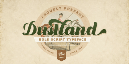 Introducing, Dustland - a standout bold script with a touch of vintage look and feel. This type of font perfectly made to be applied especially in logo, headline, signage and the other various formal forms such as invitations, labels, logos, magazines, books, greeting / wedding cards, packaging, fashion, make up, stationery, novels, labels or any type of advertising purpose. Features : - uppercase & lowercase - numbers and punctuation - multilingual - alternates / swashes and ligatures - PUA encoded We highly recommend using a program that supports OpenType features and Glyphs panels like many of Adobe apps and Corel Draw, so you can see and access all Glyph variations. How to access opentype feature : letterhend.com/tutorials/using-opentype-feature-in-any-software/ Email us to letterhend@gmail.com if you need something! Happy Designing!
 - Stoneland by Letterhend,
$12.00 Get ready to stand out with Stoneland, a stunning display font with many ligatures that will elevate your designs to the next level. Stoneland is perfect for those looking to make an impact with their designs, thanks to its strong and bold style. The font is perfect for a variety of design projects, including logos, branding, packaging, and the other various formal forms such as invitations, labels, logos, magazines, books, greeting / wedding cards, packaging, fashion, make up, stationery, novels, labels or any type of advertising purpose. Features : Uppercase & lowercase Numbers and punctuation Alternates & ligatures Multilingual PUA encoded We highly recommend using a program that supports OpenType features and Glyphs panels like many of Adobe apps and Corel Draw, so you can see and access all Glyph variations.
 - Stencil Moonlight by Linotype,
$29.00Latvian designer and educator Gustav Grinbergs created Stencil Moonlight as an attempt to slightly lighten up the stencil type scene. Intended as a lively, semi-formal face, its shapes are smooth and compact. It leaves a very heavy feeling on the page, as its letters display a very fat bold design. Stencil Moonlight is available is two separate font styles, Regular and Small Caps. When used together, the Stencil Moonlight family can create the perfect combination for your next display need. Stencil Moonlight works best in larger sizes, where it is clear that its forms stem from an experiment with stencil design. Grinbergs recommends the face for application in package design, advertising, poster design, and perhaps even for the subtitling of foreign films! - Ohanlon by Fontdation,
$18.00 Introducing our new release: Ohanlon. Ohanlon is a bold display sans with a subtle hint of reverse-contrast personality which will gives dramatic feel to your design. Packed with lots of stylistic alternate characters to let you play with various letter combinations. Go wild and experimental by combining the sans with the block or script-ish alternate letters to elevate your design game, or you can even go formal with the standard letters. Oh and also, the slanted/faux-italic version is available too. Suits best for logotype/branding, packaging design, and many other designs that need a direct punch to the face. Ohanlon is a versatile font, whether you'll go vintage or modern, this font will got your needs properly covered.
 - Bestop Glistening by Bungletter,
$12.00 Bestop Glistening is a modern script font that features a classic and elegant touch. Bestop Glistening is attractive because it is sleek, clean, feminine, sensual, glamorous, simple and very easy to read, thanks to its many beautiful letter connections. I also offer a number of decent stylistic alternatives for some of the letters. Classic style is very suitable to be applied in various formal forms such as invitations, labels, restaurant menus, logos, fashion, make up, stationery, novels, magazines, books, greeting/wedding cards, packaging, labels or all kinds of advertising purposes. . . . . . Contains full set: -Has 2 font models, Regular and Bold -Uppercase -Lowercase -Alternative -Ligatures -Punctuation -Number -Multilingual support. need help or have questions let me know. I'm happy to help. Thanks & Congratulations on the Design!


