10,000 search results
(0.049 seconds)
- Nesti Sweet by Gatype,
$12.00 Nasti Sweet is a round bubble display font, a very unique trendy font with a combination of modern character bindings, and I think this product suits the teaser display theme in every headline design, business cards, leaflets, magazines, children's events, and brand screen printing. Come on, take a look and be happy to hear the review. If you have suggestions about this product, please let your work environment know whether this product is good for them. Thank you so much for everything!!
 - Zamoka by Eraky,
$9.00 ZAMOKA font is a display font of 2 weights Regular and Rounded, ideally suited for advertising and packaging, festive occasions, editorial and publishing, logo, branding and creative industries, poster and billboards as well as web and screen design. ............................................................................ ZAMOKA font provides advanced typographical support with features such as ligatures, case-sensitive forms, fractions, super and subscript characters, and stylistic alternates. It comes with a complete range of figure set options – oldstyle and lining figures, each in tabular and proportional widths.
 - Fresh Sugar by RagamKata,
$14.00 Fresh Sugar takes the classic bubble font style and adds a groovy flair, creating a unique and eye-catching visual language. The rounded, plump letters bring a sense of joy and playfulness to any design, captures the essence of freshness with its vibrant and lively aesthetics. It's like a burst of creativity and positivity in every letterform. Ideal for a range of design projects including posters, social media graphics, packaging, and more. Fresh Sugar adds a touch of sweetness to any creative endeavor.
 - Mohn by Ryan Keightley,
$19.00 Mohn is a sans serif font that draws inspiration from the Bauhaus movement, characterized by its geometric shapes and neo-grotesque elements. With its clear and legible forms, Mohn works as a body copy font, or blow it up larger for headlines to really see its gently rounded corner details which bring a personal and contemporary touch to any design project. Available in 7 weights with italics for each, a variety of accented glyphs, ligatures, and extra stylistic alts on select letters.
 - Proach by Grontype,
$10.00 Poarch is a clean and modern condensed font, the font well designed as a sans serif font with all caps. It has round tip angle and different style as a sans font in common. The font is perfect for any project such as Brochure/Magazine Header, Logo Tagline, Flyer Titles and it also can be a paragraph text font. Features: Uppercase and Lowercase Regular, Light and Italic Version Numeral and Punctuation Ligatures Multilingual Support Modern Look Thankyou for Choosing This font Regards, Grontype
 - Barley Script by Mans Greback,
$59.00 Barley Script is a round and flowing script typeface. It is handmade by Måns Grebäck and works perfectly for logotypes and slogans. The font contains a lot of alternate characters and ligatures to make the script simulate a handpainted logo. With its hundreds of glyphs it also has support for a wide range of languages. Write underscores before any word to make an underline. Example: _Barley If your software supports ligatures, you can write multiple underscores for a longer line. Example: __Bakeries
 - Pen Nib Square JNL by Jeff Levine,
$29.00 The idea started with the 1934 sheet music of “Mazurka Amabile”. Its hand drawn title had most of the letters rendered in a rectangular shape [‘square’ in the sign trade] that featured rounded corners and terminals made by the shape of the lettering pen nib. A few letters were rounder in design than others, so those were scrapped in favor of a more consistent character shape throughout the font. Pen Nib Square JNL is available in both regular and oblique versions.
 - Chennai by insigne,
$24.99 Updated in 2009, Chennai has new weights and OpenType features. Chennai is a simplified sans-serif with a full complement of OpenType alternates. The typeface is rounded, slightly extended and geometric. Over fifty OpenType alternate characters are available, including swashed lower forms, traditional caps and a traditionally formed lowercase. Chennai also includes seven style sets, oldstyle figures, and small caps. Please see the sample PDF to see these in action. Use Chennai whenever you need a contemporary and versatile sans serif.
 - Glofuts by Maulana Creative,
$9.00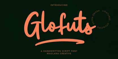 Glofuts is a handwritten script font. With clean rounded stroke and fun character. It has Opentype features of ligatures and extra swash, To give you an extra creative work. Glofuts handwritten script font support multilingual more than 100+ language. This font is good for logo design, Social media, Movie Titles, Books Titles, a short text even a long text letter and good for your secondary text font with sans or serif. Make a stunning work with Glofuts handwritten script font. Cheers, MaulanaCreative
 - HWT Bulletin Script Two by Hamilton Wood Type Collection,
$29.95 Bulletin Script was a style offered by several American wood type manufacturers in the late 19th Century. It may actually be one of the most iconic styles of the late 1960 Psychedelic era when Victorian revival was in full swing. The style known as "Bulletin Script No. 2” varies from the more commonly seen Bulletin in that its bottom strokes have a concave swash to them rather than rounded bulbous bottom terminals. This new digitization features over 300 glyphs including Central European characters.
 - Haymer by Greater Albion Typefounders,
$9.50 Haymer stands at the apogee of legibility and clarity. Its design embodies symmetry, even stroke widths and a subtle rounded quality to give an instinctive appeal to the reader and to the designer. Haymer is modern yet characterful and is ideal for use as a text family, online and wherever instant easy readability is required. An extensive family is offered, in four weights, regular and condensed widths, lower case and capital (small and petite) forms as well as display inline faces.
 - ITC Clover by ITC,
$29.99ITC Clover is the work of California designer Jill Bell. ITC Clover's design is even, rounded, and friendly. It has the look of the loopy cursive writing taught in grade school, although its shapes are much more controlled. Capitals are decorated with generous loops and curlicues, which combine with a lowercase alphabet that is only reserved in relation to the capitals. The letters almost dance across the page even when they are static, and they bring their own dynamism to any animation. - Tulisans by RGB Studio,
$14.00 Tulisans is a simple sans serif typeface, with semi-rounded edges for a smooth, clean look. It's perfect for logo designs, titles or subtitles, branding, and small amounts of text. Fonts include uppercase alphabet, numbers, and common symbols, and multilingual support. Files Include : Basic Latin A-Z and a-z Numbers Symbols PUA Encode Multilanguage Support Thanks and have a wonderful day, If you have any questions, please get in touch with us Don't forget to check out our other products.
 - Decour Soft by Latinotype,
$26.00 Decour Soft is the rounded-edged version of Decour. It is a slab serif humanist low contrast typeface. The overall design also features strong curves, making it a very friendly face. The font retains the original elegant features of Decour—based on Art Deco design—such as high contrast between upper and lower case characters. Decour Soft is a suitable font for logotypes and packaging. Its design also allows it to be used with certain elegance in book titles and magazines subheadings.
 - Archopada by Wildan Type,
$17.00 Archopada is a modern, humanist, strong statement typeface with clean lines. Inspired by classic geometric and fun typefaces. This font perfect for adding a title to your portfolio or website, magazine, branding, id card or you can use for body text in long paragraph. This set includes 6 weight humanist with oblique. If you need fun taste, We also prepared rounded style plus 6 weight and oblique style. Archopada consists of upper and lowercase, numerals, ligatures plus some stylistic alternative characters.
 - Electronica by Graviton,
$20.00 Electrónica font family has been designed for Graviton Font Foundry by Pablo Balcells in 2019. It is a rounded, geometric sans serif typeface with display details and sharp, playful shapes for a fun and laid back usage. Electrónica has been conceived to be most suitable for logos, headlines and display design pieces as well as short length text blocks. Electrónica consists of 12 styles, 8 of which containing small caps and glyph coverage for several language and 4 of which are free.
 - Nebulosa by Graviton,
$20.00 Nebulosa font family has been designed for Graviton Font Foundry by Pablo Balcells in 2020. It is a futuristic, slightly extended sans serif typeface with semi rounded endings that provide a softened aesthetic without losing its solidity. Nebulosa has been conceived to be most suitable for logos, headlines and display design pieces as well as short length text blocks. Nebulosa consists of 10 styles, 8 of which containing small caps and glyph coverage for several language and 2 of which are free.
 - MC Camcode by Maulana Creative,
$12.00 Camcode is a semi Bitmap style with round edges Display sans font. Regular stroke, fun character with a bit of ligatures and alternates. To give you an extra creative work. Camcode font support multilingual more than 100+ language. This font is good for logo design, Social media, Movie Titles, Books Titles, a short text even a long text letter and good for your secondary text font with script or serif. Make a stunning work with Camcode font. Cheers, Maulana Creative
 - MC Karbin by Maulana Creative,
$16.00 Karbin is an All Caps sans Display font with slant style. Round Heavy stroke, fun character with a bit of ligatures and alternates. To give you an extra creative work. Karbin font support multilingual more than 100+ language. This font is good for logo design, Social media, Movie Titles, Books Titles, a short text even a long text letter and good for your secondary text font with script or serif. Make a stunning work with Karbin font. Cheers, Maulana Creative
 - Moressans by IKIIKOWRK,
$17.00 Introducing Moressans - Luxurious Type, created by ikiiko. Moressans is a sans serif type with a thin and rounded shape. A simple font, with a thin size, adds to the impression of elegance and also fashionable too. This typeface is perfect for an elegant logo, branding, fashion brand, luxury brand, layout magazine, beauty product, packaging product, quotes, or simply as a stylish text overlay to any background image. What's included? Uppercase & Lowercase Number & Punctuation Alternates Multilingual Support Works on PC & Mac
 - Boxley by Shinntype,
$45.00 The original superellipse typefaces coincided with the emergence of the CRT (cathode ray tube) TV screen, but there is more than this visual analogy of high-tech in play, as the pumped up angularity of the curved components of the genre also informs the quality of set text. In particular, due to the straightness of the round letters’ side stems, there is a neat modularity of vertical letter spacing, which denotes authority, with precision, complementing the tautness of the face’s curves.
 - Gmuender Kanzlei by RMU,
$25.00 Inspired by some handwritten letter forms originally made by Hermann Zapf for his 1949 book "Pen and Graver", the drawings and designs finally became an entire font. It is an ideal companion to create diplomas, certificates and any other vintage projects. Take advantage of the long s which can be reached when you change the round s by the historical OpenType feature or when you simply type the integral sign [ ∫]. This font contains also swash forms of d, g, and v.
 - Tsubu by Takehiko Ono,
$5.00 “Tsubu” (つぶ) means something small and round, like a fruit seed or a grain of rice in Japanese. All characters are completely geometric, consisting of no more than 5 x 12 dots, with a few exceptions. And proportional and monospace styles are available. It is recommended that letter spacing be set to 0 to maintain dot pitch. When the line height is set to 100%, the dot pitch is aligned horizontally and vertically, resulting in a beautiful geometric display.
 - Crate Pro by Kustomtype,
$25.00 Crate Pro is a brand-new stencil font with rounded edges and thick main strokes, all glyphs have been contemplated very carefully so that all characters match in a well-balanced and streaming way. In both shaped weights, the font suits extraordinary well for headings, slogans etc. The cleanly cut and powerful Crate Pro font can easily be used for logotype, games, prints, magazines, web, apps, packaging, posters, T-shirts, signage & design projects. The font is original and custom made by Kustomtype.
 - Hiroko by Thinkdust,
$10.00 Hiroko is a remix of the multi-functional Hiruko typeface, with a bigger, bolder look and extra textured surface. Hiroko takes the functionality of its predecessor and turns it towards making an impact, so it does more than pass the message along, it makes it stand out and ensures that people read it. Hiroko comes with support for a number of languages, and has a finely crafted set of both upper and lowercase characters, round and friendly for a positive tone.
 - Quench by Linotype,
$29.99 Quench is a fun and unique typeface from designer Hannes von Döhren. It is unmistakably characterized by its strong contrast of inside and outside forms. The counters are nearly straight and have many right angles. Conversely, the outside curves are smooth and rounded making them soft and almost bubbly. The italics have juicy curves reminiscent of brush lettering. Used together or individually, the four weights and styles can be used for a wide variety of projects including magazines, advertising, logos, and branding.
 - Toroka by Inhouse Type,
$44.55 Toroka is a geometric sans serif type family with an extensive selection of styles. Functional and highly legible, it has a friendly vibe due to the lack of extending stems on "b", "d", "p", "q", "u", and "r". Its distinctive personality comes across through the rounded apexes of "V", "W", "v", and "w". Stylised "g" and "y" add sugar and spice. The additional stylistic set offers an eccentric display alternative to the uppercase. Opentype features include ligatures, tabular figures and fractions.
 - Fuel Extended by VersusTwin,
$39.00 The Fuel Extended typefaces are a modern update on the techno sans extended for stronger impact, complete with soft rounded corners as well as decorative inktraps. Stylistic Alternates included within all styles are alternates for the capital B, E, G, and R characters, as well as all of their accented siblings. The Fuel Complete package bundles all of the dynamic styles of the Fuel, Fuel Extended, Fuel Uni, Fuel Uni Extended, and Fuel Script typefaces into one powerhouse of a collection.
 - Nanami Pro by Thinkdust,
$19.00 Nanami Pro is the heavily engineered follow up to the hugely successful Nanami and Nanami Rounded font families. Nanami Pro contains all the wonder of the original Nanami families, but with vastly extended language support including Cyrillic and Extended Latin, leading to a total of 458 carefully crafted glyphs. The original Nanami was a key font in many a typography collection, but with these new multi-lingual credentials, Nanami Pro has become a true must-have font for anyone who’s serious about design.
 - Byronic by Alan Meeks,
$30.00 Byronic is soft modern sans-serif but with an antique style lower-case. The rounded end soft look gives Byronic a friendly soft look whilst still retaining a classical typographic appearance. A very clean style and slightly condensed it is excellent for text setting and headline with an unusual loser case that compliments the caps perfectly. Available in a range of 5 weights and 5 italics and a Latin Pro character set of 430 characters including ranging numerals and small caps.
 - NS Blackbooks Victorian by Novi Souldado,
$35.00 Reminiscing the old era of historical books (seriously, that old), circa 19th century. We crafted the letters by connecting the dots from the past with research for every flow, ornaments, look, and feel, to precisely aim for that perfect shape. Ephemera Blackbooks are born with a dark and robust personality. Feel the European historical mood right away, even with just typing it with your keyboard. You don't even realize when the design is done cause we make it so easy as a one-click-time-machine to your works using Ephemera Blackbooks font. It will be a perfect armory for a vintage headline, old book cover concept, sign, posters, playing cards deck design, vintage labels, beer labels, bar decoration, apparel, merchandising, you name it. OTF Features : Stylistic Set 01 to 07 and Ligature Glyph Count : 355 glyphs Language support : Afrikaans, Albanian, AsuBasque, Bemba, Bena, Breton, Catalan, Chiga, Cornish, Danish, Dutch, English, Estonian, Faroese, Filipino, Finnish, French, Friulian, Galician, German, Gusii, Indonesian, Irish, Italian, Kabuverdianu, Kalenjin, Kinyarwanda, Luo, Luxembourgish, Luyia, Machame, Makhuwa-Meetto, Makonde, Malagasy, Manx, Morisyen, North Ndebele, Norwegian, Bokmål, Norwegian Nynorsk, Nyankole, Oromo, Portuguese, Quechua, Romansh, Rombo, Rundi, Rwa, Samburu, Sango, Sangu, Scottish Gaelic, Sena, Shambala, Shona, Soga, Somali, Spanish, Swahili, Swedish, Swiss German, Taita, Teso, Uzbek (Latin), Volapük, VunjoZulu
 - Aniron - Unknown license

- Vibrocentric - Unknown license

- Crucial by Jehoo Creative,
$17.00 Sharp and bold are the right words to describe Crucial Typeface. Crucial is a serif typeface that has a pointed tip so that each piece of character gives a bold and elegant impression. Having 8 weights and each weight packaged in an elegant Italic set, this typeface will add boldness and elegance to your designs. Crucial can be used for a variety of design styles. It is suitable for strong-spirited designs as well as for a more striking and classy editorial look. ?There are many useful features in this typeface including aalt, frac, league, lnum, locl, onum, ordn, salt, sinf, ss01, ss02, ss03, subs, sups, kern.
 - Samantha by Laura Worthington,
$75.00Samantha is a bright and cheerful font based on pointed-pen lettering and featuring slightly condensed characters and a measured rhythm. Samantha is available in upright or italic variants, each with regular and bold weights and features over 1,100 alternates and swash characters that vary in size and complexity. Samantha includes 60 ornaments and 45 catchwords, lining numerals and oldstyle and swash numerals. See what’s included! Upright, Upright Bold • Italic, Italic Bold *NOTE* Basic versions DO NOT include swashes, alternates or ornaments These fonts have been specially coded for access of all the swashes, alternates and ornaments without the need for professional design software! Info and instructions here: http://lauraworthingtontype.com/faqs/ - Mosquich by FallenGraphic,
$15.00 Mosquich is a modern and minimalistic sans serif condensed font. It has a bold and strong character, making it suitable for use in title text, logos, posters, flyers, and social media. Mosquich has wide and thick strokes, which give a strong and bold impression. It also has a compact and dense character, making it suitable for use in limited space. Mosquich is available in various sizes, from standard to custom sizes. It is also available in various styles, including Reguler, Bold, and italic. Mosquich is a versatile font that can be used for a variety of purposes. It is suitable for designers looking for a modern, minimalistic, and strong font.
 - Cannon by W Type Foundry,
$20.00 The Cannon family is the result of combining the clean aesthetics from a classic sans neo-grotesque with a touch of a geometric design. The result is a simple but dynamic typeface with retro and technological airs. Cannon is ideal for robust advertising, bold brand identities and packaging, also suitable for high impact headlines and short texts. This type family consists of 36 variants and 9 weights (thin, extra light, light, regular, book, medium, bold, extra bold, black), matching italics for all weights and widths, matching small caps for all weights and widths, alternate characters and extended language support. We are proud to introduce: Cannon.
 - High Crush by Namara Creative Studio,
$20.00 A visual reflection of progress and dynamism, Elevate your design projects to the next level with our cutting-edge bold techno display fonts. Suitable for a wide range of applications. Whether you’re designing sports event posters, tech product labels, or esports team branding, these fonts will make your content stand out. Features : Bold, Strong & Techno Display Typeface Versatile & Unique Design Alternates, Ligatures & Multilingual Support with PUA Encoded Capture attention, and make a bold impression with these fonts. Start creating the future today! Note : To be able to access ligatures and the alternate letters, please make sure the software you are using can support opentype features.
 - Grok by PintassilgoPrints,
$20.00 Bold as love, Grok is a hand-drawn typeface, assertive but soft. Showy and friendly. It's an all caps font with 2 choices for each letter, accessible via keyboard upper and lower case slots. For that handcrafted look, you know. Turn on the contextual alternates feature to automatically alternate these. Grok originally comes in two cuts: bold and… less-bold :) Later the outline style was added as a gift, a free font. And finally, there's yet a nifty picture font with dozens of dingbats to beautify your words every now and then. Perfectly suited for display uses: packaging, signage, web titlings, editorial design, book covers – and not-only-covers. Grok it?
 - Peroba Rosa by Yahya Type,
$16.00 Peroba rosa is a modern sans serif type family featuring a blend of modern, classical, and playful characteristics. The simple, clean forms and classically inspired proportions give it a timeless quality and interesting visual rhythm. Peroba rosa is perfect for logo design, magazine headers, product packaging, branding projects, clothing or simply as a stylish text overlay to any images or websites. WHAT’S INCLUDED? • Comes with regular, thin, light, italic, bold, thin italic, light italic, bold italic and bold italic font styles. Uppercase & lowercase letters. numbers. punctuation Ligature & Huge Stylistic alternate. Multilingual support. Still got a question? Send me a message and I’ll be happy to answer! qura.yahya@gmail.com

