10,000 search results
(0.045 seconds)
- Garked by Linecreative,
$16.00 Garked is a font typeface inspired by ancient nordic runes, you want to customize a logo, brand or other design with ethnic or tribal style, this font is perfect for your choice. What you get, you will get: 1. Garked – Clean San serif font including Uppercase & Lowercase (ALL CAPS) characters, 2. Numbers and Punctuation 3. Support Multi language (Western Europe Latin)
 - The Roseberry by me55enjah,
$8.00 Introducing The Roseberry, a classic handmade serif. The Roseberry is a handmade serif display typeface, inspired by classic western poster. Imperfect lines and edges lead us to a classic look. In 3 different kind of style, The Roseberry can simply give a vintage vibe on your design. Features: * 3 different style: Roseberry Solid, Outline & Codet. * All caps, numbers and punctuation.
 - Samuel by Gian Studio,
$12.00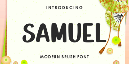 INTRODUCING Samuel is modern brush font, stylish and organic. can be used for stationery, fashion, logo, merchandise, books, clothing, magazines, cover artwork etc. Syaquita includes several ligatures, alternates and international support for most western languages. Thanks so much for looking, I really hope you enjoy it and please don't hesitate to drop me a message if you have any issues or queries :)
 - Boottering by HafisHidayat,
$15.00 Boottering is a modern handmade script, organic, energetic and dynamic, can be used for various purposes. such as the title, correspondence, wedding invitations, letterheads, signage, labels, signature newsletters, logos, posters, badges, etc. Boottering features 222 Glyphs, 40 alternate all lowercase characters, including ligatures, International support for most Western Languages is included, And for Boottering Sans do not have International Language support.
 - Les Folies JNL by Jeff Levine,
$29.00An early 20th-Century French lettering book displayed at an online image sharing site stood out with a hand-lettered version of a classic Victorian font. The lettering - a spur serif top and a split serif (or "Western-style") bottom is the basis for Jeff Levine's Les Folies JNL. All of the nuances and idiosyncracies of hand-lettering are left intact. - Telecomm NF by Nick's Fonts,
$10.00 This font is actually two different fonts. The uppercase mimics the typeface used once upon a time in Teletypes, and the lowercase is patterned after the face used during the first half of the twentieth century by Western Union for their telegrams. Both flavors of this font feature the 1252 Latin, 1250 Central European, 1254 Turkish and 1257 Baltic character sets.
 - London Court by Greater Albion Typefounders,
$16.50 London Court is a family of three 'Tudor Revival' display faces, inspired by an inscription seen underneath a clock in a splendid Tudor revival arcade in Perth, Western Australia. The resulting typeface designs are similarly 'Tudor Revival' or if you prefer 'Tudorbethan'- Roman with Blackletter details. Ideal for creating headings and posters which have an 'Olde-Worlde' feel with modern legibility.
 - Howdy by Ben Buysse,
$45.00 Howdy is a modern French Clarendon revival typeface inspired by late 19th-century woodblock type and sign painting. Its ties to the American West evoke a distinctive western and retro flair. It was designed with flexibility in mind. Intended for use as a display type, its reverse contrast forms make an impact from tall or wide headlines and anything in between.
 - Smoke-Rasterized - Unknown license

- Collint Billy by Maulana Creative,
$14.00 Collint Billy is a fancy handwritten script font duo pair with handwritten sans. With medium contrast stroke, fun character with a bit of ligatures and alternates. To give you an extra creative work. Collint Billy font support multilingual more than 100+ language. This font is good for logo design, Social media, Movie Titles, Books Titles, a short text even a long text letter and good for your secondary text font with sans or serif. Make a stunning work with Collint Billy font. Cheers, Maulana Creative
 - Embroi Ghokib by Maulana Creative,
$15.00 Embroi Ghokib Handwritten Script Font Embroi Ghokib is a fancy handwritten script font. With medium contrast stroke, fun character with a bit of ligatures and alternates. To give you an extra creative work. Embroi Ghokib font support multilingual more than 100+ language. This font is good for logo design, Social media, Movie Titles, Books Titles, a short text even a long text letter and good for your secondary text font with sans or serif. Make a stunning work with Embroi Ghokib font. Cheers, Maulana Creative
 - Brimons by Maulana Creative,
$15.00 Brimons is a condensed retro feel sans serif font. With medium low contrast stroke Caps and small caps, fun character with a bit of ligatures and alternates. To give you an extra creative work. Brimons font support multilingual more than 100+ language. This font is good for logo design, Social media, Movie Titles, Books Titles, a short text even a long text letter and good for your secondary text font with sans or serif. Make a stunning work with Brimons font. Cheers, Maulana Creative
 - Pinatas Marks by Piñata,
$12.00 Original Foundry: TypeType Original name: TT Marks The typeface Pinatas Marks is made in the style of the traditional American sign painting, which is the traditional art of painting on buildings, billboards and signage for the purpose of announcing or advertising of products, services, and activities. Font family Pinatas Marks consists of 32 fonts and has 8 different weights: Thin, ExtraLight, Light, Regular, Medium, Bold, ExtraBold, Black. Pinatas Marks is looking great on all the modern information media, ranging from small labels to entire text blocks.
 - Nirbon Duo by Maulana Creative,
$16.00 Nirbon is a Retro sans and script font duo. With Rough sans stroke and medium contrast script stroke, fun character with a bit of ligatures and alternates. To give you an extra creative work. Shorebird font support multilingual more than 100+ language. This font is good for logo design, Social media, Movie Titles, Books Titles, a short text even a long text letter and good for your secondary text font with sans or serif. Make a stunning work with Nirbon font. Cheers, Maulana Creative
 - Yapari by Power Type,
$15.00 YAPARI is a font inspired by a street typography located in a Makassar city 2005, this writing is poured into a font and then made several variations of width which are Wide, Extended, and Expanded kind of stretched font then have thickness ranging from Thin, Extra Light, Light, Regular, Medium, Semi Bold, Bold, Extra Bold, Ultra. This font is suitable for use for design projects that have a bold impression and can also be used for all lines of media as well as formal and informal
 - JFRingmaster - 100% free

- Cheap Pine by HVD Fonts,
$25.00 Cheap Pine™ is a tribute to the wood type of the eighteenth century and nineteenth century. You can use Cheap Pine Sans & Cheap Pine Shadow together to influence the color of the shadows. The font contains arrows, hands, stars and other special glyphs available through the OpenType ligatures feature.
 - Crème de la Rue by Benedict Herr,
$39.00 Crème de la Rue is an urban-art-influenced stencil font. Cut outs and spraying or painting in huge sizes are possible as well as display use for headlines or short paragraphs in mid and large scale. The Stencil cut is available with 246 glyphs, numbers, accents, arrows and ligatures.
 - Plinc Buffalo by House Industries,
$33.00 Just as its eponymous ancestors graced vast Western vistas, Buffalo fills broad horizontal typographic topography with distinctive dignity. Buffalo’s migration across a visual landscape that straddles two millennia saw it survive the threat of extinction similar to its mammalian ancestors and emerge with rotund relevance. Now fortified with modern character sets and digital flexibility, nothing espouses an artisanal post-western industrial craft renaissance quite like Buffalo. Legendary lettering artist and type designer Ed Benguiat created the original film version of Buffalo for Photo-Lettering Inc. Working under the direction of the current Photo-Lettering partners, Dutch type designer Donald Roos digitized and expanded Buffalo while expertly maintaining the organic nuances found in the original version. Like all good subversives, House Industries hides in plain sight while amplifying the look, feel and style of the world’s most interesting brands, products and people. Based in Delaware, visually influencing the world.
 - Frankfurter by ITC,
$40.99 Frankfurter font is the work of designer Alan Meeks. The most distinctive feature of this informal, sans serif typeface is its curved or rounded terminals. The letters look best when set closely together. Frankfurter Medium is well-suited to a variety of display applications and comes in four weights, regular, medium, highlight and inline.
 - Nat Grotesk by ParaType,
$30.00 Nat Grotesk family consists of 14 styles including 6 narrow ones. It has a half-closed sans serif design with simple and clear lettershapes. Due to compact proportions the face is very space saving, but nevertheless it is rather legible even in small sizes. The bold weights demonstrate increased contrast. The font is recommended for text and display typography as well as for headlines and advertising. It was designed by Natalia Vasilyeva and released by ParaType in 2007. The upgraded version with extended character set was released in 2009.
 - Lyonette NB by No Bodoni,
$39.00 These four typefaces, Berlinette NB, Lyonette NB, Marseillette NB and Parisette NB, were designed from the same basic shape, a geometric form that avoids strict horizontals and uses more offbeat triangular shapes. Lyonette is a fanciful type, gentle and precocious. It seems aloof at times but isn�t really. The frivolity and quirkiness of the narrow width is offset by the fey, finger-like horizontals, vaguely reminiscent of strange encounters and dark closets. It�s great for fashion advertising with literary pretensions. Or maybe a kinder, gentler sci-fi movie.
 - Pinguino by Sudtipos,
$49.00 Angel Koziupa's familiar brush goes upright and narrow with Pinguino. Koziupa's approach to condensed brush fonts makes use of the same elements that have always distinguished his calligraphy from any other. With Pinguino, however, we see him softening his corners and adding a distinctly feminine touch to his exotic brush. Pinguino would feel at home on sobering coffee packaging just as it would on a bouncy mixed-fruit juice bottle. Try Pinguino for your next packaging project, and tell your client an Angel told you to use it.
 - Mrs Lollipop by Hipopotam Studio,
$20.00 Mrs Lollipop is a hand drawn narrow typeface designed for one of our books. You can layer different styles over the background style to achieve lots of colorful effects. Check out the manual for details. Mrs Lollipop has upper and lowercase characters with up to three alternate glyphs. Build in OpenType Contextual Alternates feature will automatically set alternate glyphs depending on frequency of appearance of the same character (even in web font but only in HTML5 browsers). The script doesn’t throw random glyphs. It has lines, frames, hearts, stars, ladybird and two rabbits.
 - Zart by DSType,
$40.00 Zart is a heavy yet delicately sensitive display typeface filled with character, a free interpretation of the classical French styles from the late eighteenth century, reimagined for modern use. While it’s vertical strokes carry the typical weight of this style, the thinness of the horizontal strokes is further extended into the characters with the introduction of large vertical ink traps. This allowed us to design slightly narrower letters which, coupled with shorter serifs, result in a overall darker expression, creating really impactful headlines. Zart is available in three versions: Regular, Italic and Script.
 - ITC Verkehr by ITC,
$29.99ITC Verkehr was designed by Mott Jordan, who based its forms on those of narrow sans serif typefaces but also chose a departure from the tradition to set the font apart from the rest. The upper half of each character is heavier than the lower half, although this is usually the other way around. Diagonal strokes, like the horizontal of the lower case e, relax the otherwise regular, bar-like look of the font. ITC Verkehr is suited exclusively for use in headlines and display in larger point sizes. - Stubby by Tipos Pereira,
$12.00 Stubby is a display type family with 11 styles, was made for titles, headlines and also packages, posters and everything that provide space for a rude, fat and widish type. You should try Stubby in your text blocks if you're looking for an informal shape with some handwriting taste, there are eleven styles mixing from a narrowed thin to a sloppy ultrabold. Stubby has a tight spacing made to fit in squeeze places, not so elegant or clean but definitely an original choice for your real life project.
 - Borden by La Boîte Graphique,
$25.00 Borden is a rounded hand-printed caps font ideal for your graphic project. Usage recommendations : Title, short text, children’s book, poster, book cover, brochure, label, magazine. "The friendly hand-drawn charms of the Borden family […] Designed by Ewen Prigent, the Borden family is a hand rendered, all-caps design ideal for all sorts of playful settings. With its narrow condensed letterforms and rough rendering, this family is a good fit when space is limited in your design but you don’t want to compromise its friendly tone." www.fonts.com - newsletter - march 2014
 - MVB Peccadillo by MVB,
$39.00MVB Peccadillo is an interpreted revival of a metal typeface popular in the 19th Century, then known as Skeleton Antique. Highly condensed with extra short descenders, the face makes a big impact in a narrow space. Holly Goldsmith worked from letterpress-printed specimens of 96-point, antique metal type, deliberately retaining subtle distortions due to type wear and letterpress impression. Alan Dague-Greene, referring to printed samples of Skeleton Antique, adapted the design to create two additional optical sizes: “Eight” for smaller text and “Twenty-four” for subheads. - Linotype Lichtwerk by Linotype,
$29.99Linotype Lichtwerk, from German designer Bernd Pfannkuchen, is part of the Take Type Library, chosen from the entries of the Linotype-sponsored International Digital Type Design Contest 1999 for inclusion on the Take Type 3 CD. This display font contains very narrow forms with a high x-height. It is reminiscent of the constructivism of the 1920s and was designed with a small number of basic forms. The high, thin letters form words and an overall picture which almost flickers on the page. Linotype Lichtwerk with its technical look is suited exclusively for headlines. - ST Agitaciya by ShimanovTypes,
$9.00 Introducing a retro narrow grotesque called "Agitaciya" (Agitation). Bring back to the Soviet Era Agitation inspired by Soviet posters, movie titles and book covers. The letterforms are straight and condensed and come in 2 styles: uppercase and small caps alternatives. It has Extended LATIN and Extended CYRILLIC letters. "Agitaciya"created for titles, poster design, web design, branding and packaging works, illustrations, badges and other typography works. *ST Agitaciya supports 15+ languages: English, German, Spanish, Belarusian, Bosnian, Bulgarian, Croatian, Dutch, Norsk, Dannish, Macedonian, Polish, Russian, Serbian, Slovenian, Swedish, Ukrainian, Kazakh, and probably others )
 - Logx 30 by Fontsphere,
$12.00 LOGX-30 is a geometric, all-caps, display typeface. As a brother of LOGX-10 and LOGX-20 , this is the most narrow version in a series of three related typefaces. LOGX-30 is designed, like other LOGX versions, for a wide range of graphic designs and visual identifications. I think that it works best in works with a technical, geometric style, and rather striving for minimalism. Both the normal and the italic version can be used together to compose graphics, photos, large and small text in an interesting way.
 - JollyGood Proper Condensed by Letradora,
$18.00 JollyGood Proper Condensed is another member of the JollyGood family. It is an informal, hand-lettered font with a narrower weight so you can fit more text while still being fun & legible. It is a complete complete family with 4 weights in regular and italic (8 fonts in total), plus 4 rough versions. It has an amazing character set, with support for most european languages, as well as alternates and ligatures. JollyGood Proper Condensed is suitable for packaging, children's books, greeting cards or wherever you need a fun touch in your text.
 - Monotype Clearface by Monotype,
$29.99A rather narrow and compact design, Monotype Clearface combines both old style and antique characteristics. The lowercase letters are tall, the ascenders and descenders quite short. The intention was to produce a typeface that was easy to read in small sizes, hence the name. Monotype Clearface Bold was first cut for mechanical composition in 1922, and was based on the Clearface Gothic design created by Morris Fuller Benton for ATF in 1910. Although designed as a text face, Monotype Clearface is now more commonly used in advertising and display work. - Linotype Constitution by Linotype,
$29.99Frank Marciuliano designed the basic forms of Linotype Constitution around those of the swash alphabets of the 18th century. While the capitals are generously designed, the lower case letters have more reserved forms and are narrower. The characters of Constitution seem to have been set to paper with a feather and ink. The marked stroke contrast and elegant forms makes it a dynamic and sentimental font. The capitals can be used as initials mixed with other fonts, but Constitution is also good for texts which should give a feeling of nostalgia. - Linotype Octane by Linotype,
$29.99Linotype Octane is part of the Take Type Library, selected from the contestants of Linotype’s International Digital Type Design Contests of 1994 and 1997. The font was designed by German artist Norbert Reiners, a tall, thin font with a narrow line width and marked stroke contrast. The regular and bold weights seem somewhat static while the italic cuts make a dynamic impression. Linotype Octane is available in four weights, each of which contains a number of ligatures. The cool and reserved Octane is best used for shorter texts and headlines in larger point sizes. - 1820 Modern by GLC,
$38.00 This family was inspired mainly (Normal and Italic style ) by a Didot pattern font used in Rennes (France, Britanny) by Cousin-Danelle, printers, for Antiquités historiques et monumentales ‡ visiter de Montfort ‡ Corseul, par Dinan... Saint Malo... etc. an historic guidebook for a journey through a part of (French) Brittany in 1820, and many other books. The present version contains 1820 Modern Normal and Italic, 1820 Modern Large Normal and 1820 Modern Narrow Normal, each style with small caps. This font may be used together with 1906 French News and/or 1906 Titrage.
 - Salda by Hurufatfont,
$19.00 Salda; It is a modern sans serif family that blends old and new generation sans serif fonts in the same body. It has a wide usage area with its light narrow structure, sharp and clean lines, humanist touches. It provides clean and smooth visuals in vertical screens, mobile applications and block texts. With two different x heights (xL-xS), the body offers richness in text and headings. It consists of a total of 40 styles. Ideal for all kinds of editorial design, packaging, corporate identity, brand, application, web and desktop.
 - Sola by Khaito Gengo,
$25.00 Sola is a simplistic, stylish, and modern san serif type font with the unique addition of rounded corners. When creating this font, Bank Gothic originally influenced me, however when I made the square shapes lower case the font didn't retain its sophistication, so it was designed narrower. The result is this warm and soft looking font that works for all types of design, from posters and fliers to logos and business cards. Sola also features standard ligature, stylistic alternates, titling characters with extended width, and a set of standard pictograms.
 - Poplar by Adobe,
$29.00Poplar is an Adobe Originals typeface designed by Barbara Lind in 1990 for the Adobe Wood Type series. Poplar, a Gothic condensed, was designed from photographs taken by Rob Roy Kelly of the one surviving copy of an 1830 William Leavenworth type specimen book. Leavenworth possessed unusual artistic abilities, and his treatment of the letterform counters as narrow slits made it the only wood type of its kind displayed during the nineteenth century. Poplar is an excellent display face, its simplicity making it useful for a broad range of work.

