10,000 search results
(0.257 seconds)
- Binner Gothic by Monotype,
$29.99Binner Gothic is a very narrow sans serif thought to have been cut by the Bruce Typefoundry, in New York, around the turn of the century. The capitals are rather heavy with an elongated appearance, accentuated by the high-waisted treatment of characters such as B E F H M N P and R. The lowercase ascenders and descenders of the Binner Gothic font are cut at an angle. Binner Gothic is a display face particularly useful where space is at a premium. - Aquinas by ITC,
$29.00Aquinas is distinguished by the contrast between its upright, generous capitals and its narrow, slanted lower case letters which look almost like italics. The combination of these so different alphabets creates an opportunity to give texts an unusual yet elegant look. Aquinas is suitable for both running text and headlines and should be used in point sizes of 10 or larger. The lyrical and sophisticated feel of Aquinas makes it a particularly good typeface for poems, songs and other artistic texts. - Pax 2 by Linotype,
$29.99Pax is clearly a didone, using Vox classification. The contrast between the thin lines and the thicker ones is noticeable, as you would expect from a didone. The basic form is relatively narrow, therefore I designed another Pax, slightly wider and darker, and called it Pax #2. Otherwise they are more or less identical. Pax is Latin for peace, on everyone's want list in 1995 - as well as every single year before and after that. Pax was released in 1995. - Palitura by Michael Rafailyk,
$9.00 Palitura is a display typeface designed to translate Cyrillic flavor into the Latin script. Palitura means lacquered book cover in Old Ukrainian. The design of letter shapes is inspired by Early Cyrillic handwritten letters and Ukrainian patterns that are conveyed through the sharpness of form, vertical strokes that are narrower at the bottom, stylized oblique hooks at the top, and triangular accents. Languages: 480+. Scripts: Latin, Greek, Cyrillic. Specimen: michaelrafailyk.com/typeface/specimen/Palitura.pdf The promo images used photo of Tima Miroshnichenko from Pexels.
 - Rosemont by Scriptorium,
$24.00Rosemont is a playful new font which hovers on the bordeline between Arts and Crafts style and Art Nouveau style. It has the narrowness of Art Nouveau fonts like Adresack, Spoonbill and Coloma, with the curls and unique character forms of Art Nouveau fonts like Beauvoir or Acadian. The result is an interesting looking font which could be at home in either design environment. Rosemont features two sets of upper case characters, one with more decoration and one which is more plain. - Tomkin by Typesketchbook,
$55.00 Tomkin font is an extra large super family of 54 fonts! Tomkin have such a big abundance of contrast, styles, weights, width. Typesketchbook consists of a very usable, clean and modern sans typeface with Semi-square struture. The complete Tomkin type family includes 9 weights with italic and 3 width (normal, narrow, condense) versions for each of them all in all 54 fonts for a multifunctional usage, especially for cooperative work, such as website, magazine, editorial, publishing , as well as packaging.
 - Trakya Rounded by Bülent Yüksel,
$19.00 Thrace (/θreɪs/; Greek: Θράκη, Thráki; Bulgarian: Тракия, Trakiya; Turkish: Trakya) is a geographical and historical region in Southeast Europe, now split among Bulgaria, Greece, and Turkey, which is bounded by the Balkan Mountains to the north, the Aegean Sea to the south, and the Black Sea to the east. It comprises southeastern Bulgaria (Northern Thrace), northeastern Greece (Western Thrace), and the European part of Turkey (East Thrace). Trakya Rounded is a modern sans serif with a geometric touch. It has a modern streak which is the result of a harmonization of width and height especially in the lowercase letters to support legibility. Trakya Rounded is softer and rounder than it's sibling Trakya Sans. They're both ideally suited for advertising and packaging, editorial and publishing, logos, branding and creative industries, posters and billboards, small text, way-finding and signage as well as web and screen design. Trakya Rounded provides advanced typographical support for Latin-based languages. An extended character set, supporting Central, Western and Eastern European languages, rounds up the family. The designation “Trakya Rounded 500 Regular” forms the central point. The first figure of the number describes the stroke thickness: 100 Thin to 900 Bold. "Trakya Rounded" comes in 5 weights and italics and has the company of "Trakya Rounded Alt" that also comes in 5 weights and italics for a total of 20 styles. The family contains a set of 630+ characters. Case-Sensitive Forms, Classes and Features, Small Caps from Letter Cases, Fractions, Superior, Inferior, Denominator, Numerator, Old Style Figures are easily accessible in all graphic programs. Trakya Rounded is the perfect font for web use. Enjoy using it.
 - Children in Need - Personal use only

- Curwen Sans by K-Type,
$20.00 Curwen Sans is a monoline sans-serif dating from the early twentieth century. Though contemporary with Johnston’s Underground and Gill Sans, and emerging from the same artistic milieu, Curwen Sans was created solely for in-house use at the Curwen Press in London so never achieved a wide audience or recognition. The original face was cut only in a Medium weight, but the new digital family consists of four weights, each with an optically corrected Oblique, and all containing a full complement of Latin Extended-A characters. K-Type Curwen Sans comprises three packages: • Basic Family (Regular, Oblique, Bold, and Bold Oblique) • Light (Light and Light Oblique) • Medium (Medium and Medium Oblique)
 - LambadaDexter - Unknown license

- Letterboard by Sunday Creative Co.,
$12.00 Creatives understand the compulsion to make something of worth. And each creative person has a toolbox they grab from often. Letterboard Lite is the narrow geometric sans that can headline or support whatever project is next on your list — the one unfussy tool you’ll use time and again. With its geometric shapes, Letterboard is a ground-floor sans that stabilizes the foundation upon which everything else will be built. It cements the context unobtrusively without begging to be acknowledged. Pair Letterboard with any script typeface and it will highlight that script’s qualities, whether capricious or elegant. Pair it with a serif or slab serif for an obvious change of tone: With a modern slab, trends will be respected, but it will act more coy with an old-school chunky slab. Letterboard’s geometry is easily subsumed as a partner to a range of serifs, from classics to the latest releases. These qualities and its narrowness make it easy for Letterboard to be used as a large display font in headlines or branding applications. Letterboard comes with 270 characters necessary for setting over 150 Latin-based languages: A–Z with diacritics, lining numerals, and the most common punctuation and symbols.
 - Movida by ROHH,
$39.00 Movida™ is a 101-font mega family - modern, spurless, with geometric flat-sided nature. Its versatile character and huge choice of styles let it serve as a charismatic display typeface as well as clean contemporary tool for setting paragraph text. Its dynamic personality fits perfectly to such industries as sports, gaming, technology, streetwear, automotive. Movida works great for logo design & branding, magazine editorial use, web design, user interfaces and mobile applications. Movida features a super-flexible 3-axis variable font allowing fluent adjustments to width, weight and italic angle. This single font contains all the styles and features of the whole mega family. Main features: 5 widths (Narrow, Condensed, Normal, Expanded, Wide) 10 weights for each width (from Hairline to Black) + 10 corresponding italic styles 1 variable font (3 axes: weight, width, italic angle) modern, slick & sharp spurless design large x-height improving legibility in small sizes flattened oval shapes, adding vertical rhythm and elegance to narrow styles extended latin language support OpenType features (case sensitive forms, standard and discretionary ligatures, stylistic sets, contextual alternates, lining, oldstyle and tabular figures, slashed zero, fractions, superscript and subscript, ordinals, currencies and symbols)
 - Miedinger by Canada Type,
$24.95 Helvetica’s 50-year anniversary celebrations in 2007 were overwhelming and contagious. We saw the movie. Twice. We bought the shirts and the buttons. We dug out the homage books and re-read the hate articles. We mourned the fading non-color of an old black shirt proudly exclaiming that “HELVETICA IS NOT AN ADOBE FONT”. We took part in long conversations discussing the merits of the Swiss classic, that most sacred of typographic dreamboats, outlasting its builder and tenants to go on alone and saturate the world with the fundamental truth of its perfect logarithm. We swooned again over its subtleties (“Ah, that mermaid of an R!”). We rehashed decades-old debates about “Hakzidenz,” “improvement in mind” and “less is more.” We dutifully cursed every single one of Helvetica’s knockoffs. We breathed deeply and closed our eyes on perfect Shakti Gawain-style visualizations of David Carson hack'n'slashing Arial — using a Swiss Army knife, no less — with all the infernal post-brutality of his creative disturbance and disturbed creativity. We then sailed without hesitation into the absurdities of analyzing Helvetica’s role in globalization and upcoming world blandness (China beware! Helvetica will invade you as silently and transparently as a sheet of rice paper!). And at the end of a perfect celebratory day, we positively affirmed à la Shakti, and solemnly whispered the energy of our affirmation unto the universal mind: “We appreciate Helvetica for getting us this far. We are now ready for release and await the arrival of the next head snatcher.” The great hype of Swisspalooza '07 prompted a look at Max Miedinger, the designer of Neue Haas Grotesk (later renamed to Helvetica). Surprisingly, what little biographical information available about Miedinger indicates that he was a typography consultant and type sales rep for the Haas foundry until 1956, after which time he was a freelance graphic designer — rather than the full-time type designer most Helvetica enthusiasts presume him to have been. It was under that freelance capacity that he was commissioned to design the regular and bold weights of Neue Haas Grotesk typeface. His role in designing Helvetica was never really trumpeted until long after the typeface attained global popularity. And, again surprisingly, Miedinger designed two more typefaces that seem to have been lost to the dust of film type history. One is called Pro Arte (1954), a very condensed Playbill-like slab serif that is similar to many of its genre. The other, made in 1964, is much more interesting. Its original name was Horizontal. Here it is, lest it becomes a Haas-been, presented to you in digital form by Canada Type under the name of its original designer, Miedinger, the Helvetica King. The original film face was a simple set of bold, panoramically wide caps and figures that give off a first impression of being an ultra wide Gothic incarnation of Microgramma. Upon a second look, they are clearly more than that. This face is a quirky, very non-Akzidental take on the vernacular, mostly an exercise in geometric modularity, but also includes some unconventional solutions to typical problems (like thinning the midline strokes across the board to minimize clogging in three-storey forms). This digital version introduces four new weights, ranging from Thin to Medium, alongside the bold original. The Miedinger package comes in all popular font formats, and supports Western, Central and Eastern European languages, as well as Esperanto, Maltese, Turkish and Celtic/Welsh. A few counter-less alternates are included in the fonts.
 - Aure Jane by Aure Font Design,
$23.00 Aure Jane defines grace under fire. These clean, sans-serif forms engage the reader with a subtext of trust. Jane’s excellent legibility will stand up under almost any typographic challenge, bringing confidence to text and titles, and clarity to astrological expressions and chartwheels. Jane is an original design developed by Aurora Isaac. After more than a decade in development, 2018 marks the first release of the CJ and KB glyphsets in regular, italic, bold, and bold-italic. The CJ glyphset is a full text font supporting a variety of European languages. A matching set of small-caps complements the extended lowercase and uppercase glyphsets. Supporting glyphs include standard ligatures, four variations of the ampersand, and check-mark and happy-face with their companions x-mark and grumpy-face. Numbers are available in lining, oldstyle, and small versions, with numerators and denominators for forming fractions. Companion glyphs include Roman numerals, specialized glyphs for indicating ordinals, and a variety of mathematical symbols and operators. The CJ glyphset also includes an extended set of glyphs for typesetting Western Astrology. These glyphs are also available separately in the KB glyphset: a symbol font re-coded to allow easy keyboard access for the most commonly used glyphs. In addition to Aure Jane’s versatility as a text font, Jane can enhance the message of other designs. Aure Jane pairs well as an innocuous foil to any decorative font; Aure Sable, for example, will shine all the more beside Jane’s sensible utility. The witty highlights of Aure Brash will sparkle against Jane’s practicality. Give Aure Jane a trial run! You may discover a permanent place for this font family in your typographic palette. AureFontDesign.com
 - Super Chill MC by Saja TypeWorks,
$12.00 There is nothing wrong with your computer screen. Do not attempt to adjust the picture. We will control the horizontal. We will control the vertical. You are about the experience the awe and mystery which is Super Chill. Super Chill Mind Control (MC) mixes super narrow letterforms with gothic inspiration, lulling you to sleep and also given you a freak out! The font includes: - A complete set of uppercase and lowercase letters, basic punctuation, numerals and currency figures, and diacritics - Stylistic Opentype Alternates to avoid letter crashing - Fun dingbats all sorts of nefarious purposes - Western Europe language support Need an extended license? Simply email us at hello@sajatypeworks.com and we’ll be happy to help! A collaboration between Dave Savage of Savage Monsters and Aaron Bell of Saja Typeworks. Get in touch: We’re here to help! If you have any questions or need assistance, please DM or contact us via hello@sajatypeworks.com Languages supported: Abneki, Afaan Oromo, Afar, Albanian, Alsatian, Amis, Anuta, Aragonese, Aranese, Arrernte, Arvanitic (Latin), Asturian, Aymara, Basque, Bikol, Bislama, Breton, Cape Verdean Creole, Cebuano, Chamorro, Chavacano, Chickasaw, Cofán, Corsican, Dawan, Delaware, Dholuo, Drehu, English, Faroese, Fijian, Filipino, Folkspraak, French, Frisian, Friulian, Galician, Genoese, German, Gooniyandi, Guadeloupean Creole, Haitian Creole, Hän, Hiligaynon, Hopi, Ido, Ilocano, Indonesian, Interglossa, Interlingua, Irish, Italian, Jamaican, Javanese (Latin), Jèrriais, Kala Kagaw Ya, Kapampangan (Latin), Kaqchikel, Kikongo, Kinyarwanda, Kiribati, Kirundi, Klingon, Latin, Lojban, Lombard, Makhuwa, Malay, Manx, Marquesan, Meriam Mir, Mohawk, Montagnais, Murrinh-Patha, Nagamese Creole, Ndebele, Neapolitan, Ngiyambaa, Norweigan, Novial, Occidental, Occitan, Oshiwambo, Palauan, Papiamento, Piedmontese, Portuguese, Potawatomi, Q’eqchi’, Quechua, Rarotongan, Romansh, Rotokas, Sami (Southern Sami), Samoan, Sango, Saramaccan, Sardinian, Scottish Gaelic, Seri, Seychellois Creole, Shawnee, Shona, Sicilian, Slovio (Latin), Somali, Sotho, Spanish, Sranan, Sundanese (Latin), Swahili, Swazi, Swedish, Tagalog, Tetum, Tok Pisin, Tokelauan, Tshiluba, Tsonga, Tswana, Tumbuka, Tzotzil, Uzbek (Latin), Volapük, Walloon, Waray-Waray, Warlpiri, Wayuu, Welsh, Wik-Mungkan, Wiradjuri, Xhosa, Yapese, Yindjibarndi, Zapotec, Zulu.
 - JF Cotswold Leaves - Unknown license

- Dearest Outline - Unknown license

- Dearest Open - Unknown license

- Silver Crown by Linecreative,
$16.00 Silver Crown is an Ultra Condensend display font with minimalist characters. It's perfect for logos, name cards, magazine layouts, headers, or even large scale artwork. Silver Crown, a clean sans serif, offers you: 1. Upper and Lowercase characters (All Caps) 2. Ligatures (121 characters) and Stylistic alternates (9 Characters) 3. Multilingual Support (Latin Western Europe), Numbers and Punctuation
 - Fine And Dandy JNL by Jeff Levine,
$29.00 Fine and Dandy JNL comes from the hand lettered title of the 1929 movie "Isle of Escape"; found on the sheet music for its theme song "My Kalua Rose". An engraved and fancy Roman, the style combines elements of Western, Art Nouveau and Art Deco into one attractive type design; available in both regular and oblique versions.
 - Flashes by profonts,
$39.99Flashes is a striking display font based on Enric Crous-Vidal's design from 1953. Unger redesigned the font based on artwork from old font books, and extended the character set to cover not only standard Western but also the Central European character set. It has been a tremendous amount of meticulous work to digitize and edit all the flashes! - Sidiqie by Chococreator,
$5.00 Sidiqie is a modern sans serif with a monoline and minimalist style. With smooth, neat lines, and with just a hint of contrast, Sidiqie works beautifully for logos, branding, and web titles. See examples for some examples of how you can use them. Includes Sidiqie Light Sidiqie Reguler Sidiqie Bold Sidiqie Black Support for western languages
 - Dietal Sans by Tour De Force,
$25.00 Dietal Sans is a companion to the Dietal slab serif family. It is a condensed sans serif family that comes in 5 weights. Dietal Sans coquettes with different type categories from sans and slab to calligraphy, western, pixel and display elements. Contains Stylistic Alternates, Ordinals and Tabular Figures as Open Type Features in Extended Latin and Cyrillic character set.
 - Brattleboro Stencil JNL by Jeff Levine,
$29.00 The inspiration for Brattleboro Stencil JNL was found within a reproduction of a sales catalog for stencil punch dies manufactured by S.M. Spencer & Co. (originally of Brattleboro, VT), circa 1868. Basically a sans serif letter, the font's unusual feature is its "split tail" design where the letters take on a bit of a "Western" look in appearance.
 - Federasyon by Yasin Yalcin,
$14.00 Federasyon was designed on the principles simplicity, legibility and functionality. The font family includes four weights and each weight has more than 240 characters on its own. Federasyon contains more than 10.000 optical arrangement data for each character to work in harmony with each other. Federasyon supports a total of 22 languages, including Western and some Central European languages.
 - Primrose Gardens by Rachel White Art,
$12.00 Primrose Gardens is a lovely, loopy all caps font. Mix and match loopy capitals with plain jane lowercase letters for a whimsical vibe. The loopy alternates are coded as uppercase letters for ease of use. Hit shift on b, e, k, m, r, w, and y for a loopy alternate. Includes characters for Western European languages.
 - Farringdon by Solotype,
$19.95An old wood type we picked up in London from the Fredrick Ullmer Company. It's not marked, and we've never seen it in a catalog, so we don't know who made it. We like it for antique-looking western posters and playbills. We added the lowercase. We have seen it used on British music hall bills. - Yenthida by RCKY Studio,
$15.00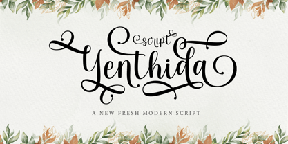 Yenthida Script is a modern calligraphy design, including Regular. This font is casual and beautiful with strokes. Can be used for various purposes. such as logos, product packaging, wedding invitations, branding, headlines, signage, labels, signatures, book covers, posters, quotes, and more. Yenthida Script includes changes in OpenType stylistics, binding, and international support for most Western languages.
 - Ramen Sans by Nina Belikova,
$20.00 Ramen Sans is a friendly grotesque type family with the warmth of serif types and a little bit of the edginess of geometric sans! Designed with body text in mind, it offers 5 weights (and their italics), small caps, tabular figures, fractions, numerators, denominators, and supports the Adobe Latin 3 character set (most western and central European languages).
 - Mexican City by Typefactory,
$14.00 Mexican City is a slab serif font with western feel. With its neat and beautiful arrangement of letters, this typeface will look outstanding in both formal and non-formal designs. Perfect for headlines or logos, jacket, Porter finds its inspiration in the style of mid-19th century typefaces using generous slab serifs and a hard-working appearance.
 - Old Trail JNL by Jeff Levine,
$29.00 An image of an antique metal marking stencil [circa late 1890s or early 1900s] reading “Folck’s Roller Mills #196 New Surprise manufactured by Wolfe Brothers, Cumberland, MD” had the words “New Surprise” rendered in a Western/Victorian typeface. Those letters served as the model for Old Trail JNL, which is available in both regular and oblique versions.
 - RM Elegance by Ray Meadows,
$19.00 With an obvious nod to Art Deco, this font offers a stylish design with distinctively elongated ascenders and descenders. Includes: Western European, Central European, Baltic & Turkish sets. Due to the modular nature of this design there may be a slight lack of smoothness to the curves at very large point sizes (around 100 pt and above).
 - Kiss And Tell by Comicraft,
$49.00 You wanted the best and you got the best! Originally created for the KISS: PSYCHO CIRCUS comic in the late '90s, this thick/thin font is one of our most versatile and popular offerings. Features automatic alternates, Manga characters, Western & Central European language support and Crossbar I Technology™ to place that character in exactly the right spot!
 - Tengu by The Northern Block,
$34.95 Tengu is a multiline display typeface digitised and expanded from Gustavo Pardo Sarmiento Tangui (1973). An intricate wirelike framework creates an elegant yet futuristic font ideal for apparel, books, t-shirts and posters. The font includes over 400 characters. Opentype features include digital numerals, lining figures, fractions and language support covering Western, South and Central Europe.
 - Logotypia Pro by FDI,
$25.00 Logotypia Pro is is made for one purpose: the design of modern logotypes, brands and headlines. Logotypia Pro offers: - unique and modern shapes - alternate swash glyphs - easy to build ligatures - connect glyphs with Logotypia's "connector-glyphs" - metrics optimized for display use - complete class based kerning - includes western (ANSI/Mac Roman) and russian alphabet (codepage 8859-5)
 - Young Heart by Alit Design,
$14.00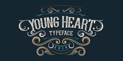 Introducing Young Heart Typeface western style display font. OpenType features with Stylistic Alternates. To access the alternate glyphs, you need a program that supports OpenType features such as Adobe Illustrator CS and Adobe Indesign. You can use this font for various purposes. such as logo, t-shirt, posters, lable, letterhead, book cover and etc. Thank you and enjoy :)
 - Open Range by FontMesa,
$20.00 Open Range is a new font design based on an old classics sans serif font from the 1800s. Some may say that this font looks like a western version of the more modern Benguiat but samples of lettering from the 1800s show a similar design to Benguiat and may have been the inspiration for that font.
 - Gumok by Linecreative,
$14.00 Gumok - Ultra Condensend font and Minimalis Character, It's Perfect for logo, name card, magazin layout,headers, or oven large scale artwork What you get dear, you will get : 1. Gumok- A clean San serif font including Upper & Lowercase characters(ALL CAPS), 2. Stylistic alternates Character (9 Character) 3. Supports Multi linguage (Latin Western Europe), Numbers and Punctuation
 - Dietal by Tour De Force,
$25.00 Dietal is condensed slab serif family that comes in 5 weights. Dietal coquettes with different type categories from sans and slab to calligraphy, western and display elements. It is available in two versions: with curved and sharp joining. Contains Stylistic Alternates, Ordinals and Tabular Figures as Open Type Features in Extended Latin and Cyrillic character set.
 - Rottarity Feminine by Siwox Studios,
$12.00 Rottarity Feminine, connecting script, designed to convey modern, elegance and fashionable. It is slender, feminine and friendly. Rottarity Feminine will work perfectly for fashion, e-commerce brands, trend blogs, or any business that wants to appear classy and chic. This font support accent letters of Central Europa, Western (À Â Æ È Ë ã ä æ è...),


