10,000 search results
(0.034 seconds)
- Charming Smile by Prioritype,
$19.00 Introducing. Charming smile font. Beautiful and fun with a touch of vintage style. Equipped with various alternative characters add to the added value of this font. Great for t-shirt designs, social media posts, cover designs, stickers and more. Features: Uppercase, Lowercase, Numeral, Punctuation, Multilingual, Alternates & PUA Encoded. Obtained file format: Otf & Ttf. Multilingual contained: Afrikaans, Albanian, Asu, Basque, Bemba, Bena, Breton, Catalan, Chiga, Cornish, Danish, Dutch, English, Estonian, Filipino, Finnish, French, Friulian, Galician, German, Gusii, Indonesian, Irish, Italian, Kabuverdianu, Kalenjin, Kinyarwanda, Luo, Luxembourgish, Luyia, Machame, Makhuwa-Meetto, Makonde, Malagasy, Manx, Morisyen, North Ndebele, Norwegian Bokmål, Norwegian Nynorsk, Nyankole, Oromo, Portuguese, Quechua, Romansh, Rombo, Rundi, Rwa, Samburu, Sango, Sangu, Scottish Gaelic, Sena, Shambala, Shona, Soga, Somali, Spanish, Swahili, Swedish, Swiss German, Taita, Teso, Uzbek (Latin), Volapük, Vunjo, Zulu. Thanks :)
 - Xmas Wishes by Resistenza,
$29.00 Xmas Wishes Font - A collection of 55 calligraphic Christmas greetings and 10 Christmas dingbats. All handwritten with different tools like broad nib pen, pointed pen and brush pen which allowed us to create diverse styles. The letterings are written in different languages; English, French, Spanish and Italian. Add the beauty of calligraphy to your layout and create unique gadgets for this Holiday Season like posters, greeting cards, wrapping paper, tags, and much more! You can also use the designs as photo overlays for your blog or social media content. Open the images to see all the details AWESOME FEATURES 'Font in .otf .ttf' '55 Handlettering Xmas words' '10 Hand-drawn Xmas dingbats' 'Languages in use English, French, Spanish and Italian' 'We highly recommend Turquoise Font to combine with the letterings.'
 - Book Jacket by Canada Type,
$24.95 Book Jacket is arguably the most famous of all typefaces done in the Typositor era. Designed by Ursula Suess over an entire year, and published in 1972, Book Jacket became an instant success story that lasted well into the 1980s (even though it was copied by Phil Martin who published it under the name Bagatelle shortly after its release). Almost 40 years later, Ursula Suess and Canada Type consolidate their talents to bring you a revised, improved and expanded digital version of this film type classic, including small caps, additional swashes and new alternative forms. Book Jacket is available as a 4-font package in Mac PostScript and universal TTF format, or a single Pro OTF which includes features for small caps, swashes, caps to small caps, stylistic alternates, and class-based kerning.
 - Antique by Storm Type Foundry,
$26.00The concept of the Baroque Roman type face is something which is remote from us. Ungrateful theorists gave Baroque type faces the ill-sounding attribute "Transitional", as if the Baroque Roman type face wilfully diverted from the tradition and at the same time did not manage to mature. This "transition" was originally meant as an intermediate stage between the Aldine/Garamond Roman face of the Renaissance, and its modern counterpart, as represented by Bodoni or Didot. Otherwise there was also a "transition" from a slanted axis of the shadow to a perpendicular one. What a petty detail led to the pejorative designation of Baroque type faces! If a bookseller were to tell his customers that they are about to choose a book which is set in some sort of transitional type face, he would probably go bust. After all, a reader, for his money, would not put up with some typographical experimentation. He wants to read a book without losing his eyesight while doing so. Nevertheless, it was Baroque typography which gave the world the most legible type faces. In those days the craft of punch-cutting was gradually separating itself from that of book-printing, but also from publishing and bookselling. Previously all these activities could be performed by a single person. The punch-cutter, who at that time was already fully occupied with the production of letters, achieved better results than he would have achieved if his creative talents were to be diffused in a printing office or a bookseller's shop. Thus it was possible that for example the printer John Baskerville did not cut a single letter in his entire lifetime, for he used the services of the accomplished punch-cutter John Handy. It became the custom that one type founder supplied type to multiple printing offices, so that the same type faces appeared in various parts of the world. The type face was losing its national character. In the Renaissance period it is still quite easy to distinguish for example a French Roman type face from a Venetian one; in the Baroque period this could be achieved only with great difficulties. Imagination and variety of shapes, which so far have been reserved only to the fine arts, now come into play. Thanks to technological progress, book printers are now able to reproduce hairstrokes and imitate calligraphic type faces. Scripts and elaborate ornaments are no longer the privilege of copper-engravers. Also the appearance of the basic, body design is slowly undergoing a change. The Renaissance canonical stiffness is now replaced with colour and contrast. The page of the book is suddenly darker, its lay-out more varied and its lines more compact. For Baroque type designers made a simple, yet ingenious discovery - they enlarged the x-height and reduced the ascenders to the cap-height. The type face thus became seemingly larger, and hence more legible, but at the same time more economical in composition; the type area was increasing to the detriment of the margins. Paper was expensive, and the aim of all the publishers was, therefore, to sell as many ideas in as small a book block as possible. A narrowed, bold majuscule, designed for use on the title page, appeared for the first time in the Late Baroque period. Also the title page was laid out with the highest possible economy. It comprised as a rule the brief contents of the book and the address of the bookseller, i.e. roughly that which is now placed on the flaps and in the imprint lines. Bold upper-case letters in the first line dramatically give way to the more subtle italics, the third line is highlighted with vermilion; a few words set in lower-case letters are scattered in-between, and then vermilion appears again. Somewhere in the middle there is an ornament, a monogram or an engraving as a kind of climax of the drama, while at the foot of the title-page all this din is quietened by a line with the name of the printer and the year expressed in Roman numerals, set in 8-point body size. Every Baroque title-page could well pass muster as a striking poster. The pride of every book printer was the publication of a type specimen book - a typographical manual. Among these manuals the one published by Fournier stands out - also as regards the selection of the texts for the specimen type matter. It reveals the scope of knowledge and education of the master typographers of that period. The same Fournier established a system of typographical measurement which, revised by Didot, is still used today. Baskerville introduced the smoothing of paper by a hot steel roller, in order that he could print astonishingly sharp letters, etc. ... In other words - Baroque typography deserves anything else but the attribute "transitional". In the first half of the 18th century, besides persons whose names are prominent and well-known up to the present, as was Caslon, there were many type founders who did not manage to publish their manuals or forgot to become famous in some other way. They often imitated the type faces of their more experienced contemporaries, but many of them arrived at a quite strange, even weird originality, which ran completely outside the mainstream of typographical art. The prints from which we have drawn inspiration for these six digital designs come from Paris, Vienna and Prague, from the period around 1750. The transcription of letters in their intact form is our firm principle. Does it mean, therefore, that the task of the digital restorer is to copy meticulously the outline of the letter with all inadequacies of the particular imprint? No. The type face should not to evoke the rustic atmosphere of letterpress after printing, but to analyze the appearance of the punches before they are imprinted. It is also necessary to take account of the size of the type face and to avoid excessive enlargement or reduction. Let us keep in mind that every size requires its own design. The longer we work on the computer where a change in size is child's play, the more we are convinced that the appearance of a letter is tied to its proportions, and therefore, to a fixed size. We are also aware of the fact that the computer is a straightjacket of the type face and that the dictate of mathematical vectors effectively kills any hint of naturalness. That is why we strive to preserve in these six alphabets the numerous anomalies to which later no type designer ever returned due to their obvious eccentricity. Please accept this PostScript study as an attempt (possibly futile, possibly inspirational) to brush up the warm magic of Baroque prints. Hopefully it will give pleasure in today's modern type designer's nihilism. - Deft Brush by wearecolt,
$16.00 A beautiful brush font created directly from original drawn characters. Deft Brush features a number of ligature and alternative glyphs to add to the hand drawn look. A great front for bold headlines, titles and crafty logotypes. Available as both .otf and .woff
 - Coastline by Surplus Type Co,
$9.00 Introducing Coastline - A textured script typeface which features regular & alternate fonts in both .otf and SVG format! You can choose whether you want the heavily textured result with the SVG version, or a more solid design with the .otf font, and also interchange your letters using the Alternates for a more natural handwritten look. Coastline is great for countless areas of design and works equally well for creating quotes, posts & advertisements as well as physical goods like apparel, posters & housewares.
 - Bulmer by Bitstream,
$29.99Morris Fuller Benton’s ATF version of Baskerville’s design cut by William Martin for the British printer and publisher William Bulmer. ATF released the design in 1928. - Quiller by Canada Type,
$24.95Quiller is another catch from the hot metal days, another one that managed to slip through the fingers of both the photo-typers and digitizers of last 4 decades. JJ Sierke’s Privat design from 1966 is now resurrected and heavily extended to be used by computer users everywhere. The original design was revived, and two whole new fonts were added to it - one with very unique swash caps and alternates, and one with many many ligatures and letter-combination ornaments. Quiller is a cross between brush calligraphy and very casual fast handwriting. It even has a slight Arabic simulation to it. Given such traits, the addition of a swash font and a multitude of ligatures comes in very handy to keep the natural flow of the font and maintain the elegance of its spirit. Those who like the auto-magic of OpenType’s intelligent substitution should like the fact that the OTF version is a single font with all the bells and whistles ready to go in the swash and discretionary ligatures features. If you use the latest versions of Adobe programs, the OTF version of Quiller is highly recommended. - Stencil by Bitstream,
$29.99Gerry Powell’s stencil version of Clarendon designed for ATF in 1938. - Platanos by eyetype,
$14.00 Platanos is bold, has a beautiful and unique leaf top style, it is a model of modern calligraphy typography, combined with the style of calligraphy writing. The Features of this fonts is; Swash Alternates Standart ligatures Stylistic Alternates Stylistic sets File font Platanos Include ; - Platanos OTF - Platanos Shadow OTF Languages supported: Breton, Catalan, Czech, Danish, Estonian,French, German, Hungarian, Icelandic, Italian, Romanian, Scottish Gaelic, Slovak, Latvian, Lithuanian, Norwegian, English, Finnish, Polish, Portuguese, Slovenian, Spanish, Swedish, Turkish, Welsh. Basically, all european languages that are based on latin alphabet Can be used for various purposes.such as headings, logos, wedding invitation, t-shirt, letterhead, lable, news, posters, badges etc. To enable the OpenType Stylistic alternates, you need a program that supports OpenType features such as Adobe Illustrator CS, Adobe Indesign & CorelDraw X6-X7.
 - Rebellious Brush by Joanne Marie,
$12.00 Rebellious Brush marker font is a hand lettered brush script. What fun I've had from the beginning using pencil on paper to practising creating the glyphs with several types of markers! You'll notice that there are a couple of swashes in the preview pictures - I haven't advertised these because they are only accessible via a glyphs panel using the OTF file supplied.
 - Bandolina by Hanoded,
$15.00 Bandolina is a fun, hand drawn typeface. Didone-ish, off-key, jumpy and full of happy glyphs. It comes with a bagful of quirkiness, a pinch of eccentricity and a full range of diacritics.
 - TT Tsars by TypeType,
$39.00 TT Tsars useful links: Specimen | Graphic presentation | Customization options The TT Tsars font family is a collection of serif display titling fonts that are stylized to resemble the fonts of the beginning, the middle and the end of the XVIII century. The project is based on title fonts, that is, the fonts that were used to design book title pages. The idea for the project TT Tsars was born after a small study of the historical development of the Cyrillic type and is also based on Abram Shchitsgal’s book "Russian Civil Type". At the very beginning of the project, we had developed a basic universal skeleton for the forms of all characters in all subfamilies of the family, and later on, we added styles, visual features, artifacts and other nuances typical of the given period onto the skeleton. Yes, from the historical accuracy point of view it might be that such an approach is not always justified, but we have achieved our goal and as a result, we have created perfectly combinable serifs that can be used to style an inscription for a certain time period. The TT Tsars font family consists of 20 fonts: 5 separate subfamilies, each of which consists of 4 fonts. Each font contains 580 glyphs, except for the TT Tsars E subfamily, in which each font consists of 464 characters. Instead of lowercase characters in the typeface, small capitals are used, which also suggests that the typeface is rather a display than text one. In TT Tsars you can find a large number of ligatures (for Latin and Cyrillic alphabets), arrows and many useful OpenType features, such as: frac, ordn, sinf, sups, numr, dnom, case, onum, tnum, pnum, lnum, salt (ss01), dlig. Time-related characteristics of the subfamilies are distributed as follows: • TT Tsars A—the beginning of the 18th century (Latin and Cyrillic) • TT Tsars B—the beginning of the 18th century (Latin and Cyrillic) • TT Tsars C—the middle of the 18th century (Latin and Cyrillic) • TT Tsars D—the end of the 18th century (Latin and Cyrillic) • TT Tsars E—conditionally the beginning of the 18th century (only Latin) TT Tsars A and TT Tsars B families (both the beginning of the 18th century) have different starting points: for TT Tsars A it is Latin, for TT Tsars B it is Cyrillic. The development of the TT Tsars A family began in Latin, the font is based on the royal serif Romain du Roi. The Cyrillic alphabet is harmoniously matched to the Latin. The development of the TT Tsars B family began in Cyrillic, which is based on a Russian civil type. Characteristic elements are the curved one-sided serifs of triangular characters (A, X, Y), drops appear in the letter ?, the middle strokes ? and P are adjacent to the main stroke. Latin was drawn to pair with Cyrillic. It is still based on the royal serif, but somewhat changed: the letters B and P are closed and the upper bar of the letter A rose. This was done for the visual combination of Cyrillic and Latin and at the same time to make a distinction between TT Tsars A and TT Tsars B. TT Tsars C is now the middle of the 18th century. Cyrillic alphabet itself did not stand still and evolved, and by the middle of the 18th century, its forms have changed and become to look the way they are shown in this font family. Latin forms are following the Cyrillic. The figures are also slightly modified and adapted to the type design. In TT Tsars C, Cyrillic and Latin characters are created in parallel. A distinctive feature of the Cyrillic alphabet in TT Tsars C is the residual influence of the flat pen. This is noticeable in such signs as ?, ?, K. The shape of the letters ?, ?, ?, ? is very characteristic of the period. In the Latin alphabet, a characteristic leg appears at the letter R. For both languages, there is a typical C characterized by an upper serif and the appearance of large, even somewhat bolding serifs on horizontals (T, E, ?, L). TT Tsars D is already the end of the 18th century when with the development of printing, the forms of some Cyrillic characters had changed and turned into new skeletons of letters that we transposed into Latin. The figures were also stylized. In this font, both Cyrillic and Latin are stylistically executed with different serifs and are thus logically separated. The end of the century is characterized by the reduction of decorative elements. Straight, blueprint-like legs of the letters ?, R, K, ?. Serifs are very pronounced and triangular. E and ? are one-sided on the middle horizontal line. A very characteristic C with two serifs appears in the Latin alphabet. TT Tsars E is a steampunk fantasy typeface, its theme is a Latinized Russian ?ivil type (also referred to as Grazhdansky type which emerged after Peter the Great’s language reform), which includes only the Latin alphabet. There is no historical analog to this typeface, it is exclusively our reflections on the topic of what would have happened if the civil font had developed further and received a Latin counterpart. We imagined such a situation in which the civil type was exported to Europe and began to live its own life.
 - AwanZaman by TypeTogether,
$93.00 AwanZaman has a three-phase story, beginning with Dr Mamoun Sakkal’s two Arabic styles and culminating with Juliet Shen’s Latin extension. AwanZaman started as simply Awan, a commission for a modern, clean, monoline typeface for writing headlines and story titles in a forward-thinking Kuwaiti newspaper. Awan was based on the geometric forms of Kufic script, while in phase two, a second typeface (Zaman) was designed to add enough calligraphic Naskh details to make it easy to read in demanding newspaper settings. Together these two phases give the typeface a warm, familiar, and progressive look, as well as an explanatory two-part name — AwanZaman. Since most editorials use typical Naskh headline fonts with an exaggerated baseline, Awan’s rational forms immediately distinguish it as a modern and progressive voice in the crowded field of Arabic editorial typefaces. As the companion Arabic typeface, Zaman has the same basic proportions and forms as Awan, but with many cursive, energetic, and playful details. And since modern monoline fonts are increasingly being used to set extended texts, more features were borrowed from Naskh calligraphy to expand the typeface’s use from headlines into text setting. When using the AwanZaman Arabic family, Awan (geometric Kufic forms) is the starting point. To add the sweeping, energetic personality of Zaman (calligraphic Naskh forms), simply activate an alternate character through the option of 20 stylistic sets available in any OpenType-savvy software. The two typefaces function as one file — the AwanZaman Arabic family — allowing users to combine features from both designs to transform the appearance of text from geometric and formal to playful and informal. The third phase of AwanZaman’s development introduced a companion Latin typeface designed by Juliet Shen to fulfil the persistent need in the Arabic fonts market for modern and geometric bilingual type families. Due to the Arabic’s monolinear strokes, AwanZaman Latin was destined to be a sans serif with a tall x-height, larger counters, and corresponding stem thickness to harmonise with the Arabic’s overall text colour and page presence. But it needed much more. One of AwanZaman’s chief assets is making the two languages look on a par when typeset side by side. Arabic and English readers will have a different sense of what that entails, but this type family defers to the Arabic — graceful and artistic with a good mix of straight stems and curved forms. Latin in general doesn’t aesthetically flow the way Arabic does, yet the tone of the Latin needed to mirror both the Arabic’s more squarish curves and formal personality of Awan and the undulating and more playful shapes of Zaman without looking outlandish. That need was met by creating some novel Latin characters, which are accessed through four stylistic sets the same way as AwanZaman Arabic. The alternates are not just clever in the way they look and how they echo the Arabic aesthetic, but also in harmonising the disparate languages and serving designers well when needing a balanced, bilingual text face with a warm and lively voice. AwanZaman is a clever, seven-weight powerhouse that makes extensive use of OpenType’s stylistic sets (20 in the Arabic and four in the Latin) so writers and designers can make the most of everything from a single glyph in display sizes down to dense text in paragraphs. As AwanZaman Arabic has no italic, neither does the Latin; contextual distinction normally handled by italics is achieved by exploiting the family’s seven weights. AwanZaman’s intricate OpenType programming supports Persian and Urdu, with features such as the returning tail of Barri Yeh treated properly. From its inception in geometry to its melding of two worlds with novel forms, AwanZaman is a personal labor by designers Dr Mamoun Sakkal and Juliet Shen, and embodies the TypeTogether ideals of serving the global community with innovative and stylish typeface solutions. The complete AwanZaman Arabic and Latin families, along with our entire catalogue, have been optimised for today’s varied screen uses.
 - Della Robbia by Bitstream,
$29.99Thomas Maitland Cleland’s careful and scholarly creation of a typeface from 15th Century Florentine inscriptional capitals; designed for the Bruce division of ATF. - Top Heavy by m u r,
$15.00A font that's a little off balance because of its exaggerated serifs. - Stymie by Bitstream,
$30.99 Morris Fuller Benton’s 1931 design, reworking the model of Memphis for ATF.
 - Sagittarius by Hoefler & Co.,
$51.99 A typeface with lightly-worn futurism, Sagittarius is equally at home among the beauty and wellness aisles, or the coils of the warp core. The Sagittarius typeface was designed by Jonathan Hoefler in 2021. A decorative adaptation of Hoefler’s Peristyle typeface (2017), Sagittarius’s rounded corners and streamlined shapes recall the digital aesthetic of the first alphabets designed for machine reading, a style that survives as a cheeky Space Age invocation of futurism. Sagittarius was created for The Historical Dictionary of Science Fiction, where it first appeared in 2021. From the desk of the designer: Typeface designers spend a lot of time chasing down strange valences. We try to figure out what’s producing that whiff of Art Deco, or that vaguely militaristic air, or what’s making a once solemn typeface suddenly feel tongue-in-cheek. If we can identify the source of these qualities, we can cultivate them, and change the direction of the design; more often, we just extinguish them without mercy. Sometimes, we get the chance to follow a third path, which is how we arrived at Sagittarius. During the development of Peristyle, our family of compact, high-contrast sans serifs, I often found myself unwittingly humming space-age pop songs. Nothing about Peristyle’s chic and elegant letterforms suggested the deadpan romp of “The Planet Plan” by United Future Organization, let alone “Music To Watch Space Girls By” from the ill-advised (but delicious) Leonard Nimoy Presents Mr. Spock’s Music from Outer Space, but there they were. Something in the fonts was provoking an afterimage of the otherworldly, as if the typeface was sliding in and out of a parallel universe of high-tech spycraft and low-tech brawls with rubber-masked aliens. It might have had something to do with a new eyeglass prescription. But I liked the effect, and started thinking about creating an alternate, space-age version of the typeface, one with a little more funk, and a lot more fun. I wondered if softer edges, a measured dose of seventies retrofuturism, and some proper draftsmanship might produce a typeface not only suitable for sci-fi potboilers, but for more serious projects, too: why not a line of skin care products, a fitness system, a high-end digital camera, or a music festival? I put a pin in the idea, wondering if there’d ever be a project that called for equal parts sobriety and fantasy. And almost immediately, exactly such a project appeared. The Historical Dictionary of Science Fiction Jesse Sheidlower is a lexicographer, a former Editor at Large for the Oxford English Dictionary, and a longtime friend. He’s someone who takes equal pleasure in the words ‘usufructuary’ and ‘megaboss,’ and therefore a welcome collaborator for the typeface designer whose love of the Flemish baroque is matched by a fondness for alphabets made of logs. Jesse was preparing to launch The Historical Dictionary of Science Fiction, a comprehensive online resource dedicated to the terminology of the genre, whose combination of scholarship and joy was a perfect fit for the typeface I imagined. For linguists, there’d be well-researched citations to explain how the hitherto uninvented ‘force field’ and ‘warp speed’ came to enter the lexicon. For science fiction fans, there’d be definitive (and sometimes surprising) histories of the argot of Stars both Trek and Wars. And for everyone, there’d be the pleasure of discovering science fiction’s less enduring contributions, from ‘saucerman’ to ‘braintape,’ each ripe for a comeback. A moderated, crowdsourced project, the dictionary is now online and growing every day. You’ll find it dressed in three font families from H&Co: Whitney ScreenSmart for its text, Decimal for its navigational icons, and Sagittarius for its headlines — with some of the font’s more fantastical alternate characters turned on. The New Typeface Sagittarius is a typeface whose rounded corners and streamlined forms give it a romantically scientific voice. In the interest of versatility, its letterforms make only oblique references to specific technologies, helping the typeface remain open to interpretation. But for projects that need the full-throated voice of science fiction, a few sets of digital accessories are included, which designers can introduce at their own discretion. There are alternate letters with futuristic pedigrees, from the barless A popularized by Danne & Blackburn’s 1975 ‘worm’ logo for NASA, to a disconnected K recalling the 1968 RCA logo by Lippincott & Margulies. A collection of digitally-inspired symbols are included for decorative use, from the evocative MICR symbols of electronic banking, to the obligatory barcodes that forever haunt human–machine interactions. More widely applicable are the font’s arrows and manicules, and the automatic substitutions that resolve thirty-four awkward combinations of letters with streamlined ligatures. About the Name Sagittarius is one of thirteen constellations of the zodiac, and home to some of astronomy’s most inspiring discoveries. In 1977, a powerful radio signal originating in the Sagittarius constellation was considered by many to be the most compelling recorded evidence of extraterrestrial life. Thanks to an astronomer’s enthusiastically penned comment, the 72-second transmission became known as the Wow! signal, and it galvanized support for one of science’s most affecting projects, the Search for Extraterrestrial Intelligence (SETI). More recently, Sagittarius has been identified as the location of a staggering celestial discovery: a supermassive black hole, some 44 million kilometers in diameter, in the Galactic Center of the Milky Way. <
 - Best Quotes by Din Studio,
$29.00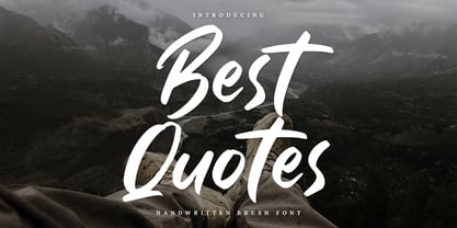 Best Quotes is a classy handwritten font. Made for any professional project branding. It is the best for logos, branding and of course quotes. Every letter has a unique and beautiful touch. Includes: Best Quotes (OTF) Features: PUA Encoded Multilingual Support Numerals and Punctuation
 - Gerova by Asenbayu,
$15.00 Gerova is a serif display font that is aesthetically pleasing and has beautiful curves. Gerova font also gives the impression of luxury with a sleek and sharp serif. This font provides a unique collection of glyphs that are perfect for completing a variety of projects, such as logo designs, identities, product labels, fashion, magazines and more. Gerova font features Open Type Format (OTF), alternative styles, ligatures, kerning, uppercase & lowercase letters, numeral, punctuation and multilingual support.
 - Athletic Dept by Hustle Supply Co,
$15.00 Athletic Dept This typeface is a hand drawn, vintage inspired athletic display font. This typeface was drawn on grid paper, scanned and vectorized in illustrator. The roughness and imperfections vary slight for each letter, giving your project an authentically handcrafted look. This typeface comes with Western European Characters as well as some special Characters. It also includes OTF, TTF & Web Font Files.
 - Black Hymned Script by Letterhend,
$17.00 Black Hymned - Font Trio is a font package containing three style with same vibes!. Each font contains lowercase, uppercase, numbers, symbols and also supports multi languages. You will get TTF and OTF. This font can use in any software without problem! A simple font. Features: uppercase & lowercase numbers and punctuation multilingual PUA encoded Please like and follow as appreciation, Thank You,
 - Hellotropica by Garisman Studio,
$20.00 Hellotropica is made with natural hand brushes to give it Summer Vibes. With the unique Opentype and ligature it will add aesthetic value to your design product. Including Hellotropica Swashes which you can unite into an amazing design. Simple installation Works for Windows or MAC Included file OTF, TTF PUA Encoded Open Versatile for poster, logotype, labels, book cover Detailed dry brush
 - BRICK 3d by WAP Type,
$15.00 More information about this Font Introducing “Brick 3D esport Font” This font can be used for any variety purpose, such as: Logo, Esport Logo, Band Logo, Championship Logo, Military Logo and Clothing FEATURES : uppercase lowercase symbol & number All images on the demo is just for preview purpose only, not included on the file! FILES INCLUDE : TTF OTF Hope you love it Thank you!
 - Mighty Dust by madeDeduk,
$12.00 mighty dust is a blackletter. There's come with 3 style font with much alternative inside. Suitable to create any branding, product packaging, invitation, quotes, t-shirt, label, poster, logo etc. Feature otf. and ttf. file woff and woff2. file Uppercase & Lowercase Number & Symbol International Glyphs Multilingual support Alternative Ligature Feel free to drop us a message any time Hope you enjoy it.
 - Charme Script by Supfonts,
$15.00 My new font is beautiful and smooth modern calligraphy with a floating baseline. Charme Script will look beautiful on Christmas and holiday invitations, wedding invites and stationery, logos, and more. I love using it for emphasis words and pairing it with serifs Includes: Charme OTF & TTF Uppercase and lowercase Numbers and punctuation Foreign language support Check out my blog: www.instagram.com/dmitriychirkov pinterest.com/dmitriychirkov7
 - Charmini by Luxfont,
$18.00 Charmini is an exquisite font with a soft and at the same time confident serifs, modern and with a touch of retro. Font lines are strict with smooth, perfect transitions. Charmini family includes 2 types of uppercase letters and has 9 font thickness options - from the lightest weights, suitable for large amounts of text to the heaviest weights, intended for headlines. Tech Specs: 36 fonts in family UPPERCASE and 2 versions of lowercase letters ligature fi ff fl Numbers & basic Punctuation Serif Typeface 9 variants of width + italic OTF font format ld.luxfont@gmail.com
 - Pretty Night by Haksen,
$10.00 Hello Guys, In this case I will let You know if I’ve released new font product with the name “Pretty Night” “Pretty Night” is a font that is designed with a natural impression on every scratch, As you can see in the preview how "Pretty Night" is written like handwriting, it is suitable for various brands. What You Will Get darling? :) - Pretty Night otf - Pretty Night S-1 otf - Pretty Night S-2 otf - Bonus swash and doodle otf - Bonus swash and doodle otf S - Bonus swash and doodle otf S2 Please enjoy and have fun with this font. Thanks
 - Flamante Sans by deFharo,
$8.00 Flamante Sans is a group of eight corporate typographies of geometric construction, without serifs and neo-grotesque style, are fonts with an excellent readability for titles, short texts or for use in signage. The group of fonts is made up of 4 weights: Light, Book, Medium & Bold plus their respective italics. This initial development of Flamante Sans typography has been the basis for the drawing of the "Flamante family" fonts composed of 5 styles (Sans, Serif, SemiSlab, Round & Stencil) making a total of 40 fonts that are perfect corporate use, advertising or editorial titles or signage of public spaces for example. They include the Bitcoin symbol. Swiss-style fonts built on a 4 ◊ 6 building grid, formed with 144 x 119 units (Medium version), two digits taken from the fibonacci and Perrin sequences, these measures define the width and height of the vertical and horizontal antlers and the overall proportion of the font. The metrics and kerning have been carefully set up for fluent reading in paragraph texts. ================================== - OpenType Features: Standard Ligatures, Additional languages, All Alternates, Alternate Annotation Forms, Superscript, Kerning, Superiors, Capital Spacing, Localized Forms, Superior letters, Discretionary Ligatures, Subscript, Fractions, Slashed Zero, Inferiors, Extended Fractions, Scientific Inferiors, Ordinals, Denominators, Oldstyle Figures, Numerators, Historical Forms, Historical Ligatures. They include the Bitcoin symbol. - 500 glyphs. Latin Extended-A ï OTF & TTF
 - Onyx by Bitstream,
$29.99Gerry Powell’s revival of the condensed and elongated Fat Face, cut for ATF. - Sathseed by Zamjump,
$17.00 Sathseed is a fun, lively, handwritten brush script created with the utmost care, love, and attention to detail. It's ideal for logos, titles, product packaging, merchandise, quotes... Try it for yourself in the preview section - what you see is what you get! To achieve an authentic handwritten feel, Sathseed comes with a full set of lowercase substitutions and ligatures to play with, giving you lots of variety. If you use software that supports OpenType, they are included in the main font that will be active as you type. If not, I've also included Alternate and Ligature as separate fonts for you to use. Your download will include the following files in TTF & OTF format. Litagure as well as alternate and extra swash. For web font use, a web font kit consisting of Awesomespill Regular fonts in WOFF, WOFF2 formats is also provided. Any question? Drop me a line and I'll be happy to answer!
 - Larof by Twinletter,
$17.00 Introducing our newest font, the Larof Sports Font Family is an American sports graphic combination display font family inspired by classic and vintage styles, but with an eye for modernity. This font includes many shapes, perfect for logos, greeting cards, quotes, posters, branding, business cards, stationery, design titles, and so on. This font is also enriched with 6 styles of choice, which of course makes it easy for you to use it in various kinds of projects according to the theme you want. What are you waiting for, use this font and get an extraordinary visual project. What’s Included : - File font OTF, TTF, WOFF, WOFF2, CSS, HTML - All glyphs Iso Latin 1 - Alternate, Ligature - Simple installations - We highly recommend using a program that supports OpenType features and Glyphs panels like many Adobe apps and Corel Draw so that you can see and access all Glyph variations. - PUA Encoded Characters – Fully accessible without additional design software. - Fonts include Multilingual support
 - 161 Vergilius by GLC,
$38.00 This font was inspired by the rare manuscript Roman Quadrata used by an unknown scribe to inscribe a copy of the Roman poet Virgil’s GEORGICS, somehwere around 161 to 180 AD. Only a few sheets have survived, now preserved by different libraries around the world. In creating this font, we have adapted it for contemporary users, making differences between U and V; I and J (which made no difference at all to ancient Latin scribes) and naturally adding the glyphs for Thorn, Oslash, Lslash, W, Y, as well as the usual accented characters and punctuation, none of which existed at the time. Only capitals are present in the original; but we have provided alternates: so alternating each character A-Z/a-z will give a pleasant appearance of manual script. We have added the Roman numerals “I V X L C D M” in the OTF/TTF versions usable as “Old Style Numerals” alternates.
 - Libertinas & co by deFharo,
$28.00 Libertinas & co. is a handwritten typeface, with a casual, elegant and sensual style, with many possibilities to compose different titles, flyers, publications or typographic posters for example. The font has an extra set of capital letters and another one of decorative lowercase for word end, also 3 stylistic set with more alternative letters and many other Open Type functions. Includes the Bitcoin symbol. The Commercial version includes - 734 glyphs. Latin Extended-A • OTF & TTF - Libertinas & co. can be used unlimited for both Commercial and Personal projects. - The download file includes a PDF with the specimen sheet of typography. - OpenType features compatible with: Photoshop, Illustrator, QuarkXpress, Indesign. - OpenType Functions: Scientific Inferiors, Swash, Terminal Forms, Titling alternates, Extended Fractions, Inferiors, All Alternates, Superiors, Contextual Ligatures, Denominators, Contextual Alternates, Contextual Swash, Discretionary Ligatures, Capital Spacing, Superscript, Additional languages, Superior letters, Oldstyle Figures, Historical Forms, Historical Ligatures, Kerning, Localized Forms, Numbers Small Caps, Numerators, Ordinals, Subscript, Ornaments, Slashed Zero, Standard Ligatures, Stylistic Alternates, Stylistic Set, Fractions. - Bitcoin symbol (ligatures): b#
 - Arzeti Script by Konstantine Studio,
$15.00 I have enough jewellery - Said no one ever. In every wedding proposal, jewel is a number one thing (after love) that man present to their woman with “Will you marry me?” sentence following. If that’s the way it works, let me show you Arzeti. A present for the one you love. I'm not gonna say its a font cause its a jewel. A sparkling beautiful things for your wedding projects, never get any wrong with any of your wedding invitations, greeting cards, bridal stuff, signs, logo, fashion branding, rustic theme, sweet stuff, as long as love involved, please, give it a go and enjoy it more. Arzeti Script is a beautiful skinny monoline script font (okay its still a font tho) with implementation of handwriting and carefully crafted to lookin lovely in every letters that they have. There’s a Stylistic Alternates for the Uppercase of each letters to make your name sparkling more than before. Available in OTF and TTF files and Multilanguage Support.
 - Octagon Calligraphy by Slex Studio,
$18.00 Octagon Calligraphy is calligraphy font with a classic style and a touch of elegance, inspired by the handwriting of women and ancient manuscripts. Carefully designed to work together in harmony that makes it very suitable for wedding media, book covers, greeting cards, logos, branding, business cards and certificates, even for any design work that requires a classic, formal or luxurious. Try Octagon Calligraphy, enjoy the richness of OpenType features and let her fun and elegant excitement make you happy and enhance your creativity! You can use this font very easily. multilingual support and ligatures Your download will include OTF & TTF format files. If you do not have programs that support OpenType features like Adobe Illustrator and CorelDraw X Versions, you can access all alternative flying machines using Font Book (Mac) or Character Map (Windows): Do not forget to see, buy, like and share my other great products. And feel free if you have a question, please contact me : slexs515@gmail.com Thank you for purchases.!
 - Monck by Putracetol,
$28.00 Introducing Monck, a modern display font that combines the best of modern typography and classic serif styles. With its sleek design and unique lettering options, Monck is perfect for a wide range of design projects. Whether you're creating logos, posters, quotes, or social media graphics, Monck offers a plethora of alternates and end swashes through its OpenType features. Monck comes with three different file formats - otf, ttf, and woff - making it compatible with various design software programs such as Adobe Illustrator CS, Adobe Photoshop CC, Adobe InDesign, and Corel Draw. This means you can easily access and utilize the alternate glyphs in Monck to create eye-catching lettering compositions. The OpenType features in Monck allow you to access uppercase and lowercase letters, as well as alternates and ligatures, giving you endless possibilities for creative combinations. Additionally, Monck supports multiple languages, making it a versatile choice for designers around the world. In your zip package, you'll find the Monck font files in otf, ttf, and woff formats, providing flexibility for different design projects. The font includes uppercase and lowercase letters, numerals, punctuation, and symbols, ensuring that you have all the tools you need to create stunning designs. Monck is a versatile font that can be used for various design purposes, such as logotypes, headings, covers, posters, product packaging, headers, merchandise, social media graphics, greeting cards, and more. Its modern and classic fusion style adds a unique and contemporary touch to your designs, making them stand out in any context. In summary, Monck is a modern display font that offers a wide range of alternates and ligatures through its OpenType features, making it a powerful tool for creative lettering compositions. With its multilingual support and compatibility with popular design software, Monck is a must-have font for any designer looking to add a touch of modernity and versatility to their projects. So why wait? Get Monck now and start creating stunning designs with ease!
 - The Outlander by Daily Studio,
$14.00 The Outlander - Design by Daily Studio This ttypeface can make your design look strong. Simple accessible on any of yor projects. Is great for headers, logos, and quotes. Comes with a full uppercase, lowercase, punctuation, and standard multilingual support. With 255 glyphs and in OTF format.
 - Ascetic 2D by 2D Typo,
$28.00 This decorative font is based on Cyrillic Vyaz of XV-XVI centuries. This type of letters were used as display faces in sacred texts. In Vyaz, the letters are characteristically fitted to each other so the letter sequences look as one solid ornamental frieze. The font is rich in discretionary ligatures which help to accentuate the style of Vyaz. In addition to letters and standard characters there is a number of monograms and Christian symbols. These and other features are available in OTF format.
 - Arthur Keith by DLetters Studio,
$35.00 Arthur Keith Signature Style Font Is A Great Font For any project! This font is made with an awesome taste and classy with natural touch, lots of ligatures, SAlt, and Swash. We keep this font looking Natural, easy to read, elegant, stylish, attractive and very easy to use. Arthur Keith Signature Style Font is a great choice for Projects you like branding, design, wedding, photography, signature, logo designs, album covers, business cards, quotes, and tons of projects other designs. What’s Included : – Arthur Keith (OTF/TTF/WOFF) – S-Alt, SS01, Ligature, and Swash – Works on Win, Mac – Simple installations – Accessible in Adobe Illustrator, Adobe Photoshop, Adobe InDesign, even work on Microsoft Word. – PUA Encoded Characters – Fully accessible without additional design software. Thanks for your support, please kindly send us a message for any question about our product. Hope you like it.