10,000 search results
(0.055 seconds)
- Nameh by Naghi Naghachian,
$105.00 Nameh is a single weight sans-serif headline font designed by Naghi Naghashian. It is a condensed big title font. This font is a contribution to modernize the Arabic typography, gives the font design of Arabic letters real typographic arrangement and provides more typographic flexibility. Nameh supports Arabic, Persian (Farsi) and Urdu. It also includes proportional and tabular numerals for the supported languages. Nameh design fulfills the following needs: A Explicitly crafted for use in electronic media fulfills the demands of electronic communication. B Suitability for multiple applications. Gives the widest potential acceptability. C Extreme legibility not only in small sizes, but also when the type is filtered or skewed, e.g., in Photoshop or Illustrator. Nima’s simplified forms may be artificial oblilqued in InDesign or Illustrator, without any loss in quality for the effected text. D An attractive typographic image. Nameh was developed for multiple languages and writing conventions. Nameh supports Arabic, Persian and Urdu. It also includes proportional and tabular numerals for the supported languages. E The highest degree of calligraphic grace and the clarity of geometric typography.
 - Jekta by Naghi Naghachian,
$104.00 Jekta is a sans-serif headline font designed by Naghi Naghashian. This is a single weights font, ExtraBold. This font is a contribution to modernisation of Arabic typography, gives the font design of Arabic letters real typographic arrangement und provides more typographic flexibility. Jekta supports Arabic, Persian and Urdu. It also includes proportional and tabular numerals for the supported languages. Jekta design fulfills the following needs: A Explicitly crafted for use in electronic media fulfills the demands of electronic communication. B Suitability for multiple applications. Gives the widest potential acceptability. C Extreme legibility not only in small sizes, but also when the type is filtered or skewed, e.g., in Photoshop or Illustrator. Nima’s simplified forms may be artificial oblilqued in InDesign or Illustrator, without any loss in quality for the effected text. D An attractive typographic image. Jekta was developed for multiple languages and writing conventions. Jekta supports Arabic, Persian and Urdu. It also includes proportional and tabular numerals for the supported languages. E The highest degree of calligraphic grace and the clarity of geometric typography.
 - Homa by Naghi Naghachian,
$108.00 Homa is a sans-serif sigle weight font designed by Naghi Naghashian. It is extremely legible even in very small size. This font is The contribution to modernisation of Arabic typography, gives the font design of Arabic letters real typographic arrangement und provides more typographic flexibility. Homa supports Arabic, Persian ( Farsi) and Urdu. It also includes proportional and tabular numerals for the supported languages. Homa design fulfills the following needs: A Explicitly crafted for use in electronic media fulfills the demands of electronic communication. B Suitability for multiple applications. Gives the widest potential acceptability. C Extreme legibility not only in small sizes, but also when the type is filtered or skewed, e.g., in Photoshop or Illustrator. Homa’s simplified forms may be artificial oblilqued in InDesign or Illustrator, without any loss in quality for the effected text. D An attractive typographic image. Homa was developed for multiple languages and writing conventions. Homa supports Arabic, Persian and Urdu. It also includes proportional and tabular numerals for the supported languages. E The highest degree of calligraphic grace and the clarity of geometric typography.
 - Pegah by Naghi Naghachian,
$98.00 Pegah is a sans-serif font family designed by Naghi Naghashian in three weights. Pegah Light, Pegah Regular and Pegah Bold. This font family is a contribution to modernisation of Arabic typography, gives the font design of Arabic letters real typographic arrangement und provides more typographic flexibility. Pegah supports Arabic, Persian and Urdu. It also includes proportional and tabular numerals for the supported languages. Pegah design fulfills the following needs: A Explicitly crafted for use in electronic media fulfills the demands of electronic communication. B Suitability for multiple applications. Gives the widest potential acceptability. C Extreme legibility not only in small sizes, but also when the type is filtered or skewed, e.g., in Photoshop or Illustrator. Nima’s simplified forms may be artificial oblilqued in InDesign or Illustrator, without any loss in quality for the effected text. D An attractive typographic image. BaBa was developed for multiple languages and writing conventions. BaBa supports Arabic, Persian and Urdu. It also includes proportional and tabular numerals for the supported languages. E The highest degree of calligraphic grace and the clarity of geometric typography.
 - BaBa by Naghi Naghachian,
$98.00 BaBa is a sans-serif font family designed by Naghi Naghashian in three weights. BaBa Light, Baba Regular and Baba Bold. This font family is a contribution to modernisation of Arabic typography, gives the font design of Arabic letters real typographic arrangement und provides more typographic flexibility. BaBa supports Arabic, Persian and Urdu. It also includes proportional and tabular numerals for the supported languages. BaBa design fulfills the following needs: A Explicitly crafted for use in electronic media fulfills the demands of electronic communication. B Suitability for multiple applications. Gives the widest potential acceptability. C Extreme legibility not only in small sizes, but also when the type is filtered or skewed, e.g., in Photoshop or Illustrator. Nima’s simplified forms may be artificial oblilqued in InDesign or Illustrator, without any loss in quality for the effected text. D An attractive typographic image. BaBa was developed for multiple languages and writing conventions. BaBa supports Arabic, Persian and Urdu. It also includes proportional and tabular numerals for the supported languages. E The highest degree of calligraphic grace and the clarity of geometric typography.
 - Hafez by Naghi Naghachian,
$88.00 Hafez is a sans-serif font family designed by Naghi Naghashian in three weights. Hafez Light, Hafez Regular and Hafez Bold. This font family is a contribution to modernisation of Arabic typography, gives the font design of Arabic letters real typographic arrangement und provides more typographic flexibility. Hafez supports Arabic, Persian and Urdu. It also includes proportional and tabular numerals for the supported languages. Hafez design fulfills the following needs: A Explicitly crafted for use in electronic media fulfills the demands of electronic communication. B Suitability for multiple applications. Gives the widest potential acceptability. C Extreme legibility not only in small sizes, but also when the type is filtered or skewed, e.g., in Photoshop or Illustrator. Nima’s simplified forms may be artificial oblilqued in InDesign or Illustrator, without any loss in quality for the effected text. D An attractive typographic image. BaBa was developed for multiple languages and writing conventions. BaBa supports Arabic, Persian and Urdu. It also includes proportional and tabular numerals for the supported languages. E The highest degree of calligraphic grace and the clarity of geometric typography.
 - Homayoon by Naghi Naghachian,
$102.00 Homayoon is a sans-serif sigle weight font designed by Naghi Naghashian. It is extremely legible even in very small size. This font is The contribution to modernisation of Arabic typography, gives the font design of Arabic letters real typographic arrangement und provides more typographic flexibility. Homayoon supports Arabic, Persian (Farsi ) and Urdu. It also includes proportional and tabular numerals for the supported languages. Homayoon design fulfills the following needs: A Explicitly crafted for use in electronic media fulfills the demands of electronic communication. B Suitability for multiple applications. Gives the widest potential acceptability. C Extreme legibility not only in small sizes, but also when the type is filtered or skewed, e.g., in Photoshop or Illustrator. Homayoon’s simplified forms may be artificial oblilqued in InDesign or Illustrator, without any loss in quality for the effected text. D An attractive typographic image. Homayoon was developed for multiple languages and writing conventions. Homayoon supports Arabic, Persian and Urdu. It also includes proportional and tabular numerals for the supported languages. E The highest degree of calligraphic grace and the clarity of geometric typography.
 - Dara by Naghi Naghachian,
$88.00 Dara is a sans-serif sigle weight font designed by Naghi Naghashian. It is extremely legible even in very small size. This font is The contribution to modernisation of Arabic typography, gives the font design of Arabic letters real typographic arrangement und provides more typographic flexibility. Dara supports Arabic, Persian ( Farsi ) and Urdu. It also includes proportional and tabular numerals for the supported languages. Dara design fulfills the following needs: A Explicitly crafted for use in electronic media fulfills the demands of electronic communication. B Suitability for multiple applications. Gives the widest potential acceptability. C Extreme legibility not only in small sizes, but also when the type is filtered or skewed, e.g., in Photoshop or Illustrator. Dara’s simplified forms may be artificial oblilqued in InDesign or Illustrator, without any loss in quality for the effected text. D An attractive typographic image. Dara was developed for multiple languages and writing conventions. Dara supports Arabic, Persian and Urdu. It also includes proportional and tabular numerals for the supported languages. E The highest degree of calligraphic grace and the clarity of geometric typography.
 - Linotype Laika by Linotype,
$29.99Linotype Laika is part of the Take Type Library, chosen from the entries of the Linotype-sponsored International Digital Type Design Contests of 1994 and 1997. This fun font was created by Dutch designer Mark van Wageningen, who based its forms on those of a sans serif font but gave them wavy, irregular contours. They look almost as though they lie just under the surface of a pool and the movement of the water gives them their undulating appearance. The dynamic Linotype Laika is especially good for headlines in larger point sizes or shorter texts in point sizes of 14 or larger. - Pompano by Letterhend,
$17.00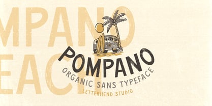 Pompano is an organic sans serif typeface which is purposely made for headline, display or logotype.This type of font perfectly made to be applied especially in logo, and the other various formal forms such as invitations, labels, logos, magazines, books, greeting / wedding cards, packaging, fashion, make up, stationery, novels, labels or any type of advertising purpose. Features : regular & stamp version uppercase & lowercase numbers and punctuation multilingual alternates & ligatures PUA encoded We highly recommend using a program that supports OpenType features and Glyphs panels like many of Adobe apps and Corel Draw, so you can see and access all Glyph variations.
 - Lust by Positype,
$49.00 Lust’s original masters were completely redrawn, expanded, with a new optical size added based on customer requests. Lust now sports 6 fonts, instead of the original 4: Standard, Display, Fine, and complementing Italics. The character set has been expanded as well to include more OpenType features and more swashes. The Lust Collection is the culmination of 5 years of exploration and development, and I am very excited to share it with everyone. When the original Lust was first conceived in 2010 and released a year and half later, I had planned for a Script and a Sans to accompany it. The Script was released about a year later, but I paused the Sans. The primary reason was the amount of feedback and requests I was receiving for alternate versions, expansions, and ‘hey, have you considered making?’ and so on. I listen to my customers and what they are needing… and besides, I was stalling with the Sans. Like Optima and other earlier high-contrast sans, they are difficult to deliver responsibly without suffering from ill-conceived excess or timidity. The new Lust Collection aggregates all of that past customer feedback and distills it into 6 separate families, each adhering to the original Lust precept of exercises in indulgence and each based in large part on the original 2010 exemplars produced for Lust. I just hate that it took so long to deliver, but better right, than rushed, I imagine.
 - Intimate Summer by Get Studio,
$15.00 Introducing Intimate Summer Font Duo, featuring a strong and bold sans font alongside a casual handwriting-inspired script font. This duo is a perfect combination that brings harmony and versatility to your creative projects. The bold sans font exudes strength and confidence with its clean lines and thick letterforms. It commands attention and adds a modern and retro touch to any design. Complementing the bold sans is the casual script font, which mimics the relaxed style of handwritten text. This script font brings a unique and free-spirited atmosphere to your typographic compositions. Together, this font duo offers an ideal balance between strength and casualness, making it a versatile choice for a variety of design applications. Whether you're designing logos, branding materials, invitations, or editorial layouts, this font duo is a captivating combination that adds an irreplaceable casual touch to your projects.
 - Middle Name by Graphicfresh,
$14.00 Middle Name - Minimal Classic Font Middle Name Sans is a geometric styled font. However, the design strays from the natural limitations of many sans-type fonts. Its eccentric style with a mix of today's styles makes this font suitable for various purposes. We added a bit of a classic touch to it. So that users can reminisce with the style of the past. You can create various designs with this font. Such as logos, posters, design templates, magazines, flyers and others. The strong character of the letters makes your design feel more modern and minimalist. Middle Name Sans comes with two versions. Regular and italic versions. When downloading, If there are things you want to ask or problems you face with this font. Don't hesitate to ask us. Because we are very happy to help you. Thanks Graphicfresh
 - Night Train by FontMesa,
$19.95 Night Train is a new font built from the ground up; while Night Train may resemble an old classic wood type there are a few lines that make this font a little more modern setting it apart from other wood type revivals. If you're a railroad enthusiast you're sure to enjoy the steam locomotive graphic located on the less than and greater than keys on all versions of this font, due to the fine detail of this train illustration the best printing results will be at 600dpi or higher on a laser printer. An alternate K and R are within the Night Train fonts, for Win Type1 these alternates are on the left and right bracket keys, for Truetype and OpenType you may access the alternates by using the Character Map in Windows or Adobe Illustrator, for OpenType you may also find them on the stylistic alternates page of the glyph map in Illustrator. There's something new with Night Train that the sign making people will love, for the first time FontMesa is pleased to offer a block shadowed version in four directions. One fill font is all that is needed for all four open faced fonts, you'll need an application that works in layers in order to use the fill font with the open faced fonts, simply place the fill font in its own layer then move it behind one of the open faced fonts of Night Train. The Night Train name has been on my list to use as a font name for a few years, a friend from years ago used to sail his boat in the Mackinac race from Chicago to Mackinac Island, the name of that boat was the Night Train. Watching the 2010 Olympic four man U.S. bobsled team win gold with their sled also called Night Train has inspired me to complete this font.
 - Centima by TipografiaRamis,
$29.00 Centima – a geometric sans serif typeface family, built in six styles. The typeface is intended for use in display sizes, but also is quite legible in text and is well suited for editorial and brand design. Centima is released in OpenType format with support for most European languages and includes some OpenType features – proportional/tabular, lining/oldstyle figures, slashed zero, ligatures, fractions.
 - The Hohoho by Avchi,
$12.00 Tho Hohoho is a font specially designed for christmas purposes. This font is a condensed sans serif, have a round corner, and have a happy concept. The main target is for Christmas design, but can be use for another purposes such as kitchen, nature, and other. This Font Include : Ligatures Latin Numbers & Punctuation We wish this font can bring customers to happiness.
 - Rigid Display by Studio Fat Cat,
$20.00 Rigid Display is a sans serif font designed for display needs such as titles, logos, etc. with a different touch. Rigid Display provides 5 weights for its users to have freedom in handling. This fresh font is an alternative that will refresh your font library and also the viewers so feel free to choose it as the main pawn for your project
 - Undergrunge Tornado by Roland Hüse Design,
$19.00 This is another grunge style hand drawn font I created with a poster marker. Including all Latin language extensions, Cyrillic and Japanese Hiragana and Katakana. It's an all caps font. I drew a couple versions of each letter then picked one of them for lower and one for uppercase so they can be combined for better flow and more even more natural look.
 - Kvltura by Invasi Studio,
$19.00 You want to add more rawness to your design. The Kvltura Font comes in Unbored Scribbles style, making your voice louder. Kvltura is an all-caps handwritten font. You can also combine any character with a Kvltura ligature and alternates for an incredible combination! This font is perfect for your display project for headlines, quotes, editorial design, print posters, and much more.
 - Golca by Pepper Type,
$30.00 Golca is a humanist, slightly elongated sans-serif font family with open aperture. It features rich language support and includes Cyrillic and Greek scripts for your international projects. It is perfect for branding purposes, as well as UI/UX applications and web appearance. Friendly and highly legible, it is also suitable as a body copy typeface for various printed media.
 - Boottering by HafisHidayat,
$15.00 Boottering is a modern handmade script, organic, energetic and dynamic, can be used for various purposes. such as the title, correspondence, wedding invitations, letterheads, signage, labels, signature newsletters, logos, posters, badges, etc. Boottering features 222 Glyphs, 40 alternate all lowercase characters, including ligatures, International support for most Western Languages is included, And for Boottering Sans do not have International Language support.
 - Saffron by Tall Chai,
$15.00 Saffron is a contemporary, luxurious sans-serif font family with weights ranging from Light (300) to Bold (700). Features: Available in 5 weights Over 320 glyphs supporting extended Latin Ideal for display texts: Titles, Logos and Headlines etc. Perfect for branding and rebranding Supports OpenTypes features like Ligatures and Stylistic Alternates Symbols for 10 major currencies including Bitcoin provided in all weights
 - CF Santiago by Contrafonts,
$28.00 This alphabet has only capital and small caps. With several alternative characters (A, R, Y) in different style groups. The capitals are even more flexible, with alternatives for Uncial inspiration. In addition to ligatures symbols and various groups of numbers. Of course we use Opentype for a expanded use in modern software for layout and graphic design. Compatible with mac and PC.
 - Nevo by Meat Studio,
$37.33 Nevo is a 14 style contemporary sans serif designed by Stew Deane. Nevo was specifically designed for a premium feel that is suitable for anything from advertising and branding to web and screen. Its versatility comes from the minimal, subtly unique letterforms that come in 7 weights, with matching italics for each weight making it easily adaptable to brands and market sectors.
 - Rouben by Roman Melikhov,
$23.00 Rouben is a sans serif font family for creating minimalistic logos, wordmarks, titles, taglines. Use stylistic alternates to emphasize separate letters in your text. Features: - 10 weights + variable font - Multilanguage + Cyrillic - 2 stylistic alternates for each letter You can use alternates in most major image editors, just find menu item Glyphs (Alternates) there. For any questions about the font please contact: arbuzzu@gmail.com
 - Mindset by PintassilgoPrints,
$19.00 Meet Mindset, an open-minded versatile hand-drawn family. Its regular and slim cuts, both all-caps-with-alternates for that unique feel, fit countless purposes where a touch of hand-done is welcome. There’s yet a picture font with plenty of stylish graphic elements for added coolness. Give it a try and see for yourself. It's all in the mind, y'know.
 - Nura by Sabrcreative,
$12.00 Introducing the Nura Font Family is the modern Display sans serif family. The Nura Font family comes in various sizes from Thin to Black, giving you the freedom to get creative with this font. With strong characters in the size of Black, it is very suitable for use for sign displays. and other sizes you can use as needed for your project
 - Bernandes by Letterday Studio,
$20.00 Bernandes is a new modern script font with an irregular base line. Trendy and feminine style. Bernandes looks beautiful in wedding invitations, thank you cards, quotes, greeting cards, logos, business cards, and more. Perfect for use in ink or watercolors. Includes initial and terminal letters, alternatives and support for many languages. To enable the OpenType Stylistic alternative, you need a program that supports OpenType features such as Adobe Illustrator CS, Adobe Indesign & CorelDraw X6-X7, Microsoft Word 2010 or newer versions. There are additional ways to access alternatives / swashes, using Character Maps (Windows), Nexus Fonts (Windows), Font Books (Mac) or software programs such as PopChar (for Windows and Mac).
 - Quick Tracer by Keristyper Studio,
$14.00 introduce Quick Tracer font with sporty modern cutouts and dynamic tilt. Ideal for fast car racing sports titles, running matches, cycling, automotive, and other modern dynamic monograms or texts. This font is good for logo design, Social media, Movie Titles, Books Titles, short text even long text letters, and good for your secondary text font with sans or serif. **Featured:** * Standard Uppercase & Lowercase * Numeral & Punctuation * Multilingual : ä ö ü Ä Ö Ü ß ¿ ¡ * Alternate & Ligature * PUA encoded We recommend programs that support the OpenType feature and the Glyphs panel such as Adobe applications or Corel Draw. so you can use all the variations of the glyphs. Hope you enjoy our fonts!
 - Wistina Script by Black Studio,
$15.00 Wisterya Script is a new modern script font with an irregular base line. Trendy and feminine style. Wisterya Script looks beautiful in wedding invitations, thank you cards, quotes, greeting cards, logos, business cards, and more. Perfect for use in ink or watercolors. Includes initial and terminal letters, alternatives and support for many languages. To enable the OpenType Stylistic alternative, you need a program that supports OpenType features such as Adobe Illustrator CS, Adobe Indesign & CorelDraw X6-X7, Microsoft Word 2010 or newer versions. There are additional ways to access alternatives / swashes, using Character Maps (Windows), Nexus Fonts (Windows), Font Books (Mac) or software programs such as PopChar (for Windows and Mac).
 - Rubiesque by Nootype,
$45.00 Rubiesque is the sans serif version of Rubis, these two families share the same skeleton and weights. Rubiesque is a sans combining humanist and grotesk references which give this typeface an interesting & unique personnality. The regular and medium weights are perfect for text while the italic give an interesting texture to the text. The range of style give a good flexibility to this family. It’s a perfect family for editorial use. Rubiesque consists in a 10 styles family, from Light to Black with their corresponding italics. Each font includes OpenType Features such as Small Caps, Proportional Figure, Tabular Figures, Numerators, Superscript, Denominators, Scientific Inferiors, Subscript, Ordinals, Fractions and ligatures. Rubiesque family supports Latin and Cyrillic, all these languages are covered: Latin language support: Afar, Afrikaans, Albanian, Asturian, Azeri, Basque, Bosnian, Breton, Bulgarian, Catalan, Cornish, Corsican, Croatian, Czech, Danish, Dutch, English, Esperanto, Estonian, Faroese, Filipino, Finnish, Flemish, French, Frisian, Friulian, Gaelic, Galician, German, Greenlandic, Hungarian, Icelandic, Indonesian, Irish, Italian, Kurdish, Latin, Latvian, Lithuanian, Luxembourgish, Malagasy, Malay, Maltese, Maori, Moldavian, Norwegian, Occitan, Polish, Portuguese, Provençal, Romanian, Romansch, Saami, Samoan, Scots, Scottish, Serbian, Slovak, Slovenian, Spanish, Swahili, Swedish, Tagalog, Turkish, Walloon, Welsh, Wolof Cyrillic language support: Adyghe, Avar, Belarusian, Bulgarian, Buryat, Chechen, Erzya, Ingush, Kabardian, Kalmyk, Karachay-Balkar, Karakalpak, Kazakh, Komi, Kyrgyz, Lak, Macedonian, Moldovan, Mongol, Permyak, Russian, Rusyn, Serbian, Tatar, Tofa, Tuvan, Ukrainian, Uzbek
 - Bologna by David Turner,
$35.00 Inspired by pointed pen calligraphy and modulated sans serif typefaces used for advertising in the 1920´s, Bologna is a high contrasted sans serif with a modern and fashionable look. Bologna comes in three weights: Regular, Bold and Black. The Regular and Bold weights are, despite of their high contrast, also build for body texts. Whereas Bologna Black, with a more expressive look and sharp angles, is specially designed for large and striking headlines, packaging or identities. Overview: 3 weights - Regular, Bold, Black Regular/Bold: 657 Glyphs Black: 871 Glyphs Lining, tabular and old style figures Ligatures: fl, fi, ff, ffi ffl, Unicase Letters: a, e, m, n, r Alternative Guillemets Case Sensitive Arrows Bologna Black: hairline accents and interpunctations Fractions Extended Language Support Stylistic Sets: ss01 = Alternative Guillemets / Alternative y ss02 = Unicase glyphs ss03 = Numerals in circle ss04 = Numerals in black circle ss05 = Hairline Accents and Interpunctations (Bologna Black)
 - Kolaron by IbraCreative,
$17.00 Kolaron – A Modern Condensed Sans Serif Font Kolaron is a contemporary condensed sans-serif font that effortlessly blends sophistication with modernity. Its sleek and streamlined design features condensed letterforms that exude a sense of efficiency and space optimization, making it an ideal choice for projects where legibility and style are paramount. The font’s clean lines and geometric shapes contribute to a polished and professional appearance, making it versatile for a range of applications, from corporate branding to editorial design. Kolaron’s balanced letter spacing and subtle yet distinctive details showcase a meticulous attention to typographic detail, ensuring a harmonious and eye-catching visual experience across various mediums. Whether used for headlines, signage, or digital interfaces, Kolaron stands as a testament to the elegance achievable in contemporary typography. Kolaron is perfect for branding projects, logo, wedding designs, social media posts, advertisements, product packaging, product designs, label, photography, watermark, invitation, stationery, game, fashion and any projects. Fonts include multilingual support for; Afrikaans, Albanian, Czech, Danish, Dutch, English, Estonian, Finnish, French, German, Hungarian, Italian, Latvian, Lithuanian, Norwegian, Polish, Portuguese, Slovak, Slovenian, Spanish, Swedish.
 - Revla Slab by Eclectotype,
$40.00 The Revla family just keeps expanding! This is Revla Slab. It has the same exuberant charm as its siblings ( Revla Sans and Revla Serif ) with a touch more chunk. OpenType contextual alternates make for text that is lively and bouncy, without the monotony of obviously repeating letterforms. It’s shamelessly fun, but pretty serious at the same time. The range of weights can be used to maintain an even colour across different sizes - use lighter weights for bigger sizes and vice versa. OpenType features include automatic fractions, ordinals, contextual alternates (which along with the pseudo-randomness, help maintain a nice tight fit with minimal glyph collisions), standard and discretionary ligatures (OK, only one discretionary ligature, but it’s a belter!), and case-sensitve forms. Obviously, in sharing a common skeleton, it will work well with other members of the Revla Superfamily, particularly Revla Sans.
 - Livory by HVD Fonts,
$50.00 Livory is a serif type family of four fonts including small caps, 25 ornaments & 50 ligatures in each style. It was designed by Hannes von Döhren & Livius F. Dietzel between 2005 and 2010. Livory is influenced by the French Renaissance Antiquas from the 16th century. It has an organic look with a warm touch and was especially developed for long texts. With its melted corners and individual serifs, Livory has also a smooth and handcrafted appearance in display sizes. With almost 780 glyphs in each font, Livory is equipped for complex, professional typographic work. The OpenType fonts have an extended character set to support Central and Eastern European as well as Western European languages. Each font includes small caps, fractions, old style-, lining-, tabular numbers, scientific superior/inferior figures, ligatures, ornaments and a set of arrows.
 - Hysteria Rollers by Din Studio,
$20.00 Hi, Everyone! Looking for a font that will make your branding stand out? Do you sometimes have an appetite for a bit more wholesome typography? Looking for a fabulous, stylish, and adventure font? We've got what you want. Hysteria Rollers - A Sans Script Font Duo Hysteria Rollers is a fantastic font duo. An uppercase sans serif font is accompanied by a gorgeous handcrafted script brush font that works together in perfect harmony. Designed primarily as a captivating font to add the right amount of modernity and style, This font duo is an excellent choice to ensure a great font match for your designs and projects! Our font always includes Multilingual Support to make your branding reach a global audience. Features: Ligatures Alternates Stylistic Set Swashes PUA Encoded Numerals and Punctuation Thank you for downloading premium fonts from Din Studio
 - Lust Stencil by Positype,
$39.00 When you hear that name, you likely ask yourself, ‘why?!’ I did too, but the number of requests could not be ignored. Once I finally decided to move forward with it, the only way to solve the offering would be to adhere to the same theme of indulgence, I planned for the same number of optical weights AND Italics. Yeah, italic stencils… ok, why not? It’s not a new concept. One thing to note and a creative liberty I assumed during the design. Lust Stencil would not be just a redaction or removal of stress to produce a quick stencil. To do that, would just be a cheap solution. Strokes had to resolve themselves correctly and/or uniquely to the concept of the stencil format. And, it had to be heftier. For it it to look correctly, it needed about 8% additional mass to the strokes for it to retain the effervescent flow of the curves and the resolute scalloped lachrymals. The Lust Collection is the culmination of 5 years of exploration and development, and I am very excited to share it with everyone. When the original Lust was first conceived in 2010 and released a year and half later, I had planned for a Script and a Sans to accompany it. The Script was released about a year later, but I paused the Sans. The primary reason was the amount of feedback and requests I was receiving for alternate versions, expansions, and ‘hey, have you considered making?’ and so on. I listen to my customers and what they are needing… and besides, I was stalling with the Sans. Like Optima and other earlier high-contrast sans, they are difficult to deliver responsibly without suffering from ill-conceived excess or timidity. The new Lust Collection aggregates all of that past customer feedback and distills it into 6 separate families, each adhering to the original Lust precept of exercises in indulgence and each based in large part on the original 2010 exemplars produced for Lust. I just hate that it took so long to deliver, but better right, than rushed, I imagine. It would have taken even longer if not for font engineer and designer, Potch Auacherdkul. Thanks Potch.
 - Rahere Informal by ULGA Type,
$18.99 Rahere Informal is a slab semi-serif typeface that has a seriously charming personality and a little spring in its step. Serifs bend and flick, giving the characters a spirited, almost calligraphic feel. It's lively and friendly without being whimsical, great for messages that need a casual but credible tone with a bit of zing in the mix. Rahere Informal is suitable for a wide range of applications such as information signage, packaging, advertising, brochures, catalogues, screen text, visual identities and opera festivals. Want an annual report that pleases the board, shareholders and investors? Set it in Rahere Informal - that’ll put a smile on everyone’s face. The family comes in six weights from light to extra bold with corresponding italics. The lighter weights are more delicate, an evenly-spaced flamboyance of flamingos basking in the sun. As the weights get heavier, characters transform into a tight-knit group of line dancing rhinos. All styles contain a set of swash caps, a few ligatures and alternatives. Nice. The character set covers most European languages plus Vietnamese. Each weight contains lining & non-aligning numerals in both proportional & tabular spacing. The tabular numerals share the same width across all weights and styles (matching Rahere Sans and Rahere Slab). If a companion sans serif is needed, Rahere Sans is the ideal partner. They are both part of the extended Rahere typeface family and have been designed to complement each other. Seriously charming, charmingly serious. Seriously, what more do you want from a typeface? Rahere, founder of St Barts in London The typeface is named after Rahere, a 12th-century Anglo-Norman priest, who founded the Priory of the Hospital of St Bartholomew, London in 1123. In 2007 I was successfully treated at Barts for relapsed testicular cancer so I’m indebted to all the doctors, nurses and support staff who work there. A special shout out to Orchid Cancer – a UK charity that helps men affected by cancer – who funded the research for my treatment.
 - BD Gitalona Variable by Balibilly Design,
$139.00 We introduce our Variable Font from the high-complex BD Gitalona font family. Consisting of 3 axes; weight, optical size, and serif, that will give you a different experience extending the family of BD Gitalona. We don't want to mention how many families can be generated from this variable font. During the development process, we got up to more than 50 families and stopped to allow you to continue to play with the slide buttons. And again, BD Gitalona is filled with an explorative and experimental decorative version that we present separately. Figure out the decorative version BD Gitalona Moxa to make the aesthetic appeal of this whole typeface here! Inspiration The world of entertainment moves non-stop. One by one, figures appeared and left. We expect to create something to entertain previous trends with packaging more relevant to the present. More specifically, we admire and are inspired by some of the world's leading and top singers with a segmented nature. We imagine so many figures that can affect every viewer. However, each artist or singer has a segment because almost all of them have characteristics. The Design The basic design of this typeface begins with a transitional serif shape with sharp, shapeless corners. Then in the middle of the invention, there was an opportunity to explore it further from the readability side by adding an optical variable that can adjust the serif thickness when used together between large, medium to paragraph text sizes for editorials. The shift from serif to sans-serif with the contrast initiated by the shift of the serif family form as a different variable also makes this font richer in terms of the features it contains. Parts are expected to add to the user satisfaction with the complexity of this font. The Features BD Gitalona consists of one sub-family intended for body text with nine weights from Thin(100) to Black(900) and four other display sub-families such as Display serif, Flick, Harmony Sans and Contrast Sans. Each consists of four weights Thin(100), Regular Weight(400), Bold(700), and Black(900). And again, there are also retailed separately; the BD Gitalona Variable font, which is designed to accommodate all Subfamily in 1 font file, and BD Gitalona Moxa, an experimental typeface. A total of 700+ glyphs in each style. Advanced OpenType features functionally and aesthetically, such as Case-sensitive forms, small caps, standard and discretionary ligatures, stylistic alternates, ordinals, fractions, numerator, denominator, superscript, subscript, circled number, slashed zero, old-style figure, tabular and lining figure. Supports multi-languages including Western Europe, Central Europe, Southeast Europe, South America, and Oceania.
 - Hello Cartel Story Script Duo by Attract Studio,
$13.00 Hello Cartel Story Script FONT DUO is a new modern script font with irregular base lines. Trendy and feminine style. Hello Cartel Story Script looks beautiful in wedding invitations, thank-you cards, quotes, greeting cards, logos, business cards, and more. Perfect for use in ink or watercolors. Includes initial letters and terminals, alternatives and support for many languages. Include file: Hello Cartel Story Script.OTF Hello Cartel Story Sans.OTF To activate the OpenType Stylistic alternative, you need a program that supports OpenType features such as Adobe Illustrator CS, Adobe Design & CorelDraw X6-X7, Microsoft Word 2010 or newer versions. There are additional ways to access alternatives / swash, using Character Map (Windows), Nexus Fonts (Windows), Font Books (Mac) or software programs such as PopChar (for Windows and Mac). How to access all alternative characters, using Windows Character Map with Photoshop: https://www.youtube.com/watch?v=Go9vacoYmBw How to access all alternative characters using Adobe Illustrator: http://youtu.be/iptSFA7feQ0 How to use a stylish font set in Microsoft Word 2010 or later versions: https://youtu.be/x1A_ilsBsGs Need help or have questions, let me know. I am happy to help :) Thank you & Congratulations on the Design!